32,39 €
Mehr erfahren.
- Herausgeber: Packt Publishing
- Kategorie: Wissenschaft und neue Technologien
- Sprache: Englisch
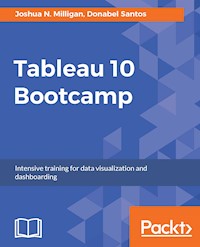
Sharpen your data visualization skills with Tableau 10 Bootcamp.
About This Book
- Make informed decisions using powerful visualizations in Tableau
- Learn effective data storytelling to transform how your business uses ideas
- Use this extensive bootcamp that makes you an efficient Tableau user in a short span of time
Who This Book Is For
This book caters to business, data, and analytics professionals who want to build rich interactive visualizations using Tableau Desktop. Familiarity with previous versions of Tableau will be helpful, but not necessary.
What You Will Learn
- Complete practical Tableau tasks with each chapter
- Build different types of charts in Tableau with ease
- Extend data using calculated fields and parameters
- Prepare and refine data for analysis
- Create engaging and interactive dashboards
- Present data effectively using story points
In Detail
Tableau is a leading visual analytics software that can uncover insights for better and smarter decision-making. Tableau has an uncanny ability to beautify your data, compared to other BI tools, which makes it an ideal choice for performing fast and easy visual analysis.
A military camp style fast-paced learning book that builds your understanding of Tableau 10 in no time. This day based learning guide contains the best elements from two of our published books, Learning Tableau 10 - Second Edition and Tableau 10 Business Intelligence Cookbook, and delivers practical, learning modules in manageable chunks. Each chunk is delivered in a "day", and each "day" is a productive day. Each day builds your competency in Tableau. You will increase your competence in integrating analytics and forecasting to enhance data analysis during the course of this Bootcamp.
Each chapter presents core concepts and key takeaways about a topic in Tableau and provides a series of hands-on exercises. In addition to these exercises, at the end of the chapter, you will find self-check quizzes and extra drills to challenge you, to take what you learned to the next level. To summarize, this book will equip you with step-by-step instructions through rigorous tasks, practical callouts, and various real-world examples and assignments to reinforce your understanding of Tableau 10.
Style and approach
A fast paced book filled with highly-effective real-world examples to help you build new things and help you in solving problems in newer and unseen ways.
Sie lesen das E-Book in den Legimi-Apps auf:
Seitenzahl: 293
Veröffentlichungsjahr: 2017
Ähnliche
BIRMINGHAM - MUMBAI
Tableau 10 Bootcamp
Copyright © 2017 Packt Publishing
All rights reserved. No part of this book may be reproduced, stored in a retrieval system, or transmitted in any form or by any means, without the prior written permission of the publisher, except in the case of brief quotations embedded in critical articles or reviews.
Every effort has been made in the preparation of this book to ensure the accuracy of the information presented. However, the information contained in this book is sold without warranty, either express or implied. Neither the authors, nor Packt Publishing, and its dealers and distributors will be held liable for any damages caused or alleged to be caused directly or indirectly by this book.
Packt Publishing has endeavored to provide trademark information about all of the companies and products mentioned in this book by the appropriate use of capitals. However, Packt Publishing cannot guarantee the accuracy of this information.
First published: September 2017
Production reference: 1220917
ISBN 978-1-78728-513-2
www.packtpub.com
Credits
Authors
Joshua N. Milligan
Donabel Santos
Project Coordinator
Kinjal Bari
Commissioning Editor
Veena Pagare
Proofreader
Safis Editing
Acquisition Editor
Divya Poojari
Indexer
Mariammal Chettiyar
Content Development Editor
Trusha Shriyan
Graphics
Kirk D'Penha
Technical Editor
Naveenkumar Jain
Production Coordinator
Shraddha Falebhai
Copy Editor
Safis Editing
About the Authors
Joshua N. Milligan has been with Teknion Data Solutions since 2004 and currently serves as a principal consultant. With a strong background in software development and custom .NET solutions, he brings a blend of analytical and creative thinking to BI solutions, data visualization, and data storytelling.
His years of consulting have given him hands on experience in all aspects of the BI development cycle from data modeling, ETL, enterprise deployment, data visualization, and dashboard design. He has worked with clients in numerous industries including financial, energy, healthcare, marketing, government, and services.
Joshua has been named by Tableau as a Tableau Zen Master every year since 2014. This places Joshua in a group of individuals recognized by Tableau as not only masters of the tool but also who have a deep desire to teach and help others. As a Tableau Ambassador, trainer, mentor, and leader in the online Tableau community, Joshua is passionate about helping others gain insights from their data.
He frequently broadcasts webinars to educate and inform the Tableau community and the world at large about the wonders of Tableau and is a much sought after featured speaker at Tableau conferences, user groups, and various technology and industry functions. He thrives on helping others.
Joshua is the author of the first edition of Learning Tableau, which quickly became one of the highest acclaimed Tableau books for users at all levels. He was a technical reviewer of the Tableau Data Visualization Cookbook, Creating Data Stories with Tableau Public, and his work has been featured multiple times on Tableau Public’s Viz of the Day and Tableau’s website. He also shares frequent Tableau tips, tricks, and advice along with a variety of dashboards on his fun and creative blog site, VizPainter. You can follow Joshua on Twitter at @VizPainter.
Donabel Santos is a self-confessed data geek. She loves working with data, writing queries, and developing reports on her SQL Server databases, and exploring and visualizing data with Tableau.She is the principal and senior business intelligence architect at QueryWorks Solutions, a Tableau Learning and Alliance partner in Vancouver, BC, Canada, providing consulting and training services. She has spent years in consulting and has developed a variety of solutions for clients in different verticals—finance, manufacturing, healthcare, legal, higher education, and local government.Donabel is a multi-year Microsoft Data Platform MVP (previously known as SQL Server MVP) and has extensive experience in the SQL server in different areas, such as development, administration, data warehouse, reporting (SSRS), tuning, troubleshooting, XML, CLR, and integration with ERPs and CRMs using PowerShell, C#, SSIS, and Power BI.One of Donabel's passions is teaching and sharing her love for data. She is a Tableau Certified Professional and a Tableau accredited trainer, delivering Tableau public and on-site client training. She is also the lead instructor for a number of courses at British Columbia Institute of Technology (BCIT), including Applied Database Administration and Design (ADAD) and Applied Data Analytics (ADA) programs. She teaches SQL server administration, development, integration (SSIS), data warehouse foundations, and visual analytics with Tableau.Donabel has also authored three other books with Packt: SQL Server 2012 with PowerShell V3 Cookbook, PowerShell for SQL Server Essentials, and SQL Server 2014 with PowerShell V5 Cookbook. She also contributed a chapter to PowerShell Deep Dives by Manning Publications..
www.PacktPub.com
For support files and downloads related to your book, please visit www.PacktPub.com. Did you know that Packt offers eBook versions of every book published, with PDF and ePub files available? You can upgrade to the eBook version at www.PacktPub.com and as a print book customer, you are entitled to a discount on the eBook copy. Get in touch with us at [email protected] for more details. At www.PacktPub.com, you can also read a collection of free technical articles, sign up for a range of free newsletters and receive exclusive discounts and offers on Packt books and eBooks.
https://www.packtpub.com/mapt
Get the most in-demand software skills with Mapt. Mapt gives you full access to all Packt books and video courses, as well as industry-leading tools to help you plan your personal development and advance your career.
Why subscribe?
Fully searchable across every book published by Packt
Copy and paste, print, and bookmark content
On demand and accessible via a web browser
Customer Feedback
Thanks for purchasing this Packt book. At Packt, quality is at the heart of our editorial process. To help us improve, please leave us an honest review.
If you'd like to join our team of regular reviewers, you can e-mail us at [email protected]. We award our regular reviewers with free eBooks and videos in exchange for their valuable feedback. Help us be relentless in improving our products!
Table of Contents
Preface
What this book covers
What you need for this book
Conventions
Reader feedback
Customer support
Downloading the example code
Downloading the color images of this book
Errata
Piracy
Questions
Creating Your First Visualization and Dashboard
Connecting to data
Foundations for building visualizations
Measures and dimensions
Discrete and continuous
Discrete fields
Continuous fields
Visualizing data
Creating bar charts
Iterations of bar charts for deeper analysis
Line charts
Iterations offline charts for deeper analysis
Creating geographic visualizations
Filled maps
Symbol maps
Using Show Me
Bringing everything together in a dashboard
Building your dashboard
Summary
Interactivity
Creating a motion chart
Creating a dynamic column/row trellis chart
Creating a top/bottom N filter
Comparing one to everything else
LOD expressions
Dynamically displaying dimensions
Dynamically displaying and sorting measures
Summary
Moving from Foundational to More Advanced Visualizations
Comparing values across different dimensions
Bar charts
Bar chart variations
Bullet chart - Showing progress towards a goal
Bar in Bar charts
Highlighting categories of interest
Visualizing dates and times
The built-in date hierarchy
Variations of date and time visualizations
Gantt charts
Relating parts of the data to the whole
Stacked bars
Treemaps
Area charts
Pie charts
Visualizing distributions
Circle charts
Jittering
Box and whisker plots
Histograms
Visualizing multiple axes to compare different measures
Scatterplot
Dual axis
Combination charts
Summary
Dashboards and Story Points
Creating a filter action
Creating a URL action
Creating an infographic-like dashboard
Creating story points
Summary
Data Preparation
Using the Data Interpreter and pivots
Using the legacy Jet driver
Using schema.ini to resolve data type issues
Pivoting columns
Using unions
Using join
Using blends
Summary
Using Row-Level, Aggregate, and Level of Detail Calculations
Creating and editing calculations
Level of detail calculations
Level of detail syntax
Level of detail example
Parameters
Creating parameters
Ad hoc calculations
Performance considerations
Summary
Table Calculations
Overview of table calculations
Creating and editing table calculations
Quick table calculations
Relative versus fixed
Scope and direction
Working with scope and direction
Addressing and partitioning
Advanced addressing and partitioning
Custom table calculations
Data densification
When and where data densification occurs
Leveraging data densification
Summary
Formatting Visualizations to Look Great and Work Well
Formatting considerations
Understanding how formatting works in Tableau
Worksheet-level formatting
Field-level formatting
Additional formatting options
Adding value to visualizations
Tooltips
Summary
Advanced Visualizations, Techniques, Tips, and Tricks
Advanced visualizations
Slope chart
Lollipop chart
Waterfall chart
Sparklines
Dumbbell chart
Unit chart/symbol chart
Marimekko chart
Sheet swapping and dynamic dashboards
Dynamically showing and hiding other controls
Advanced mapping techniques
Supplementing the standard in geographic data
Manually assigning geographic locations
Creating custom territories
Ad-hoc custom territories
Field-defined custom territories
Some final map tips
Using background images
Animation
Summary
Sharing Your Data Story
Presenting, printing, and exporting
Presenting
Printing
Exporting
Sharing with users
Sharing with Tableau Desktop users
Sharing with Tableau Reader users
Sharing with users of Tableau Server, Tableau Online, and Tableau Public
Publishing to Tableau Public
Publishing to Tableau Server and Tableau Online
Interacting with Tableau Server
Additional distribution options using Tableau Server
Summary
Preface
Tableau is a software package that helps explore, visualize, analyze and make sense of data. It helps us see different kinds of data in a different light. Tableau makes it easy to connect to different kinds of data sets and understand it more, and "see" what kinds of stories we can unearth. It doesn't matter if it's business data, social data, maybe your fitness tracker data or playlist, it is fascinating to see and learn something about our business, our health, our own social network, our world in general.
Tableau's uniqueness comes from Tableau's paradigm. Tableau is different from traditional BI products that force you to select a chart type and then match data to various components of the chart. You won't be confronted with wizards or pre-built dashboards that give you some insight at first but fail to deliver additional insight when you need it.
Instead, Tableau allows for hands-on interaction with data, it's easy to get into a flow of asking questions, uncovering new insights, raising new questions and answers, and finally designing a data story to share with others.
And, Tableau is fun! It allows for creativity and gives freedom to explore, understand, design, and share. Tableau doesn't lock you into a single path to a solution. Tableau designers feel like artists with data as paint and Tableau a blank canvas.
What this book covers
Chapter 1, Creating Your First Visualization and Dashboard, will introduce you to the basic concepts of data visualization and see multiple examples of individual visualizations that are ultimately put together in an interactive dashboard.
Chapter 2, Interactivity, presents different ways to incorporate interactivity within Tableau charts. Interactivity can keep whoever is consuming your charts to be more be engaged, and encourage them to ask questions, answer questions, and ask more questions without breaking the flow of analysis.
Chapter 3, Moving from Foundational to More Advanced Visualizations, expands upon the basic concepts of data visualization to show how to extend standard visualization types.
Chapter 4, Dashboards and Story Points, covers how to combine different charts together in dashboards to provide a consolidated view of the data. Story points are also introduced to provide a more effective way to present information catered to specific audiences and message.
Chapter 5, Data Preparation, includes ways to help clean, transform or combine data sets to prepare them for data analysis in Tableau. This chapter discusses different data preparation strategies including using the Data Interpreter, pivot, schema.ini as well as comparing operations such as union, join and blend
Chapter 6, Using Row-Level, Aggregate, and Level of Detail Calculations, introduces the concepts of calculated fields, the practical use of calculations, and walks through the foundational concepts for creating row level, aggregate, and level of detail calculations.
Chapter 7, Table Calculations, breaks down the basics of scope, direction, partitioning, and addressing to help you understand and use them to solve practical problems.
Chapter 8, Formatting Visualizations to Look Great and Work Well, Formatting can make a standard visualization look great, have appeal, and communicate well. This chapter introduces and explains the concepts around formatting in Tableau.
Chapter 9, Advanced Visualizations, Techniques, Tips, and Tricks, expands your horizons by introducing non-standard visualization types along with numerous advanced techniques while giving practical advice and tips.
Chapter 10, Sharing Your Data Story, explores numerous ways of sharing your stories with others because once you've built your visualizations and dashboards; you'll want to share them.
What you need for this book
You will need to install Tableau Desktop V10 to follow the recipes in this book. Tableau Desktop can be downloaded from www.tableau.com. The trial version of Tableau offers a fully functional version for 14 days.
If you are an educator or student using Tableau for your course, please check out Tableau for Teaching (TFT). You can find more information from http://www.tableau.com/academic/teaching. This is a great program for educators who want to integrate visual analytics in their courses.
If you are a journalist, Tableau Desktop is free for you: https://public.tableau.com/en-us/s/blog/2013/06/journalists-now-tableau-desktop-free-you.
You can also use Tableau Public, a free version of the software, to complete many of the recipes. Tableau Public has some limitations, however, which may prevent you from following some of the steps. You can find the comparison and limitations of the different Tableau Desktop versions here: https://public.tableau.com/en-us/s/download
While this book covers Tableau V10, many of the concepts and steps still apply to other versions, barring some minor changes in steps or interface.
Conventions
In this book, you will find a number of styles of text that distinguish between different kinds of information. Here are some examples of these styles, and an explanation of their meaning.
Code words in text, database table names, folder names, filenames, file extensions, pathnames, dummy URLs, and user input are shown as follows: "We'll create a calculated field named Floor to determine if an apartment is upstairs or downstairs."
A block of code is set as follows:
IF [Apartment] >= 1 AND [Apartment] <= 3 THEN "Downstairs" ELSEIF [Apartment] > 3 AND [Apartment] <= 6 THEN "Upstairs" ELSE "Unknown" END
New terms and important words are shown in bold. Words that you see in the Tableau interface, such as those in menus, dialog boxes or field names, appear in the text like this: "Drag and drop the Customer field to the Rows shelf."
Warnings or important notes appear in a box like this.
Reader feedback
Feedback from our readers is always welcome. Let us know what you think about this book—what you liked or may have disliked. Reader feedback is important for us to develop titles that you really get the most out of.
To send us general feedback, simply send an e-mail to [email protected], and mention the book title via the subject of your message.
If there is a topic that you have expertise in and you are interested in either writing or contributing to a book, see our author guide on https://www.packtpub.com/books/info/packt/authors.
Customer support
Now that you are the proud owner of a Packt book, we have a number of things to help you to get the most from your purchase.
Downloading the example code
You can download the example code files for all Packt books you have purchased from your account at http://www.packtpub.com. If you purchased this book elsewhere, you can visit http://www.packtpub.com/support and register to have the files e-mailed directly to you.
You can download the code files by following these steps:
Log in or register to our website using your e-mail address and password.
Hover the mouse pointer on the
SUPPORT
tab at the top.
Click on
Code Downloads & Errata
.
Enter the name of the book in the
Search
box.
Select the book for which you're looking to download the code files.
Choose from the drop-down menu where you purchased this book from.
Click on
Code Download
.
Once the file is downloaded, please make sure that you unzip or extract the folder using the latest version of:
WinRAR / 7-Zip for Windows
Zipeg / iZip / UnRarX for Mac
7-Zip / PeaZip for Linux
The code bundle for the book is also hosted on GitHub athttps://github.com/PacktPublishing/Tableau-10-Bootcamp. We also have other code bundles from our rich catalog of books and videos available athttps://github.com/PacktPublishing/. Check them out!
If you are using Tableau Public, you'll need to locate the workbooks that have been published to Tableau Public. These may be found at the following link: http://goo.gl/wJzfDO.
Downloading the color images of this book
We also provide you a PDF file that has color images of the screenshots/diagrams used in this book. The color images will help you better understand the changes in the output. You can download this file from: http://www.packtpub.com/sites/default/files/downloads/Tableau10Bootcamp_ColorImages.pdf.
Errata
Although we have taken every care to ensure the accuracy of our content, mistakes do happen. If you find a mistake in one of our books—maybe a mistake in the text or the code—we would be grateful if you would report this to us. By doing so, you can save other readers from frustration and help us improve subsequent versions of this book. If you find any errata, please report them by visiting http://www.packtpub.com/submit-errata, selecting your book, clicking on the errata submission form link, and entering the details of your errata. Once your errata are verified, your submission will be accepted and the errata will be uploaded on our website, or added to any list of existing errata, under the Errata section of that title. Any existing errata can be viewed by selecting your title from http://www.packtpub.com/support.
Piracy
Piracy of copyright material on the Internet is an ongoing problem across all media. At Packt, we take the protection of our copyright and licenses very seriously. If you come across any illegal copies of our works, in any form, on the Internet, please provide us with the location address or website name immediately so that we can pursue a remedy.
Please contact us at [email protected] with a link to the suspected pirated material.
We appreciate your help in protecting our authors, and our ability to bring you valuable content.
Questions
You can contact us at [email protected] if you are having a problem with any aspect of the book, and we will do our best to address it.
Creating Your First Visualization and Dashboard
Tableau is an amazing platform for achieving incredible data discovery, analysis, and storytelling. You can see, understand, and make decisions based on your data, using VizQL—a visual query language that is designed for a natural and seamless flow of thought and work. You do not need to learn VizQL; it's all done behind the scenes without forcing you to write tedious SQL scripts or MDX code, or painstakingly work through numerous wizards to select a chart type and then link everything to data.
Instead, you will be interacting with your data in a visual environment where everything that you drag and drop will be translated into the necessary queries and then displayed visually. You'll be working in real time, so you will see results immediately, get answers as fast as you can ask questions, and be able to iterate through dozens of ways to visualize the data to find a key insight or tell a piece of the story.
Tableau allows you to accomplish numerous tasks, including the following:
Data connection, integration,
and preparation
: Tableau allows you to connect to data from sources and, if necessary, create a structure that is ready to use. Most of the time, this is as easy as pointing Tableau to a database or opening a file, but Tableau gives you the tools to bring together even complex and messy data from multiple sources.
Data exploration
: You can explore a dataset very easily using Tableau in order to understand what data you have visually.
Data visualization
: This is the heart of Tableau. You can iterate through the countless ways of visualizing the data to ask and answer questions, raise new questions, and gain new insights.
Data analysis
: Tableau has an ever growing set of analytical functions that allow you to dive deep into understanding complex relationships, patterns, and correlations in the data.
Data storytelling
: Tableau allows you to build fully interactive dashboards and stories with your visualizations and insights so that you can share the data story with others.
We'll take a look at each of these tasks in the subsequent chapters. In this chapter, we will introduce the foundational principles of Tableau and focus on data visualization. We'll accomplish this through a series of examples that will introduce the basics of connecting to data, exploring and analyzing the data visually, and finally putting it all together in a fully interactive dashboard. These concepts will be developed far more extensively in the subsequent chapters. However, don't skip this chapter as it introduces key terminologies and foundational concepts, including the following:
Connecting to data
Foundations for building visualization
Visualizing the data
Creating bar charts
Creating line charts
Creating geographic visualizations
Using Show Me
Bringing everything together in a dashboard
Connecting to data
Tableau connects to data stored in a wide variety of files and databases. These include flat files, such as Excel and text files; relational databases, such as SQL Server and Oracle; cloud based data sources, such as Google Analytics and Amazon Redshift; and OLAP data sources, such as Microsoft Analysis Services. With very few exceptions, the process of building visualizations and performing analysis will be the same no matter what data source you use.
For now, we'll connect to a text file, specifically, a Comma-separated Values file (.csv). The data itself is a variation of the sample data provided with Tableau for Superstore—a fictional retail chain that sells various products to customers across the United States. It's preferable to use the supplied data file instead of the Tableau sample data as the variations will lead to differences in visualizations.
chapter 01 workbooks, included with the code files bundle, already have connections to the file; however, for this example, we'll walk through the steps of creating a connection in a new workbook:
Open Tableau to see the home screen with a list of connection options on the left-hand side, thumbnail previews of recently edited workbooks in the center, links to various resources on the right-hand side, and sample workbooks at the bottom.
Under
Connect
and
To a file
, click on
Text File
.
In the
Open
dialogue box, navigate to the
\Learning Tableau\Chapter 01\
directory and select the
Superstore.csv
file.
You will now see the data connection screen, which allows you to visually create connections to data sources. Notice that Tableau has already added and given a preview of the file for the connection:
For this connection, no other configuration is required; so, to start visualizing the data, simply click on the
Sheet 1
tab at the bottom! You should now see the main work area within Tableau, which looks similar to the following screenshot:
We'll refer to the elements of the interface throughout the book using specific terminology, so take a moment to get familiar with the terms used for the various components numbered in the preceding image:
The menu contains various menu items for performing a wide range of functions.
The toolbar allows for common functions, such as undo, redo, save, and add a data source.
The sidebar contains tabs for
Data
and
Analytics
. When the
Data
tab is active, we'll refer to the sidebar as the data pane. When the
Analytics
tab is active, we'll refer to the sidebar as the analytics pane. We'll go into details regarding this later in this chapter, but for now, note that the data pane shows the data source at the top, contains a list of fields from the data source and is divided into dimensions and measures.
Various shelves, such as
Columns
,
Rows
,
Pages
, and
Filters
, serve as areas to drag and drop fields from the data pane. The
Marks
card contains additional shelves, such as
Color
,
Size
,
Text
,
Detail
, and
Tooltip
. Tableau will visualize data based on the fields you drop on the shelves.
The canvas or view is where Tableau draws data visualization. You may also drop fields directly onto the view. In Tableau 10, you'll observe the seamless title at the top of the canvas. By default, it will display the name of the sheet, but it can be either edited or hidden.
Show Me
is a feature that allows you to quickly iterate through various types of visualizations based on data fields of interest. We'll look at
Show Me
toward the end of the chapter.
The tabs at the bottom of the window give you the option for editing the data source as well as navigating between and adding any number of sheets, dashboards, or stories—these are described as follows. Many times, generically, a tab (whether it is a sheet, dashboard, or story) is referred to as a sheet:
A sheet
: A sheet is a single data visualization (such as a bar chart or line graph). Since sheet is also a generic term for any tab, we'll often refer to a sheet as a view because it is a single view of the data.
A dashboard
: A dashboard is a presentation of any number of related views and other elements (such as text or images) arranged together as a cohesive whole to communicate a message to an audience. Dashboards are often interactive.
A story
: A story is a collection of dashboards or single views arranged to communicate a narrative from the data. Stories can also be interactive.
As you work, the status bar will display important information and details about the view and selections.
Various controls allow you to navigate between sheets, dashboards, and stories as well as view the tabs as a filmstrip or switch to a
Sheet Sorter
showing an interactive thumbnail of all sheets in the workbook.
Now that you have worked through connecting to the data, we'll explore some examples that lay the foundation for data visualization and then move on to building some foundational visualization types. To prepare for this, do the following:
From the menu, select
File
|
Exit.
When prompted to save changes, select
No
.
From the
\Learning Tableau\Chapter 01
directory, open the
Chapter 01 Starter.twbx
file. This file contains a connection to the
Superstore
data file and is designed to help you walk through the examples in this chapter.
With a connection to the data, you are now ready to visualize and analyze the data. As you start doing so, you will take on the role of an analyst at the retail chain. You'll ask questions to the data, build visualizations to answer those questions, and ultimately design a dashboard to share the results. Let's start by laying down some foundations to understand how Tableau visualizes data.
Foundations for building visualizations
When you first connect to a data source, such as the Superstore file, Tableau will display the data connection and the fields in the data pane on the left sidebar. Fields can be dragged from the data pane into the canvas area or onto various shelves, such as Rows, Columns, Color, or Size. The placement of the fields will result in different encodings of the data based on the type of field.
Measures and dimensions
The fields from the data source are visible in the data pane and are divided into measures and dimensions. The difference between measures and dimensions is a fundamental concept to understand when using Tableau:
Measures
: Measures are values that are aggregated. That is, they can be summed, averaged, counted, or have a minimum or maximum.
Dimensions
: Dimensions are values that determine the level of detail at which measures are aggregated. You can think of them as slicing the measures or creating groups into which the measures fit. The combination of dimensions used in the view defines a view's basic level of detail.
Let's consider a view (which you can view in the Chapter 01 Starter workbook on the Measures and Dimensions sheet) created using the Region and Sales fields from the Superstore connection, as follows:
The Sales field is used as a measure in this view. Specifically, it is being aggregated as a sum. When you use a field as a measure in the view, the type aggregation (example SUM, MIN, MAX, AVG) will be shown in the active field. In the preceding example, the active field on Rows clearly indicates the sum aggregation of Sales: SUM(Sales).
The Region field is a dimension with one of the four values for each record of data: Central, East, South, or West. When the field is used as a dimension in the view, it slices the measure. So, instead of an overall sum of sales, the preceding view shows the sum of sales for each region.
Discrete and continuous
Another important distinction to make with fields is whether a field is being used as discrete or continuous. Whether a field is discrete or continuous, determines how Tableau visualizes it based on where it is used in the view. Tableau will give you a visual indication of the default for a field (the color of the icon in the data pane) and how it is being used in the view (the color of the active field on a shelf). Discrete fields, such as Region in the previous example, are blue, and continuous fields, such as Sales, are green.
Discrete fields
Discrete (blue) fields have values that are shown as distinct and separate from each other. Discrete values can be reordered and still make sense.
When a discrete field is used on the Rows or Columns shelves, the field defines headers. Here the discrete field Region defines the Columns headers:
Here, it defines the Row headers:
When used for color, a discrete field defines a discrete color palette in which each color aligns with a distinct value for the field:
Continuous fields
Continuous (green) fields have values which flow from first to last. Numeric and date fields are often used as continuous fields in the view. The values of these fields have an order changing which would make little sense.
When used on Rows or Columns, a continuous field defines an axis:
When used for color, a continuous field defines a gradient:
Noting that continuous and discrete are different concepts from measure and dimension is very important. While most dimensions are discrete by default and most measures are continuous by default, it is possible to use any measure as a discrete field and some dimensions as continuous fields.
In general, you can decide whether a field is continuous or discrete, using Tableau: how to display the data (header or axis, single colors or gradient) and measure or determine dimensions, using Tableau; and decide how to organize the data (aggregate it or slice/group it).
As you work through the examples in this chapter, pay attention to the fields you are using to create the visualizations, and check whether they are dimensions or measures and whether they are discrete or continuous. Experiment with changing fields in the view from continuous to discrete and vice versa to gain an understanding of the difference in the visualization.
Visualizing data
A new connection to a data source is an invitation to explore. At times, you may come to the data with very well-defined questions and a strong sense of what you expect to find. At other times, you will come to the data with general questions and very little idea of what you will find. The data visualization capabilities of Tableau empower you to rapidly and iteratively explore the data, ask new questions, and make new discoveries.
