14,54 €
Mehr erfahren.
- Herausgeber: V&S Publishers
- Sprache: Englisch
Practical guide to publish anything on your Desktop
Sie lesen das E-Book in den Legimi-Apps auf:
Seitenzahl: 422
Veröffentlichungsjahr: 2018
Ähnliche


Desktop Publishing (DTP)
Published by:
F-2/16, Ansari Road, Daryaganj, New Delhi-110002 011-23240026, 011-23240027 • Fax: 011-23240028 Email: [email protected] • Website: www.vspublishers.com
Regional Office : Hydrabad5-1-707/1, Brij Bhawan(Beside Central Bank of India Lane) Bank StreetKoti, Hyderabad - 500 095011-23240026, 011-23240027 • Fax: 011-23240028 Email: [email protected]
Branch Office : MumbaiJaywant Industrial Estate, 1st Floor - 108,Tardeo Road Opposite Sobo Central Mall,Mumbai - 400 034011-23240026, 011-23240027 • Fax: 011-23240028Email: [email protected]
Follow us on :
© Copyright: ISBN 978-93-505742-3-2
DISCLAIMER
While every attempt has been made to provide accurate and timely information in this book, neither the author nor the publisher assumes any responsibility for errors, unintended omissions or commissions detected therein. The author and publisher make no representation or warranty with respect to the comprehensiveness or completeness of the contents provided.
All matters included have been simplified under professional guidance for general information only without any warranty for applicability on an individual. Any mention of an organization or a website in the book by way of citation or as a source of additional information doesn't imply the endorsement of the content either by the author or the publisher. It is possible that websites cited may have changed or removed between the time of editing and publishing the book.
Results from using the expert opinion in this book will be totally dependent on individual circumstances and factors beyond the control of the author and the publisher.
It makes sense to elicit advice from well informed sources before implementing the ideas given in the book. The reader assumes full responsibility for the consequences arising out from reading this book. For proper guidance, it is advisable to read the book under the watchful eyes of parents/guardian. The purchaser of this book assumes all responsibility for the use of given materials and information. The copyright of the entire content of this book rests with the author/publisher. Any infringement / transmission of the cover design, text or illustrations, in any form, by any means, by any entity will invite legal action and be responsible for consequences thereon.
Publisher’s Note
After successfully publishing youth-oriented books and getting commendable appreciation from students, teachers and parents alike, V&S Publishers is venturing into the arena of student and job-oriented books with a series of computer books on various important subjects for readers of all ages. Written and presented in lucid language and simple terms, without any computer jargon, these books are an easy-to-follow manual for readers. For the convenience of readers the information is set out in an easy to understand, step-by-step format, with clear illustrations and detailed explanations to accompany each action. Besides, every book is accompanied by an interactive CD/DVD for better understanding of the readers.
Today we live in a world of computers. The present scenario is that computers are used in every field be it education, business, trade and commerce, home and hobby, or even our ordinary day-to-day life. The importance of computers is an undeniable fact in today’s world. In fact, we can't think of a world without computers.
Realising this indisputable fact, we are coming up with the series of “Comprehensive Computer Learning (CCL)” books. The series currently includes -
1. Comprehensive Computer Learning (CCL)
2. Comprehensive Computer Learning - A Youngsters' Guide
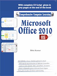
3. Comprehensive Computer Learning - Microsoft Office 2010
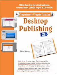
4. Comprehensive Computer Learning - Desktop Publishing (DTP)
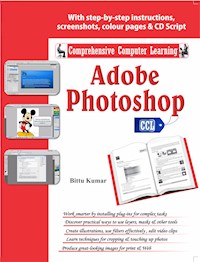
5. Comprehensive Computer Learning - Adobe Photoshop
Key features of these books:
Written in simple and lucid language
Presented in step-by-step, easy-to-understand format with detailed explanations with appropriate images & screenshots, charts & tables
Useful tips and notes given in every chapter as additional information
Accompanied by interactive CD/DVD for better understanding
This book "Comprehensive Computer Learning - Desktop Publishing" has been explicitly written keeping in mind those young excutives who wish to pursue DTP as their career. The book incorporates all the essential softwares viz Indesign, Corel Draw, Photoshop, QurakXpress etc.
While every effort has been made to minimise printing and other errors, it may be possible that a few might have managed to escape the wakeful eyes. We would like to request the readers to bring these errors to our notice so that we can rectify the same in subsequent editions.
Contents
Chapter 1 - Introduction
What is DTP?
Why Desktop Publishing?
Who Uses Desktop Publishing?
Look Beyond Desktop Publishing
Softwares Used in DTP
Conclusion
Chapter 2 - Design Basics
Elements Of Design
Design Principles
Design Stages: From Concept to Completion .
Working with the Client
The Designing Process
Typography
Character and Line Spacing
Categories of Type
Using Type in Print Media
Using Type for Electronic Media
Installing Fonts
Imagery
Saving Graphic File Formats
Understanding the Importance of Colour
Creating Colours on the Computer
Action Items Overview
Chapter 3 - DTP using MS Word
Introduction
Getting to Know Word 2010
Using Indents and Tabs
Text Boxes and Word Art
Formatting Pictures
Smart Art Graphics
Chapter 4 - DTP using Microsoft Paint
Launch Microsoft Paint
Microsoft Paint: Tools
MS Paint: Menus
Chapter 5 - MS Publisher
Introduction
Getting to Know Publisher 2010
Introduction to the Publisher 2010 Environment
Producing a Publication
Conclusion
Chapter 6 - PageMaker 7.0
Getting Started with PageMaker
Working with the Master
Printing
Chapter 7 - Adobe InDesign
Exploring the workspace
The InDesign CS5 Interface
The Document Window
Creating New Documents, InDesignCS5
Opening InDesign & Setting Preferences
Layers & Panels
The Panel
Groups
Working with Rulers and Guides in Adobe Indesign
Setting Margins using Indesign
Importing Type Using Indesign CS5
Using Em Dashes, En Dashes & Hyphens within Indesign
Importing Graphics
Threading Text in InDesign CS5
The Page Tool in InDesign CS5
Creating Quick Grids and using Live Distribute with InDesign CS5
Create Compound Frames in InDesign CS5
The Gap Tool in Indesign CS5
Working with Track Changes in Indesign CS5
How to use Notes and Add Comments to Indesign CS5 Documents
How to Fix Corrupt Indesign Files
Adobe InDesign For Web Developers & Designers
Chapter 8 - Adobe Photoshop
Getting Started
The Photoshop Workspace
Working in Photoshop
Other Useful Tasks & Shortcuts
User Interface in Photoshop
The Tool Box
Photoshop Painting Tools
Layer Styles in Photoshop
Working with Layer Styles - Understanding Bevel and Emboss
Working with Layer Styles - understanding Drop Shadows
Take a close look at how Drop Shadows work
Chapter 9 - Adobe Illustrator
Getting Started in Illustrator
Drawing Basic Shapes
Drawing with Pencil Tool
Drawing with Pen Tool
Using Brushes
Creating Compound Paths
Working with Colour and Strokes
Editing Objects, Layers & Groups
Transparency & Graphic Styles
Transforming & Moving Objects
Basic Text
Blending Shapes & Colours
Saving & Printing
Designing a Logo
Chapter 10 - Adobe Acrobat Reader
What is Adobe Reader?
Viewing modes
Navigation panels
Converting Photoshop and Illustrator files to PDF
Converting InDesign documents to PDF
Adding Bookmarks
Text and Graphics
Using Commenting and Annotation Tools
The Highlight Text, Underline Text, and Cross Out Text tools
The Attach File tools
Securing Your PDF Files
Chapter 11 - Adobe Flash
Introduction to flash
Drawing in Flash
Tools
Parts of Basic Shapes in Flash
Selecting Shapes
Modifying Shapes
Bending Shapes with the Selection Tool
Modifying Shapes with Sub-Selection and Pen Tools
Grouping Objects
Drawing Object Mode
Grouping Objects on the Stage
Breaking Apart
Building flash templates
Setting up a Flash project
Inserting Buttons
Creating “sections” of your project using the timeline
Adding a video player to your project
Adding text to the text section
Chapter 12 - Corel Draw
Toolbox & Fly-out Menus
Setting Up Your Workspace
Working with a Template
Pre-flighting Overview
Chapter 13 - Math Type
Math Type & Equation Editor
Setting Font Styles in Equation Editor
Setting Font Sizes inEquation Editor
The Math Type Toolbar (in Word)
Setting MathType Fonts & Sizes (the Style and Size menus)
MathType Preference Files
Creating a blank grid for student graphing.
Changing Word defaults for menus & drawings (Windows)
Nudging and MathType Customizable Toolbars
Saving to MathType toolbar
Using Word’s AutoCorrect Feature
Template Replacement
Keyboard Shortcuts
Chapter 14 - QuarkXpress 9
Chapter 1
Introduction
What is DTP?
Desktop Publishing is an integration of computer and publishing technologies that lets you produce high quality documents quickly and easily at a fraction of the cost normally charged by most commercial services.
This definition can be expanded upon greatly, but it simply states the case. Desktop publishing encompasses most types of hardware and software. It's not, as some individuals seem to think, simply a page-layout program used to design and print pages. DTP systems use a variety of software including word processors, draw-and-paint programs, CAD packages and page-layout programs. It combines computer hardware to increase its power and versatility, including scanners, high-resolution monitors, hard disks, laser printers and more.
Why Desktop Publishing?
There are many reasons that DTP systems have flourished in the last five years. Some of the primary reasons for growing uses of DTP are:
Cost Effectiveness
When you break down the per-page cost you'll find that DTP is extremely inexpensive when compared with other options. Many commercial publications use DTP systems to produce preview copies of documents for examination by writers and editors. One person can produce quality documents without the assistance of layout specialists and other technical staff, thereby saving money on salaries, office space, etc.
Faster Production and Timeliness
Creating documents by you can dramatically decrease production time. Instead of waiting hours for a backlogged printing house to produce a report or sales presentation, you can print it yourself. When you can create page layouts yourself, you spend less time telling a printer what you want; it reduces foot work and lets you make last-minute changes without returning to the print shop.
A DTP system will help businesses produce documents that meet the needs of clients in a more relevant manner. Instead of pencilling in data on a brochure because the old copy is outdated, you can quickly print a new version with your changes. When a customer wants revisions in a layout, a few minutes of work will let them see an actual copy of what will be printed.
Quality
Documents you produce with a word processor generally rely on a printer's built-in font set or a limited range of fonts included with the software. Page-layout programs include a wider range of fonts in a variety of sizes and styles that word processors can't access. Graphics can be imported, lines and boxes can be added and each component can be precisely placed without the telltale signs of cut and paste. DTP systems produce camera-ready copy that is identical to the final version which means, no more mock-ups to approximate the finished product.
Control
When a document is finished it looks exactly the way you want it to, not the way a layout artist or editor thought you wanted it. From the size of the headline to the font style and line width used, DTP lets you display your message in exactly the format you want. If the printout is inadequate, you can make some quick changes and print it again.
Satisfaction
Doing it yourself can be enjoyable. It is a creative form of self-expression that can be used for virtually any type of document. DTP requires a little patience but the results are quite pleasing.
Who Uses Desktop Publishing?
Small businesses have embraced the technology more firmly than any other group. Many businesses that can't afford to patronize a print shop can still add DTP capabilities to their existing computer system at a reasonable price.
Educators are avid fans of DTP as the quality documents they produce can be directed to a specific group of students and help improve grades and increase comprehension.
Home computer users desire DTP systems to produce documents such as garage sale flyers, school reports and church bulletins. Documents are more likely to be read when they are carefully prepared with a variety of fonts and graphics.
Look Beyond Desktop Publishing
It's easy to forget that desktop publishing software is only a tool for implementing your designs. All too often, desktop publishers will un-consciously bend their designs to fit the built-in features of their favourite software. Don't fall into this trap. Keep the creative process separate. There's always a way to implement a great idea.
To focus on design without the technological trappings, skim professional design publications that showcase elegant design examples.
Try joining a local advertising group, art directors club, or communications forum. It doesn't matter if you're not involved in the advertising or public relations fields. Desktop publishers share a common goal of informing, motivating, and persuading others. You're likely to return from these meetings with a fresh perspective on your communication and design efforts.
Softwares Used in DTP
Now a days, many softwares are used in DTP. In this book, we will learn to use the following:
Conclusion
DTP Softwares are valuable Tools in designing industry. Ranging from small buisiness to large business everyone uses DTP Software for a variety of work. There is a huge demand of DTP Operators worldwide. Learn these softwares, and increase your hiring potential in the marketplace.
Chapter 2
Design Basics
Elements Of Design
The placement of elements within a design, page, or website will have much influence on what kind of message is perceived by what kind of market. Formal design elements that are the basic building blocks of design are line, shape, colour, texture, value, and format. Designers also use illusions of depth and motion to help create a 3-D effect on a 2-D surface. For every design, you are trying to communicate something. These physical elements of design are your communication tools; knowing when and how to use these elements is essential to building a successful design. All these formal elements are interdependent, and they interact to complement one another and function as a team.
Lines and Shapes
The way a line moves determines the type of line it is. Lines can be straight, angular, or curved, and they may be drawn in horizontal, vertical, or diagonal directions. A line's visual quality is determined by how the line is drawn, whether thick or thin, broken or smooth. Shapes are usually considered closed forms or outlines. How a shape is drawn, like a curved shape or an angular shape, gives it a specific quality. A designer uses lines as outlines or edges to create shapes, like a pyramid or a circle. Colour can also define a shape without lines. If the colour creates an edge, it also defines the shape.
Texture
Texture describes surface quality, like rust, velvet, or sandpaper. The two categories of texture in the artistic sense are tactile and visual. Tactile texture involves the actual feeling of a surface texture like a sculpture. Designers and artists use visual texture to create the illusion of texture in artwork, using varying line qualities, patterns, or adjusting the value and colours of an element. Computers can create digital textures through various filters and effects within software programs.
High contrast images evoke a different response than low contrast images
Value
Value determines depth and dimension by the range of lightness or darkness of an element. Value is the shading, tonality, and tint of a colour (light blue and dark blue). The use of shading can help provide a three- dimensional value to an image. Value creates a focal point or centre of attention. Value contrast is the relationship between black and white or lightness and darkness of an image, and it is a result of the relationship between different elements; it produces both visual and emotional effects. As the viewer observes an image and interprets its value, the eye is drawn to light areas first, which the designer or artist can use to provide contrast and balance in an image.
Values in colour and contrast can provoke a variety of emotional responses. Low contrast or closely related values can evoke a sense of calmness or tranquility, while high-contrast images or sharp-value images can create a sense of excitement, drama, or conflict between elements. An overall darker image can promote a sense of mystery or even sadness, while an overall lighter image invites the viewer with an uplifting tone or feeling of relaxation.
Depth Perception
In the two-dimensional world of drawings, photographs, paintings, and prints, designers often need to convey a feeling of space or depth perception. Some of the elements that convey these characteristics are the sizes of objects and their relationship to one another, the overall blending of colours and shapes by adjusting tonal values, and the point of view or depth perspective. By varying the size of similar shapes-for example, rectangles-the illusion is more pronounced than with differing shapes. Spatial depth is more pronounced if shapes become smaller as they overlap, creating the illusion of objects receding. This is a form of spatial recession. By combining elements and blending the tonal values to match the background, the illusion of receding into the background creates an even more pronounced sense of depth. Tonal value involves the lightness and darkness of an image by varying its tone or value to the surrounding background. In landscape, objects are placed in the foreground to give a feeling of depth; or framing techniques are employed in which another subject surrounds the main subject for emphasis. Using tree branches in the foreground, for instance, provides emphasis to a distant subject.
Depth Perception
Perspective and Angle of View
Artists and photographers create images that show a higher or lower point of view that can enhance the feeling of depth in an image. One technique involves the use of linear perspective. This is where a horizon line is placed to approximate the eye level of the artist. From this line, invisible lines or edges-called vanishing points- are directed to lead the viewer into the image. One-point perspective involves using converging lines to lead the eye to a subject or point along a horizontal line to provide depth in perspective within the image. Two-point perspective involves a more natural approach, similar to how we view the world around us, at an angle with two edge points along the horizon line. In this view, vanishing points recede at either end of a horizontal line. Vertical lines would be parallel to the edges of the picture. An example would be if the viewer were standing on a city street corner, taking a photo of the buildings; there would be little or no vertical convergence, but rather parallel alignment of the sides of the buildings. It is not as dramatic an approach as using converging lines, and it permits the viewer to scan an image from one edge to the other.
Artists can also use fences, roads, stairways, and other techniques in compositions involving leading lines to create the effect of depth perception. Aerial perspective uses the lighter background contrast of the atmosphere with darker subjects that are closer to the viewer in landscapes to show a sense of depth. The background recedes to the lighter contrast from the darker foreground subject. To add drama to an image, artists and photographers constantly create images from lower and higher angles than a viewer's normal eye level.
Perspective and angle of view
Using Motion
Creating the illusion of motion can suggest an anticipation of movement either in slow motion or in what is termed as stop action. Artists use these techniques to trigger memories or record events, or with special effects like blurring water to give an image an ethereal quality. The feeling of movement can also be heightened by contrast, showing activity. Repeating figures or multi-exposed images have also been used to create the illusion of motion
Creating the illusion of motion
Colour
Colour is one of the most powerful design elements. A designer needs to understand which colours are appropriate to complement the message. Colour is based on wavelengths of light and contains a wide range of visual differences and contrasts. Colour is divided into three categories: hue, value, and saturation.Hue is the name of the colour (red, green, and blue). Value is the shading, tonality, or tint of a colour (light and dark blue). Saturation is the intensity of colour (bright red or dull red).
In design, a colour wheel that displays basic colours and their complementary colours, or opposite colours, is used as a guideline. Most colour wheels use 12 colour hues as the basis for all colour mixtures. With pigment colours that are used for painting or traditional artwork, the traditional primary colours are red, yellow, and blue. These are the main colours that create all others. For instance, combining red and yellow creates orange. The secondary colours are orange, green, and purple, and they can be further mixed for many colour variations. The six tertiary colours are created by mixing one primary and one secondary colour. They consist of yellow orange, red orange, red violet, blue violet, blue green, and yellow green.
Colour intensity or saturation is the brightness of a colour. To lower a colour's intensity without changing its value, a designer can add gray or combine the colour with its complementary colour, which is the colour across from it on the colour wheel. When complementary colours are placed next to each other, their brightness is intensified. For example, the opposite of orange is blue; a designer might package oranges using blue lettering to highlight the fruit, thus making it look fresher. When various colours are coordinated together in the colour scheme of an image, warm colours like reds, yellows, and oranges generally seem to come forward, while cool colours like blues, greens, and purples appear to fade to the back. High-contrast colours appear to come forward visually, while low- contrast colours appear to recede. Low-intensity versions of a colour are generally considered the tones of a colour. Colours mixed with neutral grays can result in different tones of colour.
Colours created on the computer are made by adding the primary colours of light - red, green, and blue (RGB), which act differently than pigment but are fine for electronic document design such as web pages. The colours cyan, magenta, yellow, and black (CMYK) are used for commercial printing. Colour plates used in commercial printing use the colours cyan, magenta, and yellow (CMY) as the basis for creating all other colours for print. Black (K) is then added for purity and contrast.
Format, Guidelines, and Grids
Brochures, CD covers, business cards, and posters are some of the formats designers use for their clients. The project the client brings to you will determine the format. Your design should work well within the given format. Formats have advantages and limitations that need to be considered in creating a particular design. For instance, will the final layout be a vertical or portrait orientation, or a horizontal display of elements, called a landscape orientation? What size paper and shape will it be? How will it be used, and where will it be seen? These are all considerations as you work with a particular format.
Most graphic computer applications have a set of rulers, or ruler guides, displayed along the top and left side of the document that a designer can use for measuring. A designer can click and drag from one of the ruler guides onto the document, creating what are called guidelines. These nonprintable guidelines are used for exact placement of specific sized text and graphics boxes on brochures, flyersweb pages, and so on. They also can be used to create margin guides, usually purple or blue in colour, for outer margins and for spacing between text and graphic boxes for folding procedures and alignment, web pages, and so on.
Format, Guidelines, and grids
Grids are developed from a network of intersecting horizontal and vertical guidelines. Designers use grids for consistent placement and spacing of text and graphic elements within a unified theme on successive pages to create catalogs, books, newsletters, pamphlets, magazines, and so forth.
Design Principles
A designer must be careful to understand the client's needs. By researching what the client wants to convey to the target market, the designer will be able to create the appropriate message. Principles in design are followed to combine individual elements into one harmonious piece. This involves taking various elements and providing proper balance, adding selective emphasis to create a focal point, using rhythm to set the mood, and establishing unity.
Balance
The concept of balance is to arrange elements within an area so that these elements promote a harmonious response. Visual balance is determined by the weight, position, and arrangement of elements. Balance can be formal, informal, or radial. Formal balance, also referred to as symmetrical balance, places elements with equal distribution to convey trustworthiness and integrity, as used by financial institutions or insurance companies. Informal balance, also referred to as asymmetrical balance, uses elements that counterbalance one another instead to create a harmonious composition. This type of balance gives the appearance of being casual, energetic, or trendy. Radial balance arranges elements around a central point and is used to promote unity or teamwork.
Use of Negative and Positive Space
Using empty or negative space, absent of visual elements, is a visual element in itself that actually does more to promote luxury or elegance, and sometimes a sense of mystery, than most other effects. This may utilise the "less is more" concept in design. Positive space uses content to fill up space to identify or explain something in a particular page. In an ad using empty space, a line of black type on a white background, or a line of white type on a black background, can change perception of the content of the page. Reversing colours sometimes makes an ad stand out in a crowd of ads. Care needs to be taken in the use of empty space over positive space, , .. including type size in relation to the graphic.
Negative and positive space ?
Rhythm
Rhythm is a visual pattern of repeating elements that creates a sense of movement. It is constantly used in printed media as well as in architecture. Variation in rhythm can be adjusted by changing the shape, size, colour, spacing and position of elements in a design. This change in arrangement helps to promote the mood of the design. The viewer looks at certain elements before others. Those elements that are larger, darker, or have a more unusual shape than their surrounding counterparts are used to draw the viewer's eyes into the composition.
Visual pattern of rhythm
Unity
Unity is the organisation of elements in a design as though they belong together. It allows the designer to view individual components as one integrated whole. Unity establishes continuity with a variety of elements and promotes consistency within the piece, and it combines balance, rhythm, type, imagery, and tone to evoke a particular emotion from the viewer.
Unity in a design
Design Stages: From Concept to Completion
A design solution's "personality" is created when the formal elements of colour, line, shape, texture, format, and value are put together using the principles of graphic design in spacial relationships, balance, rythm, emphasis, and unity. These elements collaborate to elicit the kind of audience reaction the client desires.
Working with the Client
The whole idea behind designing is being able to solve problems visually that help the client best communicate his or her message. Before you start designing, talk to your client and listen; then keep your client involved in the process
Listen to the client to understand the design challenge. Make the client feel involved. Try to assist gently when suggesting changes you feel would create a better product, but do not make the client feel incompetent. You need to fully understand the client's project in order to help.
You need to know the market the design is intended for and what the client's design specifications are. Is this design going to be used for print and electronic media?
If so, then understanding different ways images and text are going to be presented for each medium is crucial to the success of the project.
What materials are needed for the project, and what is your experience with these materials? What software or hardware are you comfortable with, and which ones will require that you rely on others for expertise?
Know your budget and guidelines. Complete as much research as possible so that you will be able to stay within your estimate. Set a time frame for completion of various components of the project.
The Designing Process
Graphic design begins with a visual concept-the main idea behind creating the design piece. Before coming up with a concept, you need to plan a strategy and set design objectives that meet your client's needs. Then research information, material, and visuals about your subject, and start writing down your ideas. Make changes and decisions on those ideas with the client, and then generate final comps for the intended media.
Thumbnails
Thumbnails are sketched variations of an idea. Once you have your design idea, thumbnails help create different possibilities for that idea. Create a dozen or more thumbnails, and then narrow them down to about six to ten per concept to show the client. For consistency, make thumbnails the same proportion as the final piece.
Roughs
Roughs are created as a result of combining specific elements from each thumbnail, or they may be the result of one good thumbnail, A rough is a full-size rendition of your design, including the layout of images and text and overall compositional elements that you show to the client. This version can be created while still at the drawing stage, or it can be done on the computer. The final rough usually must be created on the computer. Generating three to six roughs gives the client a good idea of what the final design will look like.
Comps
Comps show exactly what the final design will look like when printed. The designer must take painstaking efforts to make sure everything is exactly what the client had agreed to in the final rough. This is where all text, colour, imagery, and compositional elements need to come together for the final client approval before going to press, electronic media, or both.
Final Proofs for Press
The client should have the proof that provides instructions for the pressman and finishing operator. The print proof should show indications for folding, cutting, bleeding, trapping, registration, and any special requirements. Keep in mind that most ink-jet proofs will not show exact colour but may be close enough for client approval, as long as the client understands before going to press that there may be a slight difference in some colours in the final product. Another final proof will be generated at the print site, provided for and to be approved by the client, so he or she knows precisely what all the elements will look like. The designer should also furnish a disc to the client with fonts and images used, along with any other specific information needed.
Final Electronic Proofs for Electronic Media
For website designers or multimedia designers, the electronic media proof should show indications for pixel dimensions, software used, resolution requirements, text and image locations, and information, if needed, for publishing to the web, along with any special requirements. A final printed proof is also needed for checking layout of type, imagery, and all elements used, along with the final layout supplied on disc to the client. The client should have the disc contents checked on a calibrated monitor to see as closely as possible what the web page or site will look like. When working with a limited colour palette for web design, the client needs to check carefully to make sure that the colours are as accurate as possible to be displayed on the web. It must also be noted that colours on a Mac and colours on a PC vary slightly in their display
Typography
Character and Line Spacing
The spacing between characters and lines of text also determines how that type looks on your document. Tracking adjusts the spacing between characters and words. Adjusting the tracking of words too tightly in a paragraph can make it difficult to read, whereas adjusting too loosely can create "rivers" of white spacing in a paragraph, especially when type is either left or right justified. Sometimes a designer will create a loose tracking effect on a single word, or a few words, in the title of an ad or magazine cover as an attention getter. Kerning is a technique used for pairs of characters in titles or headlines that may need to be brought closer together for a more consistent look. Leading refers to the spacing between lines of text. Usually the default leading is 120 percent of the letter size for most documents.
In long articles or newsletters, less space between lines of text tends to darken the document, whereas more space will lighten it up. The message or mood you want to convey will determine how you will set up your text and what fonts you will need. The style or arrangement of setting type is called type alignment. Left aligned flushes the type to the left and is easy to read; we associate right aligned with professional return addresses on letters. Centred lines of type are used in some headlines or titles, while justified alignment places text equally on left and right sides in a column.
Categories of Type
Two main categories of type are serif type and sans-serif type. Serif type characters contain what look like "feet," or extended strokes, on the tops and bottoms; these are used to convey a conservative look and make it easier to read long articles or bodies of text. Sans-serif type has characters without these strokes, and it is more legible for labelling illustrations, headlines, and titles. ASCII type is the American standard of type: it is plain text and unformatted and can be read by any application or computer. It uses the extension .TXT. Other type categories include script type, decorative type, and symbol type Script fonts are typically used in announcements or invitations and convey the appearance of being created with a pen or brush. Decorative type is sometimes used in headlines to create a specific meaning, and symbol type is a collection of related symbols, often called dingbats, that can be used for bullets, map symbols, or logos. The type you select should be appropriate and must complement your design.
Using Type in Print Media
Here are a few design guidelines for starters when creating text documents to be printed:
Use the same fonts and sizes for various headings in the same document. If you have to use different fonts, stick with the same type family for consistency.
Use 10- or 12-point size serif type minimum for the body of text for easier reading on printedmaterial.
Use italics sparingly and infrequently, for emphasis only.
When using text type, do not use type in all upper case and do not allow too much or too little spacing between lines of type. Use the default leading on your word processor as a guide.
Using Type for Electronic Media
Here are a few design guidelines when creating electronic documents:
Try using sans-serif fonts especially for light-coloured text against a dark or black background for easier reading. Bolder fonts also work better when reversing type out of a solid or textured background.
Use a minimum 12-point size for body text, because text is displayed electronically and can be tiring on the eyes over periods of time.
Use colour for emphasis of graphic statements. Electronic media is a great means for entertaining visual stimulation.
Usually it helps to keep sentences short and use small paragraphs to hold the reader's interest.
Installing Fonts
In Windows, you would open the Fonts folder in the Appearance and Personalisation command in the Control Panel; then from the source window just drag the icon into the fonts folder and it will automatically install:
To install your fonts in Windows, select the Start button, then select the Control Panel.
Select Appearance and Personalisation link, not the links underneath, then locate the Fonts icon.
Click on the Fonts link to open the Fonts folder displaying the fonts on your computer and resize the window to half screen or less.
If you download a particular font you like, just drag the icon or the folder onto the desktop. Resize the window display, then all you need to do is drag the new font icon into the display of Fonts folder. It will automatically install.
To add font, drag font icon from source to Fonts folder of icons. To delete a font, select font icon and select to delete.
To delete a font, click on the icon and press delete from the toolbar, or right click the icon and select Delete. Be careful when deleting as it cannot be undone.
Close the dialog boxes to get back to the desktop. Your fonts are added to your computer and ready for the text exercises.
Imagery
Images are needed to explain ideas, provide further illustration to text in long articles, and strengthen the mood or idea the designer is trying to convey. We are basically visual learners of our environment. When designing with computer imagery, graphics can be categorised as either vector images or bitmap images.Vector images are lustrations, logos, drawings, or clip art that can be enlarged to any size without affecting the quality of the original image. Bitmap images, or raster images, are photographs, paintings, or complex designs that use millions of colours to record subtle gradations of tone in the image. They are not capable of being scaled larger than the original size without deteriorating the quality.
Saving Graphic File Formats
Graphic applications allow the designer to save files in specific universal formats for an intended purpose. The file extension determines the type of graphic format saved and how a file may be used. Saving graphic files in these universal formats-extensions such as .EPS, .TIF, .JPG, .GlF, .PNG, or .PDF-gives them the flexibility to be used with other graphics programs for specific purposes.
Understanding the Importance of Colour
Creating a design with appropriate colours is a major factor in client approval. Research on the designer's part is critical to the success of the design. Some colours work better in small quantities than others. A designer must also be wary of design components using dark or light tones in specific quantities that may symbolise positive or negative aspects. Complementary background colours or lettering may be used with products extensively in package design. A bag of apples might have green lettering on the package as its complement to highlight the red colour of the produce, giving a fresher appearance. When working with advertising agencies, whether on a local or global scale, colour is used differently within various cultures. Designers need to be aware of the intended market. For instance, the colour of royalty is purple in America and in Europe, but in China it is yellow. In America white symbolises purity, and people associate it with weddings, whereas in China red is the usual bridal colour.
3-Way Folding Brochure (outside page)
Depending on the intended message, colours can have contrary effects. Here are some general concepts regarding the use of colour:
White will usually stand for purity, but can also be utilised to generate a feeling of emptiness. Websites sometimes use white backgrounds as a neutral setting for images and for easier readability of text.
Black can show value in terms of elegance, such as in tuxedos and gowns. Black can be used as an attention getter as a background with white, or reversed, type. Black can also suggest danger or something negative. It is also used as a neutral background in designing web pages that have many photographs.
Gray (if a very light gray is used) can provide a subtle background on electronic media, leanding a neutral balance for images and coloured type. On printed media, it is used very sparingly. Gray can also have powerful negative symbolism, such as stormy weather.
Red can make the boldest of statements and may draw the viewer's eye more than any other colour. Red can be used in small amounts for emphasis. Red can symbolise love (bright or medium red), strength (middle or true red), or anger (dark red) depending on the tone.
Pink is a colour used often in the bakery industry. Pink can also suggest high value in packaged goods and is a feminine colour.
Violet is another colour that is generally used in small quantities. Dark violet, for instance, may suggest royalty.
Blue, as one of the most widely used colours, has different effects. Lighter shades of blue may signify dream-like fantasies. Medium and dark blues may be used to signify honesty, professionalism, and sometimes spirituality. However, in some instances, blue used as the dominant colour can adversely signify depression, dreariness, or isolation.
Green signifies nature and can be used for produce, products related to healing, or for environmental issues. Green is also used to represent wealth, perhaps for banking institutions. Contrarily, green can imply jealousy or greed.
Yellow can produce feelings of warmth and may be used to signify fast service (taxis, fast food). In contrast, yellow can also suggest danger or caution.
Creating Colours on the Computer
Millions of light-emitted colours can be created on the computer by mixing the electronic primary colours: red, green, and blue. These RGB mode colours are used for electronic display yellow such as web pages. Computers use an additive process to create colour from the primary colours. The computer's secondary colours are magenta, cyan, and yellow, or CMYK mode (K stands for black, which is used to increase contrast). Mix red and blue and you get magenta. White is theoretically created by mixing red, green, and blue at their full intensity. Using computer software, you can convert files from RGB mode to CMYK mode to create colours that will closely match pigment colours used in commercial printing.
Action Items Overview
Here is a breakdown of what you need to do:
Determine the layout of images and text, including spacing and margins, for the final size.
Research what images will be used and what fonts, styles, and sizes will be used.
Create three or more thumbnail sketches of how the images will be laid out with the text descriptions (normally, you would create more sketches, but this will do for this exercise).
Present your thumbnail sketches to your instructor or peers to get their input.
With the sketches narrowed down, create the final, full-size rough combining elements from various sketches. Then show them to your clients for approval.
ADVANCED USERS: Identify design elements and principles in various ads.
Chapter 3
DTP using mS Word
Introduction
Word 2010 is a word processor that allows you to create various types of documents such as letters, papers, flyers, faxes and more. In this lesson, you will be introduced to the Ribbon and the new Backstage view, and you'll learn how to create new documents and open existing ones.
Getting to Know Word 2010
Word 2010 is a bit different from earlier versions, so even if you've used Word before, you should take some time to familiarize yourself with the interface. The toolbars are similar to those in Word 2007, and they include the Ribbon and the Quick Access Toolbar. Unlike Word 2007, commands such as Open and Print are housed in Backstage view, which replaces the Microsoft Office Button.
The Ribbon
The new tabbed Ribbon system was introduced in Word 2007 to replace traditional menus. The Ribbon contains all of the commands you'll need in order to do common tasks. It contains multiple tabs, each with several groups of commands, and you can add your own tabs that contain your favourite commands. Some groups have an arrow in the bottom-right corner that you can click to see even more commands.
The Ribbon
Certain programs, such as Adobe Acrobat Reader, may install additional tabs to the Ribbon. These tabs are called Add-ins.
To Minimize and Maximize the Ribbon
The Ribbon is designed to be responsive to your current task and easy to use; however, you can choose to minimize it if it's taking up too much screen space.
Click the arrow in the upper-right corner of the Ribbon to minimize it.
To maximize the Ribbon, click the arrow again.
When the Ribbon is minimized, you can make it reappear by clicking on a tab. However, the Ribbon will disappear again when you're not using it.
Minimizing the Ribbon
To Customize the Ribbon
You can customize the Ribbon by creating your own tabs with whichever commands you want. Commands are always housed within . a group, and you can create as many groups as you want in order to keep your tab organized. If you want, you can even add commands to any of the default tabs, as long as you create a custom group in the tab.
Right-clicking the Ribbon to customize it
Right-click the Ribbon and select Customize the Ribbon. A dialog box will appear.
Click New Tab. A new tab will be created with a new group inside it.
Make sure the new group is selected.
Select a command from the list on the left, then click Add. You can also drag commands directly into a group.
When you are done adding commands, click OK.
The dialog box ou can customize the Ribbon
If you don't see the command you want, click on the Choose commands from: drop-down box and select All Commands.
Displaying All Commands
The Quick Access Toolbar
The Quick AccessToolbar is located above the ribbon, and it lets you access common commands no matter which tab you're on. By default, it shows the Save, Undo, and Repeat commands. You can add other commands to make it more convenient for you.
To Add Commands to the Quick Access Toolbar:
Click the drop-down arrow to the right of the Quick Access Toolbar.
Select the command you wish to add from the drop-down menu. It will appear in the Quick Access toolbar.
Adding a command to the Quick Access Toolbar
The Ruler
The Ruler is located at the top and to the left of your document. It makes it easier to adjust your document with precision. If you want, you can hide the Ruler to free up more screen space.
The Ruler
To Hide or View the Ruler:
Click the View Ruler icon over the scrollbar to hide the ruler.
To show the ruler, click the View Ruler icon again.
Hiding and viewing the Ruler
To Create a New, Blank Document:
Click the File tab. This takes you to Backstage view.
Select New
Select Blank document under Available Templates. It will be highlighted by default.
Creating a new document
Click Create. A new, blank document appears in the Word window.
To save time, you can create your document from a template, which you can select from the New Document pane. We'll talk about templates in a later lesson.
To Open an Existing Document:
Click the File tab. This takes you to Backstage view.
Select Open. The Open dialog box appears.
Select your document and then click Open.
If you've opened a file recently, you can also access it from the Recent Documents list. Just click on the File tab and select Recent.
Opening a document
Opening a recent document
Working with Text
To Insert Text:
Move your mouse to the location you wish text to appear in the document.
Click the mouse. The insertion point appears.
Type the text you wish to appear.
The insertion point
To Delete Text:
Place the insertion point next to the text you wish to delete.
Press the Backspace key on your keyboard to delete text to the left of the insertion point.
Press the Delete key on your keyboard to delete text to the right of the insertion point.
To Select Text:
Place the insertion point next to the text you wish to select.
Click the mouse, and while holding it down, drag your mouse over the text to select it.
Release the mouse button. You have selected the text. A highlighted box will appear over the selected text.
Selecting text
When you select text or images in Word, a hovertoolbar with formatting options appears. This makes formatting commands easily accessible, which may save you time. If the toolbar does not appear at first, try moving the mouse over the selection.
Hover toolbar with formatting options
To Copy and Paste Text:
Select the text you wish to copy.
Click the Copy command on the Home tab. You can also right-click your document and select Copy.
Place your insertion point where you wish the text to appear.
Click the Paste command on the Home tab. The text will appear.
The Copy command
To Cut and Paste Text:
Select the text you wish to copy.
Click the Cut command on the Home tab. You can also right-click your document and select Cut.
Place your insertion point where you wish the text to appear.
Click the Paste command on the Home tab. The text will appear.
The Cut command


