98,99 €
Mehr erfahren.
- Herausgeber: John Wiley & Sons
- Kategorie: Wissenschaft und neue Technologien
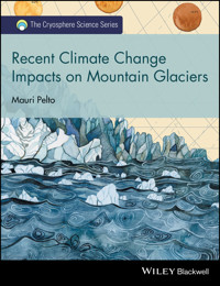
- Serie: The Cryosphere Science Series
- Sprache: Englisch
Glaciers are considered a key and an iconic indicator of climate change. The World Glacier Monitoring Service has noted that global alpine balance has been negative for 35 consecutive years. This highlights the dire future that alpine glaciers face.
The goal of this volume is to tell the story, glacier by glacier, of response to climate change from 1984-2015. Of the 165 glaciers examined in 10 different alpine regions, 162 have retreated significantly. It is evident that the changes are significant, not happening at a "glacial" pace, and are profoundly affecting alpine regions. There is a consistent result that reverberates from mountain range to mountain range, which emphasizes that although regional glacier and climate feedbacks differ, global changes are driving the response. This book considers ten different glaciated regions around the individual glaciers, and offers a different tune to the same chorus of glacier volume loss in the face of climate change.
Sie lesen das E-Book in den Legimi-Apps auf:
Seitenzahl: 342
Veröffentlichungsjahr: 2016
Ähnliche


Table of Contents
Cover
Wiley-Blackwell Cryosphere Science Series
Title Page
Copyright
Series Preface
Foreword
Chapter 1: Alpine Glaciers: An Introduction
1.1 Glacier Observation Programs
1.2 Importance of Mountain Glaciers
1.3 Glacier Terminus Response to Climate Change
1.4 Glacier Runoff
1.5 Climate Change and Impact of Runoff
References
Chapter 2: Glacier Mass Balance
Overview
References
Chapter 3: Juneau Icefield
Overview
3.1 Norris Glacier
3.2 Lemon Creek Glacier
3.3 Mendenhall Glacier
3.4 Herbert Glacier
3.5 Eagle Glacier
3.6 Gilkey Glacier
3.7 Antler Glacier
3.8 Field Glacier
3.9 Llewellyn Glacier
3.10 Tulsequah Glacier
3.11 Twin Glacier
3.12 Taku Glacier
References
Chapter 4: Northern Patagonia Icefield Region
Overview
4.1 Reichert Glacier
4.2 Gualas Glacier
4.3 San Rafael Glacier
4.4 San Quintín Glacier
4.5 Fraenkel Glacier
4.6 Benito Glacier
4.7 Acodado Glacier
4.8 Steffen Glacier
4.9 HPN4 Glacier
4.10 Colonia Glacier
4.11 Nef Glacier
4.12 Leones Glacier
4.13 Fiero Glacier
4.14 Grosse Glacier
4.15 Verde Glacier
References
Chapter 5: South Georgia, Kerguelen, and Heard Islands
Overview
5.1 Twitcher Glacier
5.2 Herz Glacier
5.3 Weddel Glacier
5.4 Bertrab Glacier
5.5 Ross–Hindle Glacier
5.6 Heaney Glacier–Cook Glacier
5.7 Nordenskjold Glacier
5.8 Harker and Hamberg Glaciers
5.9 Neumayer Glacier
5.10 Konig Glacier
5.11 Purvis Glacier
5.12 Stephenson Glacier–Heard Island
5.13 Agassiz Glacier–Kerguelen Island
5.14 Ampere Glacier
5.15 Lapparent Glacier
5.16 Lake District
References
Chapter 6: Svalbard: Hornsund Fjord Region
Overview
6.1 South Coast of Hornsund
6.2 Eastern Hornsund Glacier change
6.3 North side of Hornsund
6.4 Sorkappland
References
Chapter 7: Novaya Zemlya
Overview
7.1 Kropotkina Glacier
7.2 Moshniy Glacier
7.3 Vilkitskogo Glacier
7.4 Krivosheina Glacier
7.5 Nizkiy Glacier
7.6 Glazova Glacier
7.7 Krayniy Glacier
7.8 Taisija Glacier
7.9 Chernysheva Glacier
7.10 Borzova Glacier
7.11 Mack and Velkena Glaciers
References
Chapter 8: North Cascade Range, Washington USA
Overview
8.1 Skykomish River Basin
8.2 Mount Baker and Nooksack River
8.3 Glacier Runoff Impact
References
Chapter 9: Interior Ranges, British Columbia/Alberta
Overview
9.1 Yoho Glacier
9.2 Des Poilus Glacier
9.3 Waputik Icefield–Daly Glacier
9.4 Cummins Glacier
9.5 Apex Glacier
9.6 Shackleton Glacier
9.7 Columbia Glacier
9.8 Freshfield Glacier
9.9 Lyell Icefield–Mons Icefield
9.10 Haworth Glacier
9.11 Sir Sandford Glacier
9.12 Dismal Glacier
9.13 Illecillewaet Icefield
9.14 Deville Icefield
9.15 Conrad Icefield
9.16 Vowell Glacier
References
Chapter 10: Himalaya
Overview
10.1 Middle Lhonak Glacier
10.2 South Lhonak Glacier
10.3 North Lhonak Glacier
10.4 East Langpo Glacier
10.5 Changsang Glacier
10.6 Zemu Glacier
10.7 Kaer Glacier
10.8 Longbashaba Glacier
10.9 Zhizhai Glacier
10.10 Jimi Glacier
10.11 Yindapu Glacier
10.12 Gelhaipuco Glacier
10.13 Qangzonkco Glacier
10.14 Nobuk Glacier
10.15 Nangama Pokhari
10.16 Kanchenjunga Glacier
References
Chapter 11: New Zealand
Overview
11.1 Mueller Glacier
11.2 Hooker Glacier
11.3 Tasman Glacier
11.4 Murchison Glacier
11.5 Douglas Neve
11.6 La Perouse Glacier
11.7 Balfour Glacier
11.8 Fox Glacier
11.9 Franz Josef Glacier
11.10 Classen Glacier
11.11 Godley Glacier
11.12 Lyell Glacier
References
Chapter 12: Alps: Mont Blanc–Matterhorn Transect
Overview
12.1 Mer De Glace
12.2 Glacier d'Argentiere
12.3 Tour de Glacier
12.4 Trient Glacier
12.5 Saleina Glacier
12.6 Bossons Glacier
12.7 Taconnaz Glacier
12.8 Bionnassay Glacier
12.9 Otemma Glacier
12.10 Breney Glacier
12.11 Gietro Glacier
12.12 Corbassière Glacier
12.13 Glacier du Mont Miné
12.14 Ferpécle Glacier
12.15 Gornergletscher
12.16 Findelengletscher
12.17 Theodulgletscher
12.18 Lex Blanche Glacier
12.19 Miage Glacier
12.20 Brouillard Glacier
12.21 Freney Glacier
References
Chapter 13: Alpine Glacier Change Summary
References
Index
End User License Agreement
Pages
xi
xiii
1
2
3
4
5
6
7
8
9
10
11
12
13
14
15
16
17
18
19
20
21
22
23
24
25
26
27
28
29
30
31
32
33
34
35
36
37
38
39
40
41
42
43
44
45
46
47
48
49
50
51
52
53
54
55
56
57
58
59
61
62
63
64
65
66
67
68
69
70
71
72
73
74
75
76
77
78
79
80
81
82
83
84
85
86
87
88
89
90
91
92
93
94
95
96
97
98
99
100
101
102
103
104
105
106
107
108
109
110
111
112
113
114
115
116
117
118
119
120
121
122
123
124
125
126
127
128
129
130
131
132
133
134
135
136
137
138
139
140
141
142
143
144
145
146
147
148
149
150
151
152
153
154
155
156
157
158
159
160
161
162
163
164
165
166
167
168
169
170
171
172
173
174
175
176
177
178
179
180
181
182
183
184
185
186
187
188
189
190
191
192
193
194
195
196
197
198
199
200
201
202
203
204
205
206
207
208
209
211
212
213
215
216
217
Guide
Cover
Table of Contents
Series Preface
Foreword
Begin Reading
List of Illustrations
Foreword
Figure 1 Decrease in glacier mass balance based on data from Pelto (2015a) to illustrate the dramatic decline in North Cascade glaciers, WA.
Chapter 1: Alpine Glaciers: An Introduction
Figure 1.1 Decrease in Glacier Mass Balance based on data from Pelto (2015a) to illustrate the dramatic decline in North Cascades glaciers, WA. (Watercolor, Jill Pelto 2015).
Figure 1.2 Comparison of hydrographs for nonglacier- and glacier-fed watersheds.
Chapter 2: Glacier Mass Balance
Figure 2.1 Annual and cumulative balance of the WGMS reference glaciers.
Figure 2.2 Annual layers in a crevasse on Lynch Glacier, North Cascade Range, Washington.
Figure 2.3 Example of the relationship between annual balance (Ba), accumulation area ratio (AAR), and equilibrium line altitude (ELA) as reported to the WGMS.
Figure 2.4 Accumulation area map of Mount Baker in 2009.
Chapter 3: Juneau Icefield
Figure 3.1 June 21, 2013, Landsat 8 image indicating outlet glaciers of the Juneau Icefield, Alaska. N = Norris, L = Lemon Creek, M = Mendenhall, H = Herbert. E = Eagle, G = Gilkey, A = Antler, F = Field, Ll = Llewellyn, Tu = Tulsequah, Tw = Twin, and T = Taku.
Figure 3.2 The 1984–2013 chart of terminus change of individual glaciers from 1984 to 2013 (see individual images provided later for the observed changes).
Figure 3.3 Norris Glacier terminus change from 1984 to 2013. Red and yellow dots indicate the 1984 and the 2013 termini, respectively.
Figure 3.4 Norris Glacier overview, illustrating flow paths, snowline, and glacier boundaries.
Figure 3.5 Trimline above Norris Glacier in 1998 and the terminus in Norris Lake.
Figure 3.6 Lemon Creek Glacier change in 1984 and 2013 Landsat images. Yellow and red dots indicate the 2013 and the 1984 terminus positions, respectively.
Figure 3.7 Annual mass balance record of Lemon Creek Glacier.
Figure 3.8 Lemon Creek Glacier in 2014 (note the height of the snowline).
Figure 3.9 Mendenhall Glacier change in 1984 and 2013 Landsat images. Yellow and red dots indicate the 2013 and the 1984 terminus positions, respectively.
Figure 3.10 Herbert Glacier change in 1984 and 2013 Landsat images. Yellow and red dots indicate the 2013 and the 1984 terminus positions, respectively.
Figure 3.11 Eagle Glacier change in 1984 and 2013 Landsat images. Yellow and red arrows indicate the 2013 and the 1984 terminus positions, respectively.
Figure 3.12 Google Earth image from 2011. The red line indicates the 1948 terminus, the magenta line the 1982 terminus, the green line 2005 terminus, and the orange line the 2011 terminus.
Figure 3.13 Gilkey Glacier change in 1984 and 2013 Landsat images. Yellow and red dots indicate the 2013 and the 1984 terminus positions, respectively. T = Thiel Glacier; B = Battle Glacier.
Figure 3.14 The 2013 Landsat image of the Gilkey Glacier region indicating key locations: 1 = Gilkey Lake; 2 = valley of Thiel and Battle Glaciers; 3 and 4 = distributary tongues of the glacier; 5 = tributary glacier; 6 = unnamed glacier separating from Gilkey; 7 = Little Vaughan Lewis Glacier.
Figure 3.15 Comparison of Gilkey Glacier terminus area with Landsat imagery, 1984–2014.
Figure 3.16 Comparison of the Avalanche Canyon area, 1984–2014.
Figure 3.17 Comparison of the Vaughan Lewis Glacier area, 1984–2014.
Figure 3.18 Antler Glacier change in 1984 and 2013 Landsat images. Yellow and red dots indicate the 2013 and the 1984 terminus positions, respectively.
Figure 3.19 Field Glacier change in 1984 and 2013 Landsat images. Yellow and red dots indicate the 2013 and the 1984 terminus positions, respectively. Pink arrows indicate the same three locations.
Figure 3.20 Llewellyn Glacier indicating locations at three different terminus tongues in 1984 and 2013 Landsat images. Yellow and red dots indicate the 2013 and the 1984 terminus positions, respectively.
Figure 3.21 Tulsequah Glacier change in 1984 and 2013 Landsat images. Yellow and red dots indicate the 2013 and the 1984 terminus positions, respectively. Pink arrow indicates former glacier-dammed lake location, and red arrow marks the outlet stream at the 1984 terminus location.
Figure 3.22 A 2010 Google Earth image indicating location of a drained glacier-dammed lake on the east side of Tulsequah Glacier. The lake is drained stranding icebergs, and the lake shape is outlined with yellow dots.
Figure 3.23 Twin Glacier change in 1984 and 2013 Landsat images. Yellow and red dots indicate the 2013 and the 1984 terminus positions, respectively. East and West Twin Glaciers share an accumulation zone and have similar elevation profiles.
Figure 3.24 Twin Glacier retreats from Twin Lake in 2006 Google Earth image, with black arrows indicating bedrock being exposed between the terminus and the lake.
Figure 3.25 Taku Glacier terminus change in 1984 and 2013 Landsat images. Yellow and red dots indicate the 2013 and the 1984 terminus positions, respectively.
Figure 3.26 Mass balance record of Taku Glacier (red line) with a positive trend from 1946 to 1986 and equilibrium since, versus Lemon Creek Glacier (blue line) indicative of the rest of the glaciers with a declining mass balance throughout the period.
Figure 3.27 Terminus of Taku Glacier in a 2010 Google Earth image. The white arrow at left indicates where the outlet river of Norris Glacier is eroding the Taku terminus. The white arrow at right indicates an island generated by the deformation of outwash plain sediments.
Chapter 4: Northern Patagonia Icefield Region
Figure 4.1 Landsat image of the Northern Patagonia Icefield with glaciers. R = Reicher, G = Gualas, SR = San Rafael, SQ = San Quintín, B = Benito, H1 = HPN1, A = Acodado, ST = Steffen, H4 = HPN4, PS = Pared Sud, PN = Pared Nord, C = Colonia, Ca = Cachet, N = Nef, S = Soler, L = Leones, F = Fiero, EX = Exploradores, G = Grosse, and V = Verde. Landsat image is from January 21, 2015, except the terminus of San Quintín, which is from March 26, 2015.
Figure 4.2 Landsat comparison of Reichert Glacier in 1987 and 2015. Red arrow indicates the 1987 terminus location, yellow arrow indicates the 2015 terminus location, and purple arrow indicates the upglacier thinning.
Figure 4.3 A 2013 Google Earth image, indicating flow and two icefalls (I).
Figure 4.4 Landsat comparison of Gualas Glacier in 1987 and 2015. Red arrow indicates the 1987 terminus location, yellow arrow indicates the 2015 terminus location, and purple arrow indicates the upglacier thinning.
Figure 4.5 A 2014 Landsat image. Point M indicates an area of substantial moraine cover on the ice, Point C indicates a periodic lake, and Point I indicates the key Icefall with the snowline at the top.
Figure 4.6 Landsat comparison of San Rafael Glacier in 1987 and 2015. Red arrow indicates the 1987 terminus location, yellow arrow indicates the 2015 terminus location, and purple arrow indicates the upglacier thinning.
Figure 4.7 Landsat comparison of San Quintín Glacier in 1987 and 2015. Red arrow indicates the 1987 terminus location, yellow arrow indicates the 2015 terminus location, and purple arrow indicates the upglacier thinning.
Figure 4.8 Landsat comparison of Fraenkel Glacier in 1987 and 2015. Red arrow indicates the 1987 terminus location, yellow arrow indicates the 2015 terminus location, and purple arrow indicates the upglacier thinning.
Figure 4.9 Landsat comparison of Benito Glacier in 1987 and 2015. Red arrow indicates the 1987 terminus location, yellow arrow indicates the 2015 terminus location, and purple arrow indicates the upglacier thinning.
Figure 4.10 Landsat comparison of Acodado Glacier in 1987 and 2015. Red arrow indicates the 1987 terminus location, yellow arrow indicates the 2015 terminus location, and purple arrow indicates the upglacier thinning.
Figure 4.11 Digital Globe image of Acodado Glacier and the termini HPN2 and HPN3.
Figure 4.12 Landsat comparison of Steffen Glacier in 1987 and 2015. Red arrow indicates the 1987 terminus location, yellow arrow indicates the 2015 terminus location, and purple arrow indicates the upglacier thinning.
Figure 4.13 Comparison of lake development in 1999 and 2012 Landsat images.
Figure 4.14 Landsat comparison of HPN4 Glacier in 1987 and 2015. Red arrow indicates the 1987 terminus location, yellow arrow indicates the 2015 terminus location, and purple arrow indicates the upglacier thinning.
Figure 4.15 Changes in width, moraine position, and contributing glaciers to the eastern tributary.
Figure 4.16 Landsat comparison of Colonia Glacier in 1987 and 2015. Red arrow indicates the 1987 terminus location, yellow arrow indicates the 2015 terminus location, and purple arrow indicates the upglacier thinning.
Figure 4.17 Landsat images illustrate the impact of a lake-draining event on both the Colonia and Cachet Lakes.
Figure 4.18 Comparison of the Colonia Glacier terminus in Google Earth images indicating the collapse of the terminus tongue and lake development.
Figure 4.19 Landsat comparison of (a) Cachet and (b) Nef Glaciers in 1987 and 2015. Red arrow indicates the 1987 terminus location, yellow arrow indicates the 2015 terminus location, and purple arrow indicates the upglacier thinning.
Figure 4.20 Landsat comparison of Leones (L), North Leones (NL), and Fiero (F) Glaciers in 1987 and 2015. Red arrow indicates the 1987 terminus location, yellow arrow indicates the 2015 terminus location, and purple arrow the indicates upglacier thinning.
Figure 4.21 Image of Leones Glacier indicating landslide at orange arrows. Jill Pelto took this picture on March 13, 2015.
Figure 4.22 Landsat comparison of (a) Verde and (b) Grosse Glaciers in 1987 and 2015. Red arrow indicates the 1987 terminus location, yellow arrow indicates the 2015 terminus location, and purple arrow indicates the upglacier thinning.
Figure 4.23 Google Earth image indicating flow of Verde Glacier and recession from Verde Lake.
Chapter 5: South Georgia, Kerguelen, and Heard Islands
Figure 5.1 South Georgia glacier locations on 2015 satellite image. Tw = Twitcher, Hz = Herz, B = Bertrab, W = Weddell, H = Hindle, C = Cook, He = Heaney, No = Nordenskjold, Ha = Harker, Hb = Hamberg, N = Neumayer, K = Konig, and P = Purvis.
Figure 5.2 Comparison of Twitcher (T) and Herz (H) Glaciers in 1989 and 2015 Landsat images. Red arrows indicate 1989 terminus locations, yellow arrows 2015 terminus locations, and purple arrows upglacier thinning.
Figure 5.3 Comparison of Weddel (W) and Bertrab (B) Glaciers in 1989 and 2015 Landsat images. Red arrows indicate 1989 terminus locations, yellow arrows 2015 terminus locations, and purple arrows upglacier thinning.
Figure 5.4 Google Earth 2009 image.
Figure 5.5 Comparison of Ross (R) and Hindle (Hi) Glaciers in 1989 and 2015 Landsat images. Red arrows indicate 1989 terminus locations, yellow arrows 2015 terminus locations, and purple arrows upglacier thinning.
Figure 5.6 Comparison of Cook (C) and Heaney (He) Glaciers in 1989 and 2015 Landsat images. Red arrows indicate 1989 terminus locations, yellow arrows 2015 terminus locations, and purple arrows upglacier thinning.
Figure 5.7 Comparison of Nordenskjold Glacier (C) in 1989 and 2015 Landsat images. Red arrows indicate 1989 terminus locations, yellow arrows 2015 terminus locations, and purple arrows upglacier thinning.
Figure 5.8 Comparison of Harker (Hk) and Hamberg (Hb) Glaciers in 1989 and 2015 Landsat images. Red arrow indicates 1989 terminus locations and yellow arrows 2015 terminus.
Figure 5.9 Comparison of Neumayer Glacier in 1989 and 2015 Landsat images. Red arrows indicate 1989 terminus locations, yellow arrows 2015 terminus locations, and purple arrows upglacier thinning.
Figure 5.10 Comparison of Konig Glacier in 1989 and 2015 Landsat images. Red arrows indicate 1989 terminus locations, yellow arrows 2015 terminus locations, and purple arrows upglacier thinning.
Figure 5.11 Comparison of Purvis Glacier in 1989 and 2015 Landsat images. Red arrows indicate 1999 terminus locations, yellow arrows 2014 terminus locations, and Point A represents a peninsula in the developing lake.
Figure 5.12 Google Earth image in 2011.
Figure 5.13 Heard Island overview from Google Earth images. A = Atlas Cove, St = Stephenson Glacier, and L = Stephenson Lagoon.
Figure 5.14 Comparison of Stephenson Glacier in 2001 and 2013 Landsat images. Purple arrows indicate 2001 terminus, red arrows 2007 terminus, and yellow arrows 2013 terminus location.
Figure 5.15 Stephenson Glacier (right) and Stephenson Lagoon in 2014 Google Earth image. The lagoon is nearly iceberg free.
Figure 5.16 Kerguelen Island in 2011 MODIS image. CI = Cook Ice Cap and PF = Port du Francais.
Figure 5.17 Comparison of Agassiz Glacier, northern outlet of Cook Ice Cap in 2001 and 2011 Landsat images. Red arrows indicate 2001 terminus locations, yellow arrows 2011 terminus locations, and purple arrows upglacier thinning.
Figure 5.18 Comparison of Ampere (A) and Lapparent (L) Glaciers, southern outlet glaciers of the Cook Ice Cap in 2001 and 2013 Landsat images. Red arrows indicate 2001 terminus locations, yellow arrows 2013 terminus locations, and purple arrows upstream thinning.
Figure 5.19 Comparison of eastern outlet glaciers of the Cook Ice Cap in 2001 and 2014 Landsat images. Red arrows indicate 2001 terminus locations, yellow arrows 2013 terminus locations, and purple arrows upstream thinning.
Chapter 6: Svalbard: Hornsund Fjord Region
Figure 6.1 Sea ice extent in the Barents Sea for each April 15 from 2004 to 2012.
Figure 6.2 A 2014 Landsat image in the Hornsund Fjord region of southern Svalbard in 1990 provides a useful snapshot of glacier change in the region. The glaciers examined here are H = Hornsund, P = Paierbreen, MU = Muhlbacherbreen, ST = Storbreen, HO = Hornbreen, HA = Hambergbreen, SY=, SV = Svalisbreen, ME = Mendeljevbreen, CH = Chomjakovbreen, SA = Samarinbreen, KO = Korberbreen, SK = Skilfonna, V = Vasilievbreen, and O = Olsokbreen.
Figure 6.3 Landsat image analysis of 1990 and 2014 of KO = Korberbreen, SA = Samarinbreen, ME = Mendeljevbreen, CH = Chomjakovbreen, and SV = Svalisbreen.
Figure 6.4 Eastern end of Hornsund with Hornbreen (HO), Svalisbreen (SV), Sykorabreen (SY), and Hambergbreen (HA).
Figure 6.5 2010 Landsat image of area from the front of Hornbreen to Hambergbreen.
Figure 6.6 The north side of Hornsund with from west to east Hansbreen (H), Paierbreen (P), Muhlbacherbreen (MU), and Storbreen (ST).
Figure 6.7 Outlet glaciers of Sorkappland: Olsokbreen (O), Vasilievbreen (V), and Skilfonna (SK) in 1990 (left) and 2014 (right) Landsat images. Red arrows indicate the same locations.
Figure 6.8 Google Earth image of the Sorkappland region.
Figure 6.9 Landsat image of Olsokbreen in 2013, with the snow line back at the divide with Vasilievbreen. Orange arrow indicates new proglacial lake.
Chapter 7: Novaya Zemlya
Figure 7.1 Novaya Zemlya viewed in Google Earth image with key glaciers identified. Kr = Kropotkina, M = Moshniy, N = Nizkiy, Gl = Glazova, V = Vilkitskogo, K = Krivosheina, Ky = Krayniy, T = Tasija, Ch = Chernysheva, B = Borzova, and VM = Mack and Velkena Glaciers.
Figure 7.2 Kropotkina and Moshniy Glaciers compared in 1990 and 2015 Landsat images. Red arrows indicate 1990 terminus positions, yellow arrows 2015 terminus positions, and purple arrows upglacier thinning.
Figure 7.3 2014 Landsat image indicating the margin of Kropotkina. Red arrow indicates the 1990 terminus location; the purple arrow indicates what used to be a drainage river adjacent to the glacier, but is now simply a narrow lake connection. Yellow arrow indicates the 2015 margin of a collapsing arm of the terminus.
Figure 7.4 Vilkitskogo South (Vs) and Vilkitskogo North (Vn) Glaciers compared in 1990 and 2015 Landsat images. Red arrows indicate 1990 terminus positions, yellow arrows 2015 terminus positions, and purple arrows upglacier thinning.
Figure 7.5 Krivosheina Glacier compared in 1990 and 2015 Landsat images. Red arrows indicate 1990 terminus positions, yellow arrows 2015 terminus positions, and purple arrows upglacier thinning. Point A indicates a new island that has formed.
Figure 7.6 Nizkiy (N) and Glazova (G) Glaciers compared in 1990 and 2015 Landsat images. Red arrows indicate 1990 terminus positions, yellow arrows 2015 terminus positions, and purple arrows upglacier thinning.
Figure 7.7 The Nizkiy Glacier proglacial lake system. The yellow arrow indicates a new island in the lake that will soon be joined to the Barents Sea.
Figure 7.8 Tasija (T) and Krayniy (Ky) Glaciers compared in 1990 and 2015 Landsat images. Red arrows indicate 1990 terminus positions, yellow arrows 2015 terminus positions, and purple arrows upglacier thinning.
Figure 7.9 Chernysheva (Ch) and Borzova (Bo) Glaciers compared in 1990 and 2015 Landsat images. Red arrows indicate 1990 terminus positions, and yellow arrows indicate 2015 terminus position.
Figure 7.10 Mack Glacier (east) and Velkena Glacier (west) compared in 1988 and 2013 Landsat images.
Chapter 8: North Cascade Range, Washington USA
Figure 8.1 Map of the North Cascade region and key glacier areas observed (prepared by Ben Pelto).
Figure 8.2 Lynch Glacier 1996; note the lack of bedrock in the upper right.
Figure 8.3 Lynch Glacier in 2015; bedrock rib is visible in upper right of the glacier.
Figure 8.4 (a) Outline of Hinman Glacier in 1988 and (b) a view from the new Hinman Lake in 2009, as taken from the 1958 terminus location.
Figure 8.5 Foss Glacier in (a) 1988 and (b) 2015 taken from the west ridge of the Lynch Glacier. In 2015, the glacier is fragmenting into many small parts.
Figure 8.6 Terminus comparison of Columbia Glacier – 1992 and 2015.
Figure 8.7 Painting of Columbia Glacier in the future.
Figure 8.8 Columbia Glacier from its head in 2005 with almost the entire glacier exposed at the start of August; there was no retained snowpack by the end of the summer melt season. This has become a more common sight with 2015 having no retained accumulation.
Figure 8.9 Landsat 8 satellite image of Mount Baker. Light blue is snow, purple is bare glacier ice, dark green is evergreen forests, pink is a mixture of rock and alpine vegetation, and light green is areas dominated by deciduous shrubs.
Figure 8.10 View from the terminus of Sholes Glacier in 2015 to the mapped 1990 terminus position. Total retreat is 150 m.
Figure 8.11 Sholes Glacier measurement network and potential stream gaging locations. Blue dots are accumulation measurement sites and in some instances ablation stake locations.
Figure 8.12 Comparison of snowpack on Sholes Glacier on August 4 and September 1, 2013.
Figure 8.13 Comparison of snow extent in Landsat images from July 13 to September 15, 2014, indicating snow line position on Sholes Glacier.
Figure 8.14 Rainbow Glacier from Rainbow Ridge in September 2015. The saddle with Mazama Glacier is on skyline.
Figure 8.15 Digital Globe view of the terminus of Rainbow Glacier in 1993 and 2006, with the 1993 terminus in black and the 2006 terminus in red.
Figure 8.16 Rainbow Glacier terminus in 2014 from Rainbow Ridge, indicating the 1984 terminus position as well.
Figure 8.17 Roosevelt Glacier terminus from Heliotrope Ridge, just reaching over the edge of the cliff in 2014. Coleman Glacier is in the foreground.
Figure 8.18 A 2009 Google Earth image of Roosevelt Glacier terminus with the purple line marking the 1979 terminus, red line the 1993 terminus, yellow line the 2003 terminus, and green line marking the 2009 terminus.
Figure 8.19 Coleman (right) and Roosevelt Glaciers (left) in 2014 from Glacier Creek Road. The Glacier Creek valley bottom that Coleman Glacier reached in 1979 is evident in the middle foreground.
Figure 8.20 Coleman Glacier from Glacier Creek Road in 1984 still reaching the Glacier Creek valley bottom.
Figure 8.21 Deming Glacier in 1979, with red arrows indicating the location of a moraine that is developing.
Figure 8.22 Deming Glacier in a 2011 Google Earth image indicating the terminus location of 1984 (blue line), 1994 (magenta line), 2006 (green line), and 2011 (yellow line).
Figure 8.23 Deming Glacier from the survey Point in 2003, indicating the 1985 terminus position.
Figure 8.24 Terminus in 2014 from survey point, indicating expansion of debris cover across terminus.
Figure 8.25 Terminus of Easton Glacier from base camp in 1990. The advance moraine is the center of the image.
Figure 8.26 Easton Glacier in 1998 from base camp. Terminal moraine is the ridge on the right foreground.
Figure 8.27 Easton Glacier terminus in 2003 from the base camp, with 1985 terminus indicated.
Figure 8.28 Easton Glacier from base camp in 2014.
Figure 8.29 Change in surface elevation along a fixed profile across the glacier at approximately 2000 m. The map is based on a 1984 surface elevation.
Figure 8.30 Boulder Glacier in 2003 indicating the 1985 terminus position of an earlier survey.
Figure 8.31 On the Boulder Glacier terminus in 2003, the view beyond the margin indicates the recent retreat to the trimline of vegetation.
Figure 8.32 Boulder Glacier in Google Earth image from 1993 and 2009 indicating the retreat.
Figure 8.33 Amount of glacier runoff and percent of glacier runoff in the North Fork Nooksack River at the USGS gage, determined from the direct discharge measurements below glaciers and ablation measurements on the glaciers.
Chapter 9: Interior Ranges, British Columbia/Alberta
Figure 9.1 View across the Conrad Glacier in September 2015.
Figure 9.2 Location of glaciers examined in British Columbia and Alberta in a single Landsat image from Aug. 12, 2015 (LC80440242015224LGN00). Vowell = V, Malloy = M, Conrad = Cn, D = Deville Neve, I = Illecillewaet, G = Grand, Bv = Beaver, Dp = Des Poilus, Y = Yoho, F = Freshfield, Ci = Campbell Icefield, Co = Columbia, Wk = Waputik, L = Lyell Icefield, Mo = Mons Icefield, Ax = Apex, Cu = Cummins, T = Tusk, H = Haworth, Ss = Sir Sanford, and Di = Dismal.
Figure 9.3 Comparison of Yoho (Y) and Des Poilus (Dp) Glaciers in Landsat images from 1986 and 2015. The 1986 terminus location is indicated by red arrow, 2015 terminus position by yellow arrow, and upglacier thinning by purple arrows.
Figure 9.4 Yoho Glacier in 2005 (no accumulation zone in sight).
Figure 9.5 Yoho and Des Poilus Glaciers in a 2013 Landsat image.
Figure 9.6 Comparison of Daly (Da) and Waputik (Wk) Glaciers in Landsat images from 1986 and 2015. The 1986 terminus location is indicated by red arrow, 2015 terminus position by yellow arrow, and upglacier thinning by purple arrows.
Figure 9.7 Comparison of Cummins (C) and Tusk (T) Glaciers in Landsat images from 1986 and 2015. The 1986 terminus location is indicated by red arrow, 2015 terminus position by yellow arrow, and upglacier thinning by purple arrows.
Figure 9.8 Comparison of Apex (Ax) and Shackleton (Sh) Glaciers, and an unnamed glacier (Se) in Landsat images from 1986 and 2015. The 1986 terminus location is indicated by red arrow, 2015 terminus position by yellow arrow, and upglacier thinning by purple arrows.
Figure 9.9 Comparison of Columbia Glacier from 1986 and 2015. The 1986 terminus location is indicated by red arrow, 2015 terminus position by yellow arrow, and upglacier thinning by purple arrows.
Figure 9.10 Google Earth image of Columbia Glacier from 2004 indicating elevations and the position of the icefall.
Figure 9.11 Comparison of Freshfield Glacier in Landsat images from 1986 and 2015. The 1986 terminus location is indicated by red arrow, 2015 terminus position by yellow arrow, and upglacier thinning by purple arrows.
Figure 9.12 Google Earth image from 2005, indicating circular depressions where lakes will form with continued retreat.
Figure 9.13 A 2013 Landsat image of Freshfield Glacier with the snowline indicated by blue dots. This is a pan-sharpened Landsat image created by Ben Pelto (UNBC).
Figure 9.14 Comparison of Lyell Icefield west (Lw), Lyell Icefield east (Le), and Mons Icefield (Mo) in Landsat images from 1986 and 2015. The 1986 terminus location is indicated by red arrow, 2015 terminus position by yellow arrow, and upglacier thinning by purple arrows.
Figure 9.15 Comparison of Haworth (H) and Sir Sanford (Ss) Glaciers in Landsat images from 1986 and 2015. The 1986 terminus location is indicated by red arrow, 2015 terminus position by yellow arrow, and upglacier thinning by purple arrows.
Figure 9.16 A 2013 Landsat image of Haworth Glacier, indicating terminus and snowline.
Figure 9.17 Comparison of Dismal Glacier (Di) in Landsat images from 1988 and 2015. The 1988 terminus location is indicated by red arrow, 2015 terminus position by yellow arrow, and upglacier thinning by purple arrows.
Figure 9.18 Comparison of Illecillewaet (I) and Geikie (Gi) Glaciers in Landsat images from 1986 and 2015. The 1986 terminus location is indicated by red arrow, 2015 terminus position by yellow arrow, and upglacier thinning by purple arrows.
Figure 9.19 Comparison of Deville (D), Grand (G), and Beaver (Bv) Glaciers in Landsat images from 1986 and 2015. The 1986 terminus location is indicated by red arrow, 2015 terminus position by yellow arrow, and upglacier thinning by purple arrows.
Figure 9.20 Comparison of Conrad (Cn), Malloy, and Vowell (V) Glaciers in Landsat images from 1987 and 2015. The 1987 terminus location is indicated by red arrow, 2015 terminus position by yellow arrow, and upglacier thinning by purple arrows.
Figure 9.21 Google Earth image of Malloy Glacier terminus.
Figure 9.22 Google Earth image of Conrad Glacier terminus.
Figure 9.23 Conrad Glacier terminus in September 2015 (Ben Pelto, UNBC). Note the thin nature of the glacier below the junction and the lack of crevasses.
Chapter 10: Himalaya
Figure 10.1 Overview of Himalayan region examined in a 2015 Landsat image. Z = Zemu, C = Changsang, E = East Langpo, SL = South Lhonak, ML = Middle Lhonak, NL = North Lhonak, Ka = Kaer, Lb = Longbashaba, Zh = Zhizhai, J = Jimi, Y = Yindapu, G = Gelhaipuco, Q = Qangzonkco, N = Nobuk, Np = Nangama Pokhari, and K = Kanchenjunga.
Figure 10.2 Changes in South Lhonak (SL), Middle Lhonak (ML), and North Lhonak (NL) Glaciers from 1991 to 2015. Red arrow indicates the 1991 terminus, yellow arrow the 2015 terminus, and purple arrow areas of thinning.
Figure 10.3 Google Earth Image in 2013. Green arrow indicates detachment o f southern arm of Middle Lhonak Glacier. Pink dots indicate moraine-dammed lake. Red arrows indicate the top of icefall and typical snowline in December. There is considerable glacier area not covered by snow well into winter, which is typical of the dry postmonsoon period.
Figure 10.4 North Lhonak Glacier ablation zone indicating incised supraglacial streams (green arrows) and supraglacial ponds (pink arrows).
Figure 10.5 Changes in Jongsang (J), East Langpo (EL), and Changsang (C) Glaciers from 1991 to 2015. Red arrow indicates the 1991 terminus, yellow arrow the 2015 terminus, and purple arrow areas of thinning. Green arrow indicates a new lake forming.
Figure 10.6 Google Earth imagery from 2006, indicating collapse of stagnant ice in proglacial lake (orange arrows). Purple arrow indicates outlet stream.
Figure 10.7 Changes in Zemu (Z) and Hidden (H) Glaciers from 1991 to 2015. Red arrow indicates the 1991 terminus, and purple arrow indicates areas of thinning and retreat of tributary glaciers.
Figure 10.8 Changes in Kaer (K) and Longbashaba (L) Glaciers from 1991 to 2015. Red arrow indicates the 1991 terminus, yellow arrow the 2015 terminus, and purple arrow areas of thinning.
Figure 10.9 Changes in Zhizhai Glacier from 1991 to 2015. Red arrow indicates the 1991 terminus, yellow arrow the 2015 terminus, and purple arrow areas of thinning.
Figure 10.10 Changes in Jimi (J) and Yindapu (Y) Glaciers from 1991 to 2015. Red arrow indicates the 1991 terminus, yellow arrow 2015 terminus, and purple arrow areas of thinning.
Figure 10.11 Google Earth image of the terminus of Jimi (J) and Yindapu (Y) Glaciers, indicating the debris cover increase on Yindapu Glacier.
Figure 10.12 Changes in Gelhaipuco (G) and Qangzonkco (Q) Glaciers from 1991 to 2015. Red arrow indicates the 1991 terminus, yellow arrow the 2015 terminus, and purple arrow areas of thinning.
Figure 10.13 Gelhaipuco Lake and its unconsolidated moraine-dammed lake. Note the elevation listed near the former shoreline and the current outlet stream.
Figure 10.14 Changes in Nobuk (N) and Nangama Pokhari (Np) Glaciers from 1991 to 2015. Red arrow indicates the 1991 terminus, yellow arrow 2015 terminus, and purple arrow areas of thinning.
Figure 10.15 Google Earth image 2010 indicates the former terminus (red arrows) and current terminus (green arrows) of Nobuk Glacier and the lateral moraine adjacent to the lake.
Figure 10.16 Kanchenjunga Glacier (K) from 1991 to 2015. Green arrows indicate locations of enhanced supraglacial lakes since 1991. Purple arrow indicates areas of thinning at higher elevations in the region.
Figure 10.17 Supraglacial lakes 12 km above the terminus at the main junction region at 5200 m.
Figure 10.18 Marginal thinning and a supraglacial lake 2–3 km above the terminus at 4800 m.
Chapter 11: New Zealand
Figure 11.1 A 2015 Landsat image indicating New Zealand glaciers examined. D = Douglas, Lp = La Perouse, and B = Balfour, the development since 1972 of lakes at the end of Hooker, Mueller, and Tasman Glaciers.
Figure 11.2 Glacier change revealed in Landsat images of Mueller (M) and Hooker (H) Glaciers from 1990 and 2015. The red arrows indicate 1990 terminus location, the yellow arrows 2015 terminus location, and the purple arrows upglacier thinning.
Figure 11.3 Glacier change revealed in Landsat images from 1990 and 2015 at Tasman Glacier. Red arrows indicate 1990 terminus location, the yellow arrows 2015 terminus location, and the purple arrows upglacier thinning.
Figure 11.4 Tasman Glacier terminus with supraglacial lakes in a 2013 Google Earth image indicated by blue arrows and icebergs from calving with black arrows.
Figure 11.5 Murchison Glacier change revealed in Landsat images from 1990 and 2015. The red arrows indicate 1990 terminus location, the yellow arrows 2015 terminus location, and the purple arrows upglacier thinning.
Figure 11.6 Glacier change revealed in Landsat images of Douglas Neve from 1990 and 2015. The red arrows indicate 1990 terminus location and the purple arrows upglacier thinning.
Figure 11.7 Google Earth image from 2004 and 2009, with the green line from 2004 and the red line from 2009.
Figure 11.8 Glacier change revealed in Landsat images of La Perouse Glacier from 1990 and 2015. The red arrows indicate 1990 terminus location and the purple arrows upglacier thinning. The orange arrows indicate a region of decaying ice beyond the terminus that is being revegetated.
Figure 11.9 Glacier change revealed in Landsat images of Balfour Glacier from 1990 and 2015. The red arrows indicate 1990 terminus location, the yellow arrows 2015 terminus location, and the purple arrows upglacier thinning.
Figure 11.10 Stagnant debris-covered tongue of Balfour Glacier. Red arrow marks the terminus in 2012, yellow arrow the glacier river exiting the glacier, and the purple arrow the upglacier extent of limited crevassing.
Figure 11.11 Glacier change revealed in Landsat images of Fox Glacier from 1990 and 2015. The red arrows indicate 1990 terminus location, the yellow arrows 2015 terminus location, and the purple arrows upglacier thinning.
Figure 11.12 Franz Josef Glacier change revealed in Landsat images from 1990 and 2015. The red arrows indicate 1990 terminus location, the yellow arrows 2015 terminus location, and the purple arrows upglacier thinning.
Figure 11.13 Glacier change revealed in Landsat images of Classen (C), Grey (Gr), and Godley (Go) Glaciers from 1990 and 2015. The red arrows indicate 1990 terminus location, the yellow arrows 2015 terminus location, and the purple arrows upglacier thinning.
Figure 11.14 Glacier change revealed in Landsat images from 1990 and 2015 of Lyell Glacier (L) and its tributaries Cockayne (C) and Heim (H) Glaciers, which terminated at Lyell Lake (Ll) in 1990. The red arrows indicate 1990 terminus location, the yellow arrows 2015 terminus location, and the purple arrows upglacier thinning.
Figure 11.15 The valley below Heim and Lyell Glaciers indicating the stagnant glacier tongue of both.
Chapter 12: Alps: Mont Blanc–Matterhorn Transect
Figure 12.1 Landsat image of the glaciers in the region examined in this chapter. Bi = Bionnassay, T = Taconnaz, Mg = Mer de Glace, Ar = Argentiere, To = Tour, Tr = Trient, Sa = Saleina, Lb-Lex Blanche, M = Miage, Bd = Brouillard, Fr = Freney, Co = Corbassière, Gi = Gietro, By = Breney, Ot = Otemma, Mm = Mont Mine, F = Ferpécle, Z = Zmugg, Th = Theodulgletscher, Fi = Findelengletscher, and Gg = Gornergletscher.
Figure 12.2 A comparison of Mer De Glace (MG) and Glacier d'Argentiere (A) in Landsat images from 1990 and 2015. The red arrows indicates the 1990 terminus, the yellow arrows the 2015 terminus, and purple arrows the upglacier thinning.
Figure 12.3 Google Earth image comparison from 2003 and 2009 with the glacier outline of 2003 in red and 2009 in yellow.
Figure 12.4 Ogives on the Mer de Glace in a 2009 Google Earth image.
Figure 12.5 A 2009 Google Earth image indicating the location of the icefall that represents the active terminus. The black arrows indicate tributaries now separated, and the gray arrow indicates the one connected tributary on the north side.
Figure 12.6 A 2009 Google Earth image of Tour de Glacier indicating a thinning area that does not retain snow cover at Point A, the icefall region above the terminus, and the Aiguille du Tour tributary at Point C.
Figure 12.7 A comparison of Tour (To), Trient (Tr), Savient (Sa), and Orny (Or) Glaciers in Landsat images from 1990 and 2015. The red arrows indicate the 1990 terminus, the yellow arrows the 2015 terminus, and purple arrows the upglacier thinning.
Figure 12.8 A comparison of Bossons (B), Taconnaz (T), and Bionnassay (Bi) Glaciers in a 1990 and 2015 Landsat images. Red and yellow arrows indicate the 1990 and the 2015 terminus, respectively.
Figure 12.9 Google Earth image comparison from 2004 and 2009 indicating retreat and separation of the main glacier (A) and tributary (B) of Taconnaz Glacier.
Figure 12.10 Google Earth comparison of Bionnassay Glacier in 2001 and 2011. The green and yellow arrows indicate an icefall region in 2001 that is no longer an icefall by 2011. The red arrows indicates the terminus.
Figure 12.11 Comparison of Otemma (O) and Breney (Br) Glaciers in 1990 and 2015 Landsat images. Red and yellow arrows indicate the 1990 and the 2015 terminus positions, respectively. The snow line is indicated by blue dots on Otemma Glacier.
Figure 12.12 Otemma Glacier separation from tributaries and high snow line.
Figure 12.13 Comparison of Gietro (G) and Corbassière (Co) Glaciers in 1900 and 2015 Landsat images.
Figure 12.14 Google Earth Image of the terminus change of Gietro Glacier from 1988 to 2009.
Figure 12.15 Comparison of Glacier du Mont Miné (Mm) and Ferpécle Glacier (F) in 1990 and 2015 Landsat images. Red and yellow arrows indicate the 1990 and the 2015 terminus positions, respectively. The snow line is indicated by blue dots on Otemma Glacier.
Figure 12.16 Google Earth image from 2009 of the terminus of Glacier du Mont Miné and Ferpécle Glacier. The yellow and red arrows mark the 2009 and the 1990 terminus locations, respectively. Note the lack of crevassing on the lower portion of Glacier du Mont Miné.
Figure 12.17 Comparison of Gornergletscher (Gg), Findelengletshcer (Fi), and Theodulgletscher (Th) in 1990 and 2015 Landsat images. The terminus positions in 1990 and 2015 are indicated by red and yellow arrows, respectively; orange numbers indicate specific Gornergletscher tributaries.
Figure 12.18 Terminus of Gornergletscher in a 2009 Google Earth image. The blue arrows indicate a supraglacial stream channel and a circular depression, and the terminus is indicated by the red arrow.
Figure 12.19 Theodulgletscher in a 2009 Google Earth image. Pink arrow indicates bedrock knob emerging in the middle of the glacier.
Figure 12.20 Comparison of Lex Blanche (Lb), Miage (M), Brouillard (Br), and Freney (Fr) Glaciers in 1990 and 2015 Landsat images. The terminus positions in 1990 and 2015 are indicated by red and yellow arrows, respectively.
Figure 12.21 Miage Glacier debris-covered terminus region. Black arrows indicate supraglacial lakes in this 2011 Google Earth image.
Chapter 13: Alpine Glacier Change Summary
Figure 13.1 Survival rates of coho salmon in Puget Sound, surveyed by the Salish Sea Marine Survival Project (Zimmerman
et al.
, 2015).
List of Tables
Chapter 1: Alpine Glaciers: An Introduction
Table 1.1 Mean response of Nooksack River watershed to the 14 warm weather events from 2009 to 2013
Chapter 3: Juneau Icefield
Table 3.1 Transient snowline observed on Juneau Icefield glaciers on the same date, with observations from Landsat TM images on the noted dates
Chapter 8: North Cascade Range, Washington USA
Table 8.1 Characteristics and terminus change of Mount Baker glaciers


