
17,99 €
Mehr erfahren.
- Herausgeber: Batsford
- Kategorie: Geisteswissenschaft
- Sprache: Englisch
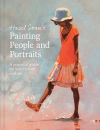
How to work with a limited palette, with step-by-step demonstrations. One of the world's best art teachers shows you how to give spontaneity and lightness to your work with a limited palette. Using only three colours (up to five at the very most), is the most effective way to give your art a fresh feel. With an array of paintings, techniques and step-by-step demonstrations, renowned artist Hazel Soan goes through a range of specific colour combinations that work. Each chapter looks at a different combination, guided by a principal hue or pigment property. For landscapes she discusses cool blue and warm yellow, for gardens transparent reds and complimentary green, and for seascapes warm blue, cool yellow and granulation. The author explores the almost inexhaustible three-colour combinations but also discusses when four- or five-colour combinations would enhance or work more efficiently. This ensures your work is more cohesive, light and brings out the beauty of the watercolour medium. This extensive guide is packed with demonstrations, work in progress and finished paintings – and every single painting will have the colours itemized, making this not only a great technique book but great resource for colour combinations. Ideal for all painters, new or experienced.
Das E-Book können Sie in Legimi-Apps oder einer beliebigen App lesen, die das folgende Format unterstützen:
Seitenzahl: 142
Veröffentlichungsjahr: 2022
Ähnliche


Contents
Introduction
Understanding the Limited Palette
What is a Limited Palette
How the Limited Palette Works
Knowing Your Colours
The Effect of Temperature Bias
Combining the Primary Colours
Pairing Opposites
Thinking in Three Colours
Choosing Colour Combos
Guided by a Dominant Colour
Chosen for Property rather than Hue
List of Colours Used in This Book
The Limited Palette in Practice
Landscape and Sky
Sunset and Sunrise
Seascapes
Places and Spaces
Flowers and Gardens
Figures, Faces and Fabric
Animals and Wildlife
Conclusion
Index
Acknowledgements
Introduction
If you picked up this book, you have probably heard watercolourists referring to painting ‘with a limited palette’ but never truly understood what this means, why it works or why it is so useful in watercolour painting. How does painting with fewer colours make paintings look more colourful than using more colours? And how many colours is ‘a few’ colours anyway?
This book explains all of the above and offers numerous examples. It is meant as a practical guide for you to take with you into the field. Very soon you will see how painting with a limited palette is not only beneficial to watercolour painting, it is also extremely efficient (see here).
This book is divided into two parts; the information outlined in general in the first half is shown in relation to individual paintings in the second half.
You will see how yellow, red and blue mix to make a colourful grey, as seen in this young elephant.
Wall Street, 38 x 28cm (15 x 11in)
Three colours – Indian Yellow. Alizarin Crimson and Ultramarine Blue – are blended on paper and mixed in the palette to quickly record the ever-changing action of this New York street scene.
PART I
Understanding the Limited Palette
What is a Limited Palette?
What I mean in this book by a limited palette is the means by which a painter uses the least number of colours possible to achieve a wide range of colouring in a painting. The aim is to exclude unnecessary colours to the benefit of the painting.
The plan is to find a small number of colours that will mix together to make all the colours required for the painting. Far from being ‘limiting’, I have found the limited palette a route to freedom: it makes the mixing experience exciting and enables me to concentrate on composition, shape and tone. For me, it starts from the basic principle that the three primary colours – blue, yellow and red – mix to make all other colours. I call this ‘three-colour thinking’, and it has helped me choose colour selections efficiently for any subject and circumstance throughout my watercolour journey.
San Giorgio at Dawn, Venice, 20 x 25.5cm (8 x 10in)
A limited palette can be as few as two colours, if that is all that is needed: here Light Red and Ultramarine Blue satisfy the colours of dawn as the sun rises above the Church of San Giorgio Maggiore and the Venice lagoon.
Gravetye Poppies, 76 x 56cm (30 x 22in)
By limiting the number of colours at the outset, I can ensure harmony between the rich purples and paler greens, and explore the variety of colours displayed on the white petals freely and safely.
Two-, Three- and Four-colour Paintings
This book will primarily concentrate on two-, three- and four-colour paintings to show the wide scope, harmony and efficiency such a few colours can offer. While three can mix to make every colour, this may or may not be to your advantage, as we shall see on the following pages. There are occasions when more colours are needed and times when two colours are quite enough. Painting is an art but what happens on the paper is science, and painting should never accept compromise. The limited palette is a thrilling key that opens the door to ‘less is more’; it is a journey I think you will enjoy.
Looking Down From Above, 56 x 76cm (22 x 30in)
The threesome, Prussian Blue, Yellow Ochre and Burnt Sienna, come together here to provide all the colours needed to paint the giraffe.
The Efficiency Advantage
A great advantage of the limited palette is its efficiency. Watercolour paintings are mostly painted from life and often need to be painted swiftly to effectively record light and shade in ever-changing light. A limited palette is efficient because having a limited number of colours lessens the variables in palette mixing, making it more straightforward and painting more efficient. When you are chasing light effects, grasping moving subjects, or trying to drop colour into washes before they dry, decisive mixing is invaluable.
Arty Conversation, 30.5 x 40.5cm (12 x 16in)
The choice of a limited number of colours speeds up the mixing time because it determines the range of colour mixes possible and serves to reduce doubt and hesitancy in the mixing equation.
How the Limited Palette Works
As well as being decisive and efficient, the limited palette enhances the colouring of a painting by guaranteeing harmony, maximizing colour interaction within the painting, and lessening the chance of muddy mixes and muddy colours. It may sound odd, but the fewer the colours, the more colourful a watercolour appears.
PIGMENT MIXING
The physical nature of pigments comes into play in watercolour more than in any other painting medium. The colours laid on the paper are made from many different pigments. When pigments are mixed together the resulting mix gets darker (and/or muddier) as different pigment colours are added to the mix – witness any painter’s rinsing pot! The aim of the watercolourist is to create fresh, lively colours, but when too many colours are mixed together, either on the palette or on the paper, the trend of pigment mixing to lead towards darkness tends to dull mixes and can cause muddy colouring. When fewer pigments are mixed this tendency is averted.
Colours of Africa, 28 x 38cm (11 x 15in)
Within a painting, colours are not seen in isolation but viewed relative to each other. Three cool versions of blue, red and yellow, shown above, are used here, yet the painting exudes warmth: the orange appears warm and vibrant in contrast to the cooler violet, which in turn becomes brighter in contrast to the yellowy green.
The Precious Colour Circle in your Head
Since colour is relative, and colours interact with each other, a wide range of colouring becomes possible from just a few colours and the mixes they can make.
You have probably seen a colour circle like the one opposite in every painting book you have picked up – it is indispensable to understanding how colour works. In this case, it is valuable in understanding the limited palette. Try to keep the colour circle in your mind, or keep referring to this page, and it will help you envision more quickly what mix or interaction might occur from a particular colour choice and pairing.
The colour circle is the painter’s guide to colour mixing, quickly viewing opposite colours, and an instant reminder of temperature bias. If you have never painted one, I highly recommend it as a satisfying and worthwhile exercise. This one is painted with the six colours I use regularly – a cool and a warm version of each primary hue.
Primary Thinking
Before I start laying paint on the paper, I choose my basic set of one, two and then three colours and, because I am familiar with how each mixes with another, I can quickly ascertain whether three will be sufficient. I admit this takes practice (that is why I am writing this book to help give you a shortcut for the process!). My pre-painting thinking is based on the three colours, blue, yellow and red, mostly in that order, and in the broadest range in terms of hue. This trio is the cornerstone upon which all colour mixing is based because, as you probably already know, the three primaries, red, yellow and blue, mix to make all the colours. Thinking about colour mixing in this triplicate fashion avoids the chasing of matching individual colours and ensures the colours work together and are seen, not in isolation, but as a whole. By choosing three initial colours it will be possible to see quickly whether three colours are enough and, if not, which extra(s) are needed.
The colours of the sky after the sun has gone down often show the three primary colours, and mixed together they paint the silhouette of the landscape – the sum of all colours, black.
The Sound of the Sand, 28 x 38cm (11 x 15in)
Here the ‘blue’ is Cobalt Cerulean, the ‘yellow’ is Raw Umber and the ‘red’ is Manganese Violet. The three colours mix together to make the black of the stallions and, as all are granulating, they give a wonderful texture to the sky and sand.
BLUE, YELLOW, RED
When I think ‘blue’, ‘yellow’ or ‘red’ I am thinking of these hues in their broadest scope, not as the bright poster primary colours learned in pre-school, but in the full range and gamut of what they have to offer in regard to their hue, warmth, coolness, light and depth of tone, transparency and opacity, staining and granulation. As you get to know your colours they become your close friends, all with different personalities and all an integral part of your painting life to whom you turn for different needs.
Knowing Your Colours
To understand why a limited palette of colours is so efficacious in watercolour painting, we first have to look at the colours themselves and learn how they behave. The individual colours are far more interesting than you might imagine: every colour made from a different pigment has its own personality.
COLOURS ARE INDIVIDUAL
The pigment gives each colour its own individual set of characteristics. This is the reason there are so many colours in watercolour ranges – all of them offer something unique to the artist. It would take a long time to learn the characteristics of every colour. Instead, artists choose a set with which they become familiar. This allows them to get to know a few stalwarts really well and become familiar with what to expect when mixing.
This book shows you how few colours you need for any one painting, but since every painting is different that still means you need a number of colours in your palette even though few are used for each painting. I use around 20 colours regularly. Some colours, like Ultramarine Blue, are consistent stalwarts, and you will see a core of about eight colours cropping up more regularly than many others. In total, around 30 different colours are represented in the paintings in this book. I am always experimenting with colours to check I have the best choice for my purpose.
Colours of the same hue have different characteristics – these are all blues, but have quite different characteristics, which we will learn about shortly.
Close colours made from the same pigment can be thought of as one colour in terms of mixing. Here Burnt Sienna and Yellow Ochre are both made from iron oxide and join Cadmium Red and Ultramarine Blue to colour this painting of my sister.
Colour is Both Hue and Tone
A colour has both a hue and a tone. Hue is the colour classification, for example, red, blue, green, yellow, and tone is the lightness or darkness of the hue. In watercolour, the first thing you notice about any colour in a palette is usually its hue, but you also need to know the range of tone it can achieve – how dark and how pale it can appear. The concentrated, undiluted colour, dried in the pan or squeezed from the tube, shows us the deepest tonal value of the colour. When diluted with water, even the darkest colours can become a tint as pale as air. In general, darker hues, like blues, browns and violets, have the potential for greater depth of tone and a broader range of values than lighter hues such as yellow, but within each class of hue there are wide variations.
Among Friends, 25.5 x 46cm (10 x 18in)
The rounded forms of these rocks are implied by a variation in tone from lighter tints to darker shades across the many different shapes, and mixed from the three colours Ultramarine Blue, Burnt Sienna and Raw Umber.
When diluted with water, this swatch of Ultramarine Blue can vary in tone from a rich, deep bright blue to a pale blue tint.
The tonal range of a lighter hue, like this Indian Yellow, is narrower: it can offer a really light tint but cannot provide a dark shade.
Reds generally sit in between blues and yellows in terms of inherent tone. Here the concentrated Cadmium Red can reach a deeper tone than the neat yellow but is not as dark as the neat blue.
Range of Hue, Depth of Tone
A hue has many different family members. Blues range from indigo to turquoise; yellows from pale lemon to browny yellows like Raw Umber and Quinacridone Gold. Among the reds there are crimson, magenta and scarlet – different colour reds, but all belonging to the red family hue. Burnt Sienna, a reddy brown, can sometimes be considered a red, and violet might act as a red or blue.
The depth of tone varies greatly depending on the pigment. Indigo is clearly a much darker blue than Cerulean, yet both are blues. Phthalo Turquoise is a greeny blue like Cerulean, and yet it too has a far greater range and depth of tone. Alizarin Crimson is a darker red than the bright Cadmium Red and has a much greater range of tone; while Quinacridone Red is slightly softer and pinker than Cadmium and has a similarly narrow range.
Compare these two lemons: the Transparent Yellow offers much deeper tone than the Indian Yellow. Remember this difference when we come to mixing.
Darker values come forward and lighter tones recede, suggesting distance and space on the paper. The variation and contrast of tonal values here describe one rock in front of the other and give the illusion of depth.
The gradual variation between the lightest tint and the darkest shade of Ultramarine Blue suggests the rounded form of a balloon.
The rose above is painted with Cadmium Red only and it is used in its most concentrated form to paint the shade between the petals, but it cannot reach the same depth of tone that the rose on the right displays, where Alizarin Crimson, a deeper red, has been added for the shades.
Depth of Tone in Practice
The greater the range of tone a hue can achieve, the darker the possible shades it can create in mixing. Both the paintings of elephants seen here are painted with three colours. Prussian Blue and Indian Yellow are used in each painting, but the red is different in each. Below, the deeper, darker Alizarin Crimson is used, and on the right the softer, brighter Quinacridone Red is employed. Look what a difference it has made! The Alizarin Crimson has the greater range of tone, and this enables it to create deeper, stronger colours and shades. The Quinacridone Red is a softer red, offering a gentle, warm atmosphere.
Be My Shelter, 56 x 76cm (22 x 30in)
The darker mixes possible with Alizarin Crimson help to suggest the strong dynamic of a mother elephant protecting her young calf against the heat of the desert sun.
The Last Meander, African Plains, 28 x 38cm (11 x 15in)
The soft, bright Quinacridone Red mixes to create soft mauves and oranges, cloaking the painting in a gentle haze that enhances a touching scene.
Translucency
The depth of tone of individual colours is related to the level of transparency of the pigment. Pigments of watercolour vary in their ‘see-throughness’; their translucency ranges from fully transparent through semi-transparent, to semi-opaque and opaque. A transparent colour allows light to pass through it and, in general, can reach deeper tones than opaque colours, especially among similar hues. This property is very important in colour mixing because it determines whether the colour will deepen or lighten the mix when it is added to another colour. Knowing this information is hugely helpful when choosing the colours for a limited palette.
Had I not placed these two sunsets side by side, you would barely notice the difference in the blacks of the landscape in silhouette. On the left, three transparent colours are used (Indian Yellow, Alizarin Crimson, Ultramarine Blue); on the right, three opaque colours (Cadmium Yellow, Cadmium Red, Cerulean). Look closely, the opaque colours cannot reach as deep a black as achieved by mixing transparent colours.
HINTS ON TRANSLUCENCY
If you are unsure about the level of transparency or opacity of a particular colour, rinse it out in a pot of water: if it creates a clear tint the colour is transparent; if the water turns cloudy it is opaque.


