17,99 €
Mehr erfahren.
- Herausgeber: Batsford
- Kategorie: Geisteswissenschaft
- Sprache: Englisch
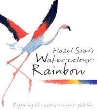
Hazel Soan's Watercolour Rainbow is an inspiring yet practical book on colour. She sets out to encourage and inspire all watercolour artists to make really radiant and colourful paintings. Hazel takes each main colour in the palette in turn and shows how to use the pigments to their maximum effect with lots of practical hints and tips throughout, as well as projects to show how the colours work in practice. All artists, whatever their level, seek advice on how to improve their paintings and this exciting book will inspire all watercolourists to use their palette to the maximum effect. The book includes: Colour Rules; The Pigments; Transparency and Opacity; Mixing Colours; The Yellows, The Reds, The Blues, The Greens, The Browns, The Blacks and Greys, The Whites; The End of the Rainbow.
Das E-Book können Sie in Legimi-Apps oder einer beliebigen App lesen, die das folgende Format unterstützen:
Seitenzahl: 129
Veröffentlichungsjahr: 2023
Ähnliche


Market Day
30.5 x 40.5cm (12 x 16in)
Boardwalk Café, San Francisco
30.5 x 33cm (12 x 13in)
Dedication
To the God of Light and in memory of our beloved dog Yassen.
Acknowledgements
A big thank you to Cathy Gosling for believing in the idea and making it happen. To my sister Rosie for reading the first draft. To Lucy Smith, my editor, who has been delightful to work with and to Zoë Anspach for the marvellous design: they both made the book look just as I hoped. To Diana Vowles for great text editing. To Madeleine Stone for photography. To Jennie Ryland for her encouragement. And to my husband and son who keep me ever on my toes.
Contents
Introduction: The Rainbow in Your Palette
1. Colour Rules
2. The Pigments
3. Transparency and Opacity
4. Mixing Colours
ALL THE COLOURS OF THE RAINBOW
5. The Yellows
6. The Reds
7. The Blues
8. The Greens
9. The Browns
10. The Blacks and Greys
11. The Whites
The End of the Rainbow
Further Reading and Index
Owning Nothing but the Wind
56 x 53.5cm (22 x 21in)
Introduction: The Rainbow in Your Palette
Colour is one of the chief attractions in a painting, both for the artist and the viewer, and the glorious pigments, transparent washes and vibrant hues of watercolour make it a particularly alluring medium. A vast array of colours and tones can be explored simply by adding water to pigment, producing paintings of breathtaking clarity and unique character.
This adds greatly to the thrill of painting, but there are times when the promise of radiant colour leads instead to disappointment. By unlocking the treasures of the palette, this book aims to broaden your knowledge so that you can approach choosing and mixing colour with confidence. Once you understand the way watercolour works and the individual characteristics of the rainbow of colours you will be equipped to show them at their captivating best.
The Wishing Well
25.5 x 30.5cm (10 x 12in)
Too Much of a Good Thing
In watercolour painting, everything depends on freshness. The white paper provides the light for luminous and transparent glazes of colour, and all you need to do is choose your paints, mix them and brush them into place.
That sounds simple, but how do you know which colours to choose? Most aspiring artists follow a list from an art book or buy a ready-made palette, but a collection of tubes and pans of lovely colours do not always translate into radiant watercolour paintings. In fact, watercolours are actually made more colourful by limiting the number of pigments, and it is how they are used in combination that is more relevant to the painter than individual hues. Although I carry as many as 22 different colours in my palette I use only 12–16 on a regular basis, rarely more than six in any one painting and often only three.
San Diego Brunch
28 x 38cm (11 x 15in)
In this family beach scene, just three colours, Indian Yellow, Permanent Rose and Ultramarine (Green Shade), are mixed to make the reds, pinks, violets, blues and greens of the beachwear. A dash of Light Red is added into the flesh tones to give them more body.
How to Use this Book
In order to ensure that this book has practical application, it is limited to the colours included in the paintings. The first four chapters discuss the use of colour in painting, present an overview of watercolour pigments and explain how to mix and lay them to optimum effect. Thereafter the chapters are divided by hue and offer specific information on individual colours. Watercolour ranges offer plenty more than are discussed here, all wonderful, but trying to include them all would have made for a very large and potentially confusing book. However, I hope that after you have read Watercolour Rainbow you will try other colours too, matching their properties to the categories identified in this book – warm and cool versions, transparent and opaque pigments – and find the set that works best for you.
I use predominantly Winsor & Newton Artists’ Water Colour, so the names of the colours here are those used by that brand. Although many manufacturers offer similar names, the hue and consistency may vary. The main thing is to find a manufacturer whose colours you enjoy and get to know a few colours really well so that you can create tints and blends intuitively. All manufacturers have an artists’ quality range and a cheaper range; the former will give you better results and, in the long run, is more economical as the paints contain less binder and more pigment. The intense colours go further, flow better and are more luminous.
The names of colours are often long, but most of them help to explain the characteristics of the colour. Becoming familiar with them will enable you to maximize their effect on paper. The watercolour medium is perfect; all you have to do is allow it to show its true colours, literally.
In reproduction, the subtlety of watercolour is sometimes lost by the limitations of the printing process. Please bear this constraint in mind as you go through the book, especially in relation to the single coloured swatches representing actual pigment colours.
Soft Summer Circles
38 x 56cm (22 x 15in)
Although the range of colours in this bouquet is reproduced by the printing process, the pigments used – Permanent Rose, Winsor Violet, Ultramarine, Aureolin, Quinachridone Gold and a dash of Cadmium Red – can still be recognized.
1. Colour Rules
A knowledge of colour theory will really help you to use colour effectively. There are rules that colours abide by and this will enable you to mix your pigments using informed choice rather than just relying on guesswork. Realizing how the eye perceives colour will also liberate your painting. Colour constancy (the tendency to see a red as red or a yellow as yellow, whatever the light conditions) is programmed into the brain, so we can identify a colour even in shadow – yet the artist must override this in order to see and paint the character of the colour that is actually present. Once you know the science behind perception, you will be able to perceive a yellow in shadow as brown or a white as blue rather than just following your first presumptions.
Primary Allegiance
35.5 x 28cm (14 x 11in)
The Supremacy of Tone
When the word ‘colour’ is used in painting, it encompasses both hue and tone. The hue is the feature of a colour that enables us to classify it, for example red, yellow or blue. The tone, or value, is the lightness or darkness of the colour as it is modified by light. Every colour has both a hue and a tone.
In figurative painting, gauging tone is more important than matching hue because the representation of light and shade (tone, or value) is the code by which we interpret the coloured patterns on the paper as being three-dimensional forms and spaces. In other words, it is the arrangement of light and dark values that describes whether something is rounded or angular, far or near, behind or in front.
In watercolour, the white paper represents the light, so the watercolourist largely paints shade; lit objects are tinted and highlights are left untouched. Being able to assess the tonal value of a colour is therefore vital in order to paint successfully.
Bike Menders
30.5 x 40.5cm (12 x 16in)
The reds are crucial to the success of this painting, but their impact lies in the use of their tone as much as in their strong hue.
No Colour is Absolute
Most people assume that objects possess the colour they appear – for example that a tomato is red, or a lemon is yellow – but this is not how it works. In fact, the surfaces of objects absorb and reflect light to varying degrees and transmit that light in different wavelengths which are then perceived by the eye as colours. Objects do not own their colour – rather they demonstrate the colour of the light leaving their surface. If an object scatters all the wavelengths of light shining upon it, it will appear white, while if it absorbs all the wavelengths it will appear black. The different wavelengths transmitted in between these two extremes depend largely on the reflective and refractive properties of the surface and the ambient illumination.
Knowing how colour is perceived by the eye may not directly help you to become a better painter, but it will free you from the assumption that an object has a definitive colour. Once you get used to the idea that colour is not absolute, that the light or shade falling on an object alters the perceived or ‘local’ colour, you will concern yourself with relative tone and relative colour instead of matching hue.
The colours in a painting are not chosen by trying to match the individual hues in the subject but rather by selecting a combination of pigments that will together approximate to its overall colouring. These two paintings look remarkably similar in colouring but the colours employed in the first (left) are Indanthrene Blue, Quinacridone Gold and Quinacridone Red, while in the second (right) they are Prussian Blue, Indian Yellow and Permanent Rose.
The Basics of Colour Mixing
The painter is concerned with the mixing of pigments. This is termed subtractive colour mixing and is based on making black, which is the sum of all colours of pigment mixed together (in light, all the colours of the spectrum mix together to make white, termed additive colour mixing).
Red, yellow and blue are primary colours; they cannot be mixed from other colours. When two primaries are mixed together, secondary colours result, making orange (red + yellow), green (blue + yellow) and violet (red + blue). The primary colour excluded from these pairs is called the opposite colour (opposite across a colour circle) or the complementary colour (completing the whole). When all three primaries, or a secondary and its opposite, are mixed together they make the tertiary colours – brown, grey, and finally black.
The colour wheel is a diagram that turns the spectrum of the rainbow – red, orange, yellow, green, blue, violet – into a circle to show the order of colours and visually demonstrates opposite colours and temperature bias.
The Colour Wheel
With the spectrum of the rainbow turned into a circle, the complementary colours can be seen opposite each other and the warm and cool sectors are easily recognized. Blue is the opposite colour to orange, red to green and yellow to violet. Red, orange and yellow are warm colours, while green, blue and violet are cool.
Cadmium Red, Cadmium Yellow and Cobalt Blue
The manufactured colours closest to the three primary hues are Cadmium Red, Cadmium Yellow and Cobalt Blue. As the first two are opaque pigments and the last is slightly opaque, black cannot be reached by mixing them together because they are not dark enough in themselves.
Prussian Blue, Permanent Rose and Indian Yellow
The intensity needed to reach true black is found in transparent colours, so in practice the ‘primary’ colours are more similar to the three primaries of process printing: cyan, magenta and yellow. Here, the trio approximating those colours is Prussian Blue, Permanent Rose and Indian Yellow.
Indanthrene Blue, Quinacridone Gold and Quinacridone Red
Many transparent primary combinations mix to make black. This and the one left are the colour combinations used in the paintings on the previous page. You can see why the overall colouring looks similar: both combinations include all the colours of the rainbow but from a different set of primary hues.
Permanent Rose, Winsor Lemon and Winsor Blue
Each manufacturer provides information on the primaries that offer the widest range of hues possible with just three colours. In the Winsor & Newton Artists’ Water Colour range they are Winsor Lemon, Winsor Blue (Red Shade) and Permanent Rose.
Opposite Colours: Completing the Colour Circle
The eye (or more accurately the brain) is forever trying to balance and complete the colour circle – you can discover this by looking at a colour, closing your eyes and noting the afterimage of opposite colour on your eyelid. Compensating for a missing colour, the eye responds by seeing the neutrals – greys or browns – as leaning to that colour, thus shadows look more mauve or blue under a yellow-orange light. The artist takes full advantage of this compensatory phenomenon by setting colours against their opposites to make them appear more vibrant – the reason why a limited palette makes for a colourful painting.
Freedom of the Wilderness
20 x 28cm (8 x 11in)
The contrast of two hues in opposition makes each more vibrant – the warmth of the Cadmium Red kayak turns the watery wash of Ultramarine (Green Shade) cooler and bluer, and the canoeist, mixed from both colours, appears blacker than the mix actually is.


