Erhalten Sie Zugang zu diesem und mehr als 300000 Büchern ab EUR 5,99 monatlich.
- Herausgeber: Batsford
- Kategorie: Lebensstil
- Sprache: Englisch
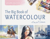
A compilation of practical guidance on everything you need to know about painting people and landscapes in watercolour, with simple exercises and step-by-step demonstrations to develop your masterpiece. Hazel Soan is a hugely successful painter and an outstanding teacher and author of art books, which have introduced the wonders of art to a generation of amateur artists. Here she collates her vast knowledge on painting in watercolour in easily digested steps that can be achieved in short bursts of time. In this extended compilation edition, Hazel Soan explains everything you need to know about painting people and landscapes in watercolour in an accessible and informative way. She advises on how to master brushstrokes and balance composition as well as dealing with the theories of colour and light. She gives you the tools to create urban streets, woodland forests and rocky coastlines and guides you through ways to insert people into your pre-existing paintings to bring them to life. Bursting with easy-to-follow exercises and demonstrations, this comprehensive compendium of watercolour painting is an invaluable companion for beginners as a well as a useful resource for more experienced painters.
Sie lesen das E-Book in den Legimi-Apps auf:
Seitenzahl: 140
Veröffentlichungsjahr: 2025
Das E-Book (TTS) können Sie hören im Abo „Legimi Premium” in Legimi-Apps auf:
Ähnliche


Zest for Life35.5 x 26cm (14 x 10in)
Bucky43 x 56cm (17 x 22in)
Contents
General Introduction
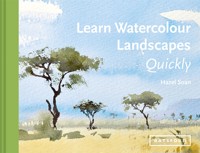
Learn Watercolour Quickly
Introduction
CHAPTER 1What you should know about watercolour
CHAPTER 2The stuff you need
CHAPTER 3Choosing the colours
CHAPTER 4Putting paint on paper
CHAPTER 5Selecting the subject
Go for it!
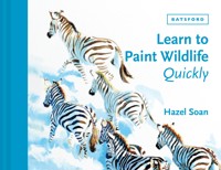
Learn Watercolour Landscapes Quickly
Introduction
CHAPTER 1Creating space
CHAPTER 2Focus on composition
CHAPTER 3Light and colour
CHAPTER 4Landscape techniques
CHAPTER 5Landscape themes
Go for it!
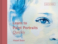
Learn to Paint People Quickly
Introduction
Chapter 1 Understanding the essentials
Chapter 2 Proportion
Chapter 3 The pose
CHAPTER 4Lighting
CHAPTER 5Portraits and clothing
CHAPTER 6Figures in a setting
Epilogue
Index
About this book
Watercolour has captivated artists and viewers alike for centuries. Its unique ability to represent light, atmosphere and emotion through translucent layers of pigment set it apart from other mediums, making it beautiful to behold and challenging to master. This compendium is designed to be a comprehensive guide to enable you to embark with confidence on your own creative journey, offering insight, techniques and inspiration through a variety of subjects.
The book is divided into three parts. It begins with the essential materials and basic techniques that make watercolour such a delight to pursue, advocating that the subject should be used to paint the watercolour rather than the watercolour used to paint the subject. The second part takes the journey into landscape painting, exploring the art of illusion, space and depth, patterns of light and shade, and the use of perspective. In the third and final section the reader is guided gently through the exciting challenge of painting people, simplifying the process of representation and showing how the inclusion of figures imparts life into paintings.
With such broad content, this one book will equip you to paint watercolour with the knowledge and skills needed to bring your artistic vision to life. Welcome to the journey, as we discover the endless possibilities this rewarding medium has to offer …
Rose to the Occasion38 x 51cm (15 x 20in)
Flowers are always a reliable subject through which to explore the thrill of watercolour. The translucent petals and glorious colours lend themselves perfectly to the medium.
Introduction
This section of the book introduces you to the watercolour medium, the paint, the pigments, the brushes, the paper and a whole range of techniques for laying this lovely medium on paper to make your heart sing. You can read this section in about 30 minutes, and will be ready to start painting even before you reach the chapter on how to choose your subject, so I suggest you take it slowly and start painting as early on in the book as possible, practising what you learn as you read. Painting is a verb before it becomes a noun, and you will learn quickly the more you lay paint on paper.
Floating By15 x 20cm (6 x 8in)
Watercolour is a medium that can very quickly catch the essence of a subject.
Jewel of the Adriatic28 x 38cm (11 x 15in)
With just two colours, Light Red and Ultramarine Blue, the captivating medium of watercolour is able to evoke the glorious light of the rising sun over a majestic silhouette in Venice.
The medium of watercolour
Watercolour is a transparent painting medium that is diluted with water, mixed on a palette with a brush and then applied to paper. The light in a watercolour painting is represented by white paper, the painter paints the shade and tints the light. Watercolour paper is heavier than cartridge paper to prevent it from buckling when wet. You can use any tool to apply watercolour, but the brushes that are made especially for this medium make it much easier to get satisfying results.
You need only the desire
Watercolour is known for its radiant washes and clarity of colour. The appearance of the watercolour is more important than the content it conveys – grasping this concept allows even a beginner to achieve attractive results. As mentioned earlier, always bear in mind that you are using the subject to paint a watercolour rather than watercolour to paint the subject.
It is true that mastering watercolour to a high level of expertise will take time, even a lifetime, but the beauty of this medium can be found as soon as you start, just by letting the lovely pigments and papers do their stuff and not worrying too much or trying too hard.
The Student28 x 35.5cm (11 x 14in)
Be curious
Inquisitive people learn fast; art does have rules, but there are no boundaries. Here is a medium that benefits from thought before action and enjoys concentration. ‘Less is more’ should be the watercolourist’s motto and being succinct often takes more preparation and care than being long-winded.
Do not be afraid to experiment even though you may waste paper in doing so, and don’t be afraid to break the rules. Most great discoveries are made by mistake, so get out of your comfort zone and explore the medium. As much as is possible, paint from life rather than from photographs. Great pleasure is found in the process of painting and if you produce a worthwhile result, bliss will be your reward. The exciting thing about watercolour is that it actually does provide an adrenaline rush because of the precariousness that can be involved in using this medium.
The Lighthouse25.5 x 25.5cm (10 x 10in)
Creation and failure are interlinked
Creation and failure are inescapably linked: without doubt, among your successes there will be failed watercolours. These are part of your creative archive and are just as important as the paintings you come to cherish: get used to it, don’t let it get you down, just carry on.
Watercolour can be unforgiving, but usually only when it is overworked and loses its fresh and lively appearance – as you haven’t got much time, you are unlikely to fall into this trap! If it goes wrong it is only a piece of paper, so simply get a fresh piece and start again.
Crossing the Kalahari23 x 30.5cm (9 x 12in)
You need very few colours and little time to paint a watercolour. Here Ultramarine Blue, Yellow Ochre and Permanent Rose are used in combination to create this desert scene in just a few minutes.
Less is more
You do not need many materials to paint good watercolours. ‘Less is more’ is the watercolourist’s maxim and applies to the materials as well as the actual painting.
Art shops can be overwhelming. All you need to start with is one fairly large or medium-sized natural hair brush, three to six tubes of paint, a palette to mix on, watercolour paper, water and some kitchen towel. If you want to work more upright, a lightweight, portable, folding easel is ideal as it can be carried outside. Alternatively, work flat; sit on a seat or stool and hold your painting on your knees or work at a table – you can’t then tilt your paper in any direction.
Curious Giraffe56 x 38cm (22 x 15in)
I worked flat to ensure the paint for the patches on the neck could spread out evenly in all directions.
Don’t buy cheap products
Do yourself a favour: buy artists’-quality materials. These may be more expensive, but buying cheap watercolour paints is a false economy – it makes the painting process more difficult, and the paint doesn’t go so far or bring such good results.
The purity and intensity of artists’-quality pigments make rich, glowing colours.
Brushes
Choose natural hair brushes, as they are easier to use than synthetic nylon brushes. Also, with natural hair you can manage with just one brush, whereas with nylon you would need several to make the same brushmarks. Start with one round natural hair brush – size 12, 10 or 8 depending on the size of paper you want to work on (see box, right). It will be more expensive than a nylon equivalent, but it is much more versatile, it will come to a fine point for detail and has a broad body that can carry lots of paint for larger washes, and it will last for many years. Research stockists online to find the best-value products.
If you want to add another brush at this stage, a 20mm (¾in) flat natural hair brush would be useful and costs less than a round brush. If you fall in love with this medium, you can add more brushes at a later date, including a thin, narrow brush for fine, even lines called a rigger.
Brush sizes
I suggest the following sizes of natural hair brush for particular paper sizes, but aim to use the biggest brush possible:
• Paper 51 x 41cm (20 x 16in) and larger: size 12 to 14 brush
• Paper 41 x 30.5cm (16 x 12in): size 10 brush
• Paper 30.5 x 20cm (12 x 8in) and smaller: size 8 brush
Bending to the Song of the Wind25.5 x 28cm (10 x 11in)
The natural hair brush can shape a frond or suggest a coming storm; the tip is used for detail, the body of the brush for broad washes.
Paints
Artists’-quality watercolour paints are purer and go a lot further than students’-quality colours, and will make for more radiant paintings. With watercolour, the fewer colours you use, the better the results. Artists’ watercolour is such an intense pigment that you need very little, and even a small tube lasts a long time. Since watercolour is essentially a transparent medium, you will be surprised at how little pigment you use for the majority of a painting (see page 46 for the colours I suggest you buy).
This little sketch is painted with the same tube colours as shown in the picture: Ultramarine Blue, Alizarin Crimson and Aureolin (yellow).
Palette
When it comes to palettes, a china or enamel palette is easier to mix on than a plastic palette (but heavier to carry if working on location). A palette with several sloping wells is ideal so the water can pool at the bottom and remain drier up the slope.
An enamel folding palette is ideal. If the paint runs into the gutter you have probably used too much water, or not enough pigment.
Paper
The main ongoing cost in watercolour painting is that of the paper, but since you can only learn to paint by actually painting on the paper, it is rather essential!
Lilac Sari56 x 30.5cm (22 x 12in)
The uneven surface texture of watercolour paper gives pleasing edges to the brushmarks of the background in this painting as the paint dances over the rough grain.
There are two main types of watercolour paper: paper made with cotton and paper made from wood pulp. The paintings in this book are all made on 100 per cent cotton paper, mostly with a rough surface, so if you like their appearance I suggest you use the same. Later, you can experiment with different papers. Paper thickness is categorized by its weight per ream. Choose heavier weight paper – 300gsm (140lb) or thicker. Forget thin paper as it buckles too much.
Surface texture
There are three main choices of surface texture:
• Rough: the grain has a prominent tooth.
• NOT (cold-pressed): the tooth is less pronounced.
• HP (hot-pressed): the surface is very smooth.
City Duo20 x 15cm (8 x 6in)
These city suits were painted on rough khadi paper, which is made with long-fibre cotton and therefore holds the water longer than most papers.
Water and kitchen towel
Water is needed to mix with the paint to break down the gum-arabic binder, thus allowing the paint to float on the paper and set when dry. It’s a good plan to have two to three small pots of water – this allows you to use a couple for rinsing off paint and one clean-water pot for making the radiant tints. You will also need kitchen towel, or a sponge or cotton rag to mop up excess water.
Pencil and eraser
It is not always necessary to draw before painting except when you need a guide for the brush. For this you need a softish pencil (2B or 4B) or a graphite stick. It does not matter if pencil marks show under a watercolour but, if corrections are to be made before painting, use a putty rubber rather than an ordinary eraser so that you do not scuff the surface of the paper.
Watercolours often require very little drawing before applying the paint. Here, only the outline of the zebra is sketched because the versatile natural hair brush can make specifically shaped strokes to delineate the stripes and thus shape the animal perfectly.
These flowers needed no preliminary drawing: they are fresher for having been painted directly on to the page.
The primary colours
There are three main colours in painting – red, yellow and blue. These are known as primary colours and can be mixed together to make all other colours. There are many different reds, yellows and blues available in watercolour, so it is possible to make many variations with combinations of a red, a yellow and a blue.
At the end of this chapter (see page 46), I recommend a set of colours to start painting with, but do aim to use as few as possible in any one painting.
A blue, a yellow and a red mix to make a full range of colours.
Wells-Next-the-Sea30.5 x 30.5cm (12 x 12in)
The red, yellow and blue used to paint this dinghy are Alizarin Crimson, Raw Umber and Prussian Blue.
Secondary colours
By mixing pairs of primary colours together you will make three more colours: these are called secondary colours. Red and yellow make orange, blue and yellow make green, and blue and red make violet.
Cobalt Blue and Permanent Rose make violet; here the colour is made by mixing the two together on the paper.
Blue and yellow make green; here the green is made by layering Winsor Yellow over Winsor Blue.
Red and yellow make orange. Permanent Rose (red) and Indian Yellow are the perfect combination to paint the orange of the coconuts.
Tertiary colours
When a primary colour (e.g. blue) is mixed with the secondary colour made from the other two primaries (e.g. orange, which is made from red and yellow), browns, greys and blacks result. These are called tertiary colours as they result from a third stage of mixing. Because watercolour paints come in a broad range of colours, mixing blacks, browns and greys can also be achieved by using ready-made secondary colours, such as Viridian (green) and Schmincke Violet. Some examples of two colour combinations are shown on this page.
Over the page, in the watercolour of an elephant, you will see how layers of yellow, blue and red combine and mix together to make all the colours required for the painting.
The Sun Gets Up With Great Earliness20 x 28cm (8 x 11in)
The three colours used to make the greys in the sky and the black silhouettes in this dawn sketch on the river are Aureolin (yellow), Ultramarine Blue and Burnt Sienna (a red-brown).
Demonstration stage 1: The first wash is the yellow of Aureolin, which goes under any colour that has yellow in it, i.e. any greens, oranges, browns and greys.
Stage 2: Prussian Blue follows, painting any area that has blue in it, such as the sky and the shadows and the green of the trees.
Stage 3: Now it’s the turn of the red. Alizarin Crimson is diluted to a pale pink and goes over the yellow of the grass to turn it to orange and over the shadows on the elephant to turn them to grey.
Stage 4: The same three colours are now used either individually or mixed together to darken the tones of the elephant and …
… then in the trees to make the dark browns of the branches. So you see – with just three colours you can make a full range of colours and tones.
Transparency
The transparent, thin films of paint in watercolour are called tints and glazes. Because they are transparent, they can be overlapped to make an unlimited number of colours and shades. When diluted, all the colours are transparent, but in their concentrated form, some pigments are less transparent than others and some are actually opaque, providing a denser covering.


