16,99 €
Mehr erfahren.
- Herausgeber: Crowood
- Kategorie: Lebensstil
- Sprache: Englisch
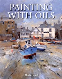
Oils give a rich, majestic quality to a painting but may often be deemed too tricky or ambitious to try. This practical book puts the joy of painting with oils within reach of all who want to develop their skills. Examples of landscape, marine, nude and equestrian paintings will inspire and show the rich diversity, texture and depth that oil painting can achieve. Written by a professional painter, it encourages artists of all levels to experiment with the medium and to develop their art. Contents include: the importance of drawings; a guide to oil paints suggesting a key range of colours; step-by-step examples with practical tips throughout; advice on composition, colour and light, and framing. An authoritative and beautiful guide to painting with oils, aimed at oil painters and, in particular, coastal and landscape - this new book will encourage artists of all levels to experiment with the medium and develop their art. Superbly illustrated with 108 colour images.
Das E-Book können Sie in Legimi-Apps oder einer beliebigen App lesen, die das folgende Format unterstützen:
Seitenzahl: 190
Veröffentlichungsjahr: 2014
Ähnliche


PAINTING WITH OILS
David Howell
THE CROWOOD PRESS
First published in 2014 by The Crowood Press Ltd Ramsbury, Marlborough Wiltshire SN8 2HR
www.crowood.com
This e-book first published in 2014
© David Howell 2014
All rights reserved. No part of this publication may be reproduced or transmitted in any form or by any means, electronic or mechanical, including photocopy, recording, or any information storage and retrieval system, without permission in writing from the publishers.
British Library Cataloguing-in-Publication Data
A catalogue record for this book is available from the British Library.
ISBN 978 1 84797 716 8
Frontispiece: Newquay, Ceredigion, Wales
CONTENTS
Introduction
1. GETTING STARTED WITH OILS
2. PUTTING A PICTURE TOGETHER
3. DEVELOPING DRAWING AND SKETCHING
4. COMPOSITION AND CONSTRUCTION
5. COLOUR AND LIGHT
6. LANDSCAPE
7. MARINE
8. FIGURES AND MOVEMENT IN PAINTINGS
9. FINISHING AND FRAMING
Index
Art Suppliers
Preci, Umbria.
INTRODUCTION
Oil paints are frequently viewed as a serious medium requiring much more commitment in terms of equipment, materials and space to work, than would be associated with watercolours or pastels. For some painters, whilst they may intend to have a go at oils at some point, that moment never really arrives because oils are just too complicated. It doesn’t have to be so. This book is not intended to be one of those encyclopaedic volumes detailing the history of oil painting, the scientific make up of individual paints or which end to hold the brushes. There are plenty of those out there already for the technically minded, that might explain at great length how Van Eyck is credited with first using oil paints or what ingredients are contained in a tube of Indanthrene Blue, but so often they don’t tell you much about how to set about painting pictures. This book is a practical guide to working in oils by a professional painter with decades of experience about what works for him. It recognizes that whilst there is an extraordinary range of paints and equipment on the market it is possible to concentrate on colours and materials that make sense, that won’t need a complete new studio to contain them and, perhaps most importantly, won’t break the bank.
What this book does cover is the author’s preferred way of working, with many step-by-step examples. It shows the equipment and materials that he uses on a regular basis and the relatively limited range of colours that have evolved over time and work fine in pretty well any set of circumstances – whether he’s working in the Arabian Desert or in the snow on the North Yorkshire Moors. It also discusses at some length the crucial question of how to put a painting together, how to ensure that the compositions are interesting, and how to produce work that people want to look at. Above all it is intended to encourage and help those either thinking about or starting out in oil painting and, for the more experienced, developing their ability with the medium and the whole fascinating process of creating paintings that people will want to look at.
The artist’s studio – brushes, paints and easel.
CHAPTER 1
GETTING STARTED WITH OILS
When we were young most of us probably started on our artistic endeavours with pencils and crayons, colouring books, and bits of paper, and some of us might even have tried our hand at drawing on walls – well we all had to start somewhere! As we got older we were perhaps given access to watercolour, poster paints and pastel but the one thing that parents and elders were highly unlikely to let us anywhere near was oil paint. Its legendary ability to end up on clothes, door knobs, small children, dogs and hamsters, as well as on passing adults, and the subsequent difficulty of removing it made it forbidden territory. Not that this mattered a lot in the early stages of artistic development but there would have come a time when most of us realized that the majority of really impressive works of art in galleries and museums were painted in oils.
La Fiancée du Pirate, La Flotte, Île de Ré.
Oil paint meant you could work on a large scale and with colours that were really bright and the fact that some of the paintings on display were hundreds of years old indicated that the medium could stand the test of time. Any subsequent experience of an oil painter’s studio or workspace would have only added to the impression that oils were special. That lingering tang of linseed oil and turpentine, along with wooden easels and polished palettes, brushes in pots, various bottles and tins about the place and fat tubes of paint, suggest this is serious territory!
Actually, that might be a somewhat romantic view, but nevertheless there is still a tendency in some galleries and auction houses to separate things like watercolours and drawings from paintings – that is oils – the real thing. We all know of course that’s a little unfair, not least because there is a counter view that regards watercolour as the most difficult medium of all to work in and in the right hands it can be used to produce stunning work. However, oils allow texture and depth of colour and the ability to work on a much larger scale than watercolour. The reason that oils have survived for hundreds of years is their remarkable resilience. They can cope with being exposed to the atmosphere and, provided the painter has used proven methods of applying the paint, they can even outlast the support they are painted on by being removed from it and fixed on a new canvas or board. From a painting angle they have the distinct advantage of knowing that what you see is what you get. What is mixed on the palette looks the same on the canvas in terms of colour and tone and, unlike watercolour, it doesn’t fade as it dries and so the painter can achieve levels of contrast, brilliance, subtlety and depth of colour that surpasses pretty well everything else. Oils can be applied in thick opaque layers or thin glaze washes and they allow paintings to be produced on the spot in one go (alla prima) or allow time for a more considered approach with a pace all of its own. Devotees of acrylics will no doubt claim that they offer similar attractions but there is an overwhelming and distracting pressure created by the fact that they dry very quickly and a few moments’ inattention or contemplation can result in ruined brushes and hardened paint in the wrong places.
A Rainy Day at Pin Mill, Suffolk.
Oil paint works well in pretty well any conditions. One of the major problems in trying to paint outside with watercolours is the time that it can take for a wash to dry on damp cold days and of course on hot days, the opposite applies. Oils work fine irrespective of the temperature and provided you learn to cope with them properly they are almost certainly the most flexible and practical medium to use both inside and out.
PAINT SELECTION
In order to paint in oils, you need paint, something to paint with and something to paint on!
For any painter it is essential at an early stage to establish a basic colour range that works for them. It makes the whole process of achieving appropriate tones and colours so much easier, takes up less space than large numbers of tubes of paint and is considerably less expensive than lots of random purchases because something takes your fancy. For the plein air painter it’s even more essential to minimize the load as space is at a premium and paint is surprisingly heavy to carry about. Most major paint manufacturers have a colour range that can be anywhere from 100 to over 150 different pigments but it’s perfectly possible to work with the three primary colours, white and a small selection of ‘earth’ colours. A range that takes this a little further with the three primary colours in a cool and warm version can cope with anything.
Artist or Student quality?
The price of paint generally reflects the strength and rarity of the pigments involved and as a guide, Artist quality paints have a higher pigment strength and when appropriate tend to use the genuine article rather than substitutes. In painting terms it usually means that the colours have more tinting power and intensity. In days gone by it was also understood that Artist quality meant higher degrees of light fastness or permanence. All major manufacturers publish colour charts that indicate the light-fast levels of their paints where there is any variation, and in a number of cases the total range available is considered permanent. Technology has also caught up with Student ranges and they are much better than before with high standards of light fastness and durability but in practical terms they still don’t have the colouring strength of the higher priced professional paints.
As a guide it’s not a terribly good idea to mix the two types of paint. There’s no technological reason why not but, when painting, it is distracting if you have some colours on the palette where only a small amount is required to achieve the colour you need and others that require a considerable dollop to make them work. Perhaps the best guide is to say that Student ranges are fine for the beginner and also can work well for those who want to paint on a large scale but don’t want to spend a fortune on paint. Otherwise as with so many things in life you get what you pay for and if you want top quality materials that are the ultimate in colour technology and pigment strength, then it has to be Artist.
A basic colour range
This particular selection is my essential palette and is discussed in more detail in Chapter 5. There are obviously perfectly viable alternatives and in some cases the colours here are at the expensive end of the paint manufacturers’ ranges but it is a selection that has stood the test of time and works well in pretty well any situation ranging from life work in the studio to desert landscapes.
Primary Colours
Cool
Warm
Blue
Cobalt Blue
French Ultramarine
Red
Alizarin Crimson
Cadmium Red
Yellow
Cadmium Lemon
Cadmium Yellow
Earth ColoursYellow Ochre Raw Sienna Raw Umber Burnt Sienna Burnt Umber
The inclusion of warm and cool primary colours is to give the painter the ability to create colour mixes that are appropriate to a particular subject and to create recession in paintings – cooler colours for backgrounds and distance, warmer in the foreground. A glance at any manufacturers’ colour chart or a colour wheel (seeChapter 5) will show the warm and cool variations of any particular colour range. They usually start with the yellows which start cool (lemon yellows) and then proceed through with increasing warmth with the mid-yellows and on towards orange. That in turn leads to the reds where the orange influence means that they are warm and as they move on towards the blues they become increasingly cool as they become mauves and violets. With some manufacturers’ charts the cool and warm pattern isn’t always quite so obvious with blues but as a general rule blues that are influenced by red are warmer and as they complete the circle and are influenced by yellow they move towards green and appear cooler. Bearing in mind that green isn’t one of the primary colours, it’s perhaps surprising that all paint manufacturers have a wide range of greens in their colour charts that often exceeds the number of blues. Greens out of the tube inevitably require mixing with other colours to produce realistic greens and a combination of the three primary colours enables that anyway, so there are no greens in my selection and as the whole question of greens deserves special attention, particularly for landscape painters, there is more to come on the subject in Chapter 6.
The earth colours may seem slightly less glamorous than the primary colours but they are an essential part of the palette and the good news is that they balance out things like the cadmiums because they are at the less expensive end of manufacturers’ price lists.
Additional colours
Often a range like this is referred to as a limited palette and all experienced painters will have their own selection. This one will work pretty well in most circumstances but it is of course fun to experiment and to add other colours that suit your approach to painting; however, do beware the temptations of the Aladdin’s Cave of a well-stocked artist supplies shop. Most painters have a collection of tubes that have been used once or twice and then discarded. What could be added to the above selection however is a colder blue – Cerulean Blue works well, tends to be expensive but is great for winter skies or cold seas – and perhaps a deeper blue: Prussian Blue for instance is a deep greeny blue. Light Red is another colour that is extremely useful for mixing with blues for creating greys and it comes into play as an earthy red. For me, this selection, plus white, is what’s in the box when I’m out painting.
Whites
You will need white in large quantities in comparison with other colours and certainly in the studio the larger tubes or even tins are very handy. There are a number of whites available from various manufacturers but the main ones are:
Titanium White – this is an excellent all rounder. It’s a bright white with maximum opacity, giving excellent covering power. It’s relatively slow drying.
Flake White – this is a traditional white containing lead and largely because of the associated hazards and related legislation it has disappeared from most manufacturers’ ranges or in some markets is only available in tins and from under the counter. Flake white or Lead White was effectively the only white available to oil painters until Titanium and Zinc White appeared in the twentieth century but, at the time of going to press, it is still available from Winsor & Newton, Michael Harding and Daler Rowney. Its major advantage is that it dries quickly which is particularly beneficial if you want to get on with adding additional layers and because it has less tinting power than Titanium White it can have a unifying effect on tones and colour. To get around the lead problem some manufacturers offer Flake White Hue – the use of hue in the name of a colour indicates that a substitute pigment has been used to imitate the original – in this case Titanium is the base but it retains the fast drying and tinting characteristics of the original Flake White.
Zinc White – this is a less opaque white, which makes it suitable for gentler top layer tints and even glazing.
Colour choice ultimately is a personal one and should be based on what works for you and what you feel comfortable with but the colours listed here are pretty well all that I need on a day out. They work well together and form a palette that is effective in any painting situation. It’s important for a painter to establish a range of paints that allow them to get on with painting rather than the whole process being a constant experiment.
PAINTING MEDIUMS AND SOLVENTS
Oil paint has a consistency that means it can be used straight from the tube. This can vary according to the manufacturer because all paint makers have their own formulas, which include not only linseed oil as the basic binder but also things like beeswax, poppy seed and sunflower oil, resin and so on. Inevitably there are claims that one mixture is better than another or gives more brilliance and luminosity and some painters will have their particular preferences but if you use paint from the established manufacturers you won’t go far wrong and you will be able to develop your own thoughts on what works best for you.
What you will need is something to dilute the paint, particularly for the early stages of a painting, and a medium to improve the flow when required for the upper layers of paint. This is known as the ‘fat over lean’ principle, which we will return to later. Traditionally these two basic requirements have been handled with turpentine for thinning paint mixes and linseed oil as an aid to making the paint more malleable. There are various alternatives. White spirit can also be used for thinning purposes but whether you opt for that or turpentine make sure that it’s a proper artists’ refined or purified product rather than cheap alternatives from your friendly DIY store. The latter are fine for cleaning brushes but using them in the actual painting process is a false economy.
Linseed oil is generally used as an additive to increase the flow of paint in the upper layers and it also increases the gloss and slows down the rate of drying; taking it one stage further a 50/50 mix of turpentine and linseed oil makes a reasonable general painting medium for the mid-layers. If Damar varnish is added to the mix – one third each of turpentine, linseed oil, and varnish – you have a glazing medium that will allow the application of transparent colour with gloss and depth of colour.
Part of the fun of being a painter is that there is a world of difference between what’s needed and what’s actually available and this is an area where experience will show what works best for you. There’s certainly an argument for an alternative to turpentine as some painters (or their nearest and dearest) find the smell unpleasant or even impossible to cope with. There are accordingly low odour substitutes like Winsor & Newton’s Sansodor but in general there is a wide range of products on the market that can speed up or slow down drying, increase gloss, improve flow and detail work, provide ready-made painting and glazing mediums, as well as things like beeswax or modern substitutes to thicken paint for impasto work. If you fancy experimenting then studying the labels or a manufacturer’s catalogue should tell you all you need to know.
METHODOLOGY
This book makes the assumption that you have a pretty good idea of what pigments need to be mixed to achieve a certain colour but for those new to the medium of oils there are a few basics that need to be dealt with.
Fat over lean
You will find a number of references to ‘fat over lean’ in this book. Oils can be painted thickly with texture (impasto) or thinly like a watercolour. They can be painted in one go (alla prima) or worked up in a series of layers ending up with transparent layers of colour (glazes) but one overriding principle needs to be applied – the initial layer should have either no oil or as little oil as possible in it, whilst the mid-layer can have a little more oil introduced and top layers or glazes may use even more. The reason for this is that an oil painting needs stability. Paint with more linseed oil in it takes longer to dry, whereas paint diluted with just turpentine dries quickly. If you don’t bother observing the fat over lean principle and have paint with lots of oil in the base layer and end up with fast drying pigment with little oil in it on top, there’s a danger that the top layer will dry quickly and seal off the bottom layer or layers whilst they are still wet and they will never dry. That means that there will be a degree of movement underneath the surface which will eventually cause cracking in the top layer or other complications where gravity takes over when it’s hung on a wall.
In practical terms of course all oil paint out of the tube has oil in it and things like Underpainting White or Foundation White can be used for base layers because they are deliberately designed to be fast drying. Otherwise, thinning the paint with turpentine will effectively dilute the oil content and therefore reduce drying time and it’s quite possible to start putting a painting together with thin washes, diluted with turpentine, and to be able to work over them virtually straight away with thicker paint that is effectively ‘straight out of the tube’ consistency; it’s perfectly possible to take this stage to the point where the picture is almost finished. However it will get increasingly difficult to work on the wet surface without messing it up and many painters at this point will leave an oil painting for at least a day or two to dry. Whether you add the last details whilst it’s still wet or wait until it’s dry and then use thin glazes, adding linseed oil to the paint will increase the flow and slow the drying time of the top layers.
Light over dark
Oil paint is controlled in terms of tints and tone by using white, which makes it effectively an opaque medium. However, if you use some colours suitably thinned without white they can be transparent which makes them ideal for the glazing process. At this point it’s worth noting that if you are going to observe the fat over lean principle and establish an initial composition with thin washes of paint it makes a lot of sense to establish the serious darks at this point and pure dark pigments diluted with turpentine will achieve this.
EQUIPMENT
Brushes
The usual means of getting paint onto a painting surface where you want it is either with brushes or a knife, although fingers can come in mighty handy on occasions. There’s a large selection of brushes available and it’s impossible to try them all out, but hog bristle brushes are the best for general handling and applying oil paint and are robust enough to last a long time. They come in three basic shapes – round, flat and filbert and the last two are usually available in long and short versions. Painters need a selection of sizes and it’s a case of trying various shapes to see what suits your approach but as a guide it’s invariably better to opt for larger brushes than you think you need rather than fiddling with smaller ones. Apart from hog bristle there is a case for having softer alternatives for glazing, detailed work and thin top layers of paint and there are sable and natural hair brushes available as well as synthetic equivalents. The latter can be attractive in this instance because they are obviously less expensive than sables and oil paint can be ruinous to the finest soft sable brushes if you forget to clean them after use.


