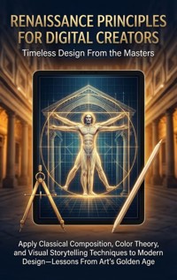
Renaissance Principles for Digital Creators: Timeless Design From the Masters E-Book
Adrian Carmichael
Erhalten Sie Zugang zu diesem und mehr als 300000 Büchern ab EUR 5,99 monatlich.
- Herausgeber: epubli
- Kategorie: Geisteswissenschaft
- Sprache: Englisch
Renaissance masters solved visual problems that designers still face today—balance, hierarchy, emotional impact, and viewer engagement. This guide translates their revolutionary techniques into practical applications for contemporary designers working across digital platforms, branding, UX, and visual communication. Discover applicable Renaissance innovations: mathematical perspective systems for creating depth and focus, golden ratio applications in layout and composition, chiaroscuro principles for dramatic lighting and emphasis, color harmony theories developed by Venetian masters, visual narrative techniques from religious altarpieces, symbolic systems for communicating complex ideas, and anatomical understanding that informs character design. Learn why these principles work psychologically and how to adapt them for screens, brands, interfaces, and modern visual challenges without replicating period aesthetics. Understand specific techniques through master analysis: Leonardo's sfumato for subtle transitions and atmospheric depth, Michelangelo's dynamic composition and movement, Raphael's balanced harmony and spatial organization, Titian's revolutionary color relationships, Caravaggio's theatrical lighting for emotional impact, and Botticelli's linear grace and decorative integration. From analyzing how Renaissance artists directed viewer attention to understanding their solutions for visual hierarchy, studying their color strategies to examining their approaches to negative space, you'll gain frameworks for applying proven visual principles to contemporary creative challenges.
Sie lesen das E-Book in den Legimi-Apps auf:
Seitenzahl: 227
Veröffentlichungsjahr: 2026
Das E-Book (TTS) können Sie hören im Abo „Legimi Premium” in Legimi-Apps auf:
Ähnliche


Table of Contents
Chapter 1: The Renaissance Mindset: Bridging Past and Present
Embracing an Innovative Mindset
The Power of Perspective
The Golden Ratio in Design
Chiaroscuro and Emotional Impact
Color Harmony and Its Relevance
Visual Storytelling Techniques
Chapter 2: Mathematical Perspective: Building Depth in Design
Understanding Linear Perspective
Exploring Atmospheric Perspective
Principles of Composition in Perspective
Using Grids to Enhance Perspective
Chapter 3: The Golden Ratio: Harmony in Layout and Composition
Understanding the Golden Ratio
Application in Renaissance Art
Golden Ratio in Modern Design
Combining the Golden Ratio with Other Principles
Evaluating Effectiveness: Testing Designs
Chapter 4: Chiaroscuro: Light and Shadow in Digital Design
Understanding Chiaroscuro in Art
Applying Chiaroscuro to Digital Design
Emotional Impact of Light and Shadow
Crafting a Cohesive Visual Narrative
Chapter 5: Color Theory: Insights from Venetian Masters
Foundations of Color Theory
Color Harmony and Its Applications
The Psychological Impact of Color
Techniques in Venetian Color Usage
Integrating Color Theory in Modern Design
Chapter 6: Visual Narratives: Storytelling Through Composition
The Journey of the Viewer
Chiaroscuro: The Power of Light and Shadow
The Golden Ratio in Narrative Flow
Movement and Emotion Through Composition
The Role of Color in Visual Storytelling
Chapter 7: Symbolism in Design: Communicating Ideas Effectively
Understanding Symbolism in Renaissance Art
Visual Metaphors: Bridging Concepts and Imagery
The Importance of Color in Symbolic Communication
Symbolism in User Experience Design
Analyzing Contemporary Examples of Symbolism
Techniques for Integrating Symbolism into Modern Design
Chapter 8: Anatomy and Character Design: Lessons from the Masters
The Importance of Proportions in Character Design
Dynamics and Movement in Character Design
The Role of Lighting and Shadows in Character Design
Conveying Emotion Through Character Design
Anatomical Understanding for Character Design
Chapter 9: Leonardo's Sfumato: Blending and Atmospheric Effects
Understanding Sfumato
Translating Sfumato to Digital Design
Enhancing User Interfaces with Sfumato
Lessons from Leonardo: Practical Applications
Chapter 10: Michelangelo's Composition: Creating Movement and Energy
Understanding Michelangelo's Dynamic Composition
Guiding Viewer Attention with Movement
Layering and Depth in Compositions
Creating Emotional Impact Through Composition
Adapting Michelangelo's Techniques for Modern Design
Chapter 11: Raphael's Harmony: Balance and Spatial Organization
The Essence of Balance in Raphael’s Art
Spatial Organization and Layout in Raphael’s Works
Color Harmony in Raphael’s Palette
Guiding the Viewer’s Eye: Compositional Techniques
The Role of Narrative in Spatial Design
Synthesizing Raphael’s Principles for Modern Design
Chapter 12: Titian's Color Relationships: Breaking Traditional Boundaries
Understanding Titian's Color Theory
Layering and Blending in Modern Design
The Psychological Impact of Color
Dynamic Composition Through Color
Breaking Boundaries with Color
Chapter 13: Caravaggio's Theatrical Lighting: Crafting Emotional Impact
The Power of Chiaroscuro
Using Light to Create Mood
Building Visual Hierarchy with Light
Techniques for Digital Applications
Chapter 14: Botticelli's Linear Grace: Elegance in Design
Understanding Botticelli's Aesthetic
The Power of Rhythm in Design
Color Harmony and Emotional Stimulus
Integrating Figures and Forms Into Design
Chapter 15: Iconography and Messaging: Visual Ethics in Modern Design
The Role of Iconography in Communication
Ethical Responsibilities of Designers
Iconography in Branding
Cultural Sensitivity in Iconography
The Future of Iconography in Design
Chapter 16: Integration and Innovation: Merging the Classical with the Contemporary
Revisiting the Masters: Lessons from Art's Golden Age
Mathematical Foundations: Perspective and Spatial Awareness
Color Theory: Harmonizing Modern Palettes
Dynamic Composition: Movement and Focus
Storytelling Through Design: Visual Narratives
Innovating Beyond Tradition: Pushing Boundaries
Embracing the Renaissance Within: A Path to Innovative Design
Chapter 1: The Renaissance Mindset: Bridging Past and Present
In this chapter, we explore the critical mindset of Renaissance artists and thinkers that continues to influence modern design. By understanding how these masters approached visual challenges, we can apply their insights to contemporary practices. Their innovative thinking not only resolved issues of balance and proportion but also created emotional connections through visual storytelling. This chapter sets the stage for a deeper dive into specific techniques and principles.
Embracing an Innovative Mindset
At the heart of the Renaissance was a spirit of innovation that transcended traditional boundaries. Artists like Leonardo and Michelangelo were not just creators but thinkers who redefined what art could achieve. This section explores the mindset that drove these masters to approach their work with curiosity and experimentation.
Redefining artistic boundaries
The Renaissance was a transformative period that fundamentally redefined artistic boundaries, enabling artists to explore beyond traditional themes and techniques. Masters like Leonardo da Vinci and Michelangelo expanded what art could express, embracing new ideas and challenging conventions. This innovative mindset paved the way for the integration of science, philosophy, and art, leading to a holistic approach to creation.
For modern designers, this principle serves as a clarion call to challenge existing norms and venture into uncharted territories. By allowing curiosity to drive exploration, today's creators can develop unique visual solutions that resonate with contemporary audiences. Adopting a mindset akin to the Renaissance artists encourages not only innovation but also the willingness to experiment, learn, and adapt methodologies from various fields to enhance visual communication.
Pursuit of knowledge across disciplines
Renaissance artists thrived on the pursuit of knowledge across various disciplines; they were not merely painters or sculptors but also scientists, engineers, and philosophers. This interdisciplinary approach enriched their artwork, as they incorporated insights from anatomy, mathematics, and natural philosophy to elevate their craft. Leonardo’s studies of human anatomy, for example, informed his realistic representations of the human figure.
For contemporary designers, this pursuit embodies the importance of broadening one's knowledge base. Embracing insights from psychology, technology, and cultural studies can offer profound benefits in producing compelling visual designs. Engaging with diverse fields fosters a rich understanding of design principles, leading to innovative applications that resonate with viewers on multiple levels and enhance the overall effectiveness of visual storytelling.
Valuing experimentation and risk-taking
The willingness to experiment and take risks was a hallmark of Renaissance artistry, allowing figures like Caravaggio and Titian to push boundaries and redefine aesthetics. Caravaggio's dramatic use of chiaroscuro and Titian's groundbreaking color techniques were products of their readiness to innovate and embrace the unknown. They did not shy away from challenges; rather, they viewed them as opportunities for growth.
This spirit of experimentation is equally vital in modern design. Designers today should cultivate an environment where trial and error are not just accepted but celebrated. Embracing failures as learning experiences allows creatives to explore novel approaches and discover new styles that can elevate their visual narratives. By adopting this mindset of experimentation, designers can ensure their work remains relevant and impactful in an ever-evolving visual landscape.
Emphasis on observation and study of nature
At the core of Renaissance artistry was a profound emphasis on observation and the systematic study of nature. Artists dedicated considerable time to understanding the world around them, meticulously analyzing the play of light, form, and color in the natural environment. Leonardo’s anatomical sketches and Michelangelo's sculptural studies exemplify how observation was used to achieve unparalleled realism in art.
For today's designers, cultivating observational skills can significantly enhance their work. By studying real-world environments, designers can draw inspiration from natural forms, effective compositions, and harmonious color schemes. This practice enriches visual storytelling, ensuring that designs not only engage aesthetically but also resonate on an emotional level with audiences. Emphasis on nature's intrinsic patterns encourages a deeper connection between the designer's visual communication and the viewer's experience.
The Power of Perspective
The introduction of mathematical perspective was a game-changer for visual representation during the Renaissance. This technique allowed artists to create depth and focus, making their works more engaging. In this section, we discuss how perspective can sharpen modern designs and enhance viewer experience.
Introduction of linear perspective techniques
The advent of linear perspective during the Renaissance marked a monumental shift in how depth and space were represented in art. This mathematical approach, pioneered by figures such as Filippo Brunelleschi and later formalized by Leon Battista Alberti, allowed artists to construct a three-dimensional illusion on a two-dimensional surface. By using a vanishing point and converging lines, artists could guide the viewer’s eye along a coherent path, creating spatial relationships that felt both natural and immersive.
Understanding these techniques can directly benefit modern designers who seek to create engaging digital environments. By incorporating linear perspective into layouts, designers can craft a sense of depth that invites exploration and interaction. This not only enhances the aesthetic appeal but also provides users with intuitive navigation pathways, ultimately improving the user experience.
Applying depth to modern digital layouts
Applying the principles of linear perspective in contemporary digital design allows creators to simulate depth effectively. For instance, the use of layering elements with varying opacity and size can create a sense of foreground and background, emulating the spatial dynamics seen in Renaissance paintings. This technique can be particularly valuable in web and app design, where depth can guide users through various content sections, making information consumption more intuitive.
Additionally, utilizing perspective grids when designing interfaces enables designers to position elements in a way that suggests depth, thus enhancing the overall user experience. Such applications not only modernize designs but also hark back to the foundation laid by Renaissance masters, reminding audiences of the beauty inherent in multidimensional compositions.
Directing viewer attention through spatial arrangements
Renaissance artists expertly manipulated spatial arrangements to direct viewer attention to focal points within their compositions. By leveraging depth and perspective, they could make certain elements more prominent, thus guiding the narrative flow of the artwork. This technique is vital for modern designers who aim to capture and sustain viewer interest within crowded digital landscapes.
Incorporating similar spatial strategies into digital layouts can enhance clarity and focus. For example, using larger, well-placed images at the forefront of a webpage can draw the viewer’s eye, while subtler details recede into the background. This creates a hierarchy that not only helps convey the intended message but also enriches the emotional experience, as users feel more comfortable navigating through a structured visual environment.
Creating emotional resonance with perspective
The emotional impact of a composition can be greatly enhanced through the effective use of perspective. Renaissance artists understood that depth could invoke feelings of awe, intimacy, or drama depending on how spatial relationships were portrayed. This principle is equally crucial for modern designers who seek to connect with their audiences on a deeper emotional level.
For digital creators, applying perspective means more than just visual tricks; it’s about creating experiences. By employing perspective in imagery, layouts, and animations, designers can evoke specific emotional responses. For instance, a slight upward angle in photography can instill a sense of grandeur or aspiration. Thus, mastering these techniques not only aligns modern design with historical efficacy but also enriches user interaction by provoking thoughtful engagement.
The Golden Ratio in Design
The Golden Ratio has been a guiding principle in art and design for centuries, celebrated for its aesthetic appeal. By studying its use by Renaissance artists, we can understand how to integrate this classic concept into contemporary design workflows. This section covers its practical applications for today’s creators.
Understanding the Golden Ratio's appeal
The Golden Ratio, often denoted by the Greek letter phi (ϕ), is a mathematical ratio, approximately 1.618, that embodies beauty and harmony. This ratio has been revered since ancient times, becoming a cornerstone in art, architecture, and nature. In the context of Renaissance art, masters such as Leonardo da Vinci and Michelangelo effectively employed the Golden Ratio to create compositions that resonate with viewers both emotionally and aesthetically.
Its appeal lies in its inherent balance, leading to designs that feel inherently pleasing. The ratio often appears in the dimensions of canvases, the arrangement of elements, and even in the proportions of human figures. By understanding its roots in classical art, modern designers can utilize this timeless principle to craft engaging visual narratives that draw the eye naturally. Ultimately, the Golden Ratio acts as a bridge between mathematical precision and artistic expression, making it invaluable for today's creators.
Utilizing the ratio in layout and composition
In practical terms, the Golden Ratio can guide layout decisions by aiding in the arrangement of visual elements. Designers can segment spaces in a composition using the ratio to create focal points that capture attention. For instance, when designing a webpage, one can divide the layout into sections that follow the 1:1.618 ratio, ensuring a balance that leads the eye through the content effectively.
Additionally, utilizing the Golden Ratio in typography enhances readability and aesthetics. By determining font sizes and leading based on this ratio, designers can achieve a hierarchy that feels intuitive. As opposed to random configurations, layouts adhering to the Golden Ratio are perceived as more harmonious, thus fostering a stronger connection with the audience and enhancing overall user experience.
Achieving balance and harmony in modern designs
The essence of the Golden Ratio lies in its ability to induce balance and harmony in designs, a principle deeply rooted in human perception. When elements align with the Golden Ratio, they foster a sense of organization, leading viewers to navigate the composition with ease. This structured approach can be integrated into various design disciplines, including branding, product design, and user interfaces.
In branding, for instance, logos can be crafted using the Golden Ratio, ensuring that every component, from icons to typography, feels proportionate. This consideration not only creates a visually appealing result but also strengthens brand recognition. By exploring the Golden Ratio's application in contemporary practices, modern designers can replicate the enduring appeal that defined Renaissance art, creating works that resonate across time.
Why proportion matters in visual communication
Proportion is a fundamental aspect of visual communication, influencing how information is perceived and understood. Understanding the Golden Ratio enables designers to establish a visual hierarchy that facilitates clearer communication. Visual elements designed with proportion in mind guide viewers through the narrative, allowing them to absorb information effortlessly.
When proportions align with the Golden Ratio, it enhances message delivery, making ideas more accessible and memorable. In an age where attention spans are limited, effective visual communication becomes paramount. By employing these principles, designers can create interfaces that not only serve functional purposes but also resonate on an emotional level, leveraging proportions to enhance impact and engagement.
Chiaroscuro and Emotional Impact
The dramatic contrasts of light and shadow, known as chiaroscuro, were mastered by artists like Caravaggio to evoke emotion and create depth in their paintings. This technique has significant implications for modern design, where mood and atmosphere are essential. This section examines how to apply chiaroscuro principles in a contemporary context.
Understanding the basics of chiaroscuro
Chiaroscuro, derived from the Italian words for light (chiaro) and dark (scuro), refers to the technique of using strong contrasts between light and shadow. This method not only creates a sense of volume in two-dimensional art but also establishes a dramatic tension that captivates viewers. Renaissance artists like Caravaggio perfected this approach, employing it to direct attention and evoke specific emotional responses.
The essence of chiaroscuro lies in its ability to manipulate light to create depth and form. By understanding how light interacts with objects, contemporary designers can implement these principles to shape visual narratives. In digital environments, chiaroscuro can be translated through gradients, shadows, and highlights, enhancing the sense of realism and guiding the viewer’s gaze effectively.
Creating focus and emphasis with lighting
Modern design can benefit immensely from the principles of chiaroscuro when it comes to creating focus and emphasis. By strategically employing light sources, designers can draw attention to key elements within a composition. For example, using a vignette effect can subtly guide the viewer’s eyes towards a focal point, much like the way Caravaggio illuminated his subjects against darker backgrounds.
In digital interfaces, emphasis achieved through lighting can significantly enhance user experience. Designers can use contrasting brightness levels to highlight calls to action, ensuring they stand out amidst a sea of content. This approach not only enhances visibility but also influences the emotional perception of the product or message being conveyed.
The psychological impact of light and shadow
The interplay of light and shadow has profound psychological effects that are critical in design. Chiaroscuro can evoke specific emotions; for instance, stark shadows can impart a sense of drama or foreboding, while soft lighting can create warmth and intimacy. This psychological manipulation is a powerful tool in visual storytelling, resonating deeply with audiences.
Unpacking the emotional undertones of chiaroscuro helps designers strategically employ lighting to elicit desired responses. Whether crafting a brand identity or developing an interactive experience, understanding the emotional weight of lighting choices enables creators to connect with their audience effectively, inspiring trust, excitement, or nostalgia.
Strategic use of contrast in digital media
Incorporating chiaroscuro principles into digital media requires a thoughtful application of contrast to create visual intrigue and maintain viewer engagement. High-contrast designs can grab attention, while lower contrast may facilitate a more understated, sophisticated aesthetic. This concept can be successfully employed in web design, branding, and digital artwork.
For example, using contrasting colors alongside chiaroscuro effects can enhance the volume and depth of elements within a layout. By understanding the balance between these contrasts, designers can build compositions that not only look dynamic but also effectively navigate the viewer’s journey through the content. This strategic use of contrast ultimately reinforces the narrative and emotion intended in the design.
Color Harmony and Its Relevance
Color theory developed during the Renaissance offers powerful insights into creating harmony and emotional responses in design. This section delves into the concepts introduced by Venetian masters, providing modern designers with frameworks for effective color use that resonate with audiences.
Exploring theories of color harmony
Color harmony is a cornerstone of effective design, rooted deeply in the Renaissance's exploration of visual perception. Artists like Titian and Veronese developed comprehensive theories that emphasized the emotional narrative conveyed through color. The concept of color harmony involves achieving a pleasing interplay between different hues, shades, and tones, creating a sense of unity and coherence within a composition.
Venetian masters understood that colors evoke specific psychological responses, using palettes to elicit emotions and guide viewer interpretation. Modern designers can apply these principles by utilizing color wheels or analogous color schemes that resonate with specific brand identities. The integration of psychological understanding in color selection not only enhances aesthetic appeal but also strengthens the intended message, making it vital for engaging contemporary audiences effectively.
Balancing colors for emotional engagement
The balance of colors in design is crucial for fostering emotional resonance with the audience. During the Renaissance, artists meticulously crafted color arrangements that conveyed mood and narrative. For instance, the use of warm tones can evoke warmth and comfort, while cooler hues might suggest tranquility or distance. This emotional layer adds depth, encouraging viewers to connect more deeply with the visual message.
Modern designers should experiment with contrasting and complementary color schemes, understanding that the right balance can significantly alter a viewer's emotional experience. Techniques such as color blocking can help in achieving dynamic compositions while maintaining emotional intent. Aligning color choices with the overall design goals ensures a more powerful connection between the work and its audience.
Innovative color palettes inspired by masterpieces
Drawing inspiration from Renaissance masterpieces when creating color palettes can help modern designers forge connections between past and present. Each artwork tells a story through its unique color choices, often reflecting the cultural and emotional narratives of its time. Analyzing these palettes can lead to innovative combinations that resonate today.
Designers can utilize the vivid and nuanced colors found in works by masters like Titian to create contemporary interfaces or branding that feel both timeless and fresh. For instance, the vibrant reds and luscious greens in certain paintings can inspire product designs that aim to capture attention and evoke emotion. By adapting these classic palettes, designers can create impactful visual communication in a variety of contexts.
Applying color theory to branding and interfaces
The influence of Renaissance color theory extends into branding and digital interfaces, where the emotional weight of color can shape user experiences. Brands today strive to create identities that resonate with their target audiences, and a solid understanding of color theory allows designers to choose hues that communicate specific values and moods effectively.
For instance, a tech brand might opt for a palette that includes cool blues and silvers to convey innovation and reliability, while a wellness brand may utilize soft greens and earthy tones to promote tranquility. By applying the principles of color harmony and emotional engagement identified by Renaissance artists, modern designers can enhance brand recognition and foster deeper connections with users in an increasingly competitive landscape.
Visual Storytelling Techniques
The Renaissance was notable for its narrative prowess, seamlessly weaving storytelling into visual art. In this section, we look at how these techniques can be adapted for modern storytelling through design, enhancing viewer engagement and creating memorable experiences.
Elements of narrative in visual compositions
Visual compositions are inherently narrative in nature, especially within the context of the Renaissance, where every element served storytelling purposes. In this era, artists like Raphael and Botticelli incorporated narrative elements through deliberate composition, guiding the viewer’s eye along a story arc. The placement of figures, use of gestures, and orchestration of color worked harmoniously to convey dynamic narratives.
Contemporary designers can learn from this by employing similar strategies in their work. For example, the placement of characters in a digital graphic should not be random; it should represent a clear progression or moment in a story. Additionally, using perspective can enhance viewer engagement by drawing them into the narrative. By orchestrating elements like foreground, middle ground, and background effectively, designers can craft compelling visual narratives that invite exploration and interpretive engagement, much like their Renaissance predecessors.
Engaging audiences through sequential art
The Renaissance laid foundational work for sequential art—art that tells a story through a series of images. Techniques seen in altarpieces and frescoes use sequential arrangements to guide the audience's eye and narrative understanding. Artists such as Giotto arranged scenes in a way that created a visual flow, making complex narratives more accessible.
Modern designers can utilize this approach through storytelling in various mediums, such as comic art, animation, and web design. By organizing information into a sequence, designers can enhance the viewer's interaction with the content. Elements like contrasting colors in each panel and deliberate pacing through image size help maintain interest and emotional resonance. This method not only conveys information effectively but also elevates the overall user experience by anchoring it in a cohesive narrative structure.
Utilizing symbolism to convey deeper meanings
Symbolism has historically enriched visual storytelling, particularly during the Renaissance, where colors, objects, and figures carried layered meanings. For instance, in Botticelli's works, various elements served dual purposes—both as narrative devices and spiritual symbols. This depth transformed simple visuals into rich narratives imbued with cultural significance.
Modern designers can harness symbolism to offer deeper engagement with their audiences. By integrating symbolic imagery relevant to current context, designers can evoke emotions and promote connections with viewers. For example, using color symbolism associated with particular themes can enhance the narrative and elicit a specific response. Furthermore, thoughtful inclusion of culturally significant motifs can provide layers of meaning, taking the audience beyond the surface and enriching their engagement with the content.
Strategies for visual communication in storytelling
Effective visual storytelling requires a nuanced approach to communication, harmonizing visual elements with narrative intent. Renaissance artists showcased this through compositions that stipulated how viewers should interpret the scene. Michelangelo, for example, used perspective and scale to emphasize pivotal moments, ensuring that the emotional impact was front and center.
In contemporary practice, applying similar strategies involves tailoring visuals to enhance clarity and emotional resonance. Designers should consider how elements like negative space, focal points, and color contrast direct viewer attention and facilitate comprehension. Furthermore, layering storytelling depth through visual hierarchies can create more engaging and accessible narratives. Ultimately, understanding these principles enables designers to craft stories that resonate profoundly with their audience, fostering connections that transcend mere visuals.
Chapter 2: Mathematical Perspective: Building Depth in Design
Mathematical perspective transformed the way artists created depth and dimension on a canvas, and its principles are crucial for digital creators today. In this chapter, we analyze the systems of perspective developed during the Renaissance, such as linear perspective and atmospheric perspective, providing insights into how these techniques can be applied to modern digital layouts and UX design for enhanced viewer engagement.
Understanding Linear Perspective
Linear perspective is a foundational technique that creates the illusion of depth by drawing lines to a vanishing point. This method was popularized by artists like Brunelleschi and later used by masters such as Raphael. In modern design, understanding linear perspective allows for more dynamic layouts, guiding the viewer's eye through a composition.
Key Point 1: Vanishing Points
Linear perspective is fundamentally anchored by vanishing points—specific points on the horizon line where parallel lines appear to converge. This concept, introduced by Brunelleschi, informs how artists like Raphael structured their compositions. In contemporary UI design, vanishing points can effectively focus user attention on essential features or calls to action within a layout.
By strategically placing these points, designers can guide the user's experience intuitively through an interface, creating a pathway for the eye. For instance, a vanishing point can help emphasize a prominent button, ensuring it stands out amid surrounding content. This not only enhances visual engagement but also improves usability by leading users toward desired actions.
Key Point 2: Horizon Line
The horizon line serves as the viewer's eye level, dictating the spatial dynamics of a composition. In the context of design, understanding the horizon line enables creators to manipulate how depth is perceived. Elements positioned above the horizon can evoke a sense of elevation or distance, while those placed below may feel more immediate and grounded.
In web design, using the horizon line creatively can establish layers within a layout, adding visual interest and complexity. For example, a hero image that's aligned below the horizon can convey a sense of depth and dimensionality, drawing users into the content. Leveraging this principle fosters a more immersive experience, encouraging deeper engagement with the material.
Key Point 3: Depth Cues
Artists often employ various depth cues—such as scale, overlap, and proportion—to convey three-dimensionality and create focal interest. These techniques are just as applicable in digital design, where visual hierarchies must be established for optimal user experience. For instance, varying the size of elements can emphasize key information, making it more prominent and easier to digest.
Overlapping elements can also suggest depth, reinforcing the hierarchy of information presented. By using these depth cues effectively, designers can guide users through a narrative or functional flow, ensuring that critical components hold significant weight in the eyes of the viewer. This approach enhances clarity and usability, ultimately resulting in a more effective design.
Key Point 4: Implementation in Digital Platforms
Today’s design tools often include grid systems that facilitate the application of linear perspective principles. These grids serve as scaffolding, allowing designers to create balanced and visually engaging layouts with relative ease. By employing grids, designers can ensure that elements are arranged harmoniously, reinforcing the intended depth and guiding the viewer's eye through the design.
Moreover, tools like Adobe XD and Figma allow for the integration of perspective elements seamlessly, supporting designers in testing and iterating their designs with precision. This implementation not only brings Renaissance techniques into the digital age but also equips modern designers with the means to craft compelling visual experiences that resonate with users.


