18,49 €
Mehr erfahren.
- Herausgeber: Crowood
- Kategorie: Lebensstil
- Sprache: Englisch
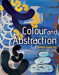
Colour and Abstraction looks at how colour was liberated from its subservient role to drawing in developing pictorial space, and how - with traditional roles broken - abstraction was born, allowing a more vibrant use of colour. As a practical book, it explores how paint can determine the colour and drawing within a painting, especially in relation to how expressive, cool, gestural, tactile or intense the work will be. This, in turn, can determine the kind of pictorial space that the artist uses, moving both toward and away from depiction. This new book encourages you to understand how colour relates to abstraction, and create a method of painting that challenges and advances your own style.
Das E-Book können Sie in Legimi-Apps oder einer beliebigen App lesen, die das folgende Format unterstützen:
Veröffentlichungsjahr: 2015
Ähnliche


Colour and Abstraction
GEORGE BLACKLOCK
THE CROWOOD PRESS
First published in 2015 by
The Crowood Press Ltd
Ramsbury, Marlborough
Wiltshire SN8 2HR
www.crowood.com
This e-book first published in 2015
© George Blacklock 2015
All rights reserved. No part of this publication may be reproduced or transmitted in any form or by any means, electronic or mechanical, including photocopy, recording, or any information storage and retrieval system, without permission in writing from the publishers.
British Library Cataloguing-in-Publication Data
A catalogue record for this book is available from the British Library.
ISBN 978 1 78500 032 4
Photography
All photographs of finished paintings by George Blacklock are courtesy of Flowers Gallery; all photographs in the tinted section Media Tools and Techniques in Chapter 5 are courtesy of Katherine Blacklock; all other photographs of studies and images are by the artist.
Dedication
To George, Katie, Ruth, and Harry
Acknowledgements
I would like to thank Matthew Flowers for his and the Flowers Gallery’s support in this endeavour, most especially Juliette O’Leary, who was fabulous. I would also like to thank my exceptionally talented daughter Katie, who took the photographs in the section ‘Media, Tools and Techniques’ in Chapter 5, and many others besides that we did not use. Also all the Blacklock clan for their support. And the University of the Arts London and Chelsea College of Arts in particular – especially the ever-patient Alex Madjitey and Betty Borthwick.
CONTENTS
Preface
Introduction
1.
The Picture Plane and Pictorial Space
2.
Drawing into Abstraction
3.
Landscape, Body and Mind
4.
Systems, Grids, Fibonacci and Phi
5.
Paint as Stuff
6.
Working in Series – The Pietas
7.
Gesture and the Theory of Joints
8.
Transcription and Abstraction
9.
The Use of Studies
10.
Inhumanities and Humanities
11.
Working Towards a Final Solution…?
Afterword
Index
Ancestral Voices 5. (Studio shot)
PREFACE
Thinking through Making
This book is not about getting you to paint like me, or even to think like me. We are all gifted with our own thought patterns and spirit – these manifest themselves in our personalities, and these differences are rewarded in painting with what is often called our ‘style’. Even when we try to adopt another style of making, we cannot help but make it our own, so you don’t have to worry about creating your own style because we do that naturally – it really is (either fortunately or not) our default position.
One of the truths about abstract painting is that intentions are often compromised and frequently improved on, by the act of making. So it is most important that you are both vigilant and persistent – these are the most important qualities to have if you want to make successful paintings.
The thoughts and pictorial ideas I have when I start a painting become enhanced by what I learn during it. I believe that if I do not learn, I don’t make an interesting painting. Making paintings that simply demonstrate what you know, may impress initially but real ideas are always about what you have learned ‘on the journey’. It is important that you concentrate your mind whilst painting so that you are ‘in the present’ and not thinking about what you would like the painting to be like, or regretting what it could have been like. Sometimes your inner mind, through its familiar interaction with the materials (and this constant interaction with the same kind of materials is an undoubted strength of painting), overrules what is in the front of your mind. On every occasion I have noticed this happening, it has always been for the better, and I have learned, and thus improved, as a painter and an artist.
The irony of this is that repeating ‘what worked last time’ never seems to work – so you adapt and move on. The fruit of your labours will attest to the rigour of your learning. Paintings thus become the product of your thinking (thinking through making). The exciting thing about making paintings (and other art objects) is that how you think and how you feel, is made real through an art object here in the world!
Pieta.
INTRODUCTION
I once watched a film of Picasso painting a picture, I think it was on glass, and I noticed that every time he made a mark he made it with absolute conviction. It was as if each mark were the final statement, even if he changed his mind (which he did a lot). I thought this was a real lesson to anyone wishing to make paintings now – that each mark you make has to have this level of conviction. Hesitant marks and decisions don’t work – they only produce hesitant or half-finished pictorial ideas. So as a matter of course, when you make your work either from the exercises in this book or in your own work, please make them at ‘full throttle’. To allow this you will have to ensure the following three things:
First, that the surface you are painting on is smooth and able to take the paint. If you are priming your own canvas, make sure you sand between coats to ensure the surface will be as smooth as you can get it. A rough or bobbly surface will interrupt the flow of your brush and consequently your thinking.
Second, be sure that you have mixed up enough paint to do the job richly. There is nothing worse if you are in ‘the moment’ when painting, to run out of the exact colour and exact consistency of paint. The result is always a bodge job, and looks it.
Third, make sure you are using the right-sized brush for the job. If you need to cover a lot of ground, and you feel bored just in covering the space, use a bigger brush!
The size and type of brush you use (or scraper or squeegee) is something you will have to feel for yourself, which is why there are no definitions of brush types in this book – any art shop will supply you with a list of brushes and their uses. I often use decorators’ brushes as they can hold a lot of paint, and I think you will find they may have to in order to create the richness of experience you want from your paintings. But no matter what sort of brushes you use, always use the most expensive you can afford, because the more expensive they are, the less they are likely to distribute hairs in your paintings.
So finally, paint with as much conviction as you can muster – no half-hearted measures.
Intimacy.
CHAPTER 1
THE PICTURE PLANE AND PICTORIAL SPACE
To discuss paintings, and particularly abstract paintings, I feel that I should first introduce the concept of pictorial space. This is the space that is realized within the rectangle of the canvas. This can be infinitely deep or as flat as the surface you are using. The invocation of pictorial space requires in turn an idea that has come to be called the ‘picture plane’. The picture plane is the actual or perceived front of the painting, and it sometimes appears to be made of glass through which you see a representation of the world or the front of a physical object.
If, for example, we are drawing a straight railroad line into a distant horizon, the space we create is measured from where the surface of the canvas begins to the depth created by the illusion. This starting point is called the picture plane. Pictorial space is what happens beyond and across this plane.
The use of perspective creates depth in our drawing (in this case ‘one point’ perspective, where everything recedes to one ‘vanishing point’ on the horizon). The interesting thing about horizon lines is that they always occur at eye level: in other words, when looking at a drawing like this we measure where we are in relation to what is depicted in the picture. This is important to understand because this is also a tool of the abstract painter.
If the horizon line is higher, it feels as if we are lower to the pictorial space – as if we were sitting or kneeling, and looking up into the pictorial space. If it is low, it is as if we were in a building higher up and looking down.
This is all well and good for traditional ‘depictive’ paintings that we have come to understand through the work of artists made since the Renaissance in Europe, and latterly through our understanding of photography. In fact we are very sophisticated regarding this kind of pictorial awareness, so much so we sometimes forget that we have it.
In the rich history of European painting we are used to seeing that pictorial space is established through an understanding of perspective – similar things, such as lamp-posts or trees, are smaller the further away they are. Colour was always used in these paintings to support this recessive quality of space. In Renaissance times painters declared space through a perspectival drawing structure (what I call a ‘here to there’ effect), but this was always reinforced through aerial or colour perspective. Atmospheric effects are realized through the use of the natural spatial properties of colour, how it advances towards or recedes away from the picture plane. We have all experienced these spatial effects when trying out different colours on our walls for interior decoration choices.
In this quick (and cock-eyed) sketch of a railway line, two things are apparent: a sense of space within the picture, and a feeling of where you are in relation to that space – you could be in the cab of a locomotive.
We are sitting in a building across the road from the red building and opposite the chair in this room space; we can see the top of the chair seat, but under the lamp.
The coloured shapes here are relatively near or further away from the ‘picture plane’; some seem more advanced towards us than others.
The Mona Lisa
In the case of a famously ‘real’ depiction, Leonardo’s Mona Lisa, the distant hills are made ‘real’ through the green/blue tint applied to the drawn landscape.
If we look at the Mona Lisa we will see that the mountains and hills in the background of the sitter (La Giaconda) are painted in a sort of faded blue/green series of tints, whereas nearer the foreground Leonardo makes use of richer and bolder colours and tones. This adds to the pictorial space that Leonardo is creating in his work.
I have reproduced the blue/green tints of the landscape behind La Giaconda in this collage, as you can see from the left panel. Once the collaged photograph of the figure is set in the picture you can see the background sits very comfortably behind the figure, in effect throwing the figure forwards.
If you look at distant mountains in the landscape, they appear to have a ‘thin’ green/bluish tinge. In most landscape paintings you will see this applied to declare pictorial space with what has been called variously atmospheric colour, or aerial perspective. The distant hills/mountains in these paintings are nearly always painted in blues and greens to establish a sense of recessive space in the background of the painting. The way that colours react to each other in this way (relative to each other in terms of pictorial space) is a fundamental aspect of paintings dating from the last half of the nineteenth century when impressionism emerged as a formidable presence in the European art world.
Once artists were able to purchase oil colour, ready mixed and in (portable) tubes on a more commercial level, they could work outdoors in the natural light of the world they were depicting. And this in turn led to colour becoming a clear focus for their invention around the ‘usual’ rules of declaring pictorial space.
Fauvism
Having understood the role that colour played in traditional paintings, the Fauvists ran riot against all the rules that had been carefully ordered to reproduce a kind of space that would fool the eye into believing the space in these paintings was exactly like the world we see outside. The paintings the Fauvists made, through a more playful use of colour (relative to this traditional use), were exhibited and received with alarm by the critics and public at the time – resulting in the name we know them by today (‘fauve’ translates as ‘wild cat’ from the French).
The first thing you find when looking at a Fauvist painting is that there is no sense of believable space. There are houses and trees and rivers detectable in their paintings, but they are signs and signifiers, and there is no attempt to ‘fool the eye’. If you try and paint a landscape within this method you will find that there are areas of space that do not ‘feel’ right compared to what we know about space. In this way the Fauvist painters disconnected colour from its role in supporting the depiction of a believable space to become increasingly the subject of the painting. In doing this they created a new focus for, and construction of, pictorial space.
In this seascape I have deliberately used vibrant colour throughout, and this ‘throws’ the drawing structure so there is no sense of a ‘here-to-there’ believable space. As a real depiction the whole image sits uncomfortably: instead we are treated to a colour fest where the real subjects of the painting are the colour harmonies and dissonances. This is an exercise that you can play with to see what alternative kinds of space and moods can be created through using this method.
Although I have used Fauvism as a focus of this phenomenon for the purposes of this book, in truth Fauvist painting is the product of a gradual process of interests and development (learning) in the use of colour from Manet through impressionism to the post-impressionist paintings that predate them. Vivid signposts to this ‘release’ of colour from its subordinate role are found in the work of Gauguin and Van Gogh.
Once this particular hare had been set running, the idea of questioning the role of all aspects of pictorial convention was inevitable. The focus of artists in the twentieth century became much more on increasing invention. In other words, artists developed the habit of asking the question ‘why not this?’ – an approach which led, inevitably, into abstraction: why does painting have to depict anything other than itself?
Henri Matisse was a noted Fauvist painter, as indeed was Georges Braque. The work they did following this explosion of colour was vital to the development of painting in the twentieth century. Braque then focused on the drawing structure within the newly established ‘non-natural looking’ pictorial space – why have perspectival space at all? He was a significant member of a group of artists, including Picasso, who invented a new structure to pictorial space we now call cubism – and cubism, as we shall see in the next chapter, is another significant signpost towards abstraction.
Matisse concentrated specifically on the role colour could play in creating a tension with the declared drawn space (he would still use fairly conventional drawing structures in his landscapes and still lives). He wanted his colour to undermine the, by now simplistic, ‘here to there’ intention of the space receding from the picture plane. His use of colour creates a tension in what the drawing wants to do with what the colour wants to do, and a major part of Matisse’s work focuses on this creative tension.
Moving towards Abstraction
Hans Hoffman (having emigrated from Europe to America) was influenced greatly by this aspect of Matisse’s work; his work focused on what he famously called the ‘push and pull’ effect to describe the creative tension in his use of colour in his paintings. However Hoffman, influenced also by the reorganization of pictorial space typified by the cubist work of Picasso and Braque, did not use perspectival drawing at all: he used completely abstract shapes, often utilizing rectangles of overlapping colour on boldly coloured grounds. So we have arrived at a significant level of abstraction, and this will be a good point at which to try and understand more about the relationship of colour to abstract pictorial space.
The coloured squares in this study after Hoffman all hold differing positions relative to the front of the picture plane. Although some are seemingly behind others, they are pushing forwards from what seems their ‘logical’ position. Thus the blue in front of the orange is being ‘pushed’ forwards: although its natural colour space is behind the orange, it appears to be in front. This creates a pictorial tension, and colour used in this way is an example of what Hoffman called the ‘push/pull’ of pictorial space.
Internet search
Look up Fauvism; Georges Braque; Henri Matisse; Hans Hoffman.
On the following pages you will see exercises in looking at the way colour ‘sits’ in space relative to other colours; try this out yourself within a basic range of shapes and drawing structures. Most of these exercises are done on a small scale – postcards are good for a lot of them – although you will find that as you modulate the ground colours you will need to invest in watercolour paper or pads.
I have tried to point out how other abstract painters have developed these properties of colour in their own work through the further study indents. Please utilize the internet to get an idea of these works, but wherever possible look out for these artists in museums and galleries.
Purposeful Play
Before you embark on these exercises, you must be cognizant of one of the most important tools in any abstract artist’s toolbox: the ability to be able to take part in play – but the purpose of play is always to find something out. This purpose requires that you are able to let your imagination run, and also that you are extremely vigilant. Play is never wrong, and in fact should be cultivated and implemented even in the direst of situations, but the ever-present twin of purposeful play is extreme vigilance. Vigilance and play are to be cultivated, and one of the great things about painting is that as you make, you learn more; and as you learn more you become increasingly vigilant.
Exercises
In this section we will take a series of colour-block exercises.
As you will see, colours occupy a different space when seen next to one another: some colours advance, others recede relative to each other in a white-ish space. It becomes clear that, as in our Fauvist landscape, colour juxtaposition can create a creative tension between natural colour space (how colours advance and recede) and the drawing structure of your painting. In other words you can create a clash with what you know to be true, and the illusion created by the colour. A general rule in trying to understand colour space is that paler, cool colours recede, and stronger, warmer colours advance.
It is worth noting here that colour responds differently on a coloured ground to when it is on a white ground. The role of white changes things completely, and instead of having a situation where on a white ground it is impossible for a colour to be lighter than it, so all colours used are darker than the ground. When we use a coloured ground, we have a use of colour space that I think has more depth; it certainly feels rounder and more spatial (and less harsh). On a coloured ground, any shapes or marks in white are active elements within the pictorial space, rather than the restrictive static role of the ground colour.
These are just postcard-sized exercises and play – you can do your own set of these to learn more about how colours relate to each other: this could be an endless series of cards – all artists have made notes to themselves in exercises such as these, they help in creating their work, so please don’t underestimate the work done here.
This one is simple: paint blobs of different colours with space between each on a white card. Note how they all appear to advance or retreat in an imaginary space next to each other: this is the natural ‘colour space’ of each hue.
Vary these exercises yourself, for example looking at the same colours but different types – cadmium yellow with a lemon yellow… or wildly different tones and hues – let yourself go.
Of course you do not have to be in any way restrictive, and in fact you will find that once the genie of unrestricted colour is out of the bottle, abstraction came out too.
I do not exclude black from any discussion of colour, mainly because black can be modified so that it has varied colour tones within it; a greenish black or a reddish black can still operate as a black in any picture, but still have a colour relationship to those around it. You can also mix a black through mixing primary colours in varying quantities, or more easily by using viridian green and alizarin crimson (having Prussian blue and a yellow handy for variables). So I do not see black as a non-colour.
To play with this further I have collaged a series of blocks of colour next to each other in the white space of a sheet of paper (you can do this on white primed canvas if you wish). When you try this exercise you will discover the need to vary what can quickly become a dry and academic process.


