36,99 €
Mehr erfahren.
- Herausgeber: John Wiley & Sons
- Kategorie: Geisteswissenschaft
- Sprache: Englisch
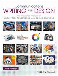
Communications Writing and Design is an integrated, project-based introduction to effective writing and design across the persuasive domains of communication.
- Build a strong foundation of core writing and design skills using professionally-designed examples that illustrate and reinforce key principles
- Readers learn and analyze techniques by creating 15 projects in marketing, advertising, PR, and social media with the help of strategy suggestions, practical tips, and professional production techniques
- Written by an experienced professional and teacher, with a focus on the cross-disciplinary nature of contemporary communication work
- Learning is reinforced through a variety of pedagogical features: learning objectives, helpful mnemonics, real-life projects and applications, chapter references for further study, and end-of-chapter summaries and exercises
Sie lesen das E-Book in den Legimi-Apps auf:
Seitenzahl: 350
Veröffentlichungsjahr: 2017
Ähnliche
Communications Writing and Design
The Integrated Manual for Marketing, Advertising, and Public Relations
John DiMarco, Ph.D.
This edition first published 2017
© 2017 John DiMarco
All rights reserved. No part of this publication may be reproduced, stored in a retrieval system, or transmitted, in any form or by any means, electronic, mechanical, photocopying, recording or otherwise, except as permitted by law. Advice on how to obtain permission to reuse material from this title is available at http://www.wiley.com/go/permissions.
The right of John DiMarco to be identified as the authors of the editorial material in this work has been asserted in accordance with law.
Registered Offices
John Wiley & Sons, Inc., 111 River Street, Hoboken, NJ 07030, USA
Editorial Office
1606 Golden Aspen Drive, Suites 103 and 104, Ames, Iowa 50010, USA
For details of our global editorial offices, customer services, and more information about Wiley products visit us at www.wiley.com.
Wiley also publishes its books in a variety of electronic formats and by print-on-demand. Some content that appears in standard print versions of this book may not be available in other formats.
Limit of Liability/Disclaimer of Warranty
While the publisher and authors have used their best efforts in preparing this book, they make no representations or warranties with respect to the accuracy or completeness of the contents of this book and specifically disclaim any implied warranties of merchantability or fitness for a particular purpose. It is sold on the understanding that the publisher is not engaged in rendering professional services and neither the publisher nor the author shall be liable for damages arising herefrom. If professional advice or other expert assistance is required, the services of a competent professional should be sought.
Library of Congress Cataloging-in-Publication Data
Hardback ISBN: 9781119118909
Paperback ISBN: 9781119118879
Cover Design: Wiley
Cover Images: (From Left to Right and Top to Bottom) © angellodeco/Shutterstock; © ESB Professional/Shutterstock; © Bosca78/Gettyimages; © alterfalter/Shutterstock; © Scanrail1/Shutterstock; © z_amir/Fotolia; © Brothers Good/ Shutterstock; © B & T Media Group Inc./Shutterstock; © VLADGRIN/Gettyimages; Martin Bond/Alamy Stock Photo; © Rawpixel.com/Shutterstock; © VLADGRIN/Gettyimages; catalog, courtesy of author; © aleksandarvelasevic/Gettyimages; © Niloo/Shutterstock; © Artnis/Shutterstock; (Background) © jeremykramerdesign/Gettyimages
Set in 10/12pt WarnockPro by Aptara Inc., New Delhi, India
Contents
Acknowledgements
Foreword
Preface
Objectives
Method
1 The Connectivity between Research, Writing, and Design
1.1 The anatomy of a text, a document, and a work
1.2 Research
1.3 Writing
1.4 Design
1.5 Summary
1.6 Chapter exercises
Chapter references
2 Writing Technical, Persuasive, and News Communication
2.1 Writing for “Marcom ” touchpoints
2.2 Effecting persuasion
2.3 Getting raw material for writing projects
2.4 Marketing communications writing: technical, persuasive, and news
2.5 Technical writing
2.6 Persuasive copywriting
2.7 News writing
2.8 Writing tool belt — essential skills
2.9 Essential grammar rules
2.10 Five common writing mistakes to avoid
2.11 Five steps to find writing success
2.12 Chapter exercises
Chapter references
3 Communication Design
3.1 Communication design solves problems
3.2 Design direction
3.3 Communication design components
3.4 Layout
3.5 Typography
3.6 Images
3.7 Color
3.8 Common design mistakes to avoid
3.9 Chapter exercises
Chapter references
4 Creative Research Methods
4.1 Understand, research, then execute
4.2 Design process—seven steps
4.3 Briefs: creative, design, and scope
4.4 Design and market research methods
4.5 Creating visual forms on paper
4.6 Chapter exercises
Chapter references
5 Design Tools
5.1 Digital design tools for communication designers
5.2 Essential image production concepts
5.3 Digital color spaces (RGB and CMYK )
5.4 Resolution, size, and output formats
5.5 Chapter exercises
Chapter references
6 Marketing Projects
6.1 Logotype and brandmark
6.2 Business card, letterhead, envelope — company stationery
6.3 Product packaging
6.4 Collateral brochures
Chapter references
7 Advertising Projects
7.1 The Ayers No. 1 ad defined
7.2 Posters and billboards
7.3 Ad specialties
7.4 Postcards
7.5 Banner ads
Chapter references
8 Public Relations Projects
8.1 Public relations / News release
8.2 Public relations / Fact sheet
8.3 Public relations / Backgrounder
8.4 Public relations / Annual report
8.5 Public relations / Infographic
Chapter references
9 Social Media for Marketing, Advertising, and Public Relations
9.1 Social media defined
9.2 Research for social media
9.3 Writing for social media
9.4 Social media design
9.5 Social media checklist
9.6 Social media examples
9.7 Chapter exercises
Chapter references
Index
Eula
List of Tables
Chapter 2
Table 1
Table 2
Table 3
Table 4
Table 5
Table 6
List of Illustrations
Chapter 1
Figure 1.1
From Complex to simple. Text, document, and work are the result of research, writing, and design. Illustration by John DiMarco.
Figure 1.2
Data drives campaigns. The “Truth” campaign uses hard data in the form of statistics to persuade young adults to stop smoking. The website and ads encourage millennials to be the generation that disavows smoking by showing a statistical trend leaning to success and feasibility, thus empowering them as group to be seen as making a historical contribution to society. www.truth.com.
Figure 1.3
Writing systems and symbols. Screenshot from Google Translate.
Figure 1.4
Linguistic value moves across image, text, and sound.
Figure 1.5
The use of design to illustrate biology goes back to the origins of science. This modern day example shows how beautiful and meaningful the connection between text and image can be. Design by D.J. Stout, Pentagram. Reproduced with kind permission of Pentagram.
Figure 1.6
Marrying text and image requires great care and can illicit precise meaning as we see with the Franklin Mills logotype and brandmark created by legendary graphic designer Milton Glaser. The image of a kite, with a lightning bolt nested inside, together offer an icon representing exploration and innovation. The graphic provides an index, pointing to Benjamin Franklin, cleverly connecting to our elementary history and science lessons with the geography of the iconic shopping mall. The final element, the logotype symbol is words, which lose abstraction when added to mark.
Chapter 2
Figure 2.1
Integrated communications touchpoints use technical, persuasive, and news writing.
Callout 2A
Identification, trust, clarity, and action are strategies for effecting persuasion (adapted from Bivins (2011). Design by Luke Hayman, Pentagram. Reproduced with kind permission of Pentagram.
Figure 2.2
Identification, trust, clarity, and action are evident in this advertisement for the Public Theater. Design by Paula Scher. Reproduced with kind permission of Pentagram.
Callout 2B
Ways to build data sets for writing and design.
Figure 2.3
a and b.
Visualizations marry data, writing, and design to make sense and connection of complex information through visual space. Design by Lisa Strausfield. Reproduced with kind permission of Pentagram.
Figure 2.4
Corporations, agencies, and organizations engaged in science and technology products, services, and causes use technical writing in their communications vehicles. IBM and the IBM logo are trademarks of International Business Machines Corp., registered in many jurisdictions worldwide.
Figure 2.5
Technical writing is the core writing style in technical communication, practiced by corporations, agencies, and organizations engaged in science and technology products, services, and causes. Here, this dog-eared Lego manual offers the framing, preparation, and steps needed to complete the task and create the intended design – without needing words.
Figure 2.6
a and b
Statistics reveal new meaning about the relevance of the data to the reader in the form of well-designed graphics. A collaboration of design, writing, data, and publishing, Pentagram's Michael Bierut and Britt Cobb worked on the design of the book with SHoP Architects’ Omar Toro-Vaca and Ryan Lovett, and Metropolis Books publisher Diana Murphy.
Figure 2.7
Good persuasive copywriting grabs the reader and makes them look closer. Notice the “you” viewpoint ” being used to “reconnect” with a vibrant customer base. Design by Turnstyle. Reproduced with kind permission of Turnstyle.
Figure 2.8
This brochure for Seattle University shows off technical, persuasive, and newswriting with a crisp concept that initiates action with meaningful headlines and one unifying word…“here.” Design by Turnstyle Studio. Reproduced with kind permission of Turnstyle.
Figure 2.9
The news magazine is written and designed to gain maximum interest while still providing newsworthy information relevant to readers’ lives. This spread from the “Brave Thinkers” list in
The Atlantic
shows the marriage between design and news writing. Design by Luke Hayman, Pentagram. Reproduced with kind permission of Pentagram.
Figure 2.10a
Small multiples with birds-eye view This spread provides small multiples of chunked information in a macro-micro driven layout that gives a birdseye view (macro) coupled with data from the ground (micro). Design by DJ Stout, Pentagram. Reproduced with kind permission of Pentagram.
Figure 2.10b
Micro/Macro design. This table of contents spread uses micro headlines in a small multiple layout that guides the reader across the macro message that Drexel University produces outstanding research. Design DJ Stout, Pentagram. Reproduced with kind permission of Pentagram.
Callout 2C
Editing process simplified.
Source
: Adpated from Metz (1991).
Figure 2.11
Editing on paper Use these common symbols when editing using a paper copy or proof.
Figure 2.12
Editing in Microsoft Word using track changes. Use track changes in Microsoft Word to keep a running record of edits throughout the life of a document. You look at markup, original, or both. See your edits and draft simultaneously.
Chapter 3
Figure 3.1a
Advertising layout. Using a typographical play with the word “any,” this outdoor advertising campaign and graphic program focuses on persuading tourists and city dwellers to visit the observation deck at the top of 30 Rockefeller Center, the landmark 70-story skyscraper in New York. Design by Michael Gericke, Pentagram. Reproduced by kind permission of Pentagram.
Figure 3.1b
Editorial layout. Creating interest for information through enigmatic imagery and clean typography, this editorial page, designed by Pentagram, highlights the commitment of the
New York Times
to the marriage of thoughtful and impactful writing with superior design. Design by Michael Bierut, Pentagram. Reproduced by kind Permission of Pentagram.
Figure 3.1c
Public relations layout. Driven by facts and company pride, this pressroom, public relations layout presents the virtues of IBM, its people, mission, and products through facts, writing, and design, http://www.ibm.com/ibm/us/en/. IBM and the IBM logo are trademarks of International Business Machines Corp., registered in many jurisdictions worldwide.
Figure 3.1d
Marketing layout. Driven by san serif typography, this identity for DRY Soda Co offers a marketing platform form signage, retail packaging, and visual merchandising. Design by Turnstyle. Reproduced with kind permission of Turnstyle.
Figure 3.2a
Grid usage rules. Understand the 3 × 3 grid rules first, and then break them to explore new approaches. Any element placed on the page must occupy one, two, or three full (with margin) vertical, horizontal, or diagonal sections of the grid. Design elements including type, image, or interactive objects should not land in the middle of a grid square or extend across a portion of it. The red circles represent where naturally the eye is drawn.
Figures 3.2b and c
Grids in action. The grid in 3.2b clearly organizes the text in this publication, which uses a three-column grid on the left side and a two-column grid on the right. In 3.2c, a book spread exemplifies the rule of thirds and the law of thirds. Notice how the dominant elements intersect the red circles, where attention is highest. Design by Turnstyle. Reproduced with kind permission of Turnstyle.
Figure 3.3
BANGPP checklist. BANGPP offers a simple checklist of criteria when looking at a layout. Use BANGPP with a 3 × 3 grid to have a reliable visual approach to designing anything on paper or a screen. Design by John DiMarco.
Figure 3.4
Balance example. Design by Paula Sher, Pentagram. Reproduced with kind permission of Pentagram.
Figure 3.5
Alignment example. Design by Michael Bierut, Pentagram. Reproduced with kind permission of Pentagram.
Figure 3.6
Negative space example. Design by DJ Stout, Pentagram. Reproduced with kind permission of Pentagram.
Figure 3.7
Grouping example. Design by Njenworks.
Figure 3.8
Proximity example. Design by D.J. Stout, Pentagram. Reproduced with kind permission of Pentagram.
Figure 3.9
Perimeter edge example. Design by DJ Stout, Pentagram. Reproduced with kind permission of Pentagram.
Callout 3A
Fonts are files too.
Figure 3.10
Stay in the font family for consistency. Font families contain various styles of a typeface (Futura, for example) such as bold, book, black, heavy, oblique, plus more. Use fonts in one family for an easy way to achieve consistency when you are unsure of how to mix fonts.
Figure 3.11
Fonts that go beyond serif and sans serif: Slab serif, Script or cursive, Black letter, Decorative, Symbol.
Figure 3.12
Characters and type. Character palette from Adobe Photoshop. Once you understand the basic attributes of type, you can apply your knowledge across applications.
Figure 3.13
Type attributes. Typography is the art of setting type. It requires understanding and keen appreciation of characters and the attributes that give them beauty and uniqueness.
Figure 3.14
Paragraph positioning. Paragraph attributes palette in Adobe Photoshop. Once you understand the basic attributes of paragraphs, you can apply your knowledge across applications.
Figure 3.15
Display type and body text. The display grabs the reader visually (readability) and the body explains the details clearly (legibility). The prop for the anniversary poster for AIGA/NY is a mix tape the designer created for the organization's launch party in 1983. Design by Michael Bierut, Pentagram. Reproduced with kind permission of Pentagram.
Figure 3.16
Readability and legibility in harmony. This book design presents New York City's design guidelines for promoting physical activity in the urban environment, to help address the twenty-first-century health concerns of obesity and related chronic diseases. Design by Luke Hayman, Pentagram. Reproduced with kind permission of Pentagram.
Figure 3.17
Hierarchy and consistency help readers digest. This spread for the Fact Book for USC's College of Letters, Arts, and Sciences creates visual hierarchy and structure using typography choices of font, size, color, and placement. Design by DJ Stout, Pentagram. Reproduced with kind permission of Pentagram.
Figure 3.18
Typography elements in beautiful harmony. This spread by Luke Hayman for
Time
magazine illustrates all the critical elements of readability and legibility. The exploded view shows responsible typography in action and breaks down what components need serious consideration when setting long form type. Can you find examples of each element?
Figure 3.19
The need for photography. Photography is a critical element across marketing, advertising, and public relations pieces as it is a main source of content. Design by Turnstyle. Reproduced by kind permission of Turnstyle.
Figure 3.20a, b, and c
The value of illustration. Illustration is used in marketing, advertising, and public relations to visualize information, create visual identity, and alter realism. Logotypes, brandmarks, charts, and drawings are all illustrations. Packaging uses illustrations extensively. Design by Turnstyle. Reproduced with kind permission of Turnstyle.
Figure 3.21
Motion graphics are used in interactive and web projects and require attention to rhythm, timing, and space.
Figure 3.22
Shape, color, and form in sequence. We see shapes first, and then color, and then we make sense of form (Wheeler 2006). This illustrates how important the design of a mark is to the identity and cognition to consumers.
Figure 3.23
The artists’ color wheel (ROYGBV). Color wheel with primary, secondary, intermediate, warm and cool colors. Design by Kristen Crawford. Reproduced with kind permission of Kristen Crawford.
Figure 3.24
Warm and cool colors.
Figure 3.25
Monochromatic color example. Design by Turnstyle. Reproduced by kind permission of Turnstyle.
Figure 3.26
Complimentary color example. Design by Turnstyle. Reproduced by kind permission of Turnstyle.
Figure 3.27
Analogous color example. Design by Turnstyle. Reproduced with kind permission of Turnstyle.
Figure 3.28
Contrasting color example. Design by Turnstyle. Reproduced with kind permission of Turnstyle.
Figure 3.29
Grayscale color example. Design by Turnstyle. Reproduced with kind permission of Turnstyle.
Figure 3.30
Black plus one. Black plus one color scheme using a knockout (reverse logotype) over black. Design by Turnstyle. Reproduced with kind permission of Turnstyle.
Figure 3.31
The personality of color. These snowboards show a range of color palettes with different visual appeals. Design by Turnstyle. Reproduced with kind permission of Turnstyle.
Chapter 4
Figure 4.1
GACMIST, put forth by DiMarco (2010), provides a vital starting point for establishing the components needed for a visual communication. Design by Elise Cruz. Reproduced with kind permission of Elise Cruz.
Figure 4.3
Brainstorm to somewhere. Brainstorming sessions need moderators and should conclude with useful flowcharts, mind maps, or lists that illustrate direction in ideas. Photography by Diana Colapietro and Megan Monfiston. Reproduced with kind permission of Diana Colapietro and Megan Monfiston.
Figure 4.4a
Concentric circle method and emotional center. For this method, generate keywords during brainstorming. Then add the keywords and place the most important nearest to the center (emotional center) of the concentric rings. Isolate words that are most important, most moving, and most connected to the potential audience. Then harvest the best words for use in tag lines, ads, and messaging.
Figure 4.4b
Concentric circle exercise in practice. This student spec ad project example shows how the concept process evolves to a digital design comp. Design by Elise Cruz. Reproduced with kind permission of Elise Cruz.
Figure 4.5a
Textual mind maps. Mind maps can text to show idea branches. Design by Artiana Winder. Reproduced with kind permission of Artiana Winder.
Figure 4.5b
Illustrated mind maps. Mind maps can use images to illustrate connections between concepts. Design by Nick Heller. Reproduced with kind permission of Nick Heller.
Figure 4.6a
Observation in ethnography. The image above shows an observation of communication confusion using an interface. This provides information on the environment, employee feelings, and customer problems. Use observations as a source of data for interview questions. Interview subjects to gain data on thoughts, feelings, attitudes, and emotions.
Figure 4.6b
Interviewing in ethnography. Interviewing people in their environment is a great method for revealing what is under the surface. Photography by Diana Colapietro and Megan Monfiston. Reproduced with kind permission of Diana Colapietro and Megan Monfiston.
Figure 4.7a, b, and c
From sketch to layout. Sketching to layout starts at thumbnail and ends with a “comp,” which is short for composite artwork. A comp is a layout ready for review and proofing. Design by Kristen Crawford. Reproduced with kind permission of Kristen Crawford.
Figure 4.8
Storyboards show action. This storyboard screenshot from agency DDB Canada's website shows the makings of a product video for the Subaru WRX. The storyboard was integral to the video shoot as a planning tool, as well as a visual prop used to bypass live action filming issues, http://www.ddbcanada.com/#/Home/SubaruWRX.
Figure 4.9
Mapping user pathways. Integrated sitemaps provide a vision of scope and flow for a user interface (UI) and user experience (UX) project.
Chapter 5
Figures 5.1a and b
Box based layouts. Page layout programs use box based frames to place text and graphics on a digital page. Adobe InDesign (bear) is used for professional projects requiring press quality output and color management features. Microsoft Word (art), which uses inline text and box based layout tools also is used for word-processing, text editing, and layout of documents printed on desktop printers.
Figure 5.2
Slides to e-Learning. Presentation slides from PowerPoint can also be output into e-learning courses with interactive learning features and quizzes for product videos and training. Audio, controls, and interactivity tools create a new experience for the passive viewer, who now becomes the active user. This type of design is training based, which is used in product marketing, professional development, and organizational learning.
Figure 5.3a
Pixels are picture elements. Raster images consist of pixels, which can be manipulated using programs like Adobe Photoshop. Zoomed in to 3200%, the pixels become clear.
Figure 5.3b
Photoshop for layouts. Programs like Adobe Photoshop also work well as layout tools for print and screen designs and for creating graphics that are imported into other applications.
Figure 5.4a
The mighty pen tool. Vector images are a series of anchor points and line segments, which are the heart of drawing and design with programs like Adobe Illustrator.
Figure 5.4b
Branding elements come from vector graphics. Logotype and brandmarks are created using drawing and design techniques with vector programs like Adobe Illustrator. Design by Michael Calandra. Reproduced with kind permission of Michael Calandra.
Figure 5.4c
Illustration as an alternative to photos. Vector images can be created using shapes, type, or manually with the “Bezier” Pen tool. This product illustration in Illustrator shows an alternative image to a photograph, which may be more easily understood in an instruction guide. Illustration by John DiMarco.
Figure 5.5a
Lowering opacity. Using sliders in programs such as Adobe Photoshop provides an adjustment of pixel depth in images or text that allows show through or overlay create visual contrast and a “screened over” look. Notice how the display text lowered to 40% opacity, allows a see though effect and blending with the image.
Figure 5.5b
Type as image. Lowering opacity creates opportunities to develop type as image. Design by John DiMarco.
Figures 5.6a and b
The power of selections. Selections in Photoshop allow you to clip out pixels in an image to select exactly the parts you want. You can drag pieces of images into other images to create new graphics and have control to overlap images and type.
Figure 5.7
Compositing artwork. Layers and compositing are essential tools for creating photorealistic artwork in all types of advertising designs. There is no need to book a photoshoot with a giraffe and bird in an office hallway. Skillful assembly using layers, and then applying a blur to the background in Adobe Photoshop offers the perfect design solution. Design by Turnstyle. Reproduced with kind permission of Turnstyle.
Figure 5.8
Color comes from light or pigment. The RGB color model is based on light. The CMYK color model is based on ink pigments. RGB is the color model used for communication design output to screen. CMYK is the color model used for communication design output to paper. Illustration by Kristen Crawford. Reproduced with kind permission of Kristen Crawford.
Figure 5.9
Web colors. The web safe color palette in Adobe Photoshop shows the 216 common colors across computer platforms and browsers.
Figure 5.10
Pantone colors for the perfect match. Matching spot color requires using Pantone swatch books during conceptualization, then using the same electronic swatch book in Adobe Illustrator, Photoshop, or InDesign for outputting files. IBM officially requires Pantone equivalent 2718C. Pantones are spot color, or “premixed ink off the shelf,” so they are consistent color on press. IBM and the IBM logo are trademarks of International Business Machines Corp., registered in many jurisdictions worldwide.
Figure 5.11
Packaging files for final output. The Package command in InDesign collects all the files needed for commercial output to a printing press and PostScript printer. It provides a “prepress checklist” that insures that fonts, image links, and color profiles are not missing or damaged before going to the device. The images and fonts are “called” by either the print server or the web server so that they can be ripped or uploaded accordingly. Regardless of the project, remember that all image files and fonts must be included in one location for print projects, motion, video, and web projects.
Chapter 6
Figure 6.1a
The anatomy of a “logo.” In this case, the design contains a brandmark and logotype, which can work individually to represent the brand and together within the full signature. Design by John DiMarco.
Figure 6.1b
The variety of marks. Line, text, and image create unlimited possibilities when it comes to logotypes and brandmarks. Design by Paula Scher, DJ Stout, Natasha Jen, and Michael Gericke, Pentagram. Reproduced with kind permission of Pentagram.
Figure 6.1c, d, e, and f
Touchpoints across a brand. This non-profit brand identity shows the different usages developed incorporating logotype, brandmark, and full signatures with taglines clearly communicating purpose and requisite brand division. Design is the bond that visually and functionally ties the different media together. “The branding is built around a friendly and accessible mark that is designed to appeal to everyone from park visitors to policy makers.” Design by Michael Bierut, Pentagram. Reproduced with kind permission of Pentagram.
Figure 6.1g and h
Iconic and indexical mark. The millennial leaning update for Microsoft Windows 8 marries logotype and brandmark with exquisite clarity, simplicity, and friendly functionality. Design by Paula Scher, Pentagram. Reproduced with kind permission of Pentagram.
Figure 6.2a
Popping with color. The stationery set for this power company shows a clear, engaging brand identity through color and consistent placement of elements throughout the card, letterhead, envelope, and folder. Design by Natasha Jen, Pentagram. Reproduced with kind permission of Pentagram.
Figure 6.2b
Iconic identity uses shape and color to define the identity. This design uses an environmental palette with different earth tone papers and organic images to transcend nature through the stationery set. Design by Turnstyle. Reproduced with kind permission of Turnstyle.
Figure 6.2c
White space as design element. Clean and crisp, and keeping printing costs low, this design uses white space as an effective design element in the stationery, plus a branded writing instrument. Design Natasha Jen, Pentagram. Reproduced with kind permission of Pentagram.
Figure 6.3a, b, and c
Illustration in package design. This packaging shows incredible use of illustration (rather than photography), color, and typography to provide important nutritional and product information for a kid focused mac and cheese brand. Design by Turnstyle. Reproduced with kind permission of Turnstyle.
Figure 6.3d
Culture in content. This food package marries cultural identity with a comic book like graphics in small multiples to establish a brand experience that engages you, rather than just providing a way to transport Chinese fast food takeout. Design by DJ Stout, Pentagram. Reproduced with kind permission of Pentagram.
Figure 6.3e
Clarity through negative space. Sheik, smooth, sultry, and stylish is the only way to feel about this hair product line, Seven. Notice how negative space is vital to the modern design. Design by Turnstyle. Reproduced with kind permission of Turnstyle.
Figure 6.4a
Make a dummy first. Design with folding in mind. Mock up brochures on blank paper, which helps you panel out content before using the computer.
Figure 6.4b
Open with a question, and then explain the solution. This brochure opens with a headline that asks a question and then flows to a subhead with the solution. Body copy and illustrations weave in visual and contextual cues introducing features and benefits. These features and benefits support the unique selling proposition, the solution of the lower costs over time, which sets the company apart from competitors. Design Natasha Jen, Pentagram. Reproduced with kind permission of Pentagram.
Figure 6.4c and d
Ask for action. This non-profit brochure highlights facts and focuses chunked copy on academics, essentials, and advocacy. Notice the call to “get involved today” in the “action” panel. The brochure copy voice is third person and the response form is first person. Design by Turnstyle. Reproduced with kind permission of Turnstyle.
Figure 6.4e and f
Newsletters, the news and promotion vehicle. Newsletters act as collateral also. They are brochures that mix newswriting, persuasive copywriting, and technical writing into an organizationally branded publication. This piece marries the brand identity and brand language into sections that illuminate the core activities, announces events, and espouses the virtues of giving. Design by Turnstyle. Reproduced with kind permission of Turnstyle.
Figure 6.4g and h
The interactivity of print brochures. Interactivity is not just for the screen. This accordion fold brochure offers perforated postcards to send or put on a bulletin board to remind the reader to “Take Travel Back.” The copy uses repetition in the opening sentence of each text block, “This isn't about,” solidifies the meaning of the message and its purpose. Design by Turnstyle. Reproduced with kind permission of Turnstyle.
Chapter 7
Figure 7.1a
Check the specs before you start to design. The
GQ
magazine advertising specs offer agencies and designers clear guidelines for print and digital media. Make sure you contact the advertiser in advance of producing your digital artwork, regardless of online or print delivery. This helps ensure that the design meets critical specifications.
Figure 7.1b
The marriage of copy writing, image, and layout using small multiples. This clever ad uses the Ayers No. 1 format with a unique selling proposition of “improving intelligence.” Design by Milton Glaser. Reproduced with kind permission of Milton Glaser.
Figure 7.1c
The power of visual dominance. This Ayers No. 1 format ad creates an emotional connection to the reader and humankind using only a headline. Design by Milton Glaser. Reproduced with kind permission of Milton Glaser.
Figure 7.2a
Experiment with art elements and principles. This poster uses text, color, shape, juxtaposition, and negative space to create intriguing poster that grabs the viewer. Design by Paula Scher, Pentagram. Reproduced with kind permission of Pentagram.
Figure 7.2b
Tell the story. This billboard uses though-provoking images to attract viewers. Design by Paula Scher, Pentagram. Reproduced with kind permission of Pentagram.
Figure 7.2c
“This is a poster,” poster. This poster shows the elegance of simplicity and the enigmatic power of headlines. No image is needed to draw in your curiosity here. Design by Angus Hyland and Fabian Herrmann, Pentagram. Reproduced with kind permission of Pentagram.
Figure 7.3a
Using design to promote. This self-promotion kit shows off the firm's design skills while contributing to their brand presence in the lives of clients. Design by Turnstyle. Reproduced with kind permission of Turnstyle.
Figure 7.3b
Invitation design with practical purpose. This design firm's anniversary Halloween party invitation acts as an ad specialty item offering a few masks to help invitees get in the mood. Design by Turnstyle. Reproduced with kind permission of Turnstyle.
Figure 7.3c
Keep it simple. Size, placement, substrate, and color are critical decisions when designing advertising specialty items. Design by Natasha Jen, Pentagram. Reproduced with kind permission of Pentagram.
Figure 7.4a
The postcard offers a small billboard to advertise your ideas and in some cases a collection piece for the recipient to savor. This military postcard shows the prowess of this United States Air Force base.
Figure 7.4b and c
Postcard designs should sell. The postcard should offer something of value to the consumer. When writing copy, ask questions and highlight features, and insert the USP. Stay true to design specifications, especially if mailing the piece. This postcard for training and professional development abides by the 60/40 rule and leaves ample space for label, postage, and USPS processing marks.
Figure 7.5a
Banner campaigns calling for action. This Dr. Pepper banner ad campaign invites you to support Larry as a playoff trophy presenter. The action is for you to “sign the petition,” which creates a digital connection to the brand. Notice the 1000 × 90 and 300 × 250 banners sit together on one web page with a consistent creative focus.
Figure 7.5b
Banner campaigns inviting old school viewers. This MTV2 banner ad campaign on a college rating site invites you to watch
Saved by the Bell
, just like when you were a kid. Notice the campaign banners in this impression set focus on one memorable character. Notice the 728 × 90 and 300 × 250 banners sit together on one web page and share one message.
Chapter 8
Figure 8.1a
Facts drive the news release. A digital news release from the pressroom of International Business Machines, Inc., describes hard data that reporters and consumers can ingest as relevant news. IBM and the IBM logo are trademarks of International Business Machines Corp., registered in many jurisdictions worldwide.
Figure 8.1b
The news release design. This news release from the pressroom of Electro Freeze, a division of H.C. Duke and Son, LLC, offers great looking design and an engaging story. It also boasts a clean and clear with a boilerplate at the end. One possible edit is to delete the quote in the lead. In most cases, avoid putting quotes in the lead, unless the quote is the thrust of the news.
Figure 8.2a
Bulleted fact sheets offer a quick read. The Social Security Administration Fact Sheet that provides clear information to citizens and journalists.
Figure 8.2b
Narrative fact sheets tell the story. A narrative based fact sheet provides paragraphs, rather than bullets. This example uses the narrative form to explain a practice used in helping children with autism.
Figure 8.2c
Q&A fact sheets. The question-and-answer-based fact sheet offers answers to direct questions that are central to an issue, product, or person. Start with a clear explanation and move toward specific instances of concern or interest.
Figure 8.3a
The narrative backgrounder. This concise narrative backgrounder tells the story of how people and organizations are working to fight malaria. It identifies the organizations involved, highlights facts about the disease and its causes, proposes a solution, and creates urgency for action. Notice the header design, which reinforces the message.
Figure 8.3b
The talking points backgrounder. This internal FEMA backgrounder provides questions with “pre-approved” answers to assist public officials fielding tough questions during a crisis and persuade homeowners in flood hazard areas to purchase flood insurance. This document, providing background information for common questions, helps local government officials to stay on message with media and community groups.
Figure 8.4a
A striking promotional and information tool. This hip annual report offers plenty of data beautifully integrated with engaging design. Design by Paula Scher, Pentagram. Reproduced with kind permission of Pentagram.
Figure 8.4b
Show the strengths in the report. This annual report highlights the most important parts of the university, students and faculty, with the theme of learning evident. Design by Turnstyle. Reproduced with kind permission of Turnstyle.
Figure 8.5a
Infographics should deliver and explain information so that it has context and meaning. This infographic educates uses a variety of qualitative and quantitative data and information to explain how to pitch the media. Design by Nowsourcing.com. Courtesy Brian Wallace. Reproduced with kind permission of Brian Wallace.
Chapter 9
Figure 9.1
Using multiple platforms to build buzz. Fiestagram, on Facebook, promoted the Ford Fiesta to fans and leveraged Instagram to continue the social media connection.
Figure 9.2
Virtual holiday. Send your Facebook profile to Cape Town.
Guide
Cover
Table of Contents
Preface
Pages
vii
ix
xi
xii
1
2
3
4
5
6
7
9
10
11
12
13
14
15
16
17
18
19
20
21
22
23
24
25
26
27
28
29
30
31
32
33
34
35
36
37
38
39
40
41
42
43
44
45
46
47
48
49
50
51
52
53
54
55
56
57
58
59
60
61
62
63
64
65
66
67
68
69
70
71
72
73
74
75
76
77
78
79
80
81
82
83
84
85
86
87
88
89
90
91
92
93
94
95
96
97
98
99
100
101
102
103
104
105
106
107
108
109
110
111
112
113
114
115
116
117
118
119
120
121
122
123
124
125
126
127
128
129
130
131
132
133
134
135
136
137
138
139
140
141
142
143
145
146
147
148
149
150
151
152
153
154
155
156
157
158
159
160
161
162
163
164
165
166
167
168
169
170
171
172
173
174
175
176
177
178
179
180
181
182
183
184
185
186
187
188
189
191
192
193
194
195
196
197
199
200
201
Acknowledgements
My sincere love and thanks go to my family, Kim, David, and Jack, who are everything to me.
My sincere gratitude goes out to my mentor and dear friend, professor and New York Times Best Selling Author Dr. Frank Brady. Frank took time to review my ideas and proposals and graciously wrote the opening foreword. His kind, thoughtful encouragement and advice have been instrumental in my growth as a scholar and author over the past decade.
My colleagues and students at St. John's University are dear to me. They motivate me to tirelessly pursue knowledge, truth, and understanding.
My sincere appreciation goes out to the team at Wiley for collaborating with me on another academic work. A hearty thank you must go to my editor at Wiley, Haze Humbert, and the editorial team of Maddie Koufogazos, Kari Capone, and Dhanashree Phadate for being so very patient, gracious, and supportive during the project and the peer review. They really helped me construct my ideas into a valuable learning product that will benefit students and professionals in the creative industries.
I am blessed and grateful to present the work of my students, as well as the most celebrated, thoughtful, and iconic designers in the world in this textbook. The firms that contributed major work for this project include Pentagram, TurnStyle, and Milton Glaser, Inc. As well, other colleagues, archivists, and students provided their assistance along with photographs and designs. I am very thankful to the people who put their heart, soul, and creativity into these projects as I try to give them further breath as educational examples.
Thank you to all who contributed…
Claire Banks Paula Scher
Michael Bierut DJ Stout
Michael Calandra Lisa Strausfeld
Diana Colapietro Brian Wallace
Kristen Crawford Steven Watson
Elise Cruz Artianna Wynder
Michael Gericke
Milton Glaser
Luke Hayman
Angus Hyland
Nick Heller
Natasha Jen
Megan Monfiston
Foreword
Although it might sound like hyperbole, this book is truly meant for all writers and designers: professionals and beginners, academics and students, journalists and copywriters, marketing and advertising creators, speechwriters and public relations specialists, authors and essayists.
Red Smith, the Socrates of sportswriters who wrote a daily column for decades, was once asked whether writing was difficult. “Why, no,” he said laconically. “You simply sit down at a typewriter, open your veins and bleed.” The point is that if you find writing easy, you are probably doing it wrong. If you study or even dip into Dr. DiMarco's book, you will find it enormously helpful as it will ease any problems you may have in putting pen or computer to paper or screen.
John DiMarco knows how difficult writing can be: he has had spent decades solving problems as a writer and designer for corporations and for his own businesses and projects, and has incorporated everything he has learned and experienced into Communications Writing and Design. His methods have been successful not only among professionals but also in academe where he has taught students who aspire to be writers and designers, and to thousands of others at conferences and seminars.
You will find in this book such discussions as the elements of style, the grace of rhetoric, the details of how to create a press release. You'll learn how to construct and design copy for an advertisement, the keys to how to structure an annual report, the composition of fact sheets and media backgrounders, in addition to a myriad of other strategies and techniques that professional corporate copywriters need to know. DiMarco populates the book with real life examples, and includes fully illustrated solutions that you can apply to your own work. His explanation of research and conceptualization alone is worth the price of admission.
This is a book – a complete manual really – that belongs next to your computer and creative team. Over the years, I guarantee you will be earmarking it, highlighting passages, and writing in its margins all the things you will have learned. Plan to wear it out from constant and inevitable use.
Dr. Frank Brady
Preface
Objectives
In communications, writing and design educates, informs, persuades, and entertains audiences. With an increased need for content across disciplines, creative, perceptive students and industry professionals in marketing, advertising, and public relations prompted the creation of this book. The main goal is to help readers learn by fostering a valuable, directed approach to building knowledge and skills through theory, technique, and practice, using an array of industry-standard projects in the integrated communications fields of marketing, advertising, and public relations.
