17,99 €
Mehr erfahren.
- Herausgeber: Batsford
- Kategorie: Geisteswissenschaft
- Sprache: Englisch
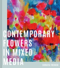
An exciting new approach to flower painting with step-by-step demonstrations for creating contemporary flower portraits and landscapes that are truly unique. This is more than a 'how-to' on flower painting. It is a guide encouraging artists to explore new and exciting ways to create flower paintings bursting with individuality and moving towards a contemporary and impressionist style. Mixed-media artist Soraya French, well known for her gloriously vibrant flower paintings, shares the secrets of her work, with expert advice on all aspects of this endlessly rewarding subject. The book covers: - Colours, shapes, patterns and textures particular to various flowers through the seasons, from fresh green foliage in the spring to rich red and gold hues in the autumn. - How to incorporate flowers in both still life and landscape paintings, pictured in woodlands, seascapes, meadows and hedgerows as well as vases. - How to assemble the perfect palette for flower painting and how to mix vibrant secondary colours, subtle tints and natural greens. - The huge range of painting materials available today, from traditional watercolour to vividly coloured wax pastels to innovative textural mediums such as crackle paste and glass bead gel. - The secrets of good composition and how to lead the eye around a painting, giving a sense of rhythm and movement while maintaining unity and harmony.Packed with exciting new ideas and illustrated with stunning examples of Soraya's own work, this book will take your flower painting to a new level and help you find your unique visual voice.
Das E-Book können Sie in Legimi-Apps oder einer beliebigen App lesen, die das folgende Format unterstützen:
Seitenzahl: 115
Veröffentlichungsjahr: 2021
Ähnliche


To my beloved trio, Tim, Yasmin and Saasha, whose mixture of gentle encouragement and brutally honest criticism motivates me to try harder. Without their help and support none of this would be possible. xxx
CONTENTS
Welcome
Exploring the media
Dynamic design strategies
The language of colour
Seductive surfaces
Explore further
Acknowledgements
Index
WELCOME
Painting flowers in mixed media presents the artist with the opportunity to combine exquisite transparent washes of inks and watercolours with the vivid colours of opaque wet and dry media to interpret the stunning colours of nature. Spontaneity, versatility and unpredictability are at the core of painting contemporary semi-abstract flowers in mixed media, but it is the degree of control that is the most appealing feature of working in this expressive and exciting way – decisions can be made and remade numerous times to allow a painting to evolve and find its natural flow and rhythm in a more unrestrained manner than can result from a laborious and tentative process.
Tulip Fusion
76 × 56 cm (30 × 22 in)
Mixed media on watercolour paper
ABOUT THIS BOOK
If you are reading this book then I hope you are ready to take a leap of faith and step into the complex but fascinating world of painting semi-abstract flowers in mixed media. There is no competing with mother nature, the greatest artist of all, so this book is my attempt to encourage you not to recreate, but to interpret the incredible amount of inspiring visual information flowers offer as a subject, in the most unique and individual way to you.
This versatile and transformative form of expression encompasses a broad range of disciplines and means something different to each individual artist. The ethos behind this book is to explore the subject’s many possibilities in a way that is most relevant to your personal approach to painting. Ultimately I hope the ideas inspire you to adapt a more expressive yet relaxed, intuitive and fluid attitude to your creative process.
Painting the most striking and flamboyant offerings of nature in mixed media is such an immersive and engaging experience. Creating art presents, of course, its own kind of stresses and dilemmas, but these are not bad stresses, and with an open mind, imagination and a variety of media and techniques, you should always be able to find new solutions and let your creativity transport you to a happy place.
I started and completed this book in 2020, during the most challenging of times for the human race, and it is testimony to the therapeutic magic of creativity. It has truly sustained me throughout this difficult time and I hope the joy I took in writing this book resonates with you and motivates you to pick up your brushes and immerse yourself in the joy of creation.
In this book you will find comprehensive information regarding different media. This is not to encourage you to buy more art supplies, but to help you make informed choices. You’ll also discover demonstrations and projects to guide you through negative shape painting, colour relationships, combining media and colour mixing.
Unless otherwise stated, all the acrylics, QoR watercolours and Williamsburg oil paints are manufactured by Golden Artist Colors. Oil pastels and crayons are from Caran d’Ache, soft pastels are by Sennelier, Unison and Jackson’s, watercolour papers are by St Cuthbert’s Mill, and FW inks, mount boards and Langton paper are by Daler-Rowney. There are equivalent brands available for some of the products.
Pink and White Lilies
51 × 41cm (20 × 16in)
Mixed media on watercolour paper
A PERSONAL NOTE
I don’t really have a profound reason for my love of painting flowers other than that their dazzling colours and spectacular shapes suit my colourful and contemporary approach to painting. I paint flowers when I am happy or sad; it is the subject I turn to when inspiration runs dry. Painting them in mixed media keeps creative boredom at bay as the infinite combination of materials presents fresh surprises and exciting possibilities. It really suits impatient, expressive and spontaneous artists who thrive on working organically and enjoy taking risks without the fear of failure.
My painting process has always been intuitive, but I have learnt to analyze it more in order to teach and write about it. When working on personal projects I am careful not to let the analytical side stifle the intuitive process, and successful pieces are the ones where I get the balance right.
Writing this note a few years ago would have sounded very different indeed. Each year of walking along the creative path brings more ‘Aha’ moments, and with them comes not only a greater understanding of the reasons for painting in the first place but, better still, a more fluid and relaxed attitude towards the process of creating art. Right now enjoying the process and experiencing the therapeutic and meditative effect of painting is at the top of my list, and success of any kind along the way is the cherry on the cake.
Looking at my brightly coloured paintings you will never guess that I am mostly attracted to paintings with much more sophisticated and understated colour schemes. To remain true to myself, however, I hope to continue painting with these unapologetically vibrant colours for as long as I can. I am full of gratitude to have my work and most treasured pastime merge so seamlessly together and never a day goes by when I take this privilege for granted.
Birthday flowers
51 × 51 cm (20 × 20 in)
Mixed media on mount board.
CULTIVATING YOUR UNIQUE VISUAL VOICE
A Touch of Spring
79 × 56 cm (31 × 22 in)
Mixed media on mount board
The art world is overflowing with talented artists; it is your authenticity and individuality that will help you thrive in this competitive arena. Cultivating your own voice needs internal focus while progressing with the technical aspects of your painting. It is through frequent practice and by closely observing and studying the repeated patterns in your own work that you get to know who you are as an artist and what makes you tick.
If you are just starting out and dabbling in different subjects and media, pick out the few that get your heart racing and make you rush to pick up your brushes. Working in a series of your most stimulating subjects creates a body of work with a common thread rather than numerous paintings each singing a different tune. Limiting external influences to a few you truly admire helps focus your mind, and always analyze and study rather than copy. Use inspiration like the spices in your kitchen: a little sprinkle to add that extra touch of magic but not to overshadow your own individuality.
Be savvy when browsing art websites: you want to access their positive aspects without the negative distractions. Connecting with other artists globally through social media can be a positive experience, but on the flip side, being bombarded with imagery when scrolling these sites for long periods can be confusing and even promote feelings of inadequacy. Above all, it takes precious time and energy that can be spent more positively in your own creative space.
It may sound like a cliché, but ultimately it is the deep and genuine connection with your subject that will resonate with the viewer. Practice and perseverance are the two key ingredients that will help you emerge as an artist with a unique visual voice.
EXPLORING THE MEDIA
The synergy between the individual mediums combined together in one painting is at the heart of using mixed media. With no particular rule book on how to make them work well together, your knowledge of each medium is paramount. Ultimately, the aesthetic success and longevity of a painting depends on the compatibility of the materials coming together in a logical sequence.
In this chapter we shall be looking at a selection of mediums and their idiosyncrasies, and the ways in which they can be a worthwhile contributor to your mixed media art. Getting to know each medium intimately means that you can judge where and how you can incorporate it, not only to enjoy a more liberating art-making process but also to add excitement to your paintings.
Facing the Sun
72 × 53 cm (28½ × 21 in)
Mixed media on watercolour paper
THE ROMANCE OF WATERCOLOURS
Light reflected through translucent washes of watercolour creates visual sensations unmatched by any other medium. Modern watercolours with strong, vibrant pigments and better quality binders have changed the sometimes wishy-washy image of this most challenging medium of all. Working on good quality paper will allow for lifting and washing out of colours and will help you to be more daring with this amazing medium. Primers such as Golden watercolour ground will give you the ability to make exciting and contemporary watercolours on canvases and artist’s panels or to eliminate unwanted areas for correction. The light dimensional ground and cold press ground manufactured by Golden give you more opportunities to explore innovative and exciting textural approaches in your watercolour flower paintings.
The magical medium of watercolour is a great contributor to a mixed media art box, either in early washes of wet-into-wet or for glazing over acrylics to recede an area or change the tone of a colour. It can be applied for tinting a wet and dry artist’s quality sandpaper or a NOT surface watercolour paper to make a tinted base for a pastel painting. So many factors come into making a successful watercolour – the quality of your paint, your surface, the brushes you use – but ultimately you, the artist, are the game-changer in the way you can stretch this medium way beyond its limited traditional image.
Posy with Himalayan Blue Poppies
28 × 24 cm (11 × 9½ in)
Watercolour on paper
A pocket-sized field watercolour box is the perfect bit of equipment to take out for quick sketches in the garden or days spent painting on location. These quick studies make great reference materials for larger future paintings.
Poppies and Daisies
53 x 53 cm (21 x 21 in)
Watercolour on paper
Knowledge of colour relationships and pigment characteristics is crucial to avoid making muddy colours and keeping your colours clean and vibrant, especially in semi-abstract styles such as mine where there are a lot of layered colours and overlapping passages. The ability to lift colour is a very appealing feature of working in watercolours for me, whether to reveal the white of the paper or a ghost of the more staining colours left behind. Above all, the luminosity of colours against the white of the paper is why watercolour is still one of the most popular mediums with artists around the world. I use Saunders Waterford High White paper for my watercolours to gain the crisp white contrast against the darker values. I love the soft edges of wet-into-wet washes against the hard edges of wet-on-dry and the texture of dry brush on NOT surface watercolour paper.
GOUACHE
Gouache, or body colour, is another versatile water-based medium with a matte finish. It has a binder of gum arabic and white to make it more opaque than watercolours. The advantages of gouache over watercolour is that it can range from transparency to opacity according to the amount of water you use and the nature of the particular pigment, and it allows you to mix opaque tints with white. The ability to apply lighter colours over darker ones and rectify mistakes by repainting easily makes gouache a more versatile and forgiving medium than watercolours, but you don’t have to dismiss one in favour of the other – just use them where they can work well in your painting to create the maximum impact.
In a similar way to acrylics, gouache combines well with dry media; the interplay of transparent passages with thicker, more opaque ones can produce some wonderful effects. You can paint with gouache on a background of any colour from light to dark. The stunning range of colours and the matte finish give the medium its unique superb qualities, making it a worthwhile addition to the mixed media art box. It has a special place in my heart as I painted with it during my teenage years, and it always takes me back to a very happy place.
Sunlit Bluebell Study (detail)
This close-up demonstrates the depth you can achieve in gouache by the juxtaposition of opaque and transparent layers while still retaining the lightness of touch. It also shows clearly how lighter tones have been superimposed over darker layers, displaying the versatility of gouache as a medium.
Sunlit Bluebell Study
25 × 23 cm (10 × 9 in)
Gouache on paper
I started this painting with a light green wash made from a touch of Phthalo Blue into Lemon Yellow. I then mixed a much darker green using Phthalo Blue, Lemon Yellow and a touch of Magenta. The sunlit bluebells are a mixture of purple (made from Phthalo Blue plus Magenta) with white so that I could superimpose the lighter ones over the darker tones of the background. This eliminates the need for masking the areas for the lighter colours or working from light to dark as in watercolours. The lighter vivid green added over the top has more white in the mix to make it more opaque. The whole painting is made up of three colours plus white.
THE VERSATILITY OF ACRYLICS
Acrylic materials are by far the most versatile of all painting media. Artist’s quality acrylics come in three quite distinctive consistencies: heavy body acrylics, the quite runny fluid colours and the inks, which are the most liquid form. These different viscosities help you to make the right choice to achieve the desired effect in your painting. All three viscosities are intermixable on a single surface and all are great contributors to a mixed media painting.


