45,99 €
Mehr erfahren.
- Herausgeber: tredition
- Kategorie: Wissenschaft und neue Technologien
- Sprache: Englisch
Welcome to "CSS Grid Layout". In this book you will learn all about the CSS grid layout model and how to create complex and responsive grid-based designs. You will learn about all the properties of grid containers and grid elements. By the end of this book, you will be able to use the grid layout to create responsive layouts and handle all kinds of scenarios. Let's get started.
Das E-Book können Sie in Legimi-Apps oder einer beliebigen App lesen, die das folgende Format unterstützen:
Seitenzahl: 22
Veröffentlichungsjahr: 2024
Ähnliche


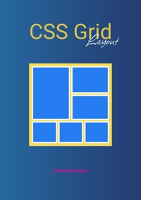
CSS Grid Layout
Abdelfattah Ragab
Introduction
Welcome to "CSS Grid Layout". In this book you will learn all about the CSS grid layout model and how to create complex and responsive grid-based designs. You will learn about all the properties of grid containers and grid elements.
By the end of this book, you will be able to use the grid layout to create responsive layouts and handle all kinds of scenarios.
Let’s get started.
key concepts
CSS3 Grid Layout is a powerful two-dimensional layout system that allows you to create complex grid-based layouts on web pages. It provides precise control over the placement and alignment of elements within a grid container. Here's an overview of CSS3 Grid Layout and its key concepts:
Grid Container
Grid Tracks and Grid Cells
Grid Items
Grid Lines
Grid Areas
Grid Template
Grid Gap
Alignment and Justification


