Erhalten Sie Zugang zu diesem und mehr als 300000 Büchern ab EUR 5,99 monatlich.
- Herausgeber: epubli
- Kategorie: Geisteswissenschaft
- Sprache: Englisch
Graphic Design Lessons: An Introduction to Essential Tools and Concepts to Deal With "Colors, Grids, Elements, Layouts, and More." Have you ever wished you knew how to design and make projects, but had no idea where to start? From the fundamentals of design principles to the cutting-edge technologies shaping its future, each chapter offers a glimpse into the diverse and dynamic world of visual communication. Here Is A Preview Of What You'll Learn... The Power of Typography in Graphic Design The Psychology of Color The Impact of Negative Space in Design Composition The Use of Grid Systems for Effective Layouts Understanding and Implementing the Rule of Thirds Exploring the Balance between Symmetry and Asymmetry Creating Harmony and Unity through Design Elements The Art of Contrast and Its Role in Graphic Design The Influence of Proximity and Grouping Using Repetition and Patterns to Enhance Designs The Role of Scale and Proportion in Visual Impact Incorporating Gestalt Principles into Design Work The Importance of Consistency in Branding and Design Achieving Visual Rhythm and Flow in Design Layouts And Much, much more! Take action now, follow the proven strategies within these pages, and explore the potent influence of typography and the artistry behind visual hierarchy. Scroll Up and Grab Your Copy Today!
Sie lesen das E-Book in den Legimi-Apps auf:
Veröffentlichungsjahr: 2025
Das E-Book (TTS) können Sie hören im Abo „Legimi Premium” in Legimi-Apps auf:
Ähnliche


Mackey J. Farris………………………………………….…………Words Count: 78,043
United States, Nashua, NH, 03063………………………………Number of Pages: 308
Documented Publishing LLC………………………………….…Book Size:5*8Inches
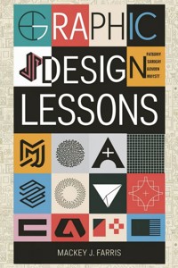
Graphic Design Lessons
An Introduction to Essential Tools and Concepts to Deal With “Colors, Grids, Elements, Layouts, and More.”
Mackey J. Farris
As a huge thanks for landing on this page, you can enjoy these 100% FREE Bonuses today!
Bonus 1
Join Our Exclusive Mastermind
"MEMBERS ONLY"
Group for FREE Where We Discuss
More About the Book, Share Our Opinions,
and Support Each Other.
Go to: https://bit.ly/Exclusive_Freebies
Bonus 2
Love Audiobooks? Get Access
to The Audio Version if Available
For a Limited Time…
Secure Your FREE Copy
Here: bit.ly/Exclusive_Freebies
Bonus 3
Get All Future Updates, Freebies and Offers Directly with NO Extra Charges!
© Copyright [2024] [Mackey J. Farris] All rights reserved.
- No part of this book may be reproduced, stored in a retrieval system, or transmitted in any form or by any means, electronic, mechanical, photocopying, recording, or otherwise, without prior written permission of the publisher, except for brief quotations in a review or scholarly article.
- This is an original work of fiction [or non-fiction] by [Mackey J. Farris]. Any resemblance to actual persons, living or dead, or actual events is purely coincidental.
Legal Notice:
The reader is solely responsible for any actions taken based on the information contained in this book. The author and publisher expressly disclaim any responsibility or liability for any damages or losses incurred by the reader as a result of such actions.
Disclaimer:
This book is intended for educational purposes only. The information contained within is not intended as, and should not be construed as medical, legal, or professional advice. The content is provided as general information and is not a substitute for professional advice or treatment.
Table of content
Introduction
Chapter 1: The Power of Typography in Graphic Design
Chapter 2: The Art of Visual Hierarchy and Information Organization
Chapter 3: The Psychology of Color in Graphic Design
Chapter 4: The Impact of Negative Space in Design Composition
Chapter 5: The Use of Grid Systems for Effective Layouts
Chapter 6: Understanding and Implementing the Rule of Thirds
Chapter 7: Exploring the Balance between Symmetry and Asymmetry
Chapter 8: Creating Harmony and Unity through Design Elements
Chapter 9: The Art of Contrast and Its Role in Graphic Design
Chapter 10: The Influence of Proximity and Grouping in Design
Chapter 11: Using Repetition and Patterns to Enhance Designs
Chapter 12: The Role of Scale and Proportion in Visual Impact
Chapter 13: Incorporating Gestalt Principles into Design Work
Chapter 14: The Importance of Consistency in Branding and Design
Chapter 15: Achieving Visual Rhythm and Flow in Design Layouts
Chapter 16: The Functionality of Alignment and Visual Connections
Chapter 17: Mastering the Art of Selecting and Pairing Fonts
Chapter 18: Creating Effective Color Palettes for Design Projects
Chapter 19: Harnessing the Emotional Power of Colors in Design
Chapter 20: Exploring the World of Vector Graphics and Scalability
Chapter 21: Understanding the Basics of Digital Image Manipulation
Chapter 22: The Role of Texture and Patterns in Graphic Design
Chapter 23: Exploring Different Print and Digital Design Formats
Chapter 24: Designing for Various Platforms and Screen Sizes
Chapter 25: Crafting Effective Logos and Brand Identity Design
Chapter 26: The Art of Creating Memorable Icons and Symbols
Chapter 27: Incorporating Photography into Graphic Design Projects
Chapter 28: Designing for User Experience and Interaction
Chapter 29: Exploring the Principles of Responsive Web Design
Chapter 30: Designing Effective User Interfaces for Applications
Chapter 31: Understanding the Importance of Accessibility in Design
Chapter 32: Incorporating Animation and Motion Graphics in Design
Chapter 33: Exploring the World of Infographic Design Principles
Chapter 34: Designing Effective Packaging and Product Labels
Chapter 35: The Role of Storytelling in Visual Communication Design
Chapter 36: Creating Compelling Magazine and Editorial Layouts
Chapter 37: Designing Effective Social Media Graphics and Posts
Chapter 38: The Impact of Cultural and Social Influences on Design
Chapter 39: Exploring the World of Environmental Graphic Design
Chapter 40: The Art of Designing Wayfinding Systems and Signage
Chapter 41: Incorporating Illustration and Hand Lettering in Design
Chapter 42: Designing for Different Demographics and Target Audiences
Chapter 43: The Influence of Minimalism in Contemporary Design
Chapter 44: Exploring the World of Retro and Vintage Design Styles
Chapter 45: Incorporating Authenticity and Storytelling in Design
Chapter 46: The Role of User-Centered Design in Graphic Design
Chapter 47: Designing for Emotional and Experiential Impact
Chapter 48: The Influence of Cultural Sensitivity in Design Work
Chapter 49: Incorporating Sustainable Design Practices
Chapter 50: The Role of Prototyping and Iteration in the Design Process
Chapter 51: Understanding the Basics of UI/UX Design Principles
Chapter 52: Exploring the World of Mobile App Design Guidelines
Chapter 53: Designing for Augmented Reality and Virtual Reality
Chapter 54: Incorporating Gamification in Design for Engagement
Chapter 55: The Role of Data Visualization in Graphic Design
Chapter 56: Exploring the World of Interactive Web Design
Chapter 57: Designing Effective Email Newsletters and Campaigns
Chapter 58: The Impact of Brand Storytelling in Design Strategy
Chapter 59: Incorporating Social Responsibility in Design Work
Chapter 60: The Role of Emotional Design in User Engagement
Chapter 61: Designing for Multilingual and Multicultural Audiences
Chapter 62: Exploring the World of User Testing and Feedback
Chapter 63: Incorporating Trends and Innovation in Design Practice
Chapter 64: The Impact of Design Thinking in Problem Solving
Chapter 65: Designing for Cross-Cultural Communication and Understanding
Chapter 66: Exploring the World of Interactive Exhibition Design
Chapter 67: Incorporating 3D Graphics and Visualizations in Design
Chapter 68: The Role of Storyboarding in Motion Graphics Design
Chapter 69: Designing for Print and Digital Advertising Campaigns
Chapter 70: Understanding the Basics of Environmental Branding
Chapter 71: Exploring the World of Iconography and Symbol Design
Chapter 72: Incorporating User Feedback in Design Iterations
Chapter 73: The Role of Aesthetics and Beauty in Design Creation
Chapter 74: Designing for Social Impact and Activism
Chapter 75: Exploring the World of Data-Driven Design Decisions
Chapter 76: Incorporating Emotional Intelligence in the Design Process
Chapter 77: The Impact of Artificial Intelligence in Graphic Design
Chapter 78: Designing for Virtual Assistants and Voice Interfaces
Chapter 79: Understanding the Basics of Responsive Typography
Chapter 80: Exploring the World of Interactive Storytelling Design
Chapter 81: Incorporating Ethical Design Practices
Chapter 82: The Role of Design in Building Trust and Credibility
Chapter 83: Designing for the Internet of Things (IoT) Ecosystems
Chapter 84: Exploring the World of Adaptive Design Strategies
Chapter 85: Incorporating Cultural Diversity in Design Representation
Chapter 86: The Impact of Gestural Interfaces in Design
Chapter 87: Designing for Emotional Well-being and Mental Health
Chapter 88: Understanding the Basics of Iconic Logo Design
Chapter 89: Exploring the World of Design Systems and Style Guides
Chapter 90: Incorporating Personalization in User-Centric Design
Chapter 91: The Role of User Empathy in the Design Thinking Process
Chapter 92: Designing for Wearable Technology and Smart Devices
Chapter 93: Understanding the Basics of Material Design Principles
Chapter 94: Exploring the World of Designing for E-commerce
Chapter 95: Incorporating Gamified Learning in Educational Design
Chapter 96: The Impact of Microinteractions in User Experience Design
Chapter 97: Designing for Inclusive and Accessible User Interfaces
Chapter 98: Exploring the World of Motion Design and Animation
Chapter 99: Incorporating Cultural Appropriateness in Design
Chapter 100: The Future of Graphic Design: Emerging Technologies and Trends
So,
Introduction
From the fundamentals of design principles to the cutting-edge technologies shaping its future, each chapter offers a glimpse into the diverse and dynamic world of visual communication.
We begin with the building blocks of effective design, understanding the power of grids to create harmonious layouts and the rule of thirds to achieve balance and visual interest. As we delve deeper, we explore the delicate interplay between symmetry and asymmetry, uncovering how each choice contributes to the overall aesthetic.
We will learn how to weave design elements seamlessly together to tell compelling stories and evoke emotions. In contrast, the art of contrast showcases how juxtaposing elements can create visual impact and captivate the audience.
The power of proximity and grouping in design leads us to examine the ways in which elements can establish relationships and hierarchy, elevating the overall composition. Repetition and patterns, in the following chapter, bring rhythm and flow to designs, drawing the eye along a journey of discovery.
Scale and proportion are the architects of visual impact, revealing how size and ratio influence our perception of design. Gestalt principles illuminate the role of perception and cognition in design, uncovering the psychology behind how humans interpret visual stimuli.
Consistency is the bedrock of branding and design, ensuring that a cohesive message is conveyed across diverse platforms and media. Visual rhythm and flow then guide us through the graceful choreography of guiding the eye and telling stories within design layouts.
Alignment and visual connections further reinforce the narrative, drawing attention to the power of subtle details in guiding the user experience. Fonts, as an art form in themselves, play a crucial role in communicating messages, emotions, and brand identity.
With a spectrum of colors at our disposal, we explore how color palettes influence moods and emotions, forging a powerful connection between design and the human psyche. The emotional power of colors leads us to experiment with texture and patterns, adding depth and dimension to our visual stories.
As the world turns digital, we navigate the vast landscape of print and digital design formats, adapting designs to fit seamlessly into diverse environments. We embrace the challenge of designing for various platforms and screen sizes, ensuring every user receives a tailored and delightful experience.
The heart of every brand lies in its logo and brand identity design. We unveil the secrets behind crafting iconic logos and brand stories that leave an indelible mark on the minds of consumers. From there, we explore the world of symbols and icons, mastering the art of concise communication.
The integration of photography into graphic design introduces a blend of reality and imagination, capturing the essence of emotions and moments. Designers further elevate their craft by embracing user experience and interaction, crafting interfaces that captivate and delight users.
In the digital age, responsive web design principles equip us with the tools to create flexible and adaptable designs for an ever-changing online landscape. Moving into the realm of applications, we design user interfaces that harmonize with the user's needs and seamlessly integrate with their daily lives.
As design reaches out to diverse audiences, we emphasize the importance of accessibility, ensuring that everyone can engage with and benefit from our creations. The inclusion of animation and motion graphics elevates our designs, captivating users with delightful movement and storytelling.
In a world inundated with data, data visualization emerges as an essential tool, transforming complex information into digestible and captivating visuals. We then step into the immersive world of interactive design, where users take center stage in their exploration of digital experiences.
The power of storytelling lies at the heart of graphic design, tapping into emotions, creating connections, and fostering empathy. Editorial layouts and social media graphics become mediums through which these narratives come alive.
Design's influence reaches beyond aesthetics, as we examine the impact of culture, ethics, and social responsibility in our creations. Cultural diversity inspires a rich tapestry of representation and inclusivity, ensuring designs resonate with global audiences.
The future beckons with exciting prospects, as we embrace the integration of emerging technologies like AI and machine learning, AR and VR, and wearable devices. Our designs adapt and evolve, guided by principles of sustainability, authenticity, and user empathy.
Through each chapter, we explore the many facets of design, empowering us to create visual experiences that transcend boundaries and leave a lasting impression on the world. So, join us on this immersive journey through the ever-changing landscape of graphic design, where art, technology, and storytelling converge to shape the future of visual communication.
Chapter 1: The Power of Typography in Graphic Design
Typography is more than just selecting and arranging letters. It is an art form that has the power to shape the way we perceive and understand information. In graphic design, typography plays a crucial role in creating effective and visually appealing designs. In this chapter, we will delve into the world of typography, exploring its history, principles, and practical applications.
To truly appreciate the power of typography, let's take a journey back in time. Typography has its roots in ancient civilizations, where inscriptions on stone tablets and papyrus scrolls served as the earliest forms of written communication. Fast forward to the invention of the printing press in the 15th century, and typography gained a new level of significance as movable type allowed for mass production of books and the dissemination of knowledge.
Today, typography encompasses a wide range of styles, from classical serifs to modern sans-serifs, script fonts, and decorative typefaces. Each font carries its own personality and conveys a distinct mood or message. When selecting a typeface for a design project, it's important to consider its readability, legibility, and appropriateness for the intended audience.
One fundamental principle of typography is hierarchy. The arrangement of type elements on a page should guide the reader's eye and emphasize the most important information. By utilizing variations in font size, weight, and style, designers can establish a visual hierarchy that directs the viewer's attention and facilitates understanding.
Another essential aspect of typography is alignment. Text can be aligned in various ways, including left, right, center, and justified. The choice of alignment depends on the design's overall composition and the desired visual impact. Proper alignment creates a sense of order and cohesion, enhancing the readability and aesthetic appeal of the design.
Spacing is also a critical consideration in typography. Kerning, leading, and tracking are techniques used to adjust the space between letters, lines, and blocks of text. Optimal spacing ensures that the text is visually balanced, allowing for comfortable reading and preventing overcrowding or awkward gaps. Attention to detail in spacing can elevate the overall quality of the design.
Furthermore, typography extends beyond individual letters and words. It involves the art of letterforms and the exploration of typographic elements such as ligatures, swashes, and glyphs. These embellishments add personality and style to the typography, making it unique and memorable.
Typography is not only about aesthetics; it also influences the tone and emotional impact of a design. Different fonts evoke different emotions and associations. For example, bold, uppercase lettering may convey strength and power, while delicate script fonts can evoke elegance and sophistication. By carefully selecting fonts that align with the intended message, designers can effectively convey the desired mood or brand personality.
In the digital age, typography has expanded its reach to encompass various platforms and devices. Responsive typography ensures that text adapts seamlessly to different screen sizes and resolutions, maintaining readability and legibility across devices. Designers must consider the impact of typography on user experience, making sure that text is accessible and easily readable on all devices.
So, typography is a powerful tool in graphic design. Its ability to shape the way we perceive and understand information is unparalleled. By understanding the history, principles, and practical applications of typography, designers can harness its power to create visually stunning and effective designs. From selecting the right typeface to establishing hierarchy, alignment, and spacing, every typographic decision contributes to the overall success of a design. So next time you embark on a design project, remember the power of typography, and let it guide your creative journey.
Chapter 2: The Art of Visual Hierarchy and Information Organization
Have you ever looked at a design and instantly known where to focus your attention? That's the magic of visual hierarchy. In graphic design, visual hierarchy is the arrangement and presentation of elements in a way that guides the viewer's eye, emphasizing the most important information and creating a sense of order. In this chapter, we will explore the art of visual hierarchy and how it contributes to effective information organization in design.
Imagine you're reading a newspaper article. The headline grabs your attention first, followed by the subheadings that break down the main points. The body text provides additional details, and perhaps there are relevant images and captions to support the content. This structured arrangement helps you navigate the information effortlessly. Graphic design follows a similar principle, utilizing various techniques to establish visual hierarchy and aid in information organization.
One of the key elements in establishing visual hierarchy is size. Larger elements naturally attract more attention than smaller ones. By strategically increasing the size of important elements such as headings, titles, or key information, designers can instantly draw the viewer's eye to the most significant parts of the design. This not only aids in capturing attention but also assists in quickly conveying the hierarchy of information.
Another important technique in visual hierarchy is contrast. Contrast refers to the differences in elements' characteristics, such as color, font weight, or texture. By using contrasting elements, designers can create visual separation between different levels of information. For example, a bold and vibrant color can be used for headings, while a lighter color or a different font style can be employed for supporting text. This contrast enhances readability and ensures that important information stands out.
Positioning plays a crucial role in visual hierarchy as well. Elements placed at the top or in the upper-left corner tend to attract more attention, as readers typically start scanning a design from the top left and move to the right. This is known as the "F-pattern" reading behavior. Designers can utilize this natural reading pattern by placing important information in the top-left quadrant and arranging other elements in a way that follows the flow of the F-pattern. This encourages viewers to engage with the content in a logical and intuitive manner.
Color can also be a powerful tool in establishing visual hierarchy. Bright and saturated colors naturally grab attention, while muted or desaturated colors recede into the background. By using color strategically, designers can highlight important elements and create a sense of depth and dimension in the design. Additionally, color can be used to create visual groupings, making it easier for viewers to identify related information.
Texture and pattern can further enhance visual hierarchy. By incorporating different textures or patterns into the design, designers can create visual interest and separate elements based on their importance. For instance, a textured background can help set the tone and provide a backdrop for the main content, while a plain or simple background can make the foreground elements stand out.
Whitespace, or negative space, is a critical component of visual hierarchy and information organization. It refers to the empty spaces between and around elements. Whitespace allows the design to breathe, giving each element room to stand on its own and reducing visual clutter. By strategically using whitespace, designers can create a sense of balance and harmony in the design, directing the viewer's attention to the key elements.
Typography also plays a significant role in visual hierarchy. Different font styles, sizes, and weights can be used to differentiate between various levels of information. Headings can be set in a larger, bold font, while body text is set in a smaller, regular font. By applying consistent typography throughout the design, viewers can quickly identify and understand the hierarchy of information.
Lastly, the use of visual cues and directional elements can guide the viewer's eye through the design. Arrows, lines, or other graphic elements can be strategically placed to indicate the flow of information or draw attention to important elements. These visual cues act as signposts, leading the viewer's gaze and aiding in the comprehension of the content.
In summary, visual hierarchy is the art of arranging and presenting elements in a way that guides the viewer's eye and communicates the importance of information. Through techniques such as size, contrast, positioning, color, texture, whitespace, typography, and visual cues, designers can create a visual hierarchy that enhances the overall organization and readability of the design. The careful consideration of these principles and their thoughtful application can significantly impact the effectiveness and engagement of the design, ensuring that the intended message is communicated clearly and efficiently to the viewer.
Chapter 3: The Psychology of Color in Graphic Design
Colors have a powerful impact on our emotions, perceptions, and behavior. In graphic design, understanding the psychology of color is crucial for creating visually compelling and effective designs. In this chapter, we will dive into the fascinating world of color psychology and explore how different colors evoke specific responses and meanings.
Think about a time when you walked into a room with vibrant, warm colors like red or orange. How did it make you feel? Chances are, you felt energized, excited, or even a bit hungry. Warm colors like red, orange, and yellow are often associated with energy, warmth, and enthusiasm. They can evoke a sense of passion, excitement, and urgency. That's why you often see these colors used in food advertisements or clearance sales.
On the other hand, cool colors such as blue, green, and purple have a calming and soothing effect. They are often associated with nature, tranquility, and harmony. Have you ever noticed that hospitals often use shades of blue or green in their decor? That's because these colors can create a sense of calmness and relaxation, which is beneficial in a healthcare setting.
Understanding the psychological effects of color is essential when designing for specific purposes or target audiences. For example, if you're creating a design for a children's product or brand, you might want to incorporate bright and playful colors like yellow, orange, or pink. These colors tend to resonate with children and can evoke a sense of joy and playfulness.
Color associations can also vary across cultures and contexts. For instance, in Western cultures, white is often associated with purity, innocence, and cleanliness. However, in some Eastern cultures, white is associated with mourning and sadness. When designing for a global audience or diverse cultural groups, it's crucial to consider the cultural connotations of colors to ensure your design resonates appropriately.
Color combinations and harmonies also play a significant role in graphic design. Colors can be used to create contrast, balance, and visual interest. Complementary colors, which are opposite each other on the color wheel, create a vibrant and energetic effect. For example, red and green or blue and orange are complementary pairs. On the other hand, analogous colors, which are adjacent on the color wheel, create a harmonious and cohesive feel. For example, shades of blue, green, and teal are analogous colors. By understanding color harmonies, designers can create visually pleasing and cohesive designs.
It's worth noting that personal preferences and cultural experiences can influence individual responses to colors. While certain colors may have generally accepted associations, everyone's perception and emotional response to color can vary. Factors such as personal experiences, cultural backgrounds, and even age can influence how colors are interpreted.
In addition to the psychological effects of color, it's essential to consider color accessibility in graphic design. Accessibility ensures that individuals with visual impairments or color blindness can still perceive and understand the information presented. Designers should consider providing sufficient contrast between text and background colors to ensure readability for all users. There are online tools available to test the contrast ratio between colors and ensure compliance with accessibility guidelines.
Color also plays a significant role in branding and brand recognition. Many successful brands are instantly recognizable by their signature colors. Think of Coca-Cola's red, McDonald's golden arches, or Facebook's blue. These brands have carefully chosen colors that align with their brand identity and evoke specific emotions and associations. When designing for branding purposes, it's important to consider how color choices can communicate the brand's values and personality.
In summary, the psychology of color is a fascinating field that has a profound impact on graphic design. Different colors evoke specific emotional responses and associations, and understanding these effects is essential for creating visually compelling and effective designs. By considering the psychological effects of color, cultural connotations, color combinations, accessibility, and brand identity, designers can harness the power of color to elicit desired emotions, convey messages, and create meaningful connections with their audience.
Chapter 4: The Impact of Negative Space in Design Composition
In the world of graphic design, it's not just what you put in your design that matters—it's also what you leave out. Negative space, often referred to as white space, is the area surrounding and between the elements in a design. While it may appear empty, negative space is a powerful tool that can greatly impact the overall composition and effectiveness of a design. In this chapter, we will explore the significance of negative space and how it can elevate your design to new heights.
At first glance, it may seem counterintuitive to intentionally leave empty space in a design. After all, isn't the goal to fill every inch of the canvas with eye-catching elements? However, negative space serves a crucial purpose—it provides breathing room, balance, and visual clarity. It allows the design elements to shine and communicate their intended message without distractions.
One of the key advantages of negative space is its ability to create emphasis and draw attention to specific elements. By strategically surrounding an important element with ample negative space, you can make it stand out and command the viewer's attention. Whether it's a headline, a logo, or a key image, the use of negative space ensures that the focal point takes center stage, creating a strong visual impact.
Negative space also plays a significant role in enhancing the readability and legibility of a design. When elements are crowded together without adequate breathing room, it can result in a cluttered and confusing visual experience. By utilizing negative space, you can separate and define different elements, making it easier for viewers to navigate the design and comprehend the information presented. In typography, for instance, negative space around letters and lines helps prevent them from merging into a jumble of unreadable text.
The strategic use of negative space can evoke a sense of elegance, simplicity, and sophistication in a design. By embracing minimalism and incorporating ample negative space, you create a sense of visual balance and harmony. The simplicity and clarity achieved through negative space can have a profound impact on the viewer, evoking a feeling of calmness and aesthetic appeal.
Negative space is also closely tied to the concept of visual tension. By intentionally manipulating the balance between positive and negative space, designers can create dynamic and visually engaging compositions. The interplay between filled elements and empty space can generate a sense of movement, rhythm, and intrigue, capturing the viewer's attention and encouraging exploration within the design.
Furthermore, negative space fosters a sense of visual hierarchy and organization. It allows designers to establish relationships between elements, directing the viewer's eye in a deliberate and meaningful way. By controlling the distribution of negative space, you can guide the viewer's gaze, emphasizing the order of importance and facilitating the flow of information. Negative space serves as a visual map, guiding the viewer through the design and ensuring a cohesive and purposeful composition.
In addition to its aesthetic impact, negative space also carries practical benefits in design. It can optimize the functionality and usability of a design, especially in digital interfaces and user experience design. By providing sufficient negative space around interactive elements such as buttons or links, you make it easier for users to navigate and interact with the design. Negative space reduces the likelihood of accidental clicks or taps and improves overall user satisfaction.
When working with negative space, it's important to remember that it can take different forms beyond literal white space. It can be any unoccupied area within the design, whether it's a solid color, a texture, or even a background image. The key is to strike a balance between positive and negative space, allowing them to interact harmoniously and create a visually compelling composition.
So, negative space is a powerful design element that should not be overlooked. It serves as a critical tool for creating emphasis, enhancing readability, fostering simplicity and elegance, generating visual tension, establishing hierarchy, and optimizing functionality. By embracing negative space in your designs, you can elevate the overall composition, create a memorable visual experience, and communicate your message with clarity and impact.
Chapter 5: The Use of Grid Systems for Effective Layouts
Imagine a well-organized city with its roads, buildings, and parks all neatly laid out in a grid. The same concept can be applied to graphic design through the use of grid systems. Grids provide a structured framework that helps designers create visually appealing and functional layouts. In this chapter, we will explore the power of grid systems and how they contribute to effective design compositions.
At its core, a grid system is a series of horizontal and vertical lines that divide a design space into columns and rows. These lines act as a guide for placing and aligning elements within the layout. Grids provide a sense of order, consistency, and visual harmony, enabling designers to achieve balanced and well-structured designs.
One of the primary benefits of using a grid system is its ability to establish visual hierarchy. By defining a grid structure, designers can allocate different levels of importance to elements based on their placement within the grid. For example, the top row or left column may be reserved for key information or main content, while secondary elements are placed in subsequent rows or columns. This hierarchy ensures that viewers can easily identify and understand the most important elements in the design.
Grids also promote alignment and consistency throughout a design. Elements that are aligned with the grid lines appear visually connected and create a sense of unity. Consistent spacing between elements, such as margins and gutters, can be achieved by following the grid structure. This level of alignment and consistency enhances the overall visual appeal and professionalism of the design.
Moreover, grid systems offer flexibility and adaptability. They provide a framework that can be easily adjusted and modified to suit different design requirements. Whether you're working on a print layout, a website design, or a mobile app interface, the grid can be customized to accommodate the specific needs and constraints of each project. Grid systems ensure that your design is scalable and responsive, allowing it to maintain its structure and integrity across various platforms and devices.
Grids not only help organize elements within a design but also assist in creating proportional and balanced compositions. The vertical and horizontal divisions of the grid provide guidelines for determining the size and placement of elements. For instance, elements can be sized proportionally based on the columns or rows of the grid, creating a harmonious relationship between different elements. Grids also aid in achieving balance by distributing visual weight evenly across the design, preventing any single element from overpowering the composition.
In addition to their aesthetic advantages, grid systems contribute to efficient and streamlined design workflows. When working with a grid, designers can make informed decisions about the placement and arrangement of elements, eliminating the need for constant guesswork. Grids provide a logical structure that guides the design process, saving time and effort in the long run. They also facilitate collaboration among designers and ensure consistency when multiple designers are working on different parts of a project.
There are various types of grid systems that designers can utilize, depending on the specific design requirements. The most common type is the modular grid, which divides the layout into equal-sized modules or cells. This type of grid is highly versatile and can be adapted to different content structures. Another type is the hierarchical grid, which combines multiple modular grids to accommodate different levels of information hierarchy. This grid is particularly useful for complex layouts that require a clear organization of content.
When using a grid system, it's important to strike a balance between structure and creativity. While grids provide a framework for organizing elements, they should not restrict or stifle creative expression. Designers can still experiment with asymmetrical compositions, overlapping elements, or breaking the grid intentionally to create visual interest and unique design solutions. The grid should serve as a guide rather than a rigid constraint, allowing for artistic exploration within its framework.
So, grid systems are invaluable tools in graphic design. They provide a structured framework that aids in establishing visual hierarchy, alignment, consistency, proportion, balance, and efficiency. By incorporating grid systems into your design workflow, you can create visually appealing, well-organized, and functional layouts that effectively communicate your message to the audience.
Chapter 6: Understanding and Implementing the Rule of Thirds
Have you ever taken a photograph or designed a layout where the subject felt perfectly placed, drawing your attention effortlessly? Chances are, the composition followed the rule of thirds. The rule of thirds is a fundamental principle in visual arts and design that can greatly enhance the balance, harmony, and visual interest of an image or layout. In this chapter, we will delve into the concept of the rule of thirds and explore how to effectively implement it in your designs.
The rule of thirds is based on the idea that an image or layout can be divided into nine equal parts by two equally spaced horizontal lines and two equally spaced vertical lines, resulting in a grid of nine rectangles. The rule suggests that the most visually pleasing and balanced compositions are achieved by placing key elements along these grid lines or at their intersections. By doing so, the design becomes more dynamic, engaging, and visually appealing.
Implementing the rule of thirds allows you to create a sense of balance and visual tension in your designs. Placing elements along the grid lines distributes visual weight and prevents the design from feeling stagnant or monotonous. The off-center placement of elements adds a touch of intrigue and captures the viewer's attention, leading the eye on a journey through the composition.
Imagine a landscape photograph with a stunning sunset. Instead of placing the horizon line right in the middle, the rule of thirds encourages you to position it along one of the horizontal grid lines, either in the top third or the bottom third. This placement creates a more compelling composition, allowing the viewer to appreciate both the sky and the landscape, while adding a sense of depth and visual interest.
In addition to horizontal placement, the rule of thirds also applies to vertical positioning. For example, in a portrait photograph, you may choose to position the subject's eyes along one of the vertical grid lines. This placement not only creates a pleasing balance but also draws attention to the subject's gaze, enhancing the emotional impact of the image.
The intersections of the grid lines, known as the "power points," are particularly significant in the rule of thirds. Placing important elements, such as the main subject or a focal point, at these power points can create a strong visual impact. These intersections naturally attract the viewer's attention and serve as focal points within the composition.
The rule of thirds is not limited to photography alone—it can also be applied to various other design disciplines. Whether you're designing a website, a poster, or a brochure, the rule of thirds can guide you in creating visually appealing layouts. By aligning key elements or points of interest along the grid lines or at the power points, you can achieve a well-balanced and visually engaging design.
However, it's important to note that the rule of thirds is not a strict formula that must be followed rigidly in every composition. It is a guideline that can be adjusted and adapted based on the specific context and desired outcome. Sometimes, breaking the rule intentionally can result in unique and creative compositions. The key is to understand the rule of thirds and use it as a tool to enhance your designs, while also allowing for artistic freedom and experimentation.
In modern design software, such as graphic design applications and digital cameras, the rule of thirds is often supported through grid overlays. These overlays provide a visual aid that helps you align elements along the grid lines or at the intersections. By enabling the grid overlay in your software or using the grid function on your camera, you can easily apply the rule of thirds and create well-composed designs or photographs.
As with any design principle, it's important to practice and train your eye to effectively implement the rule of thirds. Study and analyze successful compositions in various art forms, such as photography, painting, and graphic design. Observe how the rule of thirds is applied and experiment with incorporating it into your own designs. Over time, you will develop a natural intuition for utilizing the rule of thirds to create visually stunning and balanced compositions.
In summary, the rule of thirds is a powerful design principle that can significantly enhance the balance, harmony, and visual interest of your designs. By aligning key elements along the grid lines or at the intersections, you can create engaging and dynamic compositions that captivate the viewer's attention. Remember to embrace the rule of thirds as a guideline and allow for artistic expression and experimentation within its framework.
Chapter 7: Exploring the Balance between Symmetry and Asymmetry
In the realm of graphic design, finding the right balance is essential. The balance between symmetry and asymmetry is a delicate dance that designers engage in to create visually appealing and harmonious compositions. Symmetry refers to a design that is mirrored or balanced on both sides, while asymmetry introduces a sense of imbalance and visual tension. In this chapter, we will explore the interplay between symmetry and asymmetry, and how to effectively utilize both approaches in your designs.
Let's start by discussing symmetry—a design principle that has been employed for centuries to create a sense of order, harmony, and stability. Symmetry can be categorized into two main types: bilateral symmetry and radial symmetry. Bilateral symmetry refers to a design that is mirrored on a central axis, creating a sense of equilibrium and formal balance. Radial symmetry, on the other hand, involves elements radiating outward from a central point, often seen in circular or mandala-like designs.
Symmetrical designs possess a sense of familiarity and comfort. Our brains naturally seek balance and tend to find symmetrical compositions visually pleasing. This is why symmetrical layouts are often used in corporate designs, formal invitations, and traditional artwork. The symmetrical balance evokes a sense of reliability, professionalism, and tradition.
When using symmetry, it's crucial to ensure that the design is perfectly balanced and that both sides mirror each other accurately. Even the slightest deviation can disrupt the harmony and create a jarring effect. Design software tools often provide guides and alignment options to assist in achieving precise symmetry. Remember to pay attention to every detail, from shapes and colors to text placement and spacing, to maintain the integrity of the symmetrical design.
On the other hand, asymmetry challenges the traditional notions of balance by introducing a deliberate sense of imbalance and visual tension. Asymmetrical designs can be dynamic, unexpected, and visually captivating. They allow for more freedom and creative expression, as they don't adhere to strict mirrored arrangements.
Asymmetry offers a sense of energy, movement, and informality in a design. It can be achieved by placing elements of varying sizes, shapes, and colors asymmetrically within the layout. By breaking away from perfect symmetry, designers can create unique compositions that engage the viewer's attention and evoke a sense of curiosity.
When incorporating asymmetry into your designs, it's important to maintain a sense of visual balance. While asymmetrical designs are intentionally unbalanced, they still require a thoughtful arrangement of elements to ensure that the composition remains visually pleasing. The key is to distribute visual weight strategically and create a sense of equilibrium through the arrangement of different elements.
Contrast plays a crucial role in achieving balance within asymmetrical designs. Contrasting elements in terms of size, shape, color, or texture can be used to balance each other visually. For example, a large, bold element on one side of the design can be balanced by several smaller, subtler elements on the other side. The contrast between the elements creates a dynamic and visually appealing composition.
An important aspect to consider when working with asymmetry is the concept of visual hierarchy. Even though the design may be intentionally unbalanced, it's essential to establish a clear order of importance among the elements. This can be achieved through the careful placement and sizing of key elements within the composition. By guiding the viewer's eye to the focal points and establishing a hierarchy, you can create a sense of organization and coherence in your design.
Symmetry and asymmetry are not mutually exclusive—they can coexist within a single design to create a balanced composition with a touch of visual interest. This approach, known as asymmetrical symmetry, combines elements of both symmetry and asymmetry to achieve a unique and visually engaging result. It allows for the creation of designs that are both structured and dynamic, providing a balance between order and spontaneity.
When determining whether to use symmetry, asymmetry, or a combination of both, consider the message you want to convey and the emotional response you want to elicit from the audience. Symmetry may be appropriate for conveying professionalism and stability, while asymmetry can add a sense of excitement, creativity, and informality.
Ultimately, the balance between symmetry and asymmetry in design is subjective and depends on the specific project, target audience, and desired aesthetic. Experimentation and exploration are key to finding the right balance that best serves your design objectives.
So, the balance between symmetry and asymmetry is a fundamental aspect of graphic design. By understanding the characteristics and effects of each approach, you can create visually appealing and engaging compositions. Whether you choose to embrace perfect symmetry, playful asymmetry, or a combination of both, remember to consider the message you want to convey and the emotional response you want to evoke. Find the balance that best serves your design and captivates your audience.
Chapter 8: Creating Harmony and Unity through Design Elements
When we look at a well-designed composition, there's a sense of harmony and unity that immediately captivates our attention. This feeling of cohesion is no accident—it's the result of careful consideration and intentional use of design elements. In this chapter, we will delve into the concept of creating harmony and unity through design elements and explore how to achieve a visually pleasing and cohesive composition.
Design elements are the building blocks of visual communication. They include line, shape, color, texture, typography, and space. Each element has its unique characteristics and plays a crucial role in conveying meaning and evoking emotions. However, it's the harmonious interaction and unity among these elements that bring a design to life.
One of the key principles in creating harmony and unity is establishing a visual hierarchy. Visual hierarchy refers to the arrangement and organization of elements in a design to guide the viewer's attention and emphasize the most important information. By assigning varying degrees of prominence to different elements, you can create a sense of order and hierarchy that enhances the overall composition.
To establish a visual hierarchy, consider the use of size, scale, and proportion. Larger elements tend to draw more attention, while smaller elements are perceived as subordinate. By sizing and scaling elements in relation to each other, you can guide the viewer's eye and emphasize the focal points of your design.
Another essential aspect of creating harmony and unity is color. Color has the power to evoke emotions, convey meaning, and establish a visual connection among different elements. When working with color, it's important to consider color theory and the relationships between colors. Complementary colors, for example, are opposite each other on the color wheel and can create a vibrant and visually striking contrast. Analogous colors, on the other hand, are adjacent to each other on the color wheel and create a harmonious and cohesive color scheme.
In addition to color, the use of consistent typography contributes to the overall harmony and unity of a design. Typography encompasses the choice of fonts, sizes, spacing, and alignment of text elements. Consistency in typography creates a sense of order and professionalism. Select a limited number of fonts that complement each other and use them consistently throughout your design. Pay attention to the alignment and spacing of text to ensure readability and visual coherence.
Lines and shapes also play a significant role in creating harmony and unity. The direction, weight, and placement of lines can guide the viewer's eye and establish a visual flow within the composition. Horizontal lines can convey stability and calmness, while diagonal lines add dynamism and energy. Shapes, whether geometric or organic, can create visual patterns and relationships within a design. Consistency in line direction, weight, and shape usage contributes to the overall unity and visual coherence of the composition.
Texture is another element that can add depth, visual interest, and unity to a design. Texture refers to the visual or tactile quality of a surface. It can be incorporated through images, patterns, or even through the use of different paper stocks or printing techniques in printed designs. By using texture strategically and consistently, you can create a cohesive and visually engaging composition.
Lastly, the use of space, both positive and negative, is essential in achieving harmony and unity. Positive space refers to the occupied areas in a design, while negative space, also known as white space, refers to the empty or unoccupied areas. Negative space provides breathing room and allows elements to stand out and be visually distinct. It creates a sense of balance, elegance, and clarity. By strategically balancing positive and negative space, you can achieve a harmonious and unified composition.
When working with multiple design elements, it's crucial to consider their relationships and interactions. Ensure that each element supports the overall message and purpose of the design. Avoid overcrowding the composition or introducing elements that distract from the main focus. Every element should have a purpose and contribute to the overall unity and visual harmony.
So, creating harmony and unity through design elements is crucial for captivating the viewer's attention and conveying a cohesive message. By establishing a visual hierarchy, considering color relationships, utilizing consistent typography, leveraging lines and shapes, incorporating texture, and balancing positive and negative space, you can achieve a visually pleasing and harmonious composition. Remember to experiment, refine, and trust your creative instincts as you work towards creating designs that are both visually captivating and cohesive.
Chapter 9: The Art of Contrast and Its Role in Graphic Design


