
20,99 €
Mehr erfahren.
- Herausgeber: Crowood
- Kategorie: Lebensstil
- Sprache: Englisch
The landscape is probably the most popular theme for artists, and this book takes you through the fundamental concepts and techniques necessary for painting the natural world. It presents a vast range of practical information and advice for both beginners and more experienced painters; it will help them develop their knowledge and skill in painting the landscape both in the studio and also when working en plein-air. From initial planning through to finished paintings, you will be shown how to tackle this vast and exciting subject. The book explains the preparation process essential for establishing good composition, advises on materials and equipment, from sketchbooks and paints to easels and covers the crucial elements of tonal values, colour, shape and perspective. It also demonstrates a variety of techniques for oil and acrylic painting and includes the work of several established contemporary landscape artists. Finally, it suggests ways of encouraging self-motivation and inspiration. Superbly illustrated with 165 colour paintings.
Das E-Book können Sie in Legimi-Apps oder einer beliebigen App lesen, die das folgende Format unterstützen:
Seitenzahl: 293
Veröffentlichungsjahr: 2018
Ähnliche
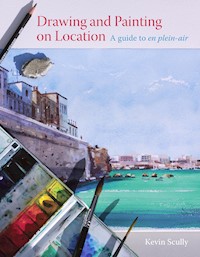


Painting Landscapes
Painting Landscapes
Kevin Scully
THE CROWOOD PRESS
First published in 2018 by
The Crowood Press Ltd
Ramsbury, Marlborough
Wiltshire SN8 2HR
www.crowood.com
This e-book first published in 2018
© Kevin Scully 2018
All rights reserved. This e-book is copyright material and must not be copied, reproduced, transferred, distributed, leased, licensed or publicly performed or used in any way except as specifically permitted in writing by the publishers, as allowed under the terms and conditions under which it was purchased or as strictly permitted by applicable copyright law. Any unauthorised distribution or use of this text may be a direct infringement of the author’s and publisher’s rights, and those responsible may be liable in law accordingly.
British Library Cataloguing-in-Publication Data
A catalogue record for this book is available from the British Library.
ISBN 978 1 78500 384 4
Frontispiece: From Beacon Hill, Kevin Scully, oil on board, 12″ × 10″. An oil sketch, painted en plein air, in preparation for a larger painting to be produced later in the studio.
Contents
Introduction
Chapter 1 Initial Planning
Chapter 2 Materials
Chapter 3 Working on Location
Chapter 4 Choosing your Subject Matter
Chapter 5 Colour
Chapter 6 Planning the Painting
Chapter 7 Starting to Paint
Chapter 8 Painting En Plein Air
Chapter 9 Working from Photographs
Chapter 10 Natural Progression
Acknowledgements
Suppliers
Contributing artists
Index
Introduction
When you go out to paint, try to forget what objects you have before you, a tree, a house, a field or whatever. Merely think here is a little square of blue, here an oblong of pink, here a streak of yellow, and paint it just as it looks to you, the exact colour and shape, until it gives you your own naïve impression of the scene before you.
CLAUDE MONET
Vapour Clouds at the Power Station, Kevin Scully. (12" × 10", oil on board)
The water vapour emitted from the chimneys at this power station takes on some spectacular colours, depending on the atmospheric conditions and the colour of the sky at certain times of the day. To obtain the full impact of this, the chimneys are best viewed from a distance. The white area at the bottom of the painting could be mistaken for snow, but is in fact several acres given over to growing papaver somniferum, the opium poppy used in the pharmaceutical trade. The choice of contrasting colours – orange and blue used in this image – add a sense of drama to the unusual subject matter.
All painting is an illusion. When we produce a painting, we are attempting to recreate the sensation experienced when viewing something in three dimensions, into a two-dimensional representation. The physical process of applying paint to a support is something that will always be totally unlike creating an image by any other mechanical or digital means. It is deep in our DNA to want to make symbols of those things that we see around us by using an ancient physical process. Ever since Homo sapiens began making representational marks on cave walls, we have been striving to do the same in ever more sophisticated ways. It is a means of self-expression, together with the need to communicate with others that which we see around us.
For painters, the click of a button and the manipulation of the photographic image will never be enough to satisfy the desire to reproduce what he or she experiences when being confronted with the complexities of nature. Why do we bother to paint the landscape, when we can far more easily photograph it? There are many obstacles to overcome, and the methods employed in translating what we see into a painting are countless and sometimes tortuous. But it is this journey that we make, with all of its complications and twists and turns, that gives the most satisfaction. It is something that has to be worked at, to be fretted over and eventually to be honed into the finished article that actually makes a statement about why we chose the subject in the first instance.
The Old Bridge at Carcassonne, David Sawyer. (16" × 24", oil on board)
Contre-jour, or painting against the light, is an excellent way of working, especially if you want to avoid getting bogged down in too much detail. The complex architecture of the medieval city and bridge has been reduced almost to a silhouette. The large, dark tree on the right gives a degree of cohesion to the whole composition and keeps the attention focused in the centre of the picture. The whole painting was completed in less than three hours, and all painted on the spot. With a minimum of brushwork and a limited colour range, the artist has produced a very successful and convincing painting. When in doubt, it always pays to keep it simple!
High Oaks Farm, Deborah Tilby. (18" × 18", oil on board)
Subjects such as this are fun to paint – all the paraphernalia that is found in a farmyard has been painted loosely and without any definition, merely suggesting what it all might be rather than actually stating it. The large, fairly plain expanse of yellow/green field on the right of the painting creates a strong design element. The narrow strip of foliage and fence on the left divides the composition vertically, and this has been counterbalanced by the road on the right. The scene is backlit with simple clouds painted with very little detail, but just sufficient to suggest the backlighting. The warm, golden colour with which the board has been prepared has been allowed to peek through in certain areas, which unifies the whole painting.
There are often underlying patterns and arrangements in the landscape that appeal to us in a subconscious way, and it is by understanding and analysing these systems that we can begin to reproduce an image that appeals to us. However, by simply basing our paintings on long-established rules, and underpinning them with trusted compositional structures, we will only be able to tell half the story. But there are no limitations when it comes to using our imagination and desire to reproduce in paint that which initially inspired us.
But there are limitations to what can be reproduced using just paint. For example, it’s impossible to replicate the brilliance of pure light by simply placing pigment on canvas, but by employing certain devious means, the sensation can be simulated by the manipulation and juxtaposition of colour in its various tones.
Not everything in nature is perfect, and just because something is there, it doesn’t necessarily mean we have to reproduce it exactly as we see it. A few adjustments might have to be made when translating the natural world into an agreeable composition. The challenges set by nature are immense and complex, and ultimately the way in which we represent them as painters is an individual one. We should strive to look beyond simply copying what we see, and instead we should attempt to make a statement about the sensation that drove us to paint that particular scene in the first place.
Village Laundry, Kerala, Kevin Scully. (20" × 27", oil on board)
Although by no means an uncommon subject for a painting, the sheer volume of washing on display perhaps excuses its inclusion in this book. This was also just a small section of ground that the laundry occupied in this village in the region of Kerala in southern India. The sheer volume of washing has been emphasized by the viewpoint taken, showing the lines at an angle, and the washing diminishing in size as it moves across the composition. To add interest to the image, small patches of colour seen in the washing have been scattered around the rest of the painting. The main focus has been strengthened by the dark background.
The term ‘landscape painting’ can also encompass other categories of subject matter, and there is much justification for overlapping one with the other. Although it definitely excludes portrait and figure painting, as well as interior scenes and traditional still-life subjects, there is good enough reason to include certain river and seascapes as well as urban and industrial landscapes. In its broadest terms, it could be described as painting anything that exists outside.
Inspiration and Motivation
There is nothing so exciting for an artist than to be able to pick up their brushes and paints and dive headlong into painting a scene that has fired them into action. Inspiration leads to motivation, and as a general rule we are inspired by the things we like to look at. By consistently placing ourselves in front of those scenes that delight us, inspiration will eventually shine upon us and keep us enthused during our painting sessions. This may be the early morning mist rising from a deep valley, or perhaps the lengthening shadows of winter trees on a sunny, snow-covered hillside at dusk. What inspires one person may not necessarily inspire another. A simple path leading into a wood may not seem to be the most exciting of subject matters, but if you have chosen to paint it for whatever reason first stirred you, it is the way in which you convey your interest in the scene to others that is the challenge.
Seeking inspiration can be a frustrating experience. If you feel the urge to paint, and nothing that presents itself inspires you, it is very easy to become dejected, especially if you end up painting something just for the sake of it. This approach usually leads to a very unsatisfactory outcome. Nobody can be inspired all of the time, but when that moment arrives you must be prepared for action.
Virtually every landscape subject has been tackled by another artist at some time or other, but this doesn’t mean that you can’t interpret it in your own, individual way. Within this book there are a number of paintings by different artists, each possessing a particular, unique style. Some of them will undoubtedly appeal to you more than others, but they have been chosen because they each have qualities to be admired. Because you may be drawn to the style in which some of them have been painted, this doesn’t necessarily mean that you wish to paint in that way. With experience your own handwriting will emerge, usually in spite of adopting some of the techniques of another painter. Although a highly realistic image may have been executed with great skill, and may contain all of those elements that combine to reproduce a great painting with faultless technique, it may not be appropriate for you. Your natural instinct may require the same scene to be painted with looser, less descriptive brushwork. Your approach may be a more expressive response to the landscape that you have chosen to depict.
However, inspiration can be drawn from those paintings that appeal to you; it may be the low horizon line, or the way in which the image has been unconventionally cropped, or perhaps the muted colour palette that the artist has used. It’s very difficult to work in isolation, and even the greatest painters will have been influenced by others that have gone before them, and often perhaps by some of their contemporaries. Even those artists whose work has been influenced by others will at some stage put their own thumbprint on the paintings that they produce.
The greatest source of inspiration is of course the landscape itself. Who couldn’t help but be motivated by a misty, early morning scene gradually lit by a pale winter sun, or the deep, rich shadows cast by the summer sun at dusk? To experience these wonders of nature does require a degree of effort though, and you may have to rise early, or travel further afield to experience that which isn’t on your immediate doorstep. By observing nature in the raw, you will eventually be able to train your eye in detecting what it is that makes a scene visually pleasing. It may be the repetition of certain elements in the landscape, for instance a row of trees, or a line of fence posts disappearing into the distance. Or conversely it may be a single element, such as a solitary tree on a barren hillside, or a lonely farmhouse deep in a hidden valley. Different seasons provide us with some spectacular subject matter; skeletal trees silhouetted against a cloudless sky, the rich, warm colours of autumn, or the blue shadows across a snowy, winter landscape, illuminated by brilliant sunlight.
Mediums Covered
This book is primarily concerned with oil and acrylic painting, and the necessary materials and equipment associated with these mediums. Although the majority of paintings in this book have been executed in oils, the underlying principles of composition, perspective, tonal variation, form and colour can be applied to any other medium, whether it’s watercolour, pastels, mixed media or simply drawing. An artist may choose a medium because it suits the way in which he or she likes to work, and in the case of oils this may be because of the appearance of a finished oil painting, with its richness and depth of colour. It may also be the medium’s versatility that appeals. A painting can be built up in stages with careful consideration to produce subtle effects, or it can be applied with gusto and bravura to create an expressive work of great dynamism.
One of the major advantages of using oils when painting the landscape is their fairly slow-drying nature. A painting can be adjusted and tweaked as lighting conditions change during the painting process. Colours can also be blended with each other or removed altogether with the wipe of a rag, and corrections can be made at almost any stage during the development of the painting.
There are very few rules that need to be adhered to when using oil or acrylic paint, but there are numerous applications and techniques to be aware of that will enable you to exploit their qualities fully when using them to develop a sound foundation for painting the landscape.
Acrylic paints have the disadvantage of drying rather quickly and tend to have a more ‘plastic’ appearance, but they will appeal to those artists who favour a more hard-edged, modern look to their work.
The way in which you work will undoubtedly dictate which medium you prefer, and perhaps your preferred medium will influence your own painting process. The qualities of each will be described later in this book.
Out of Summer, Kevin Scully. (12" × 12", oil on board)
The water level of this river has been placed low down in the image to emphasize the height of the wooded hill in the background. The four main shapes in the painting, the sky, the woods, the water, and the rocks, are each different in the way that they have been treated. The sky has been rendered in random, alternate brushstrokes, the woods in vertical ones, the water in horizontal ones, and the rocks in predominantly diagonal ones. The whole painting has retained a sense of cohesion with similar colours appearing in each separate element.
CHAPTER 1
Initial Planning
If you fail to plan, you are planning to fail!
BENJAMIN FRANKLIN
White Hart Track (detail), Kevin Scully. (22" × 24", oil on board)
Before you leap head-first into a painting, it’s wise to take some time out to consider a few things. What is it that you are hoping to achieve? Will you be content painting a simple landscape that may just contain some fields in the foreground, perhaps some trees in the middle distance, some hills behind and a cloudless sky? Or will you be attracted to a more complex composition that might include some buildings and even people? If you are fairly new to landscape painting, it would probably be rather unwise to embark on a vast, panoramic scene filled with layer upon layer of complicated detail receding into the distance. It would be far better to set your sights a little lower, and begin with a more modest scene.
If you haven’t yet developed your own style, I see nothing wrong with gathering together some images of the kind of paintings that you not only like, but those that have been painted along the lines of the kind of paintings you hope to produce. There may be many paintings that you admire, but this doesn’t necessarily mean that you want to paint in that style. Having a few paintings around that resonate with you can act like a springboard when it comes to settling on a composition, a format, or a colour scheme. Sometimes it’s possible to detect in another artist’s work a kindred spirit, and it may be that by experiencing that sensation you were inspired to paint in the first place. It might not be immediately obvious why this is so, but by studying that work and trying to read beneath the surface to discover exactly what the artist was trying to say about the subject, and why it evokes in you such exciting responses, may lead to some stimulating discoveries.
Towers of Stone, Capertee Valley, Warwick Fuller. (18" × 18", oil on canvas, stretched onto board)
The technique employed in executing this powerful painting lends itself perfectly to the subject matter. After an initial wash of thin oil paint, the artist has painted the rock and foliage with gusto, laying the paint on with bold directional strokes that describe the strata of the rock, and the rounded form of the foliage. The billowing clouds and sky have been painted with slightly thinner paint, which prevents this area of the painting from overpowering the main subject matter. The painting was completed on site from the shelter of the artist’s camp below the bluffs, in one and a half hours.
Gorge at Cundiyo, New Mexico, Charles Jamieson. (25" × 25", oil on linen)
This painting contains two separate focal points. On the left, the eye is drawn towards the gap in the undergrowth and into the more subtle shadowed areas. The other focal point is on the right, where the sun has crept over the edge of the gorge and splashed a highlight across the upper part of the tree. The artist uses the weight and depth of colour in the lower area of greenery to lead the eye into both these places. This sensation is reinforced by the strong horizontal shapes of the sky, the sun-bleached rock face in the background, the mass of the foliage, and the bare earth in the foreground. The verticals are as strong as the horizontals, particularly the two tree trunks framing the sun-drenched tree. In this painting, the eye is encouraged to travel around both horizontally and vertically.
Your aim when painting anything should be to make a statement about why you chose to paint it. Hopefully, it should be obvious to the viewer that you have done so, whether this is immediately apparent or perceived more gradually, or even subliminally, is less important. Your painting should be about something, and not just a literal interpretation of what you see in front of you.
You have to accept that not all of your paintings are going to be masterpieces, and instead regard each as a warm-up, and an exercise in learning the skills and techniques that you need to be able to eventually produce successful paintings. With experience you will be able to tell whether or not a scene is going to make a good painting, as certain things that we see in nature might look beautiful to us, but that doesn’t mean that when we replicate the scene in two dimensions, it always works as a painting.
An experienced landscape painter might make the task look easy, but the truth is, it is difficult. If it were easy, anyone with the necessary skills could do it, but it is only with practice, patience and sustained persistence that we reach our goals.
Subject Matter
The possibilities for a landscape painter are infinite, and for the inexperienced painter, often just too overwhelming. Unlike other subject matter, the landscape by its nature is immense and complex. It is its own master, and what you see is what you get. It can’t be physically rearranged or altered as can the elements in a still life set-up, or a model posing for a portrait painting.
This is the kind of photograph an inexperienced artist would probably choose to paint from, and very soon would find themselves in difficulty. The main problem with tackling this kind of picture is the absence of sufficient distinction between the various layers and shapes of the receding landscape. In its three-dimensional state it would probably have appeared as a good enough subject to paint, but the photograph has reduced much of the scene to a jumble of greenery. The two trees on the right appear to be too close to each other, and even if it were one tree with two trunks, it doesn’t look right. The stripy shadows are too dominant, and are at odds with the direction that the path is taking. The hay bales wrapped in black plastic block the view of a path leading off to the right, and the sky stops too abruptly along the treetops in the distance. So to compose a more acceptable arrangement, these things will need to be addressed.
We all have favourite subject matter that appeals to us more than others, and this would be a good starting point when contemplating what to paint. You may have some photographs that you took because you thought one day you would like to paint that scene, and perhaps some of them would indeed translate into successful paintings. You may be struck by a particular location that you feel has all the ingredients to make a spectacular painting, and as long as you feel the urge to paint it, the chances are pretty good that it will have possibilities.
In this compositional sketch, the elements in the landscape have been rearranged and separated by shape and tone, making more sense of the way in which the image can be understood spatially.
There are of course enduring scenes that have been painted a thousand times, but this doesn’t mean that they can’t be painted a thousand times more. Some typical examples of this are views of lakes and rivers with trees and hills reflected in the water, or the Tuscan farmhouse with its terracotta roof, perched on a hill backed by Cypress trees and flanked by golden fields beneath a clear, cobalt sky. Sunsets and sunrises are always appealing, but should be approached with caution, less you are lulled into producing a rather clichéd pastiche. Another typical image shows a road or track disappearing and reappearing across a landscape punctuated with hedgerows and copses, whilst the majestic grandeur of a mountain range offers great scope for a painting of great dynamism.
It’s unwise to tackle subject matter that doesn’t really appeal to you simply because it’s popular. If you have a passion for something, it will be far more likely to succeed than one that leaves you a little cold and uninspired. Sometimes the simplest of scenes can provide excellent subject matter for a painting, and conversely a highly complicated scene when rendered in paint can be rather confusing to the eye unless it has been composed and approached with care.
This image contains some interesting elements, but too many of them don’t sit comfortably together. The thatched cottage is a fairly dominant feature, but the track veers off in a different direction, leading the eye out of the picture instead of into it. There are too many lines going in different directions, and the whole image would need some serious editing to establish an acceptable arrangement. It’s also quite difficult to produce a well-balanced landscape composition without showing any sky.
These two sketches show possible alternative formats, where the positions of the different elements have been relocated.
Preparing a Strategy
There is much to consider before embarking on a landscape painting, and this is perhaps one of the most important aspects of the painting process. To some, this first stage is considered as an irritation, but it can’t be emphasized enough how essential it is, especially if you are inexperienced. A careless approach at this stage could lead to disappointment or even worse, disaster later on.
Although these initial decisions are important, they can be altered and adjusted during the early stages of your planning strategy, but rather more difficult to change once you have started to paint. A technically and beautifully painted picture may be irredeemable if any one of a number of mistakes has been made at an early stage.
Having chosen your subject matter, there are now certain decisions that have to be made. If you are working from a photograph, it’s likely that when considering compositional issues, you will need to crop the image somewhere. Having taken a photograph of a scene that appealed to you and then printed it out, you may now begin to wonder if the automatic format that the camera uses suits the subject. It is always worth considering a different format, and this could be portrait, elongated landscape, or even a square. The size of canvas or board that you choose to work on is probably of less importance, and more a matter of personal preference. A dramatic painting of doom-laden clouds casting shadows across a vast landscape can look just as dramatic on a small canvas as one painted on a much larger scale.
The next thing to consider is composition. When you took the photograph you may have consciously or subconsciously composed your image, but you should reflect now on whether or not to crop it. The temptation when taking a photograph is to include everything that you see, and this can result in an image with no strong focal point. You may now decide that the horizon line needs to be raised or lowered to shift the emphasis slightly between sky and land. If a group of trees on one side of your image is too dominant, it may need to be cropped slightly, or even entirely. What we should be doing when we are painting is to instil into our pictures that which the camera is unable to.
Another way of approaching your compositional decision is to produce a number of quick sketches, which rather than being simply linear, should be tonal. These will very quickly demonstrate what is going to work and what is not.
An arrangement that falls short as a thumbnail sketch, will also fail as a completed painting. It’s important to evaluate the tonal variations in your image. If there is little distinction between the dark, middle and light tones, your painting may lack the impact that you were hoping for, and these tonal variations need to be adjusted. Even in a subdued painting, it will be necessary to have some variance between the lights and darks, and to have them distributed throughout the painting in a balanced and cohesive manner.
There is a section of this photograph that has the potential for the basis of a good painting, but there are a few grey areas that need to be addressed.
Having established your tonal arrangement, you must now think about colour. More often than not, the colours of a photograph can be rather disappointing, and don’t in any way reflect what you saw when you took it. The bright colours that you initially perceived have become diluted, and the deep, rich shadows appear as colourless dark holes. You may have to organize your own colour scheme, and this may be based on a system of complementary colours, a warm/cool relationship, or a monochromatic range of tones.
As an alternative format, the image has been changed from landscape to portrait, and the building to the left-hand side has been removed.
The square format would also work well, and in both sketches the building to the right has been altered, and the contours of the fields in the background changed to create a better balance of movement.
The Limitations of Two Dimensions
Because of its complexity, what we observe in nature has to be amended so that it sits comfortably within the constraints of two dimensions. We have to devise devious means by which to suggest spatial divisions. This visual code can create the illusion of three dimensions, and can be suggested by differences in tonal value, aerial and linear perspective, and also colour differences. We will never be able to replicate the brilliant light emanating from the sun, and there has never been a painting so startlingly bright that we need sunglasses to look at it, but we can suggest its intensity by tweaking other colours in our painting.
We can hint at spatial differences by overlapping different elements in our landscape paintings, so that one contour appears to be behind another. This device can be further emphasized by a variation in tone or colour. Even in landscape painting, linear perspective plays an important role, where objects of a similar size appear to be smaller the further away they are. This is a useful device when painting clouds, where those closer to the horizon are depicted as smaller than clouds of a similar size, higher in the sky. The difference in the size of these clouds can also be exaggerated to emphasize the illusion of distance even more convincingly.
Aerial or atmospheric perspective can be used to suggest distance by rendering those elements seen in the distance in a more subdued colour range, and with a lack of strong contrast, texture and detail. A common trap that the novice painter falls into is trying to include everything that they see. When we focus on single elements in a scene, it is certainly possible to detect individual leaves on a tree, or blades of grass in a field, but by painting them as such, it usually detracts the viewer’s eye from that part of the picture that we want them to look at. It would be far better to paint the tree and the grass as a series of shapes of varying tones and colour, which is what we see in our peripheral vision when we are focusing on a bridge across a stream, or a dilapidated barn in the middle distance.
Dragon Hill, Oxfordshire, Kevin Scully. (16" × 14", oil on board)
Painted on a Raw Sienna ground to suggest a warm and clear summer day, the image uses both linear and aerial perspective to create a sense of distance across this open, flat landscape. The hedgerow boundaries diminish in size and tone as they recede into the distance, and the sky is gradually lightened as it meets the horizon. The fields in the far distance take on the blue haze of the atmosphere where the clouds can be seen to diminish in colour, intensity and size.
Minimizing Nature’s Complexities
We are all confronted with too much information when we place ourselves in front of nature, so we have to extract the essential ingredients from her complexities, and through a process of reduction and simplification, we must organize her various elements into a series of coherent forms. The most important part of producing a landscape painting is first to establish the general masses. It can be all too tempting to start indulging in unnecessary detail at this early stage of the painting before the foundations of the subject matter have been laid. The first thing that the viewer of a painting sees is not the detail, but the overall shapes. There may well be more descriptive detail within these areas, but this is subordinate to the overall shapes. Remember also that paintings are supposed to be viewed from a certain distance, as on the wall of a gallery, so it’s important to regularly stand back from your work to establish whether or not the overall shapes are strong enough, and not overwhelmed by extraneous detail.
Belderg Farm, Jeffrey Reed. (10" × 10", oil on canvas)
Using a very limited palette of muted colours, the artist has created a painting that describes perfectly the space that the farmhouse occupies in this open landscape. There is a strong but not obvious design element holding this composition together, where the picture is divided roughly into three sections, with the centre section being anchored by the line of foliage and farm buildings, focusing the viewer’s attention on the middle distance. Rough tracks lead the eye both to the farm, and also away from it. Overlapping the various sections has created a sense of distance, and the painting has been injected with atmosphere by adding the pale grey clouds that appear to drift across the sky in a gentle breeze. In this surprisingly small painting, just 10" × 10", so much has been said with so few brushstrokes. Painted on location in County Mayo, Ireland.
In this simplification process, the fewer shapes that you can break the scene down into, the better. These shapes can then be fine-tuned and embellished at a later stage if necessary, to a degree that describes the landscape as it is, or to leave a certain amount to the viewer’s imagination. A sound approach to organizing these shapes is to imagine them as a series of flat cardboard cut-outs, lined up one behind the other. They can be distinguished from one another by changes in tonal value and colour. Viewing the landscape through the zoom lens of a camera or binoculars also has a similar effect of separating its various components into separate, flat planes.
As well as leaving certain things out, remember too that we should also be adding things to our paintings. We shouldn’t be simply copying what we see, but instead we should be striving for originality, and our own original response to nature.
SIMPLIFYING SHAPES
To determine basic shapes when looking at a scene, it helps to screw your eyes up so that the image becomes less distinct. What happens is that many of the mid tones are eliminated, leaving just four or five discernable variations. This variation in tones and simplification of shapes become even more apparent if you take a photograph of the scene, and print out the image in black and white.
CHAPTER 2
Materials
Do not just pick up the brushes you used and cleaned yesterday because they are there. Put those back, look at all of them, and then choose your weapon, like a type of gun or a certain type of sword. You are going into battle and you want the best weapon for the job.
RICHARD SCHMIDT
The Good, the Bad, and the Ugly


