18,49 €
Mehr erfahren.
- Herausgeber: Crowood
- Kategorie: Geisteswissenschaft
- Sprache: Englisch
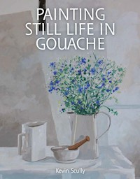
Gouache is an exciting, forgiving and versatile fine art medium. It has a long history going back many centuries, but for some time it has been seen as a medium for illustrators and designers. It has now been rediscovered by the fine artist. In this beautiful book, Kevin Scully champions its cause and explores its attributes. He explains how it can be used to exciting and stunning effect when painting still life. Further topics include: understanding and using colour effectively with sections on paint, colour, tone, light and shadow; painting flowers, objects and backgrounds; traditional and contemporary approaches with step-by-step examples and finally, ways to develop your painting and experiment with different styles, exciting compositions and new techniques.
Das E-Book können Sie in Legimi-Apps oder einer beliebigen App lesen, die das folgende Format unterstützen:
Seitenzahl: 246
Veröffentlichungsjahr: 2015
Ähnliche


PAINTINGSTILL LIFE INGOUACHE
Kevin Scully
THE CROWOOD PRESS
First published in 2015 byThe Crowood Press LtdRamsbury, MarlboroughWiltshire SN8 2HR
www.crowood.com
This e-book first published in 2015
© Kevin Scully 2015
All rights reserved. No part of this publication may be reproduced or transmitted in any form or by any means, electronic or mechanical, including photocopy, recording, or any information storage and retrieval system, without permission in writing from the publishers.
British Library Cataloguing-in-Publication Data
A catalogue record for this book is available from the British Library.
ISBN 978 1 84797 978 0
Frontispiece
Blue Jug, Green Jug, Kevin Scully. This painting demonstrates how by adding light touches of similar colours into each of the objects, a harmonious composition can be created.
Acknowledgements
This book is dedicated to all of those artists, famous and not so famous, both present and past, whose work I studied and admired during the long process of writing it. I would especially like to thank Jane Askey, Elizabeth Vann, Clare Wake and Malindy Argyle, who kindly gave permission for their paintings to be included in this book.
I would also like to thank the following establishments for allowing me to use their images for reproduction: Museo Archeologico Nazionale, Napoli (Still Life with Glass Bowl of Fruit and Vases); Dobiaschofsky Auktionen AG, Bern (Vegetable Still Life); Los Angeles County Museum of Art, California (Still Life with Cherries and Peaches), Michele Webber – contributing artist.
CONTENTS
Introduction: A brief history
1. Materials and equipment
2. Subject matter and composition
3. Colour and techniques
4. Painting flowers
5. Objects and backgrounds
6. Advanced techniques
7. What next?
Recommended art suppliers
Index
INTRODUCTION: A BRIEF HISTORY
As with many things, the precise history of gouache is vague and there are many versions to be found. However, the use of pigment in conjunction with a binder to create an opaque paint can be traced back to primitive cave paintings. The process of adding various forms of gum to pigments so that they adhere to different surfaces is also ancient.
Three Lemons, Kevin Scully. A painting in which a very limited colour range has been used. The focal point has been placed high up in the composition, and from here the vertical folds in the cloth lead the viewer’s eye down to the bottom of the picture.
It is generally believed that the word gouache is derived from the Italian guazzo or aguazzo, which refers to the process of applying oil paint over an egg tempera base. At some stage in history this term seems to have been transported to France, where it emerged as ‘gouache’ and became a generic term for all water-based paints.
The Ancient Egyptians used various binders for the pigments they used in their vibrant decorative work. These included beeswax, eggs and tragacanth, a natural gum made from the sap of assorted plant roots. Another substance was casein glue, made by mixing milk with lime. The limestone walls of tombs and temples were covered with a thin layer of plaster onto which the colours were applied. They depicted images of offerings to the gods in a rather two-dimensional way. The paint needed to be fairly opaque so that it could be applied to the stone or plaster walls of buildings and tombs. Similarly, before the existence of paper the rough surface of papyrus did not suit transparent colours.
Inanimate objects have been the subject of paintings for thousands of years. The Romans arranged groups of objects together in their mosaics and wall paintings. However, during the Middle Ages art was regarded as something to be utilized in the service of Christianity, so virtually all of the still life objects in paintings were included to embellish the religious message. It wasn’t until much later that still life as we know it today became the subject of paintings in itself.
In the Middle Ages the monks used a form of gouache for illuminating their manuscripts by adding gum to their water-based media, some of these colours being as rich today as when they were first painted. As early as the late fifteenth century the German artist Albrecht Dürer was using gouache to create beautiful paintings of great subtlety and depth. Between the sixteenth and eighteenth centuries a form of gouache was being used by both Western and Eastern miniature painters and a similar medium, distemper, made from animal glue was being used in decorative application. Raphael’s cartoons for the tapestries of the Lives of SS Peter and Paul (1515–1516), which were to be hung in the Sistine Chapel in Rome, were painted in a form of gouache.
In the seventeenth century there was a movement of still life artists in Holland that produced paintings of complex composition, depicting a huge abundance of food and drink alluding to life’s rich fertility, and by the mid-eighteenth century the Dutch were at the forefront of the genre. Many Dutch and Flemish artists were working in Paris during this period and they undoubtedly had an influence on French painters. Jean-François Eliaerts (1761–1848) was one such renowned painter who has been credited with importing the Dutch still life style into France. His talent was such that he became Professor of Art at the Institute of the Légion d’Honneur at Saint Denis and so was in a position to pass on his undoubted skills to his students. During this period he exhibited many still life paintings at the Salon, with compositions set among intricate surroundings. Some of these paintings in gouache were on wood panels.
By the eighteenth century the medium had become increasingly popular with artists in other parts of Europe, including the French artist François Boucher (1703–1770), whose decorative works made great use of its subtle, matt qualities. During this period the English artist Paul Sandby (1730–1809) was using gouache extensively in his large landscape paintings, including several images of Rochester from across the Medway River and views of Windsor Castle painted in a freer, more colourful style than his earlier topographical works in watercolour.
Still Life with Glass Bowl of Fruit and Vases. A Roman wall painting of around AD70 from a house in Pompeii.
It is just possible that gouache was introduced into England by painters of French ancestry, such as Joseph Goupy (1689–1769), nephew of the French portrait painter Louis Goupy. Joseph was drawing master to the royal family of George I, but towards the end of his career he produced small copies of Old Masters paintings in both pastel and gouache. Paul Sandby and Joseph Goupy were contemporaries and well acquainted, so it seems fairly likely that the influence lies here.
From around 1740 gouache was much favoured by English topographical artists, but other than these painters, its use had begun to decline into purely decorative painting on household furnishings and theatrical props. There is little evidence of gouache being used in still life painting in England during this period. The Swiss topographical artist Louis Ducros (1748–1810), who was working in Italy and Malta on large format, romantic landscape paintings in gouache and watercolour, continued almost alone in his use of the medium in fine works of art. In the 1830s there was something of a revival by several Victorian watercolour artists, who continued to use gouache until the end of the century.
The medium was also adopted by the Pre-Raphaelites, and many of the most famous works by artists in this movement were painted in gouache, including the set of ten beautiful paintings by Edward Coley Burne-Jones in his Perseus series. These are housed in their own wood-panelled room at the Southampton City Art Gallery. In 1840 J.M.W. Turner painted Fish Market on the Sands in which he used gouache with great effect to create the illusion of an early morning foggy sky. Turner was probably the first artist to use gouache in a more innovative way, and he began to experiment with it by incorporating it into his atmospheric watercolours. In many of his paintings an array of techniques can be detected, including semi-opaque washes, wiping out and even on occasions scratching out some of the paint from the surface. The colours are left to drip and then smudged across the paper and blotted.
In the mid-1800s it was becoming popular for artists to work outdoors and those who chose to do so were now able to carry tubes of colour rather than having to rely on paints prepared in the studio and stored in jars. Watercolour and gouache were ideal for painting en plein air, as all that was needed to dilute them was water. Among the many famous artists who produced paintings in gouache were Rubens, van Dyck, Poussin, Singer Sargent, Degas, van Gogh, Egon Schiele and Matisse. Matisse’s famous series of ‘Blue Nudes’, painted in the mid-twentieth century, were produced in gouache.
A More Modern History
As early as 1825 a poster advertising ‘The Opening of the Stockton & Darlington Railway’ in Yorkshire was painted in gouache. In France in the 1890s Toulouse-Lautrec, among others, was using gouache to produce posters for advertising and theatre productions. In the 1920s a style was set for a whole series of railway and Underground posters, painted by a great number of prolific artists, that remained in production for many years.
Vegetable Still Life, Elise Puyroche-Wagner, 1842. A gouache painting displaying the way in which the medium can be used in both transparent and opaque applications.
Still Life with Cherries and Peaches, Paul Cézanne, 1885–1887, oil. Although not executed in gouache, this painting demonstrates a more modern, casual style of still life composition that had not featured in earlier art movements.
Simplonlinie Montreux, Emile Cardinals, 1928. A poster advertising the Simplon railway link through Switzerland. One of the many thousands of transport and travel posters painted in gouache that were produced in the first half of the twentieth century.
In the twentieth century gouache became a favoured medium among illustrators and designers working to tight deadlines in advertising and publishing, as its quick-drying quality and matt finish make it excellent for accurate reproduction at the printing stage.
In 1920s Chicago a group of artists was commissioned to produce a series of posters for the utility companies. These posters, executed in gouache in a variety of styles, included work by figurative artists Oscar Hanson and Willard Elmes and graphic artist Ervine Metzel. Some examples of the transport posters can be seen in London’s Victoria & Albert Museum.
To a certain extent, gouache as a medium for producing fine art paintings has been overlooked in more recent times, being overshadowed by oil, acrylic, pastel and watercolour. With a few exceptions, artists using gouache for still life painting are a bit of a rarity. Because of the demand by designers and illustrators for the production of brighter, richer colours, gouache ceased to be regarded for a time by fine artists as a medium of true integrity. In the mid-twentieth century gouache was rather hijacked by illustrators as their medium of choice. It was used in posters, magazine illustrations and greetings cards by some very talented artists who chose the commercial route by which to make a living. There was – and still is – a fine line to be drawn between some commercial art and some fine art. It could be argued that anything painted with a view to selling could be considered ‘commercial’. This is a matter for debate, but is probably hotly disputed by many ‘fine artists’!
As with other media, there were (and still are) many ranges of gouache available that contain pigments of dubious quality and colours of a gaudy hue.
To increase the opacity of water-based paint, various substances have been added over the centuries, including chalk, marble dust and numerous other white pigments. Today’s artist’s quality gouache paint has little or no white pigment additives, but rather contains a much greater quantity of pure pigment than watercolour, and is suspended in gum arabic.
An Alternative Medium
Watercolour, as with other media, has specific qualities unique to itself. The beauty of this medium is its ability to produce subtle effects fairly rapidly with a minimal amount of effort. The transparency of the paint allows the paper to shine through, creating a luminous glow. To retain this quality, certain techniques have to be employed and decisions made regarding how you want the finished painting to look. Is it to be painted in a loose, free-flowing style or will a careful and detailed execution produce the effect you are after?
Those who have experimented with watercolour will know of the frustrations and disasters that can be encountered when applying layers of transparent washes, while trying to keep the painting fresh looking. All too easily a once-delicate painting can soon be reduced to a muddy, dead-looking mess. With careful planning and a great amount of skill it is, of course, possible to achieve success with watercolour, but this can be a rare occurrence, and can sometimes be attributed to pure luck. A successful painting created with quick and confident brushstrokes is much to be admired, but is usually the result of a great amount of practice and experience. Most people who start painting choose watercolour as their preferred medium and it does indeed have many attractions. It is a very portable medium and very little is required in the way of equipment. A small watercolour set with a retractable brush can fit comfortably in a jacket pocket, and all that is needed other than this is a watercolour sketch-pad and some water. It is ideal for making quick colour washes over a pencil or ink sketch as reference for a more finished painting back at the studio, or for creating finished paintings on the spot. Great effects can be achieved by painting wet-in-wet, allowing the colours to run into each other and perhaps manipulating the result by tilting the angle of the painting as it begins to dry. Some colours when mixed together contain pigments that ‘granulate’, causing them to separate and float across the surface of the water without actually staining the paper.
Water-based paints are familiar to almost everyone who has ever picked up a paintbrush as a child at school or at home, and thus are the obvious choice of medium with which to start painting. To paint in watercolour is extremely easy. To paint well in watercolour is extremely difficult. Although watercolour painting is perceived as a particularly British medium and very popular, it is rarely taught in art schools and those who take it up are usually left to their own devices, take lessons with a tutor at private art classes, or enroll in adult education courses. Perhaps water-based painting suits the temperament of those living in a northern climate, as it certainly lends itself to the soft, misty land and seascapes found there, and is perfect for creating scenes of moody, evocative beauty.
Watercolour, however, does have some drawbacks. An ill-considered or unplanned painting by an inexperienced artist, perhaps painted in haste, will usually be doomed to failure. Too much water added to subsequent colour washes can cause the dreaded ‘cauliflower’ or ‘mushroom cloud’ effect that is almost impossible to rectify and will remain there to haunt you for ever. Forgetting to leave areas of white paper to signify highlights can be another problem, as the paints are very difficult to wash out, particularly if the colour used has had a staining effect on the paper. Repeated efforts to lift out the colour will damage the surface of the paper, and any subsequent washes over these areas will sink in as if applied to blotting paper.
For the beginner, the first brushstrokes can often be crucial. Will the wash dry too light? Will there be streaks in the sky? Have I mixed up enough paint? Have I painted over the highlight areas? There are, of course, artists who relish this challenge and thrive on the excitement of watercolour’s relative unpredictability and constraints.
Oil paints usually suit those of a different temperament. The application of oil paint is a much more physical process. Some people like its buttery consistency and the way it can be applied with less care in terms of the accuracy of initial brushstrokes. It can be applied with a brush or palette knife and then smudged, wiped, used thinly or thickly and even scraped off if you’re not happy with the painting’s progress. A promising painting that has taken a wrong turn somewhere along the road can be completely wiped clean with a rag and some white spirit. There are many reasons why people either like or dislike oil paint. There are those who can’t stand the smell of oil paint, and those who love it. There are even those who are allergic to the oil used in its composition and to certain painting media used for thinning the paint. It is certainly not as portable and lightweight as watercolour, and more equipment is needed. It is, of course, also rather messy, so those painters who are particularly neat and tidy by nature find all the paraphernalia of cleaning brushes, palette knife and so on rather irritating. The extended drying time involved in oil painting also puts some people off, although fast-drying oil paints are now widely available, which are touch-dry overnight.
Acrylic paint is water-based and has its own pros and cons. Its fast-drying properties appeal to some people, whereas others find it a bit of a handicap, although there are additives available to slow the process down. It can be applied to many surfaces and, once dry, is pretty indestructible. It can be painted over with many layers of colour without any ill effect. It can, though, be a destroyer of brushes if they are not thoroughly washed after (and sometimes during) each painting session. An acrylic painting can resemble an oil painting, and it is sometimes difficult to distinguish one from the other, although it could be argued that it does have the suggestion of a slightly ‘plastic’ look to its finished surface in contrast to the depth and richness that can be achieved with traditional oil paint.
Why Choose Gouache?
Gouache as a painting medium is not at the forefront of everyone’s mind and in truth many people are unaware of exactly what it is. It is a rather forgotten medium, but one with endless possibilities. It is often labelled commercially as ‘Designer’s Gouache’, which may perhaps be the reason why it is often dismissed as something that should only be used by designers and illustrators, and not fine artists.
A demonstration of the way in which some colours granulate when used in a wash; the pigment separates from the water and sits on the surface of the paper.
Any of the media described previously can be used to produce wonderful still life paintings, so why choose gouache? Perhaps in its use, gouache is a combination of some of the painting processes used in both watercolour and oil paint. If cost is a consideration, then gouache is cheaper than both. If you have found the drama and occasional disappointments of using watercolour a little too much, maybe here lies the medium for you. It is far less likely to make you want to tear your hair out and rip up your failed painting efforts. The process of producing a painting in gouache can be approached in much the same way as that of a watercolour. Initial washes can be applied with the paint thinned to a pale consistency without worrying too much about any small blemishes. Subsequent applications of paint containing more pigment and less water can be tackled in a way more akin to that of an oil painting, slowly adjusting the tonal intensity as the painting progresses. These layers can be a combination of both transparent and opaque colour. Colour can be adjusted and mistakes corrected without too much fuss, either by painting over with another colour or by carefully washing out the offending area and repainting it once dry.
Gouache is generally used on fairly smooth paper; as the paint contains finely ground pigments, it sits on the surface of the paper, in contrast to watercolour, which tends to sink into the paper. This gives gouache a smooth, matt finish that makes it ideal for illustrations that have to be scanned or photographed for reproduction. It is also a fairly fast-drying medium suited to the rigours of commercial deadlines. Today’s designers and illustrators have largely abandoned the use of paint in favour of computer software such as Photoshop and Illustrator, so perhaps fine artists are turning to gouache once again.
Because it flows more smoothly than acrylic paint, it is ideal for abstract and contemporary stylized paintings that require areas of flat colour. It is a versatile medium that can be used by artists to paint subjects in an array of personal styles. In short, gouache has many of the properties of other media without many of their limitations.
What is Gouache?
Gouache is a water-based medium and is closely associated with watercolour. Unlike watercolour, it is intended to be an opaque medium, although it can also be applied in transparent washes and sometimes the result is virtually indistinguishable from watercolour. One of its advantages is that it can be used in both transparent and opaque washes. The initial laying-in of colour can be executed in the same manner as one would approach a watercolour painting. Subsequent applications of colour can be painted more thickly, as in an oil painting. As there is not much of a purist tradition associated with gouache as a medium, there are not really any hard and fast rules to follow. So, in one sense you have a free hand to experiment with the medium’s capability without the fear of worrying about whether or not you are doing the right thing.
Gouache possesses a great many of the qualities of both watercolour and oil paint, and if you enjoy painting in both or either of these media then you will probably find it fairly easy to get along with.
Tubes of gouache from some of the ranges of artist’s quality paint available, showing the medium’s rich, buttery consistency.
Why Still Life?
Still life painting is often thought of as something that artists get up to when they can’t think of anything else to paint, or because it’s too cold or too wet outside for painting landscapes. Or there may be many other practical or physical reasons why artists revert to still life. To a certain extent this may be true, but a successful still life painting still demands as much creative thinking and planning as any other form of painting, whether it’s landscape, seascape, portrait or abstract. In any of these various categories of painting certain decisions have to be made: where will the emphasis or focal point be? What kind of mood do we want to suggest? Will the colours be harmonious or contrasting? What shall I leave out or what should I add?
Even if you are a landscape painter, you will feel a lot more comfortable making these decisions in the comfort of your home, by completing your final painting from sketches or photographs. As well as these considerations, in producing a still life painting you will need to utilize your drawing and compositional skills. Just because painting still life subjects may have practical advantages over some more challenging aspects of painting, it should never be considered a lesser form of art. A good painting is a good painting no matter what category it falls into. Similarly, a bad painting will always be a bad painting.
Any time spent drawing and painting is time well spent. It will improve your observational skills, your technical skills, your compositional skills and your decision-making.
CHAPTER 1
MATERIALS AND EQUIPMENT
Artist’s quality gouache nearly always comes in tubes. There are several good products available, including those made by Winsor & Newton, Daler-Rowney, Schmincke, Sennelier, Pebeo T7, Talens, Lefranc & Bourgeois, Lukas and M. Graham. There are other brands that are perhaps of an acceptable quality, but depending on availability I would recommend starting with a few tubes from the range of one of these manufacturers. Cheap, low-quality paints are to be avoided like the plague, as are the ‘poster’ paints sold in round pans. If you encountered these during your schooldays, you will remember them as being particularly non-user friendly. No amount of scrubbing the rock-hard cakes of pigment with a wet brush could persuade them to release enough colour to cover a postage stamp.
A selection of the materials that you need for painting in gouache.
Gouache is normally available in 15ml and 38ml tubes, but sizes vary according to the brand. White is available in larger sizes and some brands sell gouache in larger jars. As with watercolour, gouache colours possess different degrees of permanence, and this is indicated on the labels. Depending upon which brand you use, it will be indicated either by a code of letters or some other grading system. Winsor & Newton’s system gives the most permanent colours an AA or A rating and the least permanent a C rating, with B in between. Daler-Rowney’s rating system uses asterisks. The greater the number of asterisks, the greater the degree of permanency. They represent the degrees in these terms: Permanent, Normally Permanent, Moderately Permanent and Fugitive. Fugitive colours are likely to fade over a period of time, so if you are worried about your paintings losing their initial brilliance when they are hanging in the Tate or the National Gallery to be admired by future generations, perhaps they are best avoided other than in very small quantities.
There are some brands of gouache available, such as Holbein & Turner from Japan, that are acrylic-based, and a recent product on the market is Shin Han Pass, which is a hybrid paint that can apparently be used as both gouache and watercolour. As with most new products, the reviews are mixed, but perhaps this is something that you might find suits your style of painting. The pigment in this paint is very strong and some of the colours can stain the paper, which makes ‘lifting out’ difficult when used in thin, watercolour washes. This is a technique used by watercolour artists to lighten certain areas already painted by rewetting them with clean water and dabbing with tissue.
Quite often your choice of brand will be dependent on where you live and availability. If you are a lover of bees, I would suggest using M. Graham’s range of gouache from the USA that incorporates honey into the manufacturing process of its paint. You will quickly become very popular with the local honeybee population, who will soon be buzzing around your painting to see what you’re up to.
Even when painted in a semiopaque manner, certain colours will granulate. The examples shown here are (from the top): Cerulean Blue, Raw Sienna, Burnt Sienna and Ultramarine.
This image shows gouache in its opaque form in the centre of these bands of colour. Towards the top, white has been gradually added, and at the bottom water has been added. Although the colour at both ends of these bands appears to be quite similar, where the paint has been diluted with water, the granulation effect is evident.
‘They’ll sell you thousands of greens. Veronese green and emerald green and cadmium green and any sort of green you like; but that particular green, never.’
Pablo Picasso, 1966
A Basic Palette
Start off by buying a few individual colours, rather than a ‘starter set’. These sets certainly contain some useful colours but there will also be colours that, for whatever reason, you may never use, or may use so infrequently that over a long period of time they will solidify in the tube. If you haven’t painted before, a good selection of colours includes:
Permanent White
Ultramarine
Cadmium Red
Brilliant Violet
Cadmium Yellow Light
Pine Green
Raw Sienna
Raw Umber
Cerulean Blue
Burnt Sienna
Cobalt Blue
Lamp Black
In some of the demonstrations in this book other colours were also used; they included: Cadmium Orange, Tyrien Rose, Helio Blue, Scarlet, Turquoise and Magenta.
If you have used watercolour, acrylic or oil paint before, you will have your own favourite colours. Different brands use differing names in their colour ranges, so a colour chart will come in useful when deciding which ones to buy. Cobalt Blue from one manufacturer may be quite different in appearance to a colour with the same name from another manufacturer. As you produce more paintings over a period of time you will naturally accumulate extra colours for specific projects: a vivid Magenta for a particular flower, or a Viridian or Turquoise Green for a certain fabric, and so on. There will be colours that you are just unable to mix from your basic colour range and these will have to be purchased when necessary.
COLLECTING COLOUR CHARTS


