16,99 €
Mehr erfahren.
- Herausgeber: Crowood
- Kategorie: Lebensstil
- Sprache: Englisch
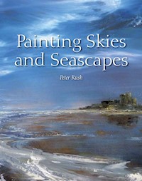
The sea and sky have captured the attention of artists for centuries. Their energy and drama, or their tranquility and beauty, can be portrayed powerfully and magnificently in a painting. This encouraging and user-friendly book gives practical advice on how to set about sea and sky painting, and explains what to look for in capturing space and movement, colour and light. Includes a guide to the tools, materials and techniques; practical instruction on coloured inks, acrylics, pastels, watercolours and oils; step-by-step painting sequences; inspiration and ideas from leading artists. A practical and inspirational guide to painting seas and skies, this book will be of great interest to marine, landscape, coastal and naval artists.
Das E-Book können Sie in Legimi-Apps oder einer beliebigen App lesen, die das folgende Format unterstützen:
Seitenzahl: 126
Veröffentlichungsjahr: 2014
Ähnliche


Painting Skies and Seascapes
Peter Rush
THE CROWOOD PRESS
First published in 2014 by
The Crowood Press Ltd
Ramsbury, Marlborough
Wiltshire SN8 2HR
www.crowood.com
This e-book first published in 2014
© Peter Rush 2014
All rights reserved. No part of this publication may be reproduced or transmitted in any form or by any means, electronic or mechanical, including photocopy, recording, or any information storage and retrieval system, without permission in writing from the publishers.
British Library Cataloguing-in-Publication Data
A catalogue record for this book is available from the British Library.
ISBN 978 1 84797 622 2
All illustrations by the author, except where otherwise credited.
CONTENTS
1Introduction
2Tools and Materials
3Techniques
4Different Mediums
5Understanding Light and Colour
6Sea Painting
7Charting the Weather
8Using a Tray Frame
Index
CHAPTER 1
INTRODUCTION
My first reliable memory is of lying in bed and watching distant clouds silently sliding toward a group of winter trees and wondering if they would tangle in the spiky branches as they went over. I must have been about four, and I have watched them ever since.
My family say that I drive like a ‘senior citizen’; I am, but the real reason I drive slowly is that I can keep an eye on the sky ahead without endangering passengers or others. On a liner going into a force nine gale I was politely asked by a member of the crew to come inside from where I had been hanging on at the prow.
A little studio I once had was at the top of a hill looking directly into the West. Many evenings we would down tools and take our chairs for the ‘Ever-Different Sunset Show’. Whistling and clapping following the last sliver of sunlight.
It is not only the visually spectacular skies that enthral me, but the knowledge that they are quite indifferent to us, having monumental business of their own elsewhere. I have never failed to be amazed at the ever-changing, never-repeating, endless moods of weather.
There are also endlessly different approaches in trying to capture the energy and drama of the sky and the sea. The following pages are not written to persuade that one way is better than another: my job, as I see it, is to lay out clearly and concisely the techniques and methods I have devised or come across, and this I do gladly.
As I cannot know where the reader is in his or her experience as a painter I can only detail my method and approach, and let the reader use them as possible stepping stones. Whether you choose to follow my directions step by step or not is your choice, but you must always be very aware of what is happening in your own painting.
Perhaps the most difficult thing to look at is the idea that painting and drawing are like other skills that can be learned, step by step, from an experienced practitioner. I do not believe that they can. In painting, it is only ourselves who can attempt to orchestrate our own development. Who would want it any other way?
Learning to paint is rather like learning to sing. A good teacher will help us find our own voice. To imitate another because we wanted to be able to sing like them would surely be quite painful. Sooner or later it would become apparent that this is what we had been doing, and we would arrive at a cul-de-sac. A seasoned teacher, I have seen that people learn best from observing in action someone whom-they respect, and that their own interest in what is happening will select and retain the information that will be the most useful to them. This is preferable to following prescribed guidelines.
I have taught in the Near and Far East, where European painting and drawing have had a huge influence: this has led to much copying and imitating as a way of learning. Many artists there have become very good at such imitation – and it has no doubt helped them to earn a living – but it poses the question ‘Where do you go from here?’
Looking and listening to others lets you see how another person has set about relaying images that have meant a great deal to them.
So, not a bad starting point would be to put on hold everything with which we may have forearmed ourselves in the way of dos and don’ts and start with a relatively clean slate. Just trust that anything that we need to know we will recognize when we come across it.
Peter Rush.
Featured Artists
When I was first asked by Crowood to write a book on painting seas and skies I was delighted, of course. There wouldn’t be a problem. How could there be? Hadn’t I been an artist for sixty years, man and boy? I must have learned something in all that time that would be worth passing on. But, and not for the first time, I was pulled up short after walking straight into great pockets of ignorance when it came to writing about mediums that I thought I was familiar with but hadn’t actually used that much.
Pen and ink drawing and working with coloured inks I was happy about, as I had used them in my forty years as an illustrator; and oil painting I had always done. It was in trying to tackle pastels, watercolour and acrylics that I became unstuck. I took classes in pastel drawing in an effort to bridge the void but I couldn’t escape that, much as I respected these mediums, I really didn’t have the feel for them.
Rather than irritate the artists who had spent their lives working with them, I asked around, looking for accomplished artists in these mediums who also loved painting seas and skies. It is therefore with great pleasure that I am able to include the work of several other talented artists in this book.
Their sailing and walking interests must help explain why the work of these artists has such a quiet, natural authority, and I am delighted to share these pages with them.
Ros Harvey
Ros Harvey works in the north of Ireland (though not Northern Ireland). Her paintings speak for themselves but she has also written articulately about her method and approach. One of its outstanding aspects, to my mind, is its honesty.
All the seeming oddness and awkwardness of Nature and of the weather, she has recorded faithfully and unflinchingly. It is rare, in my experience, to find a painter who doesn’t tidy up as they go along, trimming it here, modifying it there. Another in this mould was Joan Eardley, who worked in Glasgow and the wild east coast of Scotland.
Ros Harvey, ‘Wild Wave’. 36 × 49cm. Pastel.This is a choppy evening on our strand. I love the back-lighting and the hazy sun. I call it wild because it was unexpected. Its relatives had just flopped and skittered in with no breaking power.
Cathy Veale
Cathy Veale is another fine painter of seas and skies. She works in watercolour and has a unique feel for her subject matter. This has resulted in beautiful sea/sky paintings and a very open and articulate account of how she works. I know of no other painter who so uncannily captures watery transparency and the surface tension of ripples on a near-motionless sea.
Like Ros, Cathy is a sailor. That might tell us something.
Cathy Veale, ‘Sail’. Watercolour.Capturing a certain quality of light that defines colour and form is important in Cathy’s work.
Andrew Lievesley
Andrew Lievesley’s use of acrylic gives his seas and skies great authenticity, and looking at his paintings you can almost feel yourself striding through his landscapes. He is a great walker himself and a fine photographer, to whom I owe most of the photographs in this book.
Andrew Lievesley, ‘Sea 6’. Acrylic.
Ken Bushe
Ken Bushe is an example to us all in his commitment. How many of us would willingly get up while the stars were still showing and cycle off with him to paint the first light of the day? It is commitment like this that enables the experience to still be fresh when the painting is finished later on in the studio: there is no loss of integrity. His paintings have the quiet intelligence that can only come from being there.
Ken Bushe, ‘Sunrise from the Castle’. 36 × 41cm. Oil on canvas.This was scaled up in the studio from a small outdoor oil sketch that I particularly liked. It was painted directly in fairly stiff oil paint without any drawing. After the initial painting was dry, I kept working over it with palette knife and brush, scraping bits off, leaving others and then going back again (still following the initial sketch fairly closely) until gradually the painting took shape and began to get its own identity. After this I ignored the sketch and let the painting develop in the direction it seemed to lead me!
Rachel Sargent
Rachel is a great innovator. I think it is fair to say that she will use any mediums in any combination to get the effect that she is looking for, but she doesn’t let these effects carry her away. Every new medium, some never used before in painting, combining with others give birth to a whole range of new possibilities.
Rachel Sargent, ‘Harbour’. 40 × 25cm. Emulsion and acrylics.
Jo Bemis
Jo is one of the very few painters who paint waves without their appearing fixed and suspended in time. Perhaps it is the spray being pulled off by the wind that gives that racing movement, one part of the wave drawing itself up, the other plunging headlong down.
Jo Bemis, ‘Storm Wave’. 90 × 90cm.
Peter Archer
Peter Archer’s wonderfully hazy and impressionistic skies are hugely atmospheric. He gives us just the barest clues to the scene and we are invited to let our imagination complete the experience. Hazy, but by no means vague, and atmospheric, but by no means dreamy, it is a very individual take on the natural world.
‘Harbour Lights’. 70 × 120cm.
CHAPTER 2
TOOLS AND MATERIALS
Painting on Boards
I use hardboard and MDF (Medium Dense Fibreboard). MDF is made of compressed wood dust, and is very rigid and very smooth. Hardboard is made up of compressed tiny bits of wood; it is rather more flexible than MDF, but it can warp. Despite this, my preference is for hardboard. The surface is flecked with minute changes of colour and tone from the tiny wood chips. The surface is more alive than the surface of MDF. If, when painting, the paint should go thin or the hardboard show through anywhere, then this will appear as neutral, not interfering with the painting but not alien to it either.
Both these boards are wonderfully inexpensive, considering what can be done with them.
What would William Turner have done if you had given him a huge sheet of MDF or hardboard? He would have looked in wonder at its smooth, unblemished surface, then given a long, low whistle of appreciation. Prior to the invention of hardboard in the 1930s, the only way an artist could get a large, smooth surface to paint on was to stretch canvas on to a frame or to paint on to a plastered wall.
Canvas
Many people enjoy using canvas as it has a marvellous way of dragging the paint off the brush. However, it is not for me. I find that because you are working with the fixed edges, the brush strokes will unconsciously begin to subtly anticipate these edges and slow down, and this shows.
If the canvas is slightly slack and you are pressing hard on it with the brush, the wooden frame of the stretcher behind it will make itself felt, resulting in more paint being pulled off the brush as it goes over. A disconcerting line has then appeared.
Also, it is not possible to change the shape of your painting or to crop it without first taking it off the stretcher. A way round this could be to pin the canvas to a board to paint on, and later to put it on to a stretcher when you have decided on its shape and size.
Priming
I use PVA for priming. It is liquid plastic and, although milky when painted on the board, is transparent when dry and gives a fast, slick surface. It is also astonishingly cheap.
If you prime your boards or canvas with white, an inexpensive and very satisfactory way to do this is to add 35 to 40 per cent PVA to white emulsion. This gives a highly glazed surface, not porous and impressively tough. Two coats will give a very smooth finish, although this might not suit those who love the rather rough, dry texture that is typical of canvas. Adding PVA to any emulsion improves the quality hugely and gives a lovely ‘quality’ finish.
A touch of acrylic colour plus approximately 30 per cent water can be added to the PVA. By doing this we get an overall background tone to the painting – at certain times of the year there seems to be a rose madder tinge everywhere, particularly in mid and light grey skies.
I often add dark turquoise to the PVA when I know that I am going to paint the sea. Sometimes I paint different parts of the board in a slightly different tone. Many people prime their boards or canvas with white, but it seems to me that if you do this it would be impossible to get an overall sense of the painting until every bit of white had been painstakingly painted out. Tiny flecks of the white may still show through even then. If the priming has been done with a helpful, neutral tinge then you are able to paint darker where you need to and lighter where you need to, as you go along. It lets you paint more immediately and if something has worked first time (with luck) then you can leave it. Knowing when to stop, to leave it alone, is a lesson that I am still painfully learning.
The boards are sawn to a rough size by hand and the PVA painted on with a cheap, stiffish brush: about three coats, drying between each. The reason for the coarse brush is that it will leave tiny streaks and ridges. If you criss-cross these brush strokes with each coat you will create a ‘canvas effect’, which is useful and pleasing.
I tend to tack the boards to a wall to paint to stop any irritating movement or springing, which can happen when using an easel. The downside of doing this is that the light and its reflections are fixed, making some parts of the painting more difficult to see than others. To counter this I take it off the wall often and look at it in another room, where it can look very different.


