Erhalten Sie Zugang zu diesem und mehr als 300000 Büchern ab EUR 5,99 monatlich.
- Herausgeber: The Crowood Press
- Kategorie: Geisteswissenschaft
- Sprache: Englisch
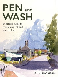
Pen and Wash is a practical guide to creating a picture that captures the discipline of pen, along with the subtlety of watercolour. With clear instruction and inspirational examples throughout, it explains the conventional approach of drawing and then adding wash, but also explores alternative ideas and styles. The author's passion for the technique is evident in his examples and enthusiastic text, making the book a superb guide to this beautiful medium. Advise on the correct equipment, techniques, the unpredictable nature of watercolours and Step by step demonstrations of pen and wash techniques.
Sie lesen das E-Book in den Legimi-Apps auf:
Seitenzahl: 239
Veröffentlichungsjahr: 2024
Das E-Book (TTS) können Sie hören im Abo „Legimi Premium” in Legimi-Apps auf:
Ähnliche


CONTENTS
Introduction
1 Materials and Equipment
2 The Basics: Pencil Drawing, Composition and Perspective
3 Sketchbooks
4 Working with Pens
5 Adding Watercolour
6 Dynamic Watercolour
7 Leaving White Space
8 Further Techniques and Developing Your Own Style
List of Suppliers
Index
INTRODUCTION
Hello. I am John Harrison: Yorkshire-born and bred, and ridiculously proud of it. A trained graphic designer with a strong illustrative style borne from my voracious childhood reading – Rupert the Bear; Just William; the Narnia series; Swallows and Amazons – and countless comic books from both sides of the Atlantic. All this varied reading matter featured drawings that I now realise have led directly to my current style of making strong line drawings – usually in ink – with colour washes applied in varying degrees to focus the viewer’s eye.
I draw inspiration (pun intended!) from many sources – Yorkshire’s glorious Dales and dramatic coastline; the iconic, stunning Lake District; many city, village and townscapes – always looking for dynamic viewpoints, interesting perspective with strong light and shadows. My favoured subject matter is that of built structures in the wider landscape, exploring the rich contrast between the man-made and the natural. Largely self-taught, I do not consider myself to be a painter, but I do use the unpredictable yet exciting medium of watercolour to highlight my drawings. My graphic design training took place in the era before computers were widely used: I learned to use a ruling pen filled with actual ink to design business forms and draw logos rather than use clip art, all of which re-awakened my love of pen and wash – a passion that had lain dormant during my years as a professional drummer in the 1970s.
So, what exactly is pen and wash? Often referred to as ‘line and wash’, traditionally the process will start with a pencil drawing to which watercolour washes are then added. At this stage the line in line and wash is represented by the pencil drawing: usually though, it comes from the ink lines added over the top of the watercolour layers – either with a traditional dip pen or a fixed nib width technical pen. My preferred style differs from this method: I generally start with an ink drawing, done directly with the pen (with no pencil safety net), to which I then add watercolour washes. This method of creating a pen and wash piece has its roots in ‘urban sketching’ – a relatively recent art movement, in which quick, loose mark-making in ink with the colour added later is the usual way of working, resulting in much livelier drawings – and the style has surged in popularity in recent years.
Being invited to write this book was a huge compliment and I have enjoyed the task immensely, but it has not been without its challenges. One such has been the discipline of separating the different aspects of my pen and wash technique into categorised subject chapters: many are, as you will discover, mentioned in more than one chapter. Some of the techniques covered in the chapter on white space, for example, could easily be described under the section on composition, and so forth.
Where this has happened, I have cross-referenced the relevant passages, so I hope you will be able to navigate your way around the text.
I often struggle to find a word to describe the finished article, the product of my pen and wash process: not strictly a painting, nor a drawing, and not an art ‘piece’, so I will often use the descriptive, made-up phrase ‘drawings-with-watercolour’.
In this book I will outline and explain my particular techniques and processes – the ones that have been popular at many art club demonstrations and workshops, and in my online tuition videos. At these events, I encourage questions and interaction, and would like to extend this invitation to you – the reader of this book. If there is anything you feel needs further explanation or clarification, please contact me and I will be happy to help.
A wintery view down Holme Lane near Slaithwaite, Huddersfield in the Yorkshire Pennines.
CHAPTER 1
MATERIALS AND EQUIPMENT
At various sketching events, demonstrations and workshops, I am often asked ‘What pen do you use?’ or ‘What’s your favourite sketchbook?’, so this chapter is really a breakdown of my favourites – my most-used supplies, rather than a comprehensive guide to everything on the market. I should confess at the outset that I am something of a stationery nerd – especially where pens and drawing accessories are concerned: I simply cannot resist trying something new that has been suggested to me, and I can very easily lose a good hour or two in an art shop.
This line illustration of the group of houses at the edge of the beach at Ravenglass, Cumbria, contrasted with a loose, abstract watercolour treatment of the beach.
I tend to use black ink in around 98 per cent of my work, as I find the crispness and definition of the lines work best for me and my preferred way of working. I have several other colours of ink with which I experiment from time to time – dark grey, dark blue and sepia – but I always revert to good old black ink.
Although it is true that you can grab any old pen or pencil – be it beaten-up, stubby, a carpenter’s version or even one from the famous Swedish flatpack emporium – and actually draw on any type of paper, whether it is the back of an envelope, a sheet of cheap bond torn from a notebook, even the clichéd napkin – it is equally true that to get the best, most pleasing results, you should try to use the very best materials within your budget. The old saying ‘buy cheap, buy twice’ really is so true in the context of paper, paint and pens, and most art supplies in general.
TECHNICAL PENS: ALSO KNOWN AS FIXED NIB WIDTH PENS
I most often use a Uni Pin 0.1mm fineline pen for my initial line work – working directly into my sketchbooks, or a sheet of watercolour paper with no preliminary pencil drawing. These pens are relatively cheap and so versatile, and as long as the nibs are not abused, they can last quite a while; in fact, I own some that are four or five years old. They are starting to dry out now, but can still be useful for lovely scratchy lines and shading.
Uni Pin is my most used brand of drawing pen. These are their fineliners, which contain waterproof ink, shown here in a range of nib widths. I alway start drawings with the 0.1 size.
After watercolour washes are added to a pen drawing, I will then strengthen some lines for dynamic effect (this process is explored in depth in Chapter 4: Working with Pens), either with multiple applications of the same 0.1mm size, or with a heavier nib – anything from a 0.2 to a 0.9. I also use Sakura’s Pigma Micron pens – which are basically the same as Uni Pins – as well as the slightly more expensive Copic SP Multiliner range, which has the advantage of being refillable, and with easily replaceable nibs.
All of the pens I have mentioned so far contain waterproof ink, which is a vital element to use when creating pen and wash following my process (this technique is covered in detail, again in Chapter 4). In addition to these pens I also use a variety of pens filled with water-soluble ink, which can be used to great effect for adding monochromatic tone to an ink drawing. Many of these pens are not marketed specifically as ‘art’ pens, but are sold for general handwriting – brands such as Zebra, Staedtler, Stabilo, Pilot and many ‘own brand’ generic examples – but they all have their own characteristics, which can often be exploited to great creative advantage.
Another lovely way of creating ink line drawings is to use the traditional dip pen and a bottle of ink – I often do this when I feel that a drawing needs more of a loose, ‘old school’ feel, with scratchy lines and those fabulous random splashes and blobs seen in the work of Gerald Scarfe and Quentin Blake – just two of my favourite artists. I will only use these in the studio though, never at a ‘live’ demonstration, workshop or sketching outdoors, as the possibility of my knocking over an open bottle of ink is just too disastrous to contemplate!
FOUNTAIN PENS
In the last few years I have become re-acquainted and ever so slightly obsessed with fountain pens – a passion which revived during the lockdown period of 2020 – especially once I found a waterproof ink that does not clog the nibs; this is Sketch Ink from Rohrer & Klingner, which is available in a wide range of colours. I use the black, dark grey and navy blue in my pens, all of which I use with cartridge converters so I can quickly refill from the bottle. I have a constantly growing collection of pens, but my favourite is a beautiful Kaweco brass sport fountain pen with an extra fine nib … the way the line just flows onto any paper is just magical: it is not the cheapest of pens by any means, but just a wonderfully tactile object to use, and inspirational in the way it makes ink lines.
Shown here is my modest collection of fountain pens, safely stored in a lovely zippered case, mainly for protection. In the majority of cases, I have replaced the supplied cartridge fitting with a converter, which allows me to fill the pen with the ink of my choice.
At the other end of the fountain pen spectrum is one from a brand that I associate with my school days – Platinum – and their Preppy model with its extra-fine nib is just a joy to use, and filled with their carbon ink (waterproof when dried); this is an excellent pen to use for my style of pen and wash. I realise I have not qualified either of these two pens with their cost: here in the UK, the Kaweco sport can cost around £70–80, while the Platinum Preppy can be readily found for £7.99, which is less than a tenth of the cost of my brass beauty.
SKETCHBOOKS
My sketchbook of choice is invariably a Seawhite of Brighton watercolour notebook … usually A5 size, and in the landscape format. The paper in these will take a good amount of watercolour washes, and to this Yorkshireman’s delight, will also withstand working on both sides of the sheet with no show through from one side to the other! I also use Moleskine sketchbooks – the versions with watercolour paper, again generally A5, along with quite a few other brands; as I said earlier, I am always looking for, and trying out, new products. The one thing that all my sketchbooks have in common is that they are all hard-backed, not spiralbound – a purely personal preference, as I often use both opposing pages in a book to create a doublewidth panoramic drawing or painting, and the wire loops in a spiral bound book do not allow this.
My favoured size and format of sketchbook: the A5 landscape version from Seawhite of Brighton, filled with NOT watercolour paper.
I also have many other types of sketchbooks – some with cartridge paper (for expressive pencil drawings when the mood strikes), and a couple of rather lovely books made from hand-made vintage watercolour paper from the 1960s – far too nice to draw on! You will find much more about my approach to, and use of, sketchbooks in Chapter 3.
WATERCOLOUR PAPER
There are three main types of watercolour paper readily available – Cold Press (CP), Hot Press (HP) and Rough. Most watercolour artists tend to use Rough or Cold Press paper, as they are more absorbent than the hot press type and have a nice ridged/textured look and feel – a feature that I rely on for my particular style of work. Rough is markedly more textured than Cold Press, and I find that this heavy textured paper is most suited to my loose watercolour painting style. Some manufacturers include a variant that is labelled Extra Rough, which, as the name suggests, is even more textured, but I have always found the standard rough variety to be more than adequate for my purposes. I rarely, if ever, use hot pressed paper, as I find that its ultra-smooth surface – although excellent for pure ink drawing – simply does not allow watercolour to behave the way I want it to.
This is my go-to watercolour paper: Saunders Waterford by St Cuthberts Mill, in a 300g weight with a rough finish.
For larger, more formal drawings and commissions I will always use Saunders Waterford 100 per cent cotton paper in as heavy a weight as possible – never less than 300g/10.5oz – in a rough finish, and in the standard white colour: there are ultra-white or brilliant white papers on the market but, for me, the basic white shade works best for my preferred subject matter and with my style of painting. The brightest white paper is created using more bleach or optical brightening agents in the manufacturing process: I am not overly keen on the glaring white – it looks rather artificial to me – but this type of paper can help watercolours appear more vibrant on its surface if your preferred style is for this ‘look’.
I much prefer the way that the rough texture of the Saunders Waterford can give a lovely, ‘wonky’ broken line with an ink pen, and it also allows the creation of some amazing wash effects, especially with the dry brush technique. When not working in a sketchbook, I generally use a quarter imperial sheet size (15 × 11 inches – approximately 38 × 28cm), which I prefer to buy in loose sheets rather than pads or blocks. Again, this is a personal choice – glued blocks are great for work that uses a lot of paint: no need to stretch or pre-damp the paper, which will dry flat rather than cockle as the sheet dries out. The only downside is the fiddly process of separating the finished piece from the block.
On my full-size drawings-with-watercolour, I usually work wet on dry (the process of painting a watercolour wash – ‘wet’ – onto dry paper), and I will very rarely pre-wet or stretch the paper: the heavier-weight Saunders Waterford works really well for my process, and often does not even need taping down to my drawing board: even when I use more and heavier watercolour washes, the paper will withstand this, and resist the buckling and warping you would see in a lighter, less robustly made paper.
I will use cold press paper on occasion – in fact some of my sketchbooks contain a slightly textured cold press paper – and although the texture is not as pronounced as my favoured Rough, there is still a good amount of ‘tooth’ on the surface for me to generate the broken wash effect I like to create. Prior to a workshop, I always send out a recommended supplies sheet to the participants, and I think it is worth repeating the most pertinent sentence here:
‘I cannot stress enough how important it is to use good quality paper, otherwise you will be disappointed with the results.’ All too often, folk have been to a discount shop and bought some random paper, then remark during the day ‘why doesn’t my paint look like yours?’. The answer is nearly always related to the quality of their paper: you can achieve good results with economy paints on the right quality paper, but you will never create great watercolours on thin, drawing bond or cartridge paper.
WATERCOLOUR PAINTS
Entire books have been written on the range, quality and suitability of watercolour paint, so again, the best I can do here is to list my own personal favourites – the paints that I have found to work best for me, and why I use them. When I re-started my watercolour practice I used a Winsor & Newton Cotman sketcher’s set – it was cheap, it seemed to have all the colours I would need, and worked well for me – at the time. As I explored further, I quickly realised that the colours did not look as ‘good’ on paper as some other artists’ work, so I moved onto the Winsor & Newton Professional Range which, again, seemed to do the trick for a few years.
A very useful tip is to create painted swatches from the colours in your palettes and label them with the pigment names. These are useful references when working on a painting and will help you to decide which colours from your range to use, as blocks of some watercolours in the palette can look very similar to each other until they are wetted and tried out on the paper.
A range of Daniel Smith ‘Dot’ cards. These often contain the preferred colour ranges of well-known artists and are a great way to test unfamiliar colours before investing in full tubes.
After experimenting with a few other manufacturers’ offerings, I finally discovered the paints that I now use on a daily basis: Daniel Smith Fine Watercolours. They are not the cheapest watercolour paints by any means, but the colours are so richly pigmented, with a very wide range of colours, and they are simply a joy to use. I prefer to use the tube paints to refill my palettes rather than use half or full pans: this means that I am able to select the colours that I prefer to use rather than rely on those that manufacturers choose to sell in a pre-filled set: most pre-packaged watercolour sets tend to include both white and lamp black paint in them – neither of which I have ever used.
The two palette swatches reproduced here show the colours that I use most often for demonstrations and workshops, during the course of which many folk have taken photographs for their own reference, once they have witnessed how my colour choices can work in the context of a pen and wash.
I can honestly say that Daniel Smith paints have never let me down: as I have six or seven palettes in use at any one time for demonstrations, workshops, and studio use, some of them can remain closed up for a month or more, and I have never had an issue with re-activating the colours: all it takes is a quick spray from a water mister, or a damp brush, and the colours are ready to use straightaway without any delay.
The same cannot be said for paints from the budget end of the spectrum – especially those sold as student- or school-quality paints, which contain significantly less pigment and can never perform as well as those sold as ‘artist quality’ or ‘professional’.
The Daniel Smith Fine Watercolours range offers a range of paint sample ‘dot’ cards, which are a great way to sample their paints. Each colour dot has been placed on to a card that is made from actual watercolour paper. You can then wet each colour dot and use the card as a mini-palette. You will be amazed just how far one dot of colour goes: I always keep a few cards in my sketching kit, as the dots have more than enough paint for my minimal sketching style, especially working in a small sketchbook.
PANS OR TUBES?
There is a widely held perception that half or full pans are for beginners and tube paint is for professionals. This is not the case at all, as the choice really depends on what kind of painting you want to do: I still use certain colours from Winsor and Newton’s Cotman range that I really like, even though this is often widely regarded as a beginner’s range. There is also a third way that many professional watercolourists employ: that of filling empty half pans with paint from a tube and allowing it to dry, so creating their own pans, and this is my preferred method.
Having said that, there are advantages with using ready-filled pans (or, more commonly, half pans): they are cheaper, very portable, easy to use – especially outdoors (en plein air) – and can last indefinitely if kept closed up when not in use, and protected from extremes of cold or heat, which can cause drying out and cracking. One of the most obvious differences between working with pans or tubes is that it is so much easier to work up a good quantity of a watercolour mix from a tube than it is from a small pan, which is helpful if you want to cover a large area of paper – a sky or expanse of water, for example.
Using tube paints to fill empty pans in several palettes (as I do) means I can replicate the same colours across the ones I use for different applications. The different palettes are not all exact duplicates as they are different sizes, but all contain the same core range of colours so that I can switch between them easily.
MY RANGE OF WATERCOLOURS
The illustration overleaf shows the current colours in my full selection of palettes, but even these are not used all of the time, as you can probably see from the paint wells that are most obviously dipped into. I make no apologies for the unwashed state of these – they are all working objects, and I felt it would be more true to my processes to show them as they are, rather than clean them for the photograph. There is also a practical element to this: if I leave mixes in the palette wells as they occur, I have a ready reference should I want to recreate the mix, especially if it has been successful in the context of the painting.
My range of watercolour palettes, from small sketchers boxes, up to the large studio metal versions. On the top row, just left of centre, is a small metal tin containing a range of grey pigments from Kremer, and to the far right is a large (unopened) Winsor and Newton 24 half-pan set.
In terms of the range of basic colours I would recommend, here is my list – and please do bear in mind that this is merely a suggestion, based on my experience. For instance, where I prefer to use Cobalt Blue for skies and bodies of water, many other artists will use Cerulean Blue or even Ultramarine. The choice of pigments is all very subjective, so all I can suggest is to experiment to find ‘your’ favourite.
The paint names are all Daniel Smith colours, but other manufacturers will have very similar labels:
• Cobalt Blue
• Payne’s Grey (bluish)
• Ultramarine
• Indigo
• Payne’s Grey
• Green Gold
• Undersea Green
• Sap Green
• Hansa Yellow
• Yellow Ochre
• Quinacridone Gold
• Quinacridone Deep Gold
• Quinacridone Red
WATERCOLOUR PIGMENT CHARACTERISTICS
It is worthwhile taking some time to familiarise yourself with the properties of the pigments in whichever paint brand you do decide to use: some pigments in the range will be more opaque than others; some will be more transparent; some will have more tendency to stain, and others will have granulating properties.
There are four basic characteristics of watercolour paints that every artist should have at least a very basic understanding of, as this will help your understanding of how and why a certain watercolour mix behaves the way it does:
• Transparent
• Semi-transparent
• Semi-opaque
• Opaque
This is a section of a Daniel Smith watercolour pigment chart, showing the properties of various colours.
1. Transparency and opacity
Watercolour paints are usually in one of four transparency categories:
Transparent watercolours allow the most light through and reflect from the white paper, whereas opaque watercolours will block the reflected light, so they look thicker and somewhat cloudy on the paper. Semi-opaque and semi-transparent pigments are mid-way properties between the two extremes.
2. Staining and non-staining paints
Watercolours with staining properties will immediately penetrate the fibres of your paper and stain them, so it will be difficult or almost impossible to lift the colour, where non-staining watercolours will settle on the surface of the paper, and can be easily re-wet and lifted – a very useful technique when you think you may have put down too heavy a wash, or inadvertently painted the ‘wrong’ area.
3. Granulation
Depending on the pigment, the particles in the paint will be heavy or light and pigments with heavier particles tend to separate from the water and collect in the tooth of the paper, demonstrating a unique appearance that can be explored to great effect to add interest and texture to your work. Nongranulating watercolours will dry to a smooth even wash, with no discernible texture.
4. Lightfastness
The longevity of your paintings will depend on the lightfastness of the watercolour paints that you use. The technical terms for the lightfastness of a paint are ‘fugitive’ and ‘non-fugitive’: non-fugitive paints (or ones with a good lightfastness rating) will not fade over time, whereas fugitive paints (or one with poor lightfastness) will fade quickly, so it is best to avoid them.
All of this information can be gleaned from the manufacturers’ websites, or, in the case of Daniel Smith paints, from the extremely comprehensive colour charts that they publish. Other paint manufacturers will provide this information, either with the paints, or on their individual websites.
WATERCOLOUR BRUSHES
The range of available watercolour brushes can be as bewildering as that for paints – so try to remember, when purchasing any art equipment, to consider quality rather than quantity. However, do not assume that the most expensive materials are always going to work the best for you, and please do not jump in and buy one of those enormous sets of brushes found in discount shops – often containing 36 or more – as you will end up only using three or four on a regular basis. Novice painters will often make the mistake of buying brushes that are too small: a quality large brush with a good point is much more useful and versatile, as it can handle everything from large washes to fine details. It is not true that you need small brushes to paint small details: I regularly paint in my A5 sketchbooks, which are around 8 × 5 inches, and often use my favourite brush size – 10 or 12 round – and never have a problem painting fine details or small areas of paint with these sizes. Currently, I use a range of synthetic brushes made by Etchr, all of which perform well when laying down a good-sized wash, but equally well when used with a good sharp point for detailed work, such as emphasis lines.
This is just a small selection of my brush collection – the ones I use most often. In the roll is a range of Etchr Round brushes from size 4 up to size 12, together with a small selection of mop brushes and one or two squareended brushes.
In terms of how many brushes is ideal, there is no right answer. What I would advise is that it will be much better for your developing watercolour painting practice to equip yourself with just a few brushes – say a size 6, 8 and 12 of a reasonably good quality, rather than buy one of the large sets of a couple of dozen generic brushes, often in an attractive case. Resist the temptation to buy one of these if at all possible: a small selection of quality brushes will stand you in good stead as you discover how to use them, and you can always add to this core set as you discover your own style and preferences with regard to the subjects you choose to paint and, indeed, the sizes at which you are comfortable working. If you are happiest on A4 or smaller, there is really no point in buying huge brushes such as the size 30, or even larger. Conversely, if you want to create full imperial sheet-sized paintings (about 30 by 22 inches) or even larger, then there is little point in buying small brushes designed for detail work.
I will use a round brush for much of the time I am painting, and I rarely use any of the speciality, often overly gimmicky brushes you might find in one of the large sets of brushes, such as the shaped fan-type brushes, extremely fine points (size 00 or 2), the shaped chisel types or those marketed to specifically paint trees and foliage, for instance. I do use squirrel mop brushes regularly, though – these are designed to hold large quantities of mixed paint for covering large areas quickly, and yet good quality examples will still form a good point for detail work. Their sizing is different to that employed on regular brushes though … a size 4 in a round watercolour brush is very fine, whilst a size 4 in a mop is relatively large. Mop brushes are generally made from squirrel or goat hair, since these are the best at holding liquid, although synthetic versions of these are also available.
I have seen people arrive at a workshop equipped with brushes that have not been designed for watercolour painting – most often those made to use with acrylics, or labelled by the manufacturers as suitable for both watercolour and acrylic. However, brushes designed for use with oil and acrylic paint will have thick, tough bristles to move the thick pigments more easily: watercolour brushes have soft, pliable bristles that can be moved around the page easily and are designed to hold plenty of water. Trying to use oil and acrylic brushes to paint with watercolour simply will not give you good results.
SYNTHETIC VERSUS NATURAL HAIR BRUSHES
It is worthwhile exploring the basic differences between the two most common types of watercolour brush on offer, as there are pros and cons to consider with both.


