Erhalten Sie Zugang zu diesem und mehr als 300000 Büchern ab EUR 5,99 monatlich.
- Herausgeber: Landauer
- Kategorie: Lebensstil
- Sprache: Englisch
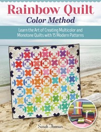
Author Sarah Thomas goes all in with this must-have quilting guide. Rainbow Quilt Color Method isn't just a collection of 15 beautiful quilts to make, but it's also a course study on how to confidently choose fabric for multi-color and monotone designs. Sarah shares her approach to selecting a harmonious palette that achieves design strength through color placement. She then goes on to explain how she uses color saturation and color value to make the same quilt with alternate coloration. For example, her rainbow version of her "Twinkle" pattern takes on a patriotic feel when it's made with reds, creams, and blues. Filled with techniques that, in many cases, let the consumers choose their own preferences to achieve their own results, it also includes instruction for basic patchwork, curves, English and foundation paper piecing, plus appliqué options if paper piecing isn't your cup of tea. Quilt patterns include Double Dip, Eden, Fan Dancer, Pergola, and more! Improve your own quilting skills by learning from a master!
Sie lesen das E-Book in den Legimi-Apps auf:
Seitenzahl: 129
Veröffentlichungsjahr: 2024
Das E-Book (TTS) können Sie hören im Abo „Legimi Premium” in Legimi-Apps auf:
Ähnliche


Dedication
In memory of my incredibly artistic and wonderfully empowering Gramma Dittman. Without her influence of the arts at such a young age, I would not have the courage or ambition to be the creative woman I am today.
Rainbow Quilt Color Method
Landauer Publishing, www.landauerpub.com, is an imprint of Fox Chapel Publishing Company, Inc.
Copyright © 2024 by Sarah Thomas and Fox Chapel Publishing Company, Inc., 903 Square Street, Mount Joy, PA 17552.
All rights reserved. No part of this book may be reproduced, stored in a retrieval system, or transmitted in any form or by any means, electronic, mechanical, photocopying, recording, or otherwise, without the prior written permission of Fox Chapel Publishing, except for the inclusion of brief quotations in an acknowledged review and the enlargement of the template patterns in this book for personal use only. The patterns themselves, however, are not to be duplicated for resale or distribution under any circumstances. Any such copying is a violation of copyright law.
Project Team
Managing Editor: Gretchen Bacon
Acquisitions Editor: Amelia Johanson
Editor: Christa Oestreich
Designer: Wendy Reynolds
Proofreader: Kurt Conely
Indexer: Jay Kreider
Print ISBN 978-1-63981-051-2eIBSN 978-1 63741-307-4
Library of Congress Control Number: 2024931605
We are always looking for talented authors.To submit an idea, please send a brief inquiry to [email protected].
Note to Professional Copy Services:The publisher grants you permission to make up to six copies of any quilt patterns in this book for any customer who purchased this book and states the copies are for personal use.
This book has been published with the intent to provide accurate and authoritative information in regard to the subject matter within. While every precaution has been taken in the preparation of this book, the author and publisher expressly disclaim any responsibility for any errors, omissions, or adverse effects arising from the use or application of the information contained herein.
For a printable PDF of the patterns used in this book, please contact Fox Chapel Publishing at [email protected], with 9781639810512 Rainbow Quilt Color Method in the subject line.
Contents
Introduction
Rainbow Method
Tools and Materials
Techniques
Basic Patchwork Piecing
Curved Piecing
English Paper Piecing
Foundation Paper Piecing
Appliqué
THE QUILTS
Eden
Loominous
Funfetti
Tutti Frutti
Ribbon Candy
Pergola
Double Dip
Lifesaver
Fan Dancer
Roulette
Trickle
Kaboom
Star Blossom
Twinkle
Sweet Tooth Medallion
Templates
About the Author
Acknowledgments
Introduction
Creating quilt and needlework patterns that utilize the rainbow spectrum is so extremely enjoyable and relaxing. As a bona fide math nerd, I find color to be mathematical. I love configuring new designs in a multitude of combinations—I’ll spend hours laying out and rearranging color swatches to include the full color wheel, then I’ll spend more hours reconfiguring that same pattern using a single-color family or specific color story. While I love choosing a pattern palette that uses monochrome or three to four complementary colors, there is just something about incorporating the full color wheel that always brings me unending joy.
A rainbow appears after a rainstorm; they are a symbol of hope, promise, luck, new beginnings, and peace. Just as a rainstorm does not last forever, neither will the storms in our own lives. Rainbows remind us that, despite hardships, we should not give up because everything will work itself out if we face our struggles. Rainbows always ignite a spark of happiness on any given day, especially those gloomy days that pop up from time to time. So when you’re struggling to choose your quilt’s color story, consider the opportunity to choose a rainbow palette and breathe unending joy and happiness into your creation!
Whether you gravitate toward bold, primary colors; those secondary and tertiary color schemes; or solids versus printed fabrics, after reviewing the Rainbow Method information, you’ll have a better understanding of how to choose your quilt’s unique color story. And if hand-selecting your quilt’s fabrics still seems like too much decision-making, here’s my hint: stick to a fabric collection, since the designer has thoughtfully planned that particular color story for you. Then all you have to do is find coordinating or blending fabrics to mix into that particular color wheel.
In this collection of quilts, I have used Rainbow Sherbet by Sarah Thomas (that’s me!) for Moda Fabrics, as well as custom-printed designs on Bella Solids, in every pattern. The collection reads as solids but are all low-volume tone-on-tone prints. They are great on their own and even better combined with your other favorite collections. The patterns I’ve brought together in this book range from quick and simple to challenging and intricate, both in terms of skill and overall design. Be sure to read through each pattern in its entirety before beginning. Tips and hints are scattered throughout to help you create the best finished quilt.
I have invested hours of calculations and time to ensure each pattern is accurate from start to finish. Again, it’s always a good idea to read the entire pattern before diving in, and perhaps make a test block to ensure proper comprehension of the overall pattern. Each of the mainstage quilts use the full rainbow spectrum, but this is your time to create your color story that resonates with you. I am so excited to see what you create!
Show and share your colorful creations on social media using #SARIDITTYpattern.
Rainbow Method
The key to creating a color story for your quilt is to understand the basics of color theory. That may sound intimidating and like you need an art degree, but it’s actually fairly simple and a ton of fun! Certain colors look really great together because of where they land on the color wheel, while others may clash if they aren’t paired thoughtfully. You can make a palette of any colors you like, but to achieve a cohesive look, you might want to incorporate another color, reduce the amount of one color, or replace with a tint, shade, or tone. Understanding color theory will guide you to those decisions.
Here are some terms that will help as you move forward:
•Color—Every hue, shade, tint, or tone we see, including black, gray, and white.
•Hue—The dominant color in the color family of the specific color being considered. Look to the outermost colors on the color wheel.
•Shade—Any hue with only black added. Shades appear saturated yet dusky.
•Tint—Any hue with only white added. It is often referred to as pastel. Tint lightens a hue to a paler version.
•Tone—Any hue with only gray (black + white) added. Toned colors appear more subtle and sophisticated, therefore more pleasing to the eye.
Notice how the reds and warm purple carry the eye around the curve? This is because warmer colors stand out more than cool colors.
Try looking at a quilt or painting you like. Where is your eye first drawn? What path does it follow when viewing the rest of the piece? Shapes and composition can affect this, but this instinct is usually heavily influenced by color—and you can be intentional by picking and arranging colors to achieve the finished effect you want. The rainbow is a great shortcut for pulling the eye in certain directions because most people will be naturally drawn to following the order of colors. (Recall ROYGBIV from grade school?) But another method is to use an accent color—use one stand-out color to create an obvious “path” through the piece. This can be a complementary color—a shade, tint, or tone—or even stark white, an obvious neutral, or a saturated deep hue to differentiate a color within your chosen palette. In this collection, I chose both stark white, muted beige, and saturated navy blue for my accent colors along with the mid-range rainbow color palette.
Color can convey mood. For example, a quilt using a lot of yellow hues and tints will look brighter and happier than a quilt with hues, shades, and tones of blue because of the automatic internal associations we have with those colors. A color story using all jewel tones (rich, saturated hues like dark purple, emerald green, scarlet red, and navy blue) will look sophisticated but could also potentially look vintage or old-fashioned depending on what shades, tones, and fabric prints are used. A pastel palette will tend to look more youthful and airier. Think about what story you want to tell with your quilt, and the colors (and prints) may follow naturally from that vision.
Don’t underestimate the use of neutrals (white, gray, black, cream, beige, brown). They typically look good with any color story and can make the colors pop in contrast. But you can also use other colors as “neutrals.” I chose to use navy blue in this collection as my deep, saturated “neutral” because it adds an unexpected shade of color without distracting from the other rainbow colors on display.
There are a lot of colors used in these prints, but the olive, white, green, and pink fabrics are still distinct.
Color Wheel
A great way to understand how colors relate to each other is by looking at a color wheel. They are always arranged in rainbow order. (Back to that ROYGBIV we know and love!) In the color wheel I’ve provided, the outermost color is the hue; traveling inward, there are two tints of that color to show how dramatically it can change while still being in the same color family.
As you pick fabric for your quilt, remember that these other options are available. A “red” doesn’t have to be the boldest one you can find! Throughout this book, the fabric collection primarily reads on the second level of the color wheel. Then when I use the “neutral” whites, creams, and navy blue, they stand out as accents among the rainbow color palette.
Pay attention to fabric prints. One with a lot of white can tint the color, even when the print ink is very dark, making it fall in a different spot on the color wheel than you expected. Or a print with a lot of color may have one “stand out” color that determines where on the color wheel it should fall. Try pinning or taping the fabric to a wall, step back 8–10 feet, then unfocus your eyes. Whichever color dominates your vision is how you should interpret that print. I also sometimes take a photo of a fabric, then after a while, only look at the digital image to determine if one color reads more prominently to me on the screen.
Bear in mind: What looks pleasing or unacceptable to my eye doesn’t mean that’s what your eye will see as well. It’s true that the color wheel is mathematical in color placement and definition, but it’s not a chemistry equation that requires exact formulas. Use the color wheel and the rainbow method as a road map to pick and choose which routes work for you to get to your destination.
Warm & Cool Colors
Warm colors are red, orange, and yellow. These colors and prints emit energy, positivity, and strength. Cool colors are green, blue, and purple. These colors and prints lend a sense of relaxation, calm, and peace. Warms tend to stand out while cools move to the “background,” which can be used to draw the eye or make certain blocks stand out.
WARM COOL
Primary, Secondary & Tertiary Colors
Red, blue, and yellow are called primary colors because they are the base from which all other colors can be obtained. Secondary colors—orange, green, and purple—are located evenly between the primary colors as they are derived by combining equal parts of their adjoining primary colors. There are six tertiary colors around the color wheel, and they are made when an equal amount of the neighboring primary and secondary color are mixed together, such as red-orange, red-purple, blue-purple, blue-green, etc. Using all three color categories in your quilt will introduce a wide range of color, interest, and depth, whether that is to create a beautiful rainbow or a more detailed, intricate pattern.
PRIMARY
red, blue, yellow
SECONDARY
purple, green, orange
TERTIARY
red-orange, red-purple, blue-purple, blue-green, yellow-green, yellow-orange
Note: White and black are not actually “colors” per say; white is the absence of color and is associated with cleanliness, simplicity, purity, and freshness. Black is the absence of light and is associated with darkness and mourning but also with elegance and wealth.
As you select fabric, make sure to compare similar colors because it may be hard to recognize a tertiary color on its own. For example, a red-orange may trick you into thinking it’s either red or orange until you place it next to one of those colors.
Monochromatic Colors
One way to group colors together is by using variations of one color, which translates to tints and shades of one hue. For example, a monochromatic blue palette could consist of midnight blue, sapphire, royal blue, and sky blue. There is still a range of colors, but you know they will look great together and express a cohesive mood because they all originate from the same color wheel wedge. Using an all-over monochromatic color palette often yields a sophisticated and timeless piece. However, this color scheme may not make your design stand out the way you want; consider incorporating an accent, such as a neutral or complementary color, to play against this color story.
MONOCHROMATIC
Complementary Colors
Every wedge on the color wheel has a complementary color—simply look directly opposite to find the complementary pairing: red and green, orange and blue, and yellow and purple, etc. Colors look brighter and more intense when paired with their opposite, but using them in equal amounts can also result in a color scheme that is hard to look at. I recommend assigning one of the complementary colors as an accent.
COMPLEMENTARY
For example, orange shapes on a monochromatic blue background will draw in the eye no matter what pattern you make. You may opt to use the same orange throughout the shapes or a variety of orange colors, and the blue background can be one blue or a combination of color wedge blue colors. Regardless, the simplicity of the blue background will draw the eye to the orange shapes throughout the quilt.
Analogous Colors
When you have a collection of colors that neighbor each other on the color wheel, these are analogous. If you select just three colors, such as orange, red-orange, and red, these create a color story that looks harmonious together. But you could keep them analogous while adding red-purple, purple, and blue-purple to your palette. Adding too many colors may ruin the effect you’re going for, so I try to limit this palette to a maximum of five colors. However, a full rainbow is the ultimate analogous color story!
ANALOGOUS


