18,49 €
Mehr erfahren.
- Herausgeber: The Crowood Press
- Kategorie: Geisteswissenschaft
- Sprache: Englisch
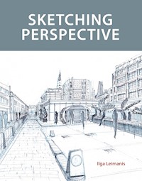
Perspective is key to visualizing a space and communicating an idea to others. This book explains how to tackle perspective with hand sketching - how to turn a 3D scene into a 2D drawing successfully. Written for a wide range of professionals from architects to set designers, engineers to interior designers, it explains the principles of perspective clearly and how to communicate a vision successfully. Topics covered include: materials and equipment, specifically with drawing on location in mind; observational drawing using the body, arms and hands to help understand the spaces being drawn; perspective constructions for one and two vanishing points for interior and exterior drawings; panoramic views and aerial perspective - how to approach drawing a crowded scene/location; adding detail - whether creating atmosphere and expression, or adding figures for scale and finally, advice is given on drawing imaginatively and how to visualize your thoughts confidently. It is fully illustrated with examples of how to draw perspective in the urban and natural landscape.
Das E-Book können Sie in Legimi-Apps oder einer beliebigen App lesen, die das folgende Format unterstützen:
Seitenzahl: 312
Veröffentlichungsjahr: 2021
Ähnliche
Sketching Perspective
The Prints and Drawings Gallery at the British Museum, one of my favourite places in London for inspiration. Two coloured pencils and two black markers of different line weights were used to draw this sketch.
Sketching Perspective
Ilga Leimanis
First published in 2021 byThe Crowood Press LtdRamsbury, MarlboroughWiltshire SN8 2HR
This e-book first published in 2021
© Ilga Leimanis 2021
All rights reserved. This e-book is copyright material and must not be copied, reproduced, transferred, distributed, leased, licensed or publicly performed or used in any way except as specifically permitted in writing by the publishers, as allowed under the terms and conditions under which it was purchased or as strictly permitted by applicable copyright law. Any unauthorised distribution or use of this text may be a direct infringement of the author’s and publisher’s rights, and those responsible may be liable in law accordingly.
British Library Cataloguing-in-Publication DataA catalogue record for this book is available from the British Library.
ISBN 978 1 78500 881 8
Cover design: Peggy & Co. Design
For my sister Andra
Acknowledgements
Thank you to the Crowood Press for commissioning this book. I had kept all my teaching materials and notes after each class I taught, thinking this material would come in handy one day and I appreciate the opportunity to develop it into a book. I also acknowledge the support of my family and friends, near and far, and to my many students over the years who have taught me so much.
Contents
Sketch of the magnificent stairwell of Two Temple Place, one of London’s architectural gems, an extraordinary late Victorian mansion built for William Waldorf Astor on the Embankment.
Introduction
This book will help you to draw any space you find yourself in. My focus throughout is on developing an understanding of how to translate what you see in front of you onto the page as quickly as possible. I always say that with enough time, it is possible to finesse your way into a good drawing, but the real test of skill comes from being able to do it quickly and repeatedly. In addition to your eyes, the methods covered in this book will show you how to use your hands and arms, in various ways, to bring the three-dimensional world flat onto the two-dimensional paper surface.
My aim with this book is to teach you these methods, first to gain an understanding and then to develop your skills in observational freehand perspective drawing. Once the observational basics are solidly within your grasp, then you will be free not to think about it anymore and to play and be creative with each image you produce. I often compare learning to draw with learning a new language: practice makes perfect and at a certain point you no longer think about grammar and vocabulary, you just fluently speak and write.
Considering we always find ourselves ‘somewhere’ in relation to a space, whether we are inside a room, outside on a city street, high above looking down, in a forest or field, this book is relevant to anyone, in any situation. You could be a sketcher on holiday or recording a new city or experience, a design professional looking for a process to help you communicate a landscape, architecture, film or interior design. This book can also be used by visual artists who want to understand drawing in order to create better paintings, drawings or installations.
I have been teaching drawing skills for nearly fifteen years to students, many of them beginners. It has been fun developing exercises for my students to learn effectively, and having taught for so many years, my own instruction has become more succinct and economical; I can see the results and know when my words have made a connection and when they have not been understood. It gives me great joy when a student has grasped the basics and has the confidence to develop further.
Following one of my workshops on freehand perspective drawing, a student approached me, saying that when she compared herself with others on her course, she did not think her drawings were good; she had come to believe that she was not talented. She realized during my workshop that it was simply the skill of freehand perspective drawing that she lacked, and this had impacted on everything, leaving her lacking in confidence. This is a familiar story, but issues can be resolved by learning and practising the basics, which are covered in detail here in this book.
Over the years, I have carried out much research in order to answer my students’ questions. Perspective was something I worked on organically, understanding and developing a method which worked for me, based on the skills I was using in other types of drawing. I used an intuitive approach for faster results.
When I am teaching, in addition to words, I also use quick sketches to demonstrate a concept, drawing right there on the spot in front of the group or the student. Most of the images in this book are made directly and quickly from observation or redrawn using these as a starting point. Many have been made whilst teaching, showing and explaining concepts to students. I usually demonstrate by drawing as that is often the quickest way to explain. I kept these sketches, hoping that one day I would have the opportunity to share them.
Other images in this book have been drawn on location. Since 2007 I have led an informal urban sketching group, Drawn in London; we meet in a chosen spot and draw for a couple of hours. One of my reasons for starting the group was to motivate myself to draw more. I set up the structure, chose a date and time, invited people on my mailing list – friends, former students and acquaintances – and then I was forced to go and draw, even if I did not want to, and I now have many sketchbooks full of drawings. Another benefit was that I came to know London better. I had recently moved, and I used these drawing dates to discover parts of this large, unfamiliar and seemingly overwhelming city and to expand my knowledge. Usually at the end of a drawing date, the group would gather and look at each other’s drawings – it was not really a class as such, but the sharing aspect made it really engaging. Beginners could learn from more experienced drawers, and materials were discussed and shared. I learned a lot during these sessions.
Most of the images in this book come from these drawing sessions. They are made in the moment, with all their imperfections, working through the problems presented. There is an energy in that direct moment, and I hope that the rawness of the material serves to inspire: you can do it too. Most of these images have not been reworked or finished properly. These direct sketches are the reason why drawing is so captivating for me. It presents the right combination of a challenge (to see if you can ‘get it right’) and a pleasure: being there in the moment, a meditation of sorts, focused and engaged with the scene in front of you.
Only a couple of images in this book are what I would consider proper, ‘finished’ drawings. By this I mean work that has been carefully considered or reworked from an original sketch. These would be exhibition-ready works made in the studio.
My background is in fine arts. I always loved art and I remember drawing as a child. I took Art as a subject in secondary school and continued my studies at Dawson College and the Université du Québec à Montréal, Canada, before moving to Riga to finish my degree in painting at the Art Academy of Latvia. It was in Latvia that I realized I was not skilled in observational drawing and took extra private lessons with a master drawer, Kristaps Ģelzis. Learning the academic, traditional way of drawing was much harder than I had anticipated, and I was surprised at how mechanical it was: there was a definite right and wrong, whereas I was always seeing things in terms of variables and ‘in betweens’. I remember the lessons I learned and have always strived to make this technical part of drawing as interesting as possible for my students.
When I moved to London, my first employer, Trevor Flynn of Drawing at Work, saw my life drawings and gave me an opportunity to teach on his courses. I am grateful for the years I spent learning ‘on the job’ for Trevor and then at Central Saint Martins Short Courses in front of many groups of students, week after week. It was the sheer volume of courses which really honed my teaching and enabled me to develop a succinct language to communicate what I wanted the students to learn. It was clear what most students responded to and when they understood or if something was left too vague and open to interpretation. This book uses that same language of teaching and expands it further. I hope you enjoy sketching perspective as much as I do and use this book to develop your understanding, speed and confidence.
CHAPTER 1
Materials and Equipment
All art is but dirtying the paper delicately.
JOHN RUSKIN
Materials for sketching perspective are similar to those used for other types of drawing; there are no hard and fast rules to follow, as anything is potentially possible. In this chapter I will separate materials into two broad categories: those used for starting a drawing, setting up the angles and lines, making it easy to adhere to the principles I outline in the book; and those materials used to draw details or atmosphere, once the initial set-up has been done. Thinking about them separately helps understand the process and will lead to a stronger, more confident result.
The various drawing materials discussed in this chapter. You don’t need all of this to get going – start simple with a pencil and a pen, and then add supplies over time.
Exploring and using materials can be so much fun. Once you get a feel for it, you will enter into a never-ending journey of possibility and discovery! For many people collecting and testing materials is a seriously pleasurable activity, but for others it can be quite intimidating, especially if you don’t know where to start. This chapter will address these concerns and give you a basis from which to pursue ideas on your own. When I meet for my location drawing group, I always allow for the sharing of materials at the end. A new discovery is always welcomed, and this part of the sharing process is possibly more engaging than simply looking at what was produced during the session.
I tend to use a good range of materials when I draw; some are good for drawing on location, while others are easier used in the studio. Some materials are really good for setting up a freehand perspective drawing, putting to paper your very first loose lines, angles and shapes, while others are better for drawing precise details, once you know where they are.
One of the reasons drawing is such an encompassing activity is the diversity of available materials: soft and hard, dry and wet, dusty and erasable versus completely permanent. Some materials are suitable for drawing on location in museums while others are completely banned from public galleries. There follows an overview of the materials I use for drawing and also in my teaching.
SKETCHBOOKS AND SUPPORTS
Sketchbooks are probably the most versatile, and easy to carry, drawing supports available. They come in a good range of sizes and papers. I have a habit of collecting sketchbooks with different types of paper and colours. Over many years of sketching you will have a full bookcase, an archive of your production, all original images which can then be reworked into more drawings, paintings, or left as they are – memories of that day.
A selection of the sketchbooks I have used over the last few years. I like collecting sketchbooks and enjoy working in different formats and on different papers.
There is something very appealing about having many finished sketchbooks. The slow observation of a location, a capturing of a moment in time, is remembered just by looking through your sketchbooks. Whilst preparing for this book, I went through all of my old sketchbooks and have strong memories of each and every drawing. It is really lovely to be able to access that moment again just by looking at the sketch.
I like to have a good variety of sketchbooks; usually I take a few with me when I go to draw, in a few sizes and also perhaps paper colours, so that I can choose which one works best for the subject as I see it in that moment. The majority of my sketchbooks are white paper, but I have also enjoyed working on brightly coloured paper, and also on a brown craft paper or black paper. Other drawers prefer to keep their sketchbooks uniform, and you may have a preference for a particular brand (Moleskine is a common favourite for its quality and simplicity). I know people who choose to buy and work with only one type of sketchbook, and then have a shelf full of the same size and brand; there is an attractiveness and order in that method too. No doubt you will find something that works for you.
Hand-made sketchbooks
A really lovely option is to make your own sketchbook, sewing, binding or stapling the pages together. You can use off-cuts of papers in this way. It is also useful if you want to use a specific paper that does not exist ready to buy. If the hand-sewn approach does not appeal, then bring the paper to a photocopy shop and they can bind it for you with various types of bindings for a reasonable price.
This was a quick sketch made while on holiday in Ineši, Latvia, using a single piece of paper folded into a concertina mini sketchbook. The sketch was planned out using a grey marker, and then quickly sketched in using a simple pack of coloured markers. In an effort to introduce more colours into the overall green landscape, I used purple and blue for the areas of shadow.
One of my favourite improvised sketchbooks is the folded concertina page. Using one single sheet of long paper, fold it back and forth into an accordion shape and this becomes a lovely support to work on. At only a few folded ‘pages’, it can become an extra challenge to try to fill it all up in one sitting. This approach works well for independent sketches on each page, one per page, as well as for a long panoramic view – you can open up the paper as needed and keep going and going. These concertina books are wonderful objects to hold and display, as they stand up on their own without support. Test out different types of paper in various colours, but also test out different weights of paper, thin and thick.
Drawing boards
All you really need to take on a drawing expedition is a piece of paper; as long as you have a support, you will be able to draw anywhere. A simple support could be another book, or you can just fold a few sheets of paper in half to give them some rigidity.
Use clips or masking tape for an easy way to secure paper to the board, or pages of your sketchbook together. Use two boards like this to sandwich papers or drawings together to protect them whilst travelling.
A drawing board is also a good idea as you can tape paper to it with masking tape or clip it with bulldog clips or ‘U’ drawing board clips. You can buy thin, rigid boards at an art supply shop, or ask if there is a lightweight off-cut you can use from your local lumber yard. I find an A3 size appropriate for drawing and lifting to keep the surface vertical in front of you. If you use a drawing board, you can use many different types of papers and sizes and not be confined to using a sketchbook.
I have travelled a lot using these boards; by attaching extra sheets of paper to the board they do not get crumpled in transit. Alternatively use an A3 plastic folder, or a thinner sheet of cardboard against which all the extra papers can be stored safely. Another option is to get a cloth shopping bag big enough to fit the A3 board inside and all your paper can be stored inside the cloth bag. Ideally you will want a solution for carrying paper that is rigid and portable. If using individual sheets of paper, you will have to think of a way to keep the papers safe and dry, both the finished drawings and the unused sheets.
MATERIALS FOR CONSTRUCTION LINES AND SETTING UP
Broadly speaking, we can say there are two parts of each drawing, the construction phase and the drawing phase. Try to plan everything out initially in a big picture way, before drawing the details. I will discuss this approach in nearly all chapters of this book.
Ideally for the start of your sketch, the planning phase, when you are not sure what you will draw, or how the drawing will look, this should be done as quickly and lightly as possible. Pencils are always a good option.
Pencils and pencil cases
At the start, you should use light, barely visible marks. The reason for this is that you cannot be sure what will happen; drawing is a process of discovery and you need to allow that to be made visible on the page. I should immediately say that while erasers are wonderful, they should not be used in the early stages of the drawing because you will spend more time erasing than drawing. When the first lines are erased, there is nothing left to compare to, and all your effort is gone. It is better to learn to hold your pencils to draw lines lightly, with a light hand pressure, to see faint lines that you can use to compare and refine your subject until you are happy with basic proportions and the overall big picture. Only at this stage – if you need to – can you rub out and correct your drawings or make these construction lines even lighter. A common pitfall is to use the eraser too much at the very start, thinking that the line you just made was ‘wrong’, but instead all you have done is destroyed useful ‘evidence’. Starting from scratch each time leaves you with a blank page.
This sketch of Battersea Power Station in London was started in pencil, and then continued in markers. You can clearly see the construction lines working out the relationship and geometry between the chimneys.
A quick marker sketch of Charing Cross Station, in London which was set up with an orange coloured pencil. Once the placement of the station and the bridge were worked out, quick details, shading and texture were added with a black marker pen. The orange pencil glows behind and around the pen lines; it is definitely visible, but I also find that the coloured line looks more deliberate than the same construction line in graphite pencil.
Use a pencil with a light touch, a hold so light that it will only make a faint mark on the paper. This is best achieved with a hard pencil: HB is ideal but if you have a heavy hand and struggle to keep a light touch, you can choose a harder pencil, 2H, 3H, 4H or harder, as the lines will be lighter and less visible, even if you press heavily. With practice, you’ll master getting a light touch.
An art supply shop will sell pencils individually or in sets. A set is good, as the pencils will all be contained in a box, and you’ll get a good range of hard and soft pencils. Softer pencils, 8B or 9B, will be used later for shading and the harder 2H or 4H can be used at the start. However, the box the set of pencils comes with is not always convenient. You also tend to use pencils at different rates: some get sharpened more often and wear down more quickly than others.
It might be an idea to get one mechanical pencil for drawing, as this will last you for a long time before replacing the leads. There are also specialist holders on the market with coloured leads, including white. They feel nice to hold, heavy in your hand, but are relatively expensive; however, you will own it for ever.
I prefer to use a couple of pencil cases and mix up my materials depending on where I am going. A simple zip case is perfect, and these come in different sizes. You can also get pencil cases which have an elastic loop for every pencil and all you need to do is to fold it open or roll it out and you can see all your materials laid out in front of you. Over the years, I have seen some beautiful, practical, even hand-made pencils cases, customized for the number of pencils or markers needed. Materials for these cases include leather, fabric or canvas.
Coloured pencils
Another option at the start is to use coloured pencils to plan your drawing. Choose one colour, for example a cool pale blue or green if working with landscape, or a warmer purple or orange. The coloured pencil is usually lighter and softer than a graphite pencil, and is good for when you want to use a fineliner or marker for your final drawing. This might be a question of aesthetics and taste, but I think it is nicer to have visible coloured construction lines under a pen drawing, rather than graphite lines.
A quick sketch of some architectural models exhibited at the Building Centre. The construction lines in grey marker are clearly visible, working through the geometry of the model, keeping all the parts lined up. The sketch is finished using a darker grey marker, black Conté and yellow highlighter.
Drawn on location at Teddington Lock, this sketch was planned and also developed using a fineliner pen, employing directional hatch strokes and also marks for textures. A small amount of blue coloured pencil is used for the bridge, as it was indeed blue in colour.
All you really need is one coloured pencil and not even invest in a complete set. Sepia, sanguine and umbers are good colours and can be bought individually at the art supply shop or online. These colours are rarely contained in any ready-to-buy sets. If the earth tones do not appeal, you can also choose bright colours: orange, pink, green and even yellow can inject some freshness and light into the drawing.
Very cheap coloured pencils can be dreadful quality and not worth working with, for example many sets aimed at the children’s market. It is worth investing in a good quality set of six or twelve colours by Caran d’Ache or Staedtler (these are my favourites, but there are other high-quality brands available). Test out the pencils before you buy them to make sure they are saturated and smooth and the pencil colour easily transfers to the paper. These better-quality pencils can be expensive to buy individually, but remember, you only need one or two to start; you can keep adding to your pencil case in time or find a set of pencils on sale one day.
Grey markers
Another option for setting out your drawing using a light touch, is with a grey marker. Take the palest grey possible, and this will function in the same way as the above materials. Grey markers can also be bought in sets or individually. It is a good idea to use the palest grey for setting up the construction of the drawing, even though you are working with a permanent marker; the grey should be so light that it won’t be noticed as the drawing develops.
Grey markers are a great addition to your pencil case. A set would include a few shades of grey from lightest to darkest, but all you really need is two or three, a light grey and a mid-tone grey. The darker ones are useful, but I find that I mostly use the paler end of the spectrum. Sometimes they are sold in packs of warm or cool greys; try them out to see the difference. If you have both, you have the option to choose a warm or cool grey depending on which one suits your subject. Also note that some markers seep through to the other side of the paper, while other markers don’t. If you are using a standard sketchbook, it is worth testing this out, so that you can prepare your sketchbook with a few sheets of paper between the pages. (While we are on the topic of markers, another of my concerns is smell. Grey markers rarely smell, but do test them out to make sure you can tolerate them.)
These three materials, graphite pencils, coloured pencils and grey markers are the ones I use the most to set up my freehand perspective drawing in the early stages, the first few minutes. I particularly like the last two, as they are the most interesting. They also force you to leave those early searching lines visible; you might be tempted to erase whilst using the pencil but erasing in those first few minutes is not advisable. Get out of that habit by using materials you cannot erase!
Pens and markers
You will need a few black fineliner pens, which come is various nib widths for different line weights. (In fact, another way to draw your construction lines is to use a fineliner with a very fine nib.) Some shops sell sets of fineliner pens in different line weights, but you can buy them individually too.
As your drawing develops, you can change the pen to a thicker, heavier line. Sometimes I use three pen weights deliberately to trick the eye into seeing distance (see the discussion on aerial perspective in Chapter 7). A medium tip marker pen is useful, as is a large bullet or chisel-tip marker for this purpose. If time is an issue and you want to quickly cover a large area, use a wider tip pen. Black is the standard to start with but add some coloured markers in different line weights for visual interest. Earth-toned pens are also appropriate for calm and more traditional aesthetics.
This drawing of Peter Zumthor’s Serpentine Gallery Pavilion 2011 was constructed with a fineliner pen, and a large black marker was used to cover the large wall surfaces quickly, using directional strokes to emphasize the planes of the walls. A little bit of colour and lightness is communicated in the garden (designed by Piet Oudolf), to contrast with the severe and rigid structure.
A sketch drawn on location in Malta with a sanguine fine pen.
Don’t throw away your worn-out markers too quickly; sometimes it is nice to work with a marker which does not contain too much ink for a dry brush effect. This is a sketch from the Royal Opera House rooftop terrace overlooking a restaurant in Covent Garden below.
Some markers are available with a brush tip. Look out for these, as they are great for varying the line thickness simply by using different hand pressures: a thin line with just the very tip of the brush marker, or a thicker, bolder line with the entire brush width. Check out the different types of brush markers available; some are more brush-like than others and they are available in greys, black and colours. Start with just a couple, and then collect more as needed. Don’t throw them away too quickly as a dry brush effect can be achieved with a worn-out marker. Some markers are also refillable.
Ballpoint pens
The ubiquitous office staple, the humble ballpoint pen or biro, is also one of my favourite drawing materials. It does not usually come in a huge range of colours, but it is lovely to use and is also good for starting a drawing. I like to hold two, three or more pens in my hand at once, drawing with multiple tips. This allows me to cover ground more quickly than with a single tip, and is particularly useful for patterns or textures, trees, grass and leaves, bricks and water surfaces.
The view across the Thames as seen from the Royal Festival Hall terrace. This sketch was entirely drawn using ballpoint pens. You can see the construction of the scene (the horizon line, the bridge across the river and the general shape of the trees) is all plotted in loosely and quickly with the biro, and then the textures of the trees, buildings, water and pavement, are quickly sketched in, sometimes using a couple of biros at the same time. The result is a dynamic, energetic sketch of the city below.
While we are on the topic of office supplies, highlighters are another favourite. I usually have one in my pencil case, and I love the bright neon yellows, pinks and other colours it permits.
Whites
A couple of good white options are needed to complete the dry part of your pencil case. A good quality white coloured pencil (Caran d’Ache is excellent) is perfect for adding light to a drawing on grey, brown, black or any coloured paper. Again, I can’t stress too much that the quality of the white pencil is really important; a poor-quality pencil will simply not do a good job. In stick form, a white Conté pencil is excellent (seepage 17).
This sketch of the Whitechapel Gallery is constructed with a fineliner pen. The yellow highlighter is used to unify all of the art pieces in the gallery. These art objects were all different colours, shapes and sizes, and the yellow serves to unify the scene, with a little grey marker for darker shadows and details.
Black paper and white gel pen can be a striking combination. This drawing, made on location at More London, depicts a scene of primarily black paving stones in the foreground and glass buildings (including the Shard) in the distance. As a gel pen is used, which cannot be erased, a certain amount of letting go is needed. For example, when I look at this drawing, I see the areas that are out of proportion or smudged and there is nothing I can do about it! I’d rather keep the drawing, with all its faults, than bin it. I hope you will also start to appreciate all the small errors and not be too hard on yourself when things don’t go to plan.
You can also experiment with other sources of white: I have found gel pens from an office supply shop to do an excellent job as a fine line, perfect for small dots or dashes of light. If you need larger, thicker pens, there are markers available which are almost like paint, and can cover up the surface underneath. Very often these need to be shaken before use to mix the colour in the marker. Similar markers are also found in metallics – silver, gold, copper or pearl – if you want to add a little sparkle or shine to your drawing.
MATERIALS FOR DETAILS AND ATMOSPHERE
Charcoal
Charcoal is the number one dusty material; it makes for beautiful moody drawings and it smudges like none other, allowing for atmosphere and expression. It is dusty and messy, and most museums and other locations place a restriction on its use indoors. It comes in a stick format; willow charcoal is the one I use most, and the sticks can be purchased in various diameters, from very fine, easily broken ‘twigs’ to great big chunky sticks. I usually suggest you break the stick into a small piece, just big enough to hold comfortably, approximately 1.5–2cm long, and draw with the body of the stick pressed flat against the paper surface, rather than using just the tip like a pen or pencil. You can swivel the stick with your wrist, moving it so that it makes a thin or a fat line, similar to using a chisel-tip marker. You’ll notice that the line quality using the stick like this, pressed against the paper, versus just the tip of the stick, is very different. Pay attention to hand pressure. Start the drawing with a light touch and a thin line and then build it up.
Another way to start a drawing in charcoal is to cover the entire surface of the paper first; a mid-tone grey is good. Use a napkin or tissue to rub in the charcoal, smoothing it out or leaving it textured, as suits the subject or mood. This achieves a toned ground. Add more charcoal for the darks and use an eraser to rub out the light, holding on to the dirty tissue, to wipe away and start afresh. This process enables you to work and rework the subject for a long time, working back and forth between adding and taking away, using the charcoal in a subtractive and additive way.
A charcoal pencil is handy, more precise and much less messy. I have seen two types on the market: a wood pencil, similar to the standard graphite pencil, which in my experience can be quite tricky to sharpen, especially if the charcoal interior is broken as it might be if dropped; and a variation where the central charcoal core is wrapped in paper which can be ‘peeled’ to reveal the charcoal inside. This is the easier type to use. The charcoal pencil can be used on its own or with the toned ground technique described above.
I rarely use compressed charcoal, because it is really messy, but I mention it here only for the sake of clarity, as sometimes it gets mixed up with willow charcoal. The compressed version is denser, darker and harder to erase than the willow version. If the above exercise is not working, then it is likely you have mixed up the compressed with the willow charcoal and will need to start again.
You will need fixative to spray over your finished charcoal drawing to seal it and prevent further smudging. If you don’t have fixative, you can simply let the back of the previous page take the excess charcoal and hope that it won’t deteriorate in time.
Erasers
I use three types of eraser: first the white plastic eraser, a school standard, which always does a good job. If you are using it for the toned ground exercise, you can cut it with a Stanley knife into a triangular shape (depending on the size, you could get two or four triangles from one eraser). This shape is useful to draw with, and you’ll be able to remove a line from the toned ground very easily. You can also get some good textures and marks and gestures, while quickly rubbing away with directional strokes. If you are working with the toned ground, it is possible the eraser will get covered in charcoal dust and then all you need to do is rub it on a clean surface, either another sheet of paper, the back of your sketchbook or board, and it will be ready to use again.
Soft putty erasers (also called kneaded erasers) are also great to use. These usually come in softer or harder consistencies and can resemble chewing gum or Blu Tack. The advantage of this type of eraser is that it is malleable, and it is possible to mould it to get into the part of the drawing you want to erase. It is also good for patting and gently pressing the paper to lightly rub out the surface; this is particularly useful if you started the construction of your drawing in pencil or charcoal and you want to lightly get rid of it, leaving a ‘ghost’ image before starting the final version.
Retractable erasers are also great, especially for getting into tight locations, including on the mid-tone surface. These are thin diameter erasers encased in a pen, similar to a mechanical, retractable pencil. There are various versions available on the market, with thinner and thicker diameters, and I find a fine tip really useful for getting into small areas – it is really the only way to do so.
Pastels
There are two types of pastels: soft (also called chalk) pastels and oil pastels. The soft ones are very similar in consistency to charcoal – they are dry and dusty and easily smudged. You can use them in exactly the same way as charcoal, with the advantage that you can introduce spectacular colour into your drawing. Keep it simple to start, and remember that you do not need to use many colours; this is not a painting. Start with one or maybe two colours, and choose earthy tones versus bright, fun ones. The soft pastel can be mixed together with charcoal in the same drawing.
This is a very quick sketch of Spitalfields Market on a sanguine and green pastel ground, drawn with graphite and rubber.
You can create a toned paper surface by covering the paper with one or two colours of pastel; these can be applied all over the paper or you can use one colour at the top and another colour at the bottom, creating a gradient. You can also mix one layer of charcoal and another layer of coloured pastel. The variations are endless and fun. You can also pre-prepare pages in your sketchbook at home, to minimize mess when out on location.


