Erhalten Sie Zugang zu diesem und mehr als 300000 Büchern ab EUR 5,99 monatlich.
- Herausgeber: epubli
- Kategorie: Geisteswissenschaft
- Sprache: Englisch
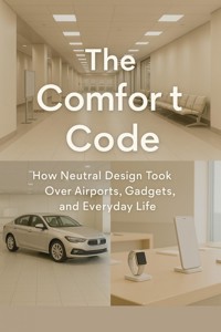
Everywhere we go, the world looks… the same. Phones shimmer in metallic silver, airports glow beige and gray, and rental cars come in fifty shades of safe. The Comfort Code unravels the hidden story of how neutrality became the global aesthetic—how color, risk, and emotion were systematically engineered out of the objects that define modern life. This book explores the quiet power of design conformity: how industrial efficiency, branding strategy, and psychology converged on one shared visual language—comfort. Through insights from behavioral science, marketing, and architecture, The Comfort Code reveals why we crave safety in form and tone, and how that craving reshapes creativity, commerce, and identity.
Sie lesen das E-Book in den Legimi-Apps auf:
Seitenzahl: 169
Veröffentlichungsjahr: 2025
Das E-Book (TTS) können Sie hören im Abo „Legimi Premium” in Legimi-Apps auf:
Ähnliche


Table of Contents
Chapter 1: The Beige Revolution
Understanding the Beige Revolution
The Role of Economic Factors
The Psychological Appeal of Neutrality
The Spread of Beige in Everyday Life
Chapter 2: Airports of Agreement
The Psychological Impact of Color
Branding Through Design
The Standardization of Airport Design
Designing for Diverse Cultures
Emotional Navigation in Airports
The Future of Airport Design
Chapter 3: Safe Innovation
The Illusion of Innovation
Case Studies in Comfort Innovation
Consumer Loyalty through Consistency
The Psychology Behind Design Decisions
Chapter 4: Color Politics
The Emotional Weight of Color
Historical Context of Color Usage
Color and Power Dynamics
The Future of Color in Design
Chapter 5: The Consumer Conformity
The Psychological Drivers of Conformity
Behavioral Economics and Consumer Choices
The Role of Marketing in Consumer Conformity
Implications for Brands in a Conformist Market
Chapter 6: Minimalism and Maximum Impact
The Roots of Minimalism
The Psychological Appeal of Minimalism
Minimalism in Consumer Products
Minimalism and Modern Aesthetics
The Limits of Minimalism
The Future of Minimalism in Design
Chapter 7: Branding and the Comfort Code
The Role of Familiarity in Branding
The Comfort Code in Brand Strategy
Safe Design Principles in Branding
Trust and Brand Longevity
The Future of Branding in a Comfort-Centric World
Chapter 8: User Experience in the Neutral Age
The Foundations of User Experience
The Role of Neutral Aesthetics in UX
Intuitive Interaction and Minimalist Design
Neutral Design and Consumer Expectations
Chapter 9: The Role of Emotion in Design
The Psychology of Emotional Design
The Impact of Color on Emotion
Creating Emotional Experiences Through Design
Case Studies in Emotional Design
Chapter 10: Conformity vs. Innovation
The Risk of Innovation
Comfort in Conformity
The Spectrum of Innovation
Behavioral Economics and Consumer Choice
The Future of Innovative Design
Chapter 11: The Global Aesthetic
The Influence of Cultural Norms on Design
Globalization and Design Conformity
Consumer Behavior and the Desire for Safety
Aesthetic Preferences Across Borders
The Impact of Technology on Global Design
Future Trends in Neutral Design
Chapter 12: Redefining the Future Palette
Embracing Bold Colors
Infusing Human Texture
The Role of Playfulness
Celebrating Diversity in Design
Sustainability Meets Aesthetics
Innovation Through Collaboration
Reimagining Consumer Interaction
Chapter 1: The Beige Revolution
In this chapter, we explore the phenomenon of the Beige Revolution, tracing how a palette of neutrality seeped into every aspect of design. From office spaces to urban landscapes, we examine the forces that led to the prevalent aesthetic of sameness, highlighting the socio-economic factors that advocate for risk-averse choices. This chapter sets the stage for understanding how a culture of conformity drives the visual language of our world today.
Understanding the Beige Revolution
The Beige Revolution represents a significant shift in design philosophy, where fear of the unknown drove a preference for familiar and neutral aesthetics. This section will discuss the historical context for this trend, highlighting how economic pressures and social expectations encourage conformity in design choices.
Emergence of Risk Aversion
The late 20th century marked a decisive shift towards risk aversion, profoundly impacting design choices. Economic turbulence, including recessions and market instability, led individuals and organizations to prioritize safety and familiarity over bold innovation. As a result, designers focused on creating products and environments that conveyed stability through neutral aesthetics.
This shift reflects broader societal changes where apprehension about the future resulted in increased demand for designs that exuded confidence and reassurance. Neutral colors like beige and gray became synonymous with a desire for predictability. This inclination for avoidance of risk extended beyond just visual elements; it influenced how products were marketed and embraced by consumers.
Consequently, the prevalence of neutral palettes emerged not merely as a stylistic choice but as an adaptive strategy to align with consumer expectations and sentiments, reinforcing a cycle of comfort and conformity.
Influence of Corporate Culture
Corporate culture played a pivotal role in mainstreaming neutral palettes across various design fields. The corporate environment, striving for professionalism, adopted beige and gray tones to cultivate an atmosphere of calm and focus. Such settings emphasized productivity and discretion, perceiving bold colors as potentially distracting or unprofessional.
This preference for neutral palettes extended from the corporate sphere to other institutions and public spaces, reinforcing the idea that uniformity communicates reliability. The influence of corporate branding practices further solidified these choices, as companies sought to project trustworthiness and cohesion through consistent design language.
As these neutral tones became the norm in corporate design, their pervasive adoption in consumer products followed suit, perpetuating a visual landscape where distinctiveness was often sacrificed for comfort and conformity. Thus, the corporate aesthetic drove the broader Beige Revolution, impacting design choices across various sectors.
Standardization of Design Elements
The standardization of design elements significantly contributed to the spread of neutral aesthetics. Industrial design practices began to prioritize uniformity in colors, materials, and forms, leading to a homogenization of products and spaces. This movement was partly driven by economic considerations, as standardized designs reduced production costs and simplified logistics.
As designers and manufacturers sought efficiencies, colors such as beige and gray were increasingly used as they offered versatility and compatibility across various applications. This trend reflected a utilitarian approach to design where functionality often overshadowed individuality.
Moreover, the globalized economy facilitated the rapid spread of these standardized products, reinforcing the notion that sameness in design equates to quality and assurance. Consequently, a common visual language emerged, shaping consumer perceptions and expectations in a world increasingly dominated by neutral aesthetics.
Psychological Safety in Design
Designers have increasingly recognized the psychological implications of color and form, particularly the association of neutral colors with safety and reassurance. Research in behavioral psychology indicates that individuals frequently respond positively to calm, muted tones, perceiving them as non-threatening and conducive to a sense of well-being.
This understanding has led designers to adopt neutral palettes deliberately, appealing to consumers’ innate desire for comfort and security. By incorporating these psychological principles into their work, designers have effectively crafted environments that promote feelings of safety, particularly in high-stress settings like airports or hospitals.
This strategic use of color in design not only enhances user experience but also fosters brand loyalty, as consumers associate favorable emotional responses with the products and spaces they inhabit. Consequently, the emphasis on psychological safety has contributed to the widespread acceptance of the neutral design paradigm, further embedding it in contemporary culture.
The Role of Economic Factors
In this section, we examine the economic drivers behind the Beige Revolution. Understanding the financial implications of design choices can illuminate why – both consumers and businesses – gravitate toward neutral aesthetics.
Cost Efficiency and Durability
Neutral colors have gained immense popularity in design due to their inherent cost efficiency and durability. In corporate and public spaces, these colors can effectively conceal wear and tear, minimizing the need for frequent replacements. This practical aspect makes neutral palettes appealing to decision-makers who must consider budget constraints amidst operational pressures.
Furthermore, spaces painted in neutral shades tend to require less maintenance over time. For businesses, minimizing upkeep not only reduces costs but also ensures a consistent aesthetic that aligns with their branding strategies. This is particularly appealing in sectors where a polished appearance is crucial for customer satisfaction and brand loyalty.
Additionally, the perception of durability fosters a sense of trust and reliability among consumers. When spaces feature neutral designs, they radiate stability, subconsciously reinforcing a notion of quality. Thus, the economic incentive and psychological benefits create a compelling case for the widespread adoption of these color choices.
Marketability of Neutral Designs
The marketability of products designed with a neutral aesthetic has been largely driven by their broad appeal. Neutral designs attract a wide audience, as they resonate with diverse consumer preferences and cultural backgrounds. This universality is essential for brands aiming to maximize their market reach and enhance sales potential.
Neutral tones are often perceived as "safe" choices, making them more inviting to consumers who may feel overwhelmed by bold colors and complex patterns. In a competitive market, products that blend seamlessly with various environments create a sense of inclusivity. This adaptability allows brands to cater to different demographic groups without alienating any specific segment.
Additionally, the adoption of neutral aesthetics in branding helps establish an identity that signals reliability and professionalism. This strategic alignment between product design and brand perception not only captivates consumer interest but also solidifies a brand's presence in the marketplace.
Influence of Globalization
The influence of globalization plays a significant role in the proliferation of neutral designs across various regions. As cultural exchanges foster familiarity and uniformity in consumer preferences, design standards increasingly converge towards a global aesthetic characterized by neutrality. This pattern enhances the sense of cohesion within international markets, further entrenching the Beige trend.
As companies expand into global markets, the need for branding that transcends cultural barriers becomes paramount. Neutral tones satisfy this demand by offering designs that are broadly acceptable and recognizable, ensuring that products resonate across different cultural contexts. Consequently, this approach to design not only meets consumer expectations but also bolsters corporate visibility on a global stage.
Moreover, as countries engage in trade and cultural dialogue, the standardization of design practices evolves, leading to less regional variance. The Beige Revolution, thus, becomes a symbol of the convergence of global practices, catering to an audience that increasingly values familiarity over distinctiveness.
Impact of Economic Crises
The impact of economic crises has been profound, significantly shaping consumer preferences towards safe, neutral designs. During downturns, consumers and businesses alike become more risk-averse, leading to a reduction in investment in bold or unconventional design choices. This shift towards neutrality is influenced by the desire for reliability and reassurance in uncertain times.
As disposable income decreases, individuals prioritize practical purchases that promise longevity and functionality. Consequently, products that epitomize a neutral aesthetic are favored, as they align with a conservative economic mindset focused on enduring value. Brands thus adapt their strategies, emphasizing the safety and timelessness of their designs.
Additionally, businesses adopt neutral aesthetics in response to market demands shaped by economic realities. The emphasis on consistency and dependability reinforces brands’ resilience during challenging periods. Ultimately, the cycle between economic conditions and design choices highlights how external factors can significantly steer visual and aesthetic norms toward conformity.
The Psychological Appeal of Neutrality
The psychological implications of design are profound. This section explores how neutral designs resonate with human emotions and perceptions, making them highly effective in various environments.
Associations with Calmness
Neutral colors play a significant role in evoking feelings of tranquility and calmness. This impact is especially pronounced in environments like airports and retail spaces, where the experience can be stressful. By utilizing a palette of soft, muted tones, designers create a serene atmosphere that soothes travelers and shoppers alike.
Research in psychology supports the notion that shades of beige, gray, and white can reduce anxiety levels. Such colors promote feelings of safety and comfort, encouraging customers to engage more freely with their environment. As a result, these settings become conducive to relaxation and well-being, which in turn enhances the overall consumer experience.
Reducing Decision Fatigue
Neutral design serves to minimize overstimulation, allowing individuals to focus and make informed decisions without feeling overwhelmed. In today’s fast-paced world, where choices bombard us at every turn, the simplification provided by neutral aesthetics is invaluable.
By stripping away excessive visual noise, neutral designs foster a clearer path to decision-making. Consumers find themselves more at ease, leading to quicker and more confident choices. The absence of vibrant, competing colors helps streamline cognitive processes, ultimately enhancing the effectiveness of spaces such as shopping malls and transit hubs.
Creating a Sense of Order
Neutral aesthetics contribute significantly to a sense of organization and harmony. In a chaotic world characterized by constant change, individuals often seek stability through their surroundings. Neutral tones instinctively align with our psychological desire for order, appealing to our innate need for clarity.
This visual consistency not only facilitates navigation through various environments but also instills a sense of peace among consumers. As spaces reflect a well-organized and calming atmosphere, they invite individuals to engage without distractions, reinforcing the feeling of groundedness necessary for positive experiences.
Impact on Brand Perception
Brands that utilize neutral tones often evoke perceptions of reliability and trustworthiness. By opting for a subtle aesthetic, these brands signal stability and strength, qualities highly valued by consumers. This strategic choice in design reinforces brand loyalty and fosters a preference among audiences seeking dependable options.
Furthermore, the psychological underpinnings of color associations contribute to this effect. Consumers tend to project feelings of calm and assurance onto brands that embrace neutral palettes, creating an emotional connection that can significantly influence purchasing behavior and brand recall.
The Spread of Beige in Everyday Life
The incorporation of neutral tones extends beyond corporate design into our everyday settings. This section elaborates on how the Beige Revolution infiltrates various aspects of life, influencing not only products but entire environments.
Home Design Trends
In recent years, there has been a significant shift towards neutral tones in home decor. Homeowners are increasingly opting for beiges, whites, and soft grays, creating spaces that feel expansive and calming. This desire for minimalist aesthetics often reflects deeper cultural shifts towards simplicity and order in chaotic modern life.
The appeal of neutral palettes lies in their adaptability. These colors serve as a versatile background against which personal style can flourish, allowing homeowners to inject individuality through art and furniture. Moreover, neutral tones tend to evoke feelings of serenity, reducing visual clutter and enhancing mental well-being.
This trend is also influenced by prevailing marketing strategies that promote the idea of comfort and safety in design. As people seek refuge from the complexities of daily life, opting for a soothing environment becomes not just a choice, but a lifestyle aligned with minimalist philosophies.
Urban Planning and Infrastructure
The Beige Revolution has made its mark on urban planning, with cities adopting muted palettes for public infrastructure to foster feelings of safety and cohesion. Neutral colors in buildings and public spaces are often chosen to create a seamless environment that reduces anxiety and promotes community interactions.
City planners aim for an aesthetic that encourages accessibility and comfort, crafting spaces that are welcoming and easy to navigate. This approach is particularly important in densely populated urban areas, where visual uniformity can promote a sense of harmony among diverse populations.
Furthermore, architectural choices are influenced by research that suggests neutral environments can lead to lower stress levels. Consequently, public infrastructure is increasingly designed with safety in mind, showcasing how these color trends extend beyond aesthetics to the very fabric of societal interaction.
Consumer Electronics Aesthetic
The consumer electronics market has increasingly shifted towards using neutral colors, particularly in product design. This trend enhances a product's marketability while reinforcing perceptions of modernity and sleekness. As technology becomes a staple of everyday life, the aesthetics of gadgets play a crucial role in shaping consumer preferences.
Neutral tones in electronics, such as smartphones and laptops, instill confidence in consumers who often associate these colors with quality and sophistication. Brands have harnessed these shades to convey a sense of reliability and familiarity, which is a significant aspect of their branding strategy.
This focus on a muted color palette is also a strategic move to minimize consumer hesitations about adopting new technologies. By employing an aesthetic that feels safe and conventional, companies can position their products as part of consumers' seamless integration into their daily lives.
Transportation and Mobility
Neutral colors have also predominated the design of transportation options, such as rental cars and public transit systems. Emphasizing shades like beige, gray, and white, the transportation aesthetic reinforces feelings of reliability and familiarity during daily commutes.
This design language serves a dual purpose: to present vehicles as trustworthy solutions while also conformingly blending into urban landscapes. The ubiquity of neutral tones creates a visual language that resonates with travelers seeking comfort in their journey.
Furthermore, studies indicate that such familiarity in design can decrease stress and promote a more positive commuting experience. As cities evolve, the choice of neutral colors in transportation design illustrates a commitment to user experience, ensuring that commuters feel at ease in their mobility choices.
Chapter 2: Airports of Agreement
Airports are often the first and last impressions of a culture for travelers. In this chapter, we analyze why the soothing tones of beige and gray dominate airport design. We discuss the psychological effects of such environments on travelers and how calming aesthetics serve as a strategic branding tool for airports globally. By examining case studies, we reveal the connections between architecture, human behavior, and the business of travel.
The Psychological Impact of Color
The colors chosen for airport designs are not random; they are intentionally selected to invoke specific psychological responses. Neutral colors like beige and gray are prevalent in the hope of creating a calming environment amidst the chaos of traveling.
Key point 1: Calming effects of neutral tones
The use of neutral tones, especially beige and gray, in airport design is rooted in their psychological calming effects. These colors are often associated with stability and tranquility, effectively reducing the sensory overload that travelers experience in busy environments. Research shows that hues perceived as calming can lower heart rates and alleviate anxiety, creating a more pleasant atmosphere during travel.
By opting for these subdued palettes, airport designers aim to provide a consistent and reassuring backdrop amidst the turbulence of travel. This strategic choice not only enhances passenger comfort but also fosters a sense of familiarity. Furthermore, as travelers encounter similar color schemes across multiple airports, the consistency adds an element of predictability that can ease pre-flight nerves.
Key point 2: How color influences traveler emotions
Color plays a pivotal role in shaping emotional responses, particularly in environments where stressors are prevalent. In airports, the deliberate selection of colors can positively influence traveler moods, promoting feelings of safety and comfort. For instance, research indicates that softer colors often evoke a sense of calmness, while brighter, more aggressive shades may heighten anxiety levels.
Airports leverage this understanding by creating environments that nurture positive emotional experiences. By favoring colors that align with emotional comfort, airports can mitigate the natural apprehension travelers may face, transforming the journey into a more pleasant experience. This emotional regulation through color is a critical aspect of designing public spaces where large numbers congregate.
Key point 3: The relationship between stress reduction and design
There is a profound connection between design elements, such as color choices, and the reduction of stress in travelers. Layout, lighting, and color not only affect the aesthetic quality of an airport but also significantly impact traveler well-being. A calm atmosphere can alleviate the anxiety that often accompanies travel, making the airport experience more enjoyable.
Studies reveal that thoughtfully designed spaces using neutral tones can lead to lower stress levels among passengers. When stress is minimized, travelers are more easily able to navigate airport challenges—whether it's long queues or security checks. This relationship underscores the essential role of design psychology in creating environments that support mental well-being during travel.
Key point 4: Case studies of airports using color effectively
Several airports have successfully implemented color strategies that highlight the importance of neutral colors in design. For example, Toronto Pearson International Airport has adopted a palette of soft grays and beiges to create a soothing environment for travelers. The subtle use of these colors helps to ease the stress associated with the busy airport atmosphere.
Another exemplary case is Changi Airport in Singapore, which combines the calming effects of neutral tones with artistic elements. By incorporating lush greenery along with soft color palettes, they create a harmonious environment that actively reduces passenger stress. These case studies illustrate how effectively utilizing color in airport design not only enhances passenger experience but also aligns with broader branding strategies that prioritize customer comfort.
Branding Through Design
Airports often serve as the face of a region, representing not only functional spaces but also branding opportunities. The choice of design elements, including palette and form, plays an essential role in shaping guest perceptions.
Key point 1: Airports as branding hubs


