Erhalten Sie Zugang zu diesem und mehr als 300000 Büchern ab EUR 5,99 monatlich.
- Herausgeber: Books on Demand
- Kategorie: Fachliteratur
- Sprache: Englisch
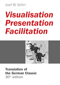
Visualisation, Presentation and Facilitation are working methods that play an increasingly important role in professional everyday life. This was the case in 1989, when this book was first published, and is more relevant now than ever. Since the first edition the author has revised this book numerous times. He has expanded and “modernised” this edition so that the best seller once again sets the benchmark in regard to content and design. The reader learns how he can skillfully visualise facts, properly prepare and confidently give presentations, effectively chair a meeting, facilitate teams and groups results-oriented, and successfully organise workshops. The book also provides the reader with proven methods, tips and techniques for communicating information understandably and vividly. The focus is always on the “how” – giving the reader concrete suggestions for practical use. With its clarity and structure this book is probably unsurpassed until this day.
Sie lesen das E-Book in den Legimi-Apps auf:
Seitenzahl: 154
Veröffentlichungsjahr: 2015
Das E-Book (TTS) können Sie hören im Abo „Legimi Premium” in Legimi-Apps auf:
Ähnliche
For Elke
Available at
book on demand, bookstores
and www.moderatorenshop.com
ISBN 9783734781087
Direct Link: www.vpf.moderatorenshop.com
Production
Cover Design: David.Seifert, Pörnbach
Text Illustrations and Chapter Cover Sheets: Design House,
Laufer & Zahs, Nußloch
Text Illustrations: Peter Kaste, Erlangen
Layout and Graphics: Moderatio, Pörnbach
Photos: Legamaster, Moderatio, Neuland, Fotolia
Printing and Binding: Salzland Druck, Staßfurt
Completely Revised and Extended Translation:
Barbara Siebert, München
Acknowledgments
I would like to thank Barbara Siebert for her painstaking care in editing the text, Karina Gregory for critically reading the text, as well as Uwe Schettler for his loving preparation of the flip charts.
Translation of the 30th German Edition
(German Title: Visualisieren Präsentieren Moderieren)
GABAL Verlag, Offenbach 2011
All brands, products, trademarks, and registered trademarks mentioned in this book are the property of their respective owners and possibly not marked as such.
All rights reserved. Reproduction – also in part – only with the written permission of the author.
www.josef-w-seifert.com
Foreword to the First German Edition
Most people have, in a manner of speaking, been “damaged” by school: Over the years they have experienced that “learning” and “teaching” are primarily associated with “speaking” and “speech”. Oral contributions of teachers and pupils are still the focal point of didactic activity wherever the educational process is institutionally guided. This “learning environment” has channeled our natural learning habits one-sidedly towards the spoken word and passive receptive learning. In the same way it has also uniformly shaped our expectations in learning situations.
Now, if in turn the pupils become teachers, company instructors, or management-level employees, they often merely “exchange roles”: Whereas they previously spent years training themselves to listen to the teacher speaking, they now quickly grow “accustomed” to presenting issues, instructions, and solutions to problems as well as to practicing the “art of lecturing”.
Among the many possible detrimental effects of this, two are particularly tragic: One is the conception that what was said was also understood, and the other is the notion that the task of the pupil or co-worker must be confined to listening and/or to following instructions.
The present book is an excellent guide for helping to dispel this “speechification”. The author has compiled a wealth of proven methods and techniques for visualisation, presentation, and facilitation. These are useful for understandably conveying information and offer practice-orientated aids for working together and solving problems in seminars and workgroups. The author goes about this using clear concepts and structures.
This is the reason why this book has a great deal to do with the true “art” of didactic activities.
Landau, September 1989
Prof. Dr. Theo Hülshoff
About this book
Visualisation, presentation, and facilitation are tasks faced by employees of modern organisations more and more frequently. The growing interest in corresponding practice sessions and complete training courses goes to show the importance of this topic.
During my work in the area of facilitation and training techniques, I have repeatedly been asked about literature presenting the topics of visualisation and presentation and/or facilitation in a concise and practical orientated form. This is why in 1989 I wrote the present book, which in the meantime has been translated into several languages and rolled off the presses over 500,000 times. I have repeatedly revised and expanded this book. For the present edition, I have once again revised it so that it is up-to-date in regard to content and design. Photos and graphics have, for example, been renewed and some tips have been added.
In this edition the three closely related subject areas – visualisation, presentation, and facilitation – are once again presented together in one volume instead of separately from one another. This provides the user with a collection of the most important principles, rules, and helpful hints, which together make up a comprehensive “guide book”.
The focus of this book is the “how to”, meaning concrete suggestions and useful contributions for practical application. I want to encourage you, the reader, to use this book as a reference work and a work book, to make your own notes in it and thus letting it become a practical tool for your everyday work.
Have fun reading and browsing through this book. I hope you find it useful and full of practical benefits!
Puch/Germany, July 1, 2011
Your Josef W. Seifert
Contents
Foreword to the 1st German Edition
About this book
1 Visualisation
1.1 Why Visualisation?
1.2 Planning a Visualisation
1.3 Building Blocks of a Visualisation
1.3.1 Media for Visualisation (Information Carriers)
1.3.2 Design Elements
1.4 “Composing” a Visualisation
1.4.1 The Sheet Partitioning
1.4.2 Arrangement and Logic
1.4.3 Colours and Shapes
2 Presentation
2.1 Presentation – What’s the Point?
2.2 Preparing a Presentation
2.2.1 Preparing for the Topic and Goal
2.2.2 Preparing for the Target Group
2.2.3 Preparing the Content
2.2.4 Preparing the Sequence of Events
2.2.5 Organising the Presentation
2.3 Conducting a Presentation
2.3.1 Tips for the Opening
2.3.2 Tips for the Main Body
2.3.3 Tips for the Conclusion
2.4 After the Presentation
3 Facilitation
3.1 Just What is Facilitation?
3.2 The Facilitator
3.3 Preparing a Facilitation
3.3.1 Preparation Related to Content
3.3.2 Clarifying the Objective
3.3.3 Preparing for the Participants
3.3.4 Methodical Preparation
3.3.5 Organisational Preparation
3.3.6 Personal Preparation
3.4 Conducting a Facilitation
3.4.1 The Course of a Facilitation
3.4.2 Facilitation Aids
3.4.3 Facilitation Methods
3.4.4 Guiding a Facilitation Process
3.4.5 Excursion into Facilitating a Discussion
3.4.6 Excursion into Large Group Facilitation
3.5 After the Facilitation
3.5.1 Personal Follow-Up
3.5.2 Organisational Follow-Up
And at the end a few Tips for the Podium
By the Way ...
Literature
List of Figures
Index
1 Visualisation
1 Visualisation
1.1 Why Visualisation?
1.2 Planning a Visualisation
1.3 Building Blocks of a Visualisation
1.3.1 Media for Visualisation (Information Carriers)
1.3.2 Design Elements
1.4 “Composing” a Visualisation
1.4.1 Sheet Partitioning
1.4.2 Arrangement and Logic
1.4.3 Colours and Shapes
1.1 Why Visualisation?
A picture is worth a thousand words, as the saying goes. Even though recent studies have shown that every individual has a preferred sensory input channel and that this is not always the visual one, the fact remains that people are “visual beings”. Most people are at least partly the “visual type”. Apart from that, a visual representation does in fact say more than anyone could express in a thousand words. Just think of the visual aspects of day-to-day interaction, the area of non-verbal communication.
Another interesting fact is the “retention rate”:
Fig. 1 – Retention rate
As this illustration shows, we retain 30% more from a presentation when visual representations (images, symbols, written words) are used. The advantages of visualisation altogether can only be guessed at.
But what exactly is “visualisation”? Visualisation means to represent something visually – this can be done for factual statements, emotions, and processes. Visual documentation does not have to replace the spoken word; rather, its aim is:
to focus the receivers’ attention on the essential
to involve the observers
to reduce the amount of speaking required
to give the audience orientation support
to make information easy (or easier) to comprehend
to emphasise essential points
to expand on and supplement what has been said
to foster retention
to encourage comments
There are no limits to personal creativity in regard to visualisation. However, you should know the fundamentals of visual representation and take them into account. This includes knowledge about ...
... planning a visualisation
... building blocks of a visualisation
... rules for the composition of a visualisation
1.2 Planning a Visualisation
A thorough concept must usually be developed before a visualisation can become reality. Depending on the situation, this will be possible to a greater or lesser degree. Even if only very little preparation is possible, you should not entirely do without visualisation and its positive effects. If you have enough time and/or the visual representation is important, you should definitely allow yourself this time for preparation.
An extensive preparation is a prerequisite for good, “impromptu” visual representations during a presentation since the presenter must have a previously developed image in his mind’s eye (and/or a pencil sketch on a piece of paper).
As in the case of the good old school essay, the first step to take for the thorough preparation of a visual representation is to gather material. One collects any information on the topic that could possibly be useful. The second step is the selection of items from this material that seem most important (initial selection).
During the third step you reduce those items left after the initial selection. For this you could use the following key questions:
What do I want to represent (content)?
What is the purpose of the visual representation (goal)?
Whom do I want to inform or convince (target group)?
Only after we have completed the planning stage do we deal with the visualisation in the narrow sense. The question now is how and with what the planned contents are to be prepared and presented.
1.3 Building Blocks of a Visualisation
To come up with a visualisation, you need, on the one hand, elements of content with which the information can be logically structured. On the other hand, you need media with which the visualisation can physically take shape. Together these can be called the “building blocks” of a visualisation. They are used to compose a comprehensive visual representation in accordance with certain rules.
Media most commonly used in (organisational) practice are:
pin board (with pin board paper)
flip chart (with flip chart paper)
overhead projector (with transparencies)
data projector etc. (with PC/notebook)
Examples of design elements are:
text
free graphics and symbols
diagrams
The design elements are equally well suited for the use with any media – the design rules are the same.
The media differ from one another in terms of usefulness depending on the occasion and purpose of their use. Therefore, on the next pages you will first of all find a brief description of each medium (information carrier). Following that, I will discuss the design elements mentioned above. The design rules are described in section 1.4 “Composing a Visualisation”.
1.3.1 Media for Visualisation (Information Carriers)
Pin Board
A pin board is a hard foam board, measuring approximately 150 x 125 cm, on which special sheets of paper are pinned. The board is set in a frame and is either mounted on the wall or has a stand, which allows it to be moved throughout the room. Collapsible or foldable versions with a carrying bag are also available. The pin board can then be transported in any mid-size car.
Pin board paper is either brown or white and is written on using special felt-tip markers with calligraphy tips.
Pin boards are especially well suited for work in small groups of up to 20 participants.
Cards (rectangles, circles, ovals), which are used during a facilitiation, can also be employed as supplementary material. They are cut out of thin cardboard and available in a variety of sizes and colours.
The pin board lends itself well to both the presentation of previously prepared visual representations and to keeping track of the development of content. Pin boards are the visualisation media for facilitation.
Fig. 2 – Pin board
Flip Chart
A flip chart stand is a portable device for holding special flip chart paper (approximately 70 x 100 cm). It is particularly useful for work in small/very small groups of up to about 10 people.
Special felt-tip markers are used to write on the paper (just like with pin board paper).
Visual representations on a flip chart can be prepared in advance or developed as the situation demands. They can remain in full view during the entire work session and be used again later.
The possibility of keeping a visual representation visible during the whole session is a big plus point of flip charts.
In both presentation and facilitation sessions flip charts are employed as useful “visualisation workhorses”.
Fig. 3 – Flip chart
Overhead Projector
The overhead projector (OHP) is still widely used for projecting visual representations made on transparencies. The transparencies are letter size or A4 while the dimensions of the projected image depend on the size of the screen and the projector’s distance from it. The OHP is suitable for presentations to both small and large groups. A particular feature is that a very large number of participants can be “served” at the same time – up to several hundred people depending on the projector model.
In most cases, the transparencies are created with special software (for example, Microsoft’s “PowerPoint”) on a computer and printed out using a colour printer. Even though these days data processors are used most commonly, transparencies or slides can also be directly projected from a PC by means of an LCD (liquid crystal display) panel. In this case the LCD panel is simply placed on the projector instead of a transparency. An “intermediary solution” is to use a so-called “feeder”, which works in exactly the same way as the feeder of a copier, except in this case transparencies are transported step by step. Of course, this can be done using a remote control.
It is also possible to produce transparencies “manually” using special overhead markers (water soluble or water proof). Especially suitable are markers with calligraphy tips (see “Tips for Working with Felt-Tip Markers,” page →).
The transparencies can be prepared ahead of time or developed as the situation demands. Their stability and ease of transport are big plus points, particularly if visual representations are to be used repeatedly.
The disadvantage of the overhead projector as compared to the pin board and the flip chart: individual visual representations can be viewed only while actually being projected.
Fig. 4 – Overhead projector
Data Projector etc.
The data projector is a digital projector that can project visual representations – called slides – directly onto a screen. These slides are often prepared using special software such as “PowerPoint”, “Keynote”, “Visio”, or “Mindmanager”. The “detour” of printing out and then placing the transparencies on the overhead projector is used less and less.
With the data projector pictures for a presentation have “learnt to move” – visualisations can now have a dynamic format. Text and graphics can be partially or completely faded in or out, and speech, music, or even film sequences can be worked in. The transition to film is fluent. The control is carried out by mouse or remote control. Photographs can be integrated into the visualisation through the computer program (depending on the available hardware constellation) or projected directly. Online tools make it possible to create and project presentations via the internet.
Ultra small, powerful, and light mini-notebooks from the “netbook” to the “smartphone” are the ideal partners for data/video projectors. Many devices offer “plug and play”. They are simply plugged into the computer – configuration and synchronisation take place automatically.
The big advantage of this “perfect” technology is at the same time its biggest disadvantage: its perfection. The more technical possibilities are used, the more a presentation becomes professional but at the same time also sterile. In an extreme case it becomes a “video showing” – often all that is missing are the crisps …
As difficult as it is to overdo a “low tech presentation” using a pin board or flip chart, just as easy it is to fall into this trap when using electric/electronic media from the overhead projector to the data projector.
By the way: For a brilliant visual representation the available projection surface is decisive. Therefore, if you are not quite sure about the provided standard of the equipment, it is better to take your own portable screen with you!
Fig. 5 – Data processor etc.
... and other media:
The reasons for and the aims of presentations are extremely complex. Which media could possibly be used or which is necessary has to be clarified for each individual situation. The ideal case is certainly that in which the presentation can be carried out “live” and “visual representation technology” need not be used at all. Placing a product on the table so that the original can be observed or even felt is certainly the optimum.
As this is often not possible, presenters have to rely on presentation technology and media. These include – as already mentioned – above all the pin board, flip chart, overhead projector, and PC with data projector.
There are some less common or widely used devices. These include the “table flip chart”, the LCD display for the PC, the “Instant Presenter” (a projector that can, for example, project a page of a book), the (microprocessor-controlled) “slide projector”, and the CCD mini colour camera for live presentations of, for example, objects. In addition, there are combined devices such as the “Copyboard” and “Copyflip”, which can immediately print out in A4 format what has been written, as well as the “eBeam” with which you can exchange data per PC and data projector between the projection surface and the computer during the presentation. Up-to-date information about media for specific applications can be obtained from specialist shops and in the internet; innovations appear almost daily.
Fig. 6 – Other media
Tips for Working with Felt-Tip Markers
Before moving on to the design elements, here are a few but important suggestions for working with felt-tip markers. Despite modern PC-based visualisation technology, they are gaining ground again.
When working with markers, the quality of your handwriting depends not only on how much practice you have had but above all on the proper handling of the markers. Below you will find tips on the correct handling using the “Edding 800” and “Edding 330” markers as examples:
Always try to write with the (lower) specified edge and do not rotate the marker while writing. As an orientation aid a “sample stroke” is provided for each marker in the illustration below, which you can use to check the starting position of the marker.
Fig. 7 – Working with felt-tip markers
The simple example below shows you the correct script size for each of the given markers. The important thing here is that the ascenders and descenders be kept short.
By the way: As soon as you succeed in coming up with the proper script using one kind of pen, you can easily do the same with any other one, whether this is a felt-tip marker or a calligraphy pen.
Fig. 8 – Script sample
1.3.2 Design Elements
A visual representation is generally a combination (composition) of different elements.
We call these elements “design elements” of the visualisation. Specifically, they are:
Fig. 9 – Design elements
The Design Element Text
The most common way to visualise information (meaning to make it visible) is to write it down.
