11,99 €
Mehr erfahren.
- Herausgeber: Batsford
- Kategorie: Lebensstil
- Sprache: Englisch
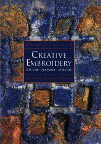
'A Complete Guide to Creative Embroidery' illustrates a wealth of ideas from two internationally renowned embroiderers. It is divided into two sections: the first, 'Design to Embroider' by Jean Littlejohn develops ideas showing that anyone can design as well as decorate fabric and paper for embroidery. The second, 'Stitched Images' by Jan Beaney, illustrates how to colour fabric and combine this with stitchery. She then looks at ways of interpreting designs using applique, patchwork, quilting, and hand and machine embroidery. The final section gives guidance on selecting a theme. With the combined talents of two innovative embroiderers, this highly illustrated book is an inspiring source of colour, pattern, design, stitch and texture which will encourage embroiderers to create their own exciting and rewarding pieces.
Das E-Book können Sie in Legimi-Apps oder einer beliebigen App lesen, die das folgende Format unterstützen:
Seitenzahl: 192
Veröffentlichungsjahr: 2014
Ähnliche


A COMPLETE GUIDE TO
CREATIVE EMBROIDERY
colourful abstract embroidery, based on cave formations, by Diane Kelly. The pattern of vertical stripes relates to the stalagmites and stalactites of the original cave.
A COMPLETE GUIDE TO
CREATIVE EMBROIDERY
DESIGNS • TEXTURES • STITCHES
Jan Beaney and Jean Littlejohn
To Steve and Philip for their continuing support and encouragement
First published as eBook in the United Kingdom in 2014 by
Batsford, an imprint of Pavilion Books Company Limited
1 Gower Street
London WC1E 6HD
www.pavilionbooks.com
This printed edition published 1997
Reprinted 2000, 2001, 2002, 2003, 2005
First published in 1991 by Century Editions,
an imprint of the Random Century Group Ltd,
Copyright © Jan Beaney and Jean Littlejohn 1997
Copyright Design to Embroiderer © Jean Littlejohn 1997
Copyright Stitched Images © Jan Beaney 1997
The right of Jan Beaney and Jean Littlejohn to be identified as Author of this work has been asserted by them in accordance with the Copyright, Designs and Patents Act 1988.
eISBN 9781849942270
All rights reserved. No part of this publication may be reproduced, stored in a retrieval system, or transmitted in any form or by any means, electronic, mechanical, photocopying, recording or otherwise, without the prior writen permission of the copyright owner.
Photography by Dudley Moss
Edited by Cindy Richards
Still Life photography on pages 10, 22, 35, 46, 49 (top), 94 (bottom), 96, 121 (top), 122 and 124 by Patrick McLeavey
Location photography by Jan Beaney, Jean Littlejohn, Philip Littlejohn, Steve Udall
Stitch Illustrations by Dennis Hawks
Front cover: Handmade feltby Gwen Hedley
Back cover: Tree Celebration II by Jean Littlejohn
CONTENTS
BOOK I – DESIGN TO EMBROIDER
JEAN LITTLEJOHN
CONTENTS
INTRODUCTION
MARK-MAKING MATERIALS
PAPER PATTERNS
MULTIMEDIA DESIGN
LEARNING TO LOOK
EXPLORING IDEAS
BOOK II – STITCHED IMAGES
JAN BEANEY
CONTENTS
INTRODUCTION
FABRIC PAINTS
REDISCOVERING APPLIQUE
STITCH THEMES
MACHINE EMBROIDERY
SELECTING A THEME
GLOSSARY
ACKNOWLEDGEMENTS
READING LIST
STOCKISTS AND SUPPLIERS
INDEX
PREFACE
Embroidery can be a sharing experience and it is stimulating to exchange ideas. We have been most fortunate over a period of years not only to share a friendship and a passion for stitched textiles but also to be in a position to work as a team, bouncing ideas from one to another.
We are not always aware of who initiates the starting points but being in a position to talk and mull over these thoughts enables us to plan a structured approach to our teaching as well as being an enjoyable experience.
Within this framework we retain our individual approaches and style of working.
There are many ways of achieving a piece of creative stitching and we would not presume that the approach we offer in these books is the only way.
For many years we have encouraged students to develop their ideas beyond the superficial by extended themes and this has been reflected in the way we have planned both books.
In some instances you may find the glossary we have compiled useful.
We believe that many people are capable of designing and stitching their own embroideries. Our students have found our methods reassuring. Our message is not to be intimidated but to enjoy learning to look and explore the creative potential of papers, fabrics and threads.
geometric design and canvas-work sample by Elizabeth Coughlan.
DESIGN TO EMBROIDER
Jean Littlejohn
detail of paper chickens by Phil Palmer.
CONTENTS
Introduction
MARK-MAKING MATERIALS
Background Papers
Interpreting an Image
Resists
Ink and Bleach
Scratching into Surfaces
PAPER PATTERNS
Printing with Sponge Blocks
Monoprinting
Patterned Backgrounds
From Paper to Embroidery
Manipulated Paper Surfaces
Boxes and Beads
MULTIMEDIA DESIGN
Large-scale Designs
Rubbings
Collage
Applied Textured Surfaces
LEARNINGTO LOOK
Close to Home
Further Afield
Looking Through
Keeping an Ideas Book
EXPLORING IDEAS
Scapes
Patterns – a possible approach
Abstract Images
Trees – a personal theme
INTRODUCTION
The ability to draw and design is within the reach of everyone but lack of confidence so often prevents people from achieving their full potential.
In many cultures, drawing skills are part of a way of life and not held up as an exclusive gift available only to those with natural ability. Just as competence in writing, mathematics or music may be improved with practice and enthusiasm, so it is with drawing.
Through drawing we learn to see. We may think we know a familiar flower until asked to describe it accurately. By recording it on paper we cannot help but understand it better.
There are very few people who can sit in front of a blank sheet of paper and conjure up designs purely from imagination. Most of us need to look at a source of inspiration and from it develop ideas which will work in fabric and thread.
To do this it is necessary to be aware of the widest possible range of media and techniques in order to select those which suit our personal style and the embroideries we plan to work.
All of the techniques in the book are based on simple principles and, most importantly, capable of being carried out at home using accessible equipment.
It has become apparent that many people would like a structured approach towards designing which will not only inspire images for embroidery, but establish confidence and act as a springboard for new and stimulating ways of working.
This book contains a range of ideas from basic backgrounds and simple mark-making through to more complex multimedia work. The ideas are there to inspire rather than follow slavishly, but the guidelines will encourage those first marks.
It is important to remember the need to experiment and not to give up if first attempts do not achieve the desired effect. Several of the designs featured in the book were done by people who started out with very little confidence in either drawing or designing, others by experienced artists. Just remember that with practice and curiosity anything is possible.
a tissue paper collage and painted pattern by Clémence Gilder.
MARK-MAKING MATERIALS
A visit to any art shop will reveal the huge range of paints, crayons, inks, pencils, papers and glues available. These provide exciting design possibilities but hasty choices can result in costly mistakes. How do you decide which ones to buy? Many people have visually appealing boxed sets of colouring media which remain unused. Ideally it would be marvellous to be let loose in an art shop and try everything before buying, indeed some shops have samples for this purpose, so it is always worth asking. Being watched doesn’t matter as simple lines and smudges will suffice to indicate if you like the feel, the mark or even the sound a material makes on the paper. Conté pencils have a wonderful colour range and blend beautifully but can make a rasping noise on textured paper which you may find unpleasant, so it is wise to try them before committing yourself to a complete box.
Before buying anything search your house, ask members of your family for contributions, and I bet you’ll be amazed at the range of mark-making materials you already have. For linear marks fibre tip pens, pencils, ink pens and ballpoint pens will offer a very wide range. Alternatively, if you are part of a group, pool your resources for one session and try each other’s materials. Using simple marks build up a chart making careful note of the name and type of material used next to each one with additional comments on its handling and potential – it will prove an invaluable source of reference.
Selecting your materials need not be complicated if a little common sense is applied. Look upon the various types of colouring media as pigments bound together in different ways. Being aware of the composition will indicate what it does. Perhaps the most effective method of selection would be to consider the quality of mark you are seeking and think in terms of line, tonal values, boldness, subtlety, vibrancy, delicacy, coarseness and texture.
This collection of design materials was accumulated over a period of years. Among the more sophisticated equipment there are everyday items such as sponges, drinking straws and an old toothbrush all of which can be very useful.
Aquarelle drawing pencils (left), medium and dark, blendable with water. A 6B graphite stick (right) is soft and can be used to shade light and heavy tones. Fine Aquarelle pencils (left) are used for subtle colour blending and make a delicate wash when brushed with clean water. Aquarelle crayons and thick soft pencils (right) are excellent for rich spreads of colour when brushed with clean water. Palettes of dry colour can be made in a sketchbook and lifted with water to produce a colour wash which is very useful for trips and museum visits. Iridescent gouache paints (left) have a lustrous quality which is very useful when designing for pearlized silk paints. Pearlized oil pastels (right) have a soft rich texture. A degree of blending may be achieved by dragging colours together with a blunt tool or working them into each other.
Pastels (left), soft and chalky in texture, can be easily smudged and blended but need fixing. Rub soft chalky pastel powder (right) across the edge of a template to achieve subtle images. Drawing inks (left), available in many colours, have great vibrancy and give colourful intensity to a design. The colourful richness of oil pastels (right) can be useful to create textured surfaces.
BACKGROUND PAPERS
When selecting fabrics for embroidery we are careful to find the appropriate quality and texture for the type of work. Paper, a crucial factor in any design work, is equally worthy of thought. Paper is a fibrous material composed of wood or rag pulp. It can be textured or smooth, matt or shiny, semi-transparent or thick and chunky, soft and absorbent or resistant to moisture.
So, not only do you have an enormous range of media, but types of surface on which to work them. For example, a wax crayon will glide smoothly over a card surface in contrast to the resistance encountered on a heavy watercolour paper.
As with the different media there is no better alternative than to experiment. Make a collection of every type of paper you can find, even the most mundane household papers, for example, tissue paper from shoe boxes, wallpaper scraps, kitchen towel and brown wrapping paper, will all prove useful. The occasional specialized paper such as the fine delicate semi-transparent Japanese or heavy watercolour papers are a pleasure to use. (Throughout the book any effect which is achieved on a specific background will be clearly stated.)
Handling papers will also emphasize their properties. Do they tear evenly or in a jagged way? How well can they be folded or manipulated? The quality and nature of the fibre will affect this and dictate the absorbency of the surface. Handmade paper is widely used in textile design and incorporated in embroidery. Old papers and offcuts from designing can be recycled into thick rich uneven handmade papers or delicate fibrous surfaces. If left unsealed they can be difficult to draw on and soak up ink and paint like a sponge, but there are occasions when this is right for a specific image.
Where the whiteness and glare of the paper is distracting a fine wash of tea, applied with a sponge or brush, will make a more receptive surface (see above). It should also be remembered that drawing can look good on prepared, textured or patterned, papers of which there are many examples in the following pages.
Each of the paperswas brushed gently with the same strength wash of tea. The various tones indicate the degree of absorbency of the different surfaces. From left to right: handmade, ingres, blotting, recycled cartridge, Japanese, cartridge, tissue and watercolour papers. Note also the way in which they have tom, another indication of their fibre qualities.
INTERPRETING AN IMAGE
Working in abstract smudges and lines is ideal when discovering the attributes of drawing media and backgrounds. The next stage is to discover what happens when you want to use the materials with control and judgement.
A collection of objects which appeal and offer varied surfaces will provide the inspiration here. For instance, pebbles, stones, fossils, plant materials and feathers will give a huge variety of textures. Man-made objects such as pieces of rust, machine parts and plastics may also prove challenging. All will provide a good opportunity to sharpen up your critical faculties. Consider which is the shiniest, the softest, or the most coarse and grainy, by handling and observation.
It is not necessary at first to draw outlines as the quality of surface is the focus. Small blocks of colour, pattern and texture, each trying to achieve a particular effect, will enrich your knowledge of mark-making and, if you note down what you used each time, be useful for future reference.
close-up photographic study of the wing of a tawny owl plus some preliminary observations
using a range of paper surfaces. Compare the differing marks made by pencil and pastel on contrasting paper surfaces. (Sketch by Shirley Warren.)
This beautiful studywas worked by Alex Caprara who used gouache and coloured pencils to describe the delicate patterns and subtle tones of the wing.
The beautiful wing from a tawny owl, featured opposite, was taken from a bird killed on a road. A photograph cannot really compensate for seeing it first hand although the tonal variations are obvious and indicate which methods of working might best describe it.
We all see things differently and consequently our drawings will vary greatly. One person might choose to emphasize the movement of the feathers whereas another might find the olour blending more exciting. Alex Caprara, a professional artist, has made a study of the wing in his style. He has used gouache and coloured pencils to illustrate its delicacy with a sensitivity and accuracy that indicates constant practice. Another artist, however, might tackle it in a completely different way.
Whatever our drawing ability we can all make a start by looking closely at objects we enjoy seeing and holding. By reworking the image in a number of ways, not only will we gain knowledge of the subject, but achieve a degree of sensitivity towards the design media which will give confidence in the future.
Candle wax was melted down and, using a sponge, simple shapes were printed on a dyed paper ground. The sponge was dipped carefully into the heated wax (avoiding skin contact) and printed repeatedly. Several prints were made from each dip. When dry a wash of diluted black water-based ink (one part ink to three parts water) was brushed over. The transparent candle wax has resisted the ink and allowed the dyed colours to shine through.
The pattern for this resist was cut from masking tape applied piece by piece and pressed down carefully. At the top of the pattern some masking tape has been left on. After the ink wash had dried each piece was gently lifted to reveal the coloured background underneath.
Melted crayons have more concentrated pigments than the candles and when melted were painted to achieve this resist pattern.
RESISTS
There is a wealth of inspiration to be found in embroideries from around the world. These richly embroidered Thai hats feature colourful geometric shapes which form the basis of the simple resists on these pages.
The principle of the resist technique is that a barrier of some kind is applied to a background and colour flooded into the design. It will not penetrate beyond the barrier, if the latter has been applied correctly. With a masking tape resist, however, a little colour sometimes seeps under the edge but, if planned for, this can be most attractive.
Long recognized as a method of patterning fabrics, a wax resist may be used most successfully on paper where it can serve two purposes: 1. To work designs on paper first, which can then be translated directly onto fabric, thus avoiding time-consuming and costly mistakes. 2. As a purely experimental medium to provide inspiration for other techniques.
Wax may be used in solid form or melted down and applied as a hot liquid. To start, simply make firm crayon marks on a not too absorbent paper and then, with a fine wash of ink diluted with water, draw a brush gently and evenly across the surface. If the wash is too thick, or the brush strokes too vigorous however, the wax will break down and no longer resist successfully.
Melted wax opens up further possibilities. The ends of discarded candles or crayons can be melted down in a thick-based saucepan – taking great care to avoid accidents. When liquid the wax may be painted, or printed, onto paper before cooling which gives a lovely fluency to the marks. Alternatively wonderfully stippled textures can be made as the wax begins to dry out.
There is great versatility in the humble wax crayon and it is available in such a range of colours, with both fluorescent and metallic effects, that it is well worth the time experimenting with it.
Richly coloured appliqué, decorated with buttons and surface stitchery, worked by people of the hill tribes in Thailand.
Patterns printed with bleach on ink formed the basis of this pattern. Torn dyed paper was stuck down and then re-torn. (Janet Edmonds)
This pattern, taken from an ancient buckle, has been drawn using bleach on an inked surface. Its charm lies in the irregular marks which are possible using this technique. (Gwen Hedley)
INK AND BLEACH
The spectacular and unexpected images made when bleach is applied to inked or dyed surfaces are a constant source of surprise. At first, just watch and enjoy what happens as the colour is eaten away in a totally unpredictable way. After the initial explorations it is possible to work with a greater degree of accuracy. Experience will give you greater skill in developing this exciting method.
Bearing in mind that bleach is a hazardous substance and should be handled carefully, it reacts well with a selection of water-based inks. Fountain pen inks, which react particularly well, can be bought in a variety of lovely colours, such as sepia and turquoise from art shops, as well as in the traditional black or blue available from high street stationers.
A firm cartridge paper makes a good background. Paint a diluted wash of ink over the background and allow to dry. When dry apply thè bleach in a variety of ways using the ends of brushes, paint brushes and pen nibs in thin, thick and irregular strokes. Be very careful if using brushes as the bleach is corrosive and can damage the bristles so do not use a special sable brush and rinse any you do use quickly and thoroughly.
Even when the ink is completely dry the bleach will continue for a while to eat into it so look again after a period of time. Working into a wet wash, the bleach will spread into amazing patterns which may continue developing for up to an hour, although the changes slow down until they are almost indiscernible. Having arrived at these lovely designs, how do you then translate them into images using fabric and thread? Although bleach can be used on dyed fabric and neutralized with vinegar many people are reluctant to risk it because of the long term effects.
Batik, monoprinting and transfer paints could all be used to create very similar images. Instead of eating away at the dye gutta could be printed, or painted, onto a fabric surface and dye flooded in to achieve a similar look. Whichever way they are developed they can inspire highly original textile surfaces.
Ink, paint and bleach were combined to form this abstract pattern. Starting with an inked background and bleached prints, further layers were added. It provided the inspiration for a tiny sample of encrusted stitching. (Rona Halford)
Carton card, with a semi-shiny surface, was covered with a very strong layer of wax and oil crayon to form a heart design. Drawing inks of various colours were brushed very carefully over the surface and left to dry. Then using a sharp tool and delicate touch, directional strokes were etched away, using cross hatching in places, to reveal the pattern underneath.
Using wax and oil pastels with a dry ink layer on top, it has been possible to etch away some directional lines indicating how stitches might be worked to recreate a summer meadow.
SCRATCHING INTO SURFACES
There are many ways of scratching through layers to reveal unique textures. A smooth surface, such as carton card, is ideal for this technique as heavily textured surfaces impede the rhythm. Wax crayons have been used for many years in this way, often by children. Start with a pale but thick layer of colour and build up using darker colours reserving the darkest for the top layer. Using a fine screwdriver, or scratching tool, scrape through the layers to reveal the colours underneath, brushing away the scrapings to see the pattern. Initially it may only be possible to work crude images although these may be what you want. Further samples may become more sophisticated. A beautifully subtle design will be made by placing tissue paper over the sample and ironing it. Some of the pattern will melt onto the tissue paper giving two, diffused images. They may be left or brushed over with the most delicate of ink washes for an abstract and subtle effect.
An alternative method is to use a wax or oil mix pastel which is ideal as it gives vibrant colour and some resistance to ink. Cover the card surface with colour in a pattern or image of your choice (in this instance it need not be applied in layers). Paint over the top, gently, with undiluted drawing inks in a variety of colours. Experiment with some of the strong colours available, especially the viridian which seems to add a special luminosity to a design. (Gold and silver drawing inks do not work well using this technique.) When the ink is completely dry use a pointed tool such as a light craft knife to scratch gently away at the ink and reveal the colours underneath. Practice on small pieces will help to establish a rhythm and movement. The lines may vary in direction or cross each other, depending on the desired effect. Experience will enable you to work with an even pressure so as not to tear away at the surface of the card.
By using the blade parallel to the surface and scraping areas rather than lines a lovely antique look appears. A word of caution – all the little scrapings of dried ink are still very strong and will smudge or spoil papers if not cleared away. Using a soft dry brush gently free the surface of all the speckles and dispose of them so that they will not ruin other pieces of work. With this method some of the crayon colour is lost but further experiments with other combinations of pastels, chalks and inks will offer an even wider range of possibilities.
The inspiration for this design came from Peruvian art. Dark ink, applied to a paper base, was scratched and scraped away, giving a feeling of antiquity to this modem interpretation. (Denise Waddington)


