28,49 €
Mehr erfahren.
- Herausgeber: Crowood
- Kategorie: Lebensstil
- Sprache: Englisch
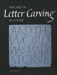
"The Art of Letter Carving in Stone" portrays the beauty of this age-old craft alongside practical instruction. Written by an eminent practitioner and teacher, it guides the novice through the basics of letter carving, drawn lettering and making simple designs, and for the more experienced it explains a new proportioning system for classical Roman capitals and demonstrates a useful approach to designing letterform variations. Topics covered include the development of twentieth-century letter carving; detailed instruction for V-incising the key strokes of letters; drawing a range of alphabets for use in letter carving; making inscriptions, gilding and painting letters and finally, designing headstones and plaques, house names and poetry texts. This beautiful book illustrates a wide range of exciting and creative pieces, and celebrates the inspiring work of contemporary letter carvers.
Das E-Book können Sie in Legimi-Apps oder einer beliebigen App lesen, die das folgende Format unterstützen:
Seitenzahl: 290
Veröffentlichungsjahr: 2013
Ähnliche


THE ART OF
Letter Carving
IN STONE
TOM PERKINS
First published in 2007 by The Crowood Press Ltd Ramsbury, Marlborough Wiltshire SN8 2HR
www.crowood.com
This e-book first published in 2014
© Tom Perkins 2007
All rights reserved. No part of this publication may be reproduced or transmitted in any form or by any means, electronic or mechanical, including photocopy, recording, or any information storage and retrieval system, without permission in writing from the publishers.
British Library Cataloguing-in-Publication Data
A catalogue record for this book is available from the British Library.
ISBN 978 1 84797 724 3
Acknowledgements
I would like to thank my wife, Gaynor, for her help in seeing this project through, John Neilson for all his help with scanning and arranging many of the diagrams, Christopher Elsey for supplying much of the text on gilding, Sara Millington-Hore for her valuable editorial input and all the letter carvers who have contributed images and written about their work, whose contributions have been invaluable to the book.
Every reasonable effort has been made to trace holders of copyright in illustrations and text reproduced in this book. Anyone holding copyright in a featured work that has not been credited is invited to contact the authors, via Crowood, and we will insert a suitable credit in future printings of this book.
Unless otherwise stated, photographs of processes are by G. and T. Perkins and diagrams by T. Perkins.
Frontispiece: Tom Perkins, V-incised Welsh slate menhir, 2m high, one of five stones, EU-funded commission for the Peddars Way National Trail, Norfolk, 2000. (Photo: Daphne Hoskin)
Contents
Foreword
Introduction
1 Background to Letter Carving
2 Tools and Equipment
3 Stone
4 Letter Carving Techniques
5 Drawn Lettering: Roman
6 Drawn Lettering: Italic
7 Drawn Lettering: Letter Spacing and Numerals
8 Designing Letter Variations
9 Guidelines for Designing Headstones and Plaques
10 Making an Inscription in Stone
11 Projects
Gallery
Bibliography
Useful Addresses
Index
’Let the beauty we love be what we do. There are hundreds of ways to kneel and kiss the ground.’
Jelaluddin Rumi
‘Our aim should be, I think, to make letters live… that men themselves may have more life.’
Edward Johnston
Foreword
People are often surprised that anyone still carves stone inscriptions by hand. ‘Can’t you get a machine to do that?’, they ask. You can, of course – at least up to a point. However, just as a handmade pot is not the same as a mass-produced one, so every part of a hand-carved inscription is the result of a direct, human process. And more than that, the letter carver (in the way the term is used in this book) has designed the letters, and not used someone else’s typeface conceived for a different purpose. That, above all else, is what it is about.
There is in fact something of a revival going on in the making of stone inscriptions. A century ago, Eric Gill laid the groundwork for a new breed of ‘studio’ letter carvers, much as he would have disliked the concept. Though few of his successors proved able to match the standards of design he had set, letter carving nonetheless survived through the second half of the twentieth century. A few determined practitioners (see Chapter 1) held out against a climate increasingly inimical to hard-won craft and design skills.
Tom Perkins arrived on the scene in the late 1970s and quickly established a reputation as a designer and carver with an original voice. When you look at a piece of lettering carved in stone by Perkins, the word ‘integrity’ comes to mind, in both its senses of ‘wholeness’ and ‘honesty’. Up close the chisel marks bear the same sense of purpose as the letters themselves. The part is a microcosm of the whole. These are not letters designed to create a superficial ‘look’, as a display typeface might. They have a life of their own, springing from their maker’s rigorous sense of design, itself a product of long reflection, well-absorbed influences and, perhaps, an inherited predisposition to craftsmanship from his shipwright father and several generations of skilled artisans before him. As Gill said in a different context, these letters are ‘things, not pictures of things’.
At the age of thirteen, Perkins was introduced to Roman letters by an art teacher, sparking off an all-absorbing interest and giving him a firm sense of what he wanted to do with his life. In 1974 he went to Reigate School of Art to study calligraphy, where he met his future wife, Gaynor Goffe. She tells how Tom would spend every spare moment drawing and painting letters. So by the time he started letter carving at Richard Kindersley’s workshop in London, though not yet twenty years of age, he already had a profound knowledge of letterforms. This would deepen further as he became familiar with the chisel. The relatively limited range of forms he now uses is the result of years of experimenting and refining; ‘extracting essence’, in the phrase of the potter Hans Coper. Designers of typefaces tend to be more celebrated than letter carvers, not least because their designs are multiplied in millions and often carry their names, but the ‘essence’ Perkins has extracted from those twenty-six letters bears comparison with the work of the best contemporary type designers.
It will be no surprise to Perkins’ students that this book does not contain gimmicks or performances designed to impress, but rather seeks to teach by example, homing in on the essentials. It is characteristic that he has chosen to include photographs of the work of other people (several of whom he has himself taught) as well as his own, and to give space to their views.
I had the good fortune to spend nearly a year as Tom’s assistant. Much as I admire his work, the most valuable gift I take from that time is the sense that the practice of letter carving is more than just playing around with shapes, meeting a client’s brief, earning a living or simply perpetuating a tradition. Letter carving is a craft rooted in several basic human preoccupations: language, design and making. This book will help students and practitioners with the technicalities of their work, but will also, I hope, impart something of what has driven its author along a remarkably single-minded path for some thirty years.
John Neilson
John Neilson, ‘Canto’, Hopton Wood limestone. Text in Spanish by artist, also on back (En el canto de la piedra suena el mar: ‘In the song of the stone sounds the sea’). Private garden, Somerset, 2004. 122 × 35 × 10cm.
Introduction
Letter carving in Britain as practised by artist-craftsmen at the beginning of the twenty-first century is gaining new popularity against a background of decades of sparse educational opportunities in this field. Whilst the classical approach to letterform advocated by Eric Gill is still very much in evidence and continues to provide a sound foundation for those wishing to learn the craft, other approaches are feeding into contemporary practice. This includes the influence of German work, notably that of Sepp Jakob (see pages 23,24) and his colleagues and students. Also, in 1988 the formation of Memorials by Artists (MBA) and Letter Exchange (a society for letterers of all disciplines), further broadened people’s outlook of what was possible in letter carving.
Letter carving in stone is a craft requiring very little in the way of equipment. I remember many years ago sitting in a café in South Kensington next to David Kindersley after he had spoken at a conference on lettering at the Victoria and Albert Museum. Someone from the Crafts Council was speaking at some length about all the equipment young craftsmen needed in order to set up. Kindersley leant across to me and whispered ‘all you need is a hammer and chisel’. Add to that a sturdy wooden easel and a diamond sharpening plate and one has all that is necessary to make a start in letter carving.
After acquiring the equipment the next most important thing is to use it! For some peculiar reason many people imagine that good letter carving technique will happen right from the start. If you experience some difficulty to begin with, this is perfectly normal. Whilst the rudiments of the letter carving techniques can be picked up relatively quickly with regular practice, the ability to make good letterforms and arrange them into effective designs is a much longer process. Many of the letter carvers in this book have been working with letterforms and carving for many years, and while the novice letter carver can make attractive items soon after beginning, refining technique and improving letterform and design is an ongoing process.
Few people consider that the making of inscriptions is an art. A lack of understanding about the different possible approaches to the design and use of lettering together with the lack of adequate educational opportunities in the making of letters by hand has contributed to this situation. It is unfortunate that although most art schools in the country have a course on the making of pots, virtually nowhere is there a course on the making and designing of letterforms, especially from a traditional perspective.
Tom Perkins, ‘All is transfigured…’, V-incised Welsh slate menhir. 110cm high. Private collection. Words by Vernon Watkins. Kind permission of the Golgonooza Press.
Tom Perkins, V-incised and painted Welsh slate, 1994. 30.5 × 49.5 × 1.5cm. Quotation by Hans Coper.
Tom Perkins, detail of Hans Coper quotation.
From the beginning of the process of learning letter carving, time should also be given to the drawing and writing of letterforms. There is a burgeoning network of courses provided by organizations such as the Calligraphy and Lettering Arts Society, the Memorial Arts Charity, the Orton Trust and West Dean College. Instruction in the drawing of letters is harder to find but much can be attained through regular practice with the aid of the drawn lettering in this book, and if possible, a little feedback from an experienced letter carver. As well as working with the classical forms, keeping a sketchbook or scrapbook of other letterforms you find interesting will help both in developing an increased perception of letterform and in the development of a repertoire of forms.
Lettering is largely an interpretative art; taking existing letterforms and making variations on them. Obviously, letter carving in most instances needs to retain legibility, so the letterforms cannot be too extreme in these situations; though for personal work such criteria may not necessarily apply.
There are at least three different levels in the practice of letter carving today. First, there is the work of the craftsman whose approach is one of copying or tracing existing letterforms such as typefaces or fonts. This can be done skilfully, but remains imitative nonetheless. Everybody starts this way. As W.R. Lethaby, architect and first principal of the Central School of Arts and Crafts, said, ‘how creative would you be if you had spent all your life in a darkened room?’ It is hoped that from this common starting point, the practitioner will move forward to the next level, which is the work of the designer-craftsman, whose approach is concerned with the intelligent adaptation and modification of existing letterforms so that the letters become in a very real sense a reflection of the individual maker. It is very difficult for the uninitiated to tell the difference between levels one and two. The third level is the work of the artist-craftsman where the interpretation of the letterforms can be highly individual and marked, they seem to resonate with and enhance the meaning of the text. The work in this book comes from people working with the approaches described in the second and third levels.
Moving into a new century with an increased amount of interest and the subsequent growth in numbers involved in letter carving, there is every hope that it can build upon its twentieth-century heritage and thrive as new opportunities for its use are found.
Ralph Beyer, ‘I and the Father are One’, one of eight ‘Tablets of the Word’, each approximately 15 × 7ft (4.6 × 2m) in Coventry Cathedral. V-incised in Hollington sandstone, 1960–61
1
Background to Letter Carving
Influential Twentieth-Century Letter Carvers in the UK
Eric Gill (1882–1940)
One thing is certain: as a carver of inscriptions he stands supreme. There the workman scaled the heights of pure form, and some of his inscribed stones possess the anonymous and inevitable quality we associate with the works of the great civilizations, where an almost frightening technical skill, for a rare moment, is the free instrument of the highest sensitivity – and the word is made stone.1
These moving words were written by the painter and poet David Jones about his friend Eric Gill. Without Gill’s remarkable contribution to the art of the incised letter in stone in the first half of the twentieth century, it is doubtful whether hand-carved letterforms, practised at a high qualitative level, would have survived into the modern era in Britain.
Gill was very fortunate to come into contact, in 1899, with the ‘father of modern calligraphy’, Edward Johnston (1872–1944). Johnston started teaching classes in calligraphy at the Central School of Arts and Crafts in London in 1899, and Gill had begun attending these classes while articled to the ecclesiastical architect W.H. Caroe. Gill describes his first sight of Johnston writing with a broad-edged pen thus:
It was no mere dexterity that transported me; it was as though a secret of heaven were being revealed.2
Gill was equally impressed with Johnston the man:
…he profoundly altered the whole course of my life and all my ways of thinking. Just as ‘art nonsense’ could not stand against him so also ‘thought nonsense’ was toppled over. He was a man miraculously deliberate of speech and equally deliberate in thought.3
Although some of Gill’s early inscriptions show the influence of having been laid out with a chisel-edged calligraphy pen, he fairly soon abandoned this practice and his later letterforms were drawn in outline with a pencil rather than directly written with a pen, though he always valued what he had learned from Johnston.
Eric Gill, ‘Omnia per ipsum…’, inscriptional tablet in Hopton Wood limestone. Carved in 1913 and given to his father for his birthday. 14.5 × 22.5cm. (Reproduced by kind permission of Myrtle Skelton)
Eric Gill, ’Westcott House’, raised lettering, Theological College, Jesus Lane, Cambridge, 1904. This seems to be the first job on which Gill cut, at the lower right corner, a Latin cross with four dots, which was a kind of signature.
Gill converted to Catholicism in 1913 and throughout his life was deeply concerned with the problems of the craftsman in modern industrial society. Gill saw himself in a very real sense as collaborating with God in redeeming the material world by infusing it with the spiritual:
I simply say that holiness is the name for that quality in things by which we judge them good. Its full meaning escapes definition in words. It is a spiritual thing; it must be apprehended by the spirit.4
Gill saw the act of making things as far more than a Darwinian struggle for survival:
…the most important motive for man’s activity in doing or making are neither animal instincts nor caprice. We hold that love is more important and not merely prettier than instinct. Upon such a ground and from such a place of vantage we survey the works of men. We see all things as evidence of love. We make what we love – in accordance with our love so we make. A pair of scissors, no less than a cathedral or a symphony is evidence of what we hold good and therefore lovely, and owes its being to love.5
At the beginning of his career as a letter carver in the early years of the twentieth century, Gill was keen to get back to first principles in lettering:
And what was fine lettering? It was in the first place rational lettering; it was exactly the opposite of ‘fancy’ lettering. That was the new idea, the explosive notion, and, you might say, the secret.6
Gill, under the guidance of Johnston, went back to the source of our modern alphabet – the classical Roman capital. Although he made thorough studies of the Trajan letter, he famously once said: ‘My inscriptions are no more like the Trajan than Caslon’s type is’,7 and ‘while we may remember Trajan lovingly in the museum, we must forget all about him in the workshop’.8 Gill’s capital letters subtly evolved all through his career and he was constantly making slight adjustments to his letterforms. It would be wrong to view his forms as static and unchanging.
David Kindersley,1952.
David Kindersley (1915–95)
Probably the best-known assistant to Eric Gill was David Kindersley. Kindersley worked with Gill from 1934 to 1936, eventually settling in Cambridge in 1945 and working there until his death. Kindersley very ably continued the tradition of fine Roman capitals pioneered by Gill, and in particular was very knowledgeable in the art of spacing letters (he worked on a computerized system for spacing letters in typography for the latter decades of his career). Whereas Gill was predominantly concerned to get back to first principles, advocating a more rational approach to letterforms and their arrangement, Kindersley, as well as using classical Roman capitals, re-introduced a more decorative approach using flourishes. This harked back to the ‘command of hand’ exercises of the English writing masters of the eighteenth century, such as George Bickham in his famous book The Universal Penman.
Slate was a material used very little by Gill – there are apparently no recorded inscriptions carved by Gill in Welsh slate, though he did carve a small number of inscriptions in Delabole slate. Slate was taken up by Kindersley, as its fine grain lent itself very well in particular to his flourished work, where the marked contrast between thick and thin strokes is vital. Kindersley, after a visit as a senior research fellow to the University of California, Los Angeles in 1968, started to produce in graphic form a series of experimental alphabets and sayings by the Sufi Idris Shah. These experiments went on to influence a freer approach that appeared in some of his carved work. In a personal note at the beginning of his biography, he says:
The Cardozo Kindersley Workshop, V-incised Welsh blue-black ledger stone, St Albans Abbey, Hertfordshire, 1979. 376 × 92cm
There are two sides to a letter cutter’s nature – or there ought to be. Just like any other craftsman or artist he will be spending a lot of time making things that he feels should be explored and making other things that other people want, and these two aspects of his work are quite different.9
The David Kindersley workshop, now the Cardozo Kindersley workshop, has been very successfully continued since his death by his wife Lida. The workshop has, since the 1950s, trained apprentices – some of the best-known being Lida Lopez Cardozo herself, Kevin Cribb, Keith Bailey, David Parsley, David Holgate and David Kindersley’s son Richard, who have all had long and successful careers, and this tradition of training apprentices continues.
Ralph Beyer (1921–2008)
A further important figure in the field of letter carving in the second half of the twentieth century was another ex-Gill assistant, Ralph Beyer, who was with Gill from 1937 to 1938. Beyer was born and brought up in Germany, which his family fled in 1933. His father, Oskar, was a leading art historian and an expert in early Christian symbols, as found in the catacombs in Rome. According to Beyer, ‘Without doubt the two main influences on my work and development as a letterer are Rudolph Koch and Eric Gill.’10 Another key influence was the painter and poet David Jones, who created freely composed painted inscriptions from the 1940s through to the 1960s, and whose work was also affected by the more primitive quality of early Christian inscriptions.
Ralph Beyer, carving a Zen poem.
Ralph Beyer, one of eight ‘Tablets of the Word’, each approximately 4.6m × 2m, in Coventry Cathedral. Pink Hollington sandstone, 1960–61.
Beyer worked with a slightly condensed, squared capital letterform throughout his career, giving his work a remarkable homogeneity. His most significant and best-known public work is the series of inscriptions in Coventry Cathedral. These are known as ‘The Tablets of the Word’, each measuring approximately 15 × 7ft (4.6 × 2m), on which are incised words from the New Testament. Beyer has said:
I was attempting to create letters, words and sentences which would be read, and also work which reflected the art of our time and its search for new forms of expression.11
Beyer taught at various art colleges from the late 1950s and then for eleven years at the City and Guilds of London Art School. He also taught one day a week on the typography degree course at Reading University, which he found most rewarding and continued to do until his retirement in 1986.
Beyer was one of the first, if not the first, to use a freer approach to the design of carved inscriptions with letters not strictly between lines, with little interlinear space and use of asymmetry in the layout. In an article in 1991 he stated:
For freely-created and freely-composed lettering there are no rules: the meaning and nature of the words will make their own demands. The future holds untold possibilities: we need the word, the graphic word, the word transcribed creatively, and in a public context.12
Beyer throws light on his work in his own words, as follows:
Memorials, headstones and recumbent stones, foundation stones, commemorative stones, cornerstones for churches, lettering on fonts, on the exterior of shops, houses, blocks of flats. These are some of the commissions and many applications of letter-design, which I have carried out since the late 1950s. The basis of this work was laid in the late 1930s when I was taught letter carving and stone masonry by Eric Gill himself and by his assistants in his workshops. This training opened up a range of work for private clients and above all for architects, by which I have earned my living from the time when I left HM Forces in 1946 and for the nearly sixty years since. Craftsmanship in stone and letter design increased my experience and finally led to teaching lettering and graphic design to students in schools of art and in the typography department of Reading University. This also gave me decided views of style and the role of lettering for buildings of every type.
When I was being taught by Eric Gill at Pigotts, I was doing a little work on his giant relief panels in stone that had been commissioned by the British government for the new building for the League of Nations in Geneva – a carved relief in stone with text in bold letters set against the figures of people and animals. The words ‘Thou Mastering Me God giver of life…’(from Gerard Manley Hopkins’ ‘Wreck of the Deutschland’) taught me something about the use of carved sculpture with lettering, used to communicate the work’s message on an equal level – so to speak. Many years later I saw, and found profoundly impressive, mosaics on walls and ceiling in St Mark’s, Venice, which used the same juxtaposition. In the 1950s I saw reproduced examples of David Jones’ poems and other texts selected by him, worked on a small scale using water-colours and Chinese white throughout. These compositions and the direct impact of their words were an inspiration to me as were the inventive, wide-ranging graphic works of the eminent German calligrapher and type designer Rudolph Koch.
My first public commission was for lettering and symbols on a large slate altar designed by Keith Murray for the Royal Foundation of St Katharine’s at Shadwell, for which I designed my own letters and incorporated symbols. Another early chance I had for lettering in large scale on architecture was for the modern Church of St Paul’s, Bow Common, for the same architectural partnership. This time the letters were cast in concrete in situ, forming a band around the top of the porch walls, picked out in Venetian red. But my most spectacular commission after this was to design all the lettering for Sir Basil Spence’s new Coventry Cathedral (1961–62). The most challenging aspect of this was to carry out the texts and symbols, based on the early Christian inscriptions in the catacombs of Rome, on the eight Tablets of the Word (four tablets on each side of the nave up to 15 × 7ft [4.6 × 2.1m] with letters of varying heights). Neither the lettering nor the symbols are taken direct from these often primitive carvings, but I endeavoured to express the words forcefully in the spirit of the art of our time. The carving of these panels was hand-done by me and my assistant onto pink Hollington sandstone. These letters and symbols, then, were composed over forty years ago for this particular context and the idiom belongs to the building, so their apparent influence on graphic and advertising design was far from my mind.
The work in the cathedral led to other commissions in which words of philosophy and poetry were important and for these commissions the informality that was the approach in Coventry was more or less maintained. For instance, the inscribed boulders in the Paul Tillich Park, New Harmony, Indiana. But after the big Coventry commissions, the functional work, described at the beginning of this statement, continued and required a more formal style: I never regretted this and have always aimed at simplicity and legibility, especially when the information had to be transmitted. I was able to engage with architects over considerations of scale and position and the designs were always related to the design of the building. I look back to these jobs, where I was an architect’s subcontractor, with pleasure.
In recent years I have felt able to choose and express words to which I personally related. These pieces, some of which have been sold and installed, are uncommissioned and have been exhibited in various locations. Most of them are smaller and therefore easier to handle and are short quotes from poetry or prose that I have found beautiful or important. Apart from the choice of size, layout, and stone it is necessary to express the words through the letter style. My aim is to give the words meaning and impact for someone seeing them for the first time.13
John Skelton, V-incised slate opening plaque. (Photo: Sussex Express)
John Skelton (1923–99)
Like Ralph Beyer and David Kindersley, Eric Gill’s nephew John Skelton, another successful and influential letter carver in the post-war era, also had a direct link to Gill.
Skelton was apprenticed to Gill in 1940, but due to Gill’s death in November that year Skelton was only with him for a few months. Following this, Skelton worked for about a year with Joseph Cribb (Gill’s first apprentice) at Ditchling Common, Sussex. After war service, Skelton had a period as an assistant to a monumental mason in Lewes, eventually setting up his own workshop in Burgess Hill in 1950 but later settling in Streat, Sussex, where he continued to work until the end of his life.
John Skelton, memorial to Valentine Kilbride, V-incised lettering, red sandstone 122 × 30.5cm. Ditchling burial ground, 1984.
He developed a recognizable style of his own, freely mixing squared and angular forms, imparting a lively dynamic to an inscription. He introduced sculpture and letter carving courses at West Dean College, near Chichester, and trained several apprentices including Jack Trowbridge, his first apprentice, who was taken on in 1953, Paul Wehrle, who started with him in 1958, and his own daughter, Helen Mary. Jack Trowbridge in particular developed into a very sensitive and inventive letter carver, but now works primarily as a silversmith in Cornwall.
Michael Biggs, inscription on rear wall of Garden of Remembrance, Dublin. Letters carved as a shallow cushion section, 1980.
Michael Biggs (1928–93)
A contemporary and friend of John Skelton’s was the stone carver Michael Biggs, who lived most of his life in Dublin. Although better known in Ireland as a liturgical artist and sculptor, Biggs managed to evolve a distinct identity of his own as a letter carver through his exploration of Irish vernacular forms that he adapted very successfully for carving in stone. There are many of his distinctive and deeply carved inscriptions to be seen in Dublin.
Will Carter (1912–2000)
Notable for his very distinguished printing and typography, Will Carter started letter carving at evening classes with David Kindersley in the late 1940s. He developed very distinctive capital letters that he dubbed ‘Carter’s caps’, which are bold versions of classical Roman letters with marked, strong serifs. Many examples of his letter carving can be seen in and around Cambridge where he worked throughout his career.
Will Carter, headstone to Beatrice Warde, V-incised Welsh slate, Epsom, Surrey, 1971. (Photo: Edward Leigh)
Michael Harvey (1921–)
Another letter carver with strong typographic connections is Michael Harvey. He originally started letter carving with Joseph Cribb at his Ditchling Common workshop in the early 1950s. He then went on to work in Dorset with Reynolds Stone – a well-known wood engraver and letter carver. In addition to his letter carving, graphics and type design, Harvey has made a notable contribution through his publications on lettering design and letter carving (see Bibliography).
Michael Harvey (assisted by Brenda Berman and Annet Stirling), incised frieze of artists’ names in Chamesson French limestone, for the Sainsbury Wing of the National Gallery, London, 1999. Letters 50cm high.
Reynolds Stone, V-incised inscription accompanying memorial window at Eton. (Reproduced by kind permission of the Reynolds Stone Estate)
Michael Renton, V-incised and raised lettering in Portland limestone for Winchester Cathedral Visitors’ Centre. Height of stone approximately 120cm.
Michael Renton (1934–2001)
A very fine wood engraver and letter carver in stone, Michael Renton studied sign writing with William Sharpington at the City and Guilds of London Art School, where he also learned letter carving with Henry Wilkinson. Renton’s work was rooted in tradition, but he was also open to more experimental approaches to lettering. His fine sign writing can be seen throughout Winchester Cathedral.
Richard Kindersley, plaque for new Arts Centre, Latymer School, London. Carved, gilded and painted Hopton Wood stone. 67.5 × 112.5cm.
Richard Kindersley (1939–)
David Kindersley’s son, Richard, has worked in his studio in Kennington, London since the 1960s and has produced much major work in the field of carved lettering, particularly in architectural settings. Over several decades he has trained numerous assistants, including myself during the period 1976–77. The following statement gives further insight into his approach to his lettering work:
Much of my work is driven by my interest in materials and how letterforms respond to the challenge of various substances from which inscriptions of letters can be fashioned.
Over the years I have experimented with brick carving, casting concrete inscriptions, carving directly into concrete and forging steel into metal letters. In each case my interest has been drawn to exploiting the technical challenges of working in these materials. Because of the relentless mechanization of producing lettering commercially, little or no knowledge still resides in working these resources by hand. A craftsperson, as opposed to a designer, has a unique potential to experiment with materials. By using their hands they can immediately tell from manipulating materials what sort of designs are possible and perhaps more importantly what sort of contribution the material can make to the letterform and general feel of an inscription.
The letters we use today are derived from historical examples that can be divided into two families. This division has always interested me and I tend to work in both traditions. On the one hand, there is drawing and making letters that have been derived from the rhythm and movement of the hand, using a tool such as a brush or pen; this gives a disciplined form and energy to lettering. On the other hand, I am equally drawn to the making of the lettering using intellectual and geometrical paradigms. The purity of the circle and straight line, free from the constriction of an edged tool, has its own rewards.
The art and craft of lettering is burgeoning and, as opposed to many other crafts, it is successfully reinventing itself to be relevant in the contemporary world. The reason for this is very simple; lettering and text are so familiar to us that we are hardly aware of the underlying structure of the letters. The mind absorbs meaning from the shape and texture of letters and in this process letters become invisible; the lettering artist makes letters visible, reconnecting the reader with the joy and complexity of fine lettering. As our world becomes more dependent on machine-produced objects, conceived and designed on computers, there is a growing appetite to see and touch objects that are made by hand.14
Richard Grasby, ‘The Four Elements’,V-incised Portland stone. 24 × 48 × 9cm.
Richard Grasby (1934–)
Richard Grasby has contributed importantly to the wider spread of letter carving in the second half of the twentieth century through his publications (see Bibliography) and his research into proportioning systems and the design of Roman inscriptions.
Ieuan Rees, Royal Opening Plaque in weathered riven purple slate, for the Courtyard Gallery at Cardiff Museum. 122cm wide.
Ieuan Rees (1941–)
Ieuan Rees has produced much notable work, over a wide range of letter carving applications, including many public art commissions. His distinctive work is widespread, particularly throughout Wales. Working also as a calligrapher, this influence can often be seen in his inscriptional work, for example in his strong uncial forms and flourished italic.
Bryant Fedden, ‘Hypostasis’, V-incised and painted Cotswold stone floor stone, 1993. 55cm square.
Bryant Fedden (1930–2004)
In Gloucestershire Bryant Fedden, sculptor, letter cutter in stone and wood, and glass engraver, ran a very successful workshop for forty years, working with a range of other craftspeople, including his wife, Kate, producing an extensive range of commissioned work and inspiring a number of people to work and live as craftsmen. He was one of the first of his generation to work more freely with carved letterforms, sometimes even carving single three-dimensional letters as pieces of sculpture. His very personal style exhibited a characteristic freedom in structure and lettering, and he described the workshop as a place
where lovely things have been made and where we always tried to excel ourselves and do our very best, … (even for clients who didn’t pay).15
There are twenty pieces of his work, made over a forty-year period, that can be seen at any time in Gloucester Cathedral.
Letter Carving in the USA
John Howard Benson, memorial to Rachel Lowe Lambert Clopton, carved in Monson, Maine slate. Brush drawn letters and ornament, V-cut. 100 × 70 × 10cm.
The Benson Family: John Howard Benson (1901–56), John E. Benson (1939–), Nick Benson (1962–)


