Erhalten Sie Zugang zu diesem und mehr als 300000 Büchern ab EUR 5,99 monatlich.
- Herausgeber: The Crowood Press
- Kategorie: Geisteswissenschaft
- Sprache: Englisch
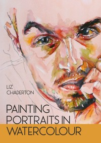
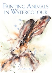
This joyful book gives you the confidence and skills to paint lively, contemporary faces and characters. Unusually, it teaches how to paint before exploring the drawing skillset necessary to capture a likeness, and thereby encourages the artist to try this genre. By explaining the techniques in clear steps with plenty of examples, it makes painting exciting and energetic portraits achievable for all.
Sie lesen das E-Book in den Legimi-Apps auf:
Seitenzahl: 135
Veröffentlichungsjahr: 2023
Das E-Book (TTS) können Sie hören im Abo „Legimi Premium” in Legimi-Apps auf:
Ähnliche


CONTENTS
Introduction
1 Transferring Your Image
2 Getting to Grips with Tone
3 Playing Around with Colour
4 Layering Colour
5 Line and Wash Portraits
6 Watercolour Plus – Mixed Media
7 Special Challenges and How to Tackle Them
8 Achieving a Likeness When Drawing Portraits
Further Resources
Index
INTRODUCTION
What makes a great portrait? We are hardwired from birth to find human faces fascinating, so it is hardly surprising that we want to capture them through painting. Yet portraiture is considered one of the most challenging subjects. We expect a portrait to look like the person; ‘sort of’ is not usually acceptable and so many artists shy away from even attempting them. Beyond achieving a likeness, a great portrait gives the viewer a glimpse into the subject’s inner life. There is also a strong argument that every good portrait is really a self-portrait. Your painting will capture a bit of your character, even when you are not the subject.
Watercolour is such a versatile medium to either render a subject in detail or through flowing washes.
The paintings in this book are not portraits to hang in museums, but to celebrate the everyday faces and characters of family and friends. I believe that if you can paint a landscape, you can paint a face; if you can capture your pet’s likeness, you can paint a person. Using techniques from still life, urban sketching and landscape painting, we will apply them to faces in a fun, contemporary and joyful way.
Why watercolour? At its best, it is a light-filled, dynamic medium. This spontaneity makes it ideal to capture the life and energy of your subject. While you may think of watercolour as delicate and ethereal, it can be bold and dynamic. Such versatility allows us to capture the essence of a wide range of sitters, so muses of all ages, sexes and races will inspire us throughout this book. For me, the medium is at its strongest when it is loose and gestural rather than overworked; letting the watercolour do what it wants to do brings out the best.
Drawing a likeness and painting a lively portrait are two different skill sets. Because we are gripped by faces, our brains tell us we already know what they look like and gets in the way of us really seeing what is going on. Many artists become despondent because they spend so much time trying to achieve a likeness that all the joy is sucked out of the process.
This book turns the usual order upside down and starts with painting technique, initially using transfer methods to map the contours of the face onto paper. Only once confidence is high do we tackle achieving a likeness freehand.
Building on the tonal map of the face, we will develop realistic layered portraits and more impressionistic renditions. Covering both pure watercolour and line and wash, this book also explores mixed media and specific challenges. Some knowledge of watercolour is assumed, but materials and techniques are explained as we progress.
At the close, the reader should have the confidence and skills to produce lively contemporary portraits, full of life and energy, and be ready to celebrate and capture the human face in all its glory.
CHAPTER 1
TRANSFERRING YOUR IMAGE
DON’T STRESS ABOUT THE DRAWING
The skills used to draw a likeness and the skills used to paint a lively portrait are different. Both are complex skill sets, but they are not one and the same. Many portrait books start with how to draw the face, perfect proportions, features and so on. This can trip people up and they fall at the first hurdle. By the time they have obtained a likeness on paper, the surface is scuffed with rubbing out and the artist is near despair.
Using a transfer method rather than drawing freehand doesn’t have to result in a stilted painting.
There is no getting away from the fact that being able to capture a likeness takes practice. But why don’t we turn things on their head? Let’s learn the painting skills first. By doing so we will build experience and confidence and become familiar with features and how they relate. Along the way we will train our eyes and brain to see what is going on.
Success breeds motivation. For this reason, I strongly urge you to use one of the transfer methods described here to gain the outlines and proportions you need.
ISN’T THAT CHEATING?
There is often the feeling that if you are not drawing freehand from life, you are somehow cheating, or that any painting produced using drawing aids must be inherently inferior to those produced without them. Some people go so far as to say that you shouldn’t even do a preparatory underdrawing, and that painting directly with no pencil guidelines is better than painting with them. Others worry that if they use some sort of tracing or transfer method, their paintings will be devoid of life and character. Banish these thoughts.
The underdrawing for this portrait was done freehand, which does not make it a better or worse painting.
Art historians tell us Vermeer used a camera obscura – does that make the Girl with the Pearl Earring any less wonderful? Joshua Reynolds’ camera obscura is in the Science Museum, London. Throughout history artists have used tools at their disposal to help them get their vision onto paper or canvas. Apply the logic described in the previous paragraph to another context and you will see the flaw. If you go somewhere by car is that cheating – shouldn’t you walk? Tracing or transferring is just a tool to get you to your destination in an efficient way.
The same face, traced each time can look so different.
You can use all your painting skills to interpret the same outline in different ways.
If a room full of artists were to trace a reference photo, then paint it using the same colour palette and tools, each painting would be different. A portrait often says more about the character of the artist than it does about the personality of the sitter. This is not to say that you should not work on your drawing skills, however, because drawing is far more than simply getting accurate guidelines down on paper.
Fired up with the success of painting lively portraits, you will be far more positive about putting in the work to capture a likeness. At the end of this chapter, I suggest some drawing exercises. Five or ten minutes spent on them daily will start to develop new pathways in your brain and better hand-eye coordination. When you decide you are ready to draw a likeness freehand, you will be in a strong position.
WHICH LINES TO TRANSFER
Aim to transfer as few lines as possible, but enough detail to guide you on the placement of features. You do not want so many that you are tempted to ‘colour in’. I would suggest the outline of the face and features, distinct highlights that must be retained and the mass of hair. Smaller details will confuse you. If you transfer too many details, remove them before starting to paint. Keep lines as light as possible. The pencil lines in this book are darker to show clearly in photos. You could use a watercolour pencil if you like and this will dissolve into your washes.
HOW TO TRANSFER YOUR PHOTO
Projecting or tracing your work onto your watercolour paper has the distinct advantage of being rapid and ensures that the surface of the paper is not damaged with rubbings out. Even artists sketching from life often draw on one piece of paper and use a transfer method before painting to avoid damaging their final paper.
Each method has its pros and cons.
Direct Transfer
Print out your chosen reference and turn it face down. Use a soft (for example 2B) pencil. Scribble densely all over the reverse of the image. Now flip over and use a piece of masking tape to affix it to your chosen painting paper. Using a pencil or stylus, press firmly and draw over the lines you wish to transfer. Check that the line is showing sufficiently and adjust your pressure. While you can use a pencil, to avoid obscuring the photo which you still need, use an old ballpoint pen, a glass dip pen (without the ink, obviously) or another blunt but pointed firm implement. When you have transferred enough lines, remove the printed photo.
The downside of this method is that you cannot increase or decrease the size. Also, you need to be able to print your image and you will mark the print in the process. It is, however, the easiest and most direct method.
Tracing
Using tracing paper (or improvising with baking parchment) is also straightforward. It will not damage your reference photo, but you cannot increase or decrease the size of your image. The other downside is that you have to press firmly with a pencil to transfer the image, which can leave grooves in your paper, but the original remains unmarked.
Simply place the tracing paper over the photo, hold it in place so it doesn’t slip and mark the lines you require. Remove and flip the tracing paper over. Scribble over the lines with a soft pencil and then place on top of your painting paper. As before, go over the lines using a pencil or stylus and check that you are pressing hard enough to transfer, but not so hard as to groove the paper.
Carbon/Graphite Paper
For an exact size copy of your image, graphite paper is slightly quicker to use than tracing paper. The sheets are reusable. Avoid ordinary carbon paper, as the line can be waxy and resist your paint; graphite paper is a better option. Place it graphite-side down on your painting paper. Place the printed image on top and again go over all the required lines using a pencil or stylus, checking that your pressure is sufficient to transfer a visible line.
Gridding
Gridding not only allows you to increase or decrease the size of your image, it also has the advantage of engaging your drawing muscles more than some of the other methods. It can be rather tedious.
You must first ensure that the dimensions of your paper are in the same proportion as your source photo. Do this by lining up the corner of your photo and your paper, and put a ruler through the diagonal corners. Where it hits the far edge indicates the dimension of your destination paper.
If the reference and drawing surface are not in the same proportion you will distort the image.
Now grid your reference photo. Depending on the size of your photo, you may wish to draw squares of 1cm (⅓in) – the smaller the boxes the more detailed the transfer. The more accurate you are at this stage, the better the outcome. Free gridding apps are available and are precise and quick to use (seeFurther Resources for links).
It is important to be as accurate as possible.
Gridding helps tone your drawing muscles as you are still observing and judging.
Accurate gridding of the reference is key, but luckily, free online tools are available.
Systematically transferring each square allows the image to be increased (or decreased) in size.
Next divide your destination paper into the same number of squares. Draw these grid lines lightly so they will be easy to erase or they will show in your final piece. An alternative is to use a watercolour pencil. If you choose a toning colour, the lines will melt away into your washes and not show in the final piece.
Transfer the source image to your destination square by square. If a line runs diagonally through the small square on the photo, place it diagonally through the large square on your paper. When finished, erase the grid.
This can be a slow process but it should be 100 per cent accurate and is ideal if you need to increase the size of your image.
Simplified Gridding
For those who are more confident in their drawing skills but who still need some support, a simplified grid can be useful. Rather than gridding with squares, divide your reference into equal quarters with a horizontal and vertical line, and then draw in diagonals. Do the same with your paper, ensuring that the proportions of reference and final paper are the same. Now use the eight triangles to transfer your image in a similar way to the more complete gridding system.
A simplified grid is speedier and more suitable for those who are already confident in their drawing skills.
Interestingly, a version of this type of grid can be seen in the Van Gogh Museum in Amsterdam, showing how Vincent van Gogh used it in his paintings.
Window or Computer Screen
On a bright day you can use a window as an impromptu light box. As long as your watercolour paper is not too thick (300gsm/140lb), you can tape the photo to the back of your paper to avoid movement, then place it on a bright window. You should be able to see through the paper sufficiently to trace the outline, especially if the room you are in is dimly lit. You cannot alter the size of your piece.
Alternatively, use a computer screen or tablet. First disable any touchscreen facility (look in your settings to do this). Turn up the screen brightness to its maximum. Tape your photo to the back of your watercolour paper and trace the image. You can increase or decrease the size of the image on the computer or tablet. Turn off lights in the room to make it easier to see the backlit image.
Light Box
A4 or A3 LED light pads are readily available at a reasonable price. They are designed for craft applications and usually plug into a USB port. Though dimmer than more expensive art light boxes, if used in a room with low ambient light, the image is readily visible through 300gsm/140lb paper. They are quick and convenient to use. These are my preference.
Crafting light pads are affordable and convenient.
Tracing Apps
Paid-for drawing apps are available on your tablet or smartphone. These superimpose the image you wish to copy onto your surface by using the device’s front and rear cameras. They often have photo manipulation software built in. You will need a tripod or similar to keep the device in place. Within limits you can increase or reduce the size of the image depending on how far it is positioned from your paper. The downside is that they take some getting used to.
Projectors
You can use a projector to enlarge drawings and project them onto your work surface, where they can be easily traced. They often project from a horizontal surface to a vertical one. Projectors are also handy for mural painting, video art and showing your portfolio.
They fall into two categories – opaque and digital. An opaque projector shines light through your printed image, so the room you are working in needs to be dim. A digital one is more expensive but will project an image from a computer, phone or tablet and is versatile. You may wish to consider the portability and ease of use of a projector, and unless you are planning to regularly enlarge images by a factor of ten, they are unlikely to be worth the expense.
REMOVE UNWANTED GRAPHITE
Once you have transferred your image, check that the lines are not too dark as you probably will not want them to show through the final painting. The easiest way to do this is to roll a kneaded eraser into a sausage and roll it backwards and forwards across the drawing to pick up excess graphite. Use soft white bread without crusts if you need to improvise.
WHAT TO LOOK FOR IN A GOOD REFERENCE PHOTO AND WHERE TO FIND THEM
A good reference photo is something very different from a good photo, but the most important thing is that you are excited to paint it! If it doesn’t motivate you, you will have to work hard in your painting. Interesting angles and unusual expressions may be fun. Look for a photo that makes your life easier and does not fight you.
A good reference photo should be in focus, have directional lighting, have a good range of tones and above all excite you to paint it.


