11,49 €
Mehr erfahren.
- Herausgeber: Crowood
- Kategorie: Geisteswissenschaft
- Sprache: Englisch
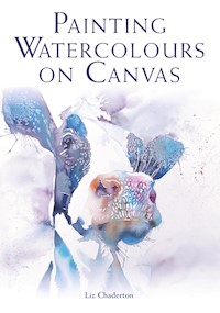
Painting on canvas poses many exciting opportunities for the artist. Along with the immediacy, vibrancy and unpredictability of watercolours, it is a liberating and creative process. This practical book explains how to start painting with watercolours on canvas and goes on to encourage new style and experimentation. It gives step-by-step demonstrations on different techniques to achieve loose, dynamic images. It is a beautiful and passionate account of how to work on a non-traditional surface to achieve striking and innovative paintings. It covers; advice on selecting and preparing canvases to accept watercolour; ways to adapt your materials and working process to canvases; step-by-step demonstrations on different techniques to achieve loose, dynamic images; Ideas for experimentation, both in style and subject, and stunning, finished images to inspire; A beautiful book that shows how to paint with watercolour on canvas to achieve bold, stunning results. Of great interest to all artists and craftsmen, it is superbly illustrated with 149 colour photographs. Liz Chaderton is a professional watercolour artist and specializes in painting animals.
Das E-Book können Sie in Legimi-Apps oder einer beliebigen App lesen, die das folgende Format unterstützen:
Veröffentlichungsjahr: 2019
Ähnliche


PAINTINGWATERCOLOURSON CANVAS
PAINTINGWATERCOLOURSON CANVAS
Liz Chaderton
THE CROWOOD PRESS
First published in 2019 by
The Crowood Press Ltd
Ramsbury, Marlborough
Wiltshire SN8 2HR
www.crowood.com
This e-book first published in 2019
© Liz Chaderton 2019
All rights reserved. No part of this publication may be reproduced or transmitted in any form or by any means, electronic or mechanical, including photocopy, recording, or any information storage and retrieval system, without permission in writing from the publishers.
British Library Cataloguing-in-Publication Data
A catalogue record for this book is available from the British Library.
ISBN 978 1 78500 590 9
Acknowledgements
Thank you to all the artists named in the text for letting me reproduce their beautiful work. I hope they inspire you to try new subjects and styles. Grateful thanks also to fellow artist Liz Baldin for all her encouragement and feedback as I put together the initial proposal for this book. I also appreciate the help and advice from The Crowood Press in making this book a reality. Finally, thank you to my husband Ian for his support, and to my sons Adam and Alex for letting me commandeer their table tennis table, which is perfect for painting large canvases upon.
Frontispiece: Mr Fox, cropped, originally 70 × 70cm, ink and watercolour on canvas.
CONTENTS
INTRODUCTION
1 SUPPLIES, MATERIALS AND EQUIPMENT
2 ALL YOU NEED TO KNOW ABOUT CANVAS
3 GETTING STARTED
4 COMPOSITION AND SUBJECT SELECTION
5 TEXTURAL TECHNIQUES AND MARK MAKING
6 TAKING IT FURTHER
7 GALLERY, FINISHING AND PRESENTATION
GLOSSARY
SUPPLIERS
USEFUL RESOURCES AND FURTHER READING
FEATURED ARTISTS
INDEX
INTRODUCTION
Let me say this straight away – I am passionate about watercolour. It is a medium of highs and lows; unpredictable, immediate, vibrant and responsive. But it can be frustrating. The inability to correct mistakes, the tendency to overwork the surface, the need to hide your lovely painting behind glass, the cost and hassle of framing, not to mention the dismissive attitude of some people towards work on paper.
Blue Flamingos, cropped, 80 × 60cm originally, watercolour on canvas.
So when I first came across the notion of painting on canvas, I was intrigued. I was already aware of the central role that the surface plays in a painting. The transparency of the medium means the paper surface becomes an integral part of the finished image. I had tried all sorts of papers from the ultra-smooth Yupo to rough blotting-type handmade papers made in the Himalayas. But canvas?
Blue Flamingos, 80 × 60cm, from the collection of jane and Bernie Chambers. Watercolour on canvas is not restricted by size or the weight of framing and there is nothing to come between the viewer and the image.
My previous plays on ordinary canvas had ended up as a frustrating mess. Here was an opportunity to try something completely new.
This book challenges the notion that watercolours must be painted on paper. It invites the artist to free their paintings from the constraints of glass and mount. We can move from the set sizes of watercolour sheets and step into the limelight of scale, should we so desire.
‘What happens if?’ is one of the most important questions you can ask yourself. You will be rewarded with happy accidents; here, dropping water into a drying wash.
Working on canvas gives you the freedom to start exploring mixed media. The Stare – ink, watercolour and imitation gold leaf on a 25 × 25cm deep edge canvas.
You know that watercolour is a tough medium to master. Its key characteristic of transparency makes it so. In fact, I am not sure the artist ever masters watercolour. Just when you think you are in control, it will poke you and show you who is boss. Equally just when you are feeling low and ready to give up, it will make you a little present of a ‘happy accident’ which will motivate you to continue your journey.
If you are concerned about the longevity of watercolour on canvas, let me put your mind at rest. Canvas, being made of cotton or linen and wood, is a natural product and will respond to the environment, especially humidity and fluctuations in temperature. However, this is true regardless of which medium you are using. The grounds and preparations for watercolour are designed to be archival, for instance, they will not yellow or degrade over time. The pigments you use will be as fugitive or permanent as when they are used on paper; the use on canvas has no impact upon their permanence. By using artist quality pigments with the highest possible lightfastness ratings, you will assure the life of your work. By sealing and protecting the finished piece with a UV resistant archival varnish, the painting will be more protected from the ageing effects of UV light, than under ordinary picture glass. I believe the artist can paint with confidence and the collector can buy with confidence, knowing that the canvas will continue to retain its vibrancy over the years.
This book shares my learning about using our unpredictable friend on a new surface. I want this to be a very practical book, so I will get down to the nitty gritty of what to do. But it comes from my experience of what works for me. There is no right or wrong in painting, just what helps you communicate through your art. So use it as a starting point to avoid the obvious pitfalls and then build on it to move forward.
I do not intend this as an introduction to watercolour painting, there are some excellent and thorough books already available that do that job. Neither is it a guide to painting in a loose and impressionistic style, though that is my natural tendency. My passion is painting animals and subjects from nature. However, I do not propose this as a book about those subjects, though of course, they are the examples I choose to illustrate techniques. This book is firmly about painting on a new substrate and how to get the most out of it. The preparation, method or working process will be in common, whichever subject you choose or whatever your preferred style.
Flicker, 30 × 30cm, watercolour on canvas by the author. Colours stay vibrant and spontaneous on the prepared canvas surface.
If you are starting out you may not have the preconceptions more experienced painters have, so canvas might be a fabulous substrate for you. If you are experienced you may wish to break out of the confines (size, presentation, mindset) of paper-based painting; if less experienced you may want to explore new surfaces or just prefer the contemporary look of canvas.
I think the most important question to ask is ‘What happens if…?’. Artists are always looking for new ways to express ideas, so read this book with a spirit of adventure and have a go. If the first experiment doesn’t work, what’s the worst that can happen? Just wash the paint off and start again.
This book aims to short circuit some of the learning for you and will guide you towards the materials I find work well and introduce you to some of the technicalities of canvas, which acrylic or oil painters take for granted. I hope it will also inspire and introduce you to the possibilities. The step-by-step demonstrations are aimed at introducing different techniques. You can either follow them in detail or apply them to a subject of your own choosing and integrate the parts you like into your practice, while rejecting the techniques that don’t work for you.
But before we dive into those practicalities I want to reiterate the case for canvas.
I hope that by the end of this book, you will be as excited as I am about the new possibilities working on canvas offers and will be eager to experiment and push your art to the next level.start again.
THE CASE FOR CANVAS
• Watercolour on canvas retains its beautiful transparency and apparent fragility, and yet it can be displayed without glass and a mount.
• The distraction of glare from the glass or an ill-chosen frame no longer gets between the viewer and the image.
• Unframed canvases have a more contemporary feel than formally framed work.
• The cost of framing no longer has to restrict your output or the size to which you work. Indeed, using a deep edge canvas, no framing is required at all.
• Handling and storing paintings is easier. Not only is the weight of the glass removed, so is the potential to chip frame corners, or crack sheets of glass.
• There is no restriction on size – well, the only restriction is the length of your arms. Now, should you wish, you can pick out a metre canvas and know that you can really make a statement. However, if working on a smaller scale is your preference, it is still open to you.
• Annoyingly, works on canvas are considered more valuable than those on paper. And some collectors worry about the durability of paper. By working on canvas you can overcome both misconceptions.
• The finish you give to your work can combine the brushwork of oil with the transparency of watercolour.
• And if the worst comes to the worst, you can scrub the canvas under the tap and start again.
CHAPTER ONE
SUPPLIES, MATERIALS AND EQUIPMENT
Paints, brushes and other supplies
While this book is not intended as an introduction to the joys of painting in watercolour, it is worth briefly revisiting the basics.
Even if you are an experienced painter, the demands of the canvas surface mean you will need to look again at some of your materials; canvas is tough on soft brushes, pigments need to be chosen for maximum lightfastness, quantities alter as you change the scale of your work, even your eraser may need to be adjusted.
La Vache, 50 × 50cm, watercolour on canvas.
Get your supplies ready and laid out conveniently before you start. If you are right-handed it is best to have them to the right of the canvas, with reference materials to the left.
Good quality materials, suited for the effect you are after, will make your painting time more pleasurable and ensure that you get as close as possible to achieving your vision.
If you are starting out, it is worth considering the materials you wish to invest in, making sure that they will work with you rather than hinder your progress. Every artist has a cupboard of supplies, bought on impulse but rarely used. Let us not add to this stock pile, but make each part of your painting kit a valued contributor.
Paint
All paints are made of pigment plus a binder. While oil paints are bound with linseed oil, acrylics with an acrylic polymer, tempera with egg yolk, watercolour paint is pigment plus a binder of gum Arabic. The same pigments are generally used throughout – only the binder and additives differ.
Colour is a joy in watercolour, but you don’t need a huge range to get started though you will, no doubt, accumulate a wonderful variety over time.
Watercolour paint is available in two different physical forms – tubes or pans (sometimes called cakes), and is available in two different qualities – student or artist.
Given that one of the prime motivations of painting on canvas is the richness of the colour that can be achieved and the lack of restriction in size, it makes sense to opt for tube colours – it is far easier to be generous and to mix up rich creamy washes. The colours are less likely to be contaminated, as they are kept in sealed tubes.
On the other hand, pans are certainly convenient and portable. They tend to be more compact, if storage is an issue. Should you opt to use pans, then spraying with clean water as you are preparing to paint will pre-moisten the cakes, letting them release their colour more readily. It will help you avoid having to scrub the pan endlessly to mix up a creamy wash. If you are painting outside, or sketching, pans are easy to maintain and use. One drawback is that colours can become contaminated rather easily when going from pan to pan without washing your brush.
The Hare Who Ate Too Many Cornflowers, 90 × 90cm, ink and watercolour on canvas. Artist quality pigments move and flow with a life of their own on the canvas. They have a special vibrancy, so it pays to use the best you can afford.
Artist quality paints rather than student quality will reward you in the long run. Student quality are less expensive because some of the good stuff has been left out and cheaper filling elements have been used in their place.
Artist quality paints use the best quality and the most finely ground pigments. These are likely to have better lightfastness properties, as well as vibrancy. You will notice that artist pigments have more life and respond as they move around the surface through the water. In general, use the best quality paints you can afford. The own-brand artist quality paints from the big retailers are often of very good quality and considerably cheaper than the branded tubes. If you are on a more restricted budget you will find that the student range from well-known manufacturers such as Winsor and Newton or Daler-Rowney offer a consistent and affordable choice. But be warned, once you start trying artist quality pigments you will find it hard to go back. Art suppliers have regular sales, so you should be able to find good quality supplies at an affordable price without having to compromise.
Each of the major global brands offer a stunning array of colour choice – perhaps with up to 250 colours. Patently you cannot afford and certainly do not need this many. You may find you prefer one brand over another, but more likely, you will end up having a favourite colour within individual ranges. Some of the more standard colours will be indistinguishable, but often paint with the same name will differ entirely. You will need to check the pigment reference to be sure of what you are buying (see box). Do consider the size of tube you buy. It is hard to be generous with a colour if you only have a tiny 5ml tube.
Many people consider gouache to be its own form of paint, but it is really an opaque form of watercolour. Most artists choose to create paintings exclusively with gouache, but it can also be used in conjunction with watercolour to strengthen highlights or intensify colours. A tube of white gouache is certainly a useful addition to your paint box and can be used to add a few finishing details.
Looking after your paints
Even if working on a larger scale, you do not get through a large quantity of watercolour paint. If you look after your paints they will last years.
Assuming you have chosen tube colour, start by squeezing the tube from the bottom. Make sure you put the lid back on tightly. If a tube becomes hard over time, don’t throw it away. Slice it open with a sharp knife and peel back the tube. Use it like pan colour. If you get a puddle of clear liquid when you squeeze colour out, the gum Arabic has separated. Put the lid on and massage the tube to mix the paint. Some colours are prone to this separation. Store the tube on its lid and the liquid will rise to the top (in effect the end of the tube), allowing you to squeeze colour out. If you have paint in your palette you can simply let it dry and add water to reactivate it upon resuming your painting. It is possible, though rare, for tube colour to go ‘off’. The smell is unmistakeable; just throw it out.
If you are using pan colours, ensure the box is fully dry before closing and storing it. In hot, humid areas you can find mould will take hold. In such a case, spray with dilute surgical spirit/rubbing alcohol or even vodka to kill the spores. A gentle wipe with antiseptic should also work. Exposure to strong sunlight will have a similar effect. If you are struggling to keep the fungus at bay, then a cotton ball soaked in alcohol left in the box should prevent growth, or the small sachets of silica found in shoeboxes, could be kept in your paint box to absorb moisture. You may find it is your water source which is causing the contamination. Consider using distilled or bottled water. Some manufacturers add a fungicide, some say that the honey added to their formulation is naturally anti-fungal. It should not be a problem if you care for your paint box.
GUIDE TO USEFUL INFORMATION ON A TUBE
Have you ever considered the information on the side of your paint tube? It can be incredibly useful.
Colour name
This is the name of the colour which is not necessarily unique to a range or manufacturer. Just because it is called the same name, does not mean it is the same colour.
Series number
An indication of the relative price of the colour. Usually series 1 is the least expensive. Price usually reflects the expense of the pigment.
Permanence rating
Measures lightfastness and depending on the manufacturer, may also take into account the stability of the paint. Look for paints with the highest rating.
Lightfastness may be shown with an ASTM rating for the pigment. The ASTM abbreviation stands for the American Society for Testing and Materials. I and II are considered permanent for artists’ use. If you are not displaying work, lightfastness will potentially be of lesser concern.
Pigment code
Every pigment is identified by its Colour Index Generic Name. This allows you to compare different manufacturers’ formulations and accounts for why they are not always visually the same colour. More than one pigment abbreviation indicates multiple pigments, which is worth knowing to avoid mixing muddy colours.
It is worth becoming familiar with your pigments. Somewhere on the tube there will be useful information which should indicate the pigment number, the transparency, permanence and staining characteristics. However, information varies from maker to maker and will become obscured as you use the tube.
Opacity
Symbols are used to represent the transparency/opacity of a colour. Transparent colours are marked with a clear circle or square, semi-transparent colours are marked with a diagonal line and opaque colours are marked with a filled-in symbol.
Granulating/staining
Not all manufacturers show this but if marked as G, the pigment granulates. Staining colours are those that cannot be lifted with a damp sponge and are marked as St.
A basic palette
A great starter palette consists of a warm and a cool primary, a couple of earth colours and perhaps a ‘treat’ colour. This should see you through just about any subject. So select one from each of the first six and then any of the remaining you fancy.
• Cadmium yellow/gamboge/quinacridone gold/Indian yellow
• Lemon yellow
• Cadmium red
• Alizarin/quinacridone rose/carmine
• French ultramarine/indanthrone blue
• Cerulean/Prussian blue/phthalo blue
• Burnt Sienna or burnt Umber
• Raw Sienna
• Raw Umber
• Dioxazine purple/manganese violet
• Viridian/pthalo green
• Sap green
A small tube of white gouache (opaque watercolour) is useful for missing highlights.


