20,99 €
Mehr erfahren.
- Herausgeber: The Crowood Press
- Kategorie: Lebensstil
- Sprache: Englisch
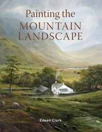
Many artists long to paint mountains - to capture their grandeur, their character and perhaps their tranquility. This practical book explains the key elements of portraying their magnificence and also advises how to reproduce the magic of a scene. With step-by-step instructions and clear, detailed advice throughout, it guides the painter through the techniques so you can express your own vision of the mountains and capture one of the greatest scenes of the natural landscape. The author's deep understanding and love of the mountains shines through the text and the paintings. There is advice on choosing mediums, brushes and surfaces, and using a limited colour palette both for en plein air and studio painting. Incorporates different features of the mountainscape - crags, slopes, rocks, lakes, woodland, cottages, animals and figures - to add life and interest to a painting. The author captures the transient and often dramatic effects of light on the mountain landscape, including the special magic of sunsets. Injects mood into a painting, from the excitement of a sublime storm to a sense of peace and refuge. Specific advice on painting sky, water and trees, and tips on using them in an effective composition. Finally, step-by-step, illustrated and detailed exercises show how to work down from the sky to the foreground, add detail, enrich hues, and increase contrast between light and shade. It is a handy guide for all artists and an inspiration to everyone who loves mountain scenery.
Das E-Book können Sie in Legimi-Apps oder einer beliebigen App lesen, die das folgende Format unterstützen:
Seitenzahl: 287
Veröffentlichungsjahr: 2021
Ähnliche


Painting theMountain Landscape
Painting theMountain Landscape
Eileen Clark
First published in 2021 byThe Crowood Press LtdRamsbury, MarlboroughWiltshire SN8 2HR
This e-book first published in 2021
© Eileen Clark 2021
All rights reserved. This e-book is copyright material and must not be copied, reproduced, transferred, distributed, leased, licensed or publicly performed or used in any way except as specifically permitted in writing by the publishers, as allowed under the terms and conditions under which it was purchased or as strictly permitted by applicable copyright law. Any unauthorised distribution or use of this text may be a direct infringement of the author’s and publisher’s rights, and those responsible may be liable in law accordingly.
British Library Cataloguing-inPublication DataA catalogue record for this book is available from the British Library.
ISBN 978 1 78500 845 0
Dedication
I would like to thank my family, including my sister-in-law, nephews and niece, and friends in the UK and abroad for all their encouragement throughout the years. Thank you to my late father, my mother and brother for so many adventures in the mountains, and to my husband and son for being my ever-obliging boat crew. Thank you also to my husband for his patience and dedication during the production of this book. Without his IT and photographic skills many of my images would no longer have been available to me.
Lastly, thanks so much to the late Peter Graham of Thornthwaite Galleries, to Beckstones Gallery, Cumbria, my friends in the Cockermouth artists, and to my wonderful framer David Scott, of Gray’s Framers, Carlisle.
Acknowledgements
To Graham Clark, for photography, IT assistance and Chapter 11.
Contents
Introduction
Chapter 1Resourcing: ‘The Ins and Outs’
Chapter 2Subject Matter and Composition: Finding the Mountains
Chapter 3A Studio Piece
Chapter 4Light is Everything
Chapter 5The Sky
Chapter 6Storm in the Mountains
Chapter 7Peace and Refuge in the Mountains
Chapter 8Water: Lakes, Rivers, Waterfalls, Snow and Ice
Chapter 9Trees, and Some Special Magic
Chapter 10The Burnt Sienna Palette: Sunsets and the Close of Day
Chapter 11Saving Your Mountain Landscapes
Suppliers
Index
Introduction
Throughout the history of art, painters have chosen to include mountains in their works. Some artists, often working on commission, reduced even high mountains to flat backdrops against which they set religious and historical pieces and portraits. Others, like John Martin, the nineteenth-century English Romantic painter, produced vast canvases, depicting expansive and dramatic mountain scenery. Martin’s work included tiny historical, mythological and religious figures – the titles often referring to stories and events involving the characters depicted, for instance, in the painting Macbeth. Despite the reservations of some at the time, these paintings were, and still are, loved by the public. Today, happily, artists have unparalleled freedom to paint their own interpretations of the mountains.
To many, mountains represent both a precious wilderness, which remains almost untouched, and a sanctuary – some people, visitors and dwellers alike, simply climb or walk to experience ‘being there’. As artists, though, we are often trying to convey different moods and atmospheres in our work, from excitement to a sense of peace and refuge. As subject matter, the mountains are truly obliging. They offer a stunning array of changing light and colours, which transform with every visit. It would be entirely possible to paint the same mountain view many times, each picture different to the last.
The art of using a fan brush.
Your childhood might have been spent in and around mountains, like my own, or you may be approaching them afresh. Whatever your previous experience, I hope that as you work through each chapter and step-by-step exercise, your confidence grows. Having the basic issues ‘ironed out’, choices such as media, surface, colour and handling of light and shade will mean that you are able to express your own vision of the mountains – and this applies whether they are the ‘fells’ of the English Lake District or any of the other incredibly beautiful mountain ranges around the world.
Two painters who originally inspired me as a student to seek out their work were J.M.W. Turner and Alfred de Breanski Senior, and I would encourage you to find mountain artists whom you feel to be impressive and energizing. Studying and practising these artists’ styles and techniques has oddly, in the past, sometimes been seen as some kind of ‘cheating’. Not so – this has been an important and respected way of learning amongst artists for centuries.
Lastly, I would like to encourage you to take notice of the technical advice given, but importantly do not allow this to stifle your own originality. The choices of mediums, brushes and surfaces are for guidance and are not absolutes. If you paint a mountain scene that you like, and you are happy with it – even if it is by accident and it breaks the rules – do not forget that you are the creator. You decide. It is your work.
CHAPTER 1
Resourcing: ‘The Ins and Outs’
Fine art is that in which the hand, the head, and the heart of man go together.
JOHN RUSKIN
Making a start on mountain painting will be different for everyone. It will depend very much on previous experience. If this is your first venture into painting, then you will have all the joy and excitement of exploring the extensive world of artistic materials for the first time. Beware though, it is an ‘Aladdin’s Cave’ and the temptations are everywhere.
Before rushing out and filling a basket with numerous brushes, supports, ‘magic’ mediums and vibrant colours, stand back and consider what basic materials are really needed. This chapter addresses the basic needs of the mountain painter. The intention is to avoid the whole process becoming too expensive and over-complicated, and hopefully doing that without spoiling the pleasure of finding the right materials.
A Day in the Fells, Stonethwaite, Borrowdale, detail, oil on canvas.
More experienced painters will be aware of the pitfalls of ‘over-buying’, but mountain painting will be likely to require a new set of ‘essentials’. Items that have always been a cornerstone of your work may no longer be ideal. The well-used colours in your paint box, along with favoured brushes, may need to be added to or replaced.
Studio or outdoors?
Early decision-making is difficult without knowing where, when and how you intend to paint. One of the first decisions to make is whether to work outdoors (known as en plein air) or in the studio. A change of mind along the way, though, is of course distinctly possible. Painting, sketching and taking photographs outdoors in a mountain landscape can be a challenge, and this topic is explored in more detail in Chapter 2.
At this point, it is a good idea to buy basics for both, until preferences are decided upon. My own practice often involves gathering sketches and photographs, then returning to the studio for completion. Sometimes I prepare a support (canvas or board) by priming with a basic colour, then I paint on it outdoors, and finally return to the studio to concentrate on glazes and details. These kinds of routines are developed over time, however, and there does not seem to be a consensus amongst painters as to which is ‘best’.
THE DIFFERENT PAINTS AND HOW TO CHOOSE BETWEEN THEM
ACRYLICS
Pros
• Acrylics are easy to set up; can be painted on just about any surface.
• They dry very quickly, so it is easy to build up layers of thin and thick textures (excellent if you are creating the varied appearance of a mountainside, or using texture to create drama, as in a mountain storm scene).
• It is easy to create a sharp outline and clean colours using acrylics because of the drying time. For instance, acrylics would be a good choice to provide sharp clarity in order to make a ridge or a mountain summit stand out against the sky.
• Water is the only thinner needed for washing and thinning (although there are lots of specialized mediums for acrylics), and this avoids the smell and fumes of oil painting mediums.
• Unlike oils, the colours of acrylics do not fade over time.
Cons
• Some acrylics dry darker because of the white binder, which dries clear – buying good quality acrylics (such as Golden) will help to avoid this. This can cause difficulty in controlling contrasts, which are often a key element of a mountain landscape.
• Acrylics are much harder to blend than oils due to their quick drying time. Unwanted edges appear between sky and mountain ridges, or in vegetation. This can be very frustrating and often difficult to get rid of. Slow-drying acrylics help to avoid these issues.
OILS
Pros
• Oils are excellent for blending. The colours of the mountainside, and those of the sky and the mountains, often blend very subtly into one another. Using oils, which dry slowly, helps enormously with this blending process. Unattractive edges can be easily blended away.
• Colours can be adjusted, modified and merged. This allows ‘wet on wet’ over a number of days when using standard oils. Drying (curing) time can be extended further by adding various oil solvents.
• Oils are perfect for ‘glazing’ (a process in which a thin layer of paint floats over an opaque layer that is still visible and reflects the light). This technique is invaluable to the mountain painter who wants to achieve ‘glowing’ mountainsides and skies. My favourite combination is a Titanium White base with a thin glaze mixed from Burnt Sienna, yellow and red.
Cons
• Oils (unlike acrylics) need a specially prepared surface, as otherwise the oil will be absorbed into the support.
• The colours of oils, although they do not change or lighten as they ‘cure’, can fade or yellow over time.
• Solvents or resins are needed for cleaning and thinning, unless using specialized water-soluble oils. Most of these solvents will create fumes that can be very unpleasant, especially if working in an enclosed space.
WATERCOLOURS
Pros
• Watercolours are inexpensive, and can be purchased in small blocks or tubes. They are very easy to transport and to use in their simplest form.
• They can be painted on special paper, which is cheaper than either canvases or boards.
• Paper and paints are lightweight, especially appropriate if you are travelling on foot into the mountains.
• They dry very quickly, and so painting layers of colour and washes can create wonderful, luminous effects of light and shadow.
• They offer a wide variety of techniques to master, such as ‘dry brush’ and ‘wet brush’.
Cons
• They can lighten and change colour as they dry.
• Mistakes are difficult to rectify by painting over, and often the artist has to ‘make the best of them’.
• They are very susceptible to damage by water, which is not ideal for the mountain painter, especially if you live in an area prone to rain. I have discovered this in the English Lake District a number of times, to my cost.
BASIC MATERIALS: WHAT DO I REALLY NEED?
Studio basics
This section begins with studio basics. Quite a lot of outdoor equipment, discussed later in this chapter, can be found amongst your main supplies. Some people have a completely separate kit for outdoors and only replenish as necessary; others make up a new set each time. A compromise solution is to have a basic outdoor set that is modified and checked according to the needs of the outing. One advantage of this strategy is that the dried-up old paint tube is spotted before a several-mile journey into the mountain scenery has been made.
Paints
The array of paints on offer is enormous. Most of the step-by-step exercises in this book use largely acrylics or oils. I personally find these two the most conducive media for capturing all the different moods of the mountain landscape. The other great advantage of oils and acrylics over some other media is that mistakes are much easier to rectify, especially when working on a large studio piece.
Over the last few years, the technical aspects of using both oil and acrylic paints have changed rather dramatically. We now have oil paints like Holbein Duo Aqua Oil, which can be thinned, mixed and washed out with water. Also available are paints like Golden Open Acrylics, which dry in a similar timeframe to oil paints. Some of the old rules have broken down, but they are useful to know and, unless you are buying special paints like the two mentioned here, they still apply.
Colours
Colours that may have the same name can appear slightly darker or lighter, more or less intense, and more or less transparent depending on the media and the support (‘support’: the surface on which the media is applied). Ultramarine Blue, for instance, a colour that you will come across in every chapter of this book, can appear differently in its various forms. Although different forms of Ultramarine Blue will usually be an intense blue, tending towards red on the spectrum, the colour found in different media will often not be identical.
Ultramarine Blue, pictured here in seven different media is, in my opinion, one of the most important colours to the mountain painter, as it links sky, mountains and water. Shown as follows: large tube (left) oil paint, large tube 120ml Winsor and Newton; large tube (right) acrylic paint, large tube 120ml Golden. Small tubes and blocks from top to bottom: slow-drying acrylic paint (created with a drying time equivalent to oils), 59ml Golden Open; water colour in a tube (in liquid form), 8ml Cotman; watercolour in a small block (part of a small set), Cotman; oil colour in a bar which can be used like paint when mixed with oil, or applied directly onto the surface and then blended, Winsor and Newton; water mixable oil, 40ml, brushes can be washed out with water, Holbein Duo Aqua.
It is easy to be attracted to some of the most beautiful, vibrant colours, which are available in all the above mediums, but it is likely that a spending spree will result in many tubes left in the cupboard, unused. The colours needed to paint a mountain landscape will vary according to the chosen mountain range, and also to the season and to the weather at the time. It is likely, however, that over time you will favour some colours over others – and will mix them to meet the changing circumstances. Some manufacturers have special ‘landscape’ packs, which contain earth and sky colours. My main objection to these packs is that all the tubes are usually the same size in a pack. I find that some paints, such as Titanium White and Ultramarine Blue, are used in much greater quantities than those used to tint other colours. I always have Alizarin Crimson, for instance, but use only a little, and a large tube lasts a very long time (as long as I don’t leave it open in its acrylic form, of course).
Mountain colours: these colours, with careful mixing, can provide all the hues and tones a mountain painter might desire, from the brightest highlights to the deepest rich shadows. For me they are essential, and I rarely need to buy any new colours, although it is always fun to experiment.
Try mixing the essential shades together as shown in the four photographs on page 12. The step-by-step exercises in this book are based mainly around the colours that are recommended here. They are also the ones I could not do without. I am not suggesting that you limit yourself entirely to these colours, but at this early stage it is not necessary to have a greater range. At the beginning of each exercise there is a brief list of the paints and supports that are needed. If you prefer oils to acrylics you will find that quick-drying oils are recommended, as are water-based oils for those who prefer to avoid the fumes.
Burnt Sienna, mixed with a little Winsor Yellow and Titanium White, will produce a rich, earthy mid-brown.
Add some Lemon Yellow to Alizarin Crimson and Titanium White to produce a glowing rich orange, suitable for highlights in vegetation.
Mixing Ultramarine Blue with Sap Green and Titanium White produces a rich, natural-looking green for painting woods and foliage.
Ultramarine Blue, Sap Green and Burnt Sienna mixed together produce a deep rich shade, ideal for dark mountain shadows.
WHAT TO BUY
PAINTS: ESSENTIAL COLOURS
Underpainting White 120 ml: Better and safer than Titanium White for underpainting, this paint can be tinted to provide a coloured ground.
Titanium White 120ml: A large tube of this is most economical and will probably be needed. This is the whitest of the whites, and opaque. It is the best white for really bright highlights in the sky, water and rocks. It is good for mixing rather than underpainting.
Alizarin Crimson 40ml: This colour could easily be overused. It is a strong tint and tends slightly towards blue. Mixing it with other colours creates some deep rich tones (a basic palette conventionally includes both a warm and a cool red, but I find Alizarin Crimson the most useful if you have a limited budget and want to buy only one red).
Colours pictured here from left to right: Top: Underpainting White; Titanium White; Alizarin Crimson; Naphthol Red; Burnt Sienna; Burnt Umber. Bottom: Winsor Yellow; Lemon Yellow; Sap Green; Prussian Blue; Ultramarine Blue; Ivory Black.
Naphthol Red 40ml: A modern pigment. Bright, powerful and can easily be overdone.
Burnt Sienna 120ml: A warm earth colour that can be used to create a glowing appearance on the mountain landscape and sky. It is particularly useful when painting autumn and evening scenes. Mixed with white, yellows and reds, it helps to emphasize warm highlights.
Burnt Umber 40ml: Like Burnt Sienna but darker, this colour is a rich earth with red undertones. Mixing a little blue with Burnt Sienna will create this tone, if you wish to economize. It is particularly helpful when painting areas of dark mountainside and vegetation.
Winsor Yellow 40ml: Combined with a small amount of Burnt Sienna or Alizarin Crimson, either this yellow or Lemon Yellow will boost the warmth and strength of highlights, particularly on vegetation and high pastures. As with any yellows, they can be overused and become dominant.
Lemon Yellow 40ml: Lemon Yellow is considered a cooler yellow as it tends towards green, whereas Winsor is warmer and more transparent.
Prussian Blue 40ml: This colour is closer to yellow than red, compared to Ultramarine Blue. I use this colour mostly to create a cyan effect on water or sky. It is a strong colour and its blue/green tone can become too overbearing if used liberally in a mountainscape.
Ultramarine Blue 120ml: This blue is indispensable. It is perfect mixed with Titanium White for skies, water and snow, essential for shadow colours and, usefully, it is a transparent oil paint – so good as a glaze. Mixed in varied quantities with Sap Green, it helps to create the illusion of distance in woodland vegetation. Unlike Prussian Blue, it does not have a hint of green.
Sap Green 120ml: This green is particularly useful for painting vegetation and green mountain slopes – not as bright as many greens but easily brightened by mixing with other colours. Using it helps to avoid garish greens and instead create more subtle colours.
Carbon or Ivory Black 40ml: A small tube should suffice. Carbon blacks are more transparent than Mars black, which is much darker and denser – and I find too strong. Ivory Black has a brown tone, which is helpful when painting vegetation and moorland in autumn and evening scenes. Mixed with white, yellows and reds, it helps to emphasize warm highlights. As a rule, my advice is to use black sparingly; mixing dark shades is preferable to create richness.
Supports (the painting surfaces)
There are now so many supports to choose from, deciding which one to select can be mind-boggling. Gone are the days when artists had no option but to struggle with long preparations of stretched canvases, wood or paper, though some artists still prefer to start from scratch.
There are three key questions to ask yourself when buying a support:
1. Does the surface match the paints that you have chosen? Many surfaces will take both oils and acrylics, but it is best to check. It is stated clearly on most supports which paints are appropriate.
2. Do you want to prepare your own surface, or buy one already prepared? Preparing a support yourself may involve the following:
‘Stretching the surface’. Canvas has to be stretched over wooden stretcher bars. Watercolour paper, because it will buckle when wet, must be soaked and then stretched over a strong solid board (unless it is 200lb weight or over, which is high quality, more expensive paper). There are lots of instruction videos and sheets available; you will find these easily on the websites of the art retailers who sell the supports, but although the instructions are simple, the processes are time-consuming.
‘Sizing’. This is not ‘sizing’ in the sense of what dimensions to use; instead it refers to the process of applying a glue-like substance in order to make the canvas or wood less porous, and to protect it.
‘Priming’ means coating the surface with an undercoat, which protects it and allows better adhesion of the paint.
If this is all new to you, then my advice is to choose one of the many quality, pre-prepared and readily available surfaces – often less expensive than buying all the equipment needed to do it yourself.
3. Is the support available in the size you would like to use?
Some supports are not viable at large sizes; for instance, thin panels are vulnerable to warping. Most manufacturers supply a large array of sizes in landscape formats that are suitable for mountain paintings. If you come across ‘French Standard’ sizes, these refer to the sizes of canvas used at one time by most artists, and this standardization dates back to the nineteenth century. Now, the sizes are rarely classified in the same way, and the best tactic is to get out your measuring tape. I have a set of templates, drawn up on a large cardboard box, which helps me envisage the size when I am ordering. The standard proportion for a landscape canvas is usually around 3:4 (height to width), which allows for development of foreground, mid-ground and distance in a mountain landscape. If a more elongated size is needed, the French ‘Paysage’ sizes, which have a lower ratio of height to width, are still available from some suppliers.
A word of warning when deciding on the support: be aware that different countries often use different standard sizes. If the canvas or board is bought from a manufacturer outside your country of residence, it may be a struggle to find standard frames nearer to home. This is not a problem if using a bespoke framer, but can be difficult on a tight budget.
WHAT TO BUY
SUPPORTS
For the purposes of the step-by-step exercises later on in this book, either boards or canvases are needed. For each exercise I have indicated roughly the size that is most appropriate, but there is no specific limitation on size. Have a look through the book and decide which exercises you would like to try before buying supports. Most large, reputable manufacturers produce fully prepared surfaces, including canvases and boards, which come ready to open up, put on the easel and paint. Do not forget the importance of weight if planning to carry the canvas or board. High quality canvas with strong stretcher bars can be surprisingly heavy.
All these supports seen in the photo are ready to use. The canvas is stretched and prepared with an acrylic primer. This does not prevent painting on a coloured layer as a base. Notice that it is pinned at the back, which is useful if you want to use it unframed. Boards are an alternative to a canvas, and I recommend that you give both of them a try. Some artists find that they like the slight ‘bounce’ and texture of a canvas, and some the more solid, smooth feel of the panels and boards.
The availability and diversity of these boards have increased hugely over the past few years, and prices have fallen. You can now buy them coloured, like the one in the photo, which is coloured with an umber wash – a neutral base colour which is particularly appropriate for mountain scenes.
Panels and boards are usually ‘cradled’ or ‘uncradled’, meaning that they either have a wooden support framework at the back, or are completely flat. The uncradled variety of panels are lightweight and excellent for carrying into the mountains. Cradled panels and boards are stronger, heavier, less liable to warp and better for studio work.
Supports pictured here from top to bottom, clockwise: Winsor and Newton cotton canvas, 16 × 20in, medium surface, back stapled and gesso primed; can be used for acrylic or oil painting. Jacksons Gesso Panel, 11 × 4in, fine tooth surface, cradled and primed; can be used for all media. Jacksons Uncradled Gesso Panel, 6 × 9in, fine tooth surface, primed, umber wash; can be used for all media. Ampersand Gessobord, 5 × 7in, fine tooth surface, primed, uncradled; can be used for oil, alkyds, acrylics, collage and mixed media.
Brushes
There is no substitute for spending time experimenting with brushes to find out which ones are most suitable for your individual style of painting. I use both filbert and flat brushes, but often complete a painting using only fan brushes and a couple of round ones, (which I sometimes flatten out slightly or mould to create certain effects). Brushes come in many sizes and shapes. It is important to be able to recognize the ones which will be most useful for blending skies and mountain surfaces, and for painting details such as trees and vegetation.
Round and flat brushes: all these brushes are synthetic, but similar shapes and sizes will be available in natural materials such as bristle and hog if you prefer them. (From left to right) Flat brush: a Galeria short-handled one-stroke/wash brush, 1in wide. This brush is strong but soft, and loads easily. I find this style of brush highly effective when painting in a coloured ground. Although it is designed for acrylics, it works with oils too. Its softness means that it is ideally suited for blending, especially when using diluted media for the initial coloured layer of paint. Filbert brush: a Galeria long-handled filbert brush, size 12. The filbert-shaped head has both the advantages of a round and a flat brush. This is a large brush that works well with thick paint. Round brushes: all these brushes are somewhat confusingly classed as ‘round’ brushes. This brush shape comes in various forms. Some have a sharp point, while others are round at the end. I find the round-ended brushes essential for painting the details of mountains and skies, but the pointed ends more difficult to handle. Again, the choice of brush is closely linked to painting style, and some artists find the pointed ends essential for detailed work. Notice the little plastic sleeves on the tips which protect the fibres. Hold on to these, as they help prevent accidental twisting and bending of the fibres, and can be re-used.
Bright, round and filbert brushes: these are all size 2 Monarch synthetic brushes, but are available in many sizes and in natural materials. (From left to right) Bright brush: these have a square end with an inward curved tip. They are useful for heavy filling as they hold a lot of paint – similar to a flat brush, but easier to control when making short strokes. Round brush: round brushes are extremely versatile and essential for fine lines and detail. Filbert brush: this is an oval-shaped brush. The edges are soft and round, and it is a useful brush for blending.
Common brush sizes range from size 00, which is a very small brush, to the large, size 20. For the purposes of this book, the brushes needed range from size 1 to size 12. It is safest to buy from a recognized name who uses standardized measurements to begin with in order to avoid confusion about shapes and sizes. Sometimes, though, it is possible to find very economical brushes on offer or in a bargain basement store, which will do the job well. It is often worth buying one or two and giving them a try.
Some artists, particularly oil painters, insist that they need brushes made of animal hair. However, there are many, like me, who find that modern synthetic brushes function as well as, if not better than, the natural brushes which they are designed to replace. They work well with both acrylics and oils, and they also seem to survive mistreatment really well (few artists can claim to have always treated their brushes with absolute respect, although we may try).
Fan brushes: this is my current collection, including some old ones and some new, which are still in their packaging. The soft-tipped fan brushes are the most suitable for blending, and the stiffer and older ones are perfect for creating rough textures. Trimming the ends off the tips of fan brushes can give them a longer life, and they can also be used to create interesting effects.
The fan brush is one that should not be overlooked. Mountain painters work with landscapes in which variations in tone are commonplace, and therefore must find a brush which meets this need. I often wonder how I managed to paint mountains and water at all before I discovered the fan brush. As a tool that creates various textures and simultaneously and easily blends tones, it is unbeatable.
It might take some time before you know which kinds of brushes to use regularly, if you are new to painting. At this stage, do not buy too many of one particular kind until you become familiar with your preferences. Conventional advice will often indicate stiff brushes like ‘hog hair’ and soft brushes like sable (or similar synthetic substitutes) for oils; squirrel hair for watercolours; and usually synthetics for acrylics. Long-handled brushes allow the artist to see more of the composition as they paint, whereas short-handled are more useful for close, detailed work.
WHAT TO BUY
BRUSHES
The sizes recommended in each step-by-step exercise in this book are intended only for initial guidance, and as you develop your own mountain painting techniques and style, as you surely will, you may find that other shapes and sizes are preferable. Some synthetic brushes are described as suitable for acrylic or oils, and can be used for the exercises, as long as you clean them well in between.
At this stage, a basic brush set for the exercises would comprise:
• 2 small, round brushes: approx. size 2 for detailed work
• 2 medium, round brushes: approx. size 6 for filling in larger areas
• 3 fan brushes: small (approx. size 1 to 2); medium (approx. size 4); large (approx. size 6 to 8)
• 1 large flat soft brush, 1in wide: a wide brush is important for laying down and blending a first coloured layer of paint. For painting base layers on bigger canvases, simply buy a larger brush
• Sometimes these brushes can be purchased in packs of two or three and are more economical. It is handy to have a couple of spares within reach
Mediums: thinners, bulkers, driers, extenders
It is now possible to buy a plethora of different mediums, which basically change the properties of the paint. They can do one or several of the following: create body, create texture, dry the paint quickly, extend drying time, create extra gloss or create a matt finish, increase the flow … the list goes on. If you decide to experiment with any of these, and you are in doubt, then stick with thinners and cleaners that are recommended by the manufacturer for each product. This helps to avoid expensive mistakes. For the purposes of the painting exercises in this book, I have occasionally advised the use of an Alkyd Medium which will allow oils to dry faster, or quick-drying oils, so that time does not become an issue.
This little cupboard contains an assortment of mediums and varnishes which I have come to rely on over the years. I find that buying small bottles like these means that they are easy to transport and there is less wastage. Some of these varnishes are available in spray form, which are often easier to use on large finished pieces in the studio.
WHAT TO BUY
MEDIUMS
When using oil paints:
• Refined linseed oil, 75ml bottle: all major manufacturers supply this for standard oil paints.
• Linseed water-soluble oil, 55ml: this medium is needed only if you decide to use water-soluble oils like Holbein Duo Aqua, which can be thinned and cleaned with water. This is not essential, but helps to produce a glossy appearance.
• Walnut Alkyd Medium, 118ml: this oil is often used instead of linseed oil. The Alkyd variety shortens the drying time and so is recommended for short exercises.
When using acrylic paints:
• Water: acrylics will mix and clean out with water as long as brushes are cleaned while still wet.
• Most manufacturers supply mediums that increase flow and gloss, such as GAC 500 Gloss Extender made by Golden, but these are not an essential buy.
When using watercolours:
• Water: like acrylics, water can be used alone, but there are numerous mixers which can be added for different effects.
• Gum Arabic, 75ml bottle: many artists swear by Gum Arabic, which is already used as a binder in the manufacture of watercolours. Used as an additive, it increases gloss, transparency and colour intensity.
PRIMERS AND VARNISHES
• 1 spray can Artist’s Retouching Varnish, 400ml: for oil and acrylic paintings.
• A can of primer will be useful if you decide to buy canvases or boards that need to be primed.
It takes about twelve months before the average oil painting is completely cured, but retouching varnish can be used for recently completed paintings to refresh gloss where the painting has sunk, or used all over as a protection. These retouching varnishes can also be used for acrylics. Final varnishes are available for all the media I have mentioned except watercolour, and come in gloss, satin and matt in both liquid and spray form. Be careful, though – some gloss varnishes are extremely shiny. Buy small amounts to begin with and test them.
Be especially careful to read the instructions for any primers or varnishes that you use, as ‘drying times’ are crucial and can be different with every manufacturer.
Cleaning materials and general supplies
Some artists claim that using white spirit to clean oil brushes causes excessive drying, so advocate less damaging solvents to clean brushes. These include white vinegar, oils or soap. If brushes are not dry, it is easy to remove most of the paint using a soft paper towel, then rub in a little oil and finally use liquid soap and water to wash them through. This is my preferred method. My advice is to make a habit of always cleaning acrylic and watercolour brushes with water immediately after use. Dried-on acrylic paints are really difficult to remove, particularly from synthetic brushes. ‘Brush Cleaner and Restorer’ is available from manufacturers like Winsor and Newton for both oils and acrylics, and does surprisingly well at reviving dried-up brushes which appear to be lost forever.


