49,99 €
Mehr erfahren.
- Herausgeber: tredition
- Kategorie: Wissenschaft und neue Technologien
- Sprache: Englisch
Welcome to the book "Responsive Layouts: Flex, Grid and Multi-Column" In this book I explain the three best-known responsive layouts: the Flexbox, the Grid and the Multi-Column layout. Flexbox is a one-dimensional layout that only works in one dimension at a time, either horizontally or vertically. The grid layout is a two-dimensional layout that distributes the elements horizontally and vertically at the same time. The multi-column layout is a special layout for magazines and newspapers, where the text should flow in columns with spacing, rules, etc. I'll explain all the properties and their values and how they affect the distribution of elements on the screen. So let's get started.
Das E-Book können Sie in Legimi-Apps oder einer beliebigen App lesen, die das folgende Format unterstützen:
Seitenzahl: 42
Veröffentlichungsjahr: 2024
Ähnliche


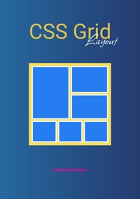


Responsive Layouts
Flex, Grid and Multi-Column
Abdelfattah Ragab
Introduction
Welcome to the book “Responsive Layouts: Flex, Grid and Multi-Column”
In this book I explain the three best-known responsive layouts: the Flexbox, the Grid and the Multi-Column layout.
Flexbox is a one-dimensional layout that only works in one dimension at a time, either horizontally or vertically.
The grid layout is a two-dimensional layout that distributes the elements horizontally and vertically at the same time.
The multi-column layout is a special layout for magazines and newspapers, where the text should flow in columns with spacing, rules, etc.
I'll explain all the properties and their values and how they affect the distribution of elements on the screen.
So let's get started.
Flexbox
Flexbox is a one-dimensional layout that works with one dimension at a time.
To use the flexbox layout, simply set the display property to flex or inline-flex as follows:
display: flex; or display: inline-flex;
If you set the display to flex, it is a block element, if you set it to inline-flex, it is an inline element. This is exactly the same as setting display to block or inline. And what about flex?
The flex influences how the subordinate elements should be distributed on the page.
So we have the flex container, the element with display: flex;
And we have the flex elements, the children of the flex container;
All properties that you apply to the container also affect the subordinate elements.
The container has its own properties and the children have their own properties and here's a quick overview of them all.
The container properties
The Item properties
Example
We have 3 div elements with different sizes and colors as follows. By setting display flex in their wrapper, they are displayed as follows:
<style>
.wrapper {
display: flex;
}
.div-1 {
width: 120px;
height: 200px;
background-color: blue;
}
.div-2 {
width: 80px;
height: 100px;
background-color: green;
}
.div-3 {
width: 200px;
height: 80px;
background-color: brown;
}
</style>
<div class="wrapper">
<div class="div-1"></div>
<div class="div-2"></div>
<div class="div-3"></div>
</div>
Before applying display flex to the wrapper, they looked like this
Now let’s understand how flex layout works.
Flex layout has two main axes, the main axis and the cross axis
The main axis is defined by the flex-direction property, and the cross axis is perpendicular to it.
flex-direction can have four values: row, column, row-reverse and column-reverse.
if flex-direction is not specified, it is set to row by default
flex-direction
The flex-direction property specifies the direction of the flexible elements.
If the element is not a flexible element, the flex-direction property has no effect.
Values
row
Default value. The flexible items are displayed horizontally, as a row
.wrapper {
display: flex;
flex-direction: row;
}
row-reverse
Same as row, but in reverse order
.wrapper {
display: flex;
flex-direction: row-reverse;
}
column
The flexible items are displayed vertically, as a column
.wrapper {
display: flex;
flex-direction: column;
}
column-reverse
Same as column, but in reverse order
.wrapper {
display: flex;
flex-direction: column-reverse;
}
Now let's look at how you can benefit from this, starting with two important flex layout properties justify-content and align-items.
I will explain the flex direction of the row in detail and leave it to you to try the other flex directions
justify-content
The CSS property justify-content determines how the browser distributes the space between and around content elements along the main axis of a flex container
Values


