17,99 €
Mehr erfahren.
- Herausgeber: Batsford
- Kategorie: Geisteswissenschaft
- Sprache: Englisch
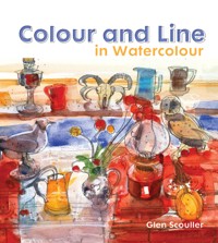
Glen Scouller's paintings are full of vibrant colour and light. In Colour and Line in Watercolour – his first book – he explains how he achieves these effects. He combines traditional watercolour techniques with adding pen and ink, pastels and crayons to create paintings brimming with colour and spontaneity. Using step-by-step demonstration paintings, Scouller shows how he builds up his paintings, working first in watercolour and adding other media to create his original style. He gives advice on his methods and techniques and encourages the reader to experiment with mixed media. He believes that keeping a sketchbook is very important, especially when travelling and shares tips on how to start and use one. There are also sections on painting outdoors and in the studio. The subjects covered are boats and boatyards, landscapes, still life, animals and figures and portraits. Colour and Line in Watercolour encourages all watercolourists, whatever their level, to experiment with the medium and produce exciting and challenging work of their own by adding line in various mixed media to their watercolours.
Das E-Book können Sie in Legimi-Apps oder einer beliebigen App lesen, die das folgende Format unterstützen:
Seitenzahl: 115
Veröffentlichungsjahr: 2016
Ähnliche


Glen Scouller
Boat and Fishing Paraphernalia, Hastings
Watercolour, Berol Karismacolor water-soluble pencil, oil pastels, Waterford NOT paper, 71 x 53 cm (28 x 21 in.) Collection of the artist
The Conversation, Falacho, Portugal
Watercolour, Berol Karismacolor water-soluble pencil, white oil pastel, Waterford NOT paper, 23 x 42 cm (9 x 16½ in.) Private collection
Glen Scouller
Contents
Small Boat, Sicily
Paolo Olbi handmade, leather-bound watercolour sketchbook, watercolour, white oil pastel, water soluble pencil 23 x 30 cm (9 x 12 in.) Collection of the artist
1 INTRODUCTION
The discipline of working from life
Sources of inspiration
2 TOOLS AND MATERIALS
Basic tools, papers and surfaces
Outdoor equipment
3 METHODS AND TECHNIQUES
Discovering and exploring watercolour
Mixed media
Demonstration: Still Life with Blue Background
Demonstration: Self-Portrait with Still Life
4 SKETCHBOOKS
Book and paper choice
Which is best for me?
5 PAINTING OUTDOORS
Hot climates
Bad weather
Demonstration: Octopus Boats, Santa Luzia, Algarve, Portugal
6 COLOUR AND LIGHT
Creating light
Saturated colour
7 FAVOURITE THEMES
What is a suitable subject?
Boats and boatyards
Still life
Landscape and urban landscape
Demonstration: Red Table and Jugs
Windows
Figures
Animals
Farms and villages
8 WORKING IN THE STUDIO
Still life
Portraits
Glossary
Index
Introduction
The Church, Mexilhoeira Grande, Algarve, Portugal
Watercolour, pencil and oil pastels, Waterford 300 gsm NOT paper 53 x 71 cm (21 x 28 in.) Private collection
A strange thing happens when I can’t get far enough back from my subject, and this beautiful old Portuguese church, with its trees stripped of their leaves in winter, is a typical example. The verticals appear to be distorted as if seen through a fish-eye lens. This is not something I do consciously: it just seems to happen naturally in my attempt to ‘fit’ everything I want into the picture, but I rather like the dynamic effect it has on the composition.
Watercolour is a swim in the metaphysics of life... a mirror of one’s own character. Let it be unpredictable and colourful.
Anonymous
The mere mention of watercolours to some contemporary artists is often met with a reaction of derision and disdain: in their eyes, the medium is in the bracket of the ‘hobby artist’ or ‘Sunday painter’. This is despite the fact that the use of watercolour was firmly established in British painting history by eighteenth-century and nineteenth-century English artists such as Turner (1775–1851), Cotman (1782–1842), Sandby (1731–1809) and their contemporaries. The rise of watercolour painting was also tied to a growing acceptance in Britain of ‘landscape’ as an appropriate subject for painting. The use of watercolours by these pioneering artists had a truly liberating effect on the nature of art for future generations. Artists now had a medium that was easily transportable, and there was no need to carry around easels, canvases or other heavy equipment. They were no longer tied to creating art within the four walls of a studio: the whole world opened up as a studio.
The Spongeware Jug
Watercolour, Waterford 300 gsm NOT paper 53 x 71 cm (21 x 28 in.)
Private collection This is an example of an early watercolour where the sumptuous colour and pattern made by the objects’ grouping was what charmed me. There is no under-drawing involved: here I simply relied on all my senses and got straight into the colour washes and mark-making, firstly with a large mop brush. Then, with a smaller brush, I added dots of pattern where they appeared on the jug and various bits of exotic fruit.
By its very nature, watercolour can be a fickle, infuriating and elusive medium, where mistakes are difficult to remedy and the applied colour sometimes appears to have a mind of its own. This, however, is one of the things I like about watercolour – its unpredictable nature and the need to ‘go with the flow’ when using it. Accidents happen… and marks, blobs, dribbles, spatters etc. can all be exciting if successfully fused into a painting. David Hockney is quoted as saying that you can’t cover up mistakes, and there is an element of truth in that statement, but only if you are making watercolours in a very purist, traditional manner. I prefer to take an approach that says if it works… then anything goes. But perhaps not to the extremes of Francis Bacon, who mused: ‘I use all sorts of things to work with: old brooms, old sweaters, and all kinds of peculiar tools and materials.’
He was, of course, referring to his oil paintings, so maybe that approach is not best suited to watercolour painting – but who knows, I’ve never tried such methods!
To achieve a truly successful watercolour painting is a bit of a balancing act. On the one hand, you have the aqueous pigment wanting to go its own way, and on the other hand, you must have a certain degree of control. Getting this delicate balance right is difficult, but the results can be magical. No other medium possesses the limpid quality of watercolour, where transparent washes appear to float on the paper.
The discipline of working from life
Pelicans, London Zoo
Staedtler clutch pencil with 4B lead, Hahnemühle sketchbook 297 x 210 cm (11¾ x 8¼ in.) Collection of the artist
Animals are nearly always on the move and it is challenging to try and capture something of their character, as with the pelican. Its beautiful, elegant shape reminded me of a Gaudier-Brzeska sculpture. These are two of many sketches I did at London Zoo, where these particular two birds obliged me by not moving too much!
If you are not skilful enough to sketch a man jumping out of a window in the time it takes him to fall from the fourth storey to the ground, you will never be able to produce great works.
Eugène Delacroix (1798–1863)
In the late 1960s and early 1970s I received a fairly classical training in drawing and painting at Glasgow School of Art, with the emphasis firmly on drawing from the life model. This disciplined way of working has stood me in good stead throughout my professional career.
Drawing has always been important to me and it’s something I enjoy doing on an almost daily basis. Sadly, nowadays art schools have moved away from this tried and tested method of training and I strongly feel that today’s students are missing out. Today the emphasis is more on intellectual input from the student rather than the physical, practical act of doing: they are asked to write about a still life rather than paint it; take a photo of a nude rather than draw it. I ask myself when the course directors will acknowledge that learning the core essentials of hand–eye observation/coordination is essential and will make a better artist, no matter what future route the student decides to pursue within the broad spectrum of the visual arts. Of course the sad thing is that a lot (if not most) of the tutors employed nowadays at art school level have themselves never received or have never had an interest in the core elements of drawing and painting, probably dismissing it as too old-fashioned and not fashionably cutting edge!
Sources of inspiration
Bird and Cat, Falacho, Algarve, Portugal
Watercolour, Berol Karismacolor water-soluble pencil, oil pastels, Waterford 300 gsm NOT paper 53 x 71 cm (21 x 28 in.) Private collection
Again, because I couldn’t get far enough away from the scene I wanted to paint, the trees and objects towards the edges of the composition have become more acutely angled. As the winter light was changing rapidly, I firstly blocked in all the main shadow areas with a mixture of French ultramarine and alizarin crimson, adding a few touches of white oil pastel to retain white on the dove and whitewashed wall. I then drew into certain areas with my pencil and picked out a few branches on the trees with a smaller brush.
I have always admired artists who can draw with pure line, such as Henri Matisse (1869–1954), Egon Schiele (1890–1918), Henri Gaudier-Brzeska (1891–1915), Raoul Dufy (1877–1953), Auguste Rodin (1840–1917), Ben Nicholson (1894–1984) and Joan Eardley (1921–1963); also some who taught me at art school, including Alexander Goudie (1933–2004), Duncan Shanks (b. 1937) and Leon Morrocco (b. 1942). They all realized the importance of line as a means of expression and for me, they all have one thing in common – the ease by which they can describe form and volume by means of a simple outline.
The combination of line and colour is something I have developed in my watercolour painting over the years. My early watercolours were made with no under- or over-drawing, just pure watercolour. This progressed into a desire to take them a stage further, experimenting by using various drawing materials in the process of making the finished painting. No matter which medium I use – whether it is oil, watercolour, pastel or gouache – I have always tried to bring out the best in my materials and I truly love the magical process of painting, which for me has always been an emotional and spontaneous thing tackled with all the intensity and passion that I can muster.
This book is therefore not so much a ‘how to do it guide’ – a book that explains how to paint a sky in three easy steps – but rather a ‘how I did it book’ – whereby the reader might find something interesting, stimulating and informative in my adventures, approach and methods with the wonderful medium of watercolour.
Hen Run, Winter
Watercolour, Indian ink, blotting paper, dry twig, Waterford 300 gsm NOT paper 53 x 71 cm (21 x 28 in.) Collection of the artist
This was a bit of an experiment: drawing into the preliminary colour washes with a sharpened dry twig dipped in Indian ink. I had used a bamboo pen many times before for ink drawings and enjoyed it, but never a dry twig. It demonstrates the fact that drawing is about mark-making, and any item that can hold a liquid medium or make a mark can be used to draw with. I also used a sheet of blotting paper to soak up the excess puddles of colour on the paper and created some interesting areas of texture. This was painted on a freezing cold winter’s day, when the washes were taking ages to dry, so blotting paper (which I always take with me) came in very useful.
Beach Figures, Collioure
Pentel fibre-tipped pen, Moleskine sketchbook, 297 x 210 cm (11¾ x 8¼ in.) Collection of the artist
This is detail from a small sketchbook, which because of its size, enabled me to draw inconspicuously on a fairly busy beach. With just a pen and notebook you can easily blend in, and draw the human figure close up.
2 TOOLS AND MATERIALS
My New Watercolour Box
Watercolour, Berol Karismacolor water-soluble pencil, oil pastels, Waterford 300 gsm NOT paper 41 x 39½ cm (16 x 15½ in.) Collection of the artist
This is a quick, splashy painting of a new paintbox, which I bought from the Little Brass Box Company. John Hurtley, the owner, makes them from brass to each individual’s requirements, offering a number of basic designs that can be personalized to fit your needs. You can have it painted in one of six basic colours, or for a small extra charge have it rendered in almost any colour that takes your fancy. I chose to have mine kept as natural brass. It’s a beautiful object both to look at and to paint with.
Basic tools, papers and surfaces
Palettes
The different watercolour palettes I’ve used over the years range from small, pocket-sized boxes to large ceramic pans set in wood – these are made by Winsor & Newton and Blockx in Belgium, and are great for working on a large scale with big brushes.
The hand is the tool of tools.
Aristotle (384–322 BC)
An artist’s tools are his or her best friends. If you look after your tools, they should last a lifetime; abuse them, and they will need to be replaced regularly. This particularly applies to brushes for watercolour painting – for instance, a Kolinsky sable brush can cost hundreds of pounds. I have to hold my hand up and say that I have been guilty of mistreating brushes in the past, especially if I’m working outside and in full flow – so engrossed and connected with my subject that everything else appears not to exist. My sins include leaving brushes in buckets of water for too long a period, causing the varnished handle to crack and loosen, and eventually revert to bare, blackened wood!
My brushes
This photograph shows a selection of the brushes I use. If I were asked to choose which brushes were indispensible I would say the large mop, the Escoda Kolinsky sable and a small sable. With these three brushes – small, medium and large – anything is possible.
Brush care
A few useful tips worth remembering are:
• Never store wet brushes in a sealed container, as they will be prone to attracting mildew.
• Always shape a brush after use (especially sables) and allow to dry naturally in the open air, or dry them with kitchen roll.
• Give brushes a treat once a year and use hair conditioner on them (a few drops per brush): allow it to soak in, then rinse before storing them. This should greatly enhance the performance of the brush – again especially noticeable with expensive sables.
There are some artists who use a cheap, squirrel-hair brush for mixing colour and an expensive sable brush to apply the colour to their paintings. That is fine if you work in a slow, deliberate manner, but for me that would disrupt my work flow and not contribute to the spontaneity that I strive for in my work.


