15,59 €
Mehr erfahren.
- Herausgeber: Batsford
- Kategorie: Geisteswissenschaft
- Sprache: Englisch
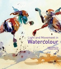
Jake Winkle's loose, fresh and spontaneous style of painting is very popular. His paintings are full of light and movement and a key feature of his technique is that he doesn't work in the traditional way of light to dark but by placing the darks first. In Light and Movement in Watercolour, his first book, he demonstrates how to paint watercolours in a loose, direct way by step-by-step demonstrations and practical projects. Watercolours are often spoiled by a desire to be entirely truthful to the subject matter, which can lead to a painting that is overworked and tight. Jake's loose approach avoids those problems. He looks at subject simplification and shows how to focus on shapes rather than objects and, by painting what you see and not what you know, demonstrates how to capture the essence of the scene with freshness and clarity. The main topics in this book are: Understanding Watercolour; Building Confidence; What to Paint; Shapes, Tones and Colours; Dark to Light and Freshness and Clarity. Jake considers each topic in detail and shows the reader how to create paintings that glow with life, interest and spontaneity.
Das E-Book können Sie in Legimi-Apps oder einer beliebigen App lesen, die das folgende Format unterstützen:
Seitenzahl: 122
Veröffentlichungsjahr: 2023
Ähnliche


St Mark’s Square
watercolour on Arches 300gsm (140lb) Rough32 x 46cm (12½ x 18in)
Rear View
watercolour on Arches 300gsm (140lb) Rough46 x 32cm (18 x 12½in)
Light and Movement in
Watercolour
JAKE WINKLE and ROBIN CAPON
Contents
Introduction
1 UNDERSTANDING WATERCOLOUR
A direct medium
Materials and equipment
2 BUILDING CONFIDENCE
Drawing
Step by step: Cathedral Close, Salisbury
Marks and washes
Shapes and spaces
Effective colour
A limited palette
3 WHAT SHALL I PAINT?
Key considerations
Subjects and inspiration
A way of seeing
4 CAPTURING LIGHT
Light and mood
Tonal contrasts
Light, tone and colour
5 DRAMA AND MOVEMENT
Paint consistency and brush technique
Spontaneity and the direct method
Step by step: From Accademia Bridge
Content and composition
Step by Step: Jumble at Pin Mill
6 DARK TO LIGHT
On location
In the studio
Step by Step: Roses
Step by Step: Exmouth Harbour
Darks first
Index
INTRODUCTION
Since I started working as a professional artist, almost twenty years ago, I have always painted in watercolour. What I instantly liked about watercolour was the fact that I did not necessarily have to follow a lengthy process to create interesting effects with colour: I could do this quickly, with a single application of paint. Moreover, as I soon discovered, the medium was more versatile than I had imagined. I found there was no reason, for example, why it could not be used as thick, virtually opaque paint as well as in translucent washes. Also, I found that I could get very striking, fresh and colourful results by starting with the dark tones in the subject, rather than following the conventional practice of working from light to dark (applying sequential washes of colour to build up tonal and other effects).
These developments grew out of my initial working process, which was essentially a wet-into-wet technique. This involved working on wet paper and then, as the paper dried out slightly, applying thicker, bolder colours, finishing with colour that was taken straight from the tube. The next logical step was to try this method on dry paper, concentrating on shape and colour, but paying particular attention to the relative tonal value of each colour in the subject.
So, having started, as most artists do, by using watercolour in the traditional way – by building up effects and the degree of tonal contrast with a sequence of colour washes – I now began to develop an entirely different approach in which the dark tones are considered first. For me, there were distinct advantages to this method. For example, it was much easier to keep the colours fresh and vibrant, and similarly easier to preserve the light tones and white areas within the painting and so create plenty of impact through tonal contrast. Also, I could judge the tonal relationships in the subject much better by starting with the dark areas, rather than having to begin by reserving the highlights. Essentially, this direct, dark-to-light process resulted in much livelier, more interesting and satisfying paintings.
Success with watercolour relies on confident mark-making, for it is not easy to correct mistakes. In turn, confidence comes from developing a sound painting practice – knowing how to mix colours, how much water to add, how to load a brush with paint, how to hold the brush to create certain effects, and so on. The learning of these basic techniques is fundamental to achieving good results, whatever approach you choose. It is particularly relevant to the dark-to-light approach because this relies on speed, spontaneity and a flow of linked shapes with very little further modification (if any).
Now, the vast majority of my work is painted in this way – dark to light. It is a method that suits all types of subject matter and, as is the aim in my work, captures each subject truthfully but as an impression rather than a detailed study. As I have said, it is a method that requires speed and confidence. But, with the right degree of application and attention to sound painting practice, success with this quite different approach to watercolour painting is eminently achievable. I can vouch for this, having tutored many classes and workshops over the years. For artists of all abilities, the direct method of dark-to-light painting offers enormous potential for expressive, rewarding and successful work.
Jake Winkle in his studio.
The Tall Vase
watercolour on Arches 300gsm (140lb) Rough46 x 32cm (18 x 12½in)
This painting is all about creating a pattern of darks that link together. After the pencil sketch, I started with the dark leaves, which left the outline shape of the flowers – the focal point of the painting. I worked on this area next, then the background, and finally the dropped leaves and tabletop.
Fairground Ride, La Rochelle
watercolour on Arches 300gsm (140lb) Rough25 x 27cm (9¾ x 10½in)
Essentially, I work with shape, tone and colour. I aim for an impression of the subject rather than a detailed study.
1 UNDERSTANDING WATERCOLOUR
For me, the attraction of watercolour lies in its immediacy, its freshness and the expressive potential that is possible by exploiting combinations of colour against the white surface of the paper. I also like the fact that it has its own distinctive technique. However, these qualities, which make watercolour such a wonderfully direct and responsive medium to work with, also mean that initially it is not an easy medium to use. With an opaque medium, such as oil or acrylic paint, you can paint over mistakes and adjust and improve the painting as you work. But with watercolour you need to have confidence in the marks and colours you first apply because there is no way of fully resolving mistakes.
In watercolour, the most powerful colour is white. It is the effect of counterchange (created by colours and tones set against the white paper) that produces atmosphere, drama and impact in a watercolour painting. The ability to create that effect relies on first gaining confidence with technique, and by so doing, learning the basic skills in handling aspects such as colour mixing, tonal strength, paint consistency and brushstrokes. Here, the key to success is practice. The more you practise, the more familiar you will become with, for example, how much water to use in a colour wash, or which colours to mix together to make the particular colour you need. Eventually, these basic skills will become second nature. Then there is more time to think about the qualities that will make your paintings personal and individual – qualities such as simplification and interpretation.
Old Harry Rocks
watercolour on Saunders Waterford 300gsm (140lb) Rough
46 x 32cm (18 x 12½in)
This was an ideal subject for watercolour – one in which I could make use of lots of white paper punctuated by strong accents of colour. I applied two colour washes, one over another, to create the sense of depth and variation in the foreground sea area.
A direct medium
The traditional approach to watercolour is to work in layers, using a sequence of colour washes, a process known as working from light to dark. The aim is to exploit the translucency of the medium, yet at the same time develop variations of tone and ‘reserve’ the white areas of the paper – either by using masking fluid or by simply not applying any paint to those areas. The danger with the layered method is that paintings can so easily become overworked and in consequence lose much of their impact. I prefer to take a different approach, one that I think is more straightforward and effective.
Watercolour is actually a very versatile medium. The character of the finished painting is principally determined by whether you work on dry, damp or wet paper, the fluidity of the colours used and the techniques chosen to apply them. In fact, when I first used watercolour I worked in a fairly traditional way, essentially with a wet-into-wet technique (see here), applying thicker paint as the work progressed. I particularly liked the contrasts that could be achieved with light and shade in this medium, and also the expressive nature of the brushstrokes. But, as I discovered, with the layered approach the subtlety of the brushstrokes is soon lost.
I wanted to preserve that subtlety and create as much drama as I could in each painting. Because of this, I began to develop a more direct approach that relied on assessing and painting the correct tone as a single wash, rather than building up the tonal value with a sequence of washes. So, with this method the darks are painted straight away; there is no preliminary underpainting. This ‘dark-to-light’ approach is a more spontaneous way of working, with the advantage that you can start wherever you like, and you don’t have to start with the lightest tones. By linking passages together through their tonal values, the painting develops with a better structure and a greater sense of immediacy and drama.
It is quite difficult to judge a light tone against the white of the paper – it is much easier to judge a very dark tone. Painting on dry paper and with reference to that first dark tone you applied, you can quickly move on to put in relatively similar tones, fusing edges wet-up-to-wet (see here), although as necessary changing the colour as you work your way around the painting. The medium-value tones are added in the same way, with the lightest tone left as the white of the paper. To help with this approach, my advice is to look at the subject matter through half-closed eyes, as this will simplify and identify the main tonal values.
The aim is to create pathways of dark and medium tones across the painting, placing simplified shapes quickly and developing them with lost and found edges. When I paint, it is not about painting one object and then moving on to the next one, it is about painting complete tonal areas as linked shapes. Also, I like to exaggerate colour slightly, rather than interpret it in an exact, realistic way.
Assisi
watercolour on Arches 300gsm (140lb) Rough32 x 46cm (12½ x 18in)
Typical of my dark-to-light approach, the most important areas in this painting are the shadows. If you can imagine the painting with just the shadows, it would still make sense.
Brian
watercolour on Arches 300gsm (140lb) Rough35 x 25cm (13¾ x 9¾in)
I never deliberately limit my colour palette. As shown here, in this portrait of my father, if there are few colours, this has been determined by the subject matter itself.
Capturing the essence
Watercolour is an ideal medium for capturing an impression of a subject. This is the way I like to work because it is quick, spontaneous and encourages results that are evocative and exciting. There is no reason why a detailed painting shouldn’t look equally stunning, of course, but for me it is the essence of a subject that is important and the fact that a certain amount is left to the viewer’s imagination.
When people first start painting they often feel obliged to represent everything in front of them and include as much detail as possible. This is a natural reaction: it takes time to appreciate and acquire the skills necessary to develop a response that involves simplification and interpretation. But in fact we cannot see everything in detail all at the same time: some things are in focus; some are not. We need to embody that idea in our paintings. If, on the other hand, we were to take each area of a subject in turn and paint it in detail, this would, in effect, create a series of small paintings within a larger one. It would probably result in a painting that is too ‘busy’ – one that lacks a particular focus and impact.
As I have suggested, a good technique to help judge tonal values is to half-close your eyes, and equally this helps to identify the essence of a subject. By half-closing your eyes it is much easier to see which shapes, details, colours and tones stand out and consequently are important to the subject, and which are out of focus. For example, when you look at a tree through half-closed eyes, the main shapes and tones are emphasized rather than the detail in the leaves.
The conventional practice in painting is to make the most important element – usually the feature that initially attracted the artist to the subject – the focal point. The viewer’s interest is led to this point by means of a carefully devised composition; additionally, it is in this area that we find the strongest colour and tonal counterchange as well as the most detail. This way of working, building a composition around a focal point, is a reliable method to begin with. It helps both in creating paintings that have a sound structure and in focusing on the essence of the subject.
I sometimes concentrate on a single image, effectively the focal point, in the form of a vignette painting, as in Mara Lion (here). In other paintings, for example street scenes such as Angers (here), I use ‘lead-in’ features to direct the eye to a focal point. However, the approach I prefer is to have no particular focal point but instead to encourage the eye to wander around the whole painting, as in The Della Salute (here). And in fact I don’t always know what the essence of a subject is when I begin painting. Often it is the painting process itself, the dark-to-light approach, that defines the essence of a subject. See also Content and Composition, here.
Mara Lion
watercolour on Arches 300gsm (140lb) Rough32 x 46cm (12½ x 18in)
Here, every brushstroke counts in helping to describe the form and character of the subject. The white spaces count too; very often in a painting it is not just the parts that are filled in with colour that are important, but equally the parts that are left unpainted.
Angers
watercolour on Arches 300gsm (140lb) Rough46 x 32cm (18 x 12½in)
Essentially, paintings are created from a relationship between shapes – usually principal shapes, such as the buildings in this painting, and shadow shapes.
The Della Salute
watercolour on Arches 300gsm (140lb) Rough32 x 46cm (12½ x 18in)
This subject required quite a complex drawing to begin with, then in the painting I concentrated on working with lost and found edges and abstract patterns to create the sense of the buildings.
Reference photo for Traditional Paris.
Traditional Paris
watercolour on Arches 300gsm (140lb) Rough46 x 32cm (18 x 12½in)
I like to start each painting with the part that most excites me about the subject, which in this case was the main shape of the building. Note that the foliage in the foreground, which is of less importance, is softer in treatment and slightly out of focus.


