Erhalten Sie Zugang zu diesem und mehr als 300000 Büchern ab EUR 5,99 monatlich.
- Herausgeber: The Crowood Press
- Kategorie: Geisteswissenschaft
- Sprache: Englisch
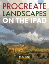
Procreate Landscapes on the iPad explains how to use this ingenious package to paint powerful landscapes at the press of the Apple pencil. By breaking down painting a landscape into different steps, it shows how Procreate can help an artist find their direction and try new techniques to create more expressive work. Referencing the work of Masters throughout, Philip Tyler shows how digital painting follows a long tradition of artists observing and interpreting the landscape, and how you can effectively use Procreate to develop your own ideas.
Sie lesen das E-Book in den Legimi-Apps auf:
Seitenzahl: 212
Veröffentlichungsjahr: 2025
Das E-Book (TTS) können Sie hören im Abo „Legimi Premium” in Legimi-Apps auf:
Ähnliche


Brancaster Beach.
Sussex Sky.
CONTENTS
Introduction
1. Landscape painting: a brief history
2. Getting started with Procreate
3. Linear drawing
4. Tone
5. Mark-making
6. Perspective
7. Colour
8. Photography and digital image manipulation
9. Composition
10. Painting progress
11. Landscape reimagined
QR codes
Further reading
Index
INTRODUCTION
I n January 2020 I bought a new iPad and an Apple pencil so that I could use Procreate. Although I have drawn digitally since the early 1990s with a drawing tablet and had used apps on my phone (Picsart, Adobe Draw) using my finger, as well as Autodesk Sketchbook and Brushes Redux on my first iPad, I instantly fell in love with Procreate.
Another Place.
During the pandemic’s lockdown, I spent a long time behind a computer screen longing to get out of the house. I did a lot of digital painting, learning the ins and outs of Procreate, and prepared a lot of new teaching material. When we eventually returned to face-to-face teaching, I noticed that many more students were also using Procreate and continue to do so.
As a piece of software, it’s very sophisticated and can do much of what Photoshop can do at a minimal cost for the download. Apart from the hardware you do not need to use an iPad Pro – as long as the operating system will run the software you are good to go.
I now regularly teach Procreate landscape painting on the iPad, as well as Procreate iPad portraiture. In preparation for both courses, I have made a lot of digital recreations of other artists’ work to demonstrate the versatility of the app. Mimicking the painterly quality of different artists’ work forces you to experiment with the digital brushes that you have at your disposal, and I have not felt the need to purchase any more. All the artworks in this book have been digitally painted.
Walking in any landscape can be immensely pleasurable, whether it’s the Sussex Downs that I have on my doorstep, or the rugged coastline of Cornwall. Taking a box of paints, canvases, easel, brushes, cloths and solvent with you is hard, but take your iPad and an Apple pencil and you have brought the whole studio with you and the task of painting in the landscape becomes a lot easier.
CHAPTER 1
LANDSCAPE PAINTING: A BRIEF HISTORY
L andscape painting in the Western European tradition does not become a genre in its own right until the mid-eighteenth to the nineteenth century. Early Renaissance paintings include landscapes which are theatrical backdrops to a piece of drama. These landscapes are invented spaces to allow a narrative to take place. We start to see landscape becoming a recognisable genre on its own with the rise of Romanticism.
Study of Sunset on the Matterhorn, after Albert Bierstadt.
Study of a Roman fresco. Whilst images of landscape exist in early artwork, landscape painting as a subject in its own right did not exist until the mid-eighteenth century.
In the Eastern tradition, however, paintings from the early first and second centuries onwards are preoccupied with landscape. Chinese landscapes were often invented, huge in grandeur and used space differently from the Western use of perspective.
Within the hierarchy of Western European art, figure painting (history painting) was deemed to be the most complicated and most important genre for an artist. Portrait painting would come next – painting the monarchy, the Pope and figures from history – and this was followed by genre painting which featured domestic scenes, usually aimed at telling some kind of moral tale. Landscape painting would come near the bottom, just above still life and painting animals.
Claude Lorrain (1600–82) was a French painter who spent most of his time in Italy producing imaginary landscapes of classical mythology. His imagery would have an impact on artists like Turner, and on garden design as well.
Turner was certainly influenced by Lorrain’s vision, but he trod an altogether different path once he received patronage from George Wyndham, the 3rd Earl of Egremont. This allowed him to break free from the way in which landscapes had traditionally been rendered.
Claude Lorrain (1600–82) would produce Arcadian views, set in imagined Classical landscapes. His view of nature informed how people saw landscape, even to the point that they would not look at landscape directly, but instead viewed landscape using a blackened glass mirror (the ‘Claude glass’), as the colours of landscape were too vulgar! Lancelot ‘Capability’ Brown would literally reroute rivers and build hills in landowners’ estates to give them a view inspired by Lorrain. JMW Turner (1775–1851) was certainly inspired by Lorrain’s vision in his earlier paintings before he became much more interested in the dramatic impact of the weather in stormy seascape paintings. These would become increasingly abstract as he got older, to the point where his later works (many of which can be seen in the Clore Gallery at Tate Britain) look like Modernist abstract paintings.
When we look at Mr and Mrs Andrews by Thomas Gainsborough (1727–88), the beautifully rendered landscape in the background of the painting is really a statement about the couple’s ownership of land.
John Constable would have had to grind his own pigments and store them in leather pouches before taking them into the landscape to make oil sketches and drawings. To our contemporary eye, these oil sketches look resolved, but they would never have been considered gallery-worthy.
The Industrial Revolution would bring about significant change: villagers moved away from their rural lives to the new towns and factories. John Constable’s oil studies captured the English rural countryside before it disappeared and many of these were then worked up into more resolved studio-based paintings.
For most people, when landscape painting is mentioned, they have the idea of the Impressionist approach – the artist working directly from nature and using a shorthand to simplify the landscape. However, that is a relatively late idea of how landscape could be rendered and artistically there is a long heritage of different ways in which landscape has been painted.
The Salon dominated the way in which artists worked, with an emphasis on historical subjects. By the late eighteenth century, however, the Neo-Classical works of Jacques-Louis David (1748–1825) began to tell politically driven allegorical narratives. In opposition, Romanticism would play an important role in developing a more emotional engagement with painting. Eugène Delacroix (1798–1863) made rallying cries to the French Revolution in Liberty Leading the People (1820).
At around the same time, the American settlers were experiencing the scale and grandeur of the landscape and responded to it accordingly. The Hudson River School, which began around 1825, saw artists producing monumental canvases which had the same kind of Romantic spirituality that James Ward had been exploring twenty years before.
In the nineteenth century, the Salon sent some of its art students to Rome to draw inspiration from the Classics of antiquity; these artists would become inspired by the idea of working from nature.
Gordale Scar was painted by James Ward for Lord Ribblesdale, a Yorkshire landowner. Ward wanted to convey something of the primordial magnitude of the British landscape, protected by the metaphoric cow as a surrogate ‘John Bull’. There is also a sense of the sublime captured in its monumental scale.
With the rise of steam travel, artists could travel further afield and experience different kinds of landscape – from the pastoral to the majestic. Along with ideas of the sublime, the magnitude of scale and the drama of the elements could create a sense of awe and wonder in the viewer. Landscape painting could talk about the power of God and the insignificance of man but could also represent the way that man was transforming the landscape in the industrial age. From James Ward’s Gordale Scar to the Pioneers painting the magnificent vistas of the American plains, landscape could begin to act as a metaphor for a spiritual experience.
Due to the development of new dyes in the textile industry, artists’ colour-men could make tube oil paint for the first time, making it easier for artists like Richard Wilson to work on location. Like Constable, many of these landscapes were relatively small studies from nature. These studies would often be brought back to the studio and worked up into completed pictures.
Back in France, the Barbizon School of artists (active between about 1830 and 1870) gathered in the Forest of Fontainebleau to work from nature, taking their direction from Constable’s example that was exhibited in France in 1824. These artists would occasionally include farm workers in their paintings as the middle classes began to reflect on the plight of the workers and the poor. With the development of photography in the early 1820s, with its ability to record nature, landscape artists began to question their role. Some began to reflect on the everyday experience and the importance of the common man. Realism would emerge around 1848, with Gustave Courbet (1819–77) taking centre stage. His landscapes show a much more physical engagement with surface and paint.
Barbara Bodichon (1827–91) was an artist as well as a social reformer and was involved in the Woman’s Suffrage Movement as well as the Pre-Raphaelite Brotherhood. Despite its name, the Brotherhood also contained women, many of whom were fighting for social change and equal rights, amongst them Barbara Bodichon, Elizabeth Siddall, Jane Morris, Joanna Mary Boyce, Georgiana Burne-Jones, and Lucy Maddox Brown.
At around the same time, members of the Pre-Raphaelite Brotherhood (founded in 1848) were also going into nature to record the landscape in meticulous detail. But these landscapes would often serve as backdrops to allegorical narratives set in a medieval context.
Impression Sunrise (1872) by Claude Monet (1840–1926) was a painting of the port in Le Havre early in the morning. The title of the work was later used to denigrate the artworks exhibited in the first Impressionist exhibition.
French Impressionism, emerging in the 1860s, would take the idea of plein air painting into a different direction, challenging what the camera could not record. Tube paint became widely available in the 1870s, and rail networks had extended to allow artists to travel further afield. By the 1880s small artistic communities were forming in Glasgow, Newlyn and Staithes, pushing their own take on Impressionism and broad-brush plein air painting.
The Finnish artist Helene Schjerfbeck gradually moved towards greater abstraction in her painting. In this digital study of landscape, you can see the way she became increasingly interested in the intersection of shapes rendered in a muted palette.
During the nineteenth century, women were still required to be chaperoned and many female artists tended to work with domestic settings. The Nordic countries, however, produced some exciting female landscape painters, such as Betzy Akersloot-Berg (1850–1922), Anna Boberg (1864–1935), Ester Almqvist (1869–1934) and Helene Schjerfbeck (1862–1946).
If the Impressionists had valued the idea of working directly from nature, the Post-Impressionist artists would return to the studio; they began to move away from the desire to record exactly what was seen and instead chose to orchestrate reality according to their own needs. Two tendencies seem to emerge here. The first, more rational one, explored the idea of organising shapes and colours within the painting. Cézanne would question the notion of perspectival space and monocular vision, while Seurat would question the notion of solidity and colour; objects would be rendered in tiny dots of pure pigment, and this Divisionism or Pointillist approach would be taken into landscape painting. Van Gogh and Gauguin, on the other hand, explored a much more emotional response to the landscape and colour. Pierre Bonnard and Édouard Vuillard also introduced much more decorative tendencies, flattening and bending pictorial space. Paintings no longer had to act as a window onto the world; they could reflect their own reality and that of the artist too. Colour could be bold and layered, textured or flat to give formal coherence to the artwork.
An artist like Pierre Bonnard would make tiny compositional drawings in pencil and create paintings from them, using his imagination to put the colours down that made pictorial sense.
The Russian painter Alexej von Jawlensky was originally trained in the Realist tradition under the great Ilya Repin before he moved to Germany where he met Kandinsky and formed part of Die Brücke – breaking away from traditional tonal rendering in favour of something much more aggressive, and summarising the essence of place but also the emotional state of the artist. Murnau in Bavaria was also the place where Kandinsky made his transition between a Fauvist interpretation of landscape to wholly abstract improvisational paintings.
The physicality of paint and heightened colour beyond naturalism led the way for other artists to approach the landscape in much more gestural and expressive ways. Fauvism and early German Expressionism could ramp up the colour to full force. The paintings of Matisse, Derain, Jawlensky and early Kandinsky show this tendency of fully saturated hues and exaggerated perspectives. In the early part of the twentieth century anything was possible. The Camden Town Group, founded by Walter Sickert, took on Post-Impressionism, and Picasso and Braque took Cézanne a stage further by fragmenting landscape into a series of flat planes.
Paul Nash became an official war artist in 1918 and in six weeks produced fifty drawings of what he called ‘muddy places’, which were then worked up into paintings.
The First World War had a significant impact on artists throughout Europe. In the hands of Paul Nash (1889–1946) landscape contained burnt-out tree stumps standing to attention like silent sentinels. The bombed-out aftermath of fighting on the front was not a landscape that the British people wanted to view, whereas Eric Ravilious (1903–42) depicted a much more Romantic view of his native Sussex. For David Bomberg (1880–1957), a fellow Slade student, the experience of warfare caused him to turn his back on the geometric abstraction he had been pursuing and go off to paint landscapes in Israel and Spain to find himself anew. The magnitude and grandeur of Ronda would give him the solution he was looking for to unpick the ‘Spirit in the Mass’ which would be developed by his pupils Frank Auerbach (b. 1931), Dennis Creffield (1931–2018) and Peter Prendergast (1946–2007). Another Slade student, Matthew Smith (1879–1959), studied with Matisse in the 1920s and one can see a similar tendency toward impasto painting and exaggerated colour, which he also shared with Chaïm Soutine (1893–1943).
The Symbolists, working around the same time as the Impressionists, used landscape in a more fantastical and dreamlike way, as a reaction against Realism and Impressionism. Arnold Böcklin (1827–1901) pictured the Isle of the Dead, and Gustave Moreau (1826–98) had both Matisse (1869–1954) and Odilon Redon (1840–1916) go through his atelier.
There is a strange sense of other-worldliness to Harald Sohlberg’s moonlit paintings of the Rondane mountains in Norway. In these he captures a sense of something mystical, connected to Norwegian mythology and a deep sense of symbolism.
For some artists in the 1920s the subconscious held the key to unlocking a new way of using landscape. Harald Sohlberg (1869–1935), working in Norway, evoked a strange ethereal twilight world. Paul Nash would move away from his bombed-out landscapes of the First World War and seek out something altogether mysterious and other-worldly with Surrealism – as would Ithell Colquhoun (1906–88) and Leonora Carrington (1917–2011). It is interesting to reflect on Salvador Dalí’s (1904–89) Surrealist landscapes when we realise that his anamorphic creatures are not placed in a strange landscape at all but come from the reality of the Catalan landscape near his home. Early Georgia O’Keeffe (1887–1986) would also show an interest in Surrealism, but when she moved away from New York to the Mexican desert she found it offered her a much more spiritual sense of place.
As a digital painter, it is worthwhile considering these examples to find your own direction as an artist. What are you trying to explore, and how does digital painting enable you to do that? As we have seen, landscape can be both invented and observed, three-dimensional and flat, decorative, expressive or abstracted. When you do an Internet search on digital landscape painting, David Hockney (b. 1937) pops up quickly. We are fully aware of the amount of work he has done with the iPad, but it is quite difficult to find good examples of digital landscape unless one looks at the work of concept artists working within the film or illustration industry. Illustrators such as Henry Wong, Sin Jong Hun, and Ayan Nag are worth looking out for.
This book will help you to use your iPad and Procreate with greater confidence and give you some inspirational content to fire up your creative imagination.
CHAPTER 2
GETTING STARTED WITH PROCREATE
P rocreate is a digital drawing and painting tool designed for the iPad and should be used with the Apple pencil. You need to check your operating system is sufficient to run Procreate. Procreate will run on all iPad Pros but you don’t need to have one to use it. You do need to make sure that you have iOS 15.4.1 or later, or a second-generation iPad mini. You also need to make sure that you have got sufficient storage space on your iPad, as you can quickly fill your iPad up with Procreate imagery. Your work can be backed up to the iCloud; an iCloud account is useful as this makes it much easier for you to import imagery directly into the software.
Once you have downloaded the software onto your iPad from the Apple store and you have paired your pencil with your iPad through your Bluetooth, you’re ready to go.
The following is reproduced with Procreate’s permission:
Procreate is a software development team dedicated to making exceptional creative tools for creative people by combining beautiful user experiences with high-performance engineering. Procreate for iPad is used by millions around the globe, has been the best-selling paid iPad app on App Store for the past six years, and the company has received three coveted Apple Design Awards. Procreate’s three apps – Procreate, Procreate Pocket, and Procreate Dreams – are placing more power in the hands of creatives, amplifying the company’s guiding principle: Art is for everyone.
On your iPad screen will be icons for all the apps that you have installed. Simply tap on the Procreate icon to open the software.
When learning any new piece of software one of the key things to consider is that you can’t learn everything immediately. It seems obvious, but so many students seem to struggle because they forget that learning takes time. It is much better to understand a few basics to get you started than to try to learn everything that the software can do. This text does not intend to cover everything, but we will explore the things that you need to know how to do to in order to make more successful digital landscape paintings.
When you first start to use the interface (what the app looks like on the iPad screen) you will begin to locate the tools that are underneath the various buttons. Procreate is designed to be quite intuitive and if you have used Photoshop, you will notice a lot of similarities.
Later chapters in this book will revisit many of the features that are introduced here, and give you a sense of how to use them in the context of drawing and painting landscape. We will explore, for instance, how Procreate will create automatic shapes when you draw, how you can manipulate those shapes, fill those shapes with colour and why sometimes your wiggly drawn line becomes a zig-zag one. We will discuss how you can select a brush, change its size and opacity, and a few exercises will get you thinking about how you can draw landscape.
Drawing and painting can be thought of in terms of mapping (linear), massing (tonal) and mark-making, and we will explore how to create space with perspective before we consider how colour works.
Once we understand the basics of drawing and painting, we can start to consider how we compose our images and how we can use photography to better inform our decision-making. It is also useful to consider common photographic mistakes when capturing landscape and how we can rectify those mistakes, as well as how we use photographs.
Throughout the text we will refer to the work of painters and printmakers who have treated landscape in different ways. There are numerous digital studies of their work made to illustrate the ideas in the text but to also demonstrate the versatility of the software. None of the artworks have been traced or digitally altered from their source and all are in the public domain.
Many artists work serially, producing several different configurations or compositions based on the same set of elements. Procreate enables you to do this very quickly and so we will begin to think about how we can rearrange what we have made and combine different things together from several digital paintings.
Drawing and painting landscape presents several challenges: visual perception, scaling, the changing nature of the subject, to name a few, and we will endeavour to explore those too.
Once we understand the basics, we can then start to ask ourselves a much more challenging question: what are we trying to say with landscape? That is really where the journey starts.
Procreate provides you with an excellent in-depth online handbook as well as lots of useful links to online videos.
Making some marks on your canvas and playing with the tools is a great place to start. When you reach a point where you need to learn how to do something that’s a great moment to consult the handbook or to search something on the Internet. It is an effective way of learning the software because you learn the aspect that you need to learn at the right time.
THE INTERFACE
We will start with an understanding of the interface, editing and painting tools. Artists paint on canvas, so Procreate refers to new documents as canvases. Once you open Procreate for the first time, you will notice that you have a gallery with some images already in there; these are examples of some of the different qualities that you can achieve using the software. This text will show you much more.
Start off by looking at the top right-hand corner of your screen and you will notice a + sign. Click on this to create a new canvas. You do not need to worry if you have chosen the wrong size; you can always re-size the canvas later, if you need to.
The standard canvas size is the size of your iPad screen measured in pixels (2160 × 1620px) using 132 dots per square inch (DPI). You can change this to 300 DPI for reproduction purposes.
Canvas size
Pixels are the individual bits of digital information that make up the image. The more pixels you have, the more information and memory this takes up on your iPad. Starting to use the default screen size is a good place to start.
NB: If you go to Crop and Resize, you can change the size of your canvas, but not the size of your image.
Crop and resize.
Gallery
The gallery is the place where your digital canvases are stored. As you start to create multiple digital canvases, you can organise these by selecting them and stacking them.
When you create a new canvas, you are presented with a very minimal interface. Along the top of the menu bar, you have a series of icons. These are divided into two sections: painting tools and editing tools.
Click on one of the canvases in your gallery; it will open, and you can start editing it. Clicking on the gallery symbol closes the canvas that you are currently working on.
Stacking is Procreate’s name for creating a folder of images. You can select more than one canvas at the same time and make duplicates of your work.
This is a useful way of organising your artworks into different themes. You can move work in and out of your stacks as many times as you wish, by selecting them and dragging them to the top left where it says ‘stack’ and they will pop back into the main gallery.
You can give your stacks a name to help you with your organisation; however, if you put more work into a stack then this name is deleted and returns to Stack. You can also select images in your gallery and share.
You can save your document as a Procreate file, a Photoshop document (PSD), or as a PDF, JPEG, PNG or TIFF. You will notice there are some animated options as well.
Sharing simply means saving them to some other space on your iPad, to iCloud, or sharing with someone else.
PAINTING TOOLS
As we progress through this book, we will touch on what each of these tools do in more depth and see them in use. For the moment you will need to use the Brush menu, be able to select a colour and be able to understand the sidebar on the left-hand side of the window.
NB: Under the Actions and Preferences menu, you can move the sidebar to the right-hand side of the window.


