20,99 €
Mehr erfahren.
- Herausgeber: Crowood
- Kategorie: Geisteswissenschaft
- Sprache: Englisch
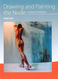
Artists have always been fascinated with portraying the nude: the beauty and nuances of the human figure are endlessly absorbing. This practical and inspirational book celebrates and continues that enduring and beautiful tradition by encouraging you to discover your own talent and style. Philip Tyler looks in detail at the key skills and themes, such as perception, proportion, composition, colour and facture, that the artist needs. He then investigates ideas and styles, and encourages you to interpret the nude so your paintings have those elusive qualities of vitality and relevance, which can turn a painting into a masterpiece.
Das E-Book können Sie in Legimi-Apps oder einer beliebigen App lesen, die das folgende Format unterstützen:
Seitenzahl: 334
Veröffentlichungsjahr: 2015
Ähnliche


Drawing and Painting the Nude
A course of 50 lessons
////////////////////////////////////////////////////////////////////////////////////////////////////////////////////////////////////////////////////////////////////////////////////////////////////
CROWOOD
Philip Tyler
First published in 2015 byThe Crowood Press LtdRamsbury, MarlboroughWiltshire SN8 2HR
www.crowood.com
This e-book first published in 2015
© Philip Tyler 2015
All rights reserved. No part of this publication may be reproduced or transmitted in any form or by any means, electronic or mechanical, including photocopy, recording, or any information storage and retrieval system, without permission in writing from the publishers.
British Library Cataloguing-in-Publication Data
A catalogue record for this book is available from the British Library.
ISBN 978 1 78500 048 5
Dedication
The book is dedicated to my dad, Bob Tyler 1933–2015.
Acknowledgements
I owe an enormous debt of gratitude to Chris Taylor and Trevor Sowden for showing me the way at school and opening the door to my life and for introducing me to Euan Uglow and Andrew Wyeth. To Arthur Ruff who taught my first life drawing classes during my A levels. Bill Randall, who taught me more about drawing than anyone I know, an astonishing teacher and to this day an extraordinary draughtsman. I must thank my models who brought so much energy and excitement to the sessions; in particular, Lou, Johanna, Lindsey, Ottavio, Felix, Frankie and Emma. Without them, none of this book could have happened and a good model is a joy to work with. I must thank Tim Benson, Shaun Ferguson, Alex Kanevsky, David Longo, Piers Ottey, Jake Spicer (www.draw-brighton.co.uk) and Julian Vilarrubi, who continue to teach the craft, and for their support, guidance and wise words on the problems of drawing and painting. I want to thank the author of The Hidden Place (http://thehiddenplace.wordpress.com/), whose blog entries introduced me to so many new painters, led me on the journey to find more, and made me realize that I am not alone. I thank you all, but equally I cannot list the thousands of artists whose work I have peered at, dissected and absorbed over the last thirty years. Thanks also to Seawhite for allowing me to photograph their art materials.
Teaching is about sharing knowledge, and those individuals whom I respect the most have told me all they know. By empowering students with skills, knowledge and understanding one equips them sufficiently to let them explore for themselves. To use the analogy of music, one doesn’t lead the student to a piano and say, ‘compose a concerto.’ I have to thank Emily Ball for giving me the encouragement to contact the Crowood Press in the first place.
Finally I have to thank my wife Louise, whose support I cannot live without. She is my rock and brings me back to earth when sometimes my head is in the clouds.
Contents
Preface
Introduction
Chapter 1 Materials
Chapter 2 Linear drawing exercises
Chapter 3 Measurement and proportion
Chapter 4 Basic anatomy
Chapter 5 Tone
Chapter 6 Composition
Chapter 7 Painting
Chapter 8 Colour
Chapter 9 The subject within the figure
Chapter 10 Afterword
Further reading
Index
Preface
What does it mean to paint figuratively? What does it take to paint the figure well? I had to learn how to paint the figure from scratch – whilst I had a fairly good foundation in drawing from my early art training at school, my painting career had followed a different path and the problem of painting the nude had to be faced alone. I trawled through old books, peered at paintings and explored all sorts of approaches, techniques and media until I found a method that I was happy with. Through the conversations I have had in preparing this book, I have discovered that I am not alone: many artists, despite studying at art school, have had to pursue a path of self-tuition to discover how to paint the nude.
For about six years my studio was my 6' × 9' bathroom, which had no windows. I would convert my bathroom into a studio on a Saturday night by placing an 8' × 4' plywood board on top of the bath (my palette) and rest another on top of that, leaning against the wall (my easel). Onto the top corner of this board I would clamp my anglepoise lamp and place a large mirror on top of the small basin. I would then rest another mirror on the laundry basket, so that I could see a reflection of myself from behind. In that converted studio I painted about 900 nude self-portraits.
To this day I do not have the perfect studio and am rarely in the studio when it is light. I have limited space and limited time in which to paint, with a full-time teaching job, but I am in no doubt that I must not use these things as an excuse. Instead, one must try to understand what can be done with what one has, rather than what one cannot have. I want my own work to pin down reality, informed through the process of observation, to achieve a certain kind of physicality of gesture and energy. I am astounded by the potential beauty of the human form, both male and female, with its grace, poise and dynamism. I hope that I can capture some small fragment of that experience. When I draw and paint I become completely lost in the moment, losing sight of time, speech and sometimes even conscious thought. It seems to be an almost trance-like state, where, for a brief moment, all one’s concerns and doubts can disappear. I hope to share my enthusiasm for drawing and painting the nude in this book, to explain some of the techniques and processes that I have discovered over the years, and to lead you on the path to your own discoveries.
Some questions that we all have to address include: How can an artist bring something new to the subject? How can you paint a nude that has vitality and relevance without resorting to gimmickry or sensationalism? How can you avoid making titillating or voyeuristic imagery that is exploitative? And how might you embrace all that twenty-first-century technology has to offer without being a slave to it? This last question I have raised with the artists who have contributed works to this book. I hope that their responses, as well as mine, might throw some light onto these questions.
The Internet is a wonderful thing and through it are many insightful tutorials and demonstrations. It opens the door to the work of many new artists and has not only opened my eyes to the infinite number of possibilities that the nude presents: it has also brought me into contact with some fantastic artists too – Tim Benson, Alex Kanevsky, and David Longo, to name three. I am grateful to them for sharing their ideas and allowing me to get some insight into their working practice; I hope it will be informative for the reader too.
Introduction
Painting and drawing the nude successfully is not an unattainable goal, and it should be an immensely satisfying journey. The lessons set out in this book will give you a focus and draw your attention to key themes and ideas. Painting can be broken down into a series of visual problems:
drawing (perception, observation, proportion, shape)
tonal value
scale
medium and material
composition
colour
facture
Once all of those aspects have been understood then there is the problem of subject. What are you trying to convey, with the nude? What are you trying to say? The exercises in this book have been designed to take you step by step toward your own set of choices and intentions. The primary concern is to provide you with further insight into the discipline. Evidently, nothing can actually replace the activity of drawing itself. But you can go a lot further if at least you have some pointers to help you on your way.
Where to begin?
Kimon Nicolaïdes stated in his book, The Natural Way to Draw: ‘Learning to draw is really a matter of learning to see – to see correctly – and that means a good deal more than merely looking with the eye.’ When we first learn to draw, the marks we make bear little resemblance to the world we see; yet these drawings are the things they represent. The box-like drawing of a house, the triangular drawing of mum, these are all symbolic of the thing being drawn. It is plain to see that children’s drawings are very similar, yet to each child these images are very personal and can often have rich narratives. As we get older we try to perfect our symbols for things – eyes, ears, noses, etc. – and we tend to strive to produce something more and more realistic. We often draw the same things over and over, constantly perfecting and recreating our symbols. Comic books are an obvious example of this symbolic language perfected, and often prove to be invaluable for the young, as this language can be appropriated and incorporated into their own schema (Gombrich’s term for a visual symbolic language used by that individual). For most people, their symbolic language stops developing at the age of about twelve, and from that age onwards the student focuses on a particular image, which they continually redraw, perfecting the image.
However, we live in a three-dimensional world, seen through two eyes. These receive reflected light images from an object, which fall upside down on the back of the retina and these two inverted images are constantly being bounced around. Each eye has a blind spot and sees two slightly different views of the same thing. This information is encoded into electrical signals, which are then decoded by the brain. With all this confusing information, is it any wonder that actually seeing is a difficult thing? Seeing is not so much a function of the eyes but the interpretation of the brain.
The way we see the world is governed by our experience of it. From childbirth we have been collecting sensory information, by placing things in our mouths and feeling them, and this information, coupled with our vision, jointly forms this miniature universe in our minds. But this information is encoded into symbols: although we know what chairs, cups and saucers, etc. look like, we don’t really see them. Instead, when we look at a familiar image, we are actually seeing an interpretation of the object through the symbol we have for it. Similarly, if we write a word, we do not see the word as a series of letters; instead we see the thing it represents. DOG conjures up an image of a dog, not the quality of the three letterforms G, D and O.
Most of our looking is really scanning. When we look at something, we are not really seeing its exactitude at all. Betty Edwards gives a good example of this in her book Drawing on the Right Side of the Brain. She suggests that you measure the size of your reflection from a number of distances from the mirror. If you try this yourself you will probably be very surprised to discover that your reflection is half the size of your head. If you draw around your reflection with a permanent marker, as you walk away from the mirror your head will still fit into that shape, no matter how far away you are. So what you see every day is not as easily understood as you might think.
Fundamental to any introduction to drawing is re-educating the way we see, teaching the student how to look at the world in such a way that they do not recognize the thing they draw. If this is achieved then the transformation can be almost instantaneous.
One of the 900 self-portrait male nudes I painted in the early 1990s. At this time the figure became a central motif in my work whilst trying to convey ideas about grief.
Chapter 1
////////////////////
Materials
Materials.
Everything capable of making a mark on paper can be used to construct a drawing. Any media can be used for drawing the nude but there is an intimate relationship between the artist, the material, the support they work on and the scale at which they work. Through your own exploration you might find that one medium is better for the kind of drawing you want to make. One might feel more resistant, more gestural, more controlled or easier to remove if you get something wrong. It is worth remembering that children scribble for many years before they begin to make meaningful marks. To become familiar with the different media, you have to use them and understand their inherent nature.
Good quality paper suitable for sustained drawing and paintings in acrylic or oil.
Drawing tool kit
You should get yourself a basic tool kit for drawing: a small sketchbook, preferably one that is fairly cheap so that you do not feel under pressure when using it. (Sketchbooks can be really intimidating: the more expensive the book the more intimidating it becomes, so a cheap sketchbook is a great start.) Buy a scrapbook as they are really cheap and the coloured paper has a lovely texture for charcoal, pencil, graphite and watercolour, as well as pastel drawing and coloured pencil studies of the figure. Photocopier paper is excellent for basic monoprint, relief print, pen and ink, biro and compressed charcoal studies. It is good for making quick studies from the figure and can be used for lots of other things too.
Buy some cheap biros too, preferably some red and black ones, a long clear plastic ruler and a cheap stationery kit with a compass and a 45° set square. You can use a red biro to draw the figure – the warmth of its tone suits flesh. Use different coloured biros to draw darker tones. You can see through a clear plastic ruler when you are measuring the figure and your set square can help with proportion. The compass is useful too, especially if you are trying to scale up an image. A plastic rubber is also a valuable purchase.
A trip to an art shop will enable you to buy some larger A1 sheets of cartridge paper (Seawhite supply an excellent 130gsm paper and a very good 220gsm acid-free). The weightier 220gsm paper is great for painting as it is less likely to cockle (deform) when wet. You can buy individual sheets as needed from your local art shop or you could order a pack, but if your budget doesn’t stretch that far you could buy a roll of lining paper from your local DIY shop. Buy the heaviest weight you can. These come in roll form and will need attaching to a board with masking tape or board clips.
Get a sheet of plywood approx. 1cm deep and slightly larger than A1 paper (approx. 70 × 100cm). You will also need a craft knife with spare blades (a retractable one is best for cutting paper and sharpening pencils) and a roll of black insulation tape.
It is not necessary to go out and spend a fortune on materials. Look at each exercise and buy what you need as you go along; eventually you may need to buy some more specialized drawing and painting media.
Charcoal
Charcoal study. Charcoal can be used on its side to broadly establish the large areas of shadow in the figure.
A finger or cloth can be used to smudge the charcoal to create more delicate tones and begin to locate the figure and model the form.
The tip of the charcoal can begin to discover the edges of forms defining the placement of limbs and hinting at the features.
The drawing is finally taken to the point of resolution, taking the drawing to its extremes of light and dark, manipulating the forms with both charcoal and an eraser.
When twigs from a willow tree are placed in a sealed container in the centre of a fire, the wood cooks and blackens; this carbonized wood is charcoal and comes in thin and thick varieties according to the part of the branch that has been used. Charcoal can produce very delicate subtle greys as well as rich, dark tones. The texture of the paper is very important in the depth of tone that is possible.
One of the common mistakes of using charcoal is to try to draw with it like a pencil. Because it can be easily moved around, areas of tone can be put down and very quickly removed, so the drawing can transform and grow in a much more organic way. Charcoal is impermanent and subsequently it needs to be fixed, either with fixative (a shellac-based aerosol which is also carcinogenic), hairspray, or PVA mixed with water and applied using a spray diffuser. The potential of charcoal as a drawing medium of the figure is limitless, from the atmospheric gestural figures of Sophie Jodoin to the elegant and subtle tonal studies of Singer Sargent and Nicolai Fechin. The fugitive nature of the medium can be used gesturally to capture the fleeting dynamic movements of the figure or the nuances of half tone running across the body into the light.
Clutch pencil
Clutch pencil, in this illustration holding black compressed charcoal and sanguine.
Clutch pencils are lead holders and will grip a thin tube of graphite, compressed charcoal or pastel. Caran d’Ache created the first spring clutch push-button type in 1929 and they now come in a variety of sizes, weights and costs. The very thin leads can break easily and are only really capable of a very fine line. The weight of the tool and how it feels in the hand is an important part of the drawing symbiosis. Clutch pencils, with the ability to hold a thicker lead, mean that you have the scope to render the figure with a more dynamic range of marks. Your mark-making can be expressive, frenetic or delicate. You can change leads easily and that means that you can draw with pencil, compressed charcoal and Conté using the same tool. A soft lead, a sanguine colour Conté and a black compressed charcoal set of leads, will offer a great scope of possibilities with the figure from quick poses and gestural responses to subtle tonal rendering.
Compressed charcoal
Compressed charcoal. These usually come in a unified stick form, either cylindrical or square ended.
Mixing crushed charcoal and gum arabic produces compressed charcoal. Charcoal pencils tend to be compressed charcoal and they can come in different grades. Usually uniform in their shape, compressed charcoal produces a very strong black and tends to stick to a greater variety of papers than normal charcoal. Compressed charcoal can be used with water to produce washes (gum arabic is also used in gouache and watercolour). It can yield dark and emotive figures and light and airy ones too. It is difficult to erase, however, and when held in the hand transfers itself easily. Compressed charcoal can come in a variety of tones from black through to white where you can produce lighter tone without needing to dilute. This works particularly well when you are drawing the figure on toned or coloured paper.
Because of its glue content, it is less likely to need fixing than normal charcoal. It can also be rubbed onto the back of photocopy paper to make transfer paper.
Toned compressed charcoal. Like pastel, these sticks come in a variety of tones and hues. The initial drawing is done on coloured paper, lightly marking out the main directions of the figure and considering the angle between each pair of forms.
A light grey is added to the drawing, thinking about fleshing out the figure but establishing tones that are darker than the paper.
Now a mid-grey and a dark-grey are added, working down to the darkest values of the drawing. This helps to establish the form and make the figure more solid as well as correcting any errors in the earlier drawing.
Finally black is added and the full range of tonal and visual contrast is established to make the drawing more visually dynamic.
Conté
This was originally invented by the French as a response to the pencil. Rather like compressed charcoal, it is a combination of pigment and gums with some waxes too, which makes it somewhat harder than pastel. Conté comes in a wide range of colours and can also be used with water.
Crayon
Wax crayons tend to be combinations of various waxes and pigment. The pigment content is usually low, so colours tend to be pale. Chunky crayons make excellent tools for frottage and wax resist especially when combined with an ink wash. Pencil crayons come in a much wider and richer variety of hues, and some are water-soluble.
WAX RESIST
This technique involves drawing with a wax candle (oil pastel or white spirit) and then laying a wash over the drawing; the grease repels the wash. Stan Smith’s drawings often incorporated mixed media with wax resist, but it is Henry Moore’s drawings during the Second World War that are some of the best examples of the technique.
Wax resist: the first drawing marks were made with a wax crayon, the highlights on the figure. Then a light wash was applied, which the crayon resisted.
Further drawing was done with an oil pastel and more washes applied to create depth of tone and a context for the figure.
Eraser
Usually made from rubber, the eraser can be both a destructive and constructive tool. Paper can be covered with a layer of charcoal and smudged in with a rag or the back of your hand to create an overall grey. The light tones of the figure can then be erased out of the grey making the drawing (rather like a bistre study, see Chapter 7), before further tones are added to make the darks.
BREAD
A humble slice of bread can be kneaded into a small ball. Stale bread is best. This can be used as a rubber in tonal figure studies of the nude. As you will see in Chapter 5 you can make a reductive tonal drawing using the rubber as a drawing medium removing a charcoal ground to describe light on the form.
PUTTY RUBBER
This is a soft kneadable rubber, and can be manipulated to erase small detailed areas as well as larger expanses. It can also be used to lift out oil paint in bistre painting where the oil is applied thinly onto primed canvas.
Graphite
Graphite offers a wide scope of expressive marks and is an excellent tool for quick gestural studies of the figure in short poses. This drawing was made from a two-minute pose.
Graphite is a form of carbon. It is found in pencils and the degree to which it is combined with clay creates the various tones available (B for black and H for hard). Graphite can also come in stick form. Soft pencils are great for immediate and tonally rich figure drawing; graphite sticks can make filling large areas of a drawing more economical but are also good for fast drawings, which capture the energy and dynamism of the figure.
Pencil is one of the most widely used media and having a broad range of pencil grades extends its scope: softer Bs can yield rich blacks and a broad range of tones; harder H pencils can yield crisp lines, which are perfect in conjunction with watercolour. Dirk Dzimirsky’s photorealist pencil drawings demonstrate the range of tones that are possible but take a look at Kent Williams’ and Jake Spicer’s life drawing to see the pencil used with great sensitivity to the subject.
Indian ink
Diluted with distilled water you can create beautiful washes with Indian ink. In this figure study the ink was applied with a brush and a stick.
Stick and ink: with a stick you can also make expressive drawings. The stick can yield rich darks and as the stick continues to draw you will be left with ink residue, which creates subtle grey lines.
The blackest of the inks, Indian ink is made by combining soot with shellac. It can be diluted with water and you should use distilled water, as normal water causes the pigment to break down and scatter into the wash. When dry, Indian ink is waterproof and lends itself to line and wash, which can produce luminous figure studies. Indian ink was a standard medium for illustrators using a dip pen at the turn of the century. Ink drawings by Phil May and Charles Keene are well worth looking at, as are those by Jason Shawn Alexander and David Foldvari.
Oil bar
Oil bar is half-way between oil pastel and oil paint. It comes in thick tubes like an over-large pastel but it has a very soft and fluid touch. The bar tends to form an outer skin much like oil paint when it dries, which has to be broken. This can be done with a knife to create a finer edge.
Rather like an oil pastel but somewhat larger, the oil bar can be used for drawing. It leaves a wet mark on the support, which can be worked like oil paint with a brush and solvent. This can lead to exciting gestural and painterly marks, which lean toward a more expressive interpretation of the figure.
First layer: in this figure study the yellow was lightly skimmed over the surface of the paper creating a sense of the pose and trying to establish the main direction of the limbs.
Second layer: red was used next and blended together with a finger.
Two further colours were added – blue and brown. These dominant hues were identified before white was layered over the top to unify the form.
The piece is brought to a conclusion; consideration was given to the space the figure sits in.
Oil pastel
This twenty-minute oil pastel drawing was made on black paper. The weave of the pastel was kept open, hatching the colours next to each other and over the top of each colour to create a rich surface.
A combination of pigment and oils, pastel comes in small stick form and a variety of rich colours. They can be mixed with white spirit to produce more painterly effects, but equally they can be used either flat, blended or mixed using hatching, cross-hatching or stippling. The range of the medium, and the scope for its manipulation can yield a wide range of figure interpretations. As with all pastels, if you can, go larger: working on bigger paper – especially coloured paper – gives you more scope to build up detail and subtle rendering of form and colour nuances.
Felix was hunched, but was bringing his shoulder blades upwards and his head downwards, exaggerating the size of his back. This oil pastel study was made on a light grey Ingres paper ground with the open weave of the pastel kept loose to build up form and richness of colour.
Pastel
Chalk pastel is pigment mixed with gums. Powdery in its nature, it too can be blended, or mixed together with cross-hatching, etc. However, unlike oil pastel, chalk pastel can be erased. Like oil pastel, the scope of chalk pastel is immense. R.B. Kitaj, Crawfurd Adamson, Paula Rego and of course, Degas demonstrate true mastery of the medium and it is worth noting that pastel drawings are often referred to as paintings.
Pen
In this drawing with a black ballpoint pen the figure is rendered using hatching and cross-hatching, which changes direction to describe the underlying form. Care was given to exploit the touch of the hand to yield lines of varying thicknesses to help describe the third dimension.
A biro or ballpoint pen has a greasy, viscous ink that is transferred onto the paper with a steel ball. A fibre tip pen and felt tip pen transfer a solvent-based ink, which dries quickly. Some artists use water-based pens, which can create washes when combined with water. Dryden Goodwin and Juan Francisco Casas offer two very different approaches to the humble ballpoint. A dip pen has a split steel tip with a small hole at its mid-point, held in a handle. The tip is immersed in ink and through capillary action, ink is held in the hole and travels down the split to reach the paper. You can dip your pen into traditional ink, but you can also draw with strong coffee, food colouring or diluted gouache. A fine fountain pen can also be used for drawing purposes. Some have mechanisms that allow you to suck up ink and some have ink cartridges. A fine-tipped fountain pen offers a lot of the same possibilities as a dip pen and can yield touch-sensitive lines. It can be used to build up hatching, cross-hatching and stippled areas of tone. The combination of the line and the dispersion of colour into water from the black make for sumptuous and evocative life drawing. It has the advantage over a dip pen that you do not need to constantly refill your pen.
A linear drawing using coloured felt tips.
A water soluble felt tip drawing was made in line and then areas of tone were added. The water was added to create the coloured washes.
Although associated with children, felt tips can also be used for drawing purposes. They are inexpensive and come in a vast array of colours. Some of them use water-based inks that will disperse into washes when mixed with water. However, the inks used fade in light so would need to be used for sketchbook work rather than as drawings to exhibit.
Quink ink
Black Quink is designed to be used with fountain pens and is a trichromatic ink made up of colour. If diluted, the colour is revealed and can produce some rich effects. Quink is water-soluble when it is dry so a line made with it might disappear if a wash is applied over it.
Pencil sharpener
Generally speaking pencil sharpeners are designed to sharpen HB pencils. Softer pencils tend to snap inside them so it is often better to sharpen pencils with either a craft knife or scalpel so that the angle of cut can be changed to suit the pencil. A small piece of sandpaper may be used to define a tip and can be used to sharpen vine charcoal.
Painting tool kit
Brushes
A wide range of inexpensive brushes can be a good starting point for experimentation in terms of scale of mark and edge quality. Feel the resistance and spring of the bristles so that you have the control you need when painting.
These can vary considerably in terms of quality, type and cost. Ideally you want brushes that you can control and ones that are capable of a wide variety of marks so that you can efficiently yield the large masses of the figure as well as describe the subtle nuances across the form. You need a brush that has resistance against the paint, so you need a stiff brush if you want to use acrylic or oil with impasto or scumbling techniques, and softer brushes for more fluid paint like watercolour or gouache (but you still need that tension in the bristles). A large brush can hold a small point and can give you a good reservoir of paint; a medium round synthetic or sable type brush can give you the freedom to make gesture drawings and ink wash drawings.
Brushes come in different shapes: round, flat, filbert and fan. Each one will give you a different mark so it is worth experimenting to find out what suits you. Brush handles vary in length and it is recommended that you buy long-handled brushes and hold them at their ends so that you can stand back from your painting and see both the figure and your painting simultaneously, to help you understand the proportions and colours on the figure.
Acrylic
This small acrylic sketch was made quickly with a very dry paint scumbled over the surface of black paper.
Originally used for mural painting, acrylic is one of the most recent paints to be developed. It comes in both tube and tub form and is usually found in two types. Daler Rowney make Cryla which is a very stiff, buttery paint which has excellent impasto qualities and a high density of pigment. More widely used are Daler Rowney’s System 3 flow formula acrylics, which tend to be less viscous and more fluid. Daler Rowney also produce an inexpensive graduate range; these are more easily thinned down to be used with either airbrush or glazes, but are suitable for most of the techniques outlined in Chapter 7. These thinner colours can of course be mixed with Cryla to make a much more dense paint.
Acrylic can be used with different painting techniques and applications, and can be mixed with different types of medium to either thicken the paint or transform the surface quality. Acrylic medium is white in its liquid form and becomes transparent when it dries. So a colour mixed in acrylic will invariably darken when it dries and will become more transparent. Acrylic is water-based, but once dry it is waterproof. It has a fast drying time but this can be altered with retarder. Because acrylic is fast drying, you can paint quickly in lots of layers – perfect for short, strenuous poses. You can break all the rules associated with oils and can combine many techniques in the same image. It is capable of a broad range of approaches, from expressive and gestural figure studies to meticulous rendering. Have a look at Shaun Ferguson’s figure painting to see just what can be done with acrylic. Winsor and Newton sell Artists’ quality paint, which will usually signify the best quality paint, as well as a Galeria range; Liquitex has a comprehensive range of acrylics too.
Gouache
In this small painting study the gouache is used thinly like watercolour and in a more gestural way in areas on the body.
Gouache can be used in a variety of ways, from thin water-colour-type glazes to thick impasto, but the paint always remains water soluble, which means that new layers can mix with earlier ones, and impasto tends to be rather brittle. Egon Schiele used gouache in combination with pencil in his powerfully moving nudes. Gouache dries flat and can be an exciting paint to explore. Humphrey Ocean made some stunning gouache studies of people which, although somewhat exaggerated, have a real sense of pose and personality.
Oil paint
Three-figure study using an initial grisaille underpainting. Oil on paper, 70 × 90cm.
A combination of pigment and linseed oil, oil paint was developed in Northern Europe by Jan Van Eyck. It was said that oil paint was invented to paint flesh and it is true that no other paint is as successful at rendering the subtle modulations of colour and light on flesh (as well as a myriad of other surfaces). Oils can be used both thinly and thickly, but the drying time for oil is lengthy, especially if the paint film gets thicker.
When painting from life you will need to take into consideration the drying time of oil. Depending on the scale of the work a medium sized painting can take anywhere between two and four hours to construct if one is working alla prima. A small oil study could take about one to one and a half hours so the nature of the pose that is set needs to have this taken into consideration.
Palette
Laying out your colours in a systemized way will develop good practice and will maximize the space for mixing.
You will need a big palette, so that you have a place for mixing your colour, a place where you can leave an amount of pre-mixed paint, and a place where you can wipe off excess paint to leave the right amount at the end of your brush. Walter Sickert would look at a student’s palette and point out that their painting resembled their palette. In other words, if your palette is a mess of muddy colour then it should hardly be surprising that your painting will be muddy too.
A palette should be the same size as the image you are working on. Maximize the space available for mixing by putting your colour at the top edge, leaving most of the palette free. Clean colour should not be sullied when it is put onto the palette so the palette must be cleaned or refreshed in some way. Organize your colour so that it is logically put down and so that you can find what you are looking for.
Ideally a palette should be non-absorbent. You can use melamine, glass or a sheet of acrylic as a palette. A piece of thin ply can be varnished and it can be cut with a jigsaw to make a space for the hand and thumb. In that way, you have a palette that can be hand-held when standing up to paint. If you prefer to paint sitting down it could be placed on a table or stool near to where you are painting.
If you dislike cleaning, a table-top or board can be covered with cellophane or even newspaper. These can then be thrown away instead of cleaning. You can also use ready-made tear off palettes, which are made from waxed paper, and behave in the same way.
Dried acrylic can build up into mountains quite quickly if left to dry. Cover with cling film to reduce the drying time and keep your paint useable.
The colour of the palette itself is an important consideration, as it will influence how you perceive the colour you are mixing. An ideal would be a transparent palette. If you are going to use a coloured ground, you can paint up some paper with that colour and place it underneath your palette.
PALETTES FOR ACRYLIC
Acrylic dries quickly so you might want to consider the build-up of acrylic colour on your palette. Working with a shiny palette means that after a big build-up the acrylic can be peeled off when it is dry. However, this can lead to bits of dried acrylic skin mixing with your wet paint. Air causes acrylic to dry so at the end of a painting session you can cover your acrylic with cling film; this will keep the paint wet for days rather than hours. Alternatively you can use a large tupperware box or a ‘stay wet’ palette; both of these have sealable lids to keep the air out, but this can cause the acrylic to smell.
WATERCOLOUR PALETTES
Watercolour palette. The space attached to the box will enable you to mix a wide variety of colours, and can be detached for cleaning. Supplement with a plate for large washes.
If you are using watercolour the box of paint usually has its own built-in palette. This is perfectly adequate for most painting but it is useful to supplement this with either a dinner plate or those plastic takeaway boxes as this will give you much more room to mix up enough watercolour for a large wash. You might also wish to use well palettes – the kind with deep recesses.
Palette knife
A range of painting and palette knives with a wallpaper scraper and kitchenware too – all capable of being used in the painting.
The palette knife and painting knife are incredibly useful tools to have in the studio. The painting knife is usually shaped like a triangle and comes in a variety of sizes. A palette knife is usually more like a rounded knife blade and can be straight or cranked. The traditional use of the palette knife is to apply paint to the palette (if the paint comes in a tin), to scrape up the residue paint from the palette to aid cleaning, to mix colour on the palette and to scrape back a painting. But many artists use the palette knife and painting knife in a more creative way. Household spatulas and squeegees can also yield larger-scale marks similar to painting knives and can also be used in the production of a painting (see the work of Alex Kanevsky).
Watercolour
A direct watercolour study using a Japanese calligraphy brush.
With the highest concentration of pigment, watercolour is simply pigment and gum acacia. Watercolour is applied as a thin wash and colour can be manipulated through subsequent glazes, although if too many are applied the colour becomes muddy. Although the basic watercolour sets seem relatively simple, watercolour is one of the hardest techniques to perfect because you cannot cover up your mistakes. When combined with white gouache it is called bodycolour. Watercolour can be used broadly to capture fleeting poses, and is beautifully demonstrated in the studies by Wendy Artin, as well as the highly resolved paintings by Dante Gabriel Rossetti.
Water-soluble oil paint


