33,59 €
Mehr erfahren.
- Herausgeber: Packt Publishing
- Kategorie: Fachliteratur
- Sprache: Englisch
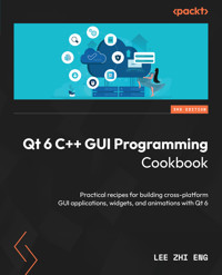
With the growing need to develop GUIs for multiple targets and multiple screens, improving the visual quality of your application has become pivotal in helping it stand out from your competitors. With its cross-platform ability and the latest UI paradigms, Qt makes it possible to build intuitive, interactive, and user-friendly UIs for your applications.
The third edition of Qt 6 C++ GUI Programming Cookbook teaches you how to develop functional and appealing UIs using the latest version of Qt 6 and C++. This book will help you learn a variety of topics such as GUI customization and animation, graphics rendering, and implementing Google Maps. You’ll also be taken through advanced concepts such as asynchronous programming, event handling using signals and slots, network programming, and other aspects to optimize your application.
By the end of this Qt book, you’ll have the confidence you need to design and customize GUI applications that meet your clients' expectations and have an understanding of best-practice solutions to common problems during the app development process.
Das E-Book können Sie in Legimi-Apps oder einer beliebigen App lesen, die das folgende Format unterstützen:
Seitenzahl: 368
Veröffentlichungsjahr: 2024
Ähnliche
Qt 6 C++ GUI Programming Cookbook
Practical recipes for building cross-platform GUI applications, widgets, and animations with Qt 6
Lee Zhi Eng
Qt 6 C++ GUI Programming Cookbook
Copyright © 2024 Packt Publishing
All rights reserved. No part of this book may be reproduced, stored in a retrieval system, or transmitted in any form or by any means, without the prior written permission of the publisher, except in the case of brief quotations embedded in critical articles or reviews.
Every effort has been made in the preparation of this book to ensure the accuracy of the information presented. However, the information contained in this book is sold without warranty, either express or implied. Neither the author, nor Packt Publishing or its dealers and distributors, will be held liable for any damages caused or alleged to have been caused directly or indirectly by this book.
Packt Publishing has endeavored to provide trademark information about all of the companies and products mentioned in this book by the appropriate use of capitals. However, Packt Publishing cannot guarantee the accuracy of this information.
Assistant Group Product Manager: Kunal Sawant
Associate Publishing Product Manager: Teny Thomas
Senior Editor: Rounak Kulkarni
Book Project Manager: Deeksha Thakkar
Technical Editor: Rajdeep Chakraborty and Jubit Pincy
Copy Editor: Safis Editing
Proofreader: Rounak Kulkarni
Indexer: Manju Arasan
Production Designer: Prashant Ghare
Senior DevRel Marketing Executive: Shrinidhi Monaharan
Business Development Executive: Samriddhi Murarka
First published: July 2016
Third edition: March 2024
Production reference: 1280324
Published by Packt Publishing Ltd.
Grosvenor House
11 St Paul’s Square
Birmingham
B3 1RB, UK.
ISBN 978-1-80512-263-0
www.packtpub.com
In loving memory of my late brother, Lee Zhi Zheng, whose introduction to the world of computing ignited my passion for technology. I extend my heartfelt gratitude to my parents and dear friends for their unconditional love, encouragement, and inspiration throughout my journey.
– Lee Zhi Eng
Contributors
About the author
Lee Zhi Eng is a self-taught programmer who worked as an artist and programmer at several game studios before becoming a part-time lecturer for two years at a university, teaching game development subjects related to Unity and Unreal Engine. He has taken part in various projects related to games, interactive apps, and virtual reality and has also participated in multiple projects that are more oriented toward software and system development. When he is not writing code, he enjoys traveling, photography, and exploring new technologies.
About the reviewer
Nibedit Dey is a seasoned software engineer-turned-serial entrepreneur with over 14 years of experience crafting sophisticated software-based products adorned with captivating user interfaces. Prior to venturing into entrepreneurship, he honed his skills at Larsen & Toubro and Tektronix in various R&D capacities, leveraging his expertise in biomedical engineering and embedded systems. Specializing in Qt and embedded technologies, Nibedit currently spearheads two innovative start-ups, ibrum technologies and AIDIA Health, where he oversees the entire product life cycle from conception to delivery. Not content with mere entrepreneurial pursuits, Nibedit is also an accomplished author, having penned the acclaimed book Cross-Platform Development with Qt 6 and Modern C++. His contributions to the tech community extend beyond literature, as he serves as a respected reviewer of technical works and imparts knowledge as a sought-after trainer in Qt and C++. Fueled by an unwavering passion for embracing new technologies, Nibedit continues to push the boundaries of innovation, driving transformative change in the digital landscape.
Table of Contents
Preface
1
Look-and-Feel Customization with Qt Designer
Technical requirements
Using style sheets with Qt Designer
How to do it...
How it works...
There’s more...
Customizing basic style sheets
How to do it...
How it works…
Creating a login screen using style sheets
How to do it...
How it works…
Using resources in style sheets
How to do it…
How it works…
Customizing properties and sub-controls
How to do it…
How it works…
Styling in Qt Modeling Language (QML)
How to do it…
How it works…
Exposing the QML object pointer to C++
How to do it…
How it works…
There’s more…
2
Event Handling – Signals and Slots
Technical requirements
Signals and slots in a nutshell
How to do it…
How it works…
There’s more…
UI events with signals and slots
How to do it…
Asynchronous programming made easier
How to do it…
How it works…
Function callbacks
How to do it…
How it works…
3
States and Animations with Qt and QML
Technical requirements
Property animation in Qt
How to do it…
How it works…
There’s more…
Using easing curves to control property animation
How to do it…
How it works...
There’s more...
Creating an animation group
How to do it…
How it works…
There’s more…
Creating a nested animation group
How to do it…
How it works…
State machines in Qt 6
How to do it…
How it works…
There’s more…
States, transitions, and animations in QML
How to do it…
How it works…
There’s more…
Animating widget properties using animators
How to do it…
How it works…
There’s more…
Sprite animation
How to do it…
How it works…
There’s more…
4
QPainter and 2D Graphics
Technical requirements
Drawing basic shapes on the screen
How to do it…
How it works...
There’s more…
Exporting shapes to SVG files
How to do it…
How it works...
There’s more…
Coordinate transformation
How to do it…
How it works...
There’s more…
Displaying images on screen
How to do it…
How it works...
There’s more…
Applying image effects to graphics
How to do it…
How it works...
There’s more…
Creating a basic paint program
How to do it…
How it works...
Rendering a 2D canvas in QML
How to do it…
5
OpenGL Implementation
Technical requirements
Setting up OpenGL in Qt
How to do it…
How it works…
There’s more…
Hello World!
How to do it…
How it works...
Rendering 2D shapes
How to do it…
How it works...
Rendering 3D shapes
How to do it...
How it works...
Texturing in OpenGL
How to do it…
How it works...
Basic lighting in OpenGL
How to do it…
How it works...
Moving an object using keyboard controls
How to do it…
How it works...
Qt Quick 3D in QML
How to do it…
How it works...
6
Transitioning from Qt 5 to Qt 6
Technical requirements
Changes in C++ classes
How to do it…
How it works…
There’s more…
Using Clazy checks for Clang and C++
How to do it…
How it works...
Changes in QML types
How to do it…
How it works...
7
Using Network and Managing Large Documents
Technical requirements
Creating a TCP server
How to do it…
How it works…
Creating a TCP client
How to do it…
How it works…
Uploading and downloading files using FTP
How to do it…
How it works…
8
Threading Basics –Asynchronous Programming
Technical requirements
Using threads
How to do it…
How it works…
QObject and QThread
How to do it…
How it works…
Data protection and sharing data between threads
How to do it…
How it works…
Working with QRunnable processes
How to do it…
How it works…
9
Building a Touch Screen Application with Qt 6
Technical requirements
Setting up Qt for mobile applications
How to do it…
How it works…
Designing a basic user interface with QML
How to do it…
How it works…
Touch events
How to do it…
How it works…
There’s more…
Animation in QML
How to do it…
How it works…
Displaying information using model/view
How to do it…
How it works…
Integrating QML and C++
How to do it…
How it works…
10
JSON Parsing Made Easy
Technical requirements
JSON format in a nutshell
How to do it…
How it works…
Processing JSON data from a text file
How to do it…
How it works…
There’s more…
Writing JSON data to a text file
How to do it…
How it works…
Using Google’s Geocoding API
How to do it…
How it works…
There’s more…
11
Conversion Library
Technical requirements
Converting data
How to do it…
How it works…
There’s more…
Converting images
How to do it…
How it works…
There’s more…
Converting videos
How to do it…
How it works…
There’s more…
Converting currency
How to do it…
How it works…
There’s more…
12
Accessing Databases with SQL Driver and Qt
Technical requirements
Setting up a database
How to do it…
How it works…
Connecting to a database
How to do it…
How it works…
Writing basic SQL queries
How to do it…
How it works…
Creating a login screen with Qt
How to do it…
How it works…
Displaying information from a database in model view
How to do it…
How it works…
Advanced SQL queries
How to do it…
How it works…
There’s more…
13
Developing Web Applications Using Qt WebEngine
Technical requirements
Introducing Qt WebEngine
How to do it…
How it works…
There’s more…
Using webview and web settings
How to do it…
How it works…
Embedding Google maps in your project
How to do it…
How it works…
Calling C++ functions from JavaScript
How to do it…
How it works…
Calling Javascript functions from C++
How to do it…
How it works…
14
Performance Optimization
Technical requirements
Optimizing forms and C++
How to do it…
How it works…
Profiling and optimizing QML
How to do it…
How it works…
Rendering and animation
How to do it…
How it works…
Index
Other Books You May Enjoy
Preface
With the growing need to develop GUIs for multiple targets and screens, improving the visual quality of your application becomes important so that it stands out from your competitors. With its cross-platform ability and the latest UI paradigms, Qt makes it possible to build intuitive, interactive, and user-friendly user interfaces for your applications.
Qt 6 C++ GUI Programming Cookbook, Third Edition, teaches you how to develop functional and appealing user interfaces using the latest version of QT6 and C++. This book will help you learn a variety of topics such as GUI customization and animation, graphics rendering, and implementing Google Maps. You will also explore advanced concepts such as asynchronous programming, event handling using signals and slots, network programming, and various aspects of optimizing your application.
By the end of the book, you will be confident to design and customize GUI applications that meet your client’s expectations and understand the best practice solutions for common problems.
Who this book is for
This intermediate-level book is designed for those who want to develop software using Qt 6. If you want to improve the visual quality and content presentation of your software application, this book is for you. Prior experience in C++ programming is required.
What this book covers
Chapter 1, Look-and-Feel Customization with Qt Designer, shows you how to design your program’s user interface using both Qt Creator and Qt Design Studio.
Chapter 2, Event Handling – Signals and Slots, covers topics related to the signals and slots mechanism provided by Qt 6, which allows you to handle your program’s event callbacks with ease.
Chapter 3, States and Animations with Qt and QML, explains how to animate your user interface widgets by empowering the state machine framework and the animation framework.
Chapter 4, QPainter and 2D Graphics, covers how to draw vector shapes and bitmap images on screen using Qt’s built-in classes.
Chapter 5, OpenGL Implementation, demonstrates how to render 3D graphics in your program by integrating OpenGL into your Qt project.
Chapter 6, Transitioning from Qt5 to Qt6, covers how you can transition your Qt 5 project to Qt 6 and discusses the differences between the two versions.
Chapter 7, Using Network and Managing Large Documents, shows you how to set up an FTP file server and then create a program that helps you to transfer files to and from it.
Chapter 8, Threading Basics – Asynchronous Programming, covers how to create multithreading processes in your Qt 6 application and run them simultaneously to process heavy calculations.
Chapter 9, Building a Touchscreen Application with Qt 6, explains how to create a program that works on a touchscreen device.
Chapter 10, JSON Parsing Made Easy, shows how to process data in the JSON format and use it together with the Google Geocoding API to create a simple address finder.
Chapter 11, Conversion Library, covers how to convert between different variable types, image formats, and video formats using Qt’s built-in classes as well as third-party programs.
Chapter 12, Accessing Databases with SQL Driver and Qt, explains how to connect your program to a SQL database using Qt.
Chapter 13, Develop Web Applications Using Qt WebEngine, covers how to use the web rendering engine provided by Qt and develop programs that empower web technology.
Chapter 14, Performance Optimization, shows you how to optimize your Qt 6 application and speed up its processing.
To get the most out of this book
You will need the following software/hardware to try the learnings from this book:
Software/hardware covered in the book
Operating system requirements
Qt Creator 12.0.2
Windows, macOS, or Linux
Qt Design Studio
Windows, macOS, or Linux
SQLiteStudio
Windows, macOS, or Linux
If you are using the digital version of this book, we advise you to type the code yourself or access the code from the book’s GitHub repository (a link is available in the next section). Doing so will help you avoid any potential errors related to the copying and pasting of code.
Download the example code files
You can download the example code files for this book from GitHub at https://github.com/PacktPublishing/QT6-C-GUI-Programming-Cookbook---Third-Edition-/tree/main. If there’s an update to the code, it will be updated in the GitHub repository.
We also have other code bundles from our rich catalog of books and videos available at https://github.com/PacktPublishing/. Check them out!
Conventions used
There are a number of text conventions used throughout this book.
Code in text: Indicates code words in text, database table names, folder names, filenames, file extensions, pathnames, dummy URLs, user input, and Twitter handles. Here is an example: “A slot function called on_pushButton_clicked() will now appear in both mainwindow.hand mainwindow.cpp.”
A block of code is set as follows:
import QtQuick import QtQuick.Window Window { visible: true width: 640 title: qsTr("Hello World") }When we wish to draw your attention to a particular part of a code block, the relevant lines or items are set in bold:
width: 128; height: 128; x: -128; y: parent.height / 2;Any command-line input or output is written as follows:
find_package(Qt6 REQUIRED COMPONENTS Network) target_link_libraries(mytarget PRIVATE Qt6::Network)Bold: Indicates a new term, an important word, or words that you see onscreen. For instance, words in menus or dialog boxes appear in bold. Here is an example: “Select Application (Qt) under the Projects window, and then select Qt Widgets Application.”
Tips or important notes
Appear like this.
Get in touch
Feedback from our readers is always welcome.
General feedback: If you have questions about any aspect of this book, email us at [email protected] and mention the book title in the subject of your message.
Errata: Although we have taken every care to ensure the accuracy of our content, mistakes do happen. If you have found a mistake in this book, we would be grateful if you would report this to us. Please visit www.packtpub.com/support/errata and fill in the form.
Piracy: If you come across any illegal copies of our works in any form on the internet, we would be grateful if you would provide us with the location address or website name. Please contact us at [email protected] with a link to the material.
If you are interested in becoming an author: If there is a topic that you have expertise in and you are interested in either writing or contributing to a book, please visit authors.packtpub.com.
Share Your Thoughts
Once you’ve read Qt 6 C++ GUI Programming Cookbook, we’d love to hear your thoughts! Please click here to go straight to the Amazon review page for this book and share your feedback.
Your review is important to us and the tech community and will help us make sure we’re delivering excellent quality content.
Download a free PDF copy of this book
Thanks for purchasing this book!
Do you like to read on the go but are unable to carry your print books everywhere?
Is your eBook purchase not compatible with the device of your choice?
Don’t worry, now with every Packt book you get a DRM-free PDF version of that book at no cost.
Read anywhere, any place, on any device. Search, copy, and paste code from your favorite technical books directly into your application.
The perks don’t stop there, you can get exclusive access to discounts, newsletters, and great free content in your inbox daily
Follow these simple steps to get the benefits:
Scan the QR code or visit the link belowhttps://packt.link/free-ebook/978-1-80512-263-0
Submit your proof of purchaseThat’s it! We’ll send your free PDF and other benefits to your email directly1
Look-and-Feel Customization with Qt Designer
Qt 6 allows us to easily design our program’s user interface through a method most people are familiar with. Qt not only provides us with a powerful user interface toolkit, called Qt Designer, which enables us to design our user interface without writing a single line of code, but it also allows advanced users to customize their user interface components through a simple scripting language called Qt Style Sheet.
In this chapter, we’re going to cover the following recipes:
Using style sheets with Qt DesignerCustomizing basic style sheetsCreating a login screen using style sheetsUsing resources in style sheetsCustomizing properties and sub-controlsStyling in Qt Modeling Language (QML)Exposing the QML object pointer to C++Technical requirements
The technical requirements for this chapter include having Qt 6.1.1 MinGW 64-bit and Qt Creator 12.0.2. The code that’s used in this chapter can be downloaded from this book’s GitHub repository: https://github.com/PacktPublishing/QT6-C-GUI-Programming-Cookbook---Third-Edition-/tree/main/Chapter01.
Using style sheets with Qt Designer
In this example, we will learn how to change the look and feel of our program and make it look more professional by using style sheets and resources. Qt allows you to decorate your graphical user interfaces (GUIs) using a style sheet language called Qt Style Sheets, which is very similar to Cascading Style Sheets (CSS), something that’s used by web designers to decorate their websites.
How to do it...
Let’s get started by learning how to create a new project and get ourselves familiar with Qt Designer:
Open up Qt Creator and create a new project. If this is the first time you have used Qt Creator, you can either click the big button, which reads Create Project…, or simply go to File | New Project….Select Application (Qt) from the Projects window and select Qt Widgets Application.Click the Choose... button at the bottom. A window will pop out and ask you to insert the project’s name and its location.Click Next several times, then click the Finish button to create the project. We will stick with the default settings for now. Once the project has been created, the first thing you will see is a panel with tons of big icons on the left-hand side of the window, which is called the mode selector panel; we will discuss this in more detail in the Dissecting Qt Designer recipe.You will see all your source files listed on the sidebar panel, which is located next to the mode selector panel. This is where you can select which file you want to edit. In this case, this is mainwindow.ui, because we are about to start designing the program’s UI.Double-click the mainwindow.ui file; you will see an entirely different interface appear out of nowhere. Qt Creator helped you switch from the script editor to the UI editor (Qt Designer) because it detected the .ui extension on the file you’re trying to open.You will also notice that the highlighted button on the mode selector panel has changed from Edit to Design. You can switch back to the script editor or change to any other tools by clicking one of the buttons located in the upper half of the mode selector panel.Let’s go back to Qt Designer and look at the mainwindow.ui file. This is the main window of our program (as the filename implies) and it’s empty by default, without any widget on it. You can try to compile and run the program by pressing the Run button (the green arrow button) at the bottom of the mode selector panel; you will see an empty window pop up once the compilation is complete.Let’s add a push button to our program’s UI by clicking on the Push Button item in the Widget Box area (under the Buttons category) and dragging it to our main window in the form editor. Keep the push button selected; you will see all the properties of this button inside the Property Editor area on the right-hand side of your window. Scroll down to the middle and look for a property called styleSheet. This is where you will apply styles to your widget, which may or may not be inherited from its children or grandchildren recursively, depending on how you set your style sheet. Alternatively, you can right-click on any widget in your UI at the form editor and select Change styleSheet... from the pop-up menu.You can click on the input field of the styleSheet property to directly write the style sheet code, or click on the … button beside the input field to open up the Edit Style Sheet window, which has a bigger space for writing longer code for style sheets. At the top of the window, you can find several buttons, such as Add Resource, Add Gradient, Add Color, and Add Font, that can help you kickstart your coding if you can’t remember the properties’ names. Let’s try to do some simple styling with the Edit Style Sheet window.Click Add Color and choose a color.Pick a random color from the color picker window – let’s say, a pure red color. Then, click OK.A line of code has been added to the text field in the Edit Style Sheet window, which in my case is as follows: color: rgb(255, 0, 0);Click the OK button; the text on your push button should change to red.How it works...
Let’s take a bit of time to get familiar with Qt Designer’s interface before we start learning how to design our own UI:
Figure 1.1 – Overview of Qt Designer’s interface
The explanation for the preceding screenshot is as follows:
Menu bar: The menu bar houses application-specific menus that provide easy access to essential functions, such as creating new projects, saving files, undoing, redoing, copying, and pasting. It also allows you to access development tools that come with Qt Creator, such as the compiler, debugger, and profiler.Widget Box: This is where you can find all the different types of widgets provided by Qt Designer. You can add a widget to your program’s UI by clicking one of the widgets from the Widget Box area and dragging it to the form editor.Mode selector: The mode selector is a side panel that places shortcut buttons for easy access to different tools. You can quickly switch between the script editor and form editor by clicking the Edit or Design button on the mode selector panel, which is very useful for multitasking. You can also easily navigate to the debugger and profiler tools at the same speed and manner.Build shortcuts: The build shortcuts are located at the bottom of the mode selector panel. You can build, run, and debug your project easily by pressing the shortcut buttons here.Form editor: The form editor is where you edit your program’s UI. You can add different widgets to your program by selecting a widget from the Widget Box area and dragging it to the form editor.Form toolbar: From here, you can quickly select a different form to edit. Click the drop-down box located at the top of the Widget Box area and select the file you want to open with Qt Designer. Beside the drop-down box are buttons to switch between the different modes of the form editor, and also buttons to change the layout of your UI.Object Inspector: The Object Inspector area lists all the widgets within your current .ui file. All the widgets are arranged according to their parent-child relationship in the hierarchy. You can select a widget from the Object Inspector area to display its properties in the Property Editor area.Property Editor: The Property Editor area will display all the properties of the widget you selected from either the Object Inspector area or the form editor window.Action Editor and Signals & Slots Editor: This window contains two editors: Action Editor and Signals & Slots Editor. Both can be accessed from the tabs beneath the window. Action Editor is where you create actions that can be added to a menu bar or toolbar in your program’s UI.Output panes: Output panes consist of several different windows that display information and output messages related to script compilation and debugging. You can switch between different output panes by pressing the buttons that carry a number before them, such as 1 Issues, 2 Search Results, or 3 Application Output.There’s more...
In this recipe, we discussed how to apply style sheets to Qt widgets through C++ coding. Although that method works well, most of the time, the person who is in charge of designing the program’s UI is not the programmer, but rather a UI designer who specializes in designing user-friendly UI. In this case, it’s better to let the UI designer design the program’s layout and style sheet with a different tool and not mess around with the code. Qt provides an all-in-one editor called Qt Creator.
Qt Creator consists of several different tools, such as a script editor, compiler, debugger, profiler, and UI editor. The UI editor, which is also called Qt Designer, is the perfect tool for designers to design their program’s UI without writing any code. This is because Qt Designer adopted the what you see is what you get approach by providing an accurate visual representation of the final result, which means whatever you design with Qt Designer will turn out the same visually when the program is compiled and run.
The similarities between Qt Style Sheets and CSS are as follows:
This is how a typical piece of CSS code looks: h1 { color: red; background-color: white;}This is how Qt Style Sheets look, which is almost the same as the preceding CSS: QLineEdit { color: red; background-color: white;}As you can see, both of them contain a selector and a declaration block. Each declaration contains a property and a value, separated by a colon. In Qt, a style sheet can be applied to a single widget by calling the QObject::setStyleSheet() function in C++ code.
Consider the following, for example:
myPushButton->setStyleSheet("color : blue");The preceding code will turn the text of a button with the myPushButton variable name to blue. You can achieve the same result by writing the declaration in the style sheet property field in Qt Designer. We will discuss Qt Designer more in the Customizing basic style sheets recipe.
Qt Style Sheets also supports all the different types of selectors defined in the CSS2 standard, including the universal selector, type selector, class selector, and ID selector, which allows us to apply styling to a very specific individual widget or group of widgets. For instance, if we want to change the background color of a specific line-edit widget with the usernameEdit object name, we can do this by using an ID selector to refer to it:
QLineEdit#usernameEdit { background-color: blue }
Note
To learn about all the selectors available in CSS2 (which are also supported by Qt Style Sheets), please refer to this document: http://www.w3.org/TR/REC-CSS2/selector.html.
Customizing basic style sheets
In the previous recipe, you learned how to apply a style sheet to a widget with Qt Designer. Let’s go crazy and push things further by creating a few other types of widgets and changing their style properties to something bizarre for the sake of learning.
This time, however, we will not apply the style to every single widget one by one; instead, we will learn to apply the style sheet to the main window and let it inherit down the hierarchy to all the other widgets so that the style sheet is easier to manage and maintain in the long run.
How to do it...
In the following example, we will format different types of widgets on the canvas and add some code to the style sheet to change its appearance:
Remove the style sheet from PushButton by selecting it and clicking the small arrow button beside the styleSheet property. This button will revert the property to its default value, which in this case is the empty style sheet.Add a few more widgets to the UI by dragging them one by one from the Widget Box area to the form editor. I’ve added a line edit, combo box, horizontal slider, radio button, and a check box.For the sake of simplicity, delete menuBar, mainToolBar, and statusBar from your UI by selecting them in the Object Inspector area, right-clicking, and choosing Remove. Now, your UI should look similar to this:Figure 1.2 – Dragging and dropping some widgets onto the form editor
Select the main window from either the form editor or the Object Inspector area, then right-click and choose Change styleSheet... to open the Edit Style Sheet window. Insert the following into the style sheet: border: 2px solid gray; border-radius: 10px; padding: 0 8px; background: yellow;You will see a bizarre-looking UI with everything covered in yellow with a thick border. This is because the preceding style sheet does not have a selector, which means the style will apply to the children widgets of the main window down the hierarchy. To change that, let’s try something different: QPushButton { border: 2px solid gray; border-radius: 10px; padding: 0 8px; background: yellow; }This time, only PushButton will get the style described in the preceding code, and all the other widgets will return to the default styling. You can try to add a few more push buttons to your UI; they will all look the same:Figure 1.3 – Changing the push buttons to yellow
This happens because we specifically tell the selector to apply the style to all the widgets with the QPushButton class. We can also apply the style to just one of the push buttons by mentioning its name in the style sheet, as shown in the following code: QPushButton#pushButton_3 { border: 2px solid gray; border-radius: 10px; padding: 0 8px; background: yellow; }Once you understand this method, we can add the following code to the style sheet: QPushButton { color: red; border: 0px; padding: 0 8px; background: white; } QPushButton#pushButton_2 { border: 1px solid red; border-radius: 10px; }This code changes the style of all the push buttons, as well as some properties of the pushButton_2 button. We keep the style sheet of pushButton_3 as-is. Now, the buttons will look like this:Figure 1.4 – Applying a different style to each button
The first set of style sheets will change all widgets of the QPushButton type to a white rectangular button with no border and red text. The second set of style sheets only changes the border of a specific QPushButton widget called pushButton_2. Notice that the background color and text color of pushButton_2 remain white and red, respectively, because we didn’t override them in the second set of style sheets, hence it will return to the style described in the first set of style sheets since it applies to all the QPushButton widgets. The text of the third button has also changed to red because we didn’t describe the Color property in the third set of style sheets.Create another set of style sheets that use the universal selector by using the following code: * { background: qradialgradient(cx: 0.3, cy: -0.4, fx: 0.3, fy: -0.4, radius: 1.35, stop: 0 #fff, stop: 1 #888); color: rgb(255, 255, 255); border: 1px solid #ffffff; }The universal selector will affect all the widgets, regardless of their type. Therefore, the preceding style sheet will apply a nice gradient color to all the widgets’ backgrounds and set their text to white with a one-pixel solid outline that is also white. Instead of writing the name of the color (that is, white), we can use the rgb function (rgb(255, 255, 255)) or hex code (#ffffff) to describe the color value.As before, the preceding style sheet will not affect the push buttons because we have already given them their own styles, which will override the general style described in the universal selector. Just remember that in Qt, the more specific style will ultimately be used when there is more than one style with an influence on a widget. This is how the UI will look now:Figure 1.5 – Applying a gradient background to all the other widgets
How it works…
If you are ever involved in web development using HTML and CSS, Qt’s style sheets work the same way as CSS. Style sheets provide the definitions to describe the presentation of the widgets – what the colors are for each element in the widget group, how thick the border should be, and so on. If you specify the name of the widget to the style sheet, it will change the style of the particular PushButton widget with the name you provide. None of the other widgets will be affected and will remain as the default style.
To change the name of a widget, select the widget from either the form editor or the Object Inspector area and change the objectName property in the property window. If you used the ID selector previously to change the style of the widget, changing its object name will break the style sheet and lose the style. To fix this problem, simply change the object name in the style sheet as well.
Creating a login screen using style sheets
Next, we will learn how to put all the knowledge we learned in the previous recipe together and create a fake graphical login screen for an imaginary operating system. Style sheets are not the only thing you need to master to design a good UI. You will also need to learn how to arrange the widgets neatly using the layout system in Qt Designer.
How to do it...
Let’s get started by following these steps:
We need to design the layout of the graphical login screen before we start doing anything. Planning is very important to produce good software. The following is a sample layout design I made to show you how I imagine the login screen will look. Just a simple line drawing like this is sufficient, so long as it conveys the message clearly:Figure 1.6 – A simple drawing depicting the login screen
Go back to Qt Designer again.We will be placing the widgets at the top panel first, then the logo and the login form beneath it.Select the main window and change its width and height from 400 and 300 to 800 and 600, respectively – we’ll need a bigger space in which to place all the widgets.Click and drag a label under the Display Widgets category from the Widget Box area to the form editor.Change the objectName property of the label to currentDateTime and change its text property to the current date and time for display purposes – for example, Wednesday, 25-10-2023 3:14 PM.Click and drag PushButton under the Buttons category to the form editor. Repeat this process once more because we have two buttons on the top panel. Rename the two buttons restartButtonand shutdownButton.Select the main window and click the small icon button on the form toolbar that says Lay Out Vertically when you mouse over it. You will see that the widgets are automatically arranged on the main window, but that’s not exactly what we want yet.Click and drag a Horizontal Layout widget under the Layouts category to the main window.Click and drag the two push buttons and the text label into the horizontal layout. You will see the three widgets being arranged in a horizontal row, but vertically, they are located in the middle of the screen. The horizontal arrangement is almost correct, but the vertical position is off.Click and drag a Vertical Spacer widget from the Spacers category and place it beneath the Horizontal Layout widget we created in Step 9 (under the red rectangular outline). All the widgets will be pushed to the top by the spacer.Place a Horizontal Spacer widget between the text label and the two buttons to keep them apart. This will ensure the text label always sticks to the left and the buttons align to the right.Set both the Horizontal Policy and Vertical Policy properties of the two buttons to Fixed and set the minimumSize property to 55 x 55. Set the text property of the buttons to empty, as we will be using icons instead of text. We will learn how to place an icon in the button widgets in the Using resources in style sheets recipe.Your UI should look similar to this:Figure 1.7 – Pushing apart the text and buttons using a horizontal spacer
Next, we will be adding the logo. Follow these steps:
Add a Horizontal Layout widget between the top panel and a Vertical Spacer widget to serve as a container for the logo.After adding the Horizontal Layout widget, you will find that the layout is way too thin in height (almost zero height) for you to add any widgets to it. This is because the layout is empty and it’s being pushed by the vertical spacer under it into zero height. To solve this problem, we can set its vertical margin (either layoutTopMargin or layoutBottomMargin) to be temporarily bigger until a widget is added to the layout.Add a Label value to the Horizontal Layout widget that you just created and rename it logo. We will learn more about how to insert an image into the label to use it as a logo in the Using resources in style sheets recipe. For now, just empty out the text property and set both its Horizontal Policy and Vertical Policy properties to Fixed. Set the minimumSize property to 150 x 150.Set the vertical margin of the layout back to zero if you haven’t already done so.The logo will now appear to be invisible, so we will just place a temporary style sheet to make it visible until we add an image to it in the Using resources in style sheets recipe. The style sheet is really simple: border: 1px solid;Your UI should look similar to this:
Figure 1.8 – Putting the placeholder logo in the middle
Now, let’s create the login form:
Add a Horizontal Layout widget between the logo’s layout and the Vertical Spacer widget. Set the layoutTopMargin property to a large number (that is, 100) so that you can add a widget to it more easily.Add a Vertical Layout widget inside the Horizontal Layout widget you just created. This layout will be used as a container for the login form. Set its layoutTopMargin property to a number lower than that of the horizontal layout (that is, 20) so that we can place widgets in it.Right-click the Vertical Layout widget you just created and choose Morph into | QWidget. Here, Vertical Layout is converted into an empty widget. This step is essential because we will be adjusting the width and height of the container for the login form. A layout widget does not contain any properties for width and height, only margins, since a layout will expand toward the space surrounding it. This makes sense considering that it does not have any size properties. Once you have converted the layout into a QWidget object, it will automatically inherit all the properties from the widget class, which means we can now adjust its size to suit our needs.Rename the QWidget object, which we just converted from the layout, loginForm and change both its Horizontal Policy and Vertical Policy properties to Fixed. Set the minimumSize parameter to 350 x 200.Since we already placed the loginForm widget inside Horizontal Layout, we can set its layoutTopMargin property back to zero.Add the same style sheet that you did for the logo to the loginForm widget to make it visible temporarily. However, this time, we need to add an ID selector in front so that it will only apply the style to loginForm and not its children widgets: #loginForm { border: 1px solid; }Your UI should look something like this:
Figure 1.9 – Constructing the frame for the login form
We are not done with the login form yet. Now that we have created the container for the login form, it’s time to put more widgets into the form:
Place two horizontal layouts in the login form container. We need two layouts: one for the username field and another for the password field.Add Label and Line Edit properties to each of the layouts you just added. Change the text property of the upper label to Username: and the one beneath to Password:. Rename the two line edits to username and password, respectively.Add a push button beneath the password layout and change its text property to Login. Rename it loginButton.You can add a Vertical Spacer widget between the password layout and the Login button to distance them slightly. After the Vertical Spacer widget has been placed, change its sizeType property to Fixed and change its Height property to 5.Select the loginForm container and set all its margins to 35. This is to make the login form look better by adding some space to all its sides.Set the Height property of the Username, Password, and loginButton widgets to 25 so that they don’t look so cramped.Your UI should look something like this:
Figure 1.10 – Adding widgets to the login form
Note
Alternatively, you can use a grid layout for the Username and Password fields to keep their sizes uniform.
We’re not done yet! As you can see, the login form and the logo are both sticking to the top of the main window due to the Vertical Spacer widget beneath them. The logo and the login form should be placed at the center of the main window instead of the top. To fix this problem, follow these steps:
Add another Vertical Spacer widget between the top panel and the logo’s layout. This will counter the spacer at the bottom to balance out the alignment.If you think that the logo is sticking too close to the login form, you can add a Vertical Spacer widget between the logo’s layout and the login form’s layout. Set its sizeType property to Fixed and its Height property to 10.Right-click the top panel’s layout and choose Morph into | QWidget. Rename it topPanel. The layout must be converted into QWidget because we cannot apply style sheets to a layout. This is because a layout doesn’t have any properties other than margins.There is a little bit of a margin around the edges of the main window – we don’t want that. To remove the margins, select the centralWidget object from the Object Inspector window, which is right under the MainWindow panel, and set all the margin values to zero.Run the project by clicking the Run button (with the green arrow icon) to see what your program looks like. If everything goes well, you should see something like this:Figure 1.11 – We’re done with the layout – for now
Now, let’s decorate the UI using style sheets! Since all the important widgets have been given object names, it’s easier for us to apply the style sheets to them from the main window since we will only write the style sheets to the main window and let them inherit down the hierarchy tree.Right-click on MainWindow from the Object Inspector area and choose Change styleSheet....Add the following code to the style sheet: #centralWidget { background: rgba(32, 80, 96, 100); }The background of the main window will change color. We will learn how to use an image for the background in the Using resources in style sheets recipe. So, the color is just temporary.In Qt, if you want to apply styles to the main window itself, you must apply them to its centralWidget widget instead of the main window since the window is just a container.Add a nice gradient color to the top panel: