Erhalten Sie Zugang zu diesem und mehr als 300000 Büchern ab EUR 5,99 monatlich.
- Herausgeber: Batsford
- Kategorie: Geisteswissenschaft
- Sprache: Englisch
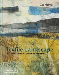
Textile Landscapes demonstrates how to develop your approach to textile art with a focus on using found objects and paint and stitch on cloth and paper. Cas explains how to exploit the contrast between the hands-on textural quality of working with fabrics and threads and the spontaneity and movement of brush marks to lend a painterly quality to your work. She begins with the basics – keeping a sketchbook to generate ideas, painting and stitching on cloth and on paper and working digitally; Inspiring Landscapes looks at natural and urban space, the changing seasons and great landscapes as well as intimate spaces and travel diaries; Painting and Marking with Cloth explains the practical aspects of painting and dyeing cloth and how to make connections between paint, print, dye, stencil and stitch; Stitch-scapes looks at the different forms of landscape, experimenting with photographs and prints and how to translate those images using ink, stitch, abstract and collage techniques and then at how to transform the image using digital techniques; On Closer Inspection covers using elements and details from landscape and the environment as found objects and for research; finally People and Place explores the relationship we have with the outdoors and the built environment, as well as personal interpretations of place. The book includes artworks by the author that explore the UK, USA, Europe and Australia, as well as works by other internationally renowned textile artists. A creative guide ideal for textile artists of all levels – students, teachers and practising artists and makers – to make unique and beautiful work inspired by the world around us.
Sie lesen das E-Book in den Legimi-Apps auf:
Seitenzahl: 152
Veröffentlichungsjahr: 2023
Das E-Book (TTS) können Sie hören im Abo „Legimi Premium” in Legimi-Apps auf:
Ähnliche


Contents
Introduction: An In-between World
About This Book
Cloth, Colour & Mark
A Common Language
Less is More: Sampling and Exploration
Making a Mark
Paper
A Little Bit About Colour
Stitch-scapes
Painting with Cloth
Choosing Materials and Media
Cloth and Paper as a Ground
Crossing Boundaries
A Flexible Canvas for Paint and Layers
Laying Out a ‘Dry Collage’ in Cloth
Colouring Fabric
Monoprinting
Stitch-Print Plates
Screen Printing
Breakdown Printing
Inspiring Landscapes
Connecting with the Landscape
Landscape and Gardeners
Capability Brown: A Textile Trail in Stitch with the Embroiderers’ Guild
Paths and Mapping
Travel Diaries
Edges of Australia
Creating a Rolled or Folded Journal
Sweeping Landscapes
‘Un-traditional’ Appliqué
Land and Sky
The Known and Unknown
Seen and Unseen Worlds
Land and Water
Re-claimed Landscapes
Woods and Trees
Red Trees
On Closer Inspection
Plant Gatherers and Collectors
Investigation and Gathering
The Stitch-Mark Palette
People and Place
Making Our Mark
1944: A Landscape of Memory
The View From Above
In Ancient Footsteps
Location
A Sense of Space and Time
The Fabric of Our Landscape
Uncommon Spaces
Hanging and Presenting Works
Concrete and Cloth
Conclusion: Textile Artists Don’t do Landscape
Bibliography and Sources
Websites and Suppliers
Index
Acknowledgements
Introduction:
AN IN-BETWEEN WORLD
With a focus on the landscape, nature and everyday subjects, my application of image, material and media has been described as ‘painting with cloth’. Yet my work does not readily fit into the edges of a canvas or frame, nor does it recognize the division of medium usage that often defines the world of painting or textiles. This liminal space is a rich and challenging ‘in-between world’ where many artists, designers and craftspeople operate. It is a place where the media, traditions and techniques normally defined as ‘fine art’ or ‘craft’ is constantly being eroded and challenged.
By way of explanation, according to the Oxford English Dictionary the word ‘liminal’ comes from the Latin word limen, meaning threshold, relating to a transitional or initial stage of a process, or occupying a position at, or on both sides of, a boundary or threshold. A liminal space is the time between the ‘what was’ and ‘what will be’, a place of transition, waiting, and not knowing.
The narratives of landscape have been portrayed by artists in a variety of styles from photographic and representative to the more impressionistic and abstract. The depth and tactile nature of textiles and the manipulation of materials literally adds another dimension to the surface, which is particularly apt when trying to portray the shapes and forms we see in the landscape as it unfolds around us. In turn, the texture, details, shapes and colours of the outside world provide an infinite stimulus for the artist to draw upon.
The significance and value of the part landscape plays in art and design crosses cultural, historical and geographical boundaries, but before the 18th century, landscape as a subject was not awarded the same importance and popularity that it has today. Indeed, to earn a living Thomas Gainsborough was obliged to paint portraits, and in a letter written in 1767 he wrote, ‘I’m sick of portraits and wish very much to take my viol-da-gam [an early cello] and walk off to some sweet village, where I can paint landskips [sic] and enjoy the fag end of life in quietness and ease.’
Gainsborough’s love of landscapes is clear from his famous portrait of Mr and Mrs Andrews (now in the National Gallery, London); the charmingly depicted couple who commissioned the painting is tucked away to one side of the painting, with the rolling landscape beyond dominating the canvas. It was not until the influence of artists such J.M.W. Turner and John Constable as part of the Romantic Movement of the late 18th to mid-19th centuries, with its emphasis on an ‘emotional response’ to nature, that the landscape became a significant subject for painting. Turner’s love of light and colour later developed into pieces that appear almost abstract in concept and application. The spontaneity and freshness of Constable’s outdoor sketches often have greater appeal to the modern eye than the more carefully worked studio paintings.
North Kent Marshes. A series of pieces looking at the familiar landscape of Kent when passing by train to London, a place where much of the ‘industrial landscape’ borders wildlife reserves. The layers include an old apron and a tea towel.
Around the same time that Constable worked in Suffolk, in neighbouring Norfolk, the Norwich School of painters become established (1803–33). Led by John Crome and John Sell Cotman, the largely self-taught, working-class artists created distinctive paintings rooted in their response to the landscape of Norfolk. I grew up admiring their depictions of the wide-open skies and flat fenlands and waterways of East Anglia in the collection at the Norwich Castle Museum. The soft, broad washes of colour and simple lines were entirely suited to the medium of watercolour, and in style they anticipate French Impressionism.
John Sell Cotman, Acle Flats and Marshes. Watercolour in the collection at the Norwich Castle Museum.
THE REVIVAL OF TAPESTRY
Woven tapestries featuring allegorical themes or scenes of aristocratic life, in common with painting, were designed as a ‘canvas’ to display on bare walls in order to be admired; they provided insulation during winter, as well as decorative interest. During the Middle Ages tapestries were the most expensive and highly prized of the decorative arts. The Mystic Hunt of the Unicorn, commissioned by Historic Scotland as part of a refurbishment at Stirling Castle and woven by West Dean Tapestry Studio in West Sussex, formed part of a project to re-create The Unicorn Tapestries (1495–1505) held in the Metropolitan Museum of Art, New York. The richness of the figurative elements is similar in effect to that of oil painting as influenced by the French style. The landscape, incidental to the story of the hunt, is beautifully worked and takes place within a closed garden, rich with woven millefleurs the small botanical detail popular in the late medieval period. Studio Master Weaver Katharine Swailes investigated not only the image to be worked, but also the working practice of a weaver at the loom, which included the complexity of matching yarn colour with a bespoke palette mixed at West Dean Studio’s dye laboratory. She describes how this connected her to the original weavers and the landscape they worked in.
The Start of the Hunt, Mystic Hunt of the Unicorn, woven at West Dean Tapestry Studio.
During the weaving of The Start of the Hunt [2002/2004], I had a daily commute to the Tapestry Studio at West Dean College along a woodland footpath path. It was interesting that during the spring and early summer months I saw the same flowers at my feet as the ones I was weaving: violet, wild strawberry, periwinkle and forget-me-not, all important players in the background of the 15th-century tapestry. These flowers have crossed the centuries, creating the same carpet in wool and in life.
Grayson Perry in The Vanity of Small Differences, a series of six tapestries that takes its inspiration from A Rake’s Progress by William Hogarth, uses similar allegorical references found in medieval tapestry. In an interview he said, ‘I usually choose a medium because of the resonances it has acquired; tapestries are grand – they hang in the vast saloons and bed chambers of ancestral piles, they often depict classical myths or military victories.’
The panels explore issues of taste and class mobility as part of life’s journey set against a backdrop of different landscapes and scenes. In the fifth tapestry, The Upper Class at Bay, the middle-aged Tim Rakewell has risen in wealth from his working-class birth and is seen, with his wife, strolling in the grounds of their mansion in the Cotswolds in an imitation of Gainsborough’s portrait of Mr and Mrs Andrew. The upper classes that the Rakewell’s aspire to be are represented by the aristocratic stag being hunted down by the forces of social change and the red dogs of taxation, upkeep and fuel bills. Perry’s work crosses art genres commenting on the social, cultural and political issues of our inherited landscape.
The Upper Class at Bay (2012) by Grayson Perry. Wool, cotton, acrylic, polyester and silk tapestry, 200 x 400cm (78¾ x 157½in). One of six tapestries from The Vanity of Small Differences woven from digital files on a Jacquard Loom by Factum Arte, in collaboration with Flanders Tapestries in Belgium.
About This Book
Our connection to the landscape and the natural world is deeply felt and meaningful and frequently appears in our art, design and writing. The same relationship can also provide inspiration for our textile art. Practical projects are exemplified by both my work and the work of some of the leading practitioners in textile art today. In references to her own collection, textile artist Diana Springall stresses the importance of looking at the work of other artists, preferably original pieces, for inspiration: ‘Basically I never set out to be a collector; I just wanted my students to see the real thing. I also used to look at what others made and thought, “I could never do that.”’
This book takes you through the broader context of working with cloth, paint and stitch as a medium to represent different aspects of the landscape. Chapter 1, Cloth, Colour and Mark, explores the connections that can be made between textiles and painting in the observation, recording and collection of material as a means to develop our ideas in relationship to the colours and forms in the landscape. Chapter 2, Painting with Cloth, explores the contrast and connection between the hands-on textural quality of working with fabrics and threads, and the spontaneity and movement of mark-making and print, to lend a ‘painterly quality’ to your work.
We turn to the core themes of this book beginning with Chapter 3, Inspiring Landscapes, which explores the legacy of the landscape as an endearing, forever-changing and sometimes challenging subject and resource for the artist. Cultural, social and political heritage of place inform the creation of ‘portable textile travel diaries’ and of larger ‘stitch-scapes’. In Chapter 4, The Known and Unknown, we look at how culture and stories lay claim to our imagination, from the mysterious beauty of trees and forest to the floating world of water. On Closer Inspection, Chapter 5, looks at landscape as a point of research and reference, and the way in which it encourages you to become your own ‘plant gatherer’ and collector of material. The increase in urbanization and the way that we stamp information on the world around us is explored in Chapter 6, People and Place, from notices and graffiti on buildings and walls, to the way we record our landscape as ‘surveillance’ locally. We conclude with Chapter 7, Location, and take a look at interventions in the landscape and built environment on a grander scale by artists who work with cloth.
A section of the installation from The Symphony of Light Kimonos, part of a series representing the four seasons, Itchiku Kubota, Japan. Exhibited at the Mariinsky Theatre in St. Petersburg in 2014.
NOTE: This book is as much a ‘Why do?’ as a ‘How to’. Techniques and processes are discussed within broad themes infused with the ideas and thoughts of the artists who have generously shared their inspiration alongside my own work.
Stitch-Scapes. Edgelands series looking at the spaces where industry meets nature. Detail revealing machine stitch and collage on paper.
CLOTH, COLOUR & MARK
To see a world in a grain of sand and heaven in a wild fl ower, Hold infi nity in the palm of your hand and eternity in an hour.
William Blake
A Common Language
For every artist, there is the what – what they make; and there is the why – the reason they are compelled to make a piece. And then there is the place where these two converge to make art. Cas Holmes is fascinated by these zones of convergence in the making of art as well as in the concrete world that inspires it. Her fascination is reflected in her work, both in its subject matter, which explores the intersections of the spaces life inhabits: the green spaces in urban areas, the verges of highways, the trees in a city park; and in its techniques of joining cloth and paper.
Everything she uses – the materials, the substrate, the techniques – are in service to her vision. ‘It’s neither material driven nor idea driven,’ she says of her work. She keeps a sketchbook, but she doesn’t sit down with an idea firmly in mind and try to make it concrete. Rather, she follows an internal thread that weaves its way from piece to piece so the whole body of work is connected subliminally about the idea.
– Ricë Freeman-Zachery
DEVELOPING YOUR VISION
In any landscape we encounter anew or are already familiar with, we build a connection. The physical experience, the way we interact with it through our senses, lodges more deeply in the mind when our interpretation is evidenced in the drawings, images, text and objects we collect. Memory becomes another layer in our work, manipulated and altered through the process of making. My small house and studio with the beautiful Mote Park on my doorstep, and the majestic views of the rolling hills of the Kent Downs from my windows and garden, provide year-long stimulus. This contrasts with the street at the front, with its cars and houses reflecting a built-up, urban environment. I am equally happy to work ‘on the move’, as I am in my studio, taking in observations and exploring the variety of materials I find on my travels for inspiration and use. Walking, making tentative marks in my sketchbook, and writing are all part of the experience of ‘discovery’, capturing an often-fleeting impression of the landscape before it changes with time, light and movement. It is a vulnerable interaction, working its way through to my conscience and informing my process. Drawing is a source of stimulation and a means of reference and reflection. Through your own observations and the recording of the things of interest to you comes the development of your visual skills and, in turn, confidence in your work.
The artist Frances Hatch who works with media directly sourced from the landscape (alongside traditional paint and pigment) reflects:
When grubbing around for tools and pigments in each environment, I make discoveries about a place that I might otherwise miss. If I return, even a day later, a different set of possibilities arise because I’m different and I’m encountering matter, water, light and air that continually fluctuate.
Norfolk Tree. The wintry and bleak feel of this piece was created using a limited palette, combining text with cloth which has been printed and stitched. The section for the sky has been created with a ‘drop cloth’ used to soak up paint and dye when printing.
Less is More:
SAMPLING AND EXPLORATION
In explaining one of the principles defining his spare, beautiful architecture, Mies van der Rohe stated that ‘Less is more’. In her sampling and application of materials, Frances Hatch uses a ‘what’s there’ philosophy, creating ‘Place Palettes’, constellations of marks on paper. As she explores a place she uses anything that makes a mark – both natural and man-made materials are recorded, named and dated. Frances takes fewer studio materials out with her these days: she trusts the environment will reveal more of what it has to offer that way.
These thoughts are worth bearing in mind when putting together art materials from which to test your ideas and create samples. We are all tempted to have just the next piece of lovely fabric, or new range of textile paints. Many of the tools and references used in painting and textiles are similar. My sketchbooks and portable drawing and sewing kits support the flow of creative ideas and observations on the move. The exploration and careful annotation of your ideas through drawings and samples in journals or sketchbooks may dictate what techniques and materials you use. The best work usually comes as a result of dialogue between idea and process, in which the connections between technique and material become more visible and that allows time for reflection and interpretation. Nigel Cheney, lecturer in Embroidered Textiles at the National College of Art and Design, describes sampling as ‘a way to answer a question through materials’.
Frances Hatch, collection of found objects to create the Cogden Place palette. These are used to inform colour choice and make marks.
Making a Mark
Any process involving the creation of your art is based on a series of choices that executes your intentions. Selecting materials and supplies is usually the first of these choices. Having too many materials can hinder the decisions you make. I carry and use as little as I need to make a mark; at all times I usually have with me a small sketchbook, basic drawing materials, scissors, glue and standard watercolour paint blocks/pencils. Koh-I-Noor paints are a good alternative to watercolour and while they are not permanent, they have a lovely intense colour. Inktense Blocks and water-soluble pencils are also a good substitute. I often use my portable media improvisationally on cloth and paper when travelling, supplemented by few basic threads, needles, pins and scissors for hand stitching.
These ‘neutral’ materials of paper, paint and drawing mediums do not readily assert themselves or have any strong meaning or connections of their own. It is the marks you make and the colours you choose that will add expression and meaning. On the other hand, gathered papers, textiles and other collage materials are more strongly determined in their ‘identity’, and carry with them inherited meanings and messages. Using gathered ephemera intentionally for their surface qualities, or in relation to concept in combination with your own mark-making, adds richness, narrative and depth to your work.
It is useful to explore the different types of mark you can make with your drawing (or textile) mediums, and while colour can be seductive, use more neutral materials or black and white in your initial explorations so you can get to grips with the textures and patterns you make. You can dedicate a whole sketchbook to developing texture and mark-making or mark grids on paper or cloth in a more systematic way. What type of mark will represent the textures and patterns you encounter most accurately?
Curved Horizontal Sharp/Soft Jagged Vertical Heavy/Light Straight Dark/Light Thick/Thin Diagonal Almost touching Dashes Scribbled Continuous/Broken Radiating Pulled Repetitive Crisp/Fuzzy Scratched Dots Smooth Circular


