13,99 €
Mehr erfahren.
- Herausgeber: The Crowood Press
- Kategorie: Geisteswissenschaft
- Serie: Small Crafts
- Sprache: Englisch
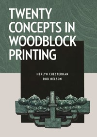
This inspiring book introduces twenty concepts for printmakers to use to enhance their work ranging from abstraction to composition, and from symbolism to boundaries. It focuses on woodblock printmaking but the principles it covers can be applied to all graphical and pictorial arts. Mainly pictorial, it includes fine examples of finished work from leading makers and students, and is a remarkable and thought-provoking addition to any maker's library.
Das E-Book können Sie in Legimi-Apps oder einer beliebigen App lesen, die das folgende Format unterstützen:
Seitenzahl: 93
Veröffentlichungsjahr: 2023
Ähnliche


Thomas Kilpper uses woodcuts/floor cuts to produce prints and also to ‘carve out pictorial traces of events of historical dimension’.
Outdoor printing at Kadoorie Farm and Botanic Garden, Hong Kong.
CONTENTS
Foreword
Preface
Introduction
1 Abstraction
2 Atmosphere
3 Authenticity
4 Balance
5 Boundaries
6 Colour
7 Composition
8 Dynamism
9 Humour
10 Impact
11 Lettering
12 Light
13 Memory
14 Motif
15 Perspective
16 Quality
17 Shape
18 Symbolism
19 Theme
20 Tradition
Contributors
Acknowledgements
Index of Terms
Index of Artists and Works
FOREWORD
Woodcut is our most primary, ancient means of communicating and deserves the lively attention of this book. For centuries artists have recognised that carving light out of the dark surface of a woodblock allows a graphic drama quite distinct to the medium. Woodcut offers limitless scale, whether the tiny block of Gwen Raverat’s The Marsh (page 109) or Thomas Kilpper’s expansive carved floor of The Ring (page 41), the expressive potential of the block knows no limits.
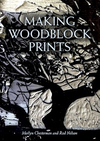
Merlyn Chesterman and Rod Nelson have a long commitment to woodcut. Whilst their earlier book Making Woodblock Prints is instructive on the technique and craft of the process, Twenty Concepts in Woodblock Printmaking sets out a structured approach to the more elusive question of what makes a print compelling to look at. It’s no accident that artists are attracted to the organic surface of a woodblock; it magically bears the evidence of its growth and infers the organic life of the tree. The connection with nature is vital to many of the artists featured in the book and central to the authors’ own approach. This book is rooted in their own experiences of making woodcut prints, and their appreciation of the natural world and its wonders. Both authors have a strong affinity with their local landscapes, which resonates in their work.
Twenty Concepts in Woodblock Printmaking is a generous book, the authors skilfully guide the reader through twenty concepts sharing their knowledge and skills as experienced printmakers and educators. As they explain,
The idea for this book sprung out of teaching people how to make woodblock prints. Quite often, one sees how a student’s print is positively transformed by simply introducing an aspect they hadn’t thought of. Their delight at seeing their own work unfold to exceed their own expectations is one of the joys of teaching.
What is it that makes an image arrest the eye and live on in our memory? This book takes the reader on a journey to plumb both the expressive power of woodcut and the emotional and unconscious self.
Emma Stibbon RA
July 2022
The block being cut for Breezy by Merlyn Chesterman. The finished print can be seen on page 130.
PREFACE
As teachers of woodblock printmaking, as well as practising printmakers, over more than twenty years we have seen a great deal of work in the medium of woodblock print, some of it very fine, by our students. Taken as a whole, their range of subject, technique, and expressive skill is very broad. This book presents what might be described as a vocabulary for the practising printmaker, with the purpose of raising points of interest for artists when considering their own work. Our intentions are to be poetic/provocative rather than prosaic/instructional. So this is not a ‘How to do it’ kind of book (this was the central theme of our last book entitled Making Woodblock Prints); rather, this book is a ‘Have you thought of this?’ essay. Although it is written with woodblock printmakers in mind, we would like to think that some of the observations might well apply to other graphical or pictorial arts.
The inspiration for Twenty Concepts is a book called The Elements of Eloquence by Mark Forsyth. The book’s starting point is the contentious premise that Shakespeare was in the first instance no more than a run-of-the-mill playwright of his time, whose first three plays did not in any way stand out from the crowd. According to Mark Forsyth’s book, Shakespeare (fortunately quite early in his career) discovered or was introduced to ‘rhetoric’ which is the art of persuasion codified in ancient Greece into a series of literary concepts or linguistic strategies which will bend an audience to the will of the speaker. From this fascinating notion, the question came to our mind, ‘If there is an accepted range of techniques and tricks that raise the power of the word to another level, might it not be possible that the same could be true for the visual arts?’
Our focus is on one particular artistic medium, woodblock print, and within that limited scope, this book is our effort to describe a visual equivalent to rhetoric.
Merlyn Chesterman and Rod Nelson
INTRODUCTION
This book is mainly pictorial. The pictures need to speak for themselves, and we have been frugal in providing artistic commentary. In thinking how to use this book, we ask the reader to consider for a moment a metaphorical spice rack. It holds numerous little jars of beautifully flavoured bark, leaves and seeds. A good cook will learn how to create delicious and interesting tastes by using these flavours in various ways and different combinations. This mythical cook would not dream, for instance, of putting the whole lot of the spices into a single meal. The cook will develop knowledge of when, how, and in what quantity to use each particular flavour in order to achieve a desired result.
Just as with this rack of spices, this book is a range of concepts from which different flavours and atmospheres can be selected, played with, and judiciously used with the intention of enhancing the work at hand. It contains examples of work by some of the finest woodblock printmakers in the world today, but also work by students for whom this might be their first print. The work that is shown is almost exclusively in the medium of woodblock print.
A NOTE ABOUT MATCHBOX IMAGES
Each concept starts with a picture of a matchbox cover printed from a woodblock from Eastern Europe or the Far East. Although this might appear to be breaking our self-imposed rule of ‘woodblock prints only’, our conviction is that even if they aren’t, they could well have been woodcuts. These delightful images illustrate the freshness and inventiveness of this tiny art-form.
CONCEPT 1
ABSTRACTION
The word ‘abstract’ derives from the Latin to ‘pull away’ – ab/trahere.
But to what does the ‘pulling away’ refer? Is it to pull away from realism? Is it to pull away from reality? Although these questions may seem excessively etymological, here the root of the word brings insight into the topic.
The question as to what is ‘real’ and what is ‘not real’ takes one to a subjective realm. Abstraction often invites the subconscious mind to ascribe meaning to a shape or a form, whether the artist intended this meaning to be there or not.
The art of abstraction lies in the creation of an image that, despite being consciously untethered from imitation of anything that might be called ‘realistic’, stimulates an emotional or intellectual reaction within the viewer.
Realism, which might be described as a depiction intended to be a version of the real world, is harder to achieve in woodblock print than in painting and certainly in photography. Therefore, almost every woodblock print is to an extent pulled away from reality by its very nature. The unreality is a by-product of the fact that the woodblock artist has to work in a particularly indirect way by cutting a block to convey ink to a piece of paper and by working in horizontal reverse. This makes it almost impossible for all but the most obsessed realist to hold onto any kind of visual likeness. It is the unrealism of woodblock print, the almost enforced artifice of it, that makes it such an appealing medium. Its disadvantages and its limitations become its very character. When the artist chooses to move more into the abstract, and further away from any attempt to portray some kind of reality, then some powerful changes happen in the work. It can become a sort of Rorschach experience, where the viewer can find all sorts of cues that resonate with their own state of mind at that moment.
Everyone thinks they know what ‘abstract’ means, and though they may know it when they see it, they might find it surprisingly hard to accomplish for themselves. It is one of the greatest challenges to do well. As a working hypothesis for a definition of doing well here is a suggestion: ‘The ability of an image to tickle the eye in such a way as to provoke the sub-conscious mind to find meaning’. Abstraction needs to be grappled with, print by print.
Matchbox, Japan. A lovely balance of shape and colour.
Peter Green RE (b. 1933), Summer Red Form, 1970, 49 × 67cm.
Eminent printmaker and teacher, who ‘with limited time for printmaking, began to explore, out of necessity, direct and simple methods of printmaking which allowed him to produce large numbers of prints produced within short periods of work. His prints were made without using a press (applying pressure with a roller or burnishing with a rag pad or Japanese style ‘baren’ – or even walking on the larger prints!).’
Rebecca Salter PRA, Into the Light 2, 78 × 52cm. (Photo: FXP Photography/Yale Center for British Art)
Rebecca Salter studied traditional woodblock printing in Japan, and is the author of a book on the subject. She is interested in ‘the notion of a dialogue between Eastern and Western aesthetics, artistic practice and architecture’. She is President of the Royal Academy (2022)
Merlyn Chesterman RE, Hartland Rocks, 2018, 23 × 30cm.
When the old chairs from St John’s Music and Arts Centre, in the small town of Hartland where I live, were going to be taken to the dump (woodworm), I said I would do it. I dismantled them, keeping the elm seats. They had been Sunday school chairs and there was a lot of pink bubble-gum on the undersides, telling of long mornings. This block had a particularly good pattern, and after wire-brushing it to bring up the grain, I printed it in order to see what it might come to represent. In the end, just the cutting of a silhouette of rocks was enough – and there was a ready-made seagull wheeling above the water.
Hegel suggests that the proper function of art is the harmony of abstraction and reality.
PROFESSOR KLAUS VIEWEG
Rod Nelson ARE, Study in Blue, 2015, 45 × 60cm.
‘Sometimes I like to throw myself into a completely experimental way of making a woodcut, usually without the slightest idea of where I am going or what the end result will be. This is one such effort, which retains some aspects of formal composition.’
Janet Cathey, Wind on the Water, 2021, 30 × 25cm.
Janet lives in Randolph, Vermont. She has been printmaking since 2013, and has been concentrating on woodblock printmaking since 2017. Carving the block is her favourite part. Her inspiration is patterns in nature, especially patterns created by interactions between light and water. Wind on the Water was inspired by a windy day at Boscastle Harbour during a visit to North Devon and Cornwall.
Rebecca Salter PRE, Shadow Cast, 2015, 54 × 50cm. (Photo: FXP Photography)
Rod Nelson ARE, Falls, 2020, 14 × 48cm.


