11,99 €
Mehr erfahren.
- Herausgeber: Batsford
- Kategorie: Geisteswissenschaft
- Sprache: Englisch
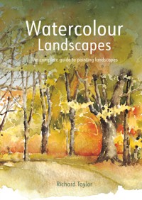
This book is the perfect companion for the watercolour landscape painter. Richard Taylor looks at each element of the landscape in turn. He moves from small details, such as a quick painting of his backpack, drawn in a break from walking, to wide sweeping panoramas. Detailed annotations point to key areas of interest for each painting showing, for example, how a wash has been used to create shadows in still water, or how paper has been left blank to represent the tops of clouds. Alongside each painting you'll find the palette of colours used, with advice on combining colours for best effect. Step-by-step demonstrations show basic watercolour techniques in action and longer projects reveal how Richard develops a fully-realised painting. Packed with invaluable hints and tips and illustrated with the author's inspiring watercolours, this book is perfect for the beginner or more experienced watercolour painter.
Das E-Book können Sie in Legimi-Apps oder einer beliebigen App lesen, die das folgende Format unterstützen:
Seitenzahl: 247
Veröffentlichungsjahr: 2021
Ähnliche


CONTENTS
Introduction
Tools and Materials
Techniques
CHAPTER 1: Hills and Mountains
CHAPTER 2: Skies and Clouds
CHAPTER 3: Forests and Woodlands
CHAPTER 4: Lakes and Rivers
Index
INTRODUCTION
The natural world always has, and, I believe, always will be one of the greatest sources of inspiration to artists.
It is, however, neither essential nor desirable to always paint a landscape – the elements that make up a landscape are certainly worthy of individual studies within their own rights. This is where sketchbook studies become important. A few visual notes made with a pencil on the texture of a gnarled oak trunk, or a ‘thumbnail’ sketch of a moored boat on a calm lake can be of immense value – especially to our understanding of the smaller features of the landscape. Armed with this knowledge of the component parts we can begin to consider composing the larger scene.
Then we can absorb ourselves in the activity of making a watercolour landscape painting – not necessarily a photographic image, as these can look unnatural in the hands of painters, but a personal response to the beauty of the landscape in which we find ourselves.
This book is intended to guide you through the stages of producing a landscape painting from first sketch to the finishing touches – I hope you enjoy the challenges and the rewards that come in between these stages.
TOOLS AND MATERIALS
This book is intended as a reference guide to help you when painting different aspects of the landscape. This chapter therefore looks at some of the tools and materials that I find most useful to carry with me when working outdoors.
TOOLS AND MATERIALS
When selecting your tools and materials it is important to bear in mind that they need to be portable and suitable for outdoor use.
Start by choosing your paper. Sketchpads are the most useful – in particular those that are ringbound, as they give a hard-backed surface on which to work. These sketchpads come in a wide range of types and sizes – I prefer a 210 × 297 mm (8¼ × 11¾ in) or 297 × 420 mm (11¾ × 16½ in) pad of at least 300 gsm weight watercolour paper. This is best as it allows me to use a lot of water in the knowledge that the paper will stay reasonably flat and not ‘cockle’.
It is also advisable to carry a small pocket-size drawing pad for making quick pencil sketches and notes of the linear and tonal structure of the subject matter before starting work on the finished picture. Sketching in monochrome can often be a very useful method of assessing and analyzing the tonal values of your subject without getting too concerned with colour at an early stage. Various tools can be used for drawing in monochrome: graphite sketching pencils are the most useful to carry in your sketching kit. These can be divided into two categories – standard drawing pencils and water-soluble pencils. Sketching pencils are very soft graphite pencils with thick leads, and are good for making quick, bold sketches. They are readily available and come in a wide range of grades – B is the hardest grade used by most artists, and 6B the softest for practical use.
WATERCOLOUR PENCIL STUDY
You can utilize the water-soluble and the graphic/linear qualities of water-soluble pencils particularly well when sketching rocks and boulders. Building up a series of tones becomes great fun using these highly portable materials.
PADS AND SKETCHBOOKS
Watercolour and cartridge-paper pads are essential for outdoor use, because they are compact and allow you to keep all of your work flat and held together. They can be used for visual notes to remind you of the scene, and personal thoughts, as well as for more ‘finished’ paintings (which are rarely completed on-site).
WATERCOLOUR AND PENCIL (opposite)
The translucent qualities of watercolour paints allow them to work particularly well with pencil – not just as guidelines. You can also enhance a watercolour painting by drawing a few well-chosen lines on top of a dry wash.
USING THE PAPER
Watercolour can be particularly effective in producing sharp highlights – leave a flash of the white paper showing through the initial wash to allow your paintings to ‘sparkle’.
TRAVELLING LIGHT
A few selected pencils are a valuable asset to your sketching kit – carrying too many only complicates matters, as you have to think about which ones to use. Graphite pencils come in a variety of grades. Artists usually make use of the B (soft) grade pencils: 6B is the softest and gives rich, dark tones, while B is the lightest and offers a subtle range of greys.
Water-soluble pencils make a normal graphite mark, but have an additional quality – the mark can be washed over with water to produce a soft, watercolour-type grey tone. Water-soluble pencils are available in different grades, although these are usually limited to soft, medium and hard.
There are many advantages of tonal sketching. First, try squinting by half-closing your eyes – you will see a simplified, tonal version of your subject. By recording these tones you will see where the dark, medium and light areas of your composition are before you begin to paint. Second, you can draw or make a sketch on any type of paper – you can even use water-soluble pencils effectively on drawing paper. Third, sketching materials are easily portable – you can slip a pencil and a small pad into your pocket wherever you go.
When drawing and sketching, practise your techniques – hold your pencil in two different ways. To sketch a quick outline, hold your pencil as you would if you were writing, and draw with the tip. However, when you want to shade or block in an area, you will need to change your grip. Place your finger along the length of the pencil so that you draw with the edge of the lead. Each style of drawing serves a very different purpose, and it is well worth practising to master each style.
Sometimes it is a good idea to make a few ‘visual notes’ using coloured pencils to capture the nature of your subject – the colour, shape and structure, for example – especially when you are short of time, or in an inhospitable environment.
Standard coloured pencils are highly effective for sketches. They are available in a large range of colours but I strongly recommend that you limit yourself to seven: deep green, sap green, olive green, yellow, raw sienna, burnt umber and ultramarine.
Water-soluble colour pencils are much softer than standard coloured pencils as they are solidified sticks of watercolour pigment. They create highly textured marks when used on watercolour paper. They are, however, most effective when water is washed over them, turning the pigment into watercolour paint. You can also dip them into water and use them to draw directly onto painted areas, darkening such sections as you choose – again, this is something that you will need to practise and experiment with to discover the method of working that suits you best.
PAINTS AND BRUSHES
Watercolour tins come in a variety of styles. I prefer no more than 12 pans – these colours are included in most sets, but you can buy replacements to create your own personal palette. Some tins include a brush, but you may choose to carry a selection of your own preferred brushes.
You can use palette lids for mixing colours.
Synthetic brushes are the best type to take out on painting expeditions. Modern ones are close in quality to natural-hair brushes.
It is a good idea to carry a small plastic water dipper in your bag, rather than taking bottles of water – you will rarely need that much to paint with. Dippers can be purchased singly from art-supply stores, or sometimes are included as part of a watercolour tin or set.
A small watercolour tin that holds pan paints fits easily into a pocket, and I can change the colour pans to suit the mood of the day and the subject matter. These tins often come with a retractable brush, and more elaborate models sometimes have a small water container built-in as well. I keep my selection of brushes simple – I use one large wash brush, one medium and one small detail brush (all round-headed), plus one flat-headed or chisel brush. For outdoor expeditions I use synthetic brushes as these are a perfectly acceptable alternative to animal-hair brushes, and are considerably cheaper to replace when lost. However, I do use natural sable brushes when working in the studio. All of my outdoor painting items are kept in a strong canvas backpack that can withstand rough treatment in hilly or mountainous environments.
WATER-SOLUBLE GRAPHITE PENCIL STUDY
The harshness of cliff and rock faces are complemented by the cold, slate-grey tone created by water-soluble graphite pencils. These combine the tonal qualities of 4B–6B pencils with the softness of watercolour washes.
TECHNIQUES
The techniques for painting skies, mountains, forests and lakes are as varied as the types of landscapes you are likely to find in any part of the world. This chapter, however, is concerned with a few of the ‘key’ techniques, which, with a little practise, you will be able to master fully. Once you have done this you will be able to apply these techniques to any situation that you wish to paint, making it your own.
GRADUATED WASH
The one thing that you can’t help but notice when standing in open, rolling countryside is that the hills in the far distance will usually appear to be lighter in tone than those closer to you in the immediate foreground. To help to record this sense of space and distance, you can apply a graduated wash across the landscape and, when this has dried, identify the physical features of the landscape by painting onto the established ‘underpainting’.
The first part of the graduated wash involves applying water to the entire ‘ground’ area with a large brush. Before this has time to dry, apply a watery wash of raw sienna and, using side-to-side brushstrokes, pull the paint down towards the base of the composition. Then, quickly, create a mixture of sap green with a hint of raw sienna (this prevents the colour mix from looking too unnatural) and reverse the process. Apply the green paint to the base of the paper and pull the paint upwards, still using side-to-side brushstrokes. This will blend with the raw sienna underwash, creating a covering of paint that goes from light on the horizon to dark in the immediate foreground without any obvious break.
CREATING A GRADUATED WASH
1Lightly dampen the paper with clean water. From the top of the paper, wash raw sienna down towards the centre using a smooth, unhurried side-to-side motion.
2Next, from the base of the paper, apply sap green and a touch of raw sienna and wash this upwards using the same motion as with raw sienna. When the two colours meet, allow them to mix naturally.
DISTANT HILLS
This spring scene was alive with the movement of shadows cast by clouds scudding across the cool sky. The muted tones of the distant hills change subtly towards the foreground.
FORMAT
Traditionally, artists have had to make a major decision before embarking on a painting – should they paint the subject on a ‘landscape’ (horizontal) or ‘portrait’ (vertical) format. Often the subject will dictate the answer, but this is not always the case. Most sky paintings suit a landscape format. However, it is worth experimenting with different formats, as the unexpected can often have much more visual impact.
Landscape is the traditional format for paintings containing large areas of sky or panoramic views, and has the advantage of allowing a wide-angle vista to be painted, enhancing the feeling of open spaces. This format also allows more room for expressive brush work through vertical brushstrokes, but considerably more vigorous brushstrokes can be developed along the length of the horizon to record movement in clouds. Overall, the landscape format conveys a general feeling of calm and tranquillity.
The portrait format, however, can produce a much more exciting, visually dynamic composition. The height of this format allows a very ‘high’ view of towering clouds to be painted, enhancing the effect of ‘pressure’ on the horizon. This can often be used to dramatic effect when painting storm clouds or clouds with a great amount of ‘height’, allowing for more attention to be given to specific cloud shapes than an overall ‘sky’ view.
LANDSCAPE
The broad, landscape format is traditionally used by artists for expanses of sky and land.
PORTRAIT
This format, when applied to landscapes, is often used to add impact to the visual dynamics of the composition.
USING DIFFERENT BRUSHES
Understanding and learning to use colours is very important for painters but it is equally important to understand the implements used for applying these colours to paper – brushes.
There are many types of brushes available in art stores, and they all have their uses, but a simple choice of just three or four brushes will be all that you could ever need for painting out of doors in ‘out of the way’ places.
The most important thing to remember is that different brushes make different marks — this is the key choice that you need to make: do you choose a large brush which will hold a lot of water and deposit this in a swathe of paint that will run and bleed onto wet paper, or do you choose a small brush that will make marks similar to thick pencil lines? Both have a valuable role to play in the painting process — but when to choose each brush?
Usually, your choice of a large brush will be for laying a background wash where little detail is required — a large brush helps you to complete this quickly without any fussy brushstrokes.
A smaller brush will be used more frequently in the foreground where the detail will be sharper and cracks in rocks, and the individual shapes of pebbles and stones can be suggested with much more control over the flow of paint.
DIFFERENT BRUSHES
1A large brush will effortlessly cover a large area of paper, leaving no evidence or suggestion of brush marks.
2A small brush will create a very different finish. As they hold less paint they have to be reloaded frequently. These are best for ‘drawing’ fine details.
ROCK FACE
The sheer scale of these rock faces was intimidating at first but it is easy to become totally absorbed in the painting process and to forget such things. A large brush was used for the solid rock and a smaller brush for the detailed cracks and fissures.
BLOTTING AND SPONGING
Light clouds can either be created by leaving an area of white paper and painting around it, or by allowing paint to flood the entire sky and then removing some of the wash while it is still damp by sponging or blotting.
When you first look at your sky and begin to plan your composition, it is important to identify the size of clouds and exactly how much of the composition they will take up. Once you have done this, dampen all of the paper and apply the sky colours. These paints will run and bleed quickly, so make sure they are applied to the area directly around the clouds. Within seconds the sky colour will have bled into the tops and bottoms of the areas that you wish to make into clouds, so some of this paint will have to be removed.
Timing is important at this stage – if you wait too long the paint will have dried, but if you try to remove the paint too soon you will only remove the surface water, leaving the paint to bleed into the damp paper. Wait until a ‘sheen’ appears on the paper – this will tell you that the surface water has been absorbed and that the fibres of the paper are still damp and that any paint can now be soaked up or blotted accordingly.
BLOTTING
Kitchen paper can also be used to remove wet paint, but this is much harsher and leaves very clear marks, making it more suited to creating moving, wispy clouds with definition.
SPONGING
Using a sponge to mop up, or remove, watery paint from watercolour paper leaves a soft edge around the sponged area and is suitable for creating summer clouds.
CLOUD SHAPES
The different types of clouds form a major part of this scene. Although the differences are subtle – the larger cloud on the left and the softer, hazy cloud on the right – they are still very much a part of the sky.
POSITIVE AND NEGATIVE EFFECTS
Sometimes the colour value (the strength or lightness) of a sky is influenced by the objects in the immediate foreground of a composition – the darkness of a spring day can be enhanced by including white sheets blowing in the wind, for example – the light objects making the sky appear darker. Alternatively, a soft, hazy sky can be made to appear even lighter and more distant by including a dark tree in the foreground – the darker this is, the lighter and more distant the sky will appear to be.
LIGHT AGAINST DARK
Light against dark is a tool that artists often use to create impact in their compositions. Objects, such as washing billowing or silver tree trunks – even white houses – are best left largely unpainted as the clarity of white paper is always sharper than white paint.
DARK AGAINST LIGHT
Dark shapes against light tend to have a calm and reassuring effect on a composition. It is always best to paint the sky and the background first, as this will give you some visual features against which to judge the tone of the foreground object – if it is too light the object will appear soft and undefined, but if it is too dark it can produce a silhouette.
Negative shapes occur when the object in the foreground appears lighter than the background. Whilst it is possible to create these lighter shapes by applying masking fluid before overlaying a wash, it does produce shapes with unnaturally hard edges. Even though painting around the lighter shape will disturb the natural flow of the sky, it is worthwhile in order to achieve softer edges. By first painting around the negative shapes with water this will help to create a smoother application of colour.
Positive shapes stand out clearly against a sky, usually dominating the foreground with their presence. These shapes need to be painted onto dry paper as the sharpness of their form is critical to the success of the painting. Use a small brush and try not to overwork the shapes as this will diffuse the sharpness required.
Hills and Mountains
FOOTHILLS
The far distant sight of violet-tinged, softly rolling hills is one that invariably makes artists want to reach for their watercolour tins. The soft greens of these gentle terrains combined with the natural siennas are a pleasure to paint in any season, and in most weather conditions – torrential rain, of course, excepted!
TONE AND DISTANCE
The effect of distance, evident in all panoramic landscapes, is best created by the use of tone – that is making colours lighter in parts and darker in other areas.
Sometimes it can be helpful to practise creating tones by using just one colour (monochrome) or even with a grey-toned, water-soluble graphite pencil, looking to ensure that the tone always increases from a light distant background to a considerably darker foreground.
When you feel that you are happy with creating tones with single colours, then try mixing some colours, such as the violets that often appear to cloak distant hills, and again, create as many different tones as you can. This can be done either by changing the balance of the paint mixture to darken the tone, or by diluting with more water to lighten it, creating a tint.
PENCIL STUDY
Water-soluble graphite pencils are highly portable and excellent for making quick preliminary sketches.
MONOCHROME STUDY
A single colour tonal study helps you to ‘see’ the range of tones that you will need to create in a composition.
CHANGING TONES
The effect of distance is conveyed in this painting by lightening the tone of the overlapping hills as they recede.
The linear qualities of the old trail, vanishing into a range of soft violet hills, illustrates the way that a sense of perspective can be created on a flat surface.
ADDING WATER
Experiment with single colours at first — how much water can you add until you lose the colour completely?
MIXING COLOURS
Now try mixing colours. This introduces a new element. How much of each colour do you need to mix to alter the tone?
TONAL MIXING
The variety of green tones required to paint a well-lit hillside landscape can be extensive – for this reason it is a good idea to practise using a manufactured green and altering the tone to both light and dark. Sap green is a particularly good colour for this type of exercise. On its own it is not a particularly ‘natural’ green, but this can be altered easily without losing the clarity of the colour. Add cadmium yellow to the sap green to produce a lighter green, seeing how far you can take the tone (by adding water) before it becomes almost invisible. Then, work in the other direction. Add ultramarine to sap green and see how dark you can make the colour whilst still maintaining a hint of green.
Once you can do this, you will be more than ready to paint grass-covered hills in any lighting conditions.
GREEN TONES
Adding darker and lighter colours to an existing ‘medium’ colour can provide a wealth of different tones for use in landscapes.
HIGHLIGHTS
The contrast between the highlights on the tops of the hills and the shadows in the valley made this particular scene very appealing to paint.
Dark tones can be used when painting hills to help define specific shapes. A shadow painted ‘behind’ a small hillock will usually push it forward into the middle ground or foreground.
Highlights in the landscape, often seen when directional sunlight is hitting patches of ground, are best created by the addition of yellow to the grass mixture.
SHADOWS
Watching clouds roll over the far horizon, casting shadows across the open hillside, is a wondrous sight to observe. It can, however, complicate the issue for painters. Suddenly, you find that you need a much wider range of greens to cope with the transient effects of the weather.
It’s time now to practise extending the potential of sap green, cadmium yellow and ultramarine by the addition of burnt umber – try as many combinations as possible and compare these with greens created by mixing your own greens from blues and yellows.
Also, you will find that introducing olive green into the far distant hills (mixed with a touch of raw sienna) at the graduated wash stage will increase the tonal variety. Paint with as many of these greens as you can when establishing the basic green of the hills. When this has dried, mix the darkest and use a small brush to ‘draw’ the shadows onto the green paint surface.
CHANGING LIGHT
The way that the light fell onto these rolling hills, changing tone and thrusting flashes of highlight forward, required an instant response to the scene.
The hills in the distance need to be applied freely with a large brush — they should also contain an element of blue or violet to ensure that they ‘sink’ into the background.
The foreground greens need to ‘sparkle’ a little to suggest a sharper focus — even dark greens can be bright. This is achieved by not mixing muddying browns in with them.
ALTERING A PROPRIETARY GREEN
Cleaner and fresher greens can be created by using a proprietary green as a base and adding yellows, blues and browns to alter its values.
MIXING GREENS
Try creating your own greens by mixing different combinations of blue and yellow – they will often turn out to be ‘muddy’ colours.
BACKPACK STUDY
Having come this far along the trail, through the foothills and lush meadows, it is perfectly acceptable to sit down and take a break. This could, however, be seen as a waste of painting time!
Instead you could take a few moments to make a sketch or two and why not turn to your equipment?
Most modern backpacks are designed with personal safety in mind and are, therefore, usually very bright colours, creating a marked contrast with the olive greens and soft violets of the landscape.
Cadmium orange is a good colour to use as a base, adding cadmium yellow to create the lighter patches, and using ultramarine and alizarin crimson for the shaded areas. Subjects like this are best painted onto dry paper – this allows you to achieve some broken brushstrokes as the paint drags across the textured watercolour paper surface, allowing highlights to develop naturally, adding a slightly old and ‘well worn’ appearance to the backpack.
QUICK STUDY
The slightly battered and faded look of this well-used backpack added to its ‘character’ and ultimate appeal as a subject for a quick sketchbook study.
Most mountaineering or trail-walking equipment today is designed to be spotted from a long distance – cadmium orange was the ideal colour for this backpack.
The edges of the rucksack were highlighted by leaving them unpainted, allowing flashes of white paper to show through.
A purple colour mixed from ultramarine and alizarin crimson was applied to the damp cadmium orange underwash to create the shadow colours here.
ROCKS
Sooner or later, you will leave the soft green foothills behind and encounter rocks and boulders. This is a much harsher environment where the soft shapes and tones of the hills give way to hard cracks and fissures. These require not just different colours, but different brushes and a whole new, sharper way of painting.
ROCK FACES
The very nature of rocks and crags means that you do not have to concentrate quite so much on colour – more on form, shape and suggested detail.
To paint a group of rock faces, start by loosely pulling a wet brush loaded with raw sienna across dry paper, covering the entire rocky area. The result will be an uneven covering of paint with several white flashes of paper showing where the brush has not fully covered the paper. These flashes will act as highlights along the rock edges.
FLAT-HEADED BRUSHES
1A large, chisel-headed brush will create a very broad sweep of paint, with excellent covering power.
2Use a small chisel-headed brush on its side to produce much sharper, linear marks which are particularly suited to sharp rock faces.
Next, mix a dark, stone-coloured wash using raw umber, burnt sienna and ultramarine and quickly wash this onto the shaded or darkest areas of rock that you can see. As long as the underwash is still slightly damp this will dry with soft edges.
When this has fully dried, you can start to paint the sharp shadows underneath the rocks and in between the cracks and fissures with a darker mix, using the tip of a small brush to obtain really sharp foreground definitions.
STREWN BOULDERS
Whilst a collection of so many rocks and boulders may initially appear off-putting, the painting method is not so difficult as it might seem – the key is to make the underwash work for you to ‘suggest’ the different textures.
The tops of flat rocks are best created by simply leaving the underwash to show through and creating the three-dimensional effect by painting the sides of the rock.
Cracks are best created by ‘drawing’ onto dry paper with the edge of a chisel-headed brush, or the point of a small brush, using a colour mixture of burnt umber and ultramarine.
STEPPING STONES
The main feature of these stepping stones is the way in which water has been used to create a wealth of wet-looking textures.
By applying clean water to drying paint you can achieve this effect – the water pushes the paint outwards, breaking up its regular drying pattern, scattering the particles of paint. As they dry, so the ‘watermark’ can be seen, providing an appearance of wetness and texture. This is a particularly appropriate technique to use when painting stepping stones, or any rocks and boulders in or on the edge of rivers.
REFLECTIONS
Observe how the shadows at the base of this boulder follow the gradual curve of the rock – work onto damp paper to help create this smoothness in your painting.
Highlights in the water ‘lift’ this study and are created by painting around tiny flashes of white paper.
The boulder colours are reflected in the water with the same colours as the boulders, but much diluted.
FAST-FLOWING WATER
Highlights and shadows are more predictable on these rounded rocks than on harsher rock faces. Watermarks – created when wet paint is applied onto dry paint – suggest texture.


