13,99 €
Mehr erfahren.
- Herausgeber: Crowood
- Kategorie: Geisteswissenschaft
- Sprache: Englisch
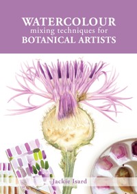
Colour mixing is a key skill for the botanical artist. In this practical guide, Jackie Isard explains how to observe and use colour accurately. She shows artists how to make informed choices when selecting pigments, as well as how to learn about colour mixing and its application. Detailed instruction and advice are given on understanding colour and pigments. The author explains how to 'see' colour and tricky mixes, from greens and reds to the difficult botanical greys. Includes advanced colour application techniques - colour enhancement, shadow colours and colour temperature transition. Finally, step-by-step guides illustrate how to paint with layers, how to use underlaying colours to enhance, and colour and fine detailing.
Das E-Book können Sie in Legimi-Apps oder einer beliebigen App lesen, die das folgende Format unterstützen:
Seitenzahl: 156
Veröffentlichungsjahr: 2021
Ähnliche
WATERCOLOUR
mixing techniques for
BOTANICAL ARTISTS
Cherry 'Chocolate ice' autumn leaf.
WATERCOLOUR
mixing techniques for
BOTANICAL ARTISTS
Jackie Isard
First published in 2021 by The Crowood Press Ltd Ramsbury, Marlborough Wiltshire SN8 2HR
www.crowood.com
This e-book first published in 2021
© Jackie Isard 2021
All rights reserved. This e-book is copyright material and must not be copied, reproduced, transferred, distributed, leased, licensed or publicly performed or used in any way except as specifically permitted in writing by the publishers, as allowed under the terms and conditions under which it was purchased or as strictly permitted by applicable copyright law. Any unauthorised distribution or use of this text may be a direct infringement of the author’s and publisher’s rights, and those responsible may be liable in law accordingly.
British Library Cataloguing-in-Publication Data A catalogue record for this book is available from the British Library.
ISBN 978 1 78500 829 0
Acknowledgements
My thanks and gratitude must go to my closest family, David and Tyler, for their patience and belief in me throughout my botanical career.
My special thanks must go to all those who have supported and helped me to develop along my journey; Billy Showell, Robert McNeill and Fiona Strickland.
Contributors
Thank you to the following artists for allowing me to use photographs of their coursework within this publication; Renata Barilli, Susan Brunner, Lisa Chernyavska, Hilde de Hondt, Vivienne Rew, Vicky Sharman, Sue Stuart and Nathalie Wallace.
Contents
Introduction
WHY IS COLOUR SO IMPORTANT TO ME?
I am passionate about colour and I have written this book to help botanical artists make informed decisions when mixing watercolour pigments.
My journey into botanical illustration came from a love of plants and gardening. After many years as a graphic designer I was made redundant and decided to take a garden design course in the hope of pursuing a new career. Learning about plants species, Latin names, soil types and how to put all this together into a beautiful garden design brought me closer to plants than I had ever been. I began to realize I had left nature and my art behind me during my working career and needed to revisit it.
Faded Protea neriifolia ‘Snowcrest’ by Jackie Isard.
Jackie Isard BA (Hons) SBA Fellow CBM ASBA.
I always enjoyed art and drawing from a very young age. My lunch hours at school were spent in the art room from the age of eight. I didn’t think I was very good at it and it wasn’t until 2014 that I took up the paint brush again and tried my hand at painting botanical. Painting plant subjects has brought me closer to nature and there are some plants I really treasure; these are wild flowers.
My garden path has turned into a botanical journey. It is wonderful to be able to describe the beauty of nature on paper with watercolour and since I began, my paint brush has been glued to my hand! As a graphic designer I learned a great deal about colour accuracy and how to visually communicate ideas. Although graphic design is a completely different field to botanical art, the disciplines are very similar. All the skills I learned have been very useful but in different ways.
• Observation – Line, Shape, Colour, Botany
• Balance – Size, Proportion, Form
• Rhythm – Texture, Composition, Detail
Observation is definitely key in botanical art and balance and rhythm just as much so. We observe, we compose, we paint! To the botanical artist, colour is a very important part of the painting process. Recognizing and mixing colour accurately is much easier when using learned skills and keen observation. The more you look, the more you will see. Each painted subject will be a new learning experience.
Colour mixing is one of my favourite parts of the painting process. You can mix so many different colours with just primaries. On my watercolour mixing courses I introduce students to mixing with primaries only. They are astounded at what they can achieve with just primary warm/cool pigments and the difference it makes to a painting. I discovered over time that there was much more to colour mixing than one realizes and a great deal to be taught. There is so much that can be achieved by learning these techniques too; building up colour in layers, adding underlay shadow tones first, overlaying and underlaying thin soft glazes to enhance colour and getting the balance right with transition of colour temperature from warm to cool. It inspired me to write this book and share all this knowledge with you.
During my botanical career I have very much enjoyed teaching. I like to think I inspire, encourage and give confidence to my students. To me, the enjoyment of teaching is that happy moment when a student suddenly grasps a technique or mixes a perfect colour. I just love to teach!
The content of this book is based on Winsor & Newton Professional Watercolour pigments but the theory can be applied to any brand. I hope it will help you make informed choices when selecting pigments as well as learn all you need to know about colour mixing and application techniques. I have endeavoured to describe this in the best way I can. I have also added useful information about the painting process I use when making decisions about colour in step by step guides.
The author teaching at Brackenwood, Bristol.
I hope this book will be helpful to many and a much needed resource for learning about mixing watercolour.
A little history about pigment
Sir Isaac Newton (1642–1726) was the first person to enlighten us to the spectrum of colours. He developed a series of experiments, which he published in 1672. He started with the rainbow and set up experiments to find out why white light splits into these different colours. The experiment was conducted by shining a white light through a glass prism. The light split into red, orange, yellow, green, blue and violet. It is from these experiments that he determined a theory that red, yellow and blue were the primary colours from which all other colours are made. Newton developed a basic colour wheel to which he added secondary colours, violet, orange and green. In 1708 he devised a circular diagram, which became the model for many colour systems in the years to come. Later, tertiary colours were added by other experimentalists to complete the colour wheel we are familiar with today.
Newton’s Colour Wheel.
Moses Harris (1730-1785). In his book The Natural System of Colours (1769–1776), Moses Harris described the multitude of colours that can be created from the three primaries (red, blue and yellow). He explained to us how all the colours are produced from primaries in his version of the colour wheel. I think he did an amazing job! The circular diagram was hand-painted and drawn up to explain how all colours meet at their darkest point in the centre of the circle and show the many mixes in between each of the true primaries. The wheel has eighteen colours – primary, secondary plus the in-between colours. At the centre he shows the shades (darker values), and at the outer edge, the tints (lighter values). It is very cleverly designed and explains much more than the basic colour wheel we are familiar with.
Harris’ colour wheel showing the spread of colour with tints and shades.
It is a known fact that there are many colours which never will admit of being mixed together: which are these: green and red, yellow and purple, blue and orange, but if the colours so mixed are possessed of all their powers, they then compose a deep black, as all opposites in either system or scheme will do… therefore no colour or teint can be formed by a connection so unnatural…
Moses Harris, The Natural System of Colours. (1766)
Johann Wolfgang von Goethe (1749– 1832) published a book called The Theory of Colours in 1810. In it he created a version of the colour wheel designed to describe their natural relationships to one another. As he explored colours he related them to emotions and attributed different qualities to certain colours. The red–orange–yellow area of his colour wheel he named ‘schön’, ‘edel’, and ‘gut’ respectively, which meant beautiful, noble and good. He considered yellow a bright and exciting colour so named it ‘good’. Red stood for gravity, dignity and attractiveness or beauty. Orange he considered to be noble. An interesting take on colour where emotion is concerned and very relevant to graphic design, which uses colour to entice specific customer markets. For instance, what does the colour purple say to you in the food industry? Yes, yummy chocolate!
Watercolour dates back to prehistoric man who made earth pigments and mixed them with water to create cave paintings and body paint. Ancient Egyptians also used water-based paints to decorate the walls of temples, tombs and papyrus. They used natural resources such as ochre, malachite, lapis lazuli, chalk and cinnabar, which were ground into a powder and mixed with gums or animal glue.
Medieval and Renaissance artists painted frescos with water-based pigment onto freshly applied plaster. Michelangelo’s Sistine Chapel was painted using this method. Often historical botanical paintings were etched and hand coloured by the artist.
Should your glance on mornings lovely Lift to drink the heaven’s blue Or when sun, veiled by sirocco, Royal red sinks out of view – Give to Nature praise and honor. Blithe of heart and sound of eye, Knowing for the world of colour Where its broad foundations lie.
Johann Wolfgang von Goethe (1749–1832)
Albrecht Dürer (1471–1528) was the first Renaissance master of watercolour. Dürer painted in great detail and produced some beautiful botanical works. At the beginning of the sixteenth century he was painting plants with great botanical accuracy. It was at this time the plant world was being introduced to new oriental species. Before this time most plants were only recorded as paintings in herbals for medicinal recognition. Eleven of Dürer’s works are kept at the Albertina in Vienna. Among them his beautiful Colombine painting, the well-known Great Piece of Turf, exquisite Peonies and his stunning Iris Troiana. Albrecht Dürer also made wonderful drawings of birds and animals.
Other historical watercolour artists of interest are Maria Sibylla Merian (1647– 1717), Franz Bauer (1758–1840), Pierre-Joseph Redouté (1759–1840), and Ferdinand Bauer (1760–1826).
Franz and Ferdinand Bauer were pioneers in botanical art. Franz contributed to the classification of the orchid species and used a microscope to produce detailed drawings. Ferdinand travelled to Australia where he made hundreds of detailed pencil sketches. Many of the plants he drew were unknown species. He used this collected reference material to paint his incredible watercolours, which are now preserved in the Natural History Museum, London.
CHAPTER 1
Equipment and Materials
ESSENTIAL EQUIPMENT FOR THE BOTANICAL ARTIST
Paper: Paper quality is very important, as we all know. You will have chosen your favourite brand. However, for my style of painting I prefer the following papers: Fabriano Artistico HP Extra White or Arches HP Bright White. A good quality paper gives better colour vibrancy and smoother detail, which is essential to the botanical artist. Papers behave differently and you may need to adapt your painting style accordingly.
Palette: A good palette makes a difference. A flat ceramic palette or porcelain plate is best. Plastic palettes leave you chasing the paint around them and will drive you mad! There’s no hard and fast rule but I recommend ceramic palettes.
The author's working set up.
My regular brushes.
Brushes: Brushes are also important for botanical painting. There are many brands out there and it can seem confusing. You can end up buying so many different types through recommendation. Choose a brush you feel comfortable with and that works well for you. I do recommend that it is full bodied and has a good pointed tip. For fine detail it is essential to have brushes like this as they hold a lot of paint and will not run out on you as quickly. There is nothing worse than having to top up your brush after every stroke! A pointed tip is perfect for fine details.
Sable and synthetic are available in different brands. My favourite brushes are Raphael Kolinsky 8408 series pointed sable in sizes 2, 4 and 6 (equivalent to Billy Showell’s sable series). I also use the Billy Showell synthetic Eradicator brush and her Fine Liner brush. I sometimes use a Rosemary and Co. series 81 filbert for blending. I have a cheap ¼ inch Cotman flat brush for mixing with. It’s best not to use your good brushes for this.
Winsor & Newton Series 7 brushes are also excellent. Isabey make similar brushes. The Isabey 6227z is full bodied and pointed. The 6228 has a fuller body and is pointed too. Personally, I prefer the pointed tips on the Raphael 8408 especially for very fine detail.
Professional pigment: Always use professional watercolour paint. Choose transparent/semi-transparent pigments for vibrancy and translucence. My preferred brand is Winsor & Newton as I find them extremely reliable and lightfast. Daniel Smith are good pigments and Sennelier have some wonderful pigments too. Select your pigments from watercolour brand colour charts first so you can see the pigment colour index numbers, whether it is transparent or semi-transparent and of course if it is lightfast. There are more details in the following chapter to guide you. Most of these charts are available to download free from the internet.
My magnifying glass.
Magnifying glass: You will need a good-quality magnifying glass. There are some good magnifying lamps too but I prefer a hand-held magnifier. Call me old fashioned! This piece of equipment will enhance your vision to enable you to see all those colours and fine details more clearly.
Crop of Winsor & Newton colour chart.
Lighting is essential.
Lighting: You will need very good lighting. To achieve absolute accuracy with colour and fine detail, this part of the equipment list is essential. A good-quality anglepoise daylight bulb lamp will assist with seeing shadows, contrasting areas, colour temperature transition and fine detail. There are many on the market but anything between 5500K and 6500K daylight bulb will be fine. 5500K 90cri is the nearest to daylight.
I have invested in two LED strip lights across my studio ceiling as the room is on the shaded side of my house. I also use an anglepoise to light my subject. The smaller the subject, the closer the lamp needs to be. A foldable LED light is good for this and also handy to take with you when travelling. You will instantly see a difference!
Backing board: A white folded board or box takes away outside influences from window sunlight and surrounding items around your work station. This makes the light more directional and gives a constant source.
Pencils and pens.
Drawing equipment: Choice of pencils is a personal thing but I always use Faber Castell 9000 series. These pencils are the best for graphite work too. I have a propelling pencil with a 0.3mm H lead that I use for transferring my drawings to watercolour paper when using a light pad. For erasing I use a Tombow mono zero refillable eraser pen. It’s great for erasing out small details, as the nib is more precise. You can shape the end to a wedge too for very small areas but take care as there is a plastic rod through the middle. For fine liner drawing I use Pigma Micron 003 pens. They are archival and waterproof. For masking out fiddly details I use a Joseph Gillot reversible mapping pen. It is brilliant for making fine veins and dots. You must be careful not to damage the surface of the paper with the nib though as it is sharp. Practise with it first; you will need to get used to it.
Other bits include water pots, a smooth burnishing stone, cloth to wipe brushes (a damp flannel or piece of linen), masking tape, Faber Castell kneadable eraser for taking off excess graphite when tracing up a drawing and a desk easel to work at an angle – better for your back!
CHAPTER 2
Understanding Colour and Pigments
THE IMPORTANCE OF KNOWING WHAT’S WHAT
Colour index names
Pigment is the main ingredient for all the paints we buy. All these pigments have properties which include lightfastness, transparency, opacity, granulation, saturation and staining. You will find some symbols on the side of your tubes or pan labels. The pigments are represented by a colour index name and a number for the particular pigment used. Yellows – PY (Pigment Yellow), Oranges – PO, Reds – PR, Greens – PG, Blues – PB, Violets – PV, Browns – PBr and Black – PBk. Some pigments have more than one colour index name. Have a look at your paint tubes to see. If you have unlabelled pans then you can look up these codes and details on the relevant paint company websites. Bear in mind different brands vary even if they appear to have the same pigment name. The index colour numbers will tell you if it is the same colour make up or not.
Primary pigments.
I have made a chart in my paintbox that tells me pigment properties, transparency and lightfastness details. I don’t list the P numbers as I look this up before buying a new colour. Single pigment colour is essential for good mixing. Daniel Smith pride themselves on this. The number of pigments you mix together, outside of three, will affect the colour mix you make. All but three of my chosen pigments are made from single pigment colour index numbers and all are Winsor & Newton professional watercolour. Two of them have two colour index names. New Gamboge has a little PR (red) and Indian Yellow has a little PO (orange) added. I would usually only mix these colours with single pigments. Quinacridone Gold has three colour index numbers, red, violet and yellow, so I would only mix this with a single pigment colour such as Winsor Violet to make more muted beige/brown tones. Using it with pigments that have more than one colour index will dull the mix a little. Quinacridone Gold does, however, make some beautiful muted/earthy greens when mixed with blues and great beige tones when mixed with Winsor Violet.


