8,39 €
Mehr erfahren.
- Herausgeber: Batsford
- Kategorie: Geisteswissenschaft
- Sprache: Englisch
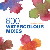
- All you need to know about mixing watercolours - Explores all the different colour mixing techniques including palette mixing, overlaying and wet-into-wet - Provides a visual source of over 600 watercolour mixes - Fully annotated paintings throughout demonstrate the colours and mixes used. Colour is fundamental to painting and the ability to mix and reproduce specific hues is an art in itself. Colour theory can be dull and complicated, but in this book, experienced artist and teacher, Sharon Finmark, demonstrates colour mixing in a practical and easy-to-follow way. In addition to being an extensive visual sourcebook to nearly 600 colour mixes, there are paintings featured throughout with all the different hues and mixes in each painting analysed and annotated. In this way, watercolour painters learn by application how to get the best out of their paints.
Das E-Book können Sie in Legimi-Apps oder einer beliebigen App lesen, die das folgende Format unterstützen:
Seitenzahl: 45
Veröffentlichungsjahr: 2013
Ähnliche


More Great Titles from Batsford
STORMY SKY Very warm complementary colours were used in the foreground to convey a sense of distance. The sweep of Permanent Rose at the horizon lends drama to the scene.
FRUIT AND VEG Red and green create a wonderful contrast. Notice how just a touch of the red provides relief from the varieties of green.
CITY ROOFTOPS Although composed of subtle earths and neutral colours, the shadows are vital in this painting. They hint at the complex labyrinth of streets and emphasize perspective, especially from a ‘bird’s-eye’ view.
Contents
Introduction
1 Your basic palette
2 Colour relationships
3 Colour properties
4 Mixing colour
5 Neutral colours
6 Colour, light and shade
7 Finding your subject
Index
INTRODUCTION
A well-stocked art supplies shop can send a novice artist well-nigh dizzy with excitement. There will be ranks of beautiful brushes and a range of papers on display – and, of course, rows of tempting pigments in luscious colours. However, succumbing to the temptation to buy every colour that makes you itch to use it will not make you a good artist; that will come from learning how to use a much smaller palette with skill.
Understanding colour
Our response to colour is very personal, depending on our preferences. However, it is generally accepted that certain colours have a particular psychological impact on us, so to produce works that evoke an emotional response in the viewer an artist must understand how to use colour effectively.
With watercolour, you have access to a very versatile range of colours. A transparent quality can be achieved simply by diluting your pigment in water; with plenty of dilution you can produce the palest and most delicate of washes or you can choose instead to use the pigment straight from the tube to give intense, brilliant colours. The colours of the tubes or pans in your paintbox invite you to use them just as they are, but you will soon want to mix your own colours too.
A painting gains unity and coherence from a limited range of colours, so resist the temptation to buy a lot of pigments – it is better to choose carefully and mix the additional colours you need. You will see from the paintings in this book how wide a range you can achieve from just a few pigments.
CASUAL NUDE WOMAN A limited palette was used to create the lovely warm skintones in this nude study.
THE LANGUAGE OF COLOUR
The language used to describe paint is often confusing, but don’t let that concern you too much – just practising and seeing what the colours produce will help to make everything clear. The terms below are ones you will commonly encounter.
Achromatic Lacking true colour; black, white and grey are considered to be achromatic, or neutral.
Adjacent/analogous The colours that neighbour each other on the colour wheel; for example, a colour scheme that used reds, oranges and yellows would be described as analogous.
Colour family Colours of the same hue, such as the range of reds or blues.
Complementary The colours that are opposite each other on the colour wheel, such as yellow and violet (see here).
High key/low key Bright, light colours are described as high key; subdued, dark ones are low key (see here).
Hue The name of the colour, such as yellow or blue.
Monochromatic A painting made with just one colour in different tonal values. In traditional watercolours a painting was often begun using only browns and was then overlaid with colour. Today, a monochromatic underpainting is more commonly used in oils and acrylics.
Neutral Greys, browns, earth colours and similar mixes are known as neutrals (see here).
Saturation The intensity of a colour.
Shade A darker colour of the original hue.
Tint A colour lightened with white. This is more often used in gouache, acrylics and oils. Watercolours work better applied transparent and luminous, so the paint is usually made a lighter colour by adding water.
Tone The lightness or darkness of a colour. Some colours will always be lighter than others; the deepest yellow will not be as dark as a deep blue, for example, but a paler blue can be the same tone as a yellow.
Value How light or dark in tone a colour appears.


