5,99 €
Mehr erfahren.
- Herausgeber: via tolino media
- Kategorie: Geisteswissenschaft
- Sprache: Englisch
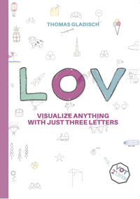
BE COURAGEOUS AND VISUALIZE! Many people are convinced that they are unable to “draw” nice enough in order to express themselves. This is true for both the private life as well as professional settings. But there’s no need for beauty or perfection. It’s all about expressing yourself and making yourself and your ideas understood by others! Using three letters everyone can write, many different objects can be sketched easily. And the one who not only describes his/her idea but also creates supporting visualizations is able to convey it way easier and win advocates! No matter if you’re looking at workshops, explanatory videos or learning to sketch your ideas - just give it a try and practice your sketching skills using L, O and V. Now packed with over 200 examples, LOV helps you in taking the first step towards simple and easy-to-understand idea visualizations! All examples are sorted by categories and you'll be given an introduction on how to combine each sketch and turn them into storyboards. The world is full of things that represent the basic shapes of L, O and V. It’s all about you and LOV! What readers said about the first edition "VOT - visualize anything with just three letters": “…the book is exactly what you call hands-on: it helps you bringing your ideas to life with simple shapes!” 5-star amazon.de review “After reading it, I look at designs differently. I keep on asking myself which letters they consist of.” Head of UX Chapter
Das E-Book können Sie in Legimi-Apps oder einer beliebigen App lesen, die das folgende Format unterstützen:
Veröffentlichungsjahr: 2024
Ähnliche


IMPRINT
Author: Thomas Gladisch, Kirschbluetenstrasse 62, 65201 Wiesbaden, Germany
Print: tolino media GmbH & Co. KG, Albrechtstr. 14, 80636 München, Germany
Fonts: Aileron by Affirmer. Creative Commons Public Domain CC0Herr von Muellerhoff by Alejandro Paul, SIL Open Font License
Copyright © 2024, Thomas Gladisch, 2nd edition 2024
First published as VOT - visualize anything with just three letters
This publication is protected by copyrights. All rights reserved. Usage of texts or images, also in parts, without the author’s permission is copyright infringement and will be prosecuted.
All company, product and hard- or software names mentioned in this publication are trademarks by the respective owners and are protected by trademark, brand and patent law.
The publication has been created with great care. However, the author cannot be held responsible for any damage that might occur in context of using this publication.
Thomas Gladisch
LOV
Visualize anything with just
three letters
Why This Book and Why LOV?
Welcome to LOV — visualize anything with just three letters! Thank you so much for your interest in expressing yourself visually!
Since you're reading this, you have most likely noticed that the book isn't called VOT 2nd edition or anything like that. Why?
Many people asked me what VOT stands for when they held the first edition in their hands. I thought a lot about it and more than "Visualisieren Ohne Tränen" (OK in German) or "Visualize (with)Out Tears" (rather bumpy in English) didn't come to my mind.
But as I'm really passionate about visualization and helping others to overcome their anxiousness of potentially failing at „drawing“, what's more straight forward than using the best thing in the world, LOVE, as a starting point into the world of sketching?
The L is a perfect half of a square, so substituting the T with an L was the obvious choice. What about the E? If you look very closely at the geometric structure of the E, it's just three tiny L's stacked on top of each other. And did you notice that you only need two fingers to visualize each letter of LOV?
What’s new?
The book has evolved. A different basic shape, simplified existing and tons of new examples sorted not by letter but by categories such as construction, transportation or animals. A new section gives you an introduction to the creation of storyboards including examples of how the LOV-based visualizations can be combined to explain even more complex ideas.
The most important thing I’ve learned is that the simple idea is so versatile – why just keep it for workshops and professionals? Some readers even told me that their kids are using it to practice drawing! I regard this as the biggest compliment I can ever get.
Why this book?
Because it’s not about beauty or perfection when trying to convey an idea or being creative.
Workshops should focus on working creatively and solution-focused instead of taking care of personal sensitivities. Same is true for your personal creative sessions. It’s about you and your ideas and not about pleasing others.
There are, of course, people who visualize almost everything but don’t use their sketch to bring an idea to life. A former client of mine once drew the following sketch on a flip-chart. Can you tell what it is?*
It’s not about the either/or but rather about making yourself understood. A written word doesn’t visualize what you meant and a scribble doesn’t explain what’s been said. It doesn’t have to, because the combination of visual and acoustic perception allows for a common understanding of what’s been meant in the first place.
Thus, this book shall be of help especially for those who shy away from visualizing their ideas, because they are convinced that they “don’t draw good enough”.
Thing is, there’s nothing to be good at. When sketching ideas, there’s no right or wrong. Almost every visual addition to a written word is helpful to explain your idea to others.
Thing is, there’s nothing to be good at. When sketching ideas, there’s no right or wrong. Almost every visual addition to a written word is helpful to explain your idea to others.
What’s This?
*It is supposed to be an “interview funnel” to show that one gets closer to the project goal by interviewing stakeholders from different hierarchy levels of the company.
The concrete use case of a visualization is secondary. Every workshop, every presentation and every explanatory video becomes more vivid and is better understood when adding visual details to it. By the way – this is also valid for all types of sketches and even for invites, such as birthdays or weddings or if you want to get started learning to draw!
For those having to deal with hesitant meeting and workshop participants, the book shall be argumentative support. Support in helping the participants to take the first step in visualizing their thoughts.
And even if you’re just curious in gaining more self-confidence in your personal drawing skills, LOV will help you to get started!
Everybody who is able to write is also able to visualize. To support things graphically and that way help other people to not only hear what’s being said but also understand what’s being meant.
The rule is simple: Just get started, it’s easier than you might think. Three letters are all you need!
Please consider this book as food for thought. It doesn’t claim completeness.
Enjoy the book and have fun visualizing your ideas using just three letters!
Whatever you do, do it with LOV!
Thomas
"I can’t draw" often leads to empty bullet lists, empty sketching areas or blank pages.
A Brief History of Writing
Our writing, as we know it today, is rather young and just came up about 1500 years before Christ. It was the Phoenicians who gave the loosely attached vowels a rigid order. The alphabet was created. Starting with “aleph” (as alpha in Greek and our A) and “beth” (beta in Greek and our B). Aleph meant ox and beth meant house.[1]
It was Johannes Gutenberg who made writing available to the broad public in the 1450s through his invention of the printing press.[2] Over the course of time, the printing press evolved into the term of block letters, which many use as their hand writing. It is defined “...a sans-serif (or "gothic") style of writing Latin script in which the letters are individual glyphs, with no joining”.[3]
Entirely different is the cursive handwriting. Cursive “... is used with many alphabets due to infrequent pen lifting and beliefs that it increases writing speed”[4] and is often questioned. No matter if you personally think learning and using cursive is helpful or not.[5]
Hence, writing is the most obvious choice to express yourself visually. But is it also the best?
Example of block letters using Aileron
Cursive letters example using Herr von Muellerhoff
No, because there are research findings proving that content can be better conveyed if it addresses multiple senses.[6]
What does this mean?
We turn the evolution of writing upside down and go backwards. Away from the combination of vowels of today’s alphabet and back to cave paintings. Depending on the location and duration of workshops and meetings the term cave paintings has a certain unintended humor. We don’t simply say or write down ox and house, but sketch them and make ourselves understood by others.
So why now L, O and V?
L, O and V represent the basic geometric shapes used in block letters and the argument “you can write, so you can also visualize things” is the simplest possible! No excuses!
Besides that: Square, circle and triangle doesn’t sound really tangible.
Making Lines Come Alive
Even though the good old flip-chart is more and more challenged by (often times even virtual) sticky notes, a larger format is always useful for placing things in a room. Especially when it comes to anchoring things visually over longer periods of time, a large format visualization supports in creating a certain presence.
A good flip-chart needs just three (and a half) things:
1. A frame to hold it visually together (a frame, no black border!).
2. A content focus (ideally a clear headline).
3. Objects that (visually) stick to the chart.
4. An optional background color to emphasize the contents on the flip-chart.
However, don’t forget that it’s not about perfection. Just getting started scribbling is still the best and easiest way forward.
Frame
When picking a frame, it’s mainly about not creating a black border. An alternative can be easily designed. No matter if it’s a pillow, circles or broken lines.
Focus
A clear headline gives the visualization a good content focus. Large letters and a well legible writing style are important.The focus can raise attention using styled letters and can be nicely combined with objects in order to underline the flip-chart’s content.
Objects
Single objects on the canvas can be simply black and white. Using horizons, shadows and colors they come to life and we can emphasize items.
The Ingredients
1. A frame to hold it visually together (a frame, no black border!).
2. A content focus (ideally a clear headline).
3. Objects that (visually) stick to the chart
4. An optional background color to emphasize the contents on the flip-chart.
Let’s Get Started
As said before, everybody is able visualize things. Just by scribbling them. One only needs to be courageous and give it a try.
The most effective way to learn something new, is to try it out.
So simply write down an L on a piece of paper. And one more and another one and even further ones. Turn it, stretch it, make it bigger, smaller and add more L’s.
Same goes for the O, since drawing a circle where start and end connect perfectly is far from easy. But an O can also be egg-shaped or shaky.
Also the V has a simple basic shape. Only two strokes, done. But are they even straight? Doesn’t matter. Just start again with another V and experiment.
And that’s all you need to prepare for a workshop or start sketching an image.
A short intro to the three letters and warmup drawing exercises can be found on the following pages.
So let’s get started!
Visualize anything with just
three letters
It’s not about beauty or perfection.
It’s about simplicity.
It’s about explaining your ideas to others.
With just three letters.
It’s about
L O V
The L
The letter L basically represents the starting point for a square. Half a square and almost a T – just the horizontal line is shorter. Besides its simple geometric shape, the L is known for being a size in clothing or the Roman number 50.
The current form of goes back to the Semitic „lamedh", which is the 12th letter of the Hebrew alphabet [7] and stands, as an abbreviation, for liter. The letter was derived from the greek lambda (λ) [8] and is regarded as the leg of Osiris, the Egyptian god.[9]
Looking beyond its origins, there are many positive character traits that start with an L. Being likable, lovable and linguistic are just a few. People whose names start with L are, according to some sources, meant to be very creative and optimistic minds.[9] These people are also supposed to have a lot of energy [10] which is actually perfect as there is a lot to discover when it comes to visualizing your ideas!
The O
The O is quite a round thing. It can be circular or egg- shaped. The highest goal is to write or sketch it so that the beginning and the end of the line match seamlessly. That way, we’re closing the circle.
Nevertheless, an O is much more than a profane circle. Danes and Norwegians are brave enough to strike it through; the Ø! However, in Germany and Sweden little dots are added on top of the O; the Ö![11]
Even though the O used to be a symbol for the eye [12], it symbolizes completeness, an end point or a finish. The idiom that something is the A and O, the Alpha and Omega, is even written in the bible.[13] Pen and paper are the A and O of visualization.
Setting end or beginning aside, go ahead and try out the O as eyes, noses, wheels, signs or planets!
The V
The letter V is a super versatile letter when it comes to visualizing things. The basic triangular shape allows for stretching and squeezing it into almost anything. It will always be a triangle. Looking at common parlance, the V is more present than one might think. We have V-shaped buildings, wear shirts with a V-neck or see brave women and men who race down ski-jumping hills in a V jumping style and show the cheering crowd a victory sign once they landed. And all who not only change light bulbs at home, know the physical unit Volt.
But there’s more to the V. Humans, plants and transportation.
No matter if made from a single or multiple V’s. Just write a V on a paper and use it as a starting point.
Buildings and Construction
An important thing to keep in mind when running or participating in ideation sessions: It's all about building new ideas. This means, leaving a workshop with a construction site and a first idea of a full-blown blueprint is perfectly fine.
When aiming for the realization of a big idea, take small steps by setting up the scaffolding first (team setup) and then move on. Brick by brick, nail by nail, screw by screw and you'll be able to turn your idea into a beautiful and sustainable result.
It all starts with your idea and LOV!
Cranes and Paint Rollers
Start with an L. (1)
Turn or mirror the L or add further ones. (2)
Add a hook or some color and both crane and paint roller are done. (3)
Using this simple principle many shapes can be created easily.
Hammer, Screws and Nails
Even though hopefully no one needs a hammer in meetings or workshops, it can sometimes be helpful to really “nail down” things. If you don’t have a nail at hand, just use a hammer to screw something in.
Traffic and Power Lines
Besides using the L as bridge pillars, it can also create image depth when varying its size. That way, power poles become smaller the farther away they are.
Scaffolding
Combining and stacking multiple L’s helps building things and shows what’s still under construction.
Ferris Wheels
The Ferris Wheel was originally built in 1893 using a steel construction. Today, it just needs a few L’s or an O and a V to create an amazing ride.
Wind Energy and Tubes
A sleek and sustainable combination of L, O and V is a wind turbine that generates energy which can then be visualized using a lightning bolt.Every tube usually has a circular beginning and end. By moving and stretching these circles, bends and curves are possible.
Buildings
Ever more new houses are being built using the classic cuboid shape of an L. Ideal for a business environment from a house to skyscrapers and factory buildings. Also a church’s nave follows this structure, although it needs some V-like structures for the roof.
Buildings
Pyramids and Eiffel Tower
A single V and some additional lines are sufficient to create tombs of famous kings.One of the world’s most iconic buildings is basically just a single V with half an O and two or more „mini“ L’s. Even simpler with one V and two O’s.
Cargo Terminals and Stadiums
A great example of V-shaped geometry are harbor cargo terminals. Same goes for a stadium’s core structure as it only needs a few L’s to build it including the respective flood lights.
Airport Towers and Lighthouses
Maintaining an overview and staying in control requires a few L’s and a V.


