9,99 €
Mehr erfahren.
- Herausgeber: Shirish Deshpande
- Sprache: Englisch
“We have more to learn from animals than the animals have to learn from us.” - Anthony Douglas Williams
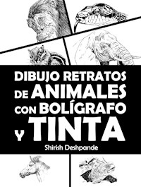
Animals are fascinating drawing subjects for most artists. Drawing lively animal portraits brings with it another level of excitement, not to mention challenges, such as bringing out that mischievous spark in a dog’s eyes or that vicious promise of impending violence in a lion’s eyes. The facial proportions of the animals, the fur or the pattern of scales on their bodies are yet other challenges difficult to master.
Not anymore.
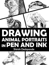
In this book, you will learn how to draw expressive and lively portraits of a range of animals, from your humble house pets to vicious forest dwellers.
What will you learn in this book?
- All about values and how they are especially important in a pen and ink drawing. How to determine the values and use them in a drawing.
- Pen and ink drawing techniques.
- Materials available for pen and ink drawing.
- Shading techniques.
- Ink painting and techniques.
- Foreshortening – the concept and its usage in drawing animal portraits.
We’ll be focusing on seven categories of animals, including:
- Elephants
- Cat family (felines)
- Dog family (canine)
- Reptiles
- Horse family
- Rodents
- Monkeys
Das E-Book können Sie in Legimi-Apps oder einer beliebigen App lesen, die das folgende Format unterstützen:
Veröffentlichungsjahr: 2023
Ähnliche
Table of Contents
INTRODUCTION
MATERIALS
Free Resource – Pen and Ink Sketching Materials Guide
SHADING TECHNIQUES
The True Value of the Values
An Important Tip About Drawing Technique
Shading Technique #1: Hatching
Shading Technique #2: Cross Hatching
Shading Technique #3: Contour Shading
Shading Technique #4: Stippling
Shading Technique #5: Random (Scribbling)
Criss-Cross Hatching – A Variation of Random (Scribbling) Techniques for Drawing Animal Fur
Free Resource – Pen Shading Techniques ‘Cheat Sheet’
Using Ink for Shading
The Drybrush Technique for Ink Painting
THE IMPORTANCE OF FORESHORTENING
Important Notes About the Upcoming Demonstrations
ELEPHANT
Profile View
Full View
Side View
THE CAT FAMILY (FELINES)
House Cat
Tiger
Lion
THE DOG FAMILY (CANINES)
A Hairy Dog
Fox
Fox Hound
REPTILES
Crocodile
Turtle
Iguana
THE HORSE FAMILY
Horse (Side View)
Donkey
Horse (Full View)
RODENTS
Chipmunk
Raccoon
MONKEYS AND APES
Chimpanzee
Silverback Gorilla (Face)
Silverback Gorilla (Full View)
BEYOND THIS BOOK…
PARTING WORDS FROM THE AUTHOR AND BONUS CONTENT
GRATITUDE AND REQUEST FOR REVIEW
DRAWING
ANIMALPORTRAITS
IN PEN ANDINK
Learn to Draw Lively Portraits of Your Favorite Animals in 20 Step-By-Step Exercises
Shirish Deshpande
Copyright ©2022 by
HuesAndTones Media and Publishing
Author: Shirish Deshpande
All rights reserved. No part of this book may be reproduced or transmitted in any form or by any means, electronic or mechanical, including photocopying, recording or by any information storage and retrieval system without written permission of the author, except for the inclusion of brief quotations in a review.
All artwork presented in this book is the copyright of the artist, regardless of whether they bear the artist’s signature or not.
INTRODUCTION
“We have more to learn from animals than the animals have to learn from us.” Anthony Douglas Williams
Humans have shared and continue to share this wonderful planet with innumerable plants and animals. When our prehistoric ancestors discovered drawing, some of their first subjects were inspired by the animal kingdom. To this day, animals keep inspiring us, we modern artists, for our drawings and paintings.
In this book, we will learn to draw various types of animal portraits using pen and ink. The word “portraits” may be somewhat misleading, as most people tend to think of portraits as illustrations of faces only. This is far from the truth. Portraits not only show the face of a person (animal in this context), but they may include some parts of the body (to convey the mood or action) or even some part of the environment where the subject is placed.
An Important Note Before You Begin
This book is meant for readers who want to learn simple, no-fuss methods to draw attractive animal pictures. This book is not meant to be a crash course in animal anatomy.
If you are looking for a guide to drawing ultra-realistic drawings, this book is not for you. If you are looking for a guide to draw well-proportioned, realistic, and lively animal drawings, this book is definitely for you.
Structure of This Book
In the initial chapters of this book, we will learn about some materials and shading techniques we can employ to draw animals. We will learn about the concept of values and learn how to use the values to our advantage. We will learn the concept of foreshortening and how it can help us draw more realistically.
We will learn about drawing a gamut of common animal types. There is virtually an infinite variety of animals on this planet, and no book can cover all of them. But I hope you will find enough interesting examples in this book. For each type of animal, we will learn to draw at least one step by step.
I will explain some common characteristics that all animals of each type have in their respective families. For example, lions, tigers and house cats all belong to the same feline family and have certain common characteristics. But they also have enough differences to warrant different demonstrations for each. If you want to draw other animals of the same family (for example, a jaguar, wildcat, puma, panther, or cheetah), you can employ the same principles we learn while drawing the three animals of the feline family.
But before all that, let’s take a look at the materials we need for drawing.
MATERIALS
If you have read any of my previous books about pen and ink sketching, you might find some repetition in this chapter. If you already have all the information you need about materials, you may skip ahead to the next chapter. If you have any questions about the materials, you can revisit this section later.
Just like the number of species of animals, there’s virtually a limitless variety of drawing material available. I will cover a large amount of that material here. But there will always be more than can be accommodated in one book.
For basic pen sketching, you need only two things: blank paper and a pen. However, we artists are never satisfied with limited materials. We always want more! So, here’s a list of all the materials that I use for pen and ink sketching. (This does not mean this is an exhaustive list of materials.)
The list of materials, just like the list of subjects, is virtually endless. But I will try to provide a starting point for your next shopping list.
Pencil, Eraser and Sharpener
Although entire sketches can be done using a pencil, here I will focus on using a pencil to do rough work, in preparation for a complete pen and ink sketch.
Pencils come in three types:
- “H” type – hard pencils which produce very light shades.
- “B” type – very soft pencils which create very dark shades.
- “HB” type – somewhere in between “H” and “B”.
Since I only use pencils for rough work in a pen and ink sketch, my intention is to erase these lines later. So, I prefer either “H” or “HB” type pencils.
Pens
There are many choices for pens, and each has its own advantages:
Ballpoint Pens and Gel Pens
These pens are very cheap, available in assorted colors and readily available. When using these, make sure you keep a spare rag nearby. These pens tend to accumulate ink near their tips, which may result in ugly dots on the sketch. Also, make sure you keep wiping the pen tip periodically before, after and during sketching.
I suggest having a white ink gel pen handy as well. These are useful for making corrections, as well as sketching light parts over dark areas.
Here’s a sketch drawn entirely using a ballpoint pen:
Technical Pens
These pens are specially made for sketching. They have built-in ink reservoirs. They are available in various tip sizes, and I highly recommend them to anyone who is serious about pen and ink sketching. Technical pens create a fixed line width, as per their respective tip sizes.
Various brands of technical pens are available. Some well-known brand names are Sakura Pigma Micron, Faber-Castell, Brustro, Artliner and Staedtler.
You may start with a set of various tip sizes and then try out various brands as you progress. The feel of each pen may vary, and you want to test out various brands before settling on one or more. These technical pens are available in assorted colors, though I mostly prefer black.
Below is a sketch drawn entirely using technical pens. Observe the nuanced pen strokes drawn with various tip sizes.
Brush Tip Pens
These pens are like technical pens, but they have a brush tip instead of a hard nib. They have a built-in ink reservoir, just like technical pens.
Brush tip pens are especially useful in creating “organic” lines. They can also be used to darken large areas of a sketch. Not only that, but they’re excellent at creating an ink effect without using ink and water. However, brush pens are a little harder to master than technical pens. They’re also available in assorted colors.
Here’s an example of a sketch done mostly using a brush tip pen. The fine hair on the nose and head was sketched using technical pens.
Fude Fountain Pens
“Fude” is a Japanese word meaning “brush”. As the name suggests, this pen works like a pen and a brush. It has a slightly curved tip, and at first glance to a new user, the tip appears broken. But this is by design. When the pen is held in a normal grip, one can draw brush-like strokes.
When the pen is held in a reverse grip, it creates fine, pen-like strokes.
Thus, one can use this pen for both broadening or tapering organic and fine lines.
A word of caution: Only use fountain pen ink in a fude fountain pen. Never use acrylic or India ink. The acrylic ink has large ink particles which get stuck in the pen nib and may ruin it permanently.
If you intend to use watercolor over the fountain pen sketch, make sure the fountain pen ink you use is waterproof.
I completed this entire cat drawing using only a fude fountain pen.
Dip Pens
Dip pens are akin to the crow quill pens used before the advent of fountain pens and ballpoint pens. A dip pen is shaped like a pen, but it does not have its own reservoir. A dip pen has a detachable nib, and typically, a dip pen is sold with several nibs of various sizes.
Since the dip pen has no ink reservoir, the nib needs to be dipped in ink and then applied to the paper. This is somewhat inconvenient to the novices of pen and ink sketching. Also, the lines may form in a much more unpredictable manner than those drawn with pens, at least in the beginning. But I promise that once you get the hang of it, you will find it somewhat addictive.
This lion portrait makes heavy use of acrylic ink, which was applied using a dip pen.
Acrylic Inks
Inks of various brands and viscosity are available for sketching. I recommend any ink which is thick and lightfast.
I use acrylic inks, preferring mainly two brands, Daler Rowney and Sumi. I have great results with both. However, you may want to try out different brands before you settle on your favorites.
Inks can be applied with watercolor brushes, dip pens, quills, or even twigs! The tools available to apply ink on paper are limited only by your imagination. These inks are completely waterproof once dry, so they can be applied along with watercolors as well.
Acrylic inks are also available in assorted colors.
Here is an example of a sketch drawn using acrylic ink. For painting the entire sketch, I used the same black acrylic ink. The ink is diluted with water to paint the gray shades.
Water Brushes
These brushes have a built-in water reservoir.
These brushes are especially useful when applying thin washes over sketches to depict soft shadows. The reservoir can be squeezed to allow water to flow into the brush tip. The amount of water can be controlled to restrict the amount of ink being dispensed. The same effect can be achieved using diluted acrylic ink and a wet brush. The advantage of the water brush is that it can be easily carried around without the need for an extra water reservoir.
Sketching Paper
The beauty of the pen and ink medium is that it can be practiced anywhere. Even a paper napkin at a restaurant table is enough for a pen sketch. However, the best results can be obtained by using the right kind of paper for the right kind of sketch. While selecting a paper, you need to consider the following things:
- Paper thickness
- Paper texture
Paper thickness is measured in GSM (grams per square meter). Without going into too much detail, it’s important to just understand that the greater the GSM specified, the thicker it is. Typical sketchbook papers are available from 50 GSM all the way up to 400 GSM.
Smaller GSM papers (70–120 GSM) are appropriate for ballpoint and technical pen work. But these papers tend to buckle when using water-based inks or watercolor. Inks and watercolor also tend to seep through these thin papers. Bigger GSM papers (upward of 250 GSM) are preferably used for ink and watercolor work.
I typically use 70–120 GSM papers for pen work and 250–300 GSM Canson or Fabriano papers for ink and watercolor work. I also sometimes use poster board paper for sketching. They are thick as well as smooth for pen work.
The extent of paper smoothness or roughness can be used to create various textures in a sketch. Technical pens work better on smooth papers, like Bristol board or poster board (modeling paper). Watercolor and ink work better on textured papers.
I drew the sketch below on ultra-smooth modeling paper using technical pens. Observe the textures created using a pen here:
I used rough-textured paper to draw the sketch below. Observe how the paper texture has been used to create a rough, gritty effect.
Free Resource – Pen and Ink Sketching Materials Guide
You can download a free pen and ink sketching materials PDF from the following location:
https://huesandtones.net/materials/
If you subscribe to my newsletter, you will get updated versions of this guide as I try out new materials. You will also receive some freebies. You can subscribe using this link:
https://HuesAndTones.net/signup/
SHADING TECHNIQUES
If you are already a pro at shading using pen and inks and would like to get straight into drawing animals, read the next section about values, then feel free to skip ahead to the next chapter (THE IMPORTANCE OF FORESHORTENING). If not, be sure to go through this entire chapter before moving on to the demonstrations.
The True Value of the Values
I welcome thee to the dark side!
Pen and ink sketching is all about understanding and exploiting light and dark areas in your artwork. These light and dark areas are called “values” in artist-speak.
Since we will be working in monochrome for the rest of this book, it’s important to understand how to use values so our sketches make sense to the viewers. Values help bring out the depth (3D effect) in our drawing done on a 2D surface (flat paper).
In any drawing or painting, the importance of understanding the values and implementing them in the artwork cannot be understated. But in the case of monochrome artwork, as in this book, the values play the most vital role in bringing out that clarity.
Let’s understand the concept of values.
Values represent the darkness, lightness and all the shades in between within a picture. Observe this image. These are two drawings from an upcoming demonstration in this book about drawing a lion.
The drawing on the left-hand side is recognizable as a drawing of a lion. But the drawing on the right-hand side feels much more alive and realistic. It also has a sense of volume to it, while the drawing on the left-hand side appears flat.
Even if we remove all the details from the drawing on the right-hand side, what separates it from the left-hand side drawing is the variety of dark and gray shades.
If you observe the drawing on the right-hand side by squinting your eyes, all you will see are the blacks, whites and grays minus the detail. These are what we call values.
When you squint your eyes, the details (and colors, if applicable) disappear, and all you can see are monochrome blobs of dark and light shapes. Once you identify the dark and light shapes, it’s easier to focus on understanding the correct composition, the sizes of various objects in the composition relative to each other and their proportions. You will also feel less overwhelmed by the complexity of the illustration.
The values in any drawing, painting or photograph remain the same regardless of whether it’s monochrome or colored. Values have nothing to do with color. They are a measure of darkness and light within the picture.
Understanding the values within a picture is extremely important when drawing anything. Values serve the following purposes:
Helps us to understand the broad shapes within a picture in a better way.
Makes our paintings more understandable to the viewer when used correctly.
Adds a certain “pop” to the paintings, meaning they can be useful in making a painting more attractive and eye-catching.
I will explain the above points in the next few pages.
When determining the values in any picture, we must observe the picture in terms of light and dark tones and any gray tones in between.
You may choose to have multiple grayscale values in your painting, like this picture of a squirrel…
…Or you may want to use only the extreme values (darkest dark and lightest light), making it a dual-value illustration.
There’s no one right way to draw. You may choose to draw using only two values or multiple values. In the various drawing demonstrations later in the book, we will use both methods so you can make these decisions for yourself.
An Important Tip About Drawing Technique
Before learning the all-important secret, let’s see where we normally go wrong.
When sketching, most people move their palms using their wrists as the pivot. This severely restricts the range of motion of the hand.
The correct way is to move the hand using the elbow as the pivot. This enables free hand movement and allows a greater range of motion. This also ensures that your hand experiences less fatigue while drawing.
Shading Technique #1: Hatching
Hatching is a very simple shading technique where we draw (almost) parallel lines which are (almost always) equidistant.
That was less of an artistic sentence and more of a legal one! Why so many disclaimers? Because there are no stringent rules about the distance between the parallel lines, and the lines don’t need to be perfectly parallel either.
