7,99 €
Mehr erfahren.
- Herausgeber: Shirish Deshpande
- Kategorie: Geisteswissenschaft
- Sprache: Englisch
Learn the magic of the toned paper in bringing your pen, ink and watercolor sketches alive!
Are you a beginner sketcher? Or are you a seasoned sketcher looking to infuse some magic in your illustrations?
Do you think that the average art instruction book omits too many steps in explaining the illustration techniques?
Then this book is for you.
Why combine pen, inks and watercolor for illustrations? And why use toned paper?
Pen and ink are the ideal tools to create mind-blowing textures and contrasts in illustrations.
Watercolor painting is appealing for the charming effects it creates but notorious for its unpredictability.
Toned paper brings in a surreal charm to the pen-ink-watercolor sketches. A toned paper can be used to create a vintage feel or to create unexpected, vivid color effects.
What will you learn in this book?
- Understanding shapes and values.
- Color theory - complementary colors, warm and cool colors.
- Composition and coloring techniques.
Of course, the real learning happens by doing, not just reading.
So, we will implement all the shading techniques and the brush techniques into ten step-by-step demonstrations.
Each demonstration will teach you how to do the initial rough pencil sketch, line work using pens, and coloring.
The ten step-by-step demonstrations will cover the following topics:
A Ladybug
We will begin our exercises by painting a beautiful Ladybug on beige paper. This is a simple exercise where we will learn to create a luster effect using white paint.
An Old Wall and Door
You will learn to create exquisite textures using pens, ink, and watercolor in this exercise.
Reflection of a Tree
You will venture to the dark side by doing our first painting on black paper. You will learn to paint loose and take advantage of the paper color.
The Waterfall
You will paint a beautiful waterfall in the jungle. You will also learn to use overlapping elements to create depth in a painting.
The Garden Steps
You will learn to simplify a seemingly complex subject and add some jazz to the painting using white highlights.
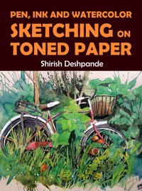
The Bicycle
You will paint a beautifully charming, yet neglected bicycle surrounded by thick foliage. You will learn to handle complex overlapping elements in this illustration.
A Path in the Forest
You will again visit the black paper in this illustration. In this illustration, you will learn an interesting technique of painting fog and creating many levels of depth in a painting on black paper.
The White Church
A painting with various elements and their complex interactions with each other. This is one of the most demanding paintings in this book.
The Yellow Boat
A simple yet beautiful illustration of a boat and the lapping waves around it. Learn to use a limited palette to paint beautiful illustrations.
An Autumn House
You will learn to declutter a seemingly overwhelming subject in this complex exercise. You will also learn to understand how to handle highly complex overlapping elements.
Das E-Book können Sie in Legimi-Apps oder einer beliebigen App lesen, die das folgende Format unterstützen:
Veröffentlichungsjahr: 2023
Ähnliche
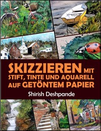


PEN, INK AND WATERCOLOR SKETCHING
ON TONED PAPER
Learn to Draw and Paint Stunning Illustrations
in 10 Step-by-Step Exercises
Shirish Deshpande
Copyright ©2021 by
HuesAndTones Media and Publishing
Author: Shirish Deshpande
All rights reserved. No part of this book may be reproduced or transmitted in any form or by any means, electronic or mechanical, including photocopying, recording or by any information storage and retrieval system without written permission of the author, except for the inclusion of brief quotations in a review.
All artworks presented in this book are copyright of the artist, regardless of whether they bear the artist’s signature or not.
Table of Contents
Title Page
INTRODUCTION
Do I Need to Be an Expert in Pen Sketching in Order to Paint on Toned Paper?
Free Resources
Materials
Transparent and Opaque Colors
SHAPES AND VALUES
How Does Painting On Toned Paper Differ From Painting On ‘Normal’ Paper?
COLORS
Warm and Cool Colors
Complementary Colors
The Colors Used for the Various Paintings in this Book
COMPOSITION AND COLORING TECHNIQUES
Foreground, Middle Ground and Background
Negative Spaces and Highlights
Using a Plastic Wrap for Applying Color
Spattering Color
Technique 1 – Flicking the Brush
Technique 2 - Spattering Color Using Brushes
Technique 3 – Spattering with a Toothbrush
EXERCISES
The Ladybug (Beige Paper – 8.5” x 5.5”)
An Old Wall and Door (Beige Paper – 9” x 12”)
Reflection of a Tree (Black Paper – 7” x 10”)
The Waterfall (Beige Paper – 9” x 12”)
The Garden Steps (Beige Paper – 9” x 12”)
The Bicycle (Beige Paper – 9” x 12”)
A Path in the Forest (Black Paper – 10” x 7”)
The White Church (Beige Paper – 9” x 12”)
The Yellow Boat (Beige Paper – 9” x 12”)
An Autumn House (Beige Paper – 9” x 12”)
MORE INSPIRATION
PARTING WORDS AND ABOUT THE AUTHOR
GRATITUDE AND REQUEST FOR REVIEW
INTRODUCTION
A Foggy Mountain Path: Beige Paper – 5.5” x 8.5”
A pen is an accessible and convenient instrument for sketching.
Ink and watercolor are often used to supplement pen sketches and/or add color to them.
Watercolor is a seemingly unpredictable medium infamous for being difficult to control.
When pen sketching and watercolor/ink come together, magic happens!
There are numerous advantages of pen and watercolor sketching. The spontaneity and the scope for happy accidents is one of the strengths of watercolor/ink. The stark value contrast and the availability of more shading options are the strengths of pen sketching.
In this book, you will learn to add one more magical dimension to this combination of pen and ink/watercolor. You will learn to paint pen and ink/watercolor sketches on toned paper.
What is toned paper?
A paper of any color other than white is toned paper. Everyone is accustomed to sketch and paint on white-colored paper. But sketching and painting on toned paper poses different challenges and produces different effects.
The result of painting an illustration on toned paper is almost surreal.
In this book, I will sometimes refer to using ink and sometimes to using watercolor. In most cases, these mediums can be used interchangeably. However, there are certain differences between their use.
The most common type of ink used for painting is acrylic ink. This ink becomes waterproof once dry. Thus, it becomes almost impossible to modify the ink blots once they have dried. Watercolor can be manipulated (to a certain degree) long after it’s applied to the paper. Ink is also brighter and more opaque as compared to watercolor.
You can find more information about ink and watercolor in the Materials section.
Do I Need to Be an Expert in Pen Sketching in Order to Paint on Toned Paper?
A Building in Italy: Beige Paper – 5.5” x 8.5”
There’s no need to be an expert, or even to have any special skills. You can be a total novice in sketching and/or painting and will still find this book helpful.
The only qualities you need to bring to the table are an enthusiasm for sketching and an open mind. Some of the learnings in this book may be contradictory to what you have learned so far (for example, you may have been told you must cover every inch of paper with color).
When explaining any technique or method for drawing/painting, I always put forth a caveat.
Whenever I explain a technique, it’s one of the many correct ways to draw/paint. It’s not the correct way.
Let that sink in for a second.
Unlike mathematics, art has many ways of achieving the same result, and all of them might be right. When I explain a technique, do not take it as a gospel truth. You may copy my technique the first time you draw to understand and learn one possibility. But you can improve your skills only by trying out different methods.
I will even encourage you to find flaws in my artwork and improve upon them in your own artwork.
With that caveat out of the way, let’s begin.
Free Resources
You may download a guide to materials for pen, ink, and watercolor sketching from here:
https://HuesAndTones.net/materials/
You may download a ‘cheat-sheet’ of pen shading techniques from this URL:
https://HuesAndTones.net/cheatsheet/
Materials
Within each demonstration, I have detailed the materials used. But here’s an overview of the common materials used.
Paper
I painted all the illustrations in this book on Stillman and Birn (S&B) Nova series sketchbook paper. This is a semi-smooth paper suitable for pen work as well as watercolor/ink work. It’s only 150 GSM thick, but it holds out nicely without much buckling, even when subjected to heavy watercolor and/or ink application. The paper also has a slight tooth which assists in creating textures.
If the terminologies in the above paragraph sound like a bunch of jargon, you are not alone! Just bear with me for some time and everything will be clear.
Many types of paper are available at any good art supplies store. You may try several types before finding the right fit for you. But here’s a rough guide of what to look for when choosing a paper type.
While selecting your paper, you need to consider the following things.
- Paper thickness
- Paper texture
Some types of paper are rough, some are smooth, and some are in-between. The roughness of a paper is also referred to as its ‘tooth’ or ‘grain’. The more tooth a paper has, the easier it is to create textural effects. Smoother paper is more conducive for sketching using technical pens. Rougher paper is better for watercolor usage.
The thickness of paper is measured in terms of GSM (grams per square meter). The more GSM value a paper has, the thicker it is.
Thicker paper is suitable for wet painting (watercolor/ink). Thin paper (smaller GSM papers 70-120 GSM) can be used if the work involves dry work (pen/pencils). Thin paper tends to buckle when wet paint is applied. Watercolor also tends to seep through thinner paper. But some types of thin paper are resilient to watercolor (e.g. the S&B Nova 150GSM paper mentioned above).
Typical sketchbooks are available from 50 GSM all the way to upwards of 400 GSM thicknesses.
Bigger GSM value paper (upward of 250 GSM) is preferable for ‘wet’ work like watercolor or ink.
Even though Stillman and Birn Nova is my personal favorite toned paper, it’s not the only option available. You may use any paper that is available to you, that you like and can afford. You may want to try out different brands of paper before you settle on a preferred brand and type.
Brushes
I use several different brushes for my artwork. I have accumulated these brushes over the years. If you do not have so many brushes, you don’t need to worry. Three to four synthetic brushes of various sizes are enough to begin with watercolor painting.
Think of having more high-quality brushes (or other materials) like having a better camera for photography. The quality of photographs primarily depends on the photographer, not the camera. If the photographer is an expert, he/she can shoot good photographs with any average camera. But, sure, they can shoot much better photographs with a better-than-average camera.
It’s the same way with brushes (or any other material). Focus on learning to making your art better. Better materials will further enhance your art. But top-of-the-line materials are not a prerequisite for beginning your learning.
Fan brush (the first brush on the left-hand side)
This brush is useful for painting soft edges in a painting.
Flat brushes (first three brushes after the fan brush)
I use these brushes to paint big, sweeping strokes for large washes. They are also useful for painting straight lines for buildings etc.
I have used flat brushes extensively in the following painting.
A Night in Tokyo: White Watercolor Paper – 12” x 16”
Round Synthetic Brushes
These brushes are useful for painting all kinds of shapes. You may use different brush sizes depending on the area you want to paint.
Most paintings can be painted using 3-4 brushes.
I use synthetic brushes for all my paintings. Better quality and long-lasting brushes made from animal hair are also available in art supply stores. The best quality (and the most expensive) of these is a sable-hair brush.
I do simply fine without all these expensive fancy brushes and use only synthetic brushes.
And here they are!
Mop brushes and Chinese brushes
On the left-hand side in the photograph above, the four brushes shown are the mop brushes of various sizes. When these brushes are wet, we can manipulate their shapes to make their tips splayed or pointed. Thus, the same brush can be used to paint big strokes as well as fine strokes.
Brush sizes
The tip size of the brush you may want to use for your paintings will depend on the size of painting and the level of detail you want to paint.
For A4 size paper (that’s nearly, but not quite equal to ‘legal’ size in the US), a size 12-14 is enough for the base wash. I even use this brush for A3 sized.
My mop brushes are sizes 0, 2, 4 and 8.
My Chinese brushes are sizes 2, 4 and 8.
Apart from these brushes, I have collected some simple round brushes of various tip sizes (0, 4, 6, 11 etc.) over the years.
Watercolor Tubes and Cakes
Personally, I prefer to use watercolor in tubes. It’s easier to pour the paint into a palette/dish/bowl and mix them.
However, buying individual tubes may prove a little costly. If so, you may begin with buying a set of 12 or more tubes of assorted colors. These sets are more than sufficient for the beginners. Later on, you may start adding more paints to your arsenal as you progress.
Another option is to begin with color cakes (half-pan set). They are cheaper than tubes. They are also easier to carry around if you plan to paint outdoors.
Other Material
You may want to keep a color palette handy for mixing the paints.
The photograph above is of the color palette that I use (and I know it’s a mess; but hear me out).
The smaller wells at the bottom can be used to pour paint out of the tubes, while the bigger wells in the middle and top rows may be used to mix various hues.
(The hue is what we refer to as color. For example… if a flower is yellow in color, we can also say that the flower has a yellow hue).
And one should not be as lazy as I am and only wash their color mixing palette periodically!
You may even use a simple plastic dish for mixing the paints.
Or you may mix the paints directly on the paper. We will do such mixing during some of the exercises later in this book.
Transparent and Opaque Colors
Watercolor paintings are typically done using transparent washes. The transparency and rapid mixing ability of watercolor is one of the unique strengths of the medium.
When watercolor is applied in transparent fashion in multiple layers on the paper, the color of the top layer is affected by the layers underneath it. For example, if the base layer is yellow and you apply a blue transparent wash over it, the color will look green (blue + yellow) rather than pure blue.
But watercolor can also be used in an opaque fashion. The ‘normal’ watercolor can be used to create opaque layers by applying thick, undiluted paint over the paper. But opaque watercolor makes this process so much easier.
When a thick, opaque layer is applied, it completely obscures the colors underneath.
Opaque watercolor is available in two types:
Poster color
Gouache
Poster colors are thick and opaque, but not as colorfast as the gouache paints. This means that the poster colors may lose a little bit of their vibrancy over time. But since poster colors are so much cheaper than gouache, they are more widely used, particularly for painting large areas in a painting.
Poster colors are typically available in the form of bottles containing liquid/thick solid paint.
I sometimes use poster color (particularly poster white) in some cases to paint large areas. Most examples in this book make use of Poster White.
SHAPES AND VALUES
A Romantic Café in Paris:Beige Paper – 5.5” x 8.5”
Observe this illustration.
What did you see first?
I bet the first thing you saw was the bright white light falling on the canopies.
Then your eye wandered over the little less bright parts of the illustration like the balustrade above, or the plants, or the people sitting in the shade.
Lastly, you probably observed the dark background which forms the interior of the café.
How did I know this? Because I understand the power of ‘values’ in controlling the viewer’s attention.
But what is a ‘value’?
In painting-speak, the word ‘value’ refers to the darkness or lightness of an area in a picture. Remember, value refers to only the brightness level of the area and has nothing to do with the actual color of that area.
A Foggy Morning in Prague: White Watercolor Paper – 12” x 16”
Observe this watercolor painting. It’s painted (mostly) using only 1 color. I mixed Yellow Ochre, Raw Sienna and a tiny amount of Permanent Orange to create a sepia hue. For the dark pillars, I added a little Burnt Sienna and Ivory Black to the mixture. I did not use any other paints for this. Yet, you can see how we can clearly distinguish between the different elements in the painting.
In fact, the same effect could have been achieved using only one color of paint.
This is the power of values.
The only difference between the paint used for the person or the light pillar in the foreground and the big building in the background is the dark/light value. The elements closer to the viewer are painted using darker values while the elements receding into the background are painted using lighter values.
You may observe that the different values have not only helped in differentiating various elements but also helped in creating a sense of depth and atmosphere.
The following painting is one I did in my earlier days.
A Path in a Village in India: Oil on Canvas – 16” x 12”
You may observe that even though this painting is interesting, it lacks the ‘wow’ factor, as if something is missing, but you can’t quite put your finger on what’s wrong.
The missing factor is the lack of a wide range of values. Even though there are many colors, everything is similarly dark or light in tone.
Let’s convert this painting to monochrome (Single color other than white).
See? You can hardly understand what is going on in this painting.
Contrary to this painting, observe the following painting.


