9,99 €
Mehr erfahren.
- Herausgeber: Shirish Deshpande
- Kategorie: Geisteswissenschaft
- Sprache: Englisch
If you are a traditional media artist looking to try out the exciting digital medium, this is the definitive guide for you.
As an artist primarily working in many traditional mediums, I faced a unique challenge. I always painted highly expressive paintings, and I wanted to bring the same expressiveness and spontaneity in my digital paintings. I did not want the typical ‘plasticky’ look for my digital paintings.
In this book, you will not only learn the immense possibilities offered to us by digital painting software in general and Procreate in particular, but also to paint in a loose and expressive manner. The goal is to paint intriguing, catchy artworks that the viewers will love to watch again and again.
Some of the tools and techniques you will learn in this book are as follows:
-Methods I employ to paint expressively.
-Why digital painting? What are the considerations while beginning with the digital painting process.
-Color theory.
-The concept of layers, using layers effectively in a digital painting.
-How layers interact with each other, using masks and layer blending modes.
-Procreate interface, menus, and the most used gestures.
-Perspective concepts.
Six step-by-step exercises:
- Drawing a Simple ‘Pencil Sketch’ of a Tree
- Using Layers for Painting Reflections in the Water
- Painting an Old House with Trees with Realistic Textures
- A Charming Village – Adding Depth to a Painting
- Fun with Letters
- Using Values and Curves to Paint a Charming Italian Town
Start your journey towards the exciting digital art possibilities today!
Das E-Book können Sie in Legimi-Apps oder einer beliebigen App lesen, die das folgende Format unterstützen:
Veröffentlichungsjahr: 2023
Ähnliche


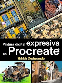

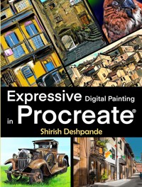
Expressive
Digital Painting
inProcreate®
Learn to draw and paint
stunningly beautiful,
expressive illustrations
on an iPad
Shirish Deshpande
Copyright ©2021 by
HuesAndTones Media and Publishing
Author: Shirish Deshpande
All rights reserved. No part of this book may be reproduced or transmitted in any form or by any means, electronic or mechanical, including photocopying, recording or by any information storage and retrieval system without written permission of the author, except for the inclusion of brief quotations in a review.
All artworks presented in this book are copyright of the artist, regardless of whether they bear the artist’s signature or not.
Table of Contents
Title Page
INTRODUCTION
Who Is This Book For?
How This Book Is Structured?
What Is Expressive Painting?
Which Part of Procreate Is Not Covered In This Book?
SOME METHODS I EMPLOY TO PAINT EXPRESSIVELY
Method 1: Do Not Abuse the Ability to Autocorrect Straight Lines and Other Shapes
Method 2: Restrict Yourself to Fewer Choices
Method 3: Use Shading and Blending Techniques like Traditional Art.
Method 4: Exaggerate the Values
Method 5: Focus On a Few Key Elements of Composition
Method 6: Respect the Intelligence of the Viewer
WHY DIGITAL?
DPI vs PPI
LET’S TALK COLOUR
RGB Colours
Colour Theory
Warm and Cool Colours
Analogous, Complementary and Neutral Colours
LAYERS
The Concept
Layers In Digital Artwork
Layer Operations
Reference Layer
Masks
Alpha Lock
Clipping Mask
Mask
Flattening the Image
LAYER INTERACTIONS (BLEND MODES)
Darkening and Lightening Modes
Contrast Modes
Inversion Modes
Cancellation Modes
Component Modes
PROCREATE INTERFACE
Most Used Gesture Controls
Actions Menu
Add
Canvas
Share
Video
Prefs
Accessibility Features
Adjustments Menu
Hue, Saturation, Brightness
Colour Balance
Curves
Gradient Map
Gaussian Blur
Motion Blur
Perspective Blur
Noise
Sharpen
Bloom
Glitch
Halftone
Chromatic Aberration
Liquify
Clone
Selection Menu
Options:
Operations on selected area:
Transform Menu
Freeform
Uniform
Distort
Warp
Operations
Brush Library
Saving the Brush Settings
Brush Types (According to My Usage)
Creating Brushes / Modifying Existing Brushes
Importing Brushes
PERSPECTIVE
Horizon
Vanishing Point and Perspective Concepts
One-Point Perspective Example
Two-Point Perspective Example
Three-Point Perspective Example
EXERCISES
Drawing a Simple ‘Pencil Sketch’ of a Tree
Using Layers for Painting Reflections in the Water
Painting an Old House with Trees with Realistic Textures
A Charming Village – Adding Depth to a Painting
Fun with Letters
Using Values and Curves to Paint a Charming Italian Town
PARTING WORDS FROM THE AUTHOR AND BONUS CONTENT
GRATITUDE AND REQUEST FOR REVIEW
INTRODUCTION
Digital painting is an exciting new way of creating art. Even though digital painting has existed for decades, it is only in the last few years that it has become easily accessible to everyone due to its availability on mobile devices.
Who Is This Book For?
This book is meant for readers who already enjoy drawing / painting and want to explore the exciting possibilities offered by digital art. You do not need to be an expert in either traditional or digital techniques to make the most of this book.
A disclaimer before you move ahead:
Most books (that I know of) about digital painting focus on making concept art like the one used in video games and movies. This is not one of those books. This book is about learning to sketch and paint realistic artwork using digital techniques.
Also, in my opinion, many digital artworks look so smooth and perfect that they feel artificial. If you are looking forward to learning the smooth, perfect-looking ‘plasticky’ art or ultra-realistic art, this book is not for you because it will steer you in a completely different direction.
I personally do not have any grudges against ‘plasticky’ or ultra-realistic digital art, and I feel every artwork has its place in this world. But the digital artworks you will learn to draw and paint in this book will embody the spontaneity and energy of traditional artwork while exploiting the flexibility of the digital medium.
With that disclaimer out of the way, let’s begin.
How This Book Is Structured?
In the initial chapters of the book, we will compare the traditional and digital techniques, and you will understand how easy and logical it is to switch between them. We will learn to apply digital techniques in the Procreate app. But the principles and methods discussed in this book can be applied while painting with any digital painting software.
You will learn about digital art concepts like layers and masks. You will also learn about the Procreate interface and how to effectively use it while painting. And the most important thing you will learn is to restrict yourself to use a few tools to maximum effect for creating expressive paintings.
Note: Procreate is a raster graphic software which runs only on iOS devices. To use Procreate, you will need:
An iOS device – iPad, iPad Air, iPad Mini, iPad Pro or iPhone (a ‘Pocket version’ of Procreate is available for iPhone, but this book will focus on the tablet version only).
A stylus – Ideally, one should use the Apple Pencil since it is well-integrated with the iPad and has an excellent pressure and tilt sensitivity. Other third-party styluses are also available. When buying a stylus, make sure it is pressure sensitive and tilt sensitive. These are important qualities for a stylus if you want to use it for drawing and painting.
After you learn the Procreate interface and the tools available, we will move on to some tricks and techniques to create a hand-drawn, expressive feel for your digital paintings. There’s also a small section about perspective concepts later in the book.
What Is Expressive Painting?
Have a look at this painting.
If you observe this painting carefully, you will find several imperfections.
If you didn’t, let me give you a hand!
Here are some parts of the painting zoomed in.
You can see that the lines are not exactly straight, the colours are not exactly within the lines, the wheels are not exactly round.
But the overall composition works.
Even though this painting is not ‘perfect’ (in the ‘photographically realistic’ sense), it has a certain spontaneity, charm, and dynamism that ‘clicks’ with the viewer. This spontaneity draws the viewer in. In my opinion, the human mind is wired to like imperfect artwork with a hand-drawn look better than perfect-looking artwork.
A warning: Being spontaneous and loose while sketching is not an excuse for being sloppy! One must maintain a balance between spontaneity and craft.
In this book, you will learn to use all the tools at our disposal in Procreate. You will also learn to use these tools effectively to make your life easier. I will encourage you to try out all the tools. But you will ultimately settle on a few tools which you will use frequently, as every artist does.
Which Part of Procreate Is Not Covered In This Book?
Procreate version 5.2 introduced the capability to paint 3D models. One can import 3D models created in other programs like ZBrush, Blender, Mudbox, Maya etc., or use one or more models provided along with the 5.2 update.
Procreate does not have the capability to create a 3D model yet. You can paint the 3D model imported into Procreate, and export it as an updated 3D model, or animated files, or images.
This opens a flood of possibilities in what you can do and create with Procreate. But 3D painting is not in the scope of this book. This book focuses entirely on learning to paint 2D expressive paintings.
SOME METHODS I EMPLOY TO PAINT EXPRESSIVELY
There are several ways of creating an element of spontaneity and expressiveness in our sketches and paintings. However, ‘expressive’ is an abstract term at best and can be interpreted differently by each person.
Remember, there’s no right or wrong in art. What I am going to show you is how I use different tools and techniques. But it is not the only right way. Any form of art demands that there should be multiple ‘right’ ways of doing the same thing. Keep this in mind as you read the rest of this book.
Following are some of the methods I use to create an expressive look to my paintings / illustrations. This will provide you with a set of tools to begin your journey into the realm of expressive drawing and painting.
Method 1: Do Not Abuse the Ability to Autocorrect Straight Lines and Other Shapes
Procreate (and many other digital painting apps) provide a facility to draw straight lines and other shapes without much effort.
In the picture above, the shapes on the left are hand-drawn. In case of the shapes on the right, I drew the shape by hand, but held the pen onto the tablet for a second after I had completed drawing the shape. This autocorrected the shapes to much smoother shapes. This is a highly useful feature in Procreate, but you must use it judiciously if you want to draw truly expressively.
If every shape looks smooth and polished, the sketch / painting will quickly lose its hand-drawn quality.
This does not mean you must forego every convenience of digital drawing, but you must not let yourself depend on it too much.
Start with some impromptu, fast sketches. Avoid using the undo. If any mistakes happen, let them remain.
Following is a live sketch I did on a crowded street in my city. The time was limited, and I was trying to capture the feel and the energy of the bustling street. You may observe very loose but spontaneous lines in this sketch.
Method 2: Restrict Yourself to Fewer Choices
One of the ways I bring about the spontaneity in my digital paintings is to restrict myself in the usage of digital tools. This may sound counterintuitive at first. Why restrict ourselves if we have all the tools available to make our life easier?
The following is an oil-on-canvas painting that I did several years ago. This is painted using only 4 colours: cadmium red, yellow ochre, black and white.
Yes, even the greenish and bluish hues you can see in this painting are derived from these 4 colours only. This set of 4 colours is called the ‘Zorn Palette’, and it’s very popular with artists who paint in oil colours.
As you may know, dozens of hues of oil paints are easily available in art supply stores. So why do some artists restrict themselves?
The answer is simple. When one has too much choice, one is more likely to go into ‘analysis paralysis’ mode or try to use every tool at his / her disposal. This may make one lose sight of the goal… to create a pleasing, expressive painting.
And when it comes to digital painting software like Procreate, the number of choices is simply staggering.
Method 3: Use Shading and Blending Techniques like Traditional Art.
In traditional sketching and painting, an artist uses various shading techniques like hatching, cross-hatching, stippling etc. There’s no need to assume you may not use these same techniques in a digital painting.
If you do not know what the above-mentioned techniques are, you can find a quick reference in this PDF, which you can download for free. You can take a printout of this PDF and practice the shading techniques in the practice sheets provided.
https://HuesAndTones.net/cheatsheet/
Did you know that the Apple pencil is not just pressure-sensitive, but also tilt-sensitive?
It means when you hold the Apple pencil at an angle to the iPad, you can simulate shading with a pencil held at an angle to the paper for smudging.
In the following monochrome sketch, see how the smudging has resulted in pencil-like shading. I have used the pre-packaged ‘6B pencil’ brush. You can see the smudge marks on the temple building and the tree trunk on the right.
The following picture is part of a bigger painting ‘A Charming Street in Bomba, Italy’. I have zoomed in to this part to show you how I have used hatching, contour, and stippling strokes to shade the linework. This linework has helped create the hand-drawn quality that we crave.
In the following picture of a forest stream, I placed the brush strokes side-by-side without blending them. It’s left to the viewer to interpret these strokes as a coherent shape.
When zoomed-in, you can clearly see the brush strokes.
Method 4: Exaggerate the Values
Before we learn how to exaggerate values, let’s learn what values are.
Observe this illustration above.
What did you see first?
I bet the first thing that caught your eye was the bright stripes of light.
Then your eye wandered over the little less bright parts of the illustration like the walls and doors of the buildings on the left- and right-hand side.
At the end, you probably observed the dark foreground foliage in the top-left corner.
How did I know this? Because I understand the power of ‘values’ in controlling the viewer’s attention.
But what is a ‘value’?
In painting-speak, the word ‘value’ refers to the darkness or lightness of an area in a picture. Remember, value refers to only the brightness level of the area and has nothing to do with the actual colour of that area.
Observe this painting above. The colours used for the glass are almost the same as the background colours. Yet, you can clearly distinguish between the glass and the background. Similarly, you can tell which plane of a leaf is attracting more light, and which planes are in the dark.
In fact, the same effect could have been achieved without using any colour at all.
This is the power of values.
Observe that the elements within the painting are clearly visible even when all the colour is drained out of the painting.
Understanding the values within a picture is extremely important while painting. It serves two purposes:
Understanding values helps us better understand the broad shapes within a picture.
Using the values correctly means making our paintings more understandable to the viewer, and can add a certain ‘pop’ to the paintings.
I will explain both the above points (in plain language) in the next few pages.
When determining the values in any picture, we must observe the picture in terms of light and dark tones, and any grey tones in-between.
You may choose to have multiple greyscale values in your painting…
…or you may want to push the values to extreme, making it almost a dual-value illustration.
To ‘see’ the values properly, the first step is to let go of the details and colours.
And how do we let go of the details and colours?
The easiest way is to squint your eyes while observing a scene / photograph.


